Vodiy Organics – Organic Egg Brand and Packaging Design
We’re sharing a case study that was completed some time ago but has only now "ripened" for release. This is the story of creating the logo and label design for Vodiy Organics.
1. The Challenge
Our client didn't just want to be another supplier; they aimed to establish a definitive voice in the market. The challenge was to break away from the "no-label" bazaar style and move past competitors who all seem to follow the same cookie-cutter design. The goal was to build immediate consumer trust, signaling a "pure and premium" product at first glance.
We were tasked with communicating the natural and organic essence of the product through the logo and label. Simply put, we needed to give shoppers a compelling reason to reach for this specific carton over a dozen others on the shelf.

2. The Research
In the current market, egg cartons often look like soldiers in a lineup—uniform and faceless. However, for our local consumers, an egg isn't just a protein source; it’s a symbol of a wholesome breakfast and "baraka" (abundance). People still hold a deep preference for "home-grown" and "village-style" over cold, industrial products. We realized we shouldn't be selling a clinical factory vibe, but rather the warmth of the countryside—where the rooster crows at dawn and the air smells of fresh hay.
3. The Solution
Rather than shouting "we are organic," we decided to let the packaging speak for itself.
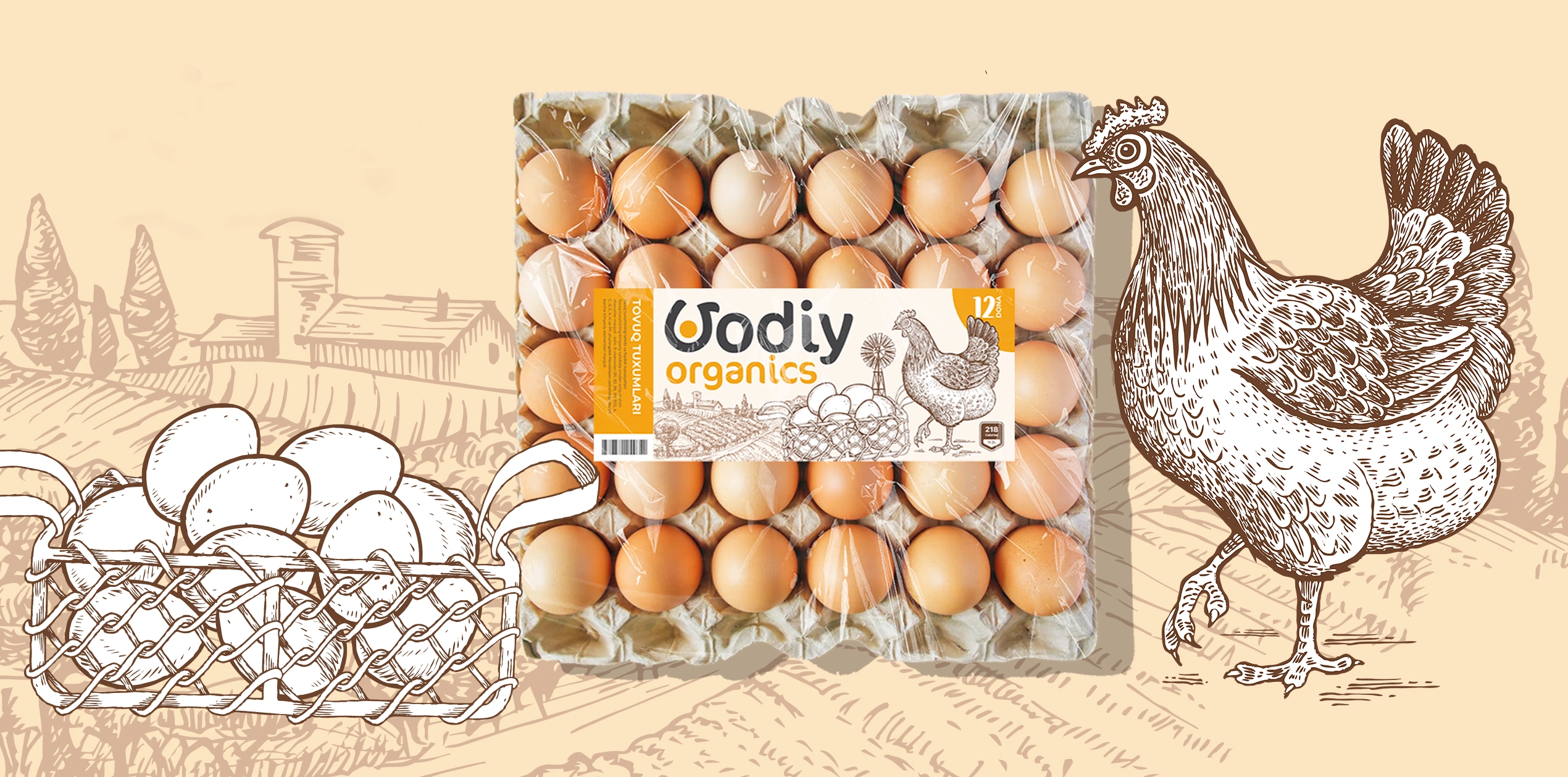
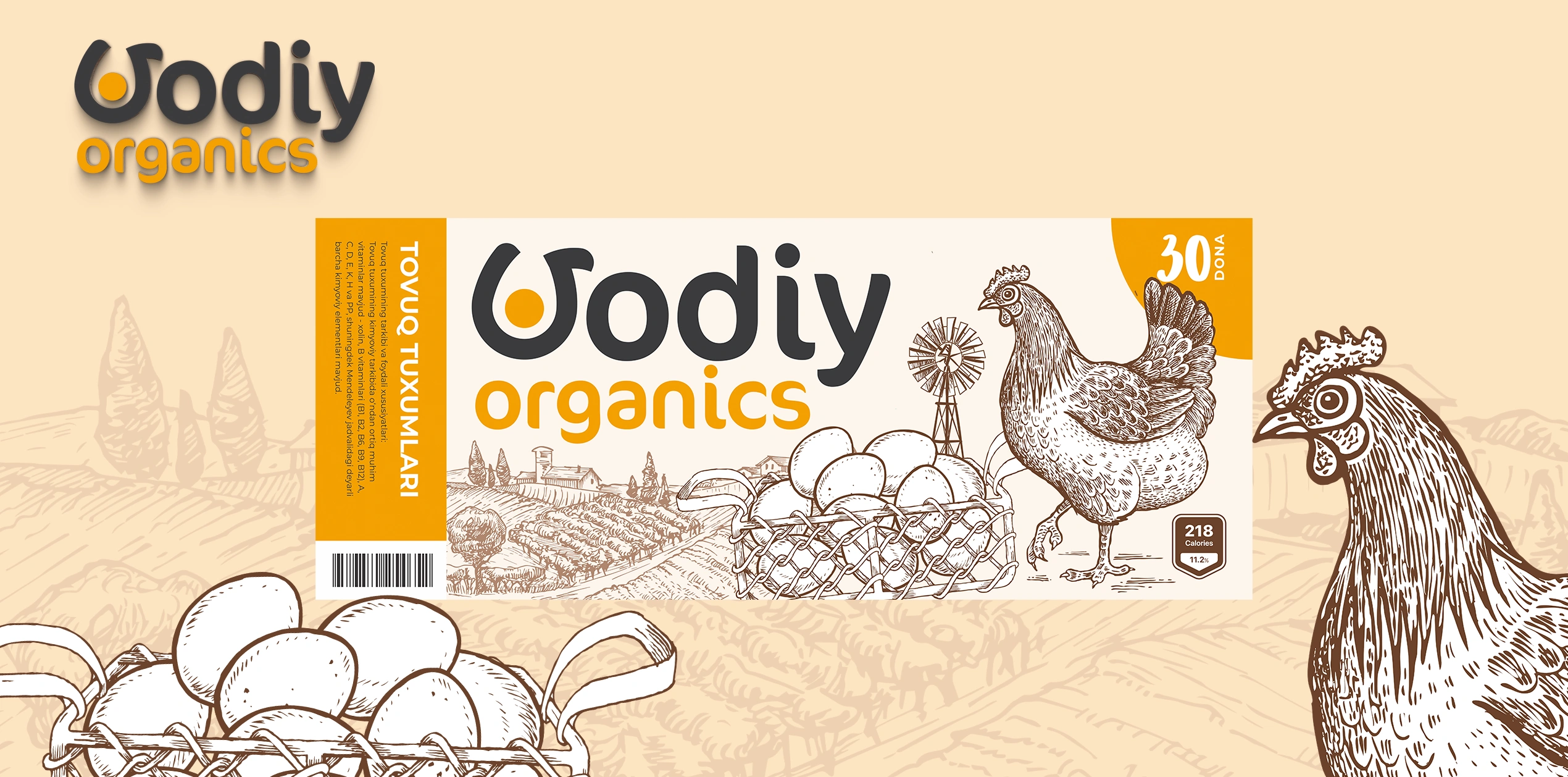
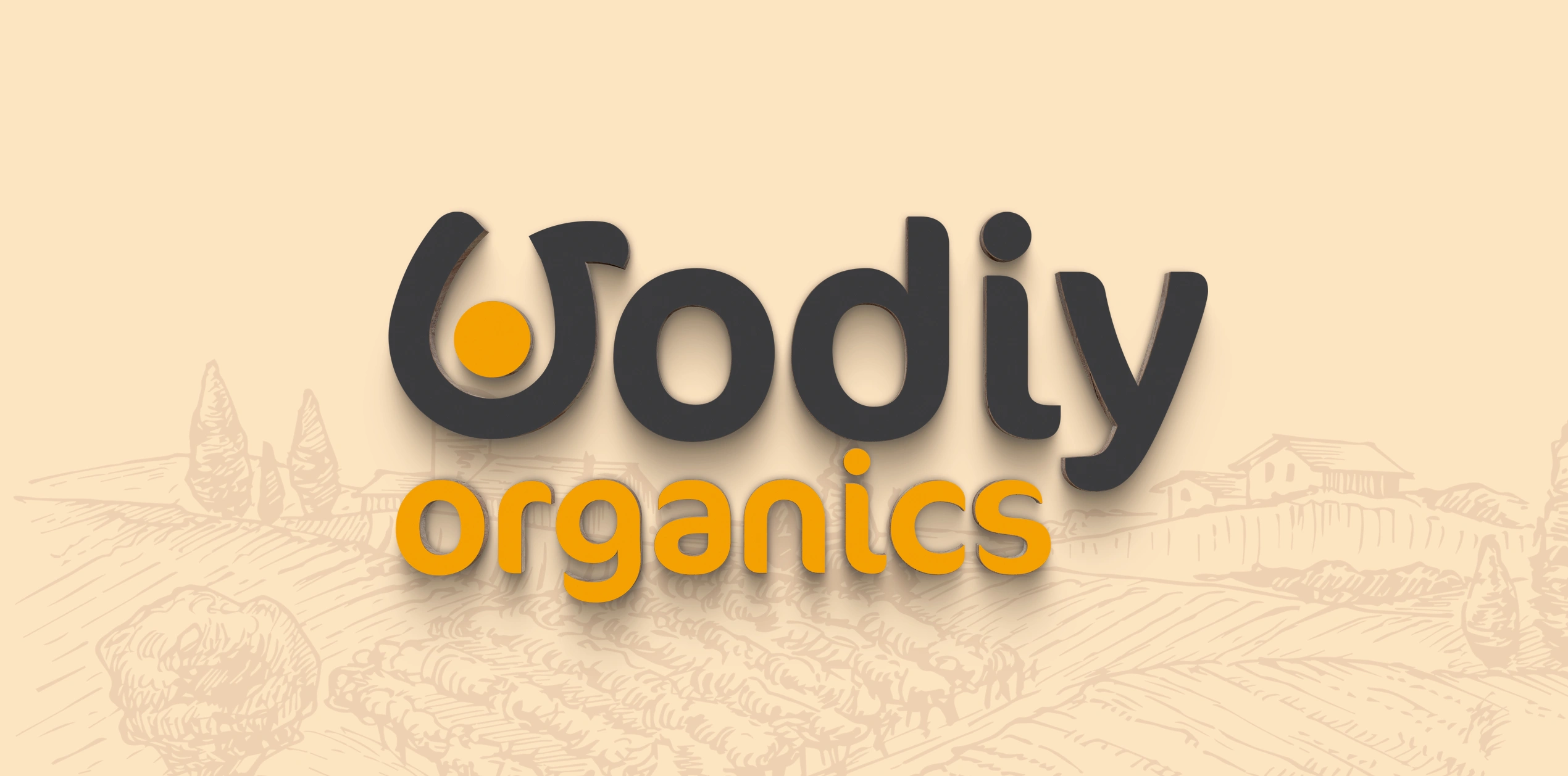
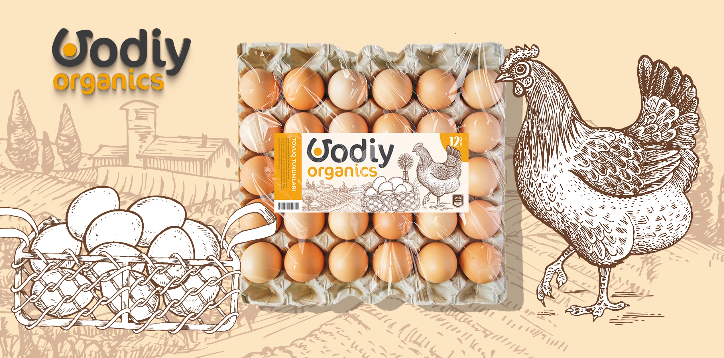
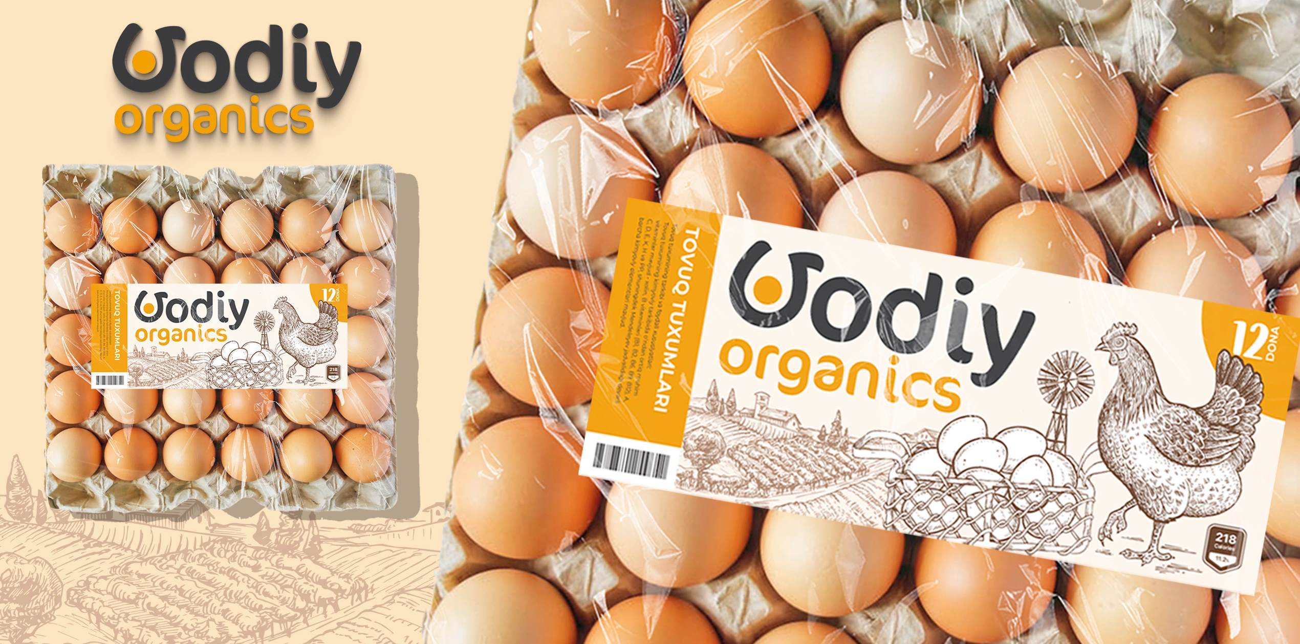
The Logo: We focused on the letter "V" in "Vodiy." We crafted it so it serves as a visual metaphor: a subtle blend of a proud hen's silhouette and the image of a sunny-side-up egg. It’s a clever detail that the subconscious picks up instantly, even if the eye doesn't notice it right away.
Label Design: We focused on artisanal aesthetics:
- Illustration: Fine, hand-drawn lines reminiscent of an artist's sketch evoke a sense of rural life and freedom.
- Color Palette: A warm, "yolk-yellow" combined with earthy tones—representing the morning sun, energy, and freshness.
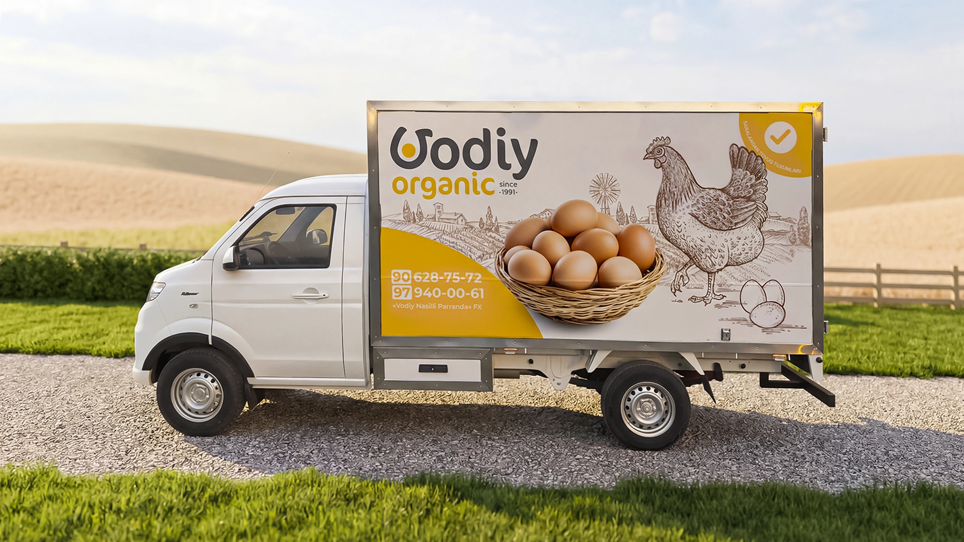
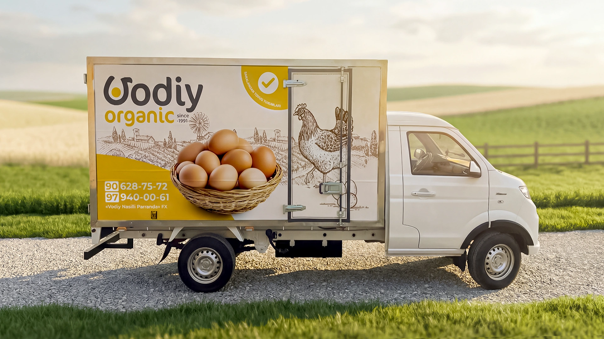
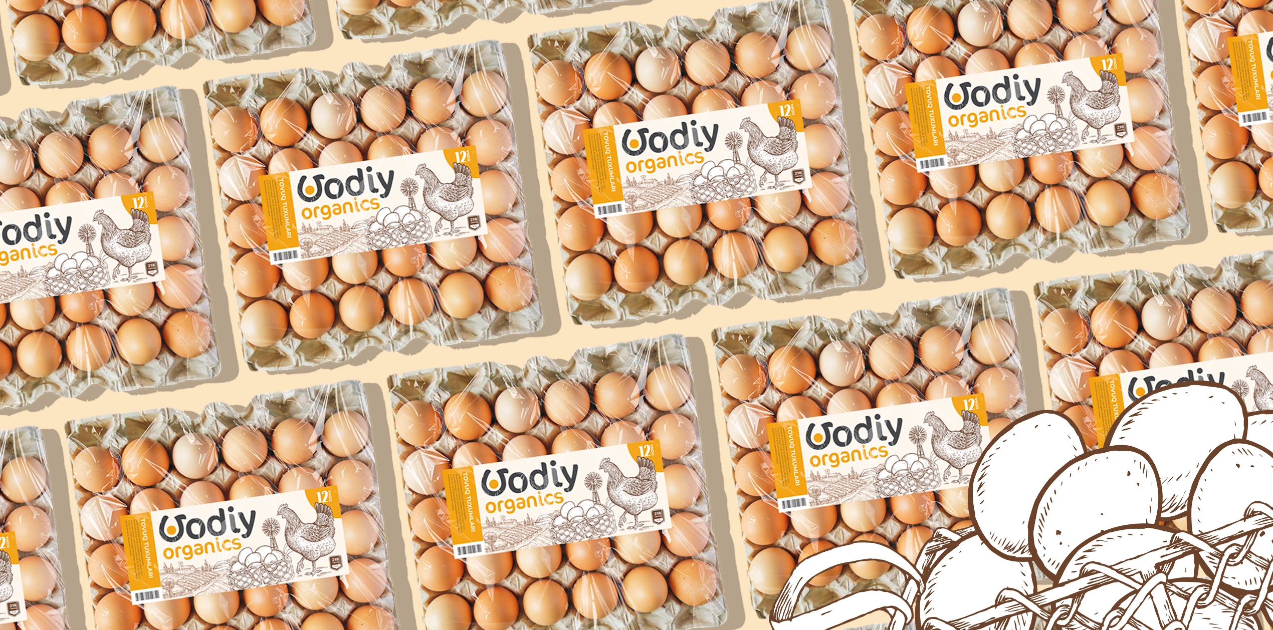
The Result
The final result is more than just a box for eggs; it is the "face" of a brand. On the retail shelf, this design stands up and says, "I'm right here." Vodiy Organics is no longer just a commodity—it’s a trusted guest in every home, bringing natural quality to the family table.
Looking for a design that gives your brand a competitive edge? Contact the Minim team.