


AquaAsia — New Label Design for a Soft Drinks Brand
In our culture, weddings, lavish feasts, and family gatherings never stop—and knock on wood, they never will! But the question of which premium soft drinks will proudly take center stage on a rich dastarkhan (festive table) without losing face in front of the guests always remains highly relevant.
For our client and manufacturer Eldor, this marks the third major joint project with us. Previously, we packed and designed his mineral water brands "NOV" and "Tashkent Suv" from A to Z. The next, third move was launching a new brand in the private label (STM) format—AquaAsia.
1. Strategy
Here, a fair question arises: why would one company launch three soft drink brands in a row? After all, doesn't common sense say that you shouldn't compete against yourself?
But the catch is that in business, the rules of the game are a bit different. Selling the exact same product under 3–4 different brands through various dealers and distribution channels is a sly and incredibly effective strategy to grab a much larger piece of the pie.
Plus, it acts as a financial safety cushion for the entrepreneur. Imagine how risky it is to put the fate of an entire factory into the hands of a single distributor and depend entirely on their mood swings. Perfectly understanding that you shouldn't put all your eggs in one basket, our client decided to enter the same territory with 2–3 independent brands, thereby reducing risks to an absolute minimum.
2. Problem and the Task
The task was crystal clear: to create packaging and a visual solution that would become a true centerpiece of the dastarkhan at our local weddings and ceremonies. At first glance, people needed to realize that this is a solid, premium product. The drink shouldn't yield an inch to European brands and, if needed, should be ready to dethrone Cola, Fanta, and Sprite from the table, as well as give a real run for their money to giants like Chernogolovka and Natakhtari.
3. Solution
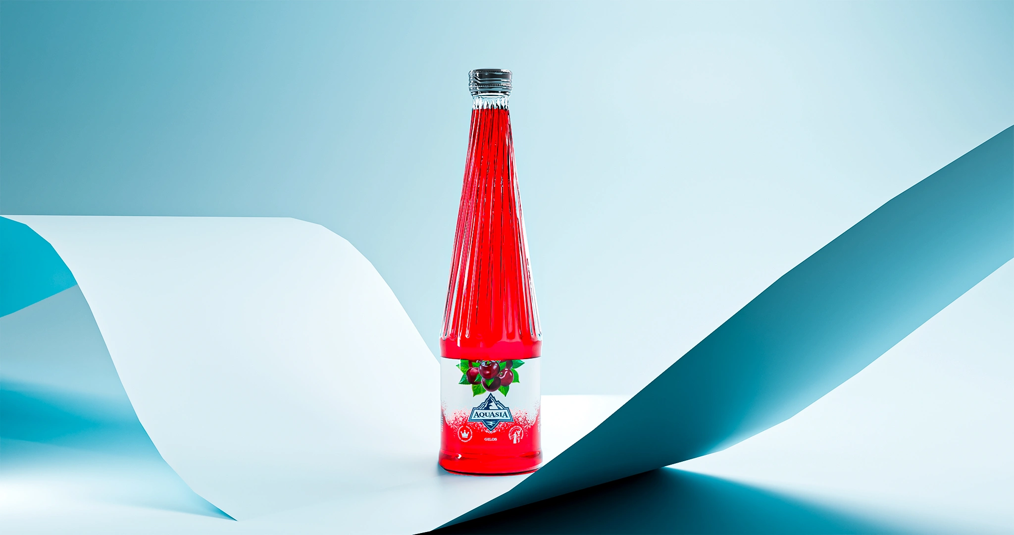
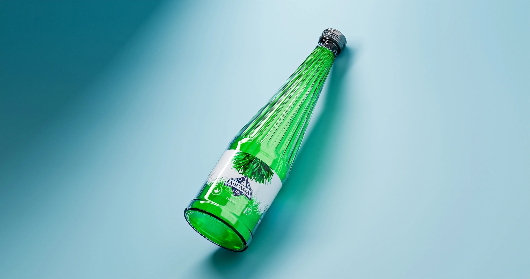
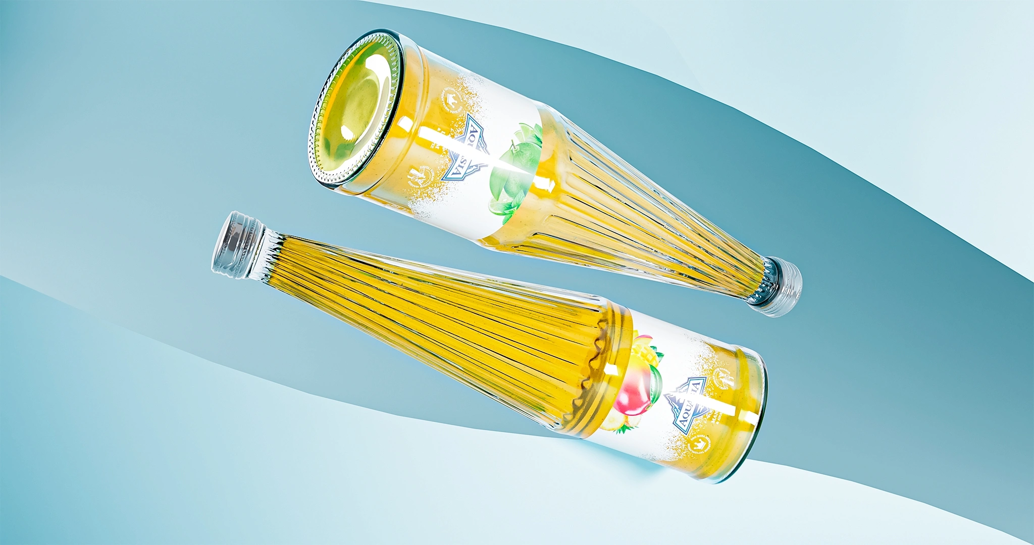
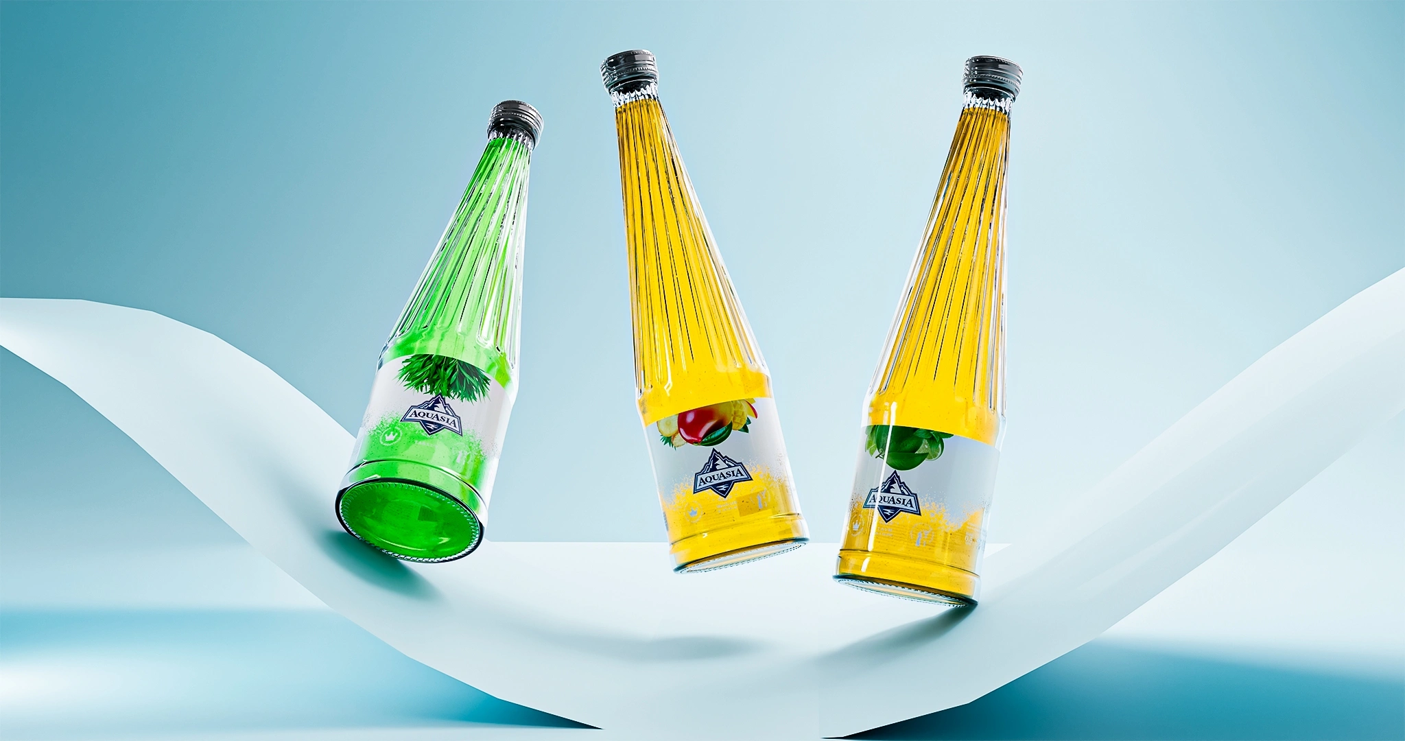
A premium glass bottle was chosen as the foundation, just like in our previous "NOV" project. MINIM agency stepped in to breathe life into this glass by developing the naming and label design.
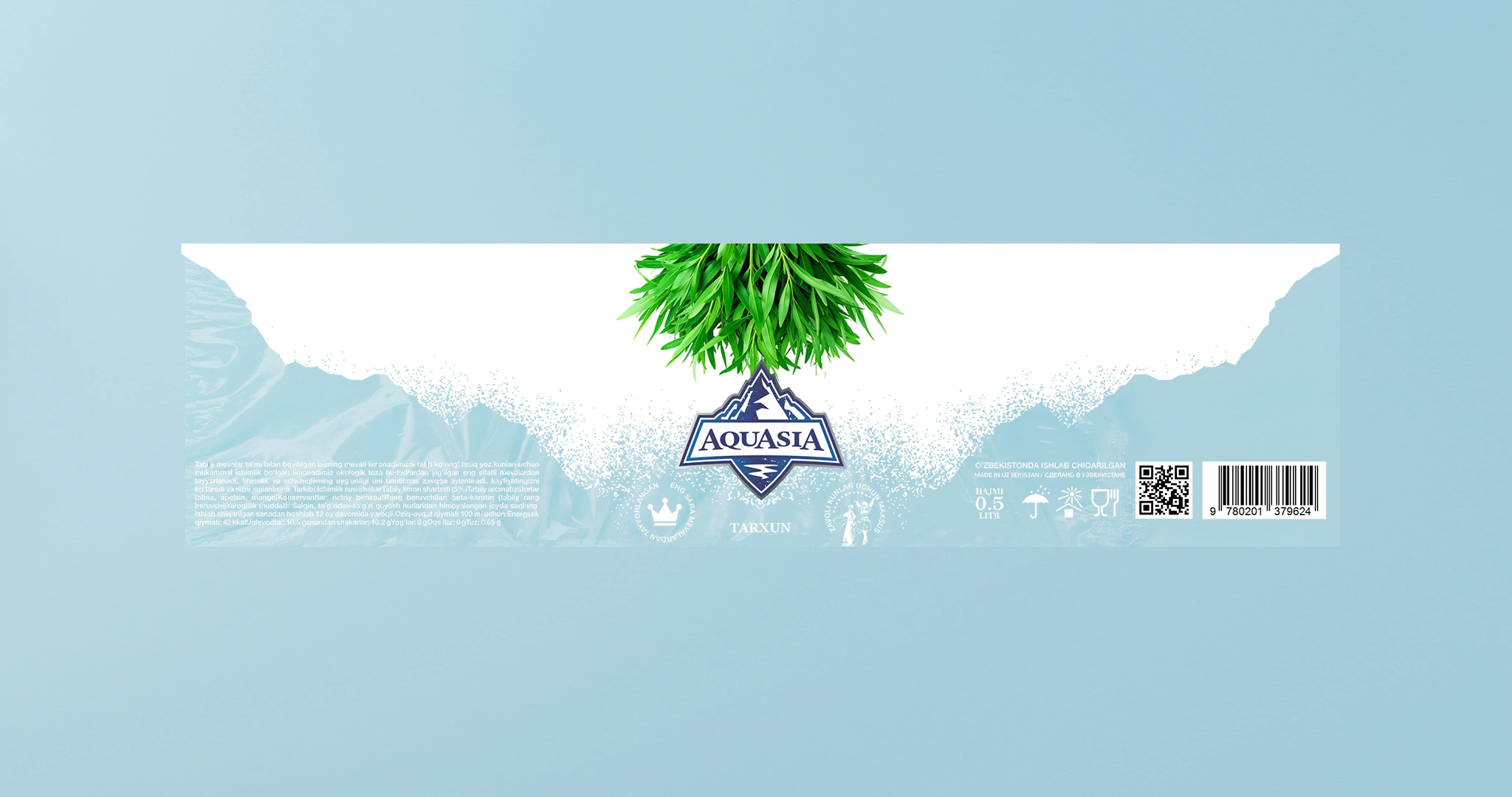
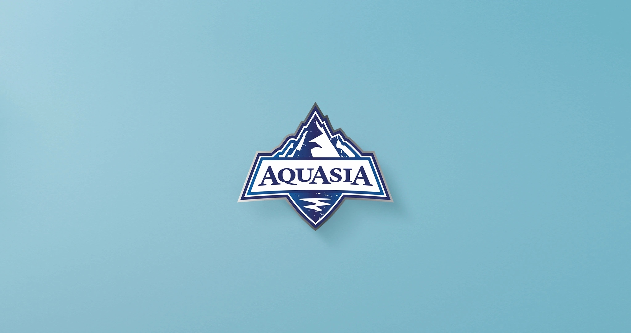
- Naming and Logo: For the new brand, we chose the name AquaAsia—catchy and with a global scale. The logo features a splash-like "spot" symbolizing a stream of crystal-clear water rushing down from high mountains. This is a direct nod to natural freshness and purity.
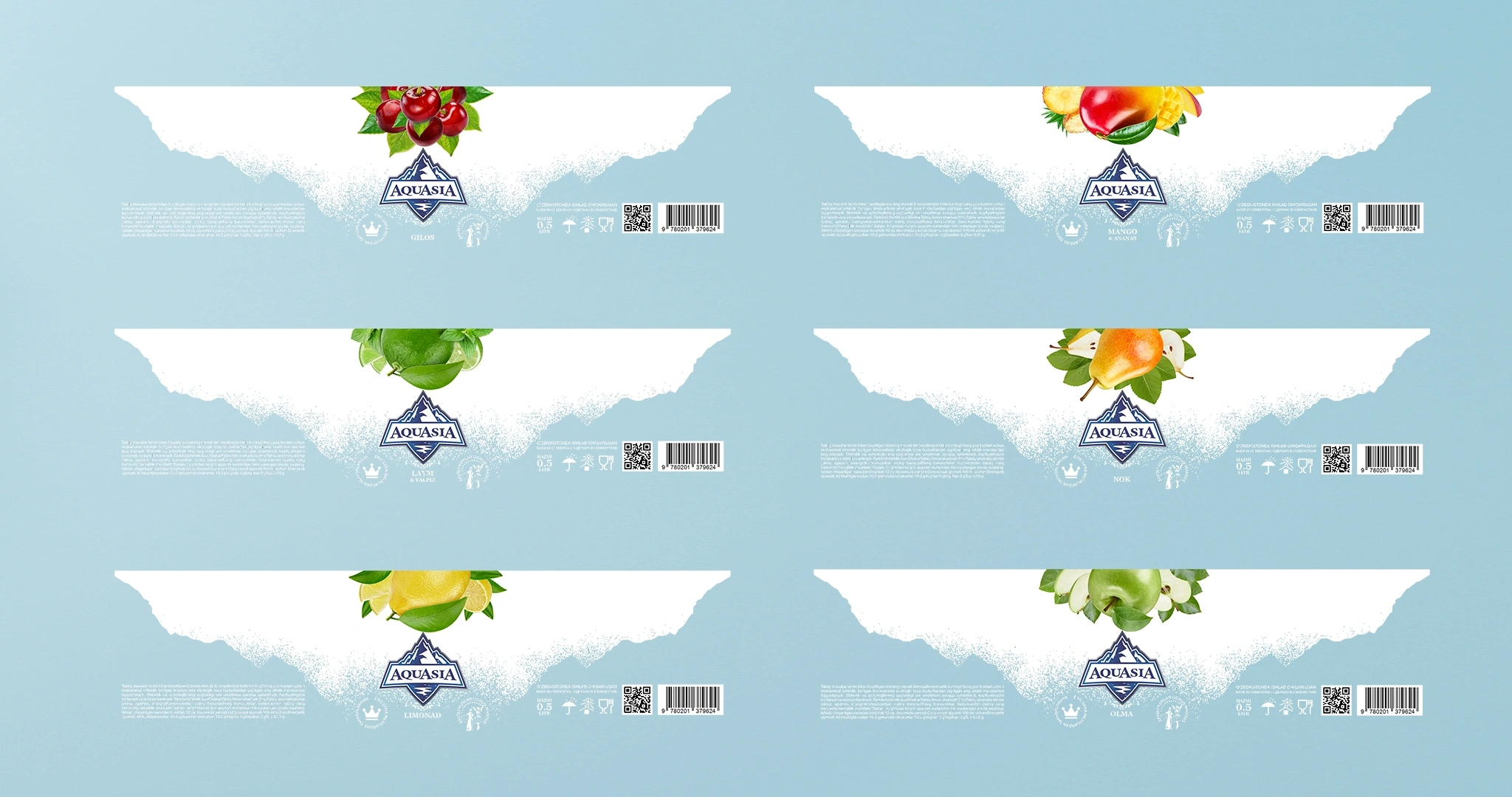
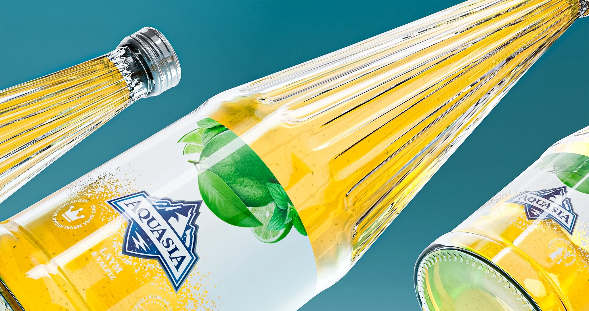
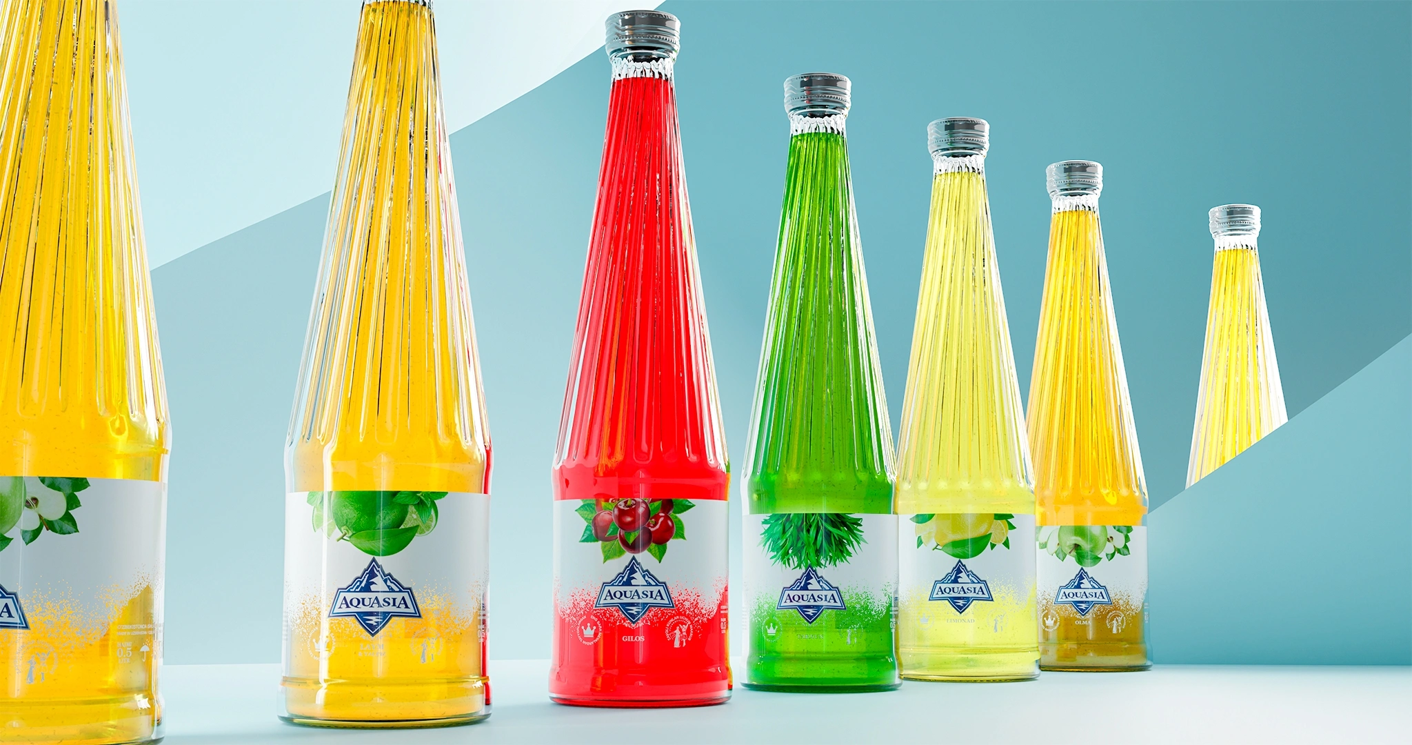
- The Chill Effect: The most interesting detail was a special graphic element used on the label's background. If you look closely, it's sprinkled with fine white "noise." Through this, we simulated frost, snow, and the effect of icy condensation on a glass bottle. The moment a buyer spots the drink on the shelf, they should instinctively swallow, visually feeling that refreshing, ice-cold vibe.
The Result
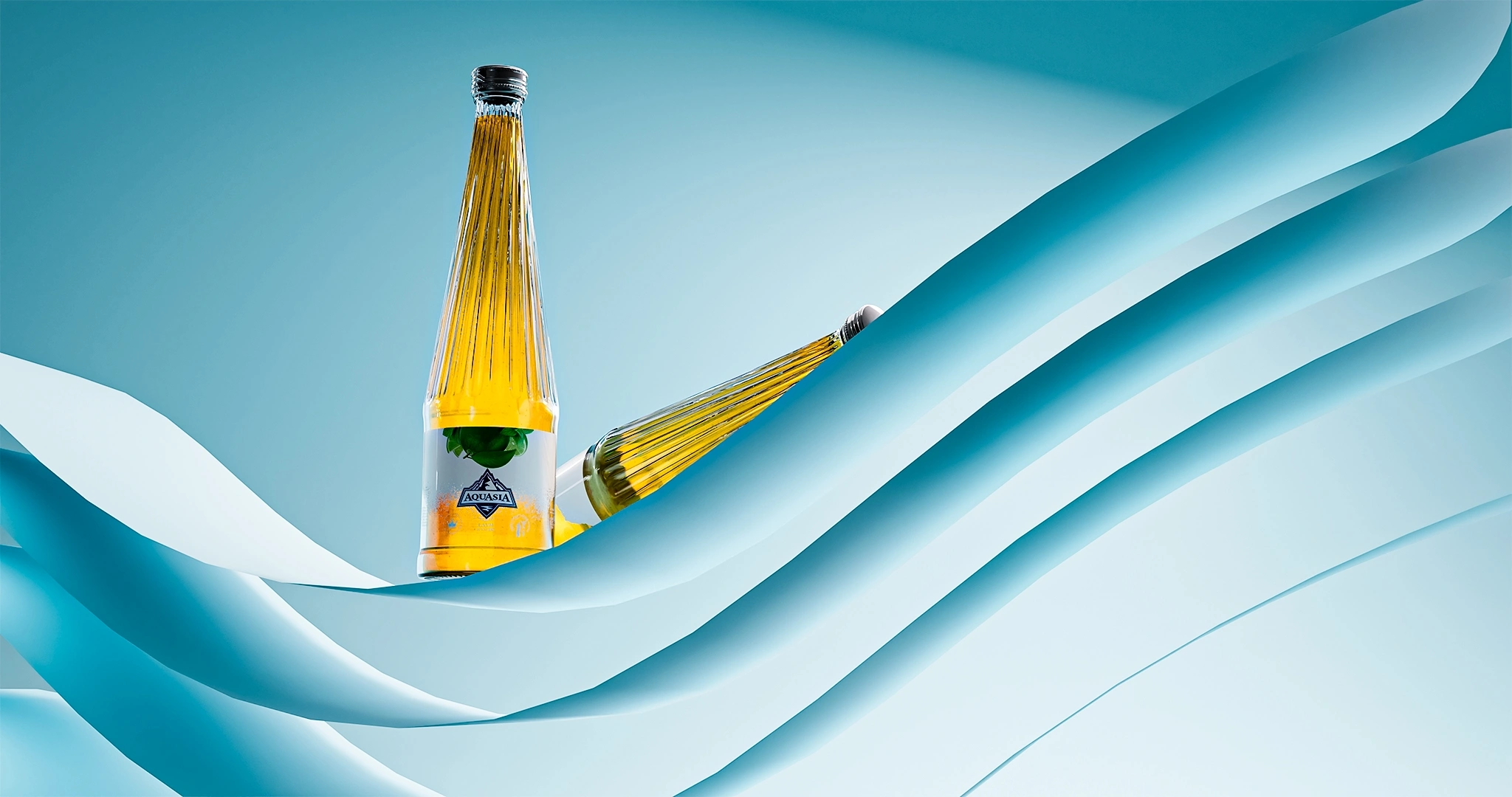
Today, AquaAsia is produced in 6 different fruit flavors. Thanks to the design we developed, the product has truly become the highlight of any feast.
Now, local consumers no longer need to rack their brains looking for expensive foreign drinks. With its majestic glass bottle, chilling design, and unique taste, AquaAsia is ready to give strong competitors a tough fight on the market and, slowly but surely, claim its rightful share.