


AKE – Bold Energy Drink Packaging Design in Uzbekistan
A visual strategy based on the metaphor of a determined character and an eagle conquering a mountain peak.
1. The Task
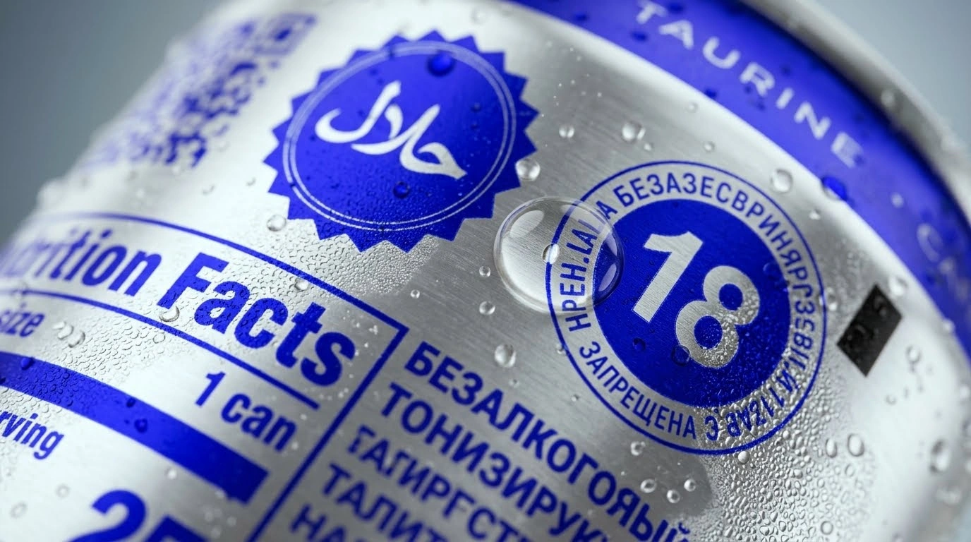
The energy drink market is one of the most competitive arenas, where a literal "battle" for consumer attention takes place. Our client wanted to introduce a new product to this market, aimed at an audience of young, energetic, self-confident, and somewhat "daring" men.
Our task was to create an aggressive and modern packaging design that would live up to the resonant "AKE" name, reflect the ambitions of its target audience, and command immediate respect on refrigerator shelves.
2. Research
The target audience consists of young people who despise mediocrity and are always striving to move forward. You can't sell them products with soft shapes or dull colors. It became clear that their drink had to be as dynamic and memorable as they are.
Based on this, the metaphor of "eagle and mountain" was chosen as the visual anchor of the brand. The eagle is a symbol of height, strength, and dominance. The slogan "Above the mountain" reinforced this powerful character through words.
3. Solution
The project developed a rigorous visual system based on geometry and color contrast:
-
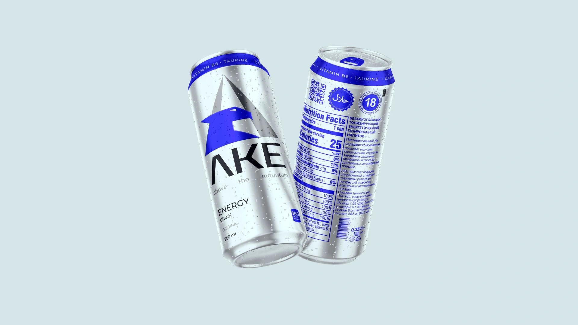
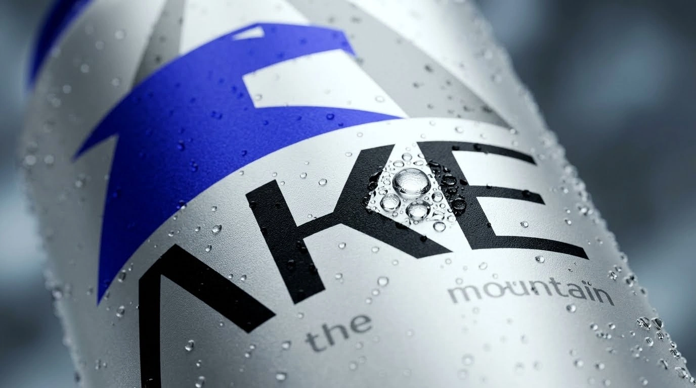
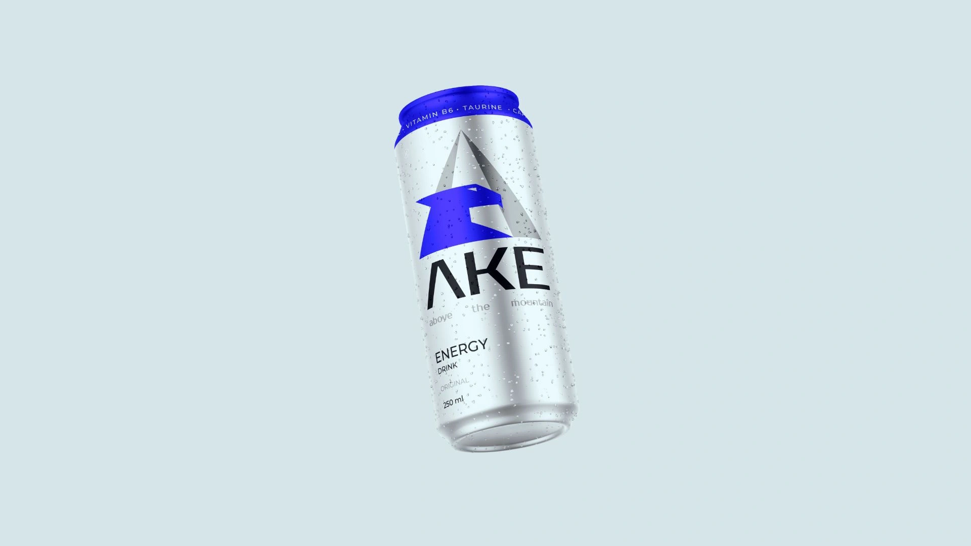
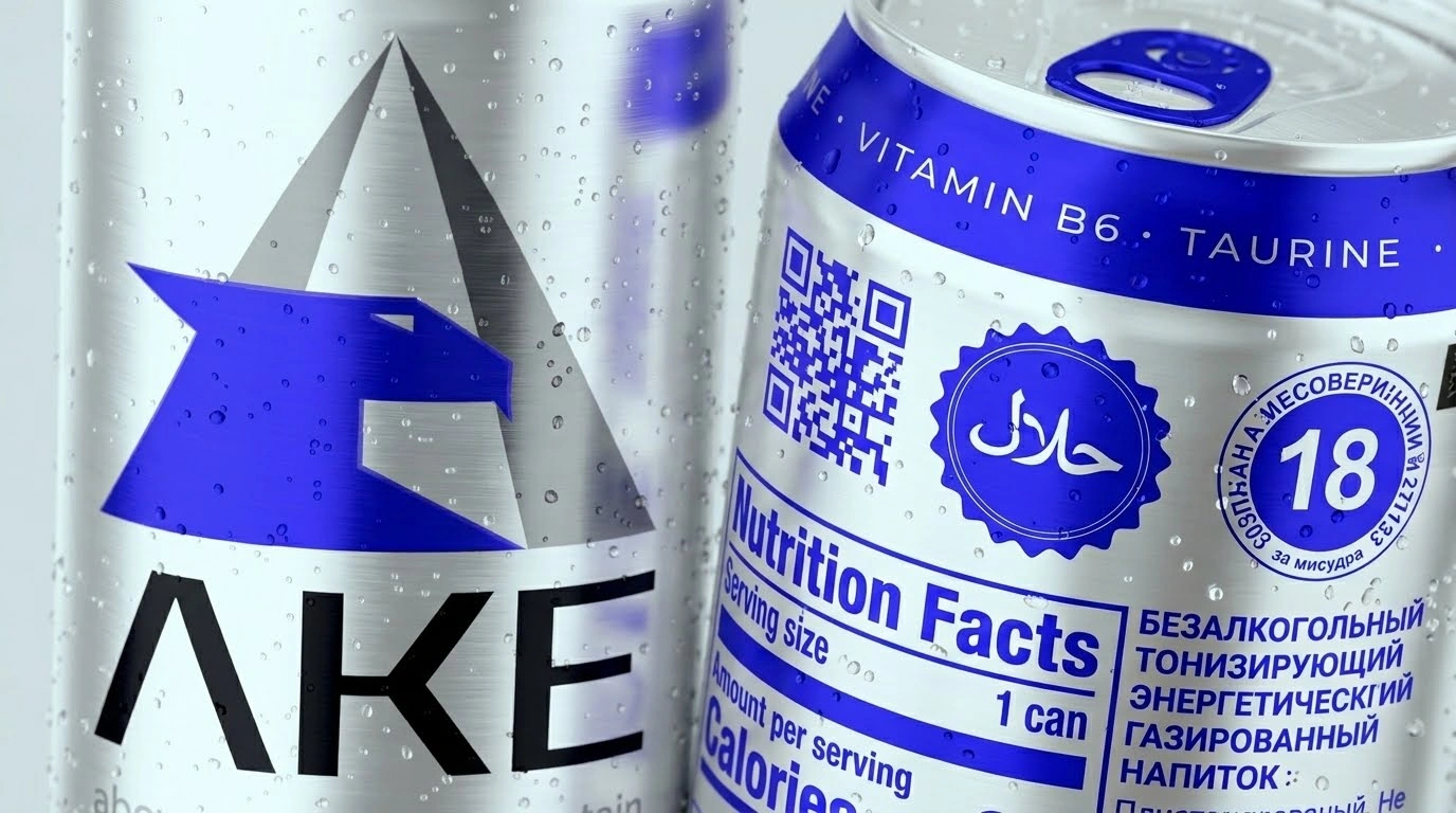
Logo and Symbolism. The main emphasis was placed on the letter "A" in the center of the packaging and the skillfully embedded eagle profile. Sharp angles and sharp lines gave the design the necessary "aggressiveness" and dynamics. The large and bold "AKE" typography under the logo ensured that the product name could be read from a distance.
-
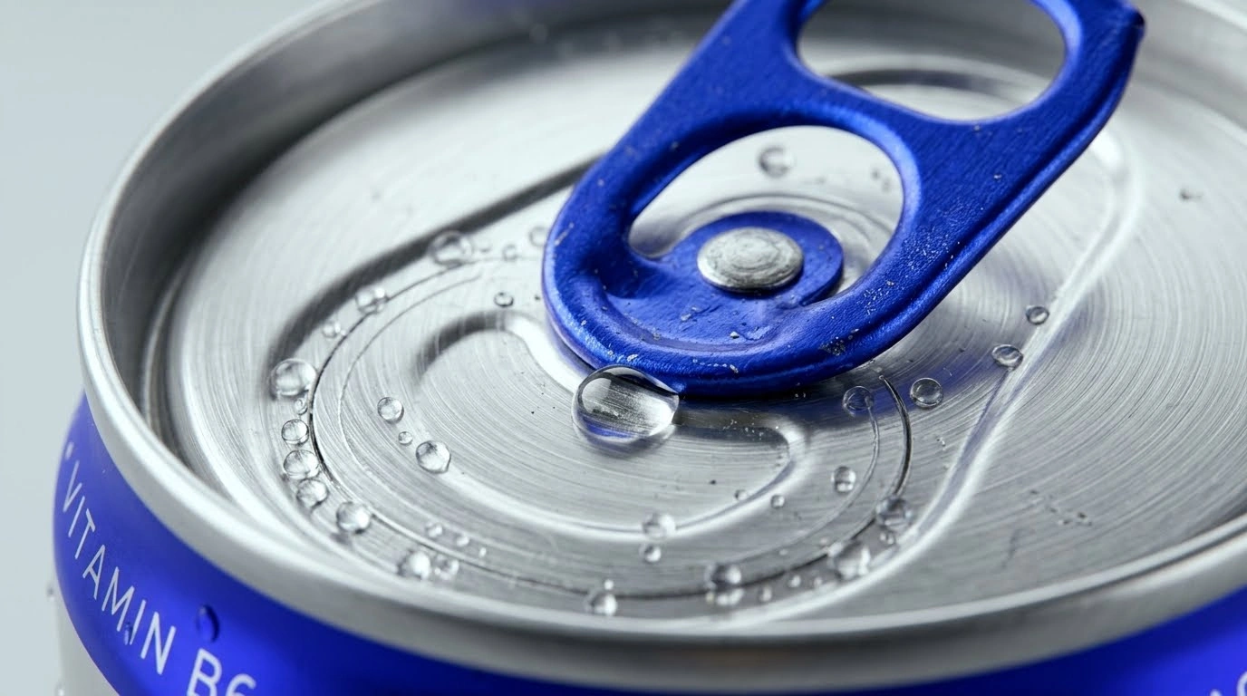
Color Contrast. Energy drinks are usually black or dark in color. To break the stereotypes, together with the client, we chose a white-blue — silver and electric blue — option.
-
Silver metallic background — gives the product a cool, refreshing, and premium tone.
-
Bright blue color — recalls electricity and brings the main energy character to the packaging.
-
Result
As a result, a brand emerged that stands out among standard "black" energy drinks on the shelf thanks to its brightness, clarity, and sharp character. AKE was able to directly respond to the ambitions of the target audience through its design.
"Design is about feeling. It has to tell the customer in a second what kind of character the product has." — David Carson, world-famous designer
Through the accurately chosen eagle metaphor and sharp geometry, AKE was able to convey its bold character to the buyer in the very first second.