Suon – Logo and Packaging Design for Water and Soft Drinks
1. The Challenge
This time, our client was a large distribution company. They planned to launch a new line of carbonated soft drinks under their own private label. The client had already chosen the name: Suon.
The etymology and philosophy behind the name are quite interesting. First, it is a resonant and pleasant-sounding word. Second, its core reflects the essence of product delivery. "Suv online" (water online) or "suv bir onda" (water in an instant) serves as a hidden reference to the idea that water will be delivered instantly, exactly when needed.
Our primary task consisted of the following:
- Create a unique logo for the local brand that harmoniously reflects this name and concept.
- Develop a packaging design, primarily targeted at the youth, that would instantly stand out on shelves crowded with competitors.
2. Research
Any strong design begins with studying the market and competitors. We analyzed the water and carbonated drinks market, specifically focusing on fruit-flavored beverages.
We noticed that the design of most brands followed a single standard: hyper-realistic 3D illustrations of fruits on the packaging, covered in gleaming water droplets, creating lively, appetizing compositions. Yes, this is a working, proven approach. But when everyone speaks the same visual language, brands start to look alike, blending into a solid wall of visual noise for the buyer. We wanted to break the mold.
In search of an idea for the logo, we turned to history. The concept of product delivery led us to ancient Bukhara and the life around the Ark fortress. In the old days, water carriers (meshkobs) delivered water to people on camels using special leather waterskins (burdyuks). We were looking for a way to combine this historical national flavor with modern speed.
3. The Solution
We abandoned the ready-made templates used by the majority and took two bold steps:
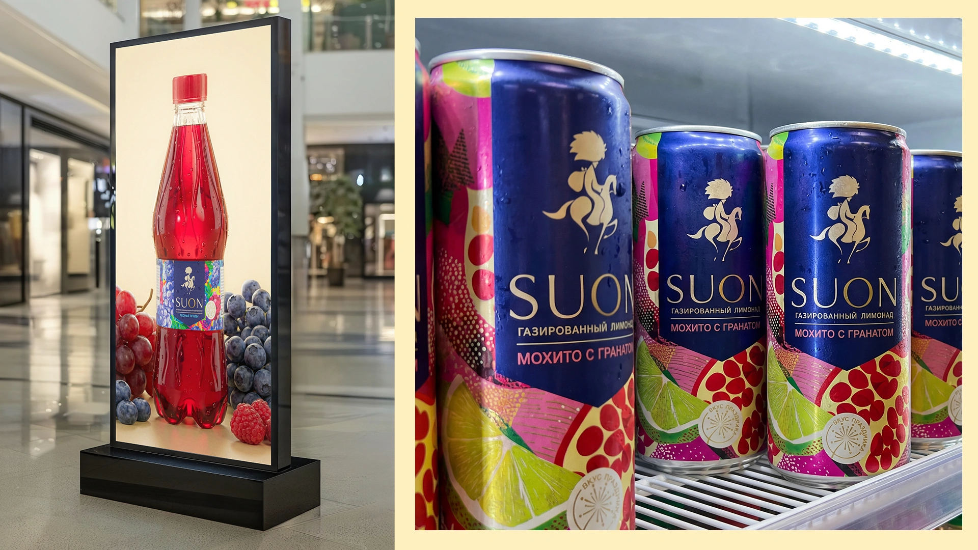
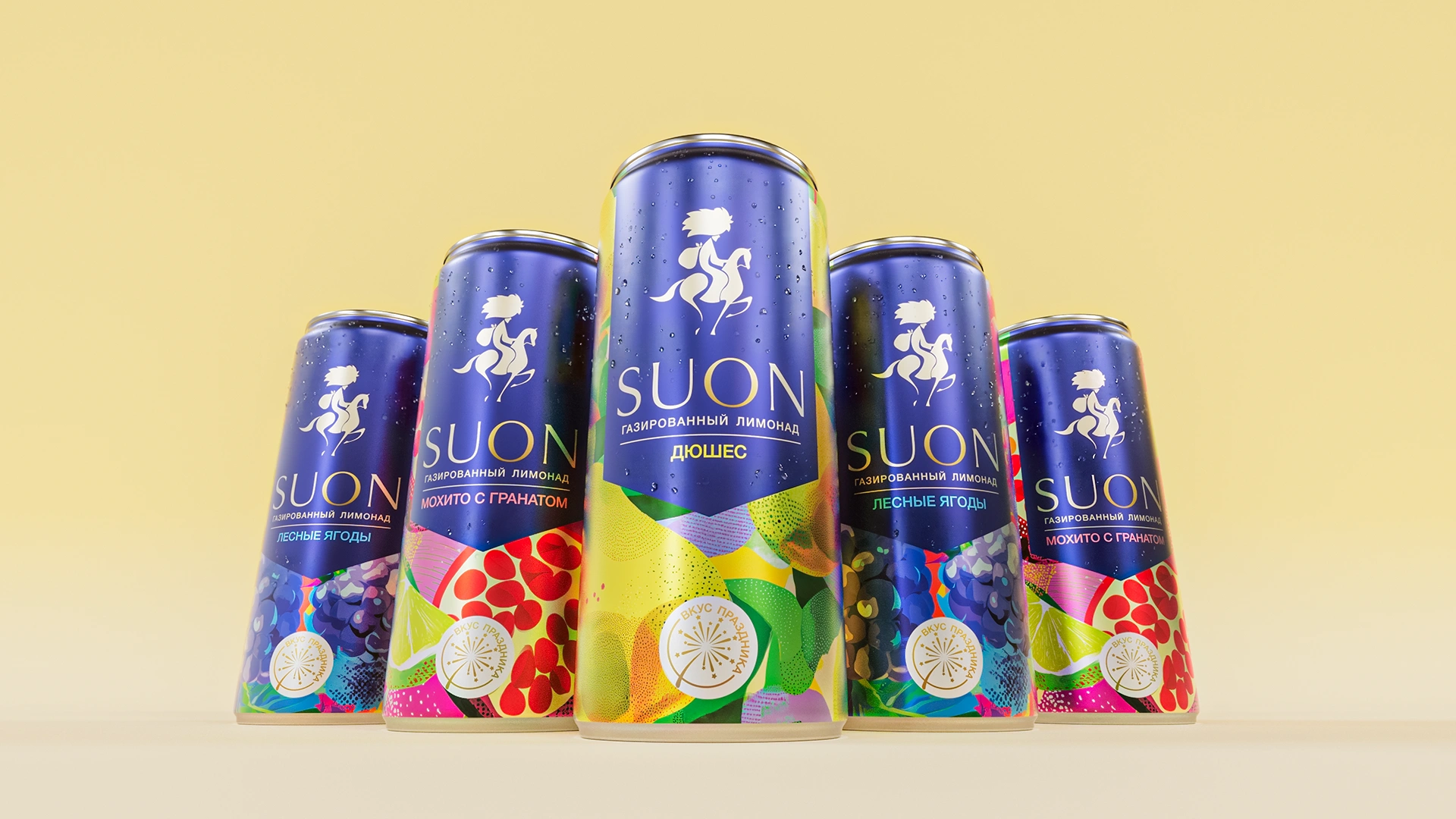
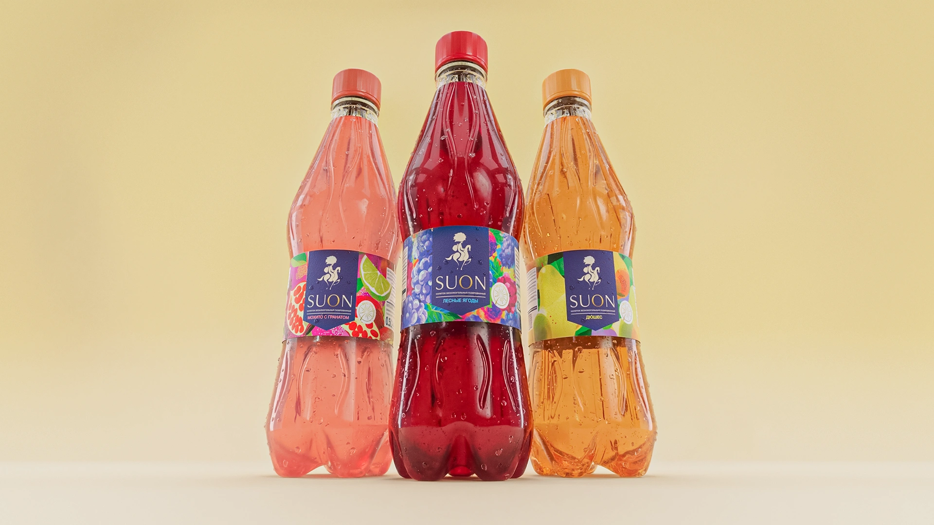
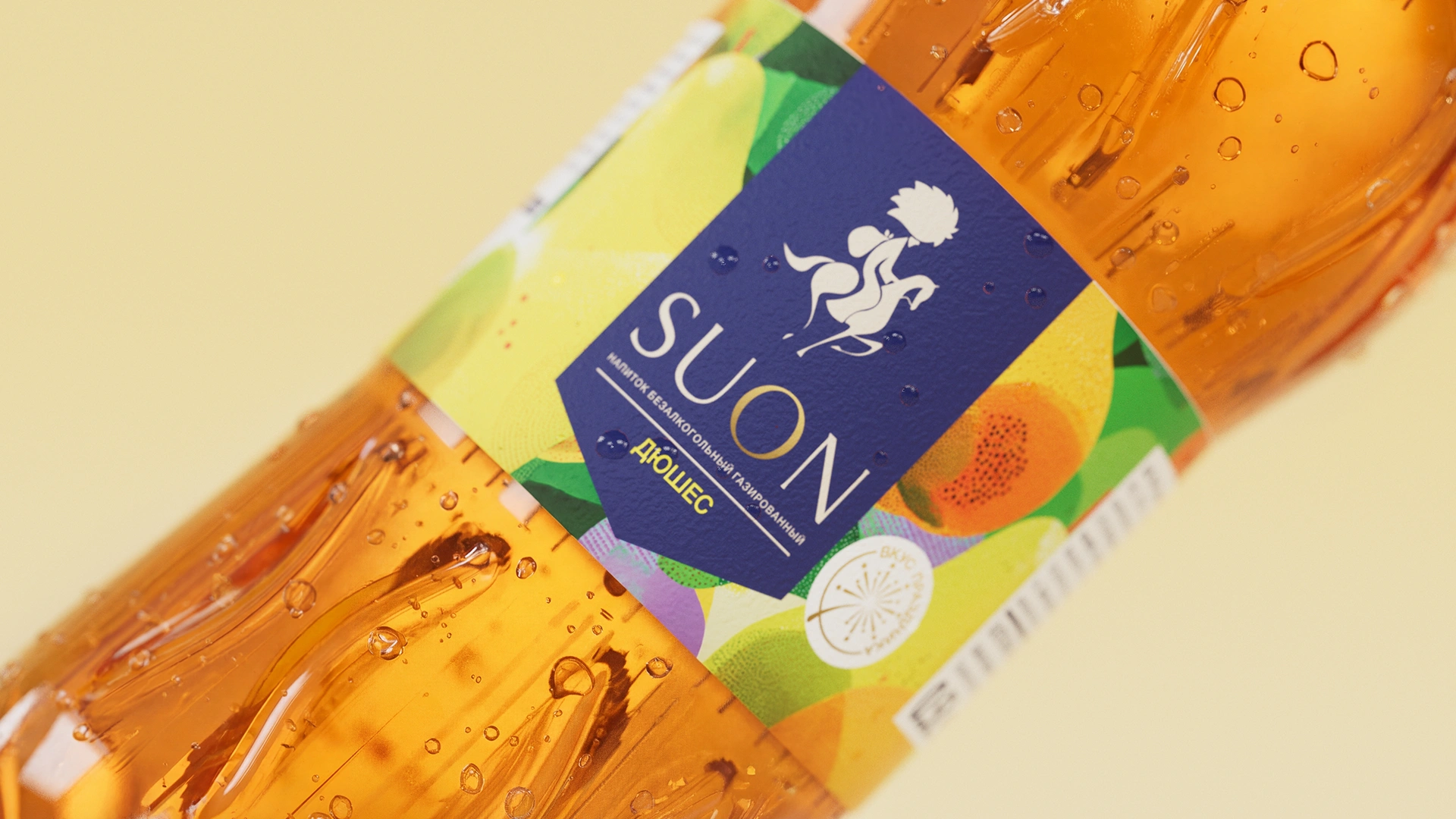
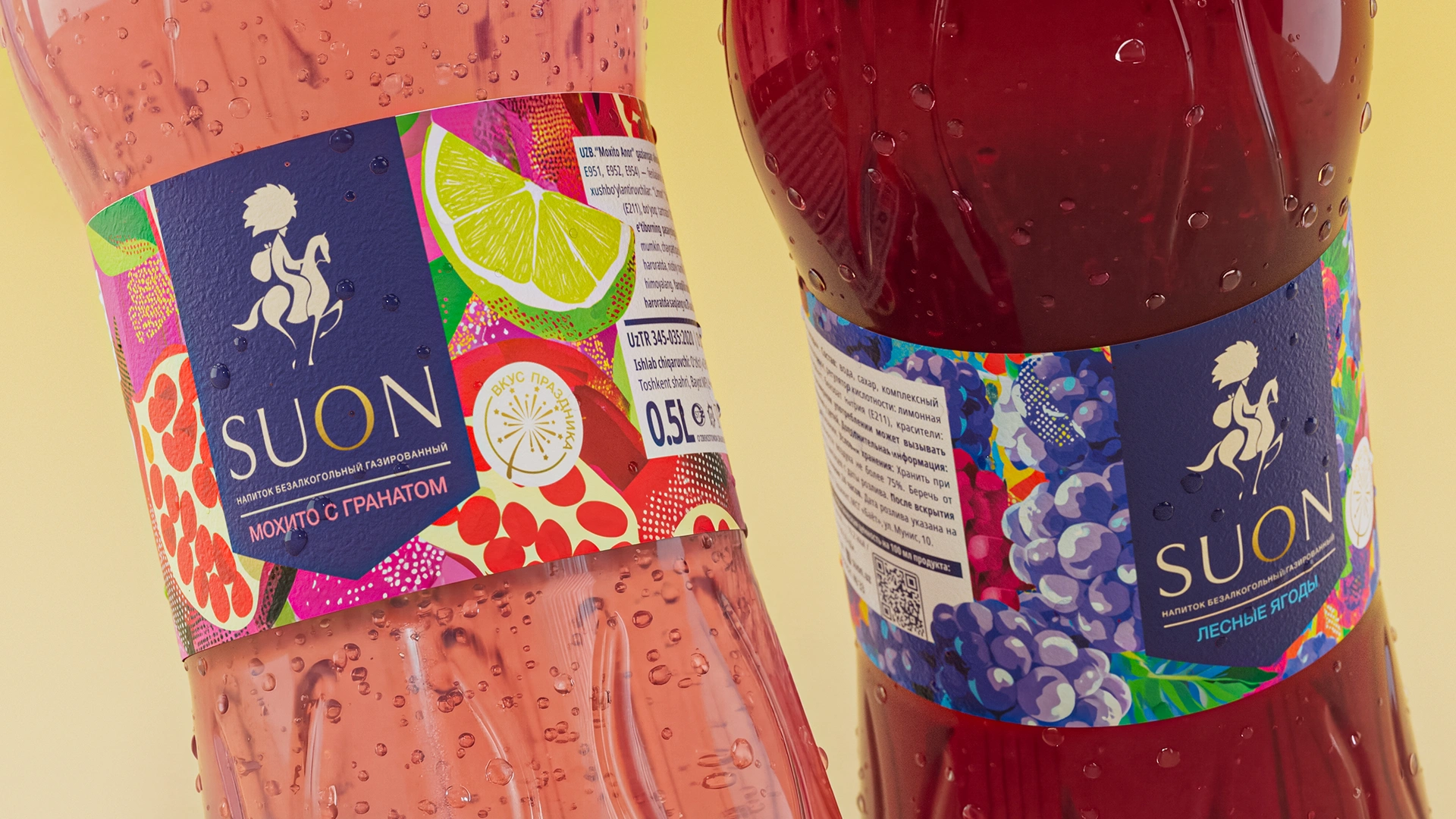
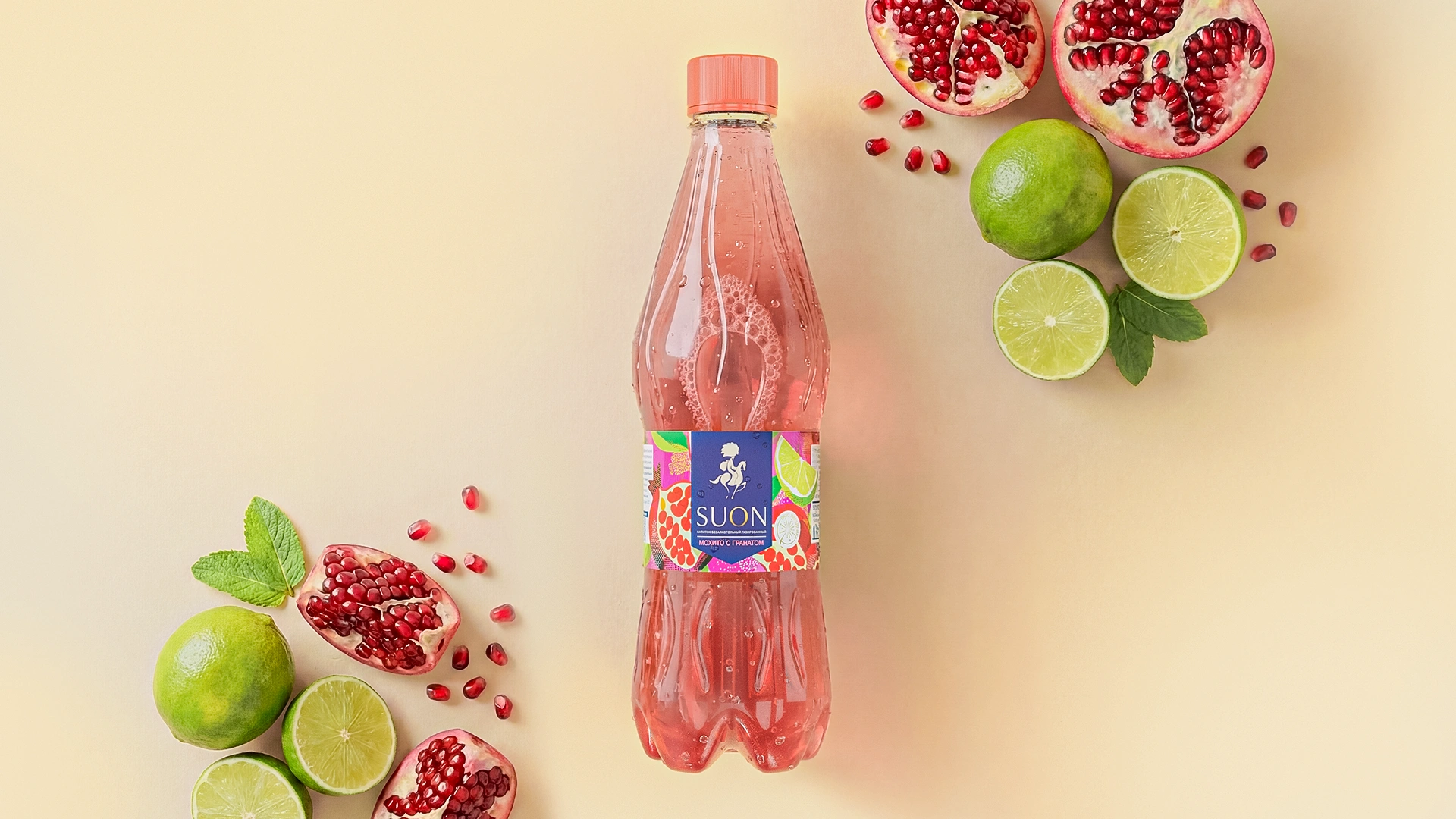
- Logo: To convey the idea of "suv bir onda" (speed, instantaneity), we chose not a slow-moving camel, but a swift, fleet-footed horse. The logo is drawn in the style of an elegant Eastern miniature. The rider wears a national headdress — a traditional chugurma — with a waterskin slung over his back. Thus, the national character, the idea of distribution (delivery), and speed merged into a single visual symbol.
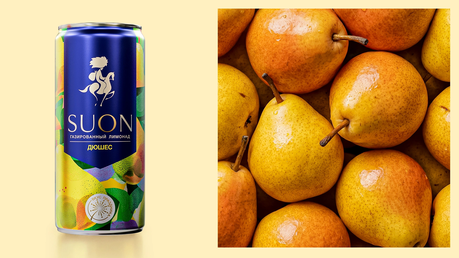
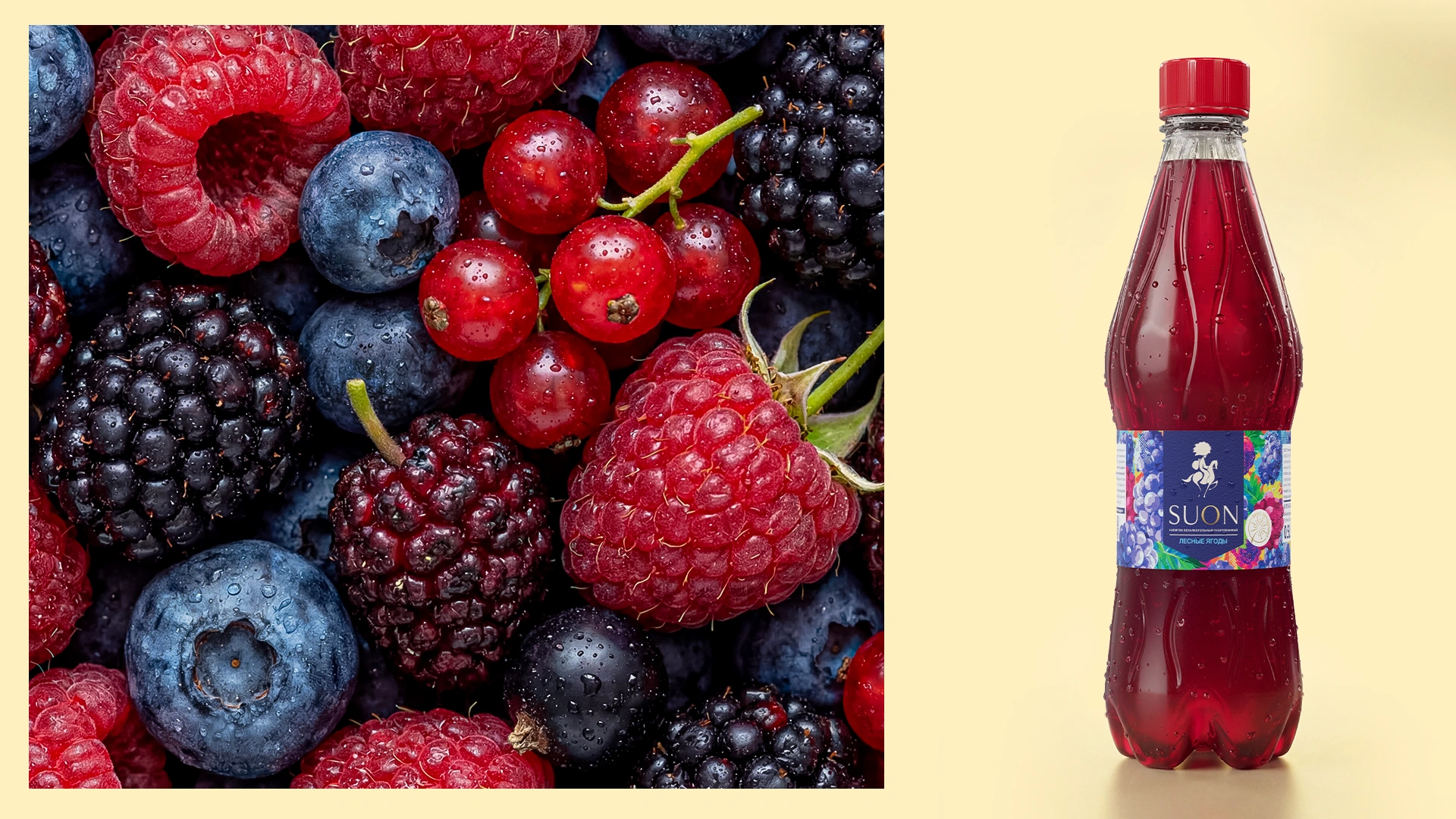
- Packaging design: Instead of 3D renders and standard glossy fruits, we decided to turn the packaging into a piece of art. In the design, we depicted the fruits using colorful, expressive 2D graphics.
In design terms, this style is a synthesis of "abstract geometric illustration" and "flat art". It stands out by conveying complex shapes through simple yet incredibly bright color spots, free-flowing lines, and unique textures. The flavors of duchesse pear, wild berries, and pomegranate mojito are revealed precisely through this dynamic and energetic abstraction. Meanwhile, the strict and elegant dark blue logo block against this colorful explosion prevents the product from looking cheap; on the contrary, it gives it a premium and solid appearance.
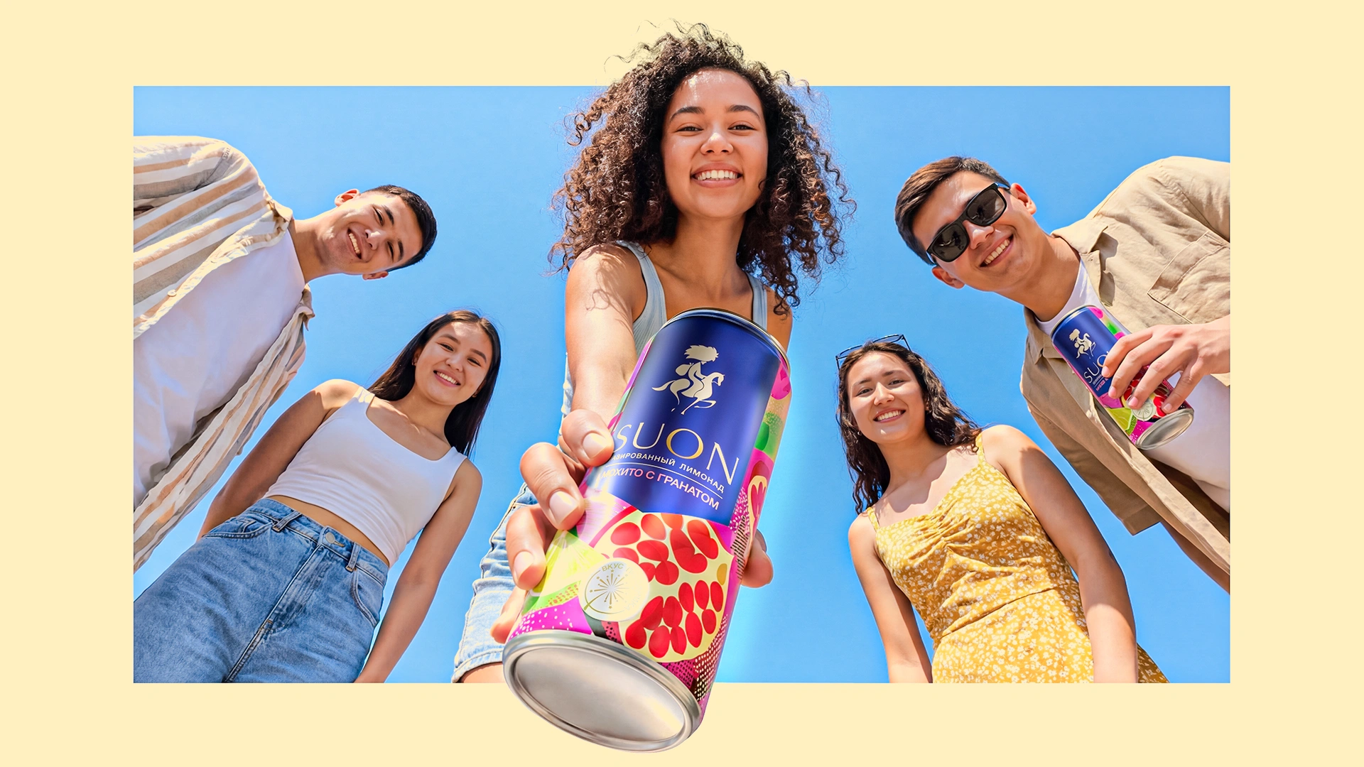
The Result
As a result, the Suon brand has become a project that confidently takes its place on the shelf and instantly grabs the attention of buyers (especially the youth, who have a keen sense for trends).
The abstract patterns and brightness gave the product a special visual charm. This drink became not just a way to quench thirst, but an element that decorates a festive table; when arranged at weddings and celebrations, it elevates the mood of the atmosphere with its aesthetic appeal.
The MINIM agency is ready to help you with packaging design, branding, and naming. Let's create the next successful project together!