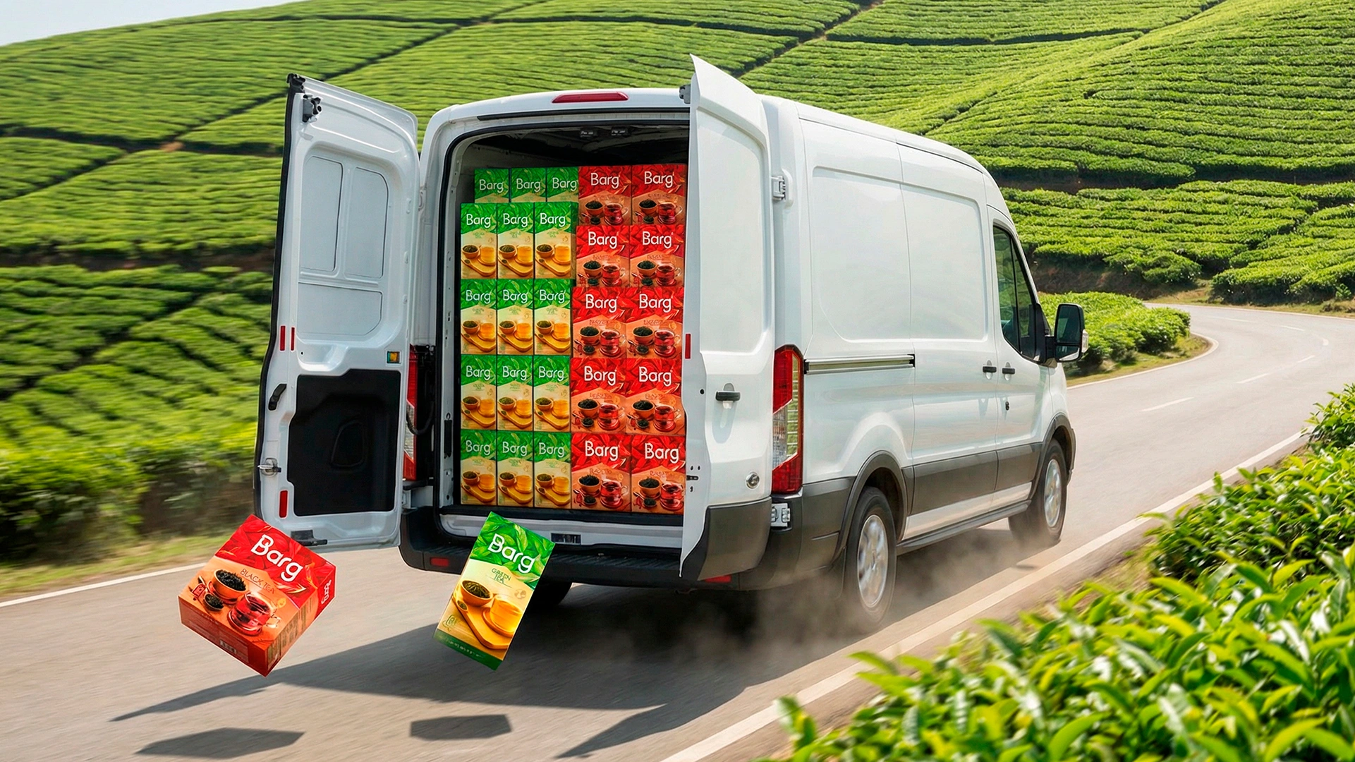
Barg – Tea Packaging Design for a Brand in Uzbekistan
The FMCG market, particularly the tea segment, is fiercely competitive. Simply having a good product isn't enough anymore. You have just a few seconds to catch the buyer's eye and instantly build trust. Through the example of the "Barg" tea brand, we share how we tackled this challenge and created a design that unmistakably stands out on the shelf.
1. The Challenge
The client approached us with a ready-made name—"Barg" (meaning "leaf" in Uzbek)—and an initial lineup of 4 SKUs. The primary objective was to break through the visual noise of crowded tea shelves by developing a memorable concept that reflects the product's premium quality. We needed to create more than just a pretty picture; we had to build a functional design system that drives sales and forms an emotional connection with the consumer.
2. The Research
Before diving into design, we deeply analyzed the motives behind purchasing tea. The target segments varied widely: everyday home consumption, office use, and traditional teahouses. However, our most inspiring insight came from purchases made for weddings, matchmaking, and engagements—specifically, tea for traditional gift trays. In Uzbek culture, only the best, most beautiful, and prestigious items are placed on these trays. Therefore, our product had to visually align with the high aesthetic standards of this specific, demanding segment.
3. The Solution
In our projects, naming always serves as the foundation for the visual strategy. We developed a cohesive logo and packaging concept that directly translates the meaning of the word "Barg" while highlighting the product's natural origins.
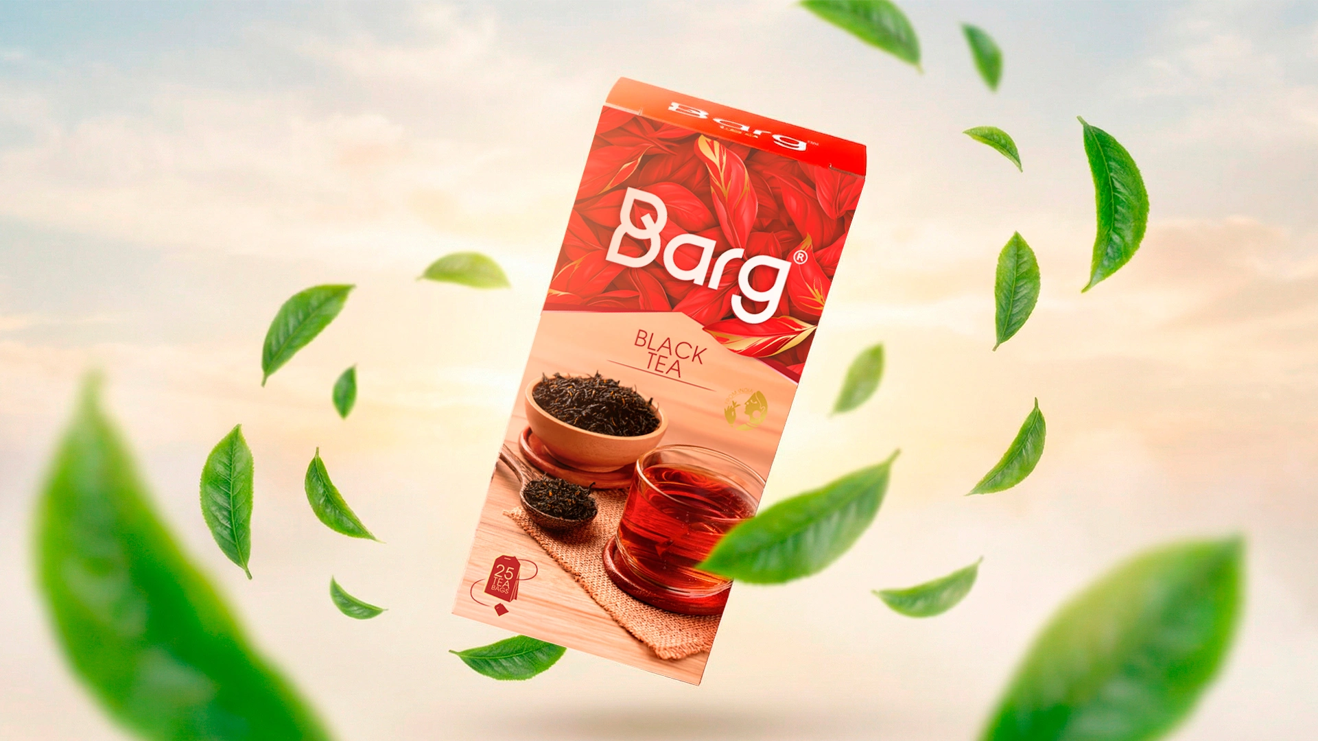
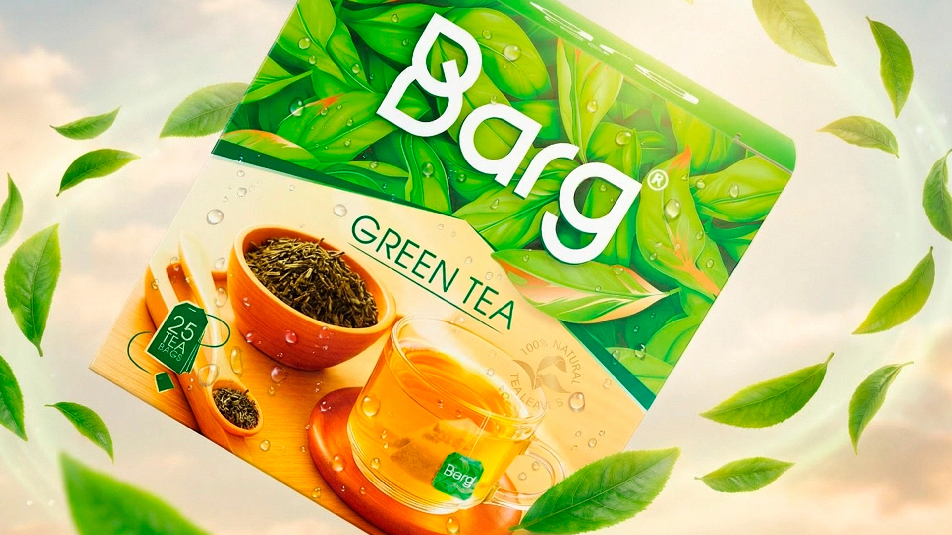
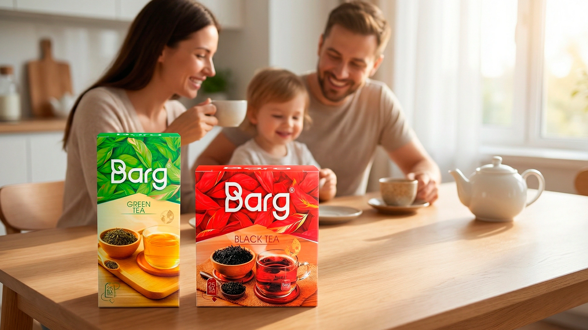
- Logo: The foundation is a modern, minimalist typographic mark where a subtle tea leaf element is organically integrated into the letters. Now, even without seeing the product itself, the logo alone clearly communicates what's inside.
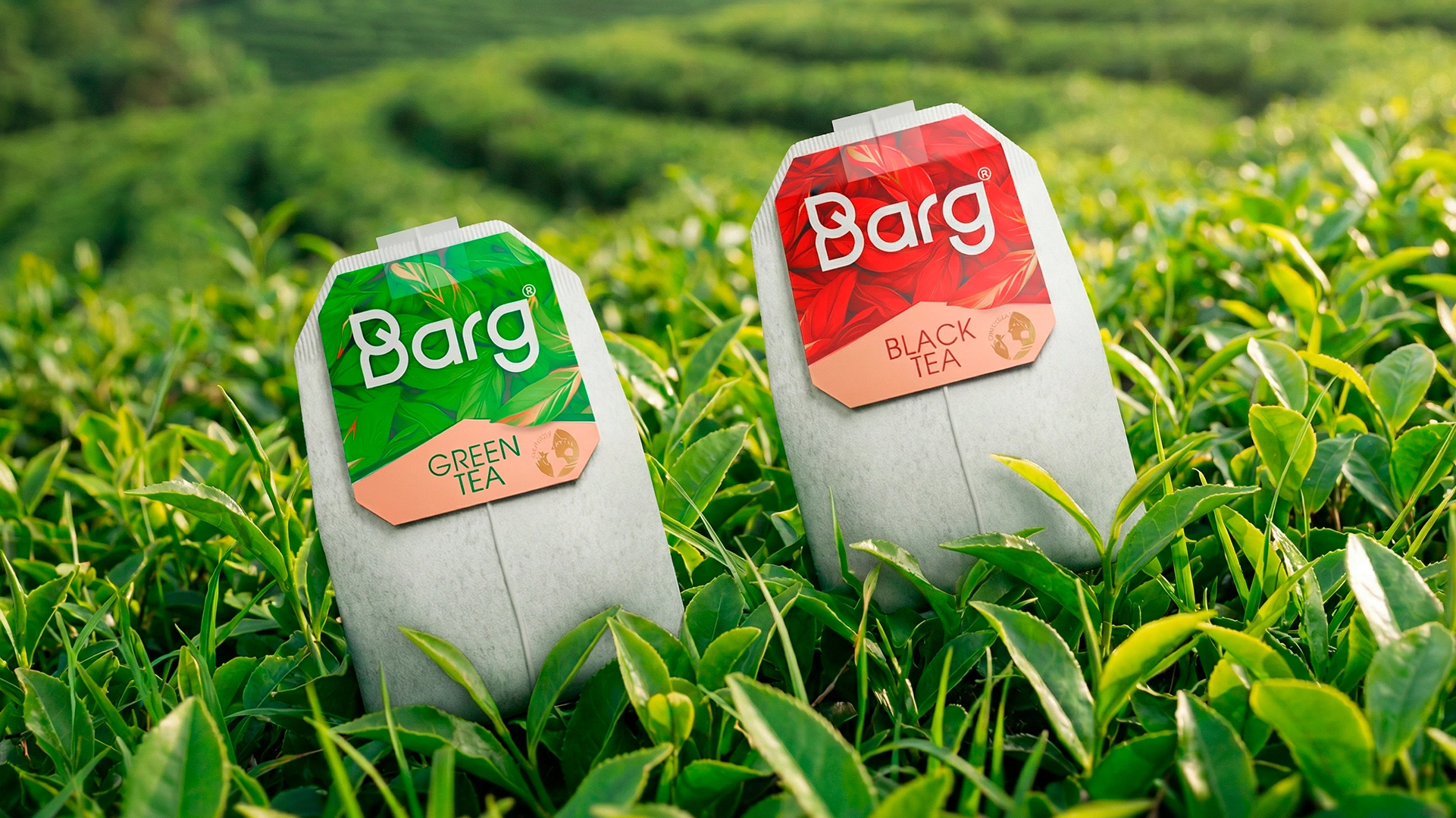
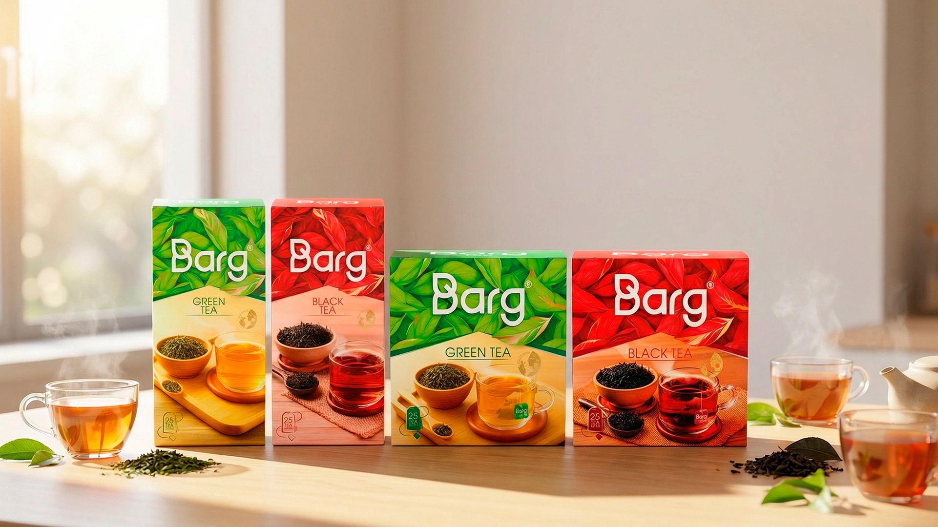
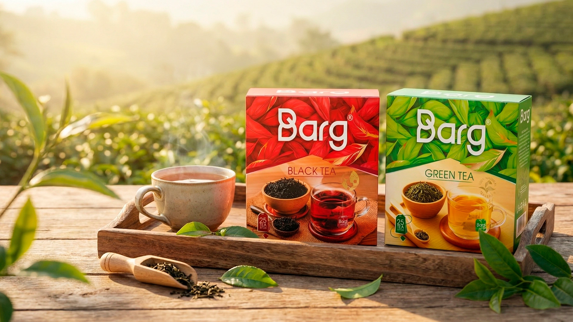
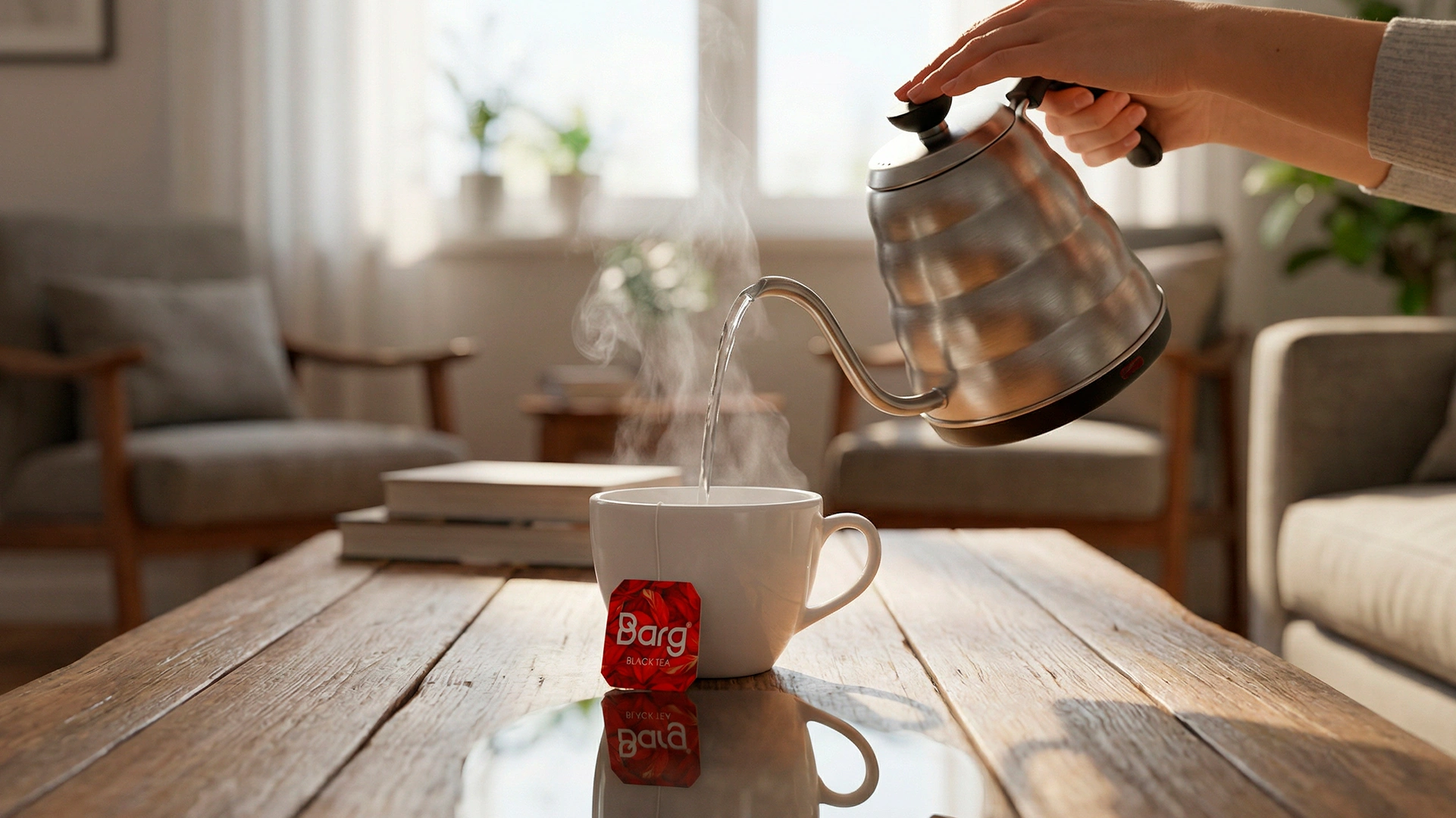
- Color & Texture: To ensure the packaging pops on the shelf, we utilized deep, rich hues. We chose a noble, eye-catching red for the black tea and vibrant, fresh leaf textures for the green tea.
- Uniqueization: To ensure the packaging looked worthy of festive gift trays and conveyed premium quality, we incorporated elegant gold foil stamping. This refined touch adds a sense of luxury and makes the box shine among its competitors.
- Building Trust: On the front panel, we placed professional food photography showcasing the actual product: premium loose-leaf tea and a beautifully brewed cup. This instantly builds trust and appetite appeal. To emphasize the tea's authentic origin, we added neat golden quality stamps: "FROM INDIA" and "100% NATURAL TEA LEAVES".
Based on real market demand, the client later expanded the line with 3 new SKUs. We built the design system to be highly adaptable, ensuring the brand identity remains consistent and harmonious across all formats, from 25- and 100-count boxes to individual tea sachets.
The Result
The final outcome is a vibrant design that not only outperforms competitors on the store shelf but is also aesthetically pleasing enough to be gifted to an honored guest or placed on a festive wedding tray. The entire packaging design system for the "Barg" project—from the logo to the various box formats—was delivered to the client as a complete, turnkey solution.
Ready for your product to conquer new market segments? Contact Minim agency—we create packaging designs that win consumers' hearts and drive sales.