


Exclusive Tea — Packaging Design for Fruit Tea
In our culture, drinking tea is more than just a habit; it is a way of sharing warmth and spending time together. However, as market competition intensifies, ordinary cardboard boxes no longer impress buyers. In our new case study, we developed a design concept for Exclusive fruit teas that breaks stereotypes and confidently stands out on the shelf.
1. Problem and Challenge
There is an outdated standard in the tea market: the product is most often packed in a cardboard box with an inner cellophane bag. As soon as it is brought home and opened, this format loses its airtightness, the tea’s authentic aroma begins to fade, and most importantly, the product itself remains hidden from the buyer.
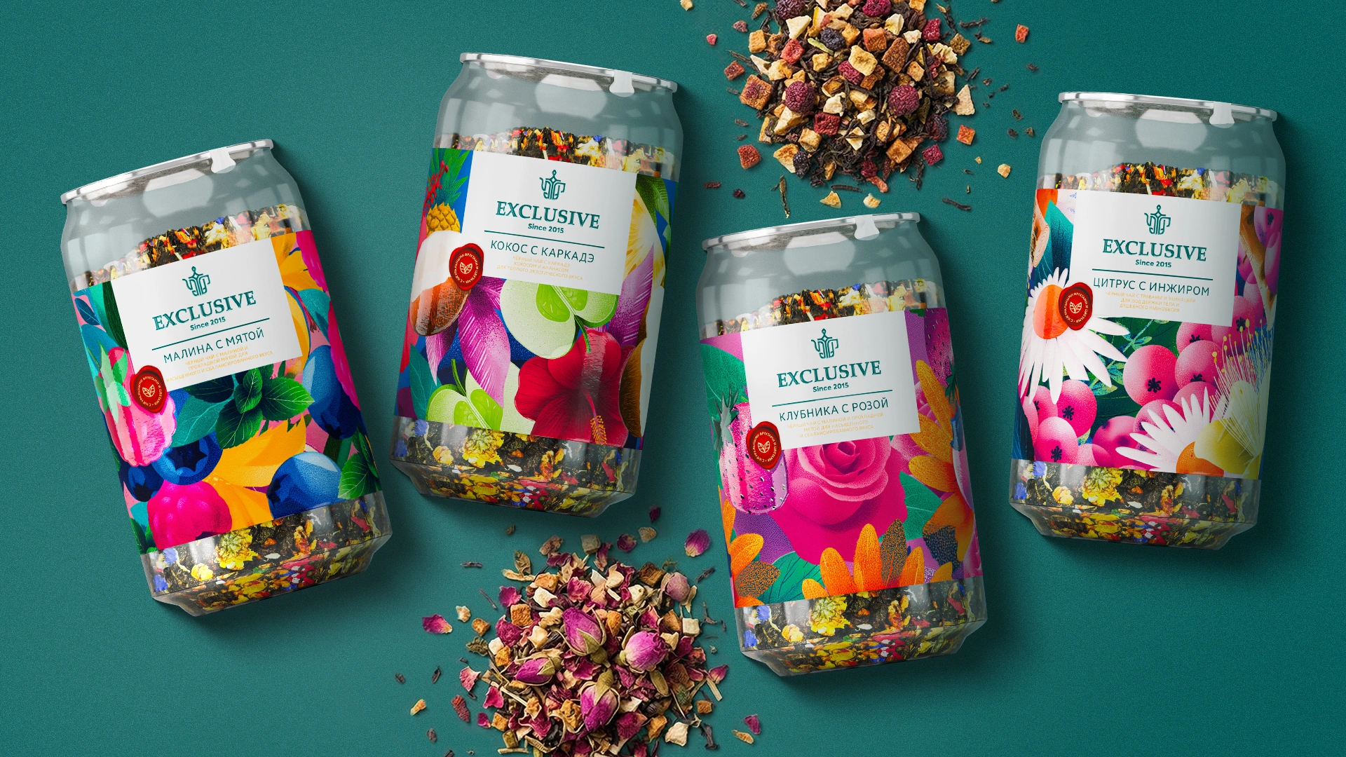
To eliminate these shortcomings, our client approached us with a ready-made PET jar format featuring an aluminum lid. MINIM’s task was to maximize the potential of this packaging and create a strong visual solution that would attract modern buyers, young families, and students while emphasizing the product’s premium quality.
2. Research
While studying the market before beginning the project, we uncovered several important insights:
- Crisis of Trust: Today’s buyers have long stopped trusting the words “fruit tea” printed on a box. Why? Because in many cases, the packaging contains little more than artificial flavorings and a few fruit pieces that have crumbled into dust.
- Visual ASMR: In reality, Exclusive tea’s greatest asset lies in its ingredients — large tea leaves, whole dried raspberries, and vibrant flower petals. This is not simply tea; it is a visual experience that delights the eye. Hiding such natural beauty inside a cardboard box and a shiny inner bag would be a missed marketing opportunity. Buyers should be able to “feel” the product’s aroma and quality with their eyes.
- Cost vs. Value: There is a common stereotype that premium-looking packaging always requires significant investment. However, our calculations showed that the cost of a transparent PET jar with an aluminum lid is almost the same as that of a standard cardboard box with an inner bag. This allowed the manufacturer to significantly increase the product’s perceived value without increasing production costs.
3. Solution
Our agency’s design approach focused on bringing the product’s natural appeal to the forefront and communicating with younger consumers in a visual language they understand:
- The label does not fully cover the jar. The upper and lower sections are intentionally left transparent, allowing buyers to see the colorful and appetizing tea blend directly. As a result, the design becomes naturally integrated with the product itself.
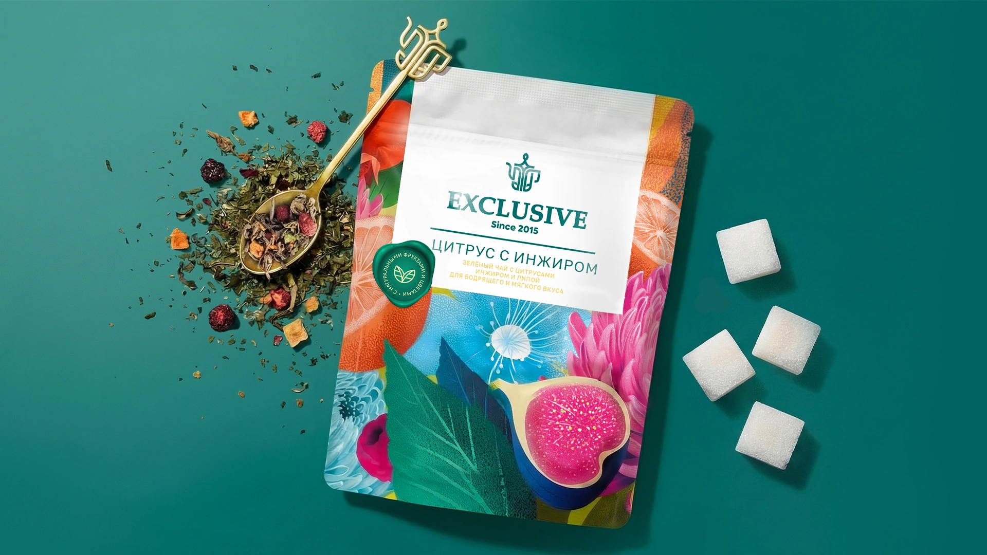
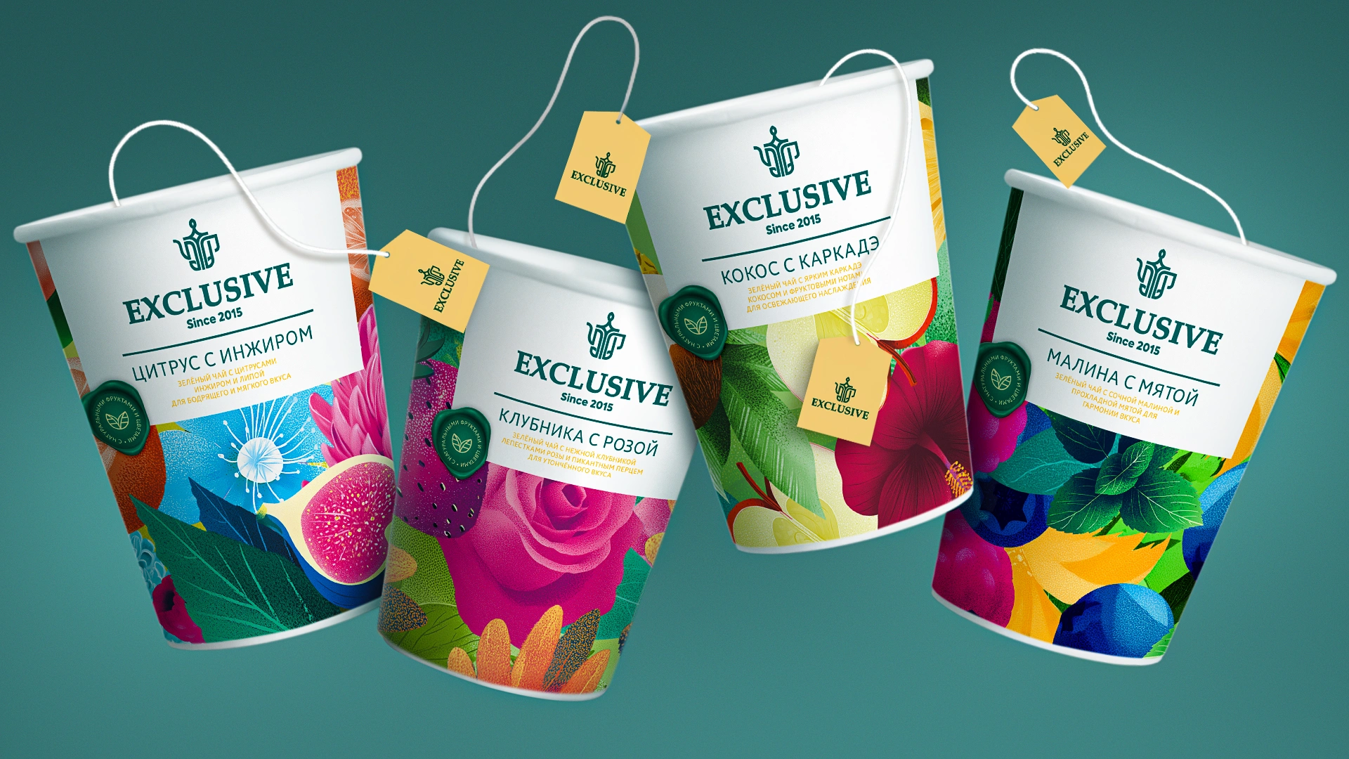
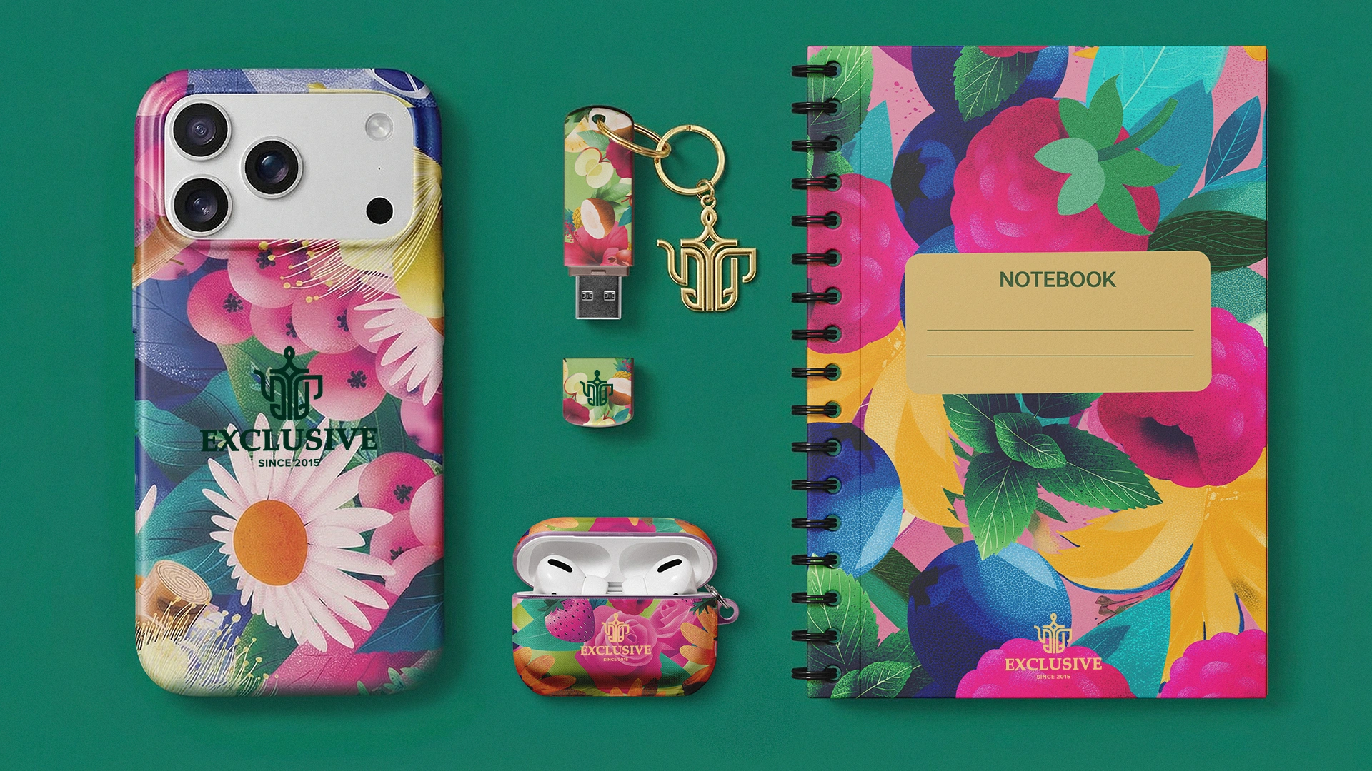
- Stereotype-Breaking Illustrations: Instead of using conventional and predictable photographs, we created large, modern, textured fruit illustrations for each flavor — raspberry, apple, cherry, and pineapple. These illustrations contrast beautifully with the vibrant backgrounds and act as a visual magnet on the shelf.
- Trust Triggers: We combined classic and contemporary typefaces within the typography system. To emphasize the product’s 100% natural composition and its connection to local orchards, we also added a green wax-seal graphic to the packaging.
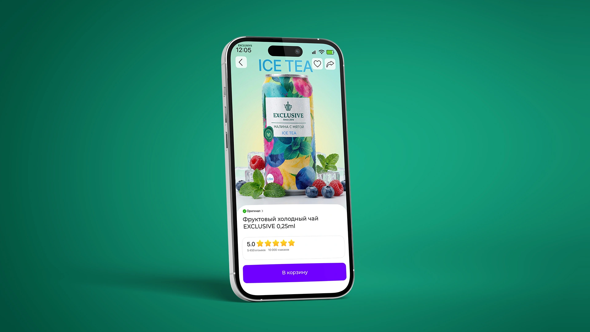
Result
Thanks to its resealable lid and airtight structure, the product became a highly convenient solution for consumers with active lifestyles, including office workers, students, and young families. The packaging successfully captured the attention of the target audience.
The strongest form of organic advertising, however, appears through the packaging’s “second life.” Once the tea is finished, consumers do not throw away the attractive jars. Instead, they reuse them in the kitchen to store spices and other small household items. In this way, the design developed by MINIM remains visible in consumers’ homes for years, continuously strengthening brand recognition and loyalty.