BesXan: Branding and Packaging Design for Karakalpak Tea
We developed the BesXan naming (“Five Khans”), logo, and vibrant packaging design for Karakalpak tea. The design blends national colors, historic fortress illustrations, and a clear emphasis on traditional milk tea.
1. Solution
We were contacted by our client, a local tea producer based in Karakalpakstan. They needed to develop a name, logo and packaging design for a new product. Our team started with research. As a result of the research, we found out that in the history of Karakalpakstan, there were five fortresses, which were ruled by five khans. Based on this information, we decided to name the new product “Bes Khan”. This means “Five Khans”. In the next step, we developed a logo combining the chosen name and the type of product. In the logo, we showed a tea leaf, representing the number five.
Result
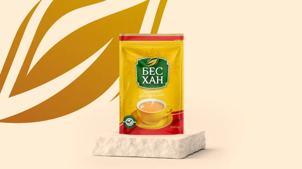
We paid special attention to the packaging design and tried to make it bright and attractive. In this case, we combined bright yellow, which is a symbol of the sun, with green, which represents naturalness. In addition, we gave the product a small red accent to attract the attention of buyers on store shelves.
The packaging design depicts an illustration related to the history and traditions of Karakalpakstan. These places are famous for milk tea, a favorite symbolic drink of the Karakalpaks. Our product is ideal for making milk tea. To emphasize this more clearly, we showed an image of tea with milk in a cup on the front side of the package. On the back side, we wrote instructions for its preparation.
This case of ours received recognition from the World Brand Design community and joined the ranks of world brands.