Sunana: Premium Tea Packaging Design
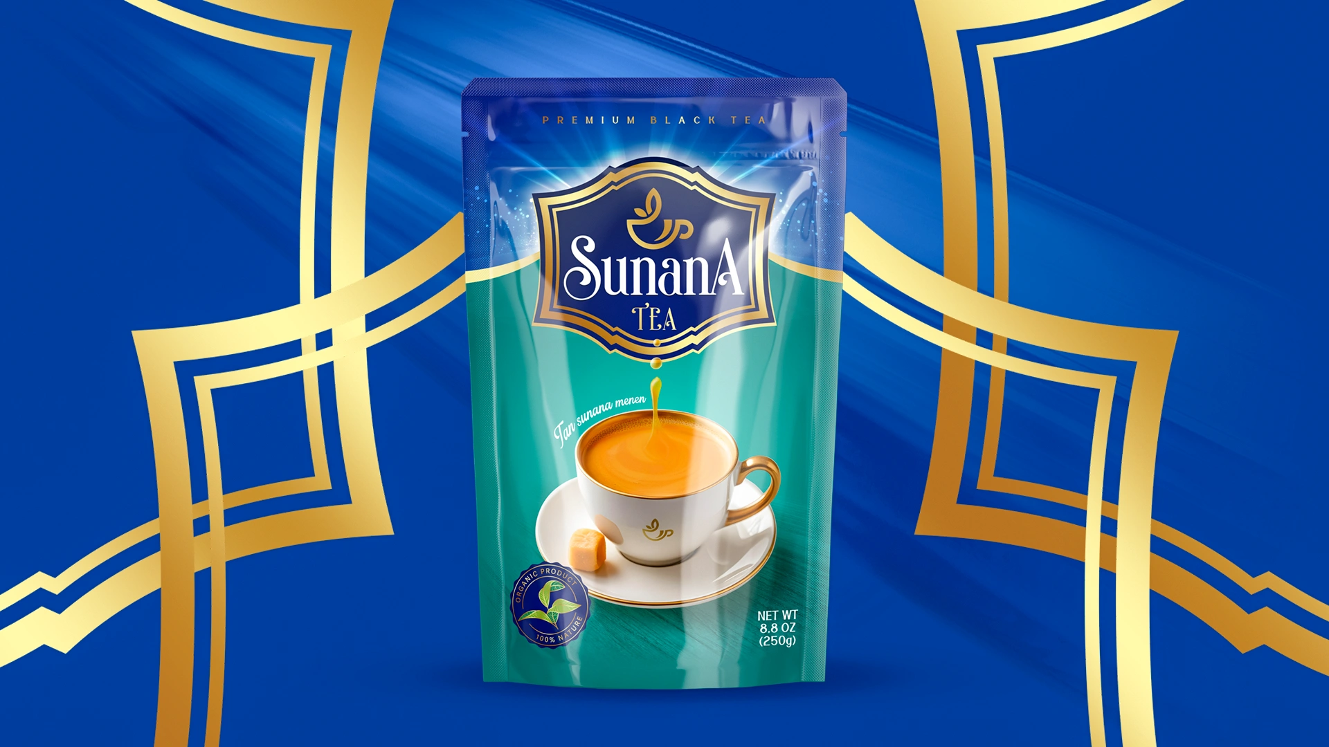
A unified packaging design concept was developed for Sunana tea. The logo symbolizes warmth. The "stain effect" and bright accents make the brand stand out on the shelf, while Ziplock packaging guarantees freshness and convenience.
1. Task
Develop a unified packaging design concept for a new tea brand. The packaging must instantly communicate a sense of premium quality — conveying the message: this is not just tea, this is art.
2. Research
Competitor Analysis:
We conducted a thorough review of both local and international competitors. Brands such as Ahmad Tea, Greenfield, Riston, Curtis, Tess, and Piala dominate supermarket shelves. Their packaging typically relies on dark, subdued tones and classic design elements. However, many fall into visual uniformity — green for herbal tea, red for black tea — creating what feels like a “monotonous chorus.” With Sunana, we set out to break the silence — to become a star that sings on its own frequency.
3. Target Audience:
We identified two primary customer segments:
Young adults (ages 25–35): Consumers who prioritize eco-friendly, natural products and appreciate premium packaging and quality.
Families and older generations: Individuals who value brand trust and tradition but are also receptive to modern packaging and fresh design ideas.
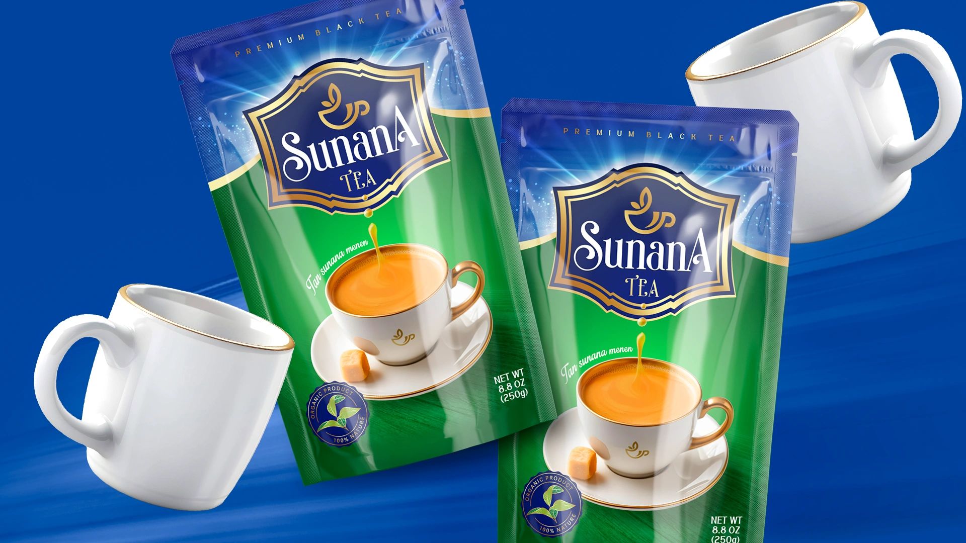
4. Packaging & Materials:
In 2024, the tea packaging market grew by 12%, driven by demand for natural and organic products. A striking 91% of premium tea consumers stated that packaging convenience significantly influences their purchase decisions. That’s why we chose ziplock pouches — modern, user-friendly, and designed to preserve freshness and flavor.


5. Decision
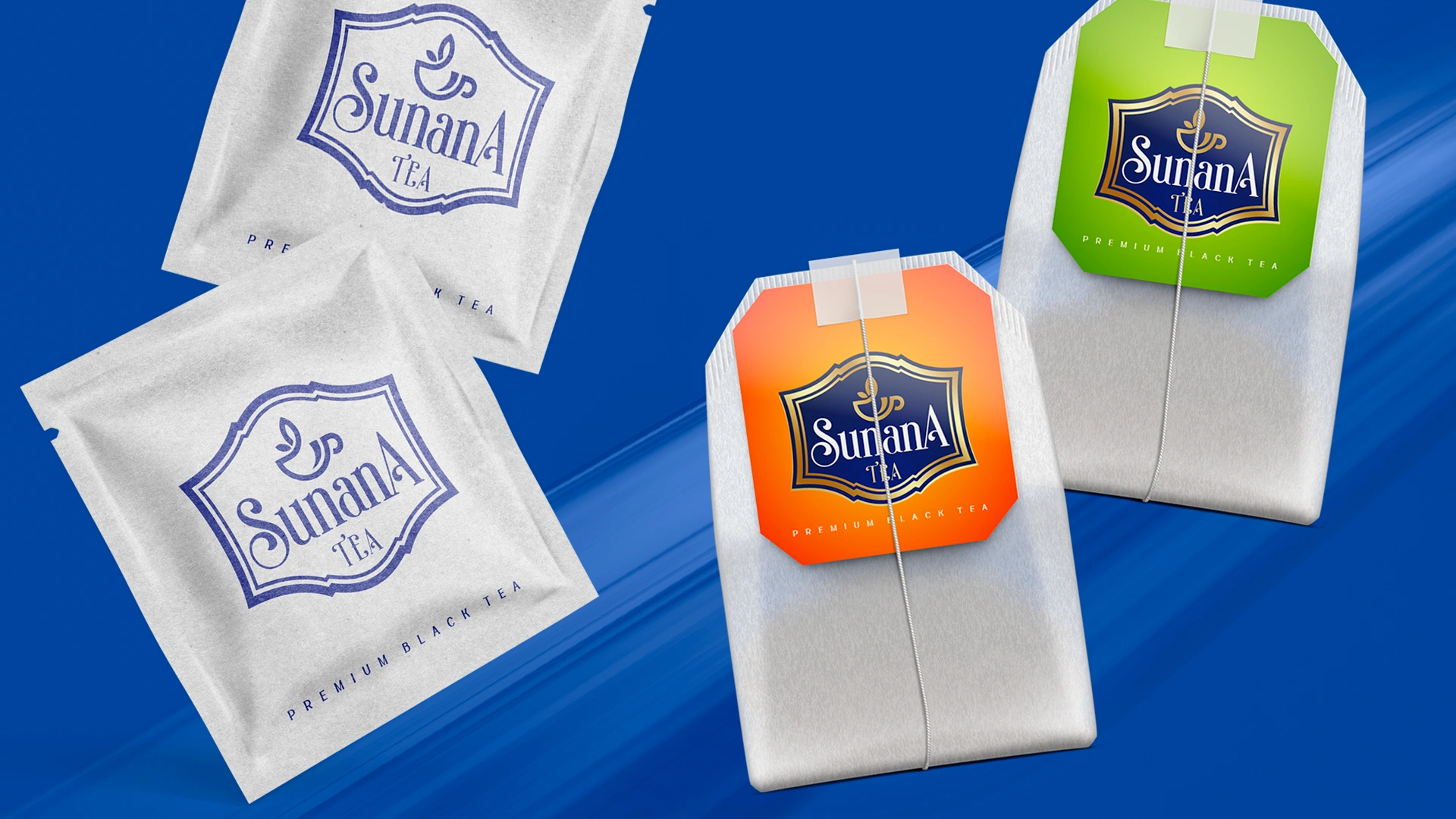
Logo:
The Sunana logo depicts a steaming cup of tea, symbolizing warmth, calm, and reflection. It’s a visual invitation to pause and savor the moment. The message is clear: “I am a premium tea that creates an atmosphere.”
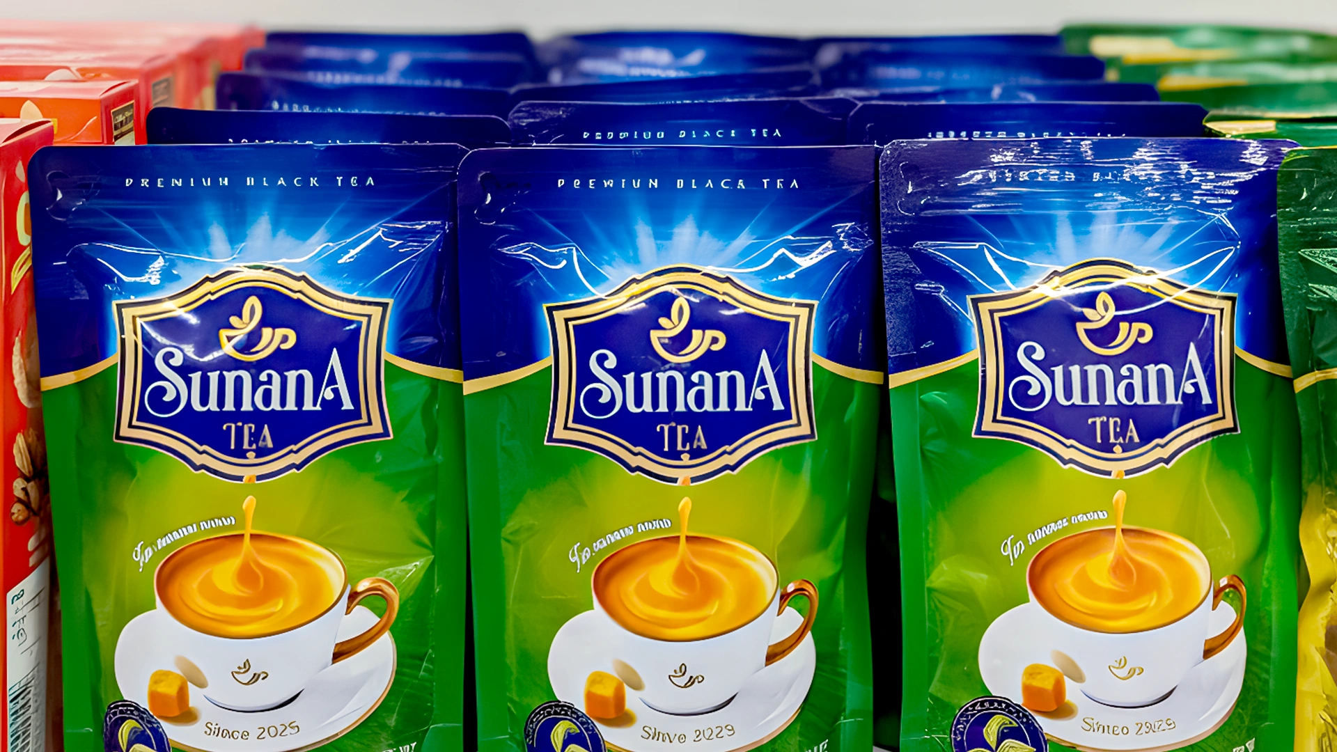
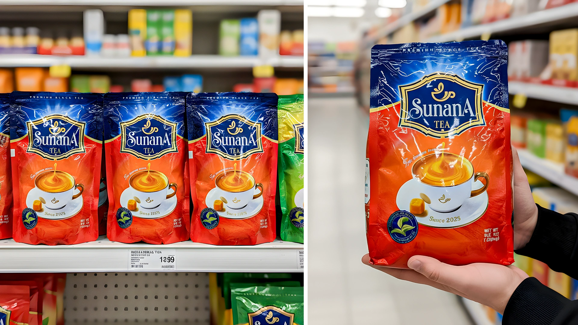
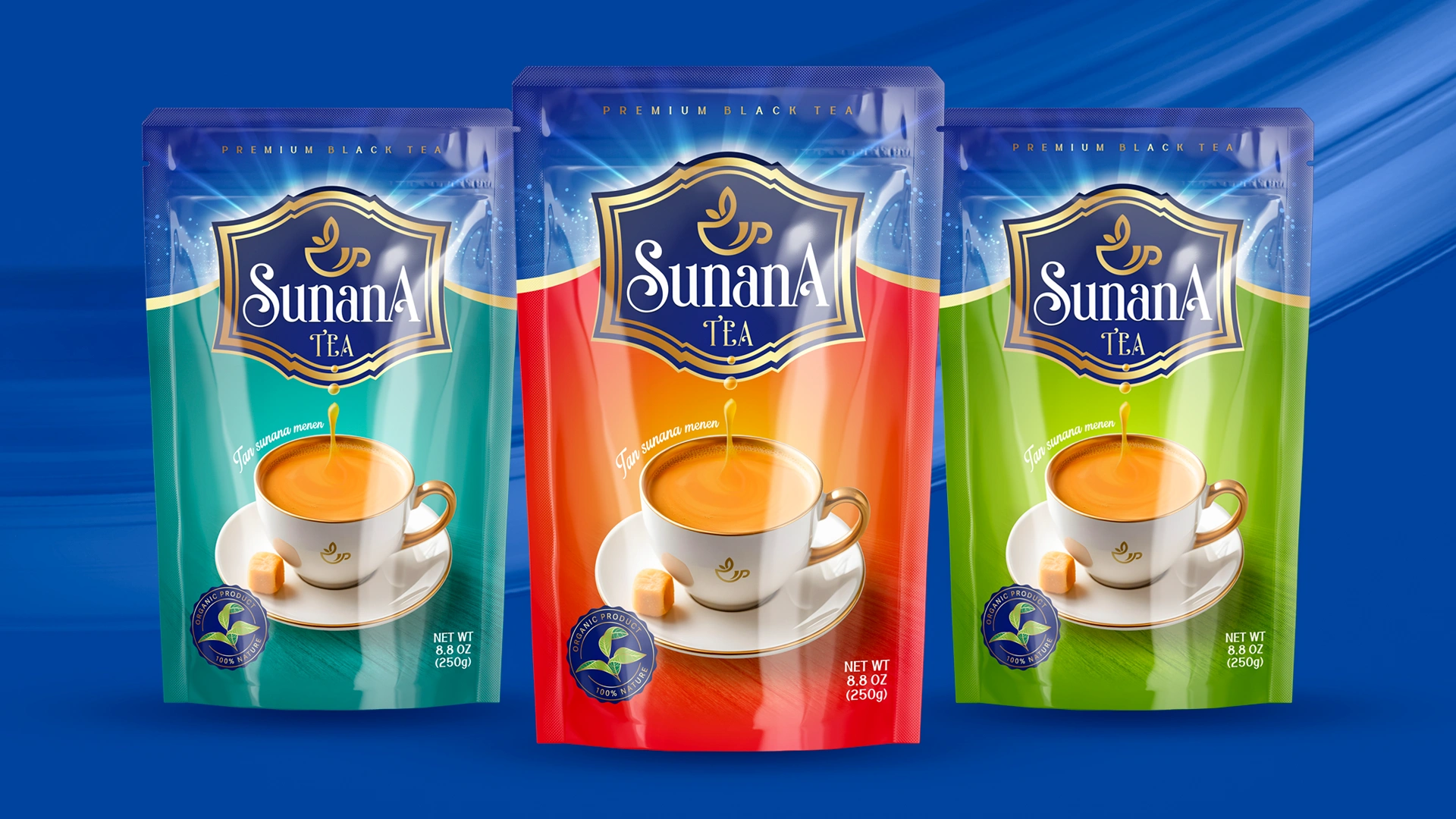
Spot Effect:
We introduced a bold spot effect as a core packaging element — a vivid color bar that contrasts against soft background tones. It grabs attention and signals individuality. The design practically declares: “I’m here!” — and it truly stands out among the competition.
Color Palette:
We applied vibrant accent colors to give each tea variety its own distinctive character and energy, reinforcing both differentiation and emotional appeal.
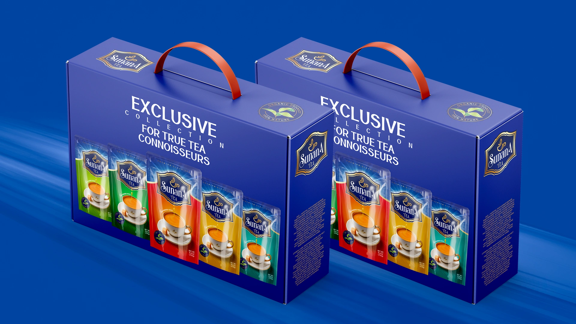
Result
Sunana has carved out a distinct place in the tea category with its standout design — vibrant accents, spot effect, and an expressive logo that radiates warmth. The ziplock packaging reinforces both functionality and premium positioning, preserving freshness and natural integrity.
The brand has successfully launched and received strong early feedback. Consumers consistently highlight its eye-catching presence on the shelf. Retailers also confirm growing customer recognition and demand for Sunana.