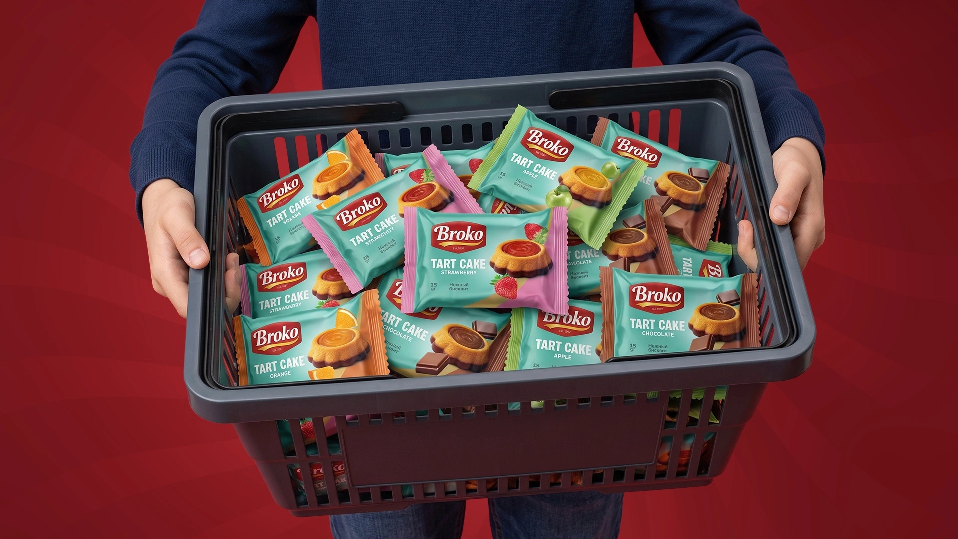
Broko — naming, logo and packaging design for a confectionery range
The Elite Konditer factory was founded by one family: brothers and their relatives. It could make everything: tarts, cupcakes, brownies, doughnuts, croissants and chocolate. But every product came out under its own name and in its own design, so shoppers had no idea they all came from the same maker. When the factory brought in new moulds and decided to launch a new range, Khojiakbar came to Minim.
1. Problem and Task
Instead of a scatter of names, the whole new range needed one brand:
- a name that's easy to say and has the potential to grow into a big brand;
- a logo that works just as well on a 15 g wrapper as on a large multipack;
- packaging that gives every product and flavour its own face, while the shelf reads as one family.
2. Research
The small-bakery shelf is one of the noisiest there is: dozens of bright 15–30 g pillow packs all fighting for the impulse buy at the checkout. Decisions take seconds, and prices are much the same.
Our key insight: in this category, the most recognisable pack wins, not the brightest. If a brand owns a colour, shoppers find it with their eyes before they read a word. So we bet on a single signature colour to hold the entire range together.
3. Solution
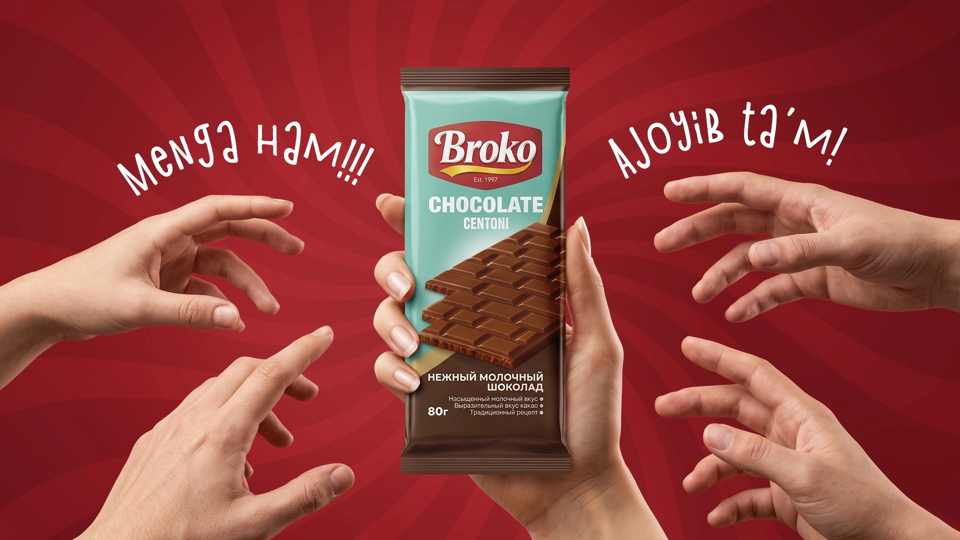
Naming. Finding the name took two rounds: the client wanted it to sound like confectionery and to last for years. The answer came from the company's own story. The factory was built by brothers, so we put the name together from Bro (brothers) and Co (company). The result was Broko, “the brothers' company”: short, punchy and equally easy to read in Latin and Cyrillic script, with the thing the family is proudest of behind it, a business built together.
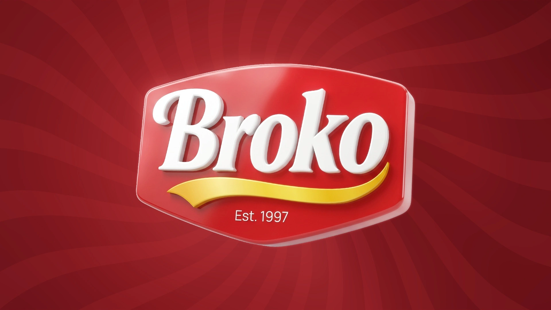
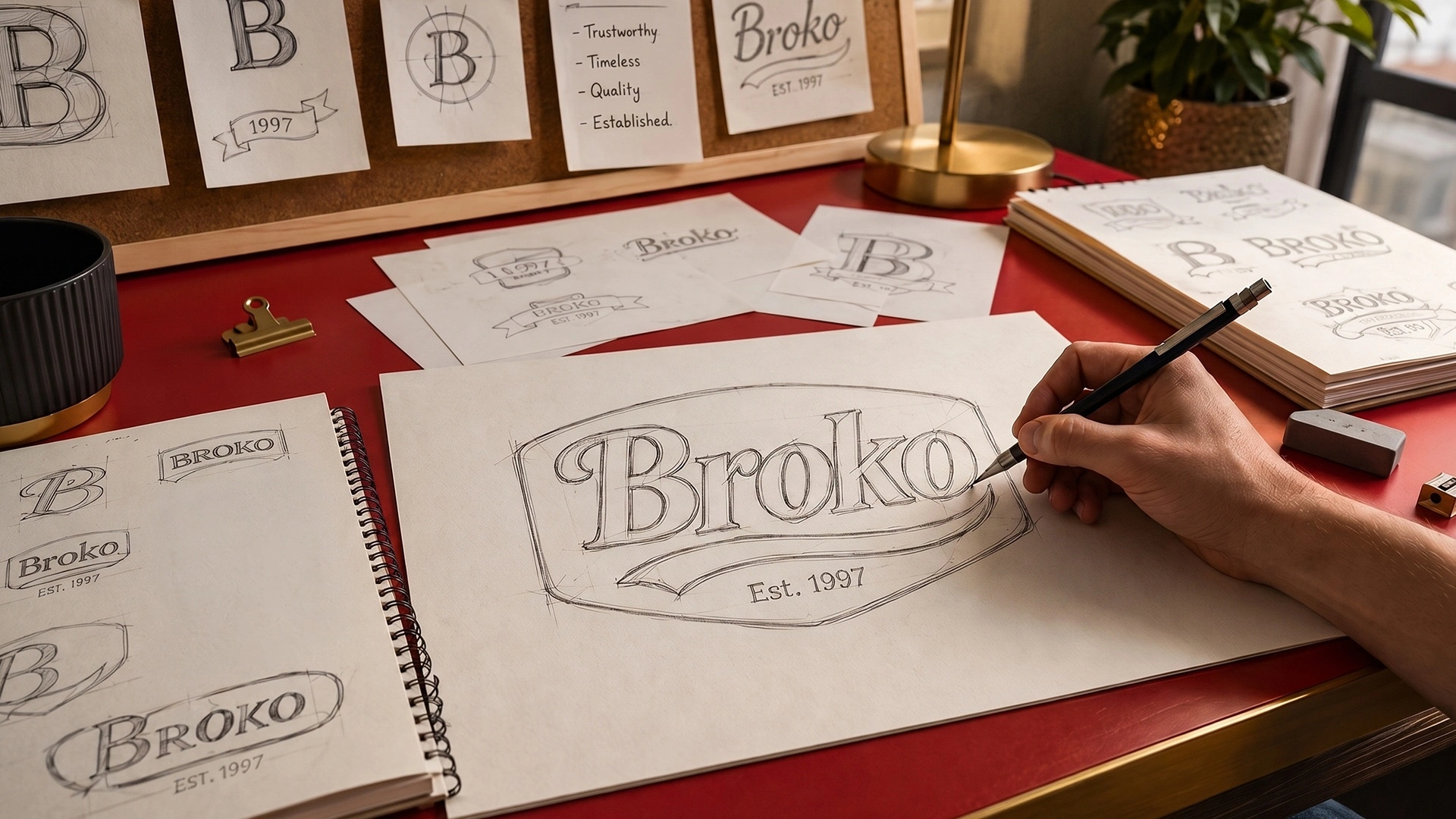
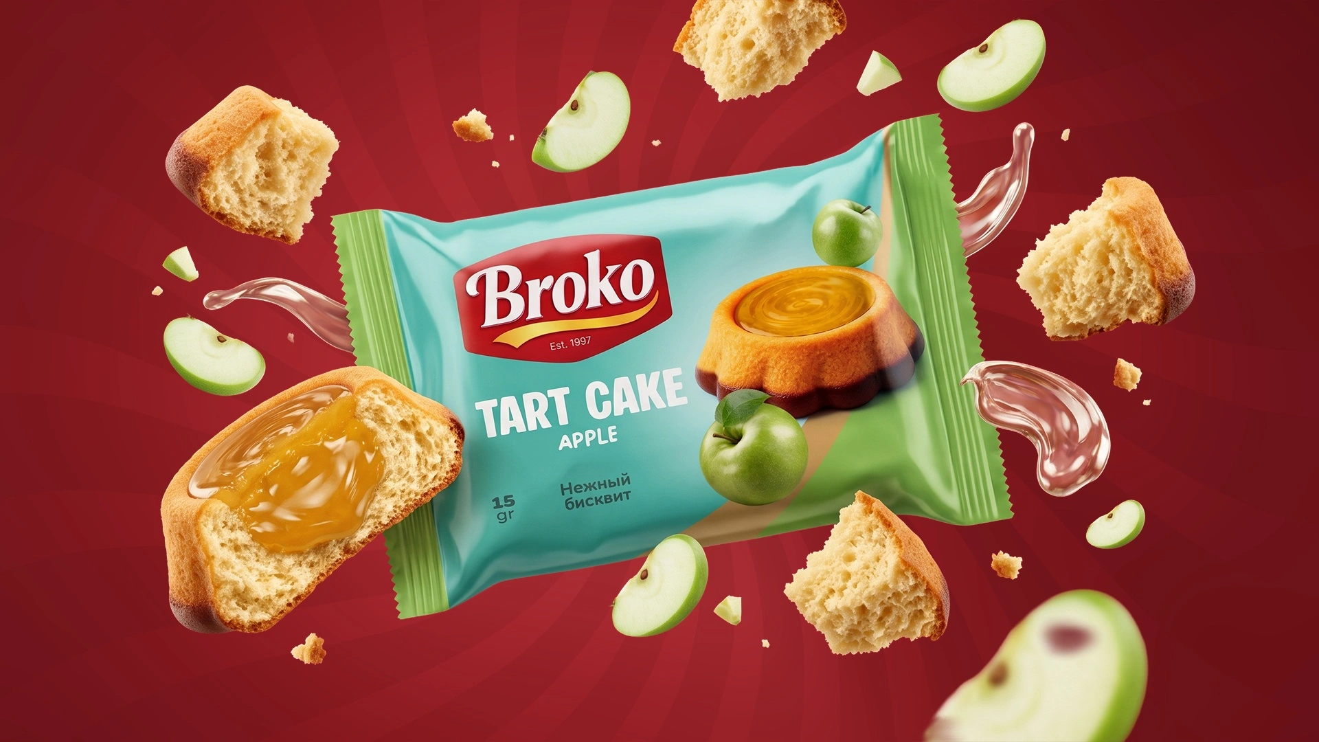
Logo. White Broko letters on a red badge with a yellow ribbon, a classic confectionery look that builds trust and appetite. Of three versions, the client approved the most balanced one.
Packaging. We built the system on three elements:
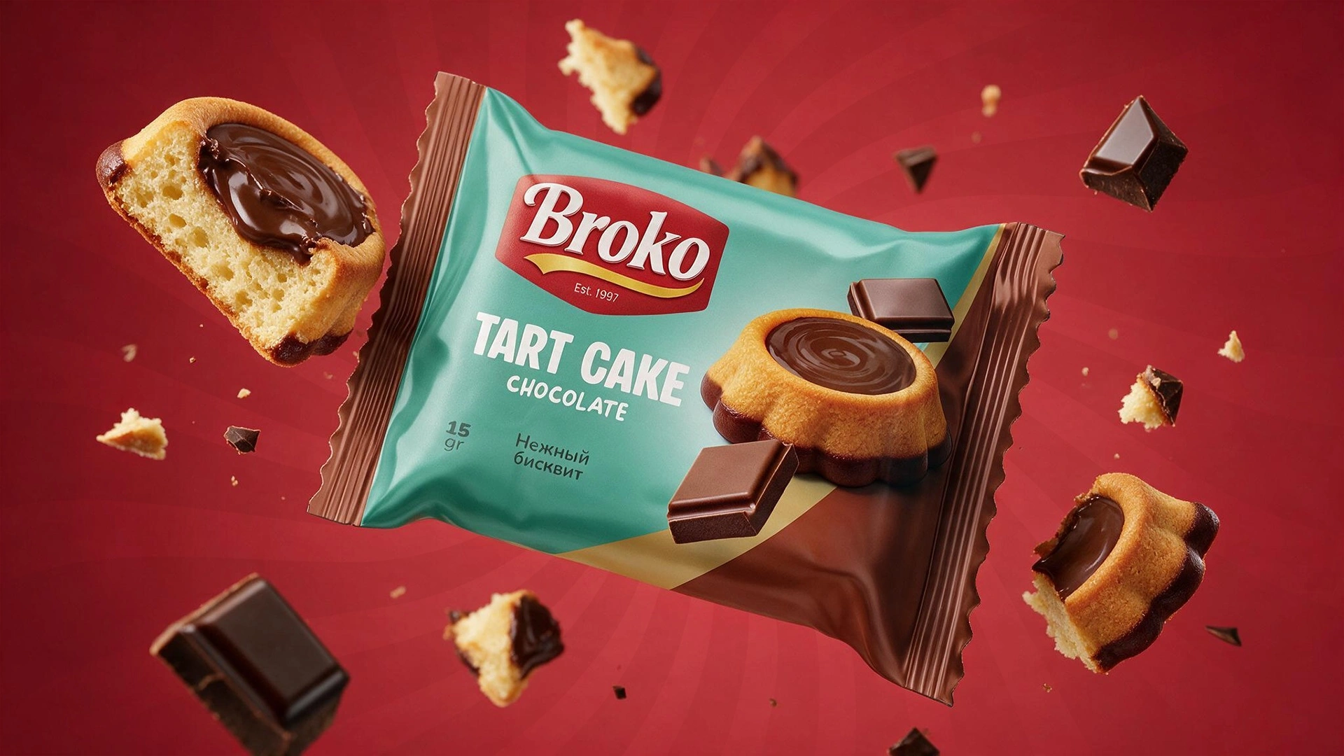
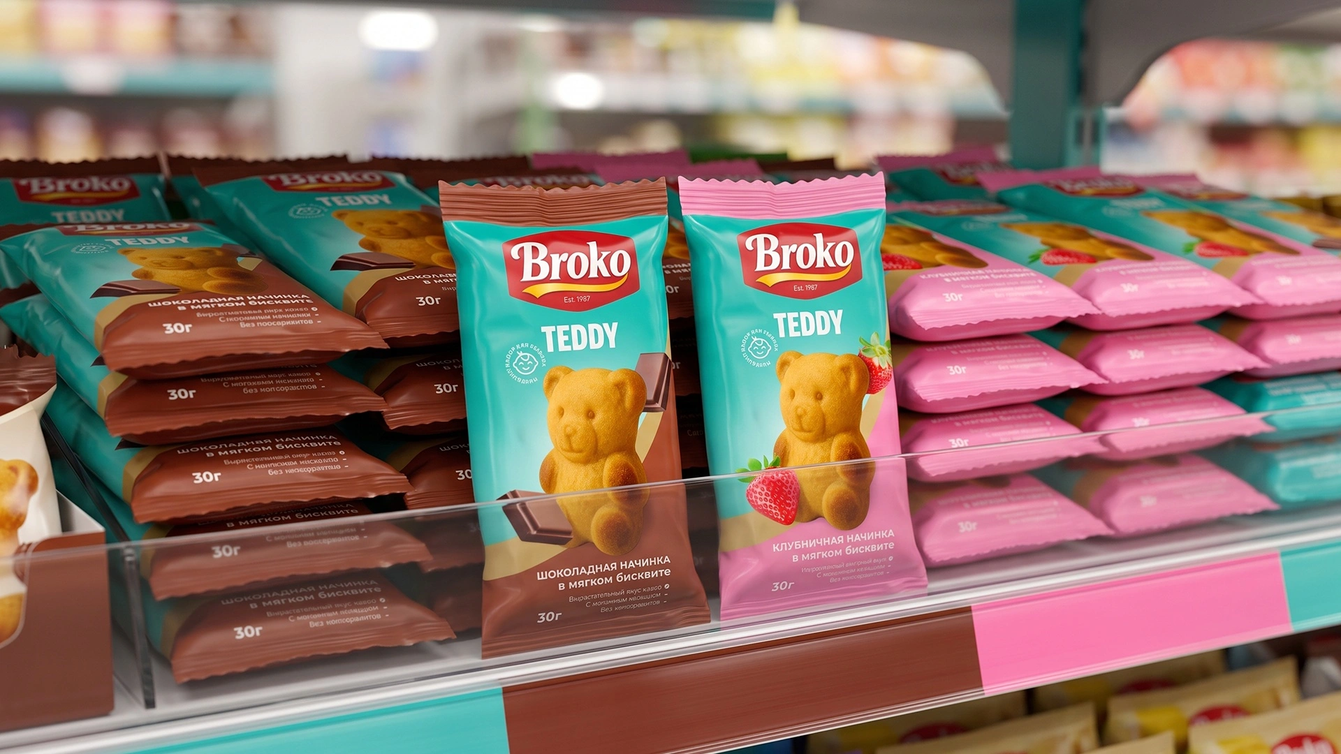
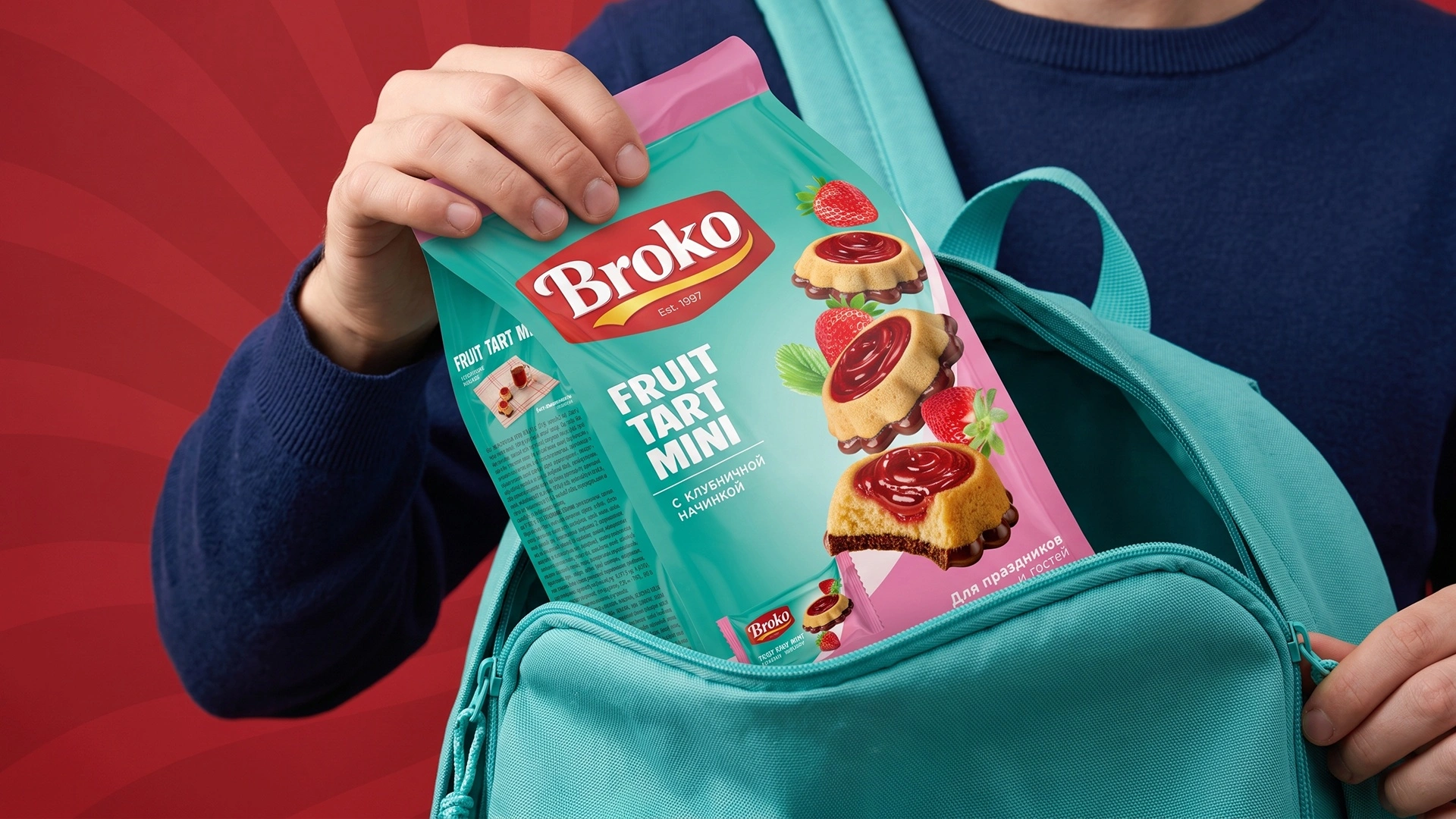
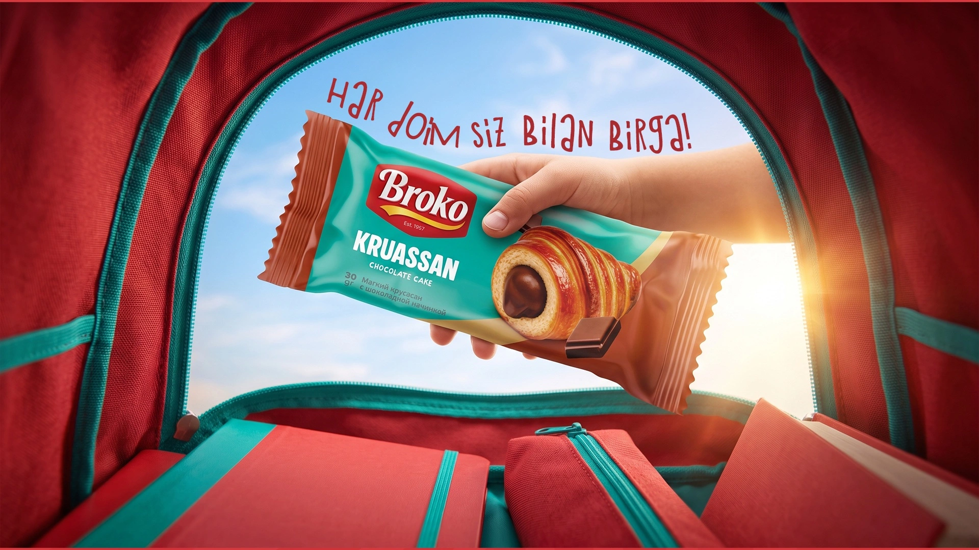
- A signature Tiffany blue: a fresh turquoise background that sets Broko apart from the red-and-yellow shelf.
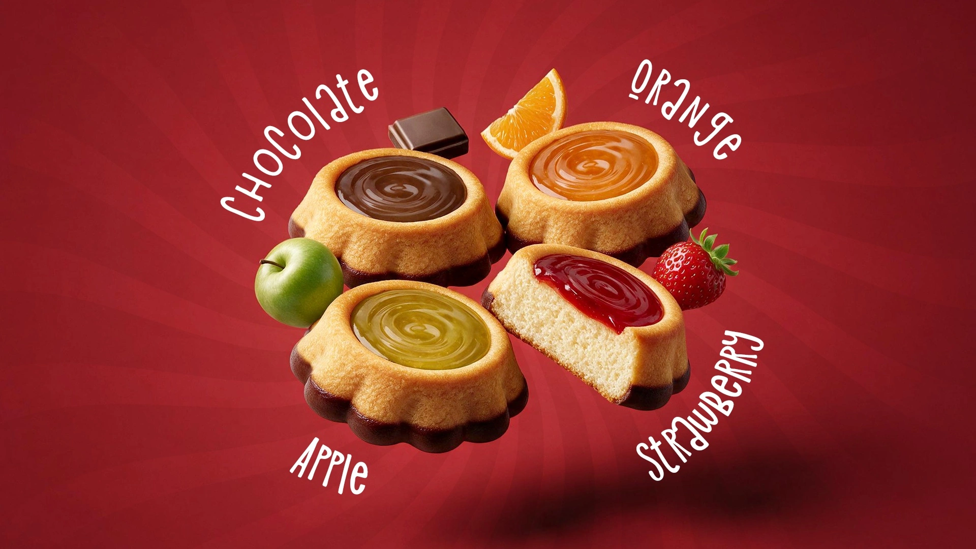
- A diagonal flavour band: green for apple, orange for orange, pink for strawberry, brown for chocolate. The flavour reads in a second.
- An appetising 3D food zone: a tart with a glossy filling, next to apple slices, orange segments or chunks of chocolate.
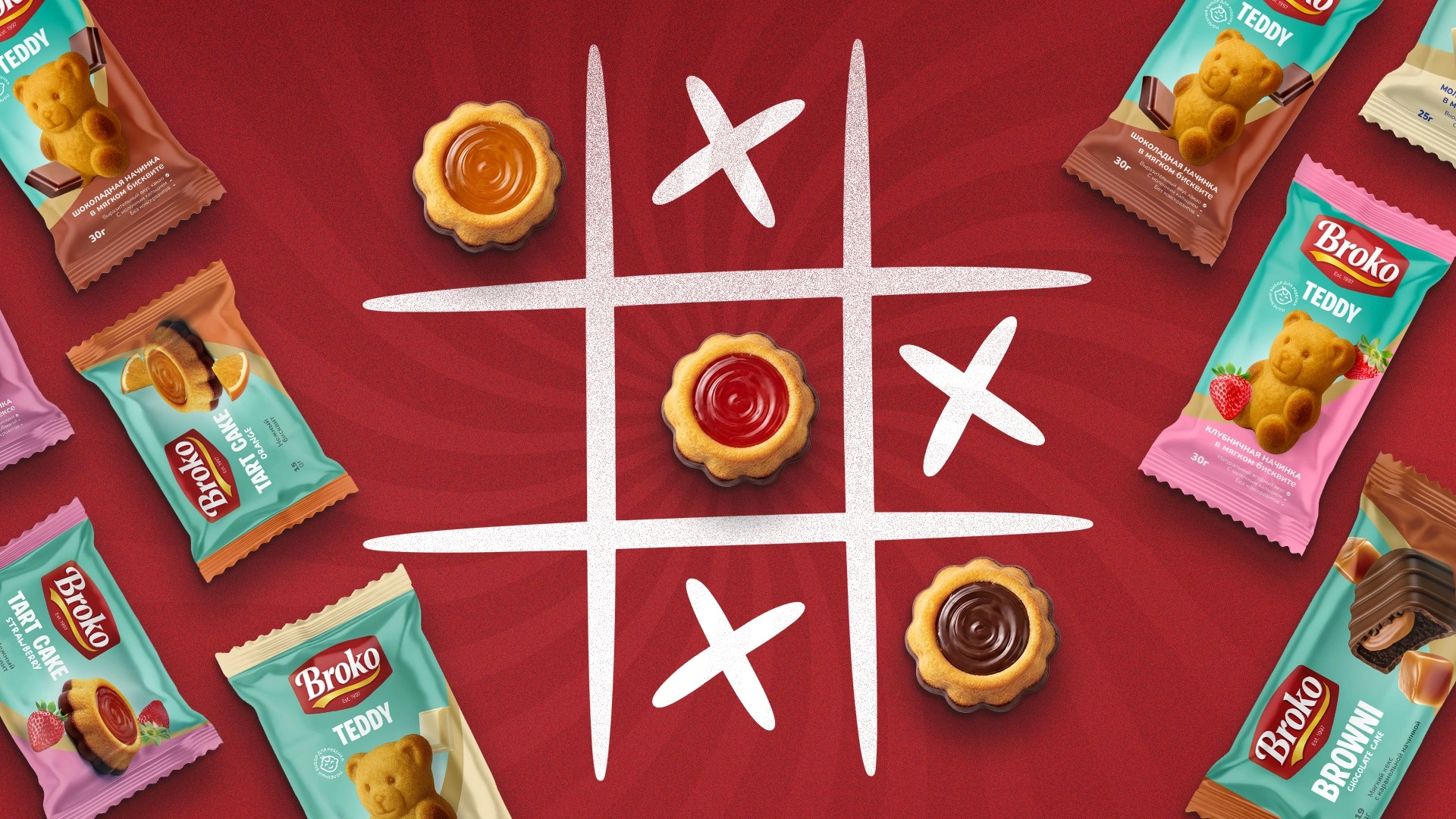
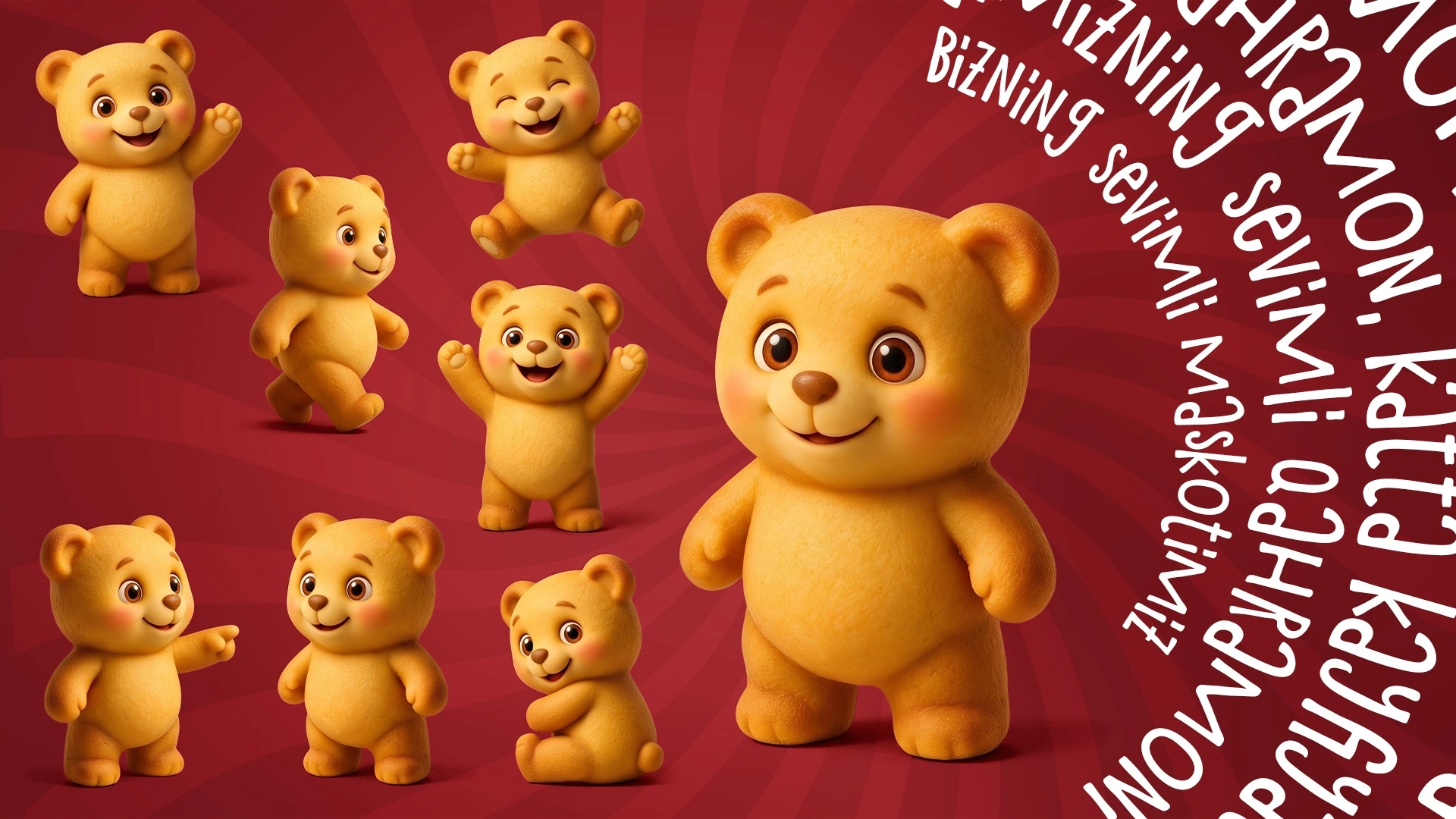
The system scales easily: for a new product, you change the band colour and keep the Tiffany blue. That's how Tart Cake, Teddy Cake (a bear-shaped cupcake), Brownie, Brownie Rose and Flowers, Cup Cake, a croissant, chocolate bars and 10-piece multipacks came about.
Result
Instead of products with different names and different designs, the factory now has a brand with one face: more than 15 SKUs in a single system. The client summed up the first line in two words, “Zo'r chiqipti” (“Turned out great”), and kept coming back with new products. In January 2026, we put together every pack for the Broko catalogue.
Broko: a turquoise that shoppers spot on the shelf at a glance.
If you have plenty of products but no single brand, get in touch with Minim.