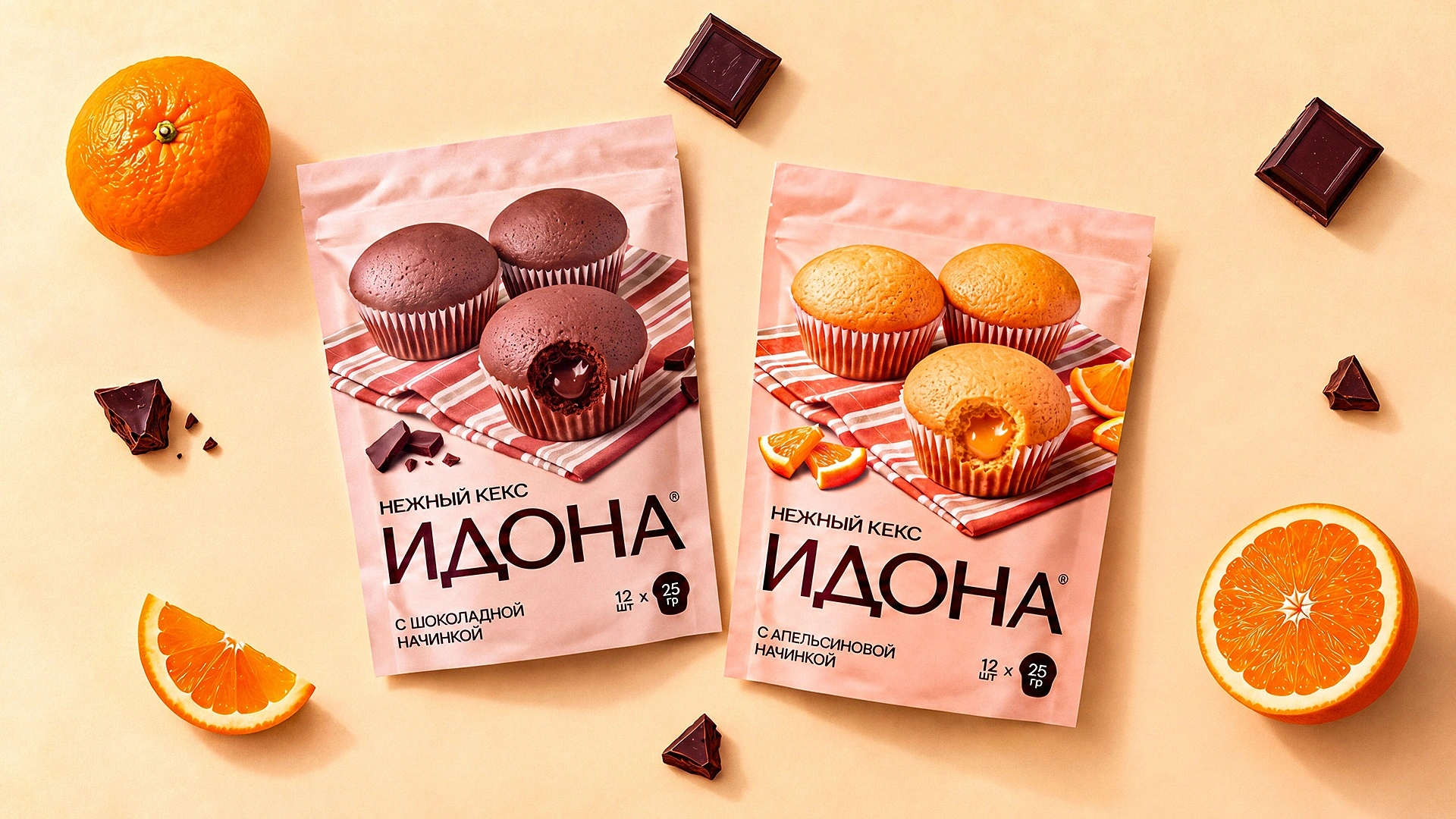
Idona — logo and packaging design for a line of soft filled cupcakes
When a client comes back with a new brand, that's the best review of the last project. The confectionery company we'd already worked with on Almos gingerbread came back with a new brand, Idona. This time it was soft cupcakes with fillings: orange, chocolate, forest berries and banana. The task sounded simple but took several rounds: make a cupcake you want to take home for tea straight from the shelf.
1. Problem and Task
The client needed an Idona logo and packaging for the whole line: a pack of 12 cupcakes at 25 g each, plus an individual wrapper for every cupcake. The brand had to stand apart from the company's other labels and not repeat the style of Almos gingerbread.
2. Research
The soft cupcake shelf is loud: bright colours, cartoon characters, big “new” badges. In that setting, volume stops working, because everyone shouts the same way.
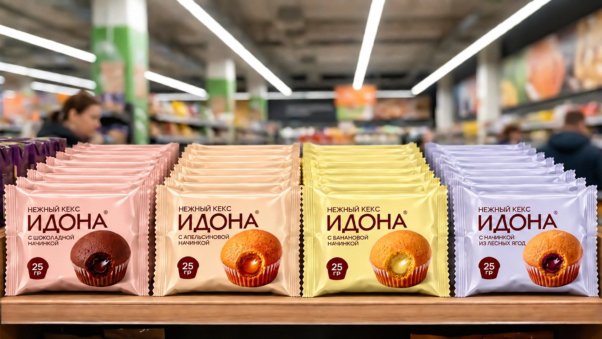
Our key insight: what really sets an Idona cupcake apart is the filling inside, and you can't see it until you break the cupcake open. So the pack has to do it for the shopper: show the cupcake cut open, so the flavour and moistness come across before anyone even picks it up.
3. Solution
We presented two concepts. The client approved the second one, with the logo carried over from the first, which is often what happens when the strengths of two ideas come together.
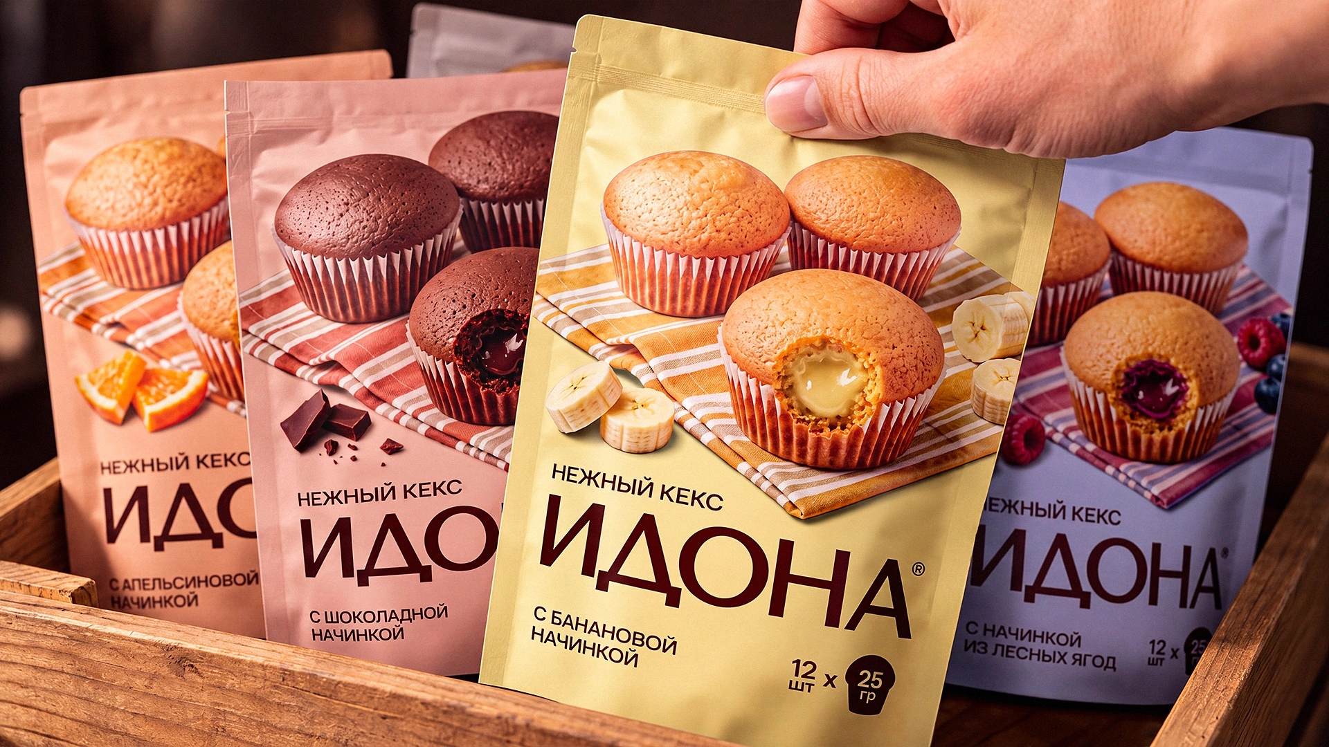
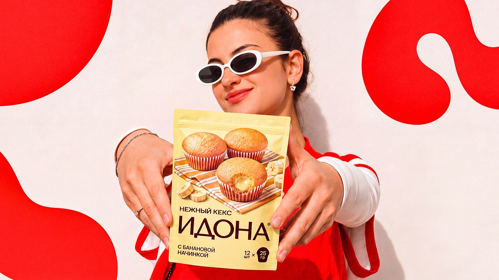
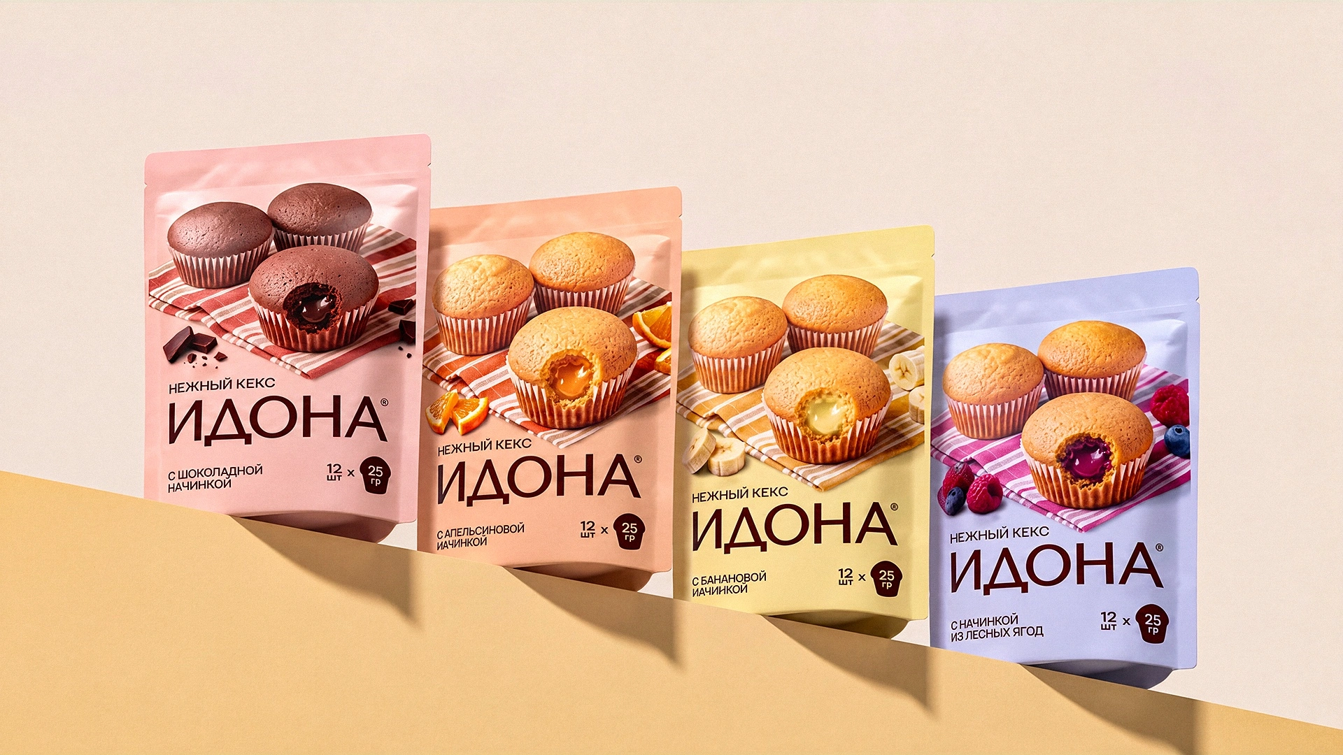
Logo. A calm, chocolate-brown ИДОНА wordmark with soft serifs and the line “Нежный кекс” (soft cupcake). No extra decoration: the brand sounds warm and confident rather than loud.
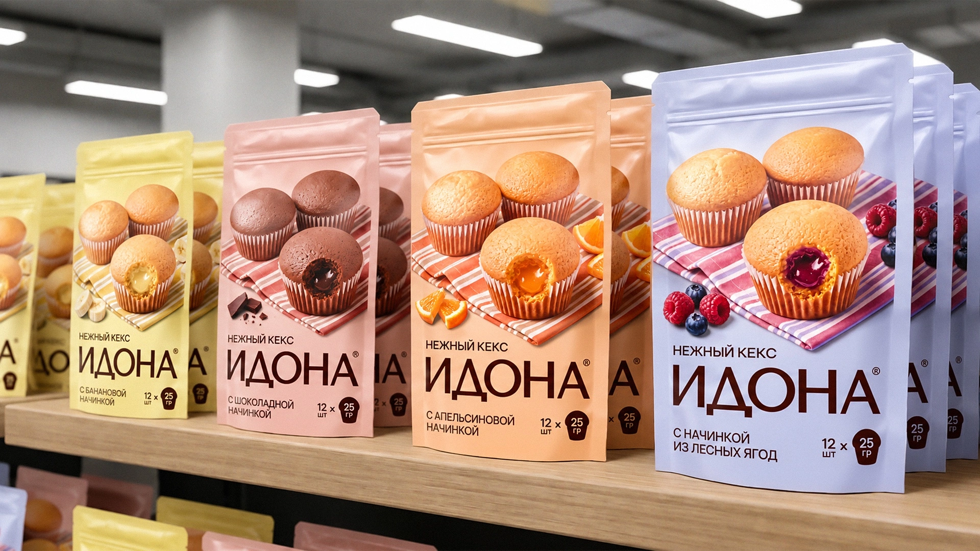
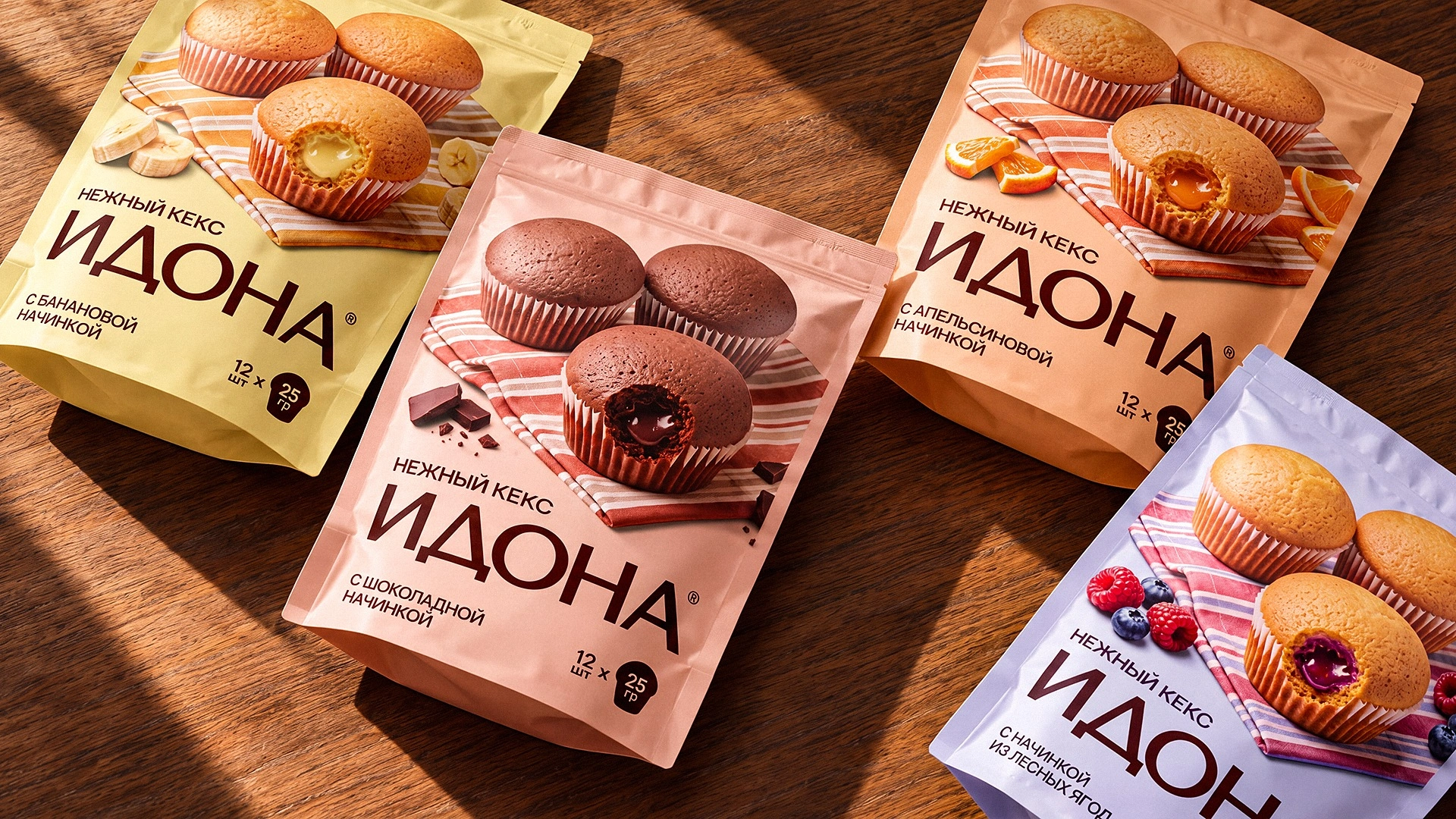
Packaging. We built the design as a scene from a home tea table:
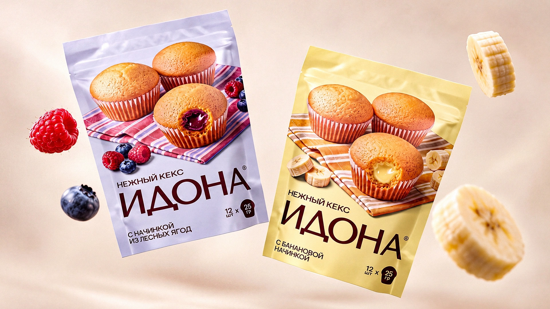
- A cupcake cut open to reveal its filling is the hero of every pack. Shoppers see the orange jam, chocolate or berries inside right away.
- A checked napkin under the cupcakes adds a homely feel and ties the line together.
- A pastel background codes the flavour: peach for orange, dusty pink for chocolate, lavender for forest berries, yellow for banana.
- Ingredients next to the cupcake (orange slices, chocolate pieces, raspberries and blueberries) signal the flavour without extra words.
- A large “12 pcs × 25 g” badge answers the shopper's main practical question.
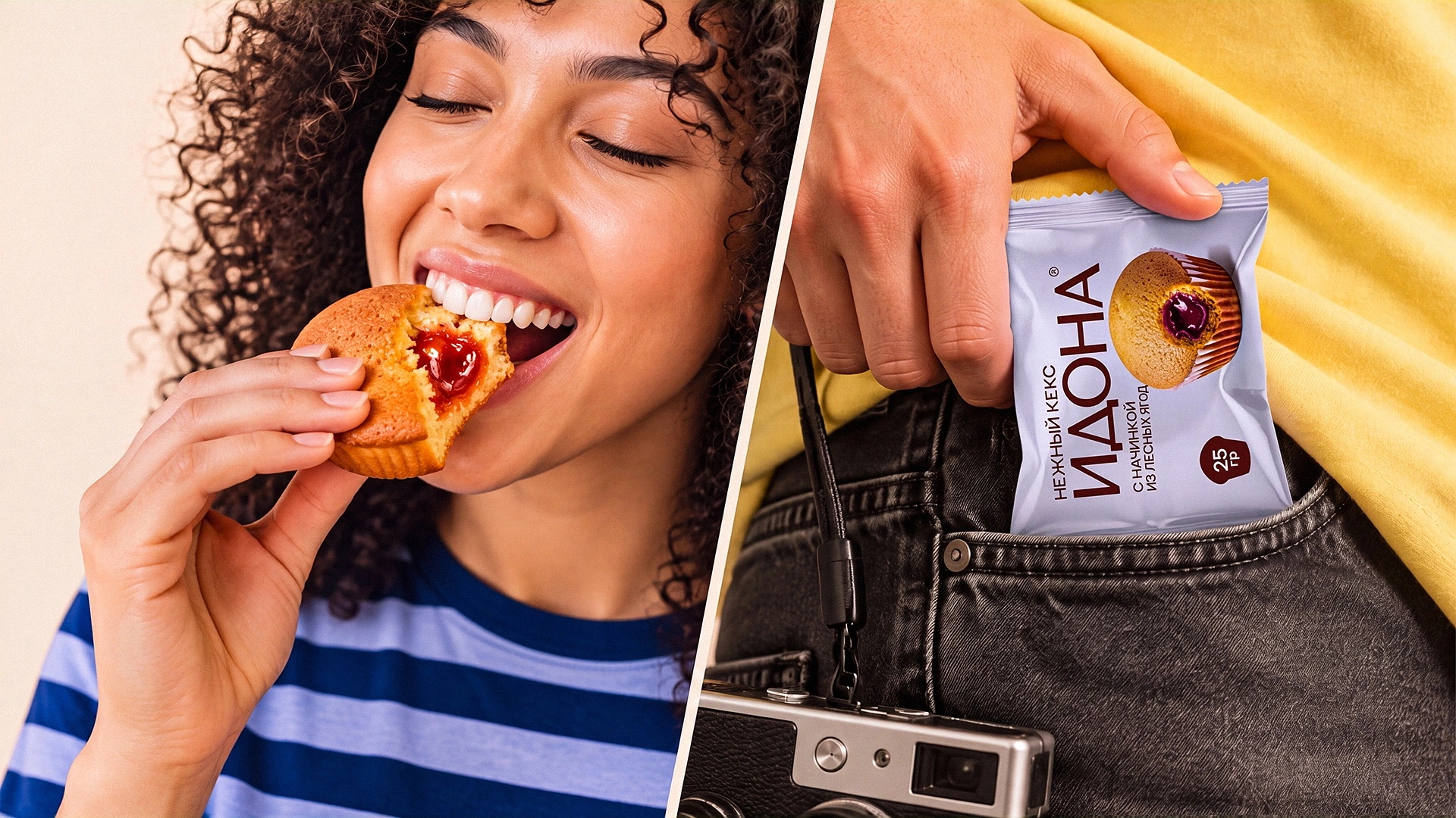
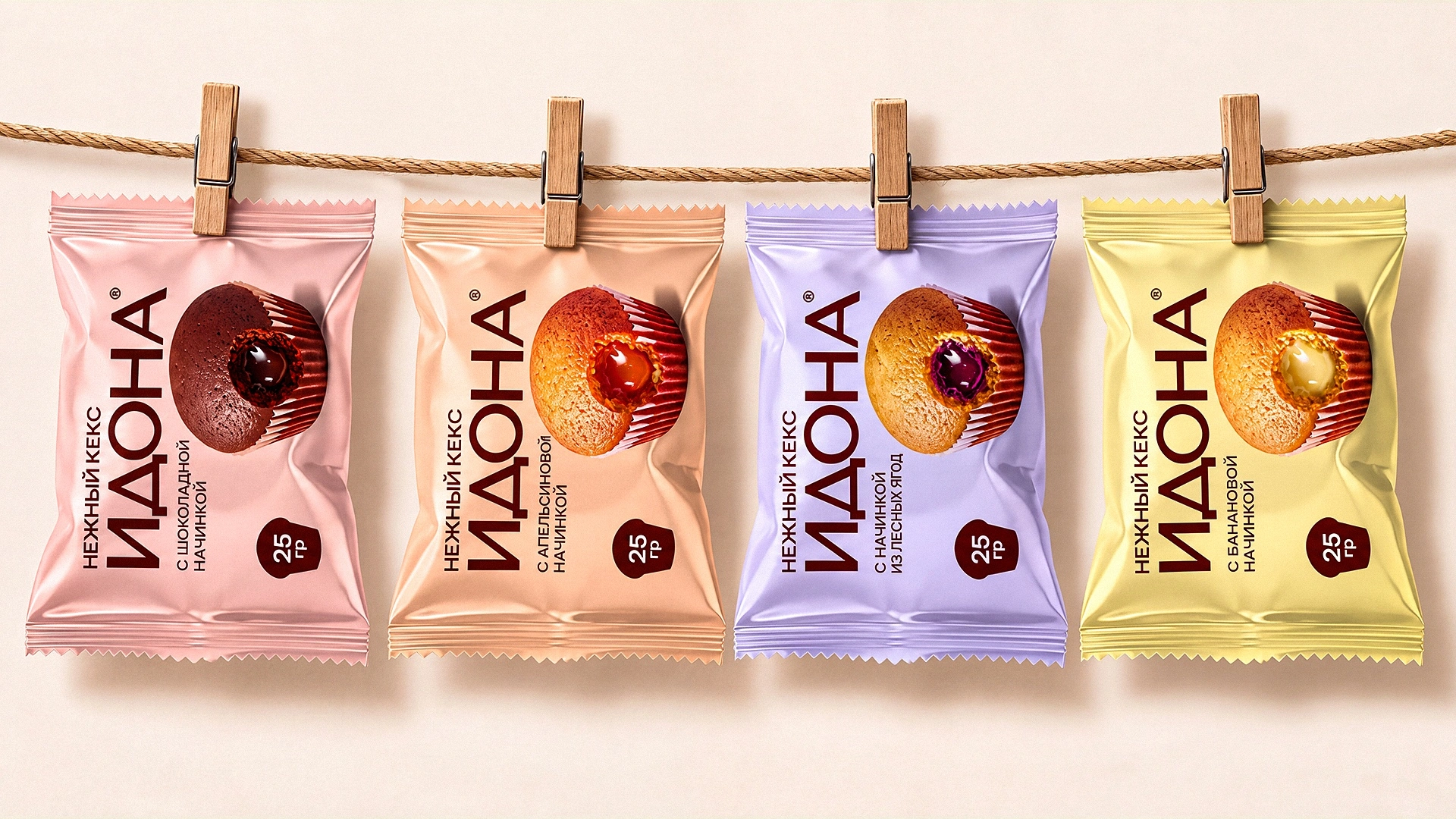
The individual wrapper repeats the system in miniature: the same logo, the same flavour colour and the cupcake cut open.
4. How we worked
The project ran with pauses: the client took time to think about the format, and one flavour was put on hold for a while. In the second round, we refined the flavour names and developed two versions of the front panel to make the choice easier. The final files went to print in August 2026.
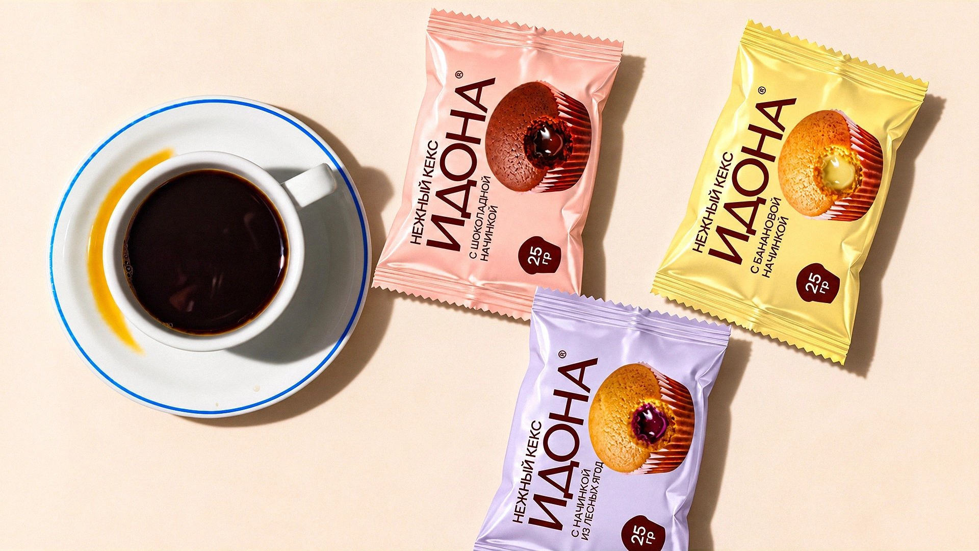
Result
Idona got its own logo and a recognisable packaging system in which every flavour reads at a glance. In the autumn, the company trusted us with the next project, Idona Kids, soft mini cupcakes for children. There's no better proof that the first job hit the mark.
Idona: a cupcake that shows its flavour before the first bite.
If your product has something worth showing, get in touch with Minim.