Just: Wafer Packaging Design
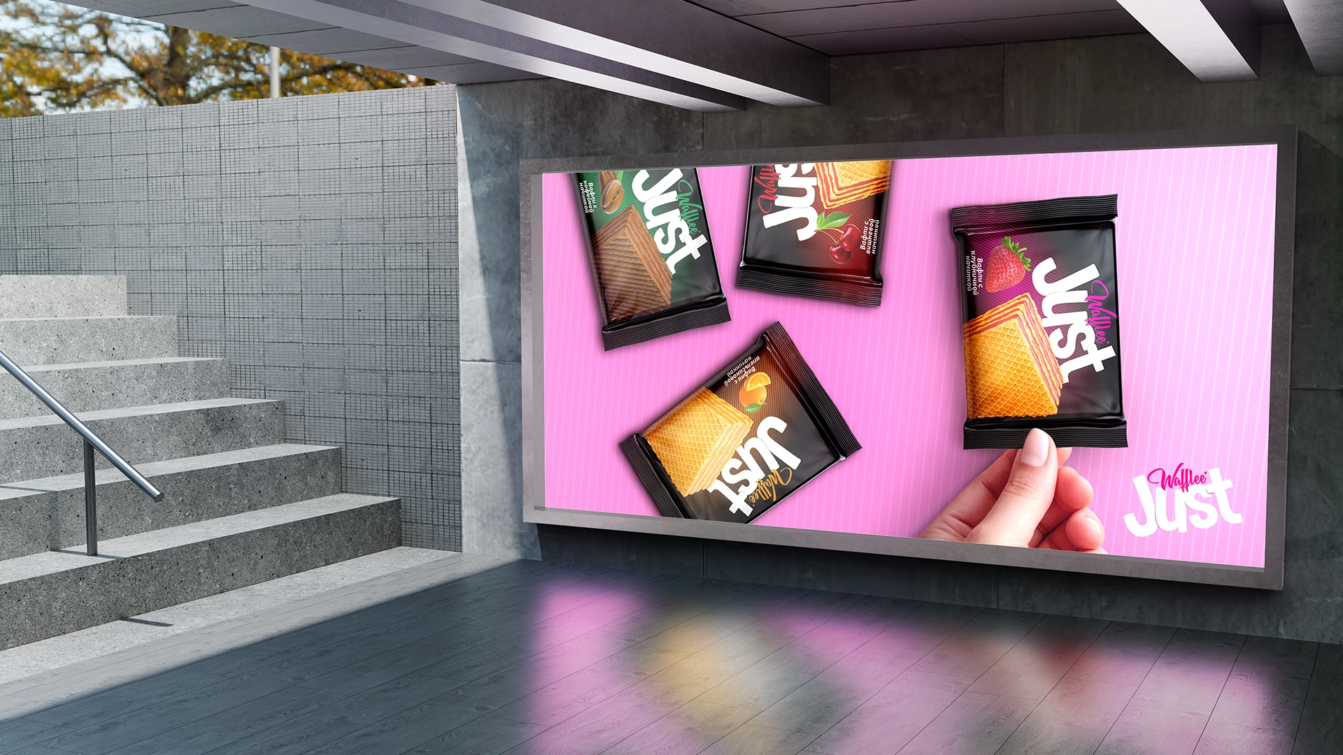
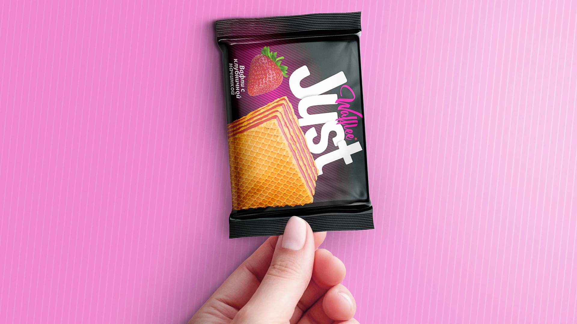
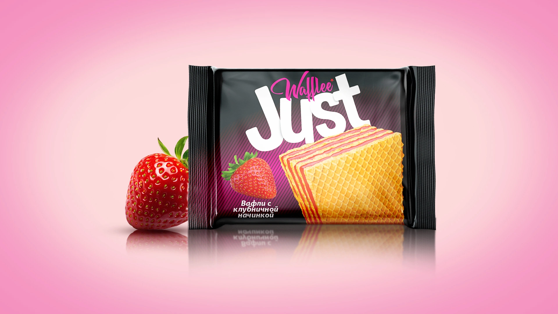
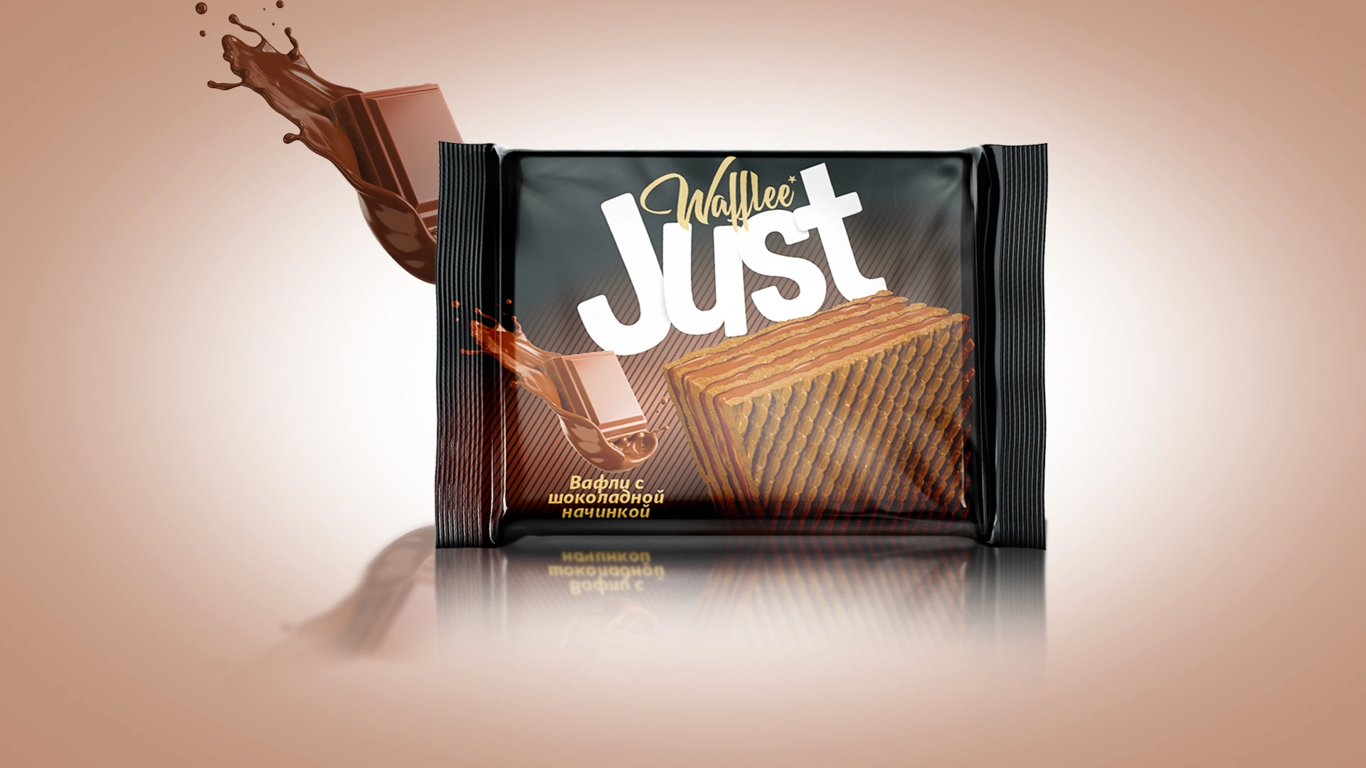
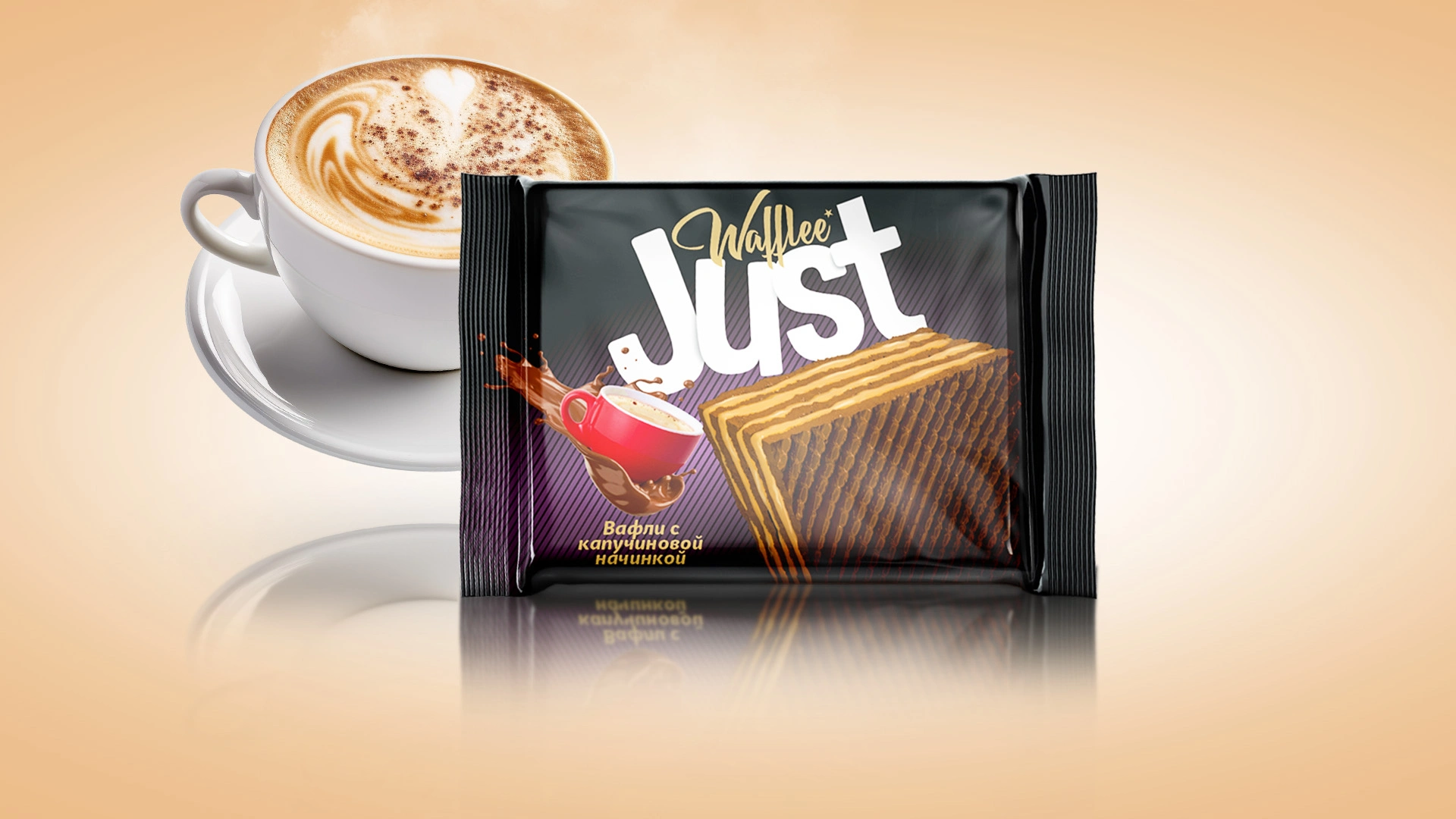
A bright, minimalist packaging design was developed for Just wafers. Black background with color accents and realistic wafer visualization. The naming Just reflects the simplicity and clarity of the product.
1. Task
The waffle market has many competitors. Customers prefer products that are simple and intuitive. Hospitality and sincerity are especially important to Uzbek culture. Our objective was to create waffles with an eye-catching yet minimalistic design and a straightforward name. The product needed to stand out easily and appeal broadly.

2. Research
We conducted extensive research on the market and consumer preferences, revealing that people gravitate towards products with clear and uncluttered designs. Many competitors offer designs that are either overly complex or uninspiring. Minimalism and natural ingredients are currently in high demand.
3. Solution
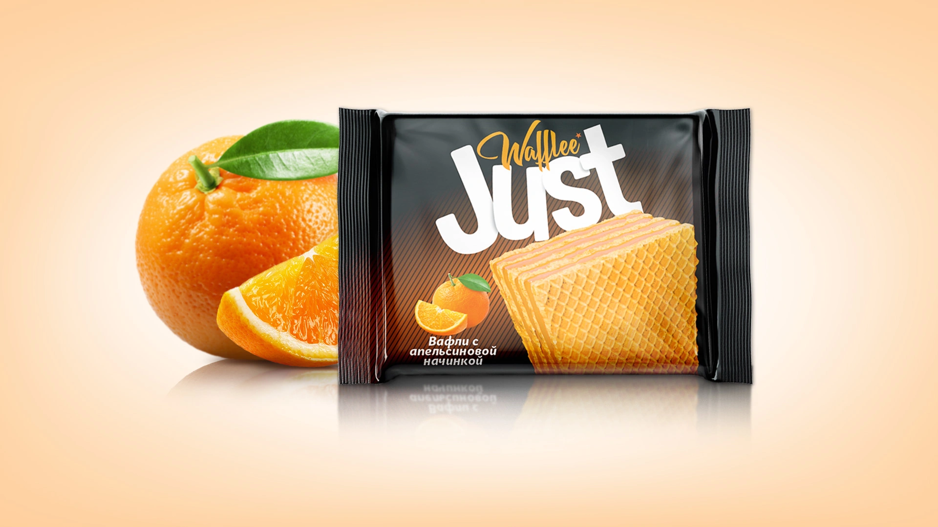
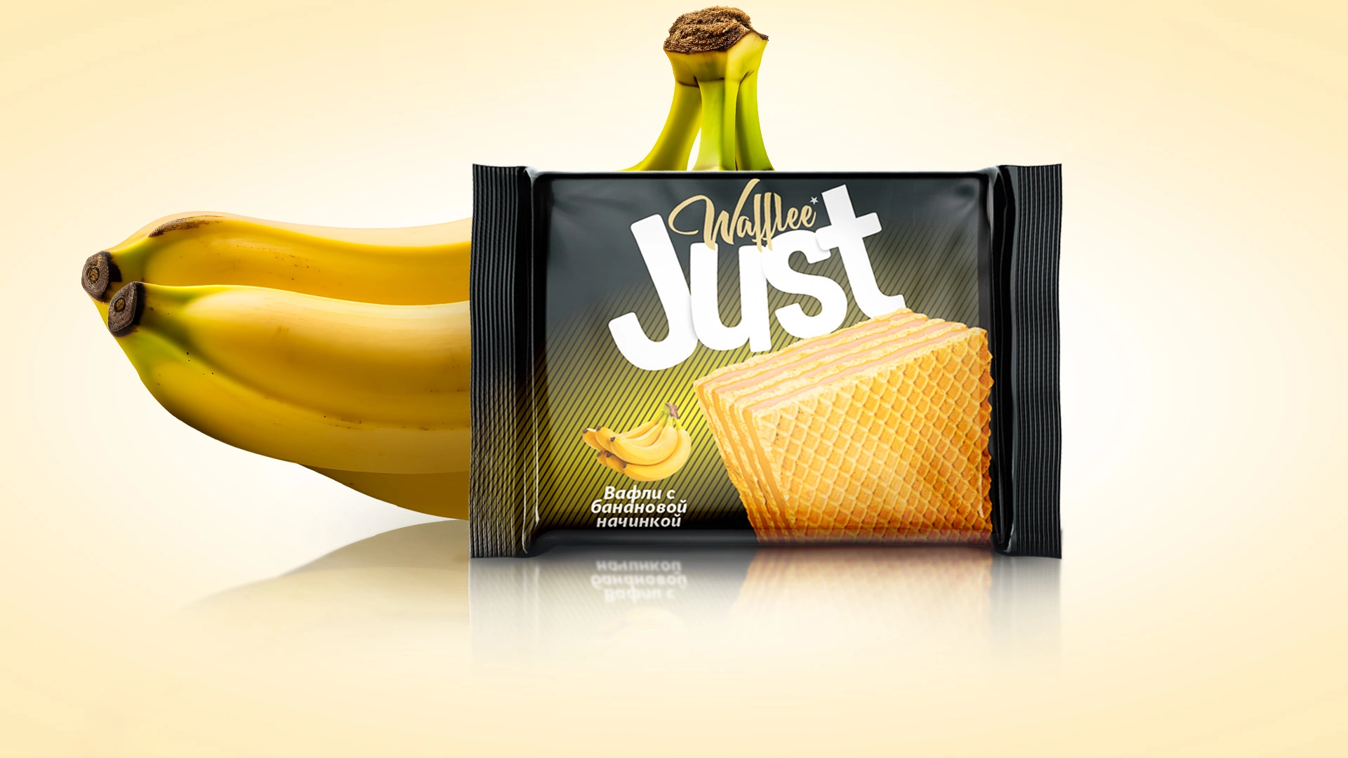
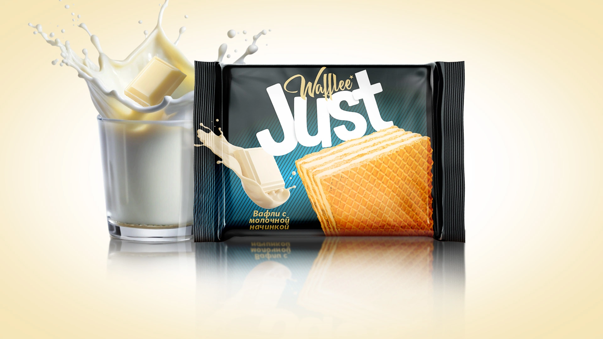
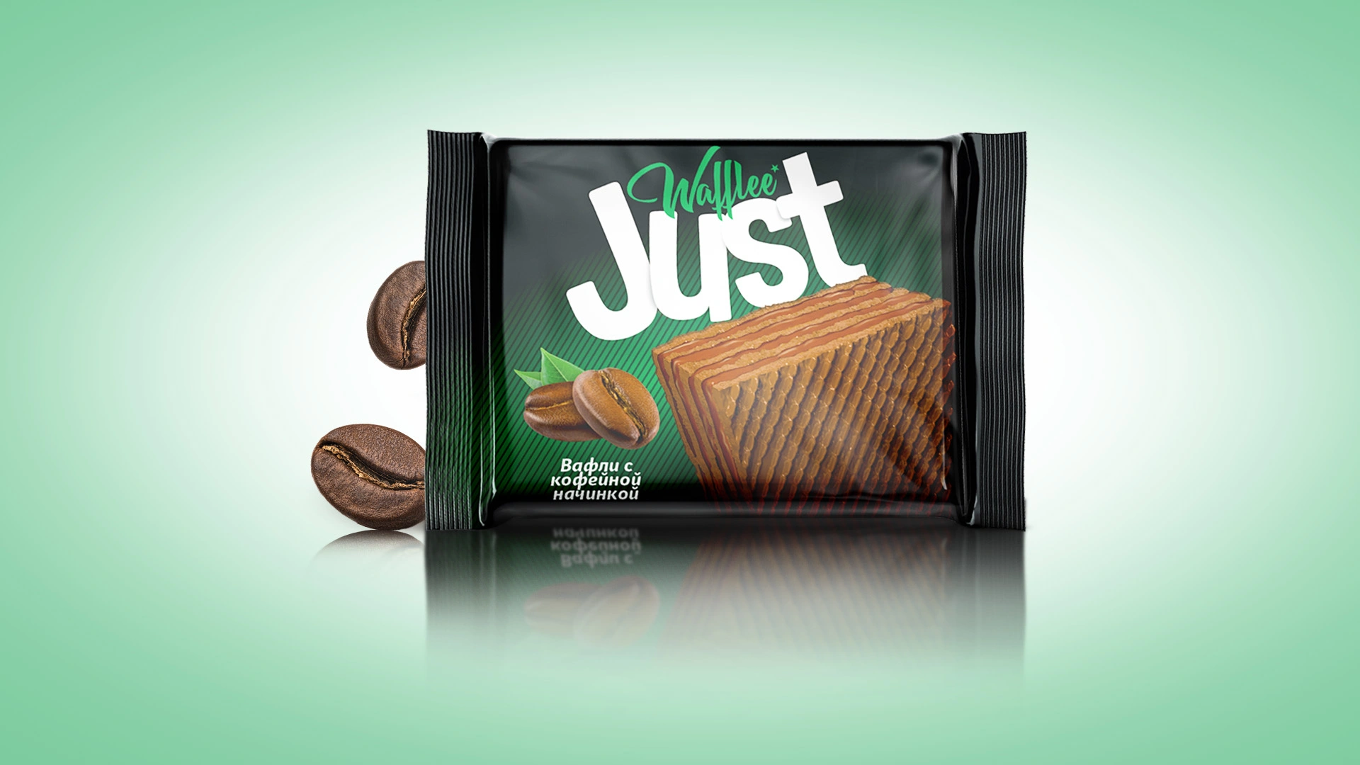
We introduced the product line under the name Just—short, clear, and directly reflecting simplicity. The packaging features a striking black background highlighted by vibrant color accents for each flavor. It showcases realistic images of waffles and their ingredients, clearly communicating quality. The line includes eight distinct flavors, and the compact packaging makes it ideal for quick snacking

Result
The Just brand is fully prepared for launch and perfectly aligned with consumer expectations. Its vibrant and minimalistic design immediately draws attention and is memorable. The simplicity reflected in both its name and design creates a contemporary and appealing image that resonates with buyers. With strong market potential, this product is well-positioned to confidently enter the Uzbek market.