


Melty — naming, logo, and packaging design for a wafer line
As the saying goes, an old friend is better than two new ones. Our regular client A'loxon aka and the "Lindo" company entrusted us with their next major project.
1. Problem and Task
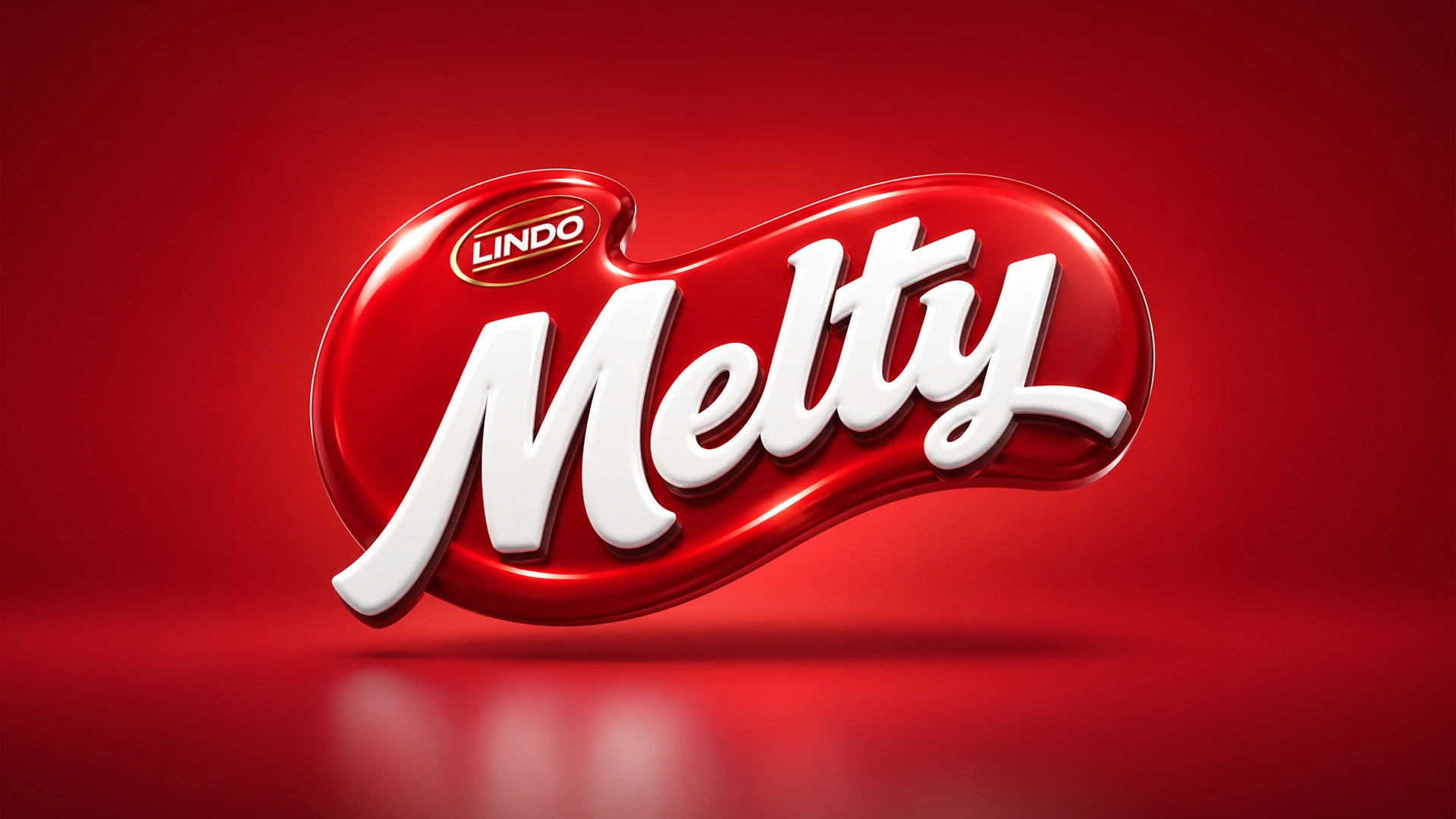
The company had introduced a new wafer production line. We had a great new product on our hands, but it lacked a name and any design vision. Our task was to find a catchy name fitting for this treat, develop a logo, and most importantly, bring wafers of different flavors into a single, cohesive design system.

2. Research
You cannot just enter a market blindly. Therefore, we first carefully studied the competitors' shelves. We analyzed which colors were already taken and looked for fresh, unused shades that would immediately catch the eye. The goal was for the packaging itself to attract the buyer.
3. Solution
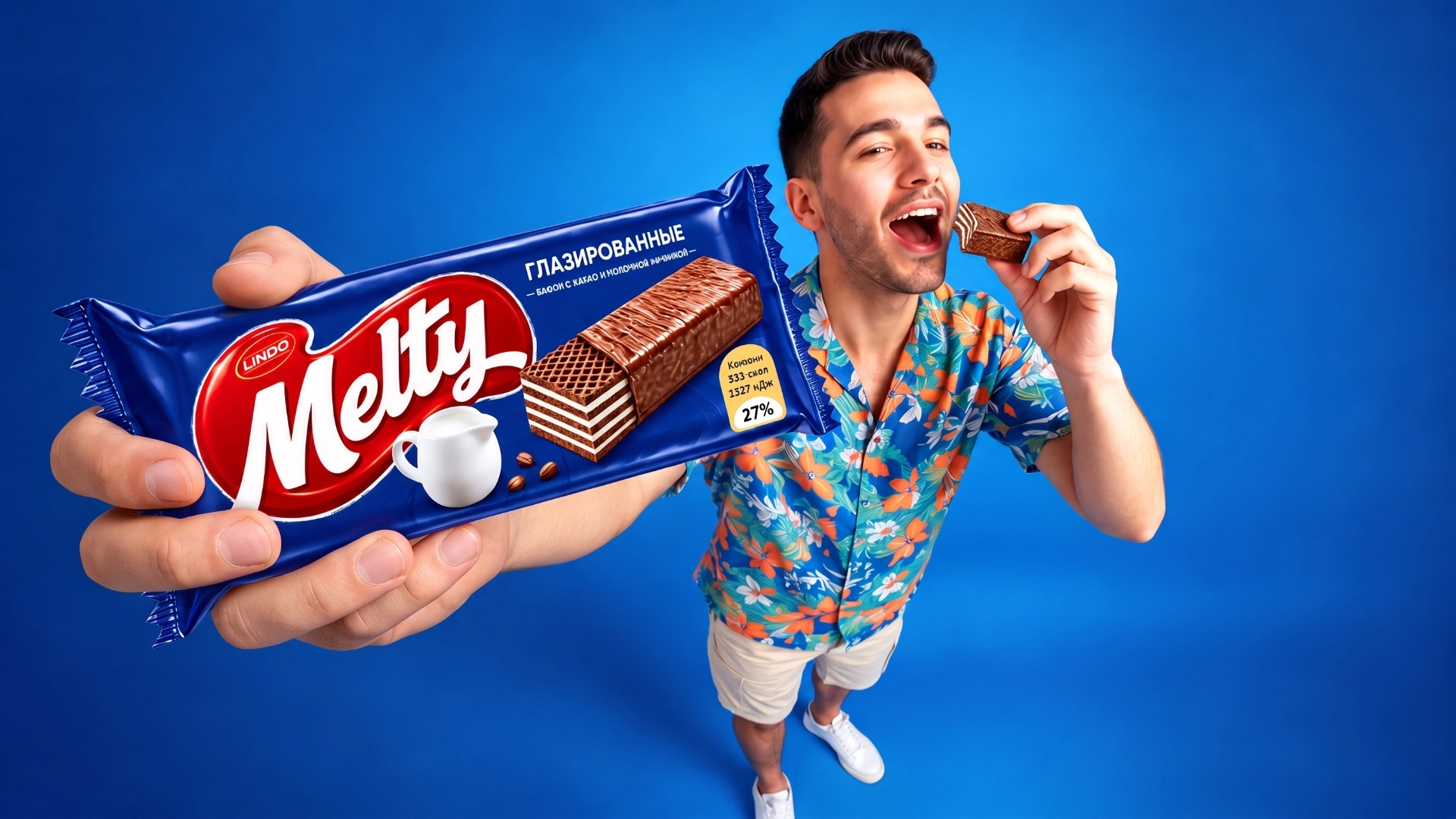
Based on the product's characteristic of melting in the mouth like ice cream, we gave it the English name Melty.
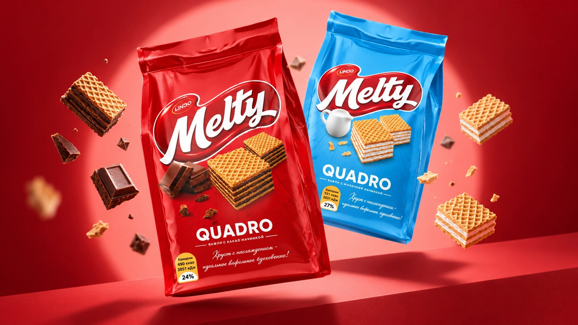
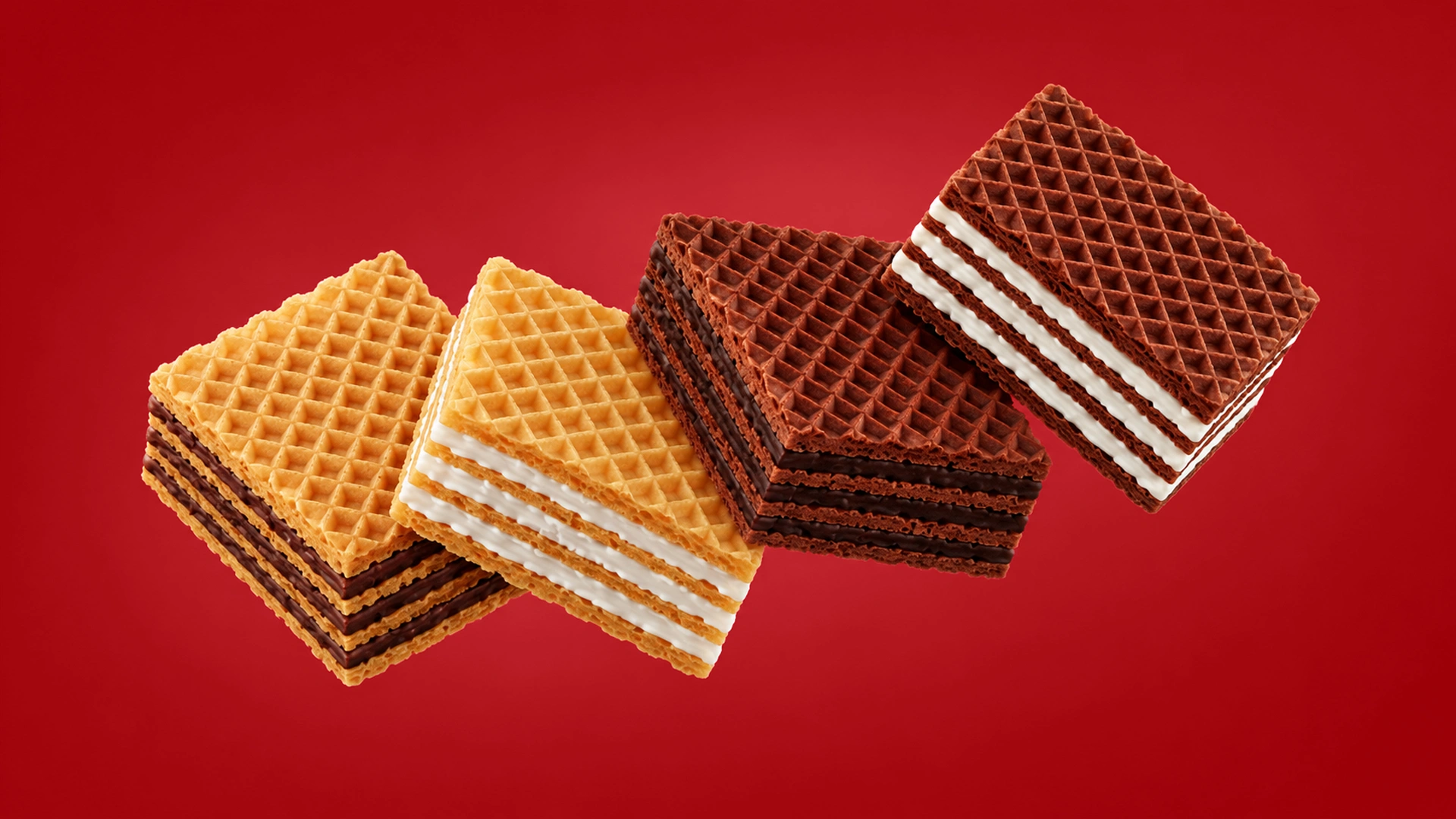
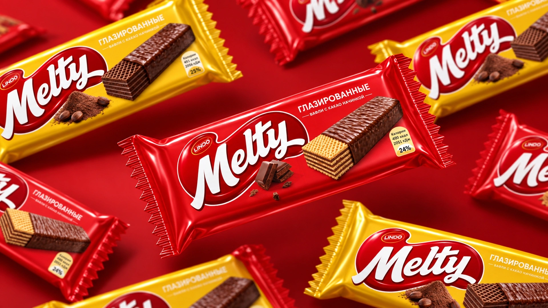
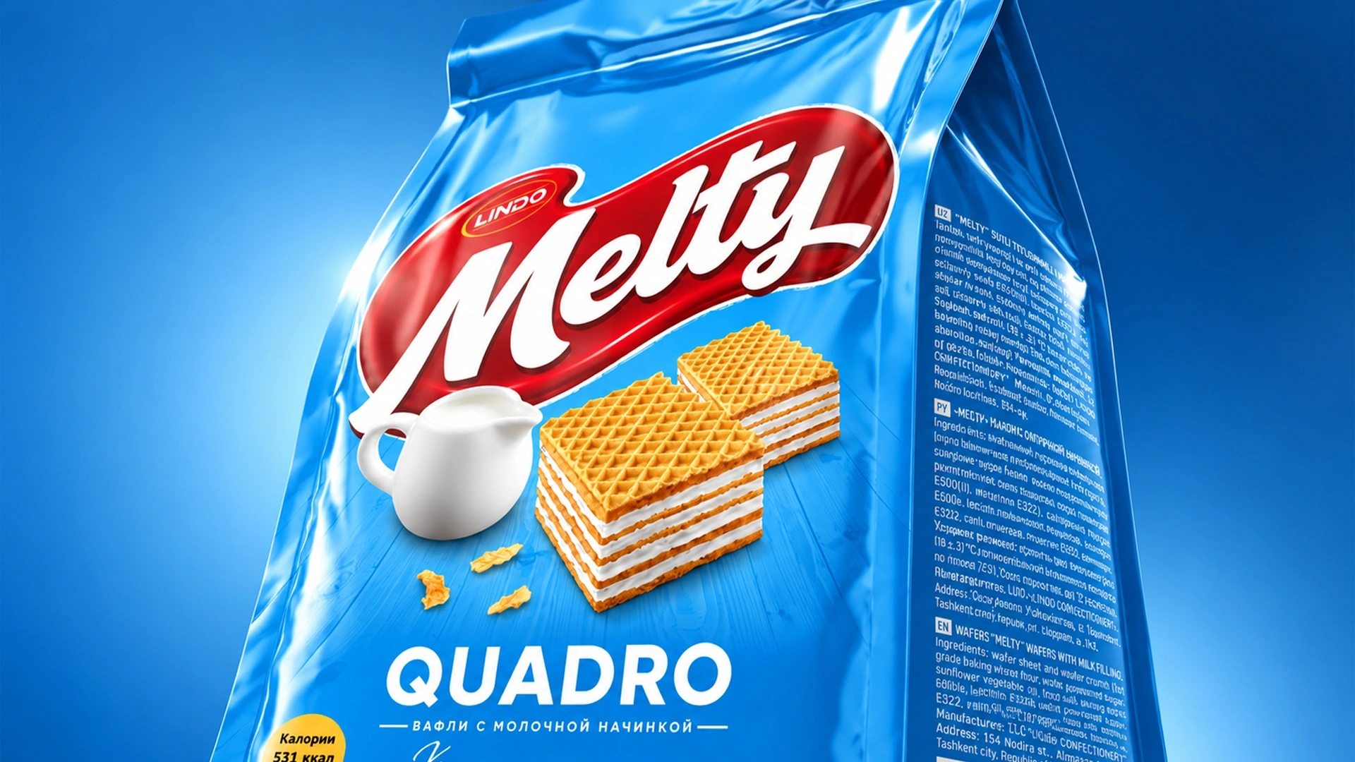
To make the wafers and chocolate chunks on the packaging look realistic and show exactly what the filling looks like, we took the time to create highly appetizing 3D models for each element.
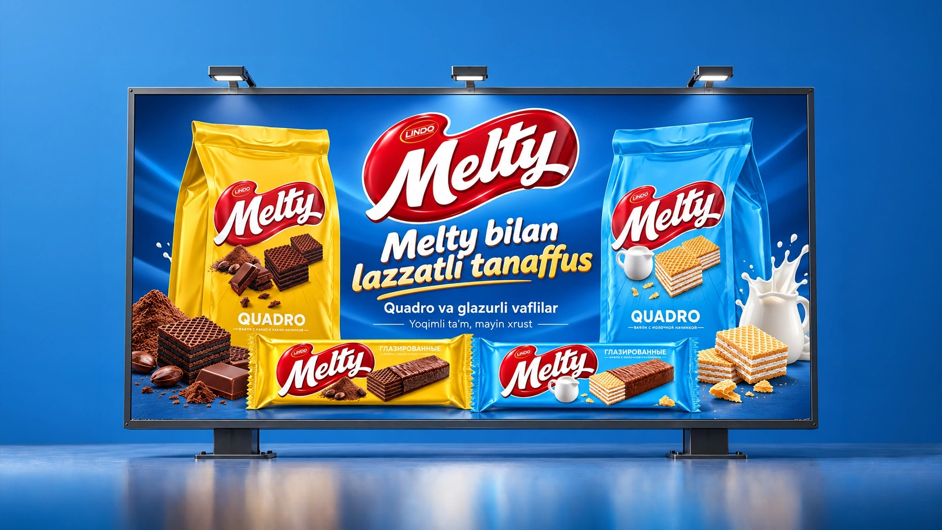
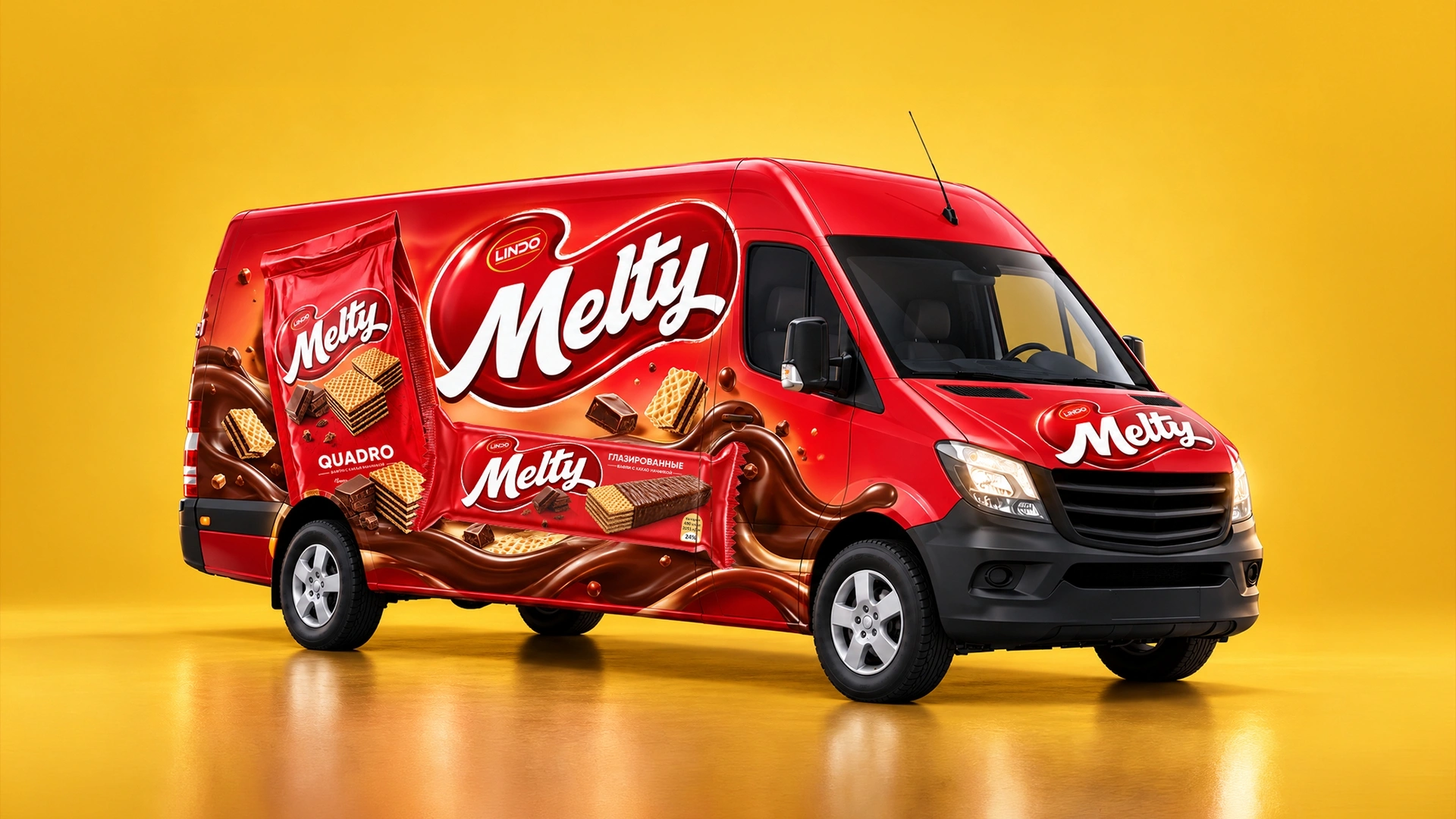
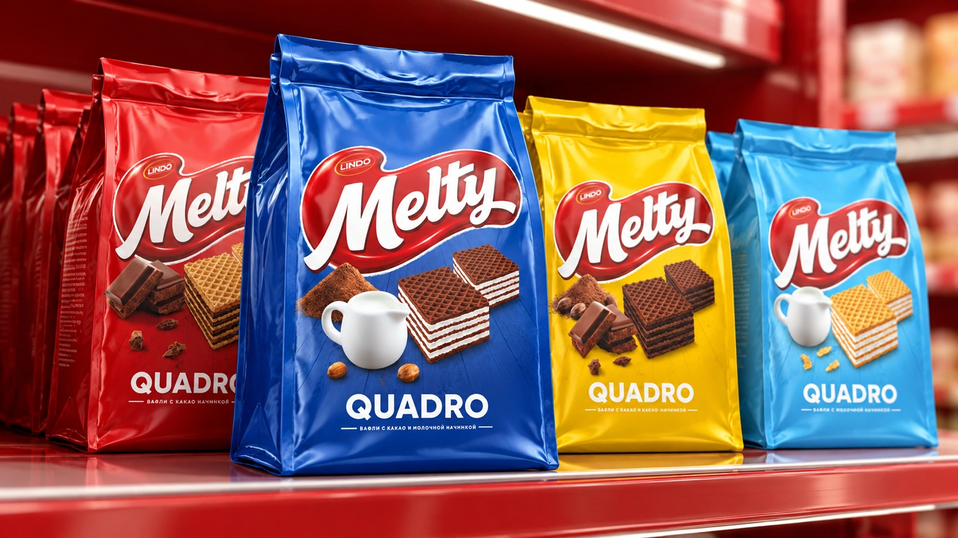
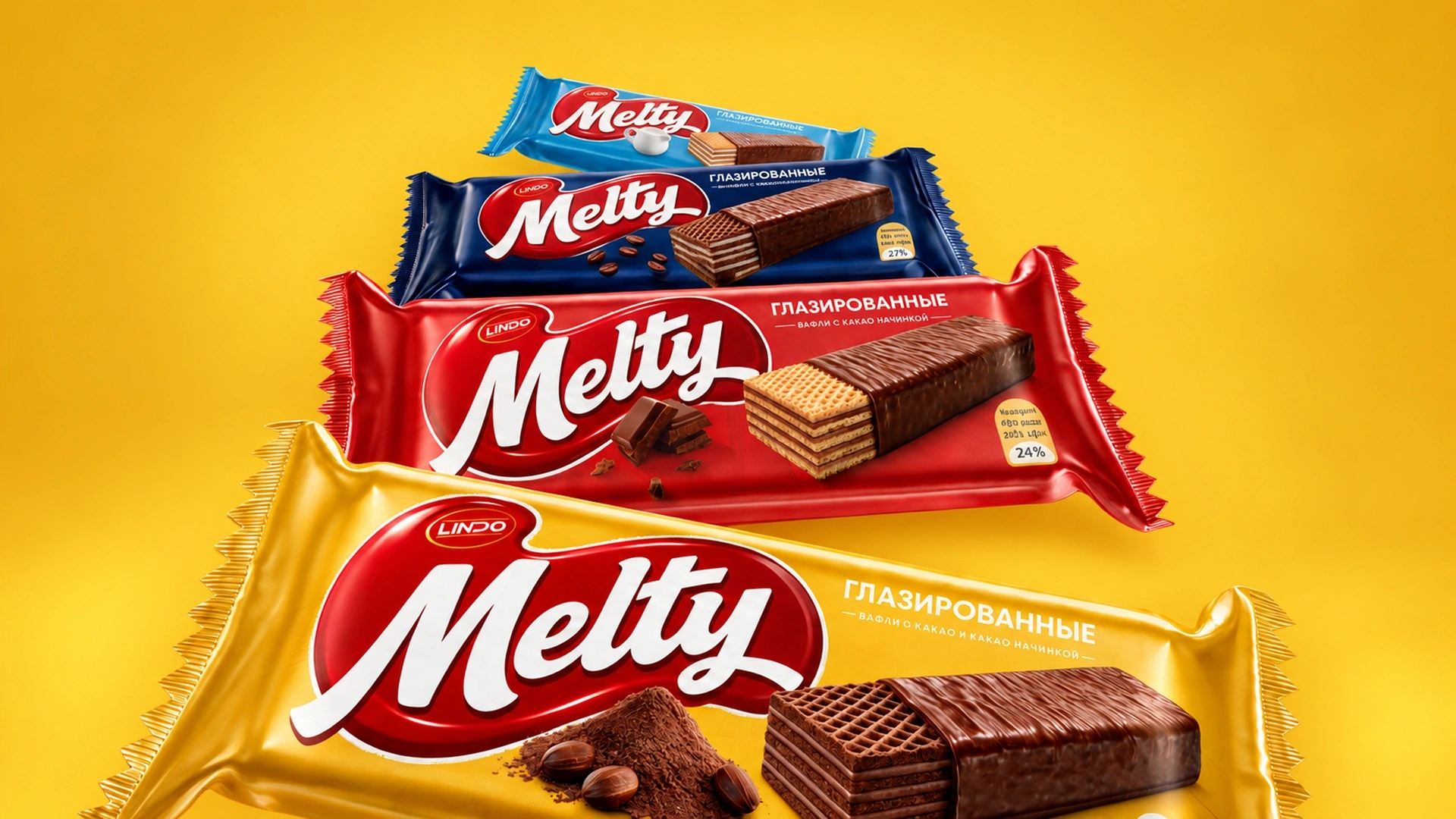
We also came up with unique color solutions: light blue for baked milk wafers, dark blue for cocoa and milk, bright yellow for chocolate, and an appetizing red for classic chocolate wafers. This system was adapted for everything from 150-gram family packs to large stand-up pouches.
Result
In short, with pure intentions and hard work, the outcome was exactly as we hoped. We created a modern and appetizing packaging that we could proudly present even on the European market. The project is currently on the verge of launching. Hopefully, in the coming days, Melty wafers will take over the shelves not only in Uzbekistan but also in neighboring markets: Tajikistan, Kyrgyzstan, Afghanistan, Turkmenistan, and Kazakhstan.