


ArZincum — Packaging Design for Zinc Solution and Spray
"Health is wealth," as our wise people say. For the body to work like clockwork, various vitamins and minerals are as essential as air and water. Zinc, in particular, plays an irreplaceable role. It acts as a shield against viruses, aids in growth, and is generally one of the most vital building blocks for our body.
The "Alkimyogar pharm" company took a major step in this direction. Using Canadian technology, they launched the production of a colloidal zinc solution right here in Fergana. This was their absolutely unique, exclusive product.
1. Problem and Task
The product's main killer feature lies in its composition: it's not just ordinary zinc, but zinc in the form of nanoparticles. Usually, the body doesn't fully absorb vitamins and minerals. But the nanoparticles in this colloidal solution are absorbed by up to 98%. Meaning, every single drop works directly for your health, without fail.
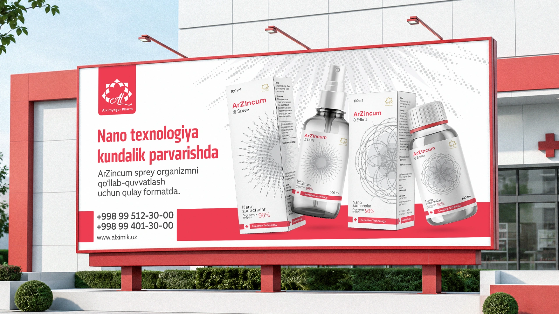
The product comes in two formats:
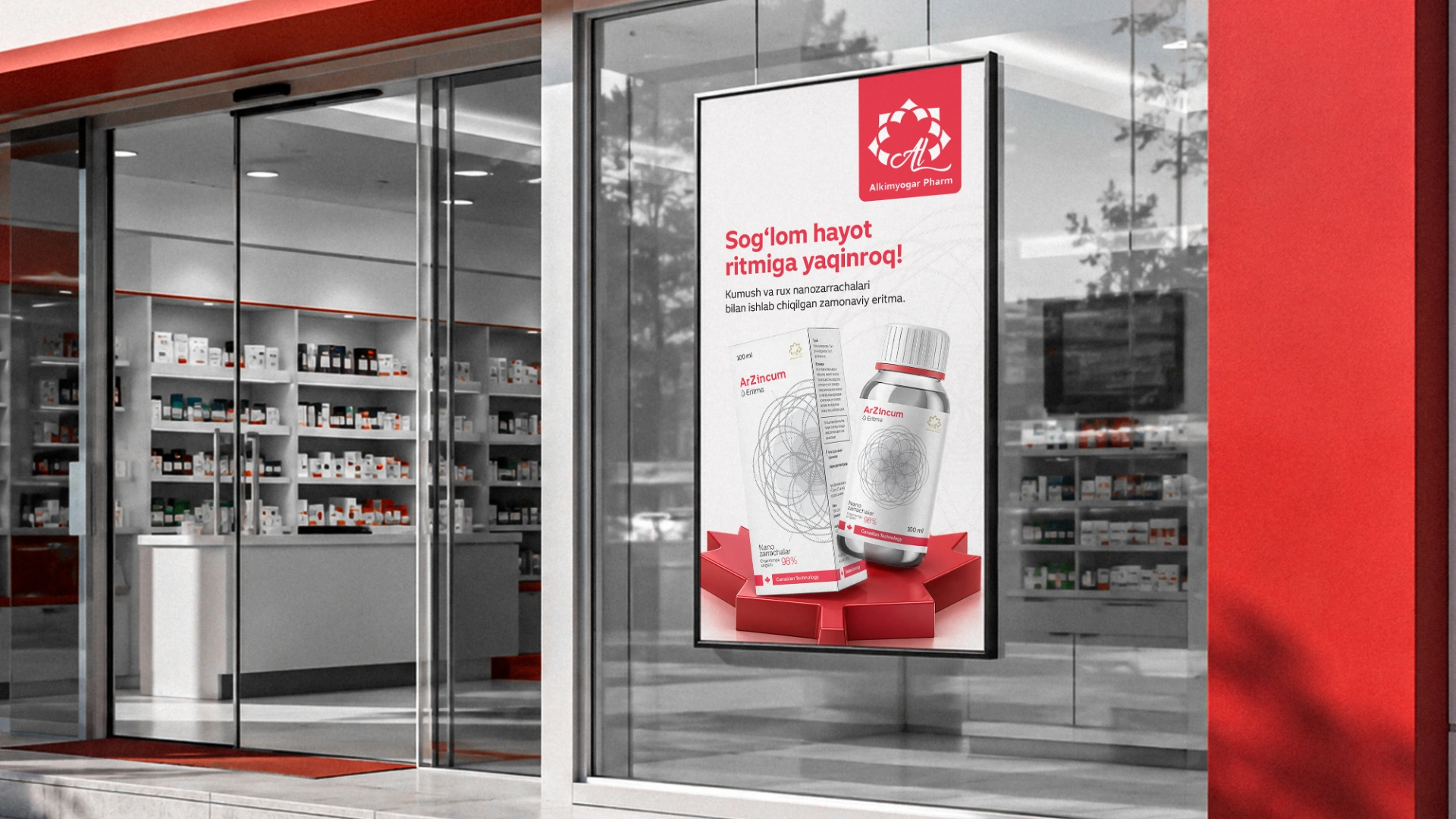
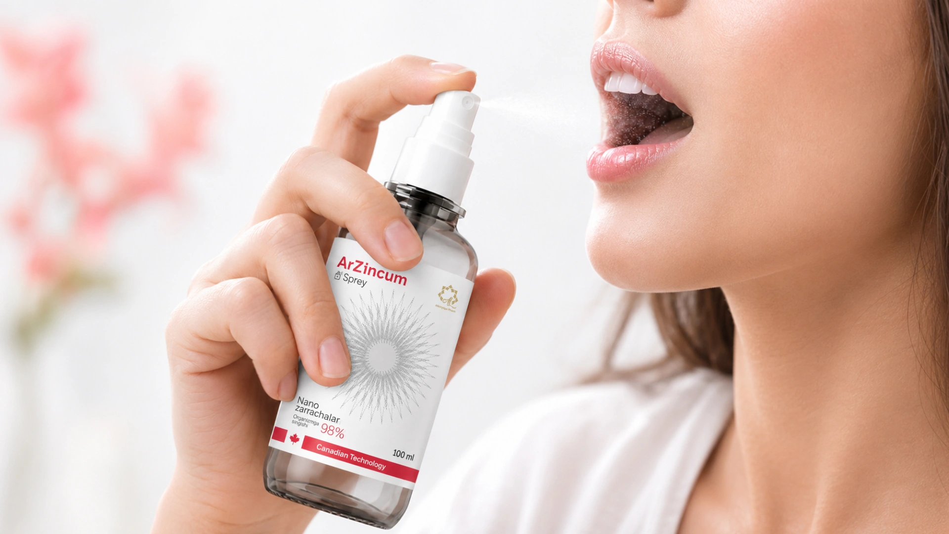
- Spray: An unrivaled lifesaver for sore throats, sinusitis, pharyngitis, and tonsillitis. Plus, it serves as a powerful topical antiseptic: it’s sprayed to treat external wounds, burns, dermatitis, eczema, and even acne.
- Solution: A natural antibiotic taken by the spoonful. It mercilessly fights viruses and infections from the inside out.
Our task was to create a packaging design that would instantly reveal the essence of this unique product and build ironclad trust with the buyer.
2. Research
By the book, we started with a raid on pharmacy shelves and a competitor analysis. Usually, dietary supplements and vitamins come in packaging that sports every color of the rainbow, often looking overly flashy. They all try to blind the buyer and scream for attention.
But our product isn't just an everyday vitamin. Given its composition and potency, it's a serious therapeutic agent. If we went with the flow and painted the packaging in neon colors, the product would instantly lose its value, and people would dismiss it as just another run-of-the-mill supplement. We needed a completely different—strictly medical and scientific—approach.
3. Solution
The resonant name ArZincum was chosen for the product, one that easily goes toe-to-toe with foreign brands. After that, we moved on to the core design concept.
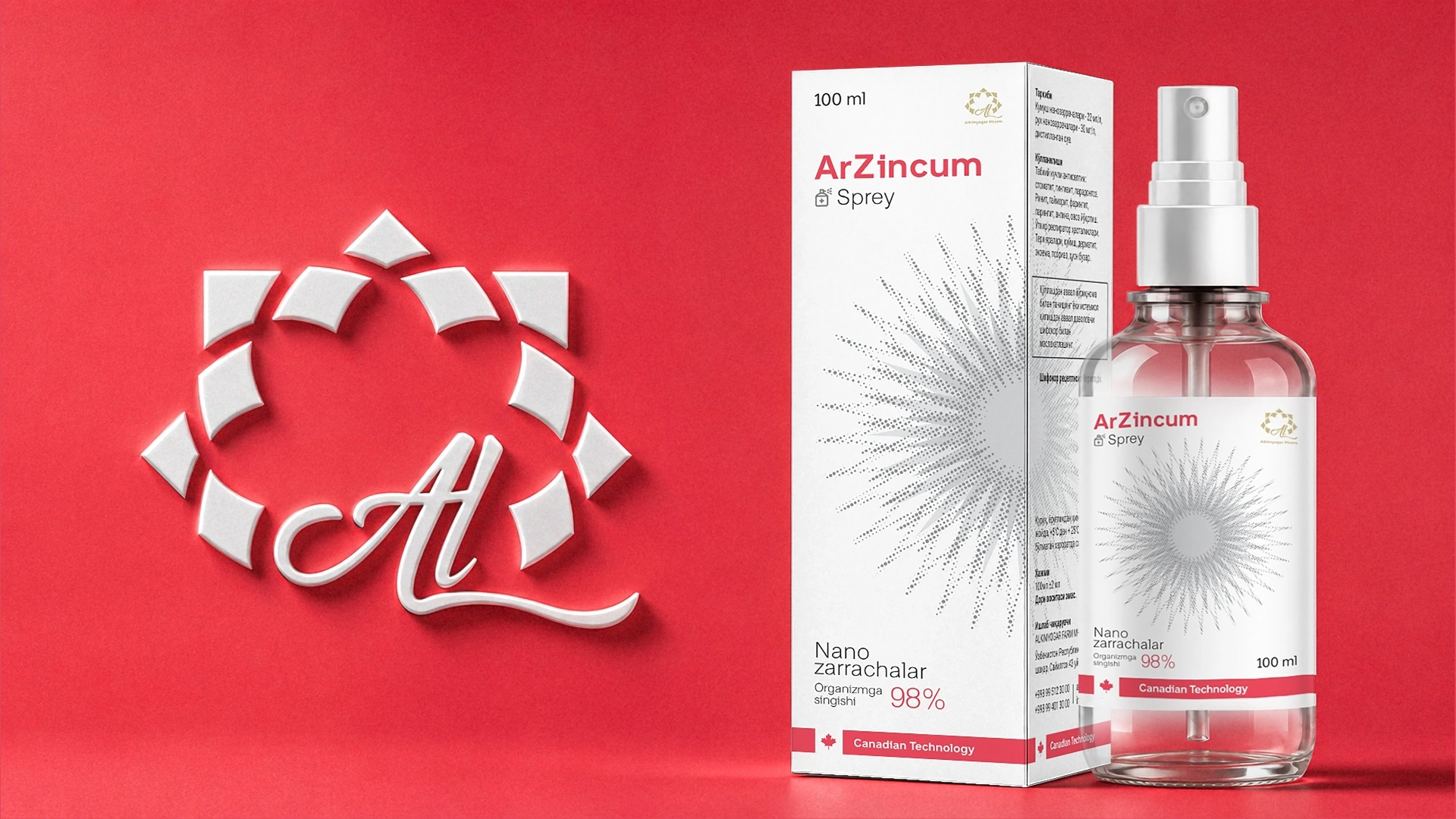
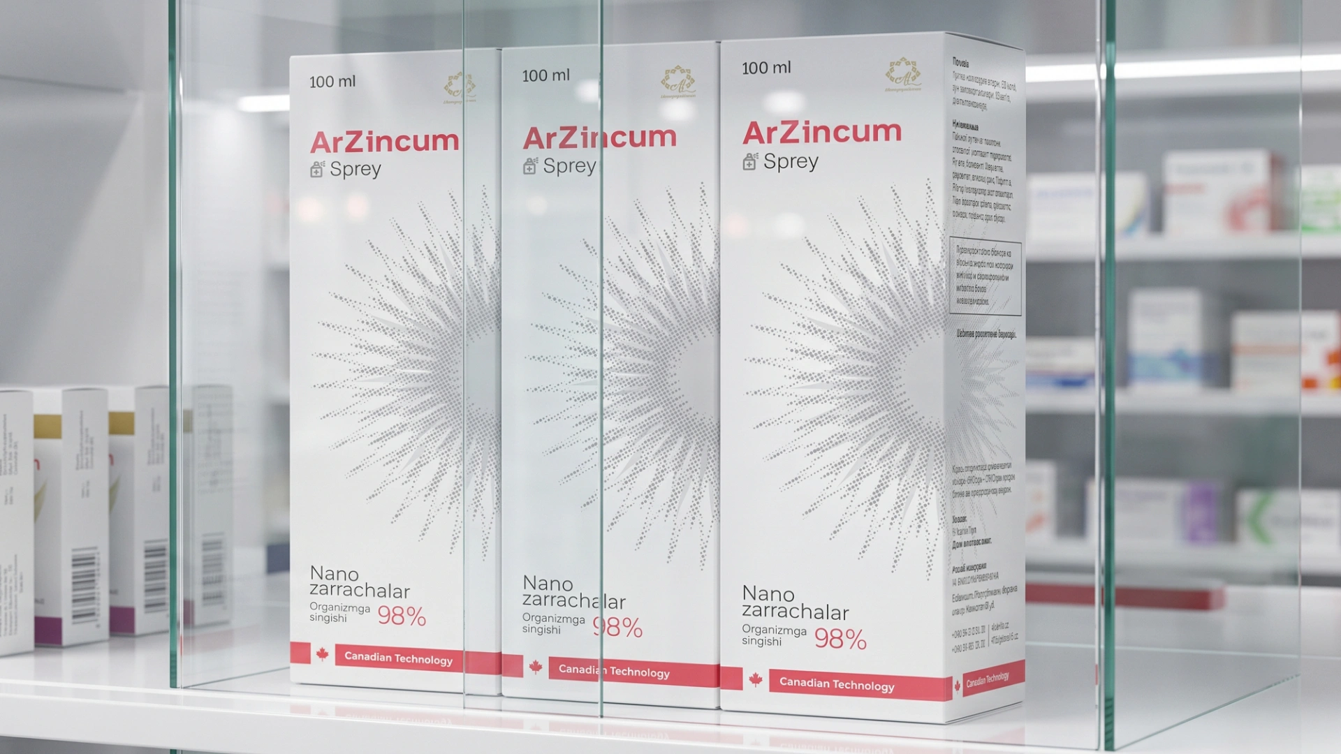
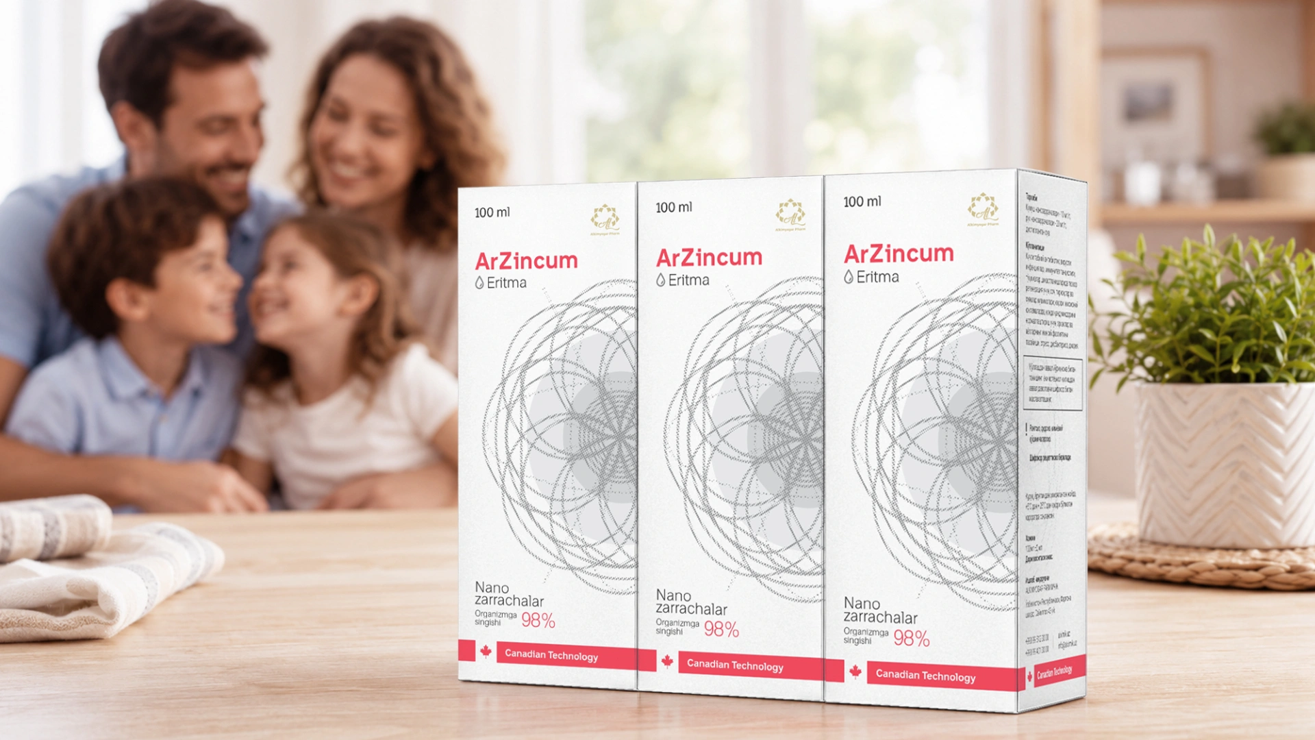
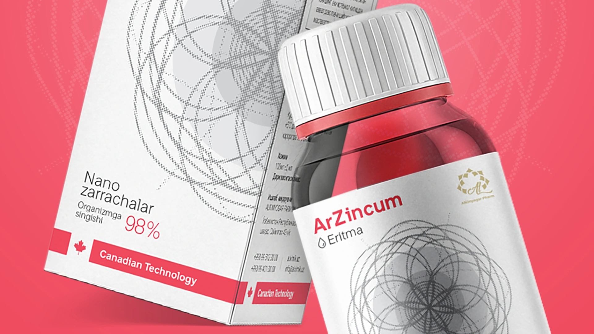
We made a crisp white background the foundation of the packaging. White is the universal code for medicine, sterility, and absolute trust. It immediately grants the product the status of serious medication. For the main elements and texts, we used a strict gray color—a direct nod to the natural shade of zinc itself.
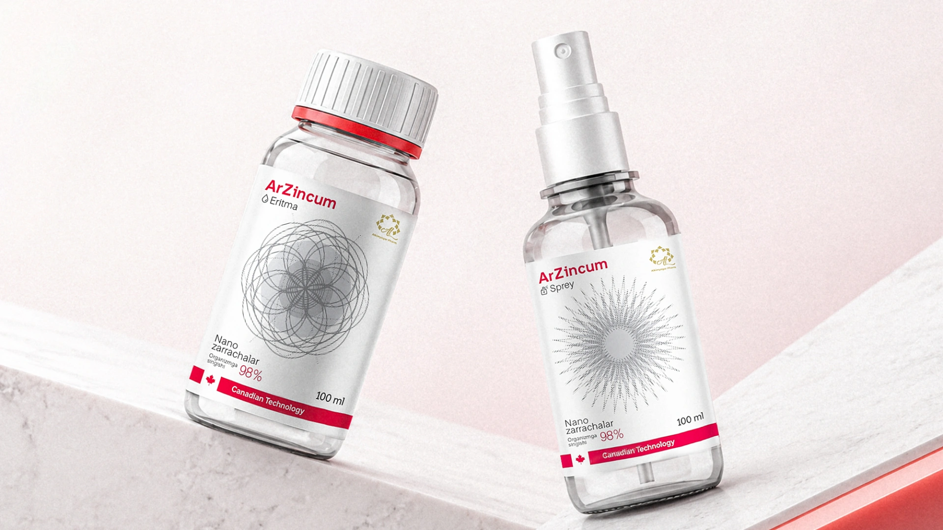
Our main creative hook was the geometric abstraction in the center of the packaging. Through this geometry, we visually explained how both forms of the product work:
- On the spray packaging, radiant lines scatter and burst outward from the center. This is a geometrically abstract metaphor for the spraying and spreading process.
- On the solution packaging, the geometric lines are tightly intertwined, forming a complex web. This is a figurative representation of how the nanoparticles—absorbed at 98%—bond with each other in the body to build healthy cells.
Result
The serious medical approach in the design instantly made its mark: ArZincum won the trust of not only everyday buyers but also doctors and pharmacists. Professionals started confidently recommending it not as a basic supplement, but as a full-fledged therapeutic agent.
From a marketing standpoint, the "clean," premium packaging free from visual noise distinctly set the product apart from competitors on the pharmacy shelf. This sharp positioning directly impacted conversion rates, driving a massive spike in sales volume and securing a steady flow of repeat purchases.