Bio-Inside – Dietary Supplement Packaging Design (BEST Line)
We have developed packaging for numerous pharmaceutical and supplement brands. We know the ins and outs of this industry. However, every new project brings its own unique insights. The Bio-Inside case was no exception.
Usually, when discussing a new project, we look at it through a strictly professional lens: the market, competitors, color palettes... But this time, something magical happened: while the client was describing the product (which didn't even have a design yet), half of our team wanted to buy these supplements for themselves right then and there.
1. The Task & The Problem
When the client approached us, the situation was as follows: they had a product made from high-quality German raw materials with a powerful composition and proven effectiveness. However, its external appearance—the packaging—did not match this quality at all.
The previous design was a classic example of an MVP (Minimum Viable Product), a path many startups take. To get to market quickly, the entrepreneur ordered a "hasty" design from an operational print shop. It was a "quick and cheap" job done by print center technicians.
The Core Issues:
- The "Cheap" Shelf: Inside, there was premium quality and a medical approach; outside, it looked like a budget, amateur product.
- Reputational Risk: Such a design might work as a temporary solution for market entry, but in the long run, it undermines trust in the brand. A customer looks at the packaging and subconsciously doubts the quality of the pills inside.
The Goal: Develop a new packaging design that meets professional, modern marketing standards. The packaging needed to become a salesperson itself.
2. The Research
Before starting, we conducted in-depth interviews with the client. We discovered that we weren't dealing with a typical businessman, but a true enthusiast and a deep expert in his field.
His philosophy differed from the standard "take a pill when you're sick" approach. He promotes a culture of systemic health maintenance and prevention through body restoration. The client literally sketched out a precise "engineering algorithm" for how the products work:
- Cleansing: First, rid the body of toxins (because vitamins simply don't work on a "polluted" system).
- Foundation: Then, strengthen the bones and immunity.
- Absorption: Finally, saturate the body with necessary minerals.
The Insight: If the founder understands and believes in his product so deeply, that confidence must be contagious. We realized our goal was to masterfully translate this expertise onto the packaging.
Another crucial point was naming. In the pharmaceutical industry, terms like Calcium, Zinc, or Fish Oil are INNs (International Nonproprietary Names) and cannot be trademarked. We needed a solution to differentiate from competitors and turn the name into a proprietary brand asset.
3. The Solution
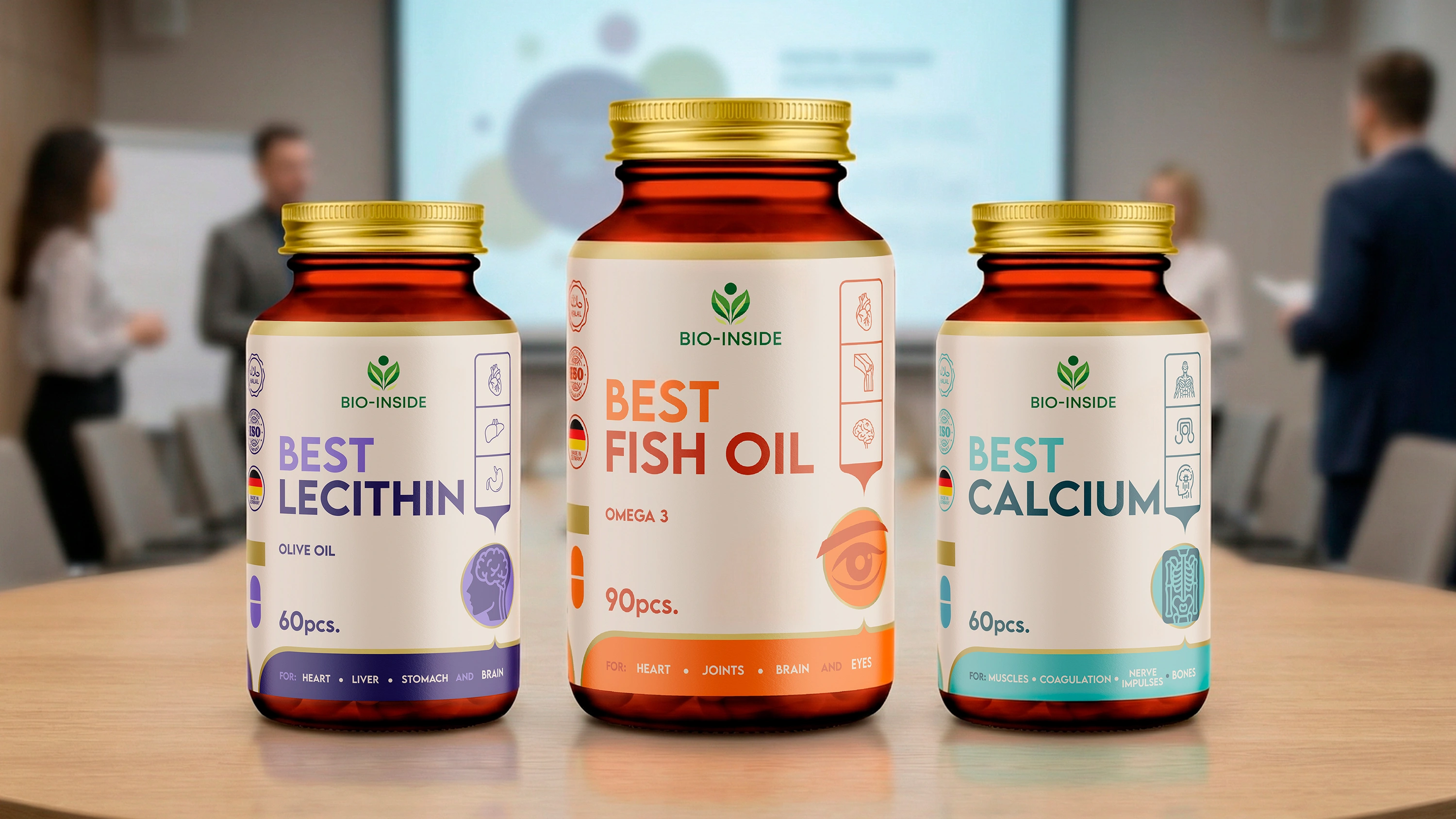
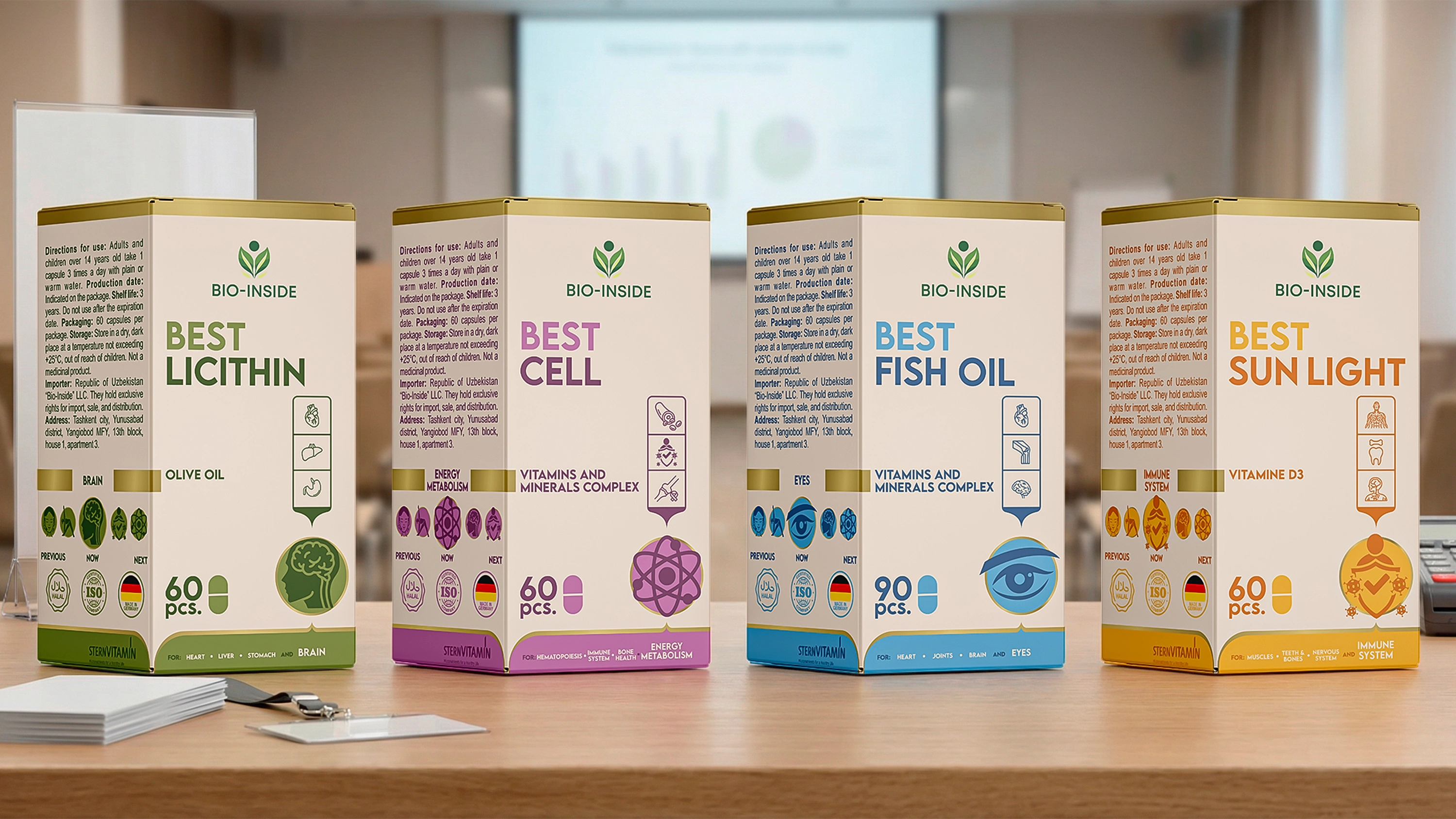
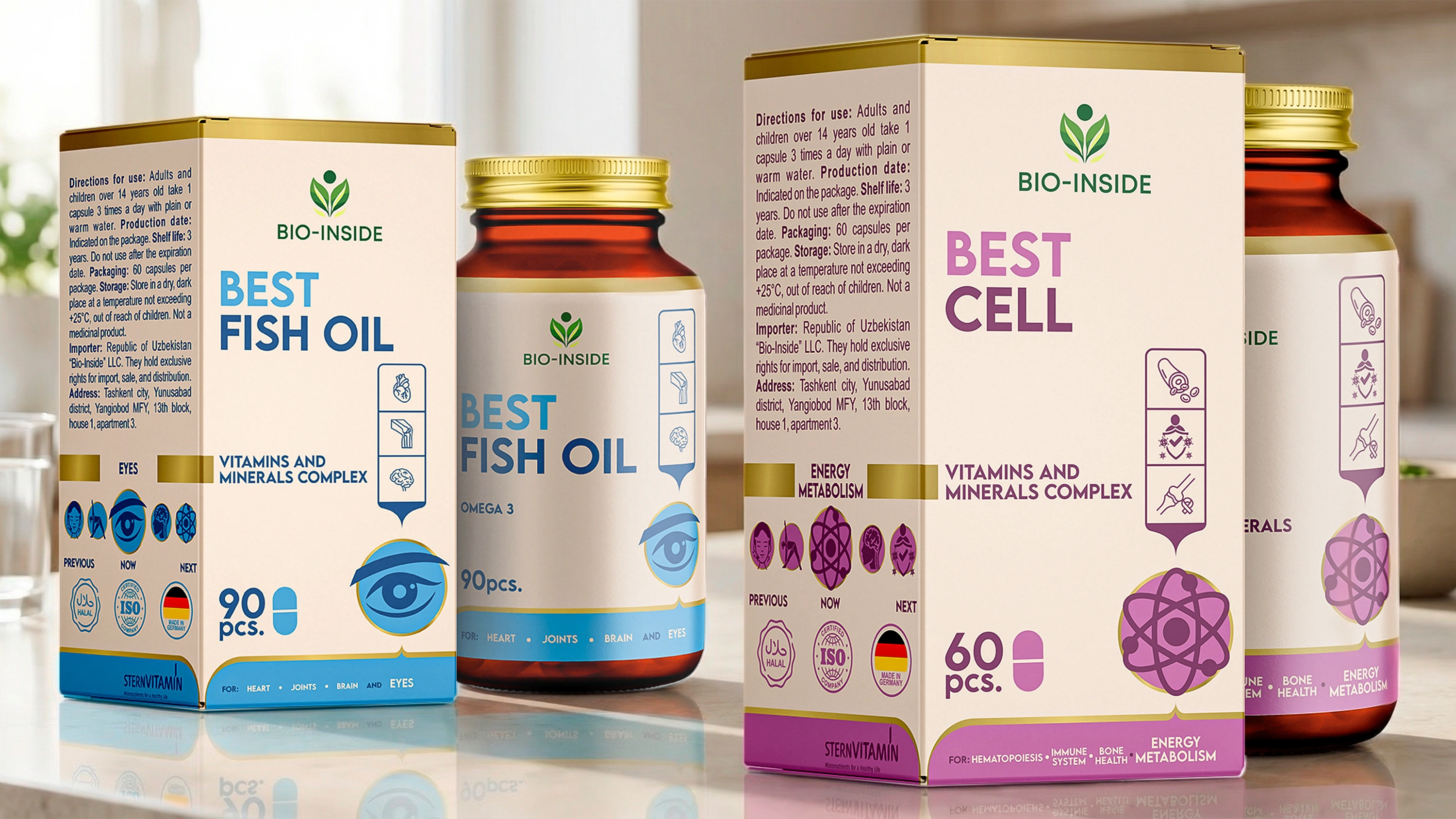
We built the design concept around that very "Golden Algorithm" provided by the client. We divided the product line into 3 main categories, clearly marking them with color-coded badges on the front of the box:
- Stage 1: Cleansing & Detox. Products that prepare the body and hit "reset" (Detox, Sun Light, Fish Oil, Lecithin).
- Stage 2: Recovery & Renewal. Products that build the foundation (Calcium, Collagen).
- Stage 3: Cellular Activity. Final nourishment and targeted care (Cell, Step).
Now, looking at the box, the buyer understands: this isn't just another bottle of vitamins, but part of a serious, step-by-step health plan.
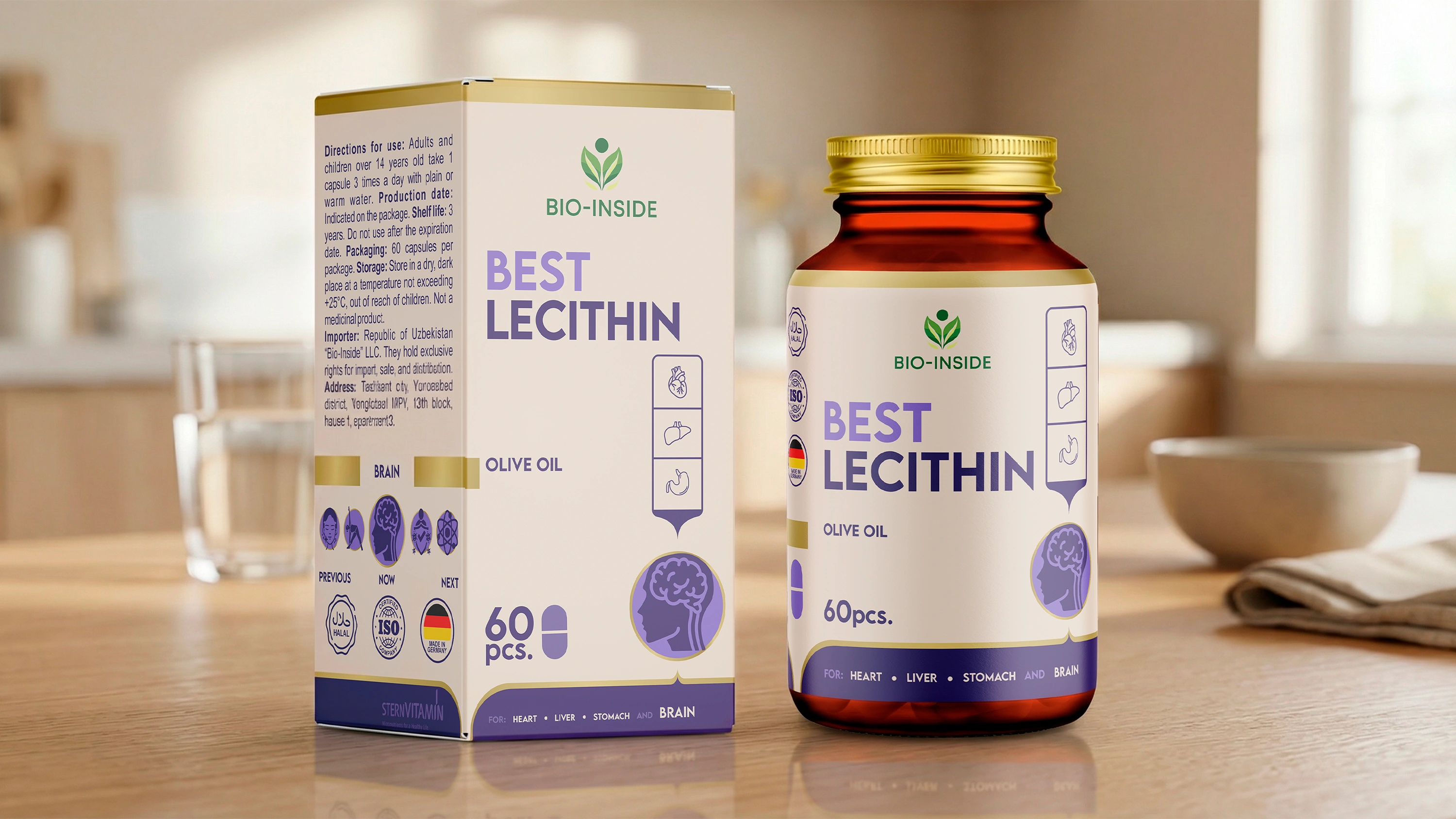
The naming and differentiation challenge was solved simply and effectively: we added the word ‘BEST’ to all product names (Best Calcium, Best Detox...). It sounds ambitious, memorable, and resonates perfectly with the client's goal — to give people the best.
Navigation & Infographics
Packaging must "speak." People in pharmacies don't like reading fine print on the back. So, we made the packaging communicative:
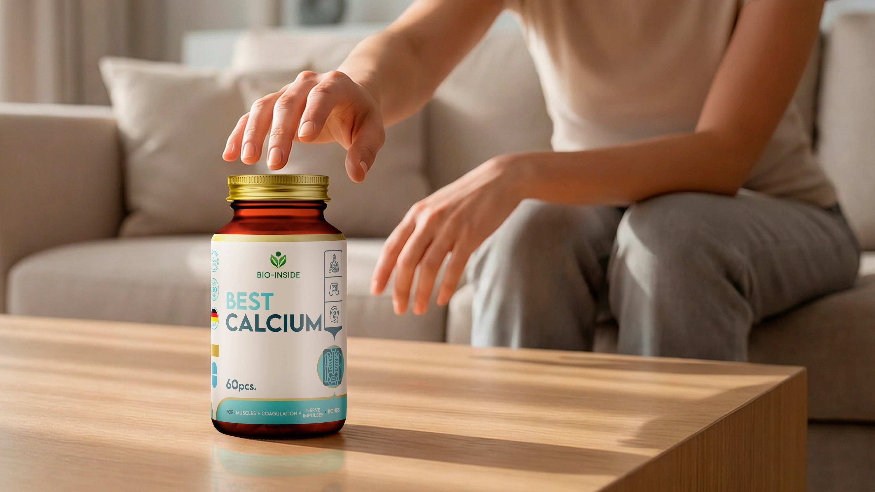
- Key Benefits at a Glance: We dedicated the most visible spot (bottom right) to the key benefits, using clear icons and keywords. For example, on Best Calcium: "For Muscles, Immune System, and Bones." On Best Detox: "For Kidney, Skin, and Liver".
- The "Chain" Effect: On the side panel, we placed a "Previous – Now – Next" scheme. A customer holding the box immediately sees where they are in the overall treatment chain and what they need to take next.
- Technical Quality: To ensure brand colors remain consistent and vibrant across different print shops, we utilized the Pantone color system.


The Result
Now, Bio-Inside products no longer feel out of place on pharmacy shelves. They have shed the "print shop prototype" look. The new design broadcasts a confident message to the buyer: "I am not just a vitamin; I am a crucial element of a perfect 3-step recovery system."
We even developed a special Box Set design for those purchasing the full recovery course. As a result, the client's powerful expert knowledge and product quality are now 100% reflected in its external appearance.