Beun: Updated Packaging Design for Premium Skincare Line
We redesigned Beun’s packaging with a premium aesthetic and unique textures for each line — Anti Age, Smart Akne, Whitening, and Cleaning. The new design improved brand recognition and increased sales.
1. Solution
We have completely redesigned the packaging, emphasizing its premium quality and features.
Each of the four sets has its own unique design:
Each of the four sets has its own unique design:
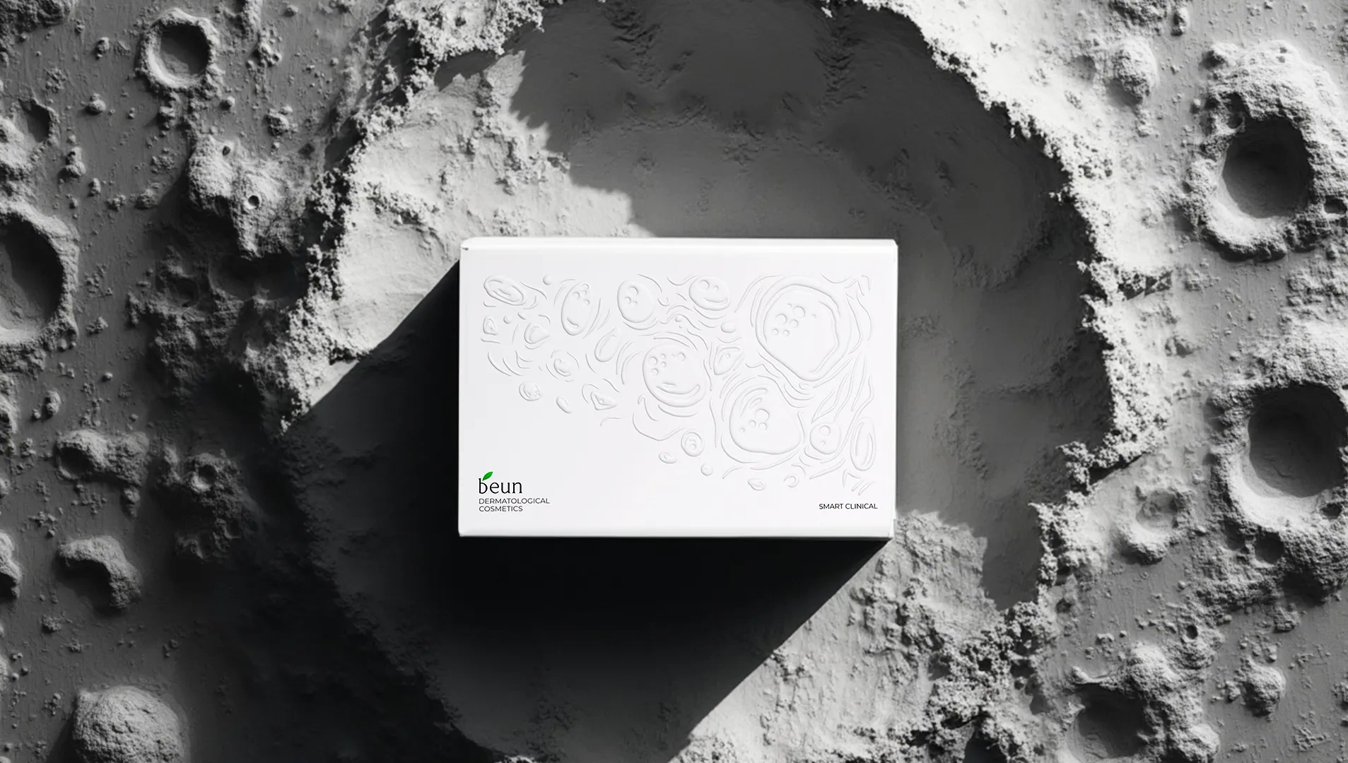
- Smart Akne: the texture reminiscent of lunar craters emphasizes the fight against acne.
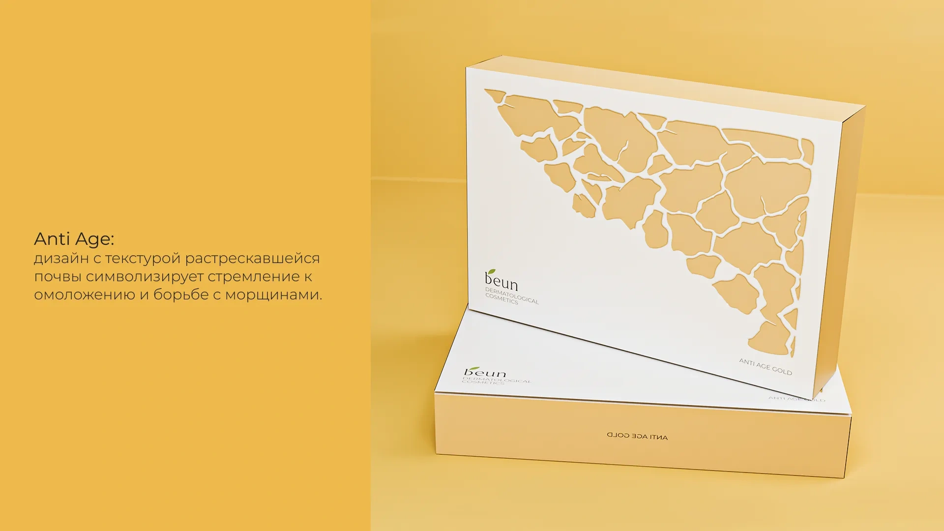
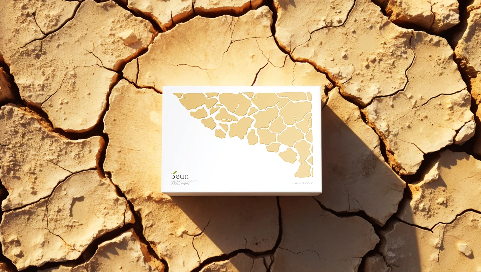
- Anti Age: the design with the texture of cracked soil symbolizes the desire for rejuvenation and the fight against wrinkles.
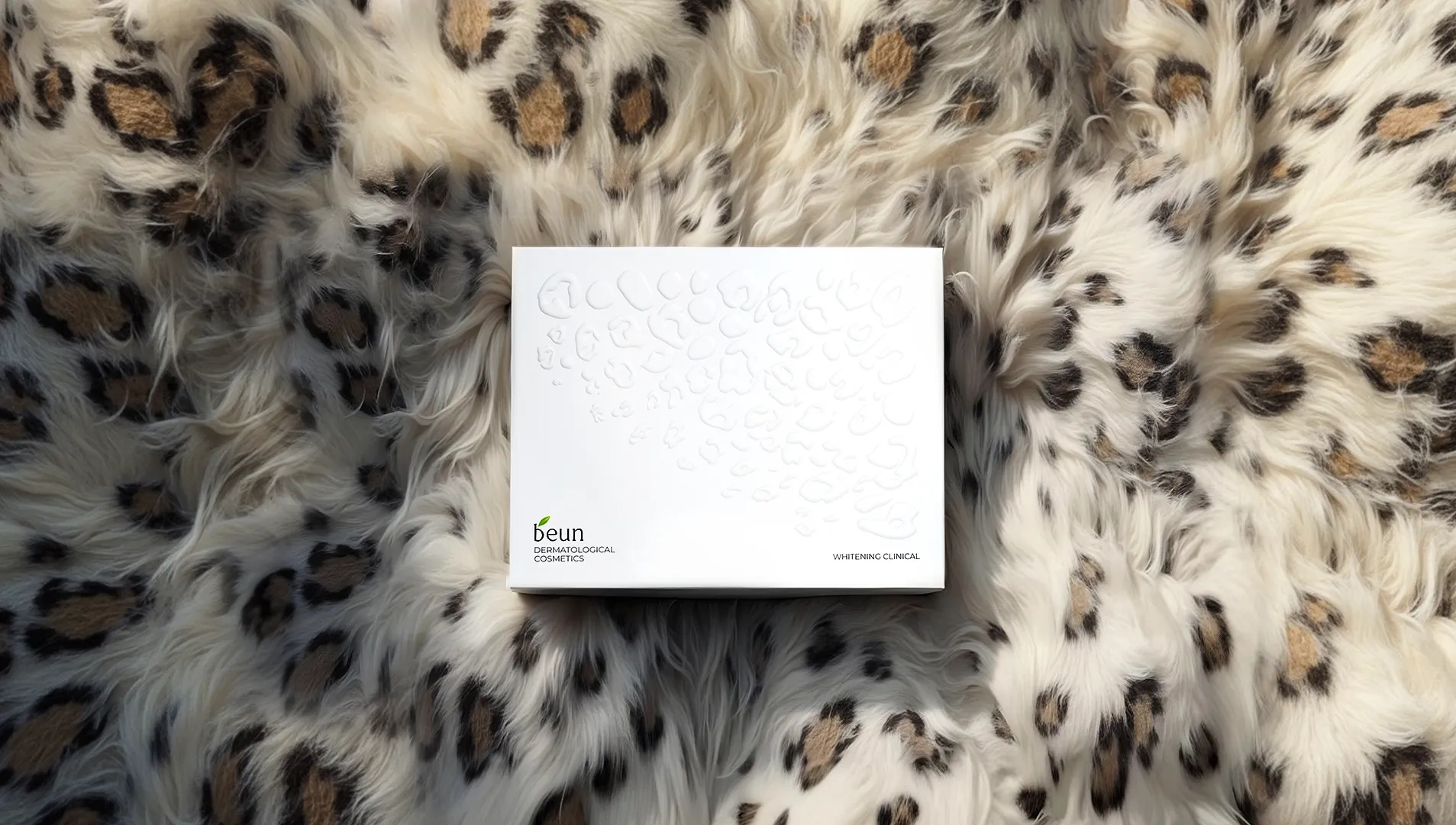
- Whitening: the snow-white texture, similar to the skin of a white leopard, emphasizes the whitening effect.
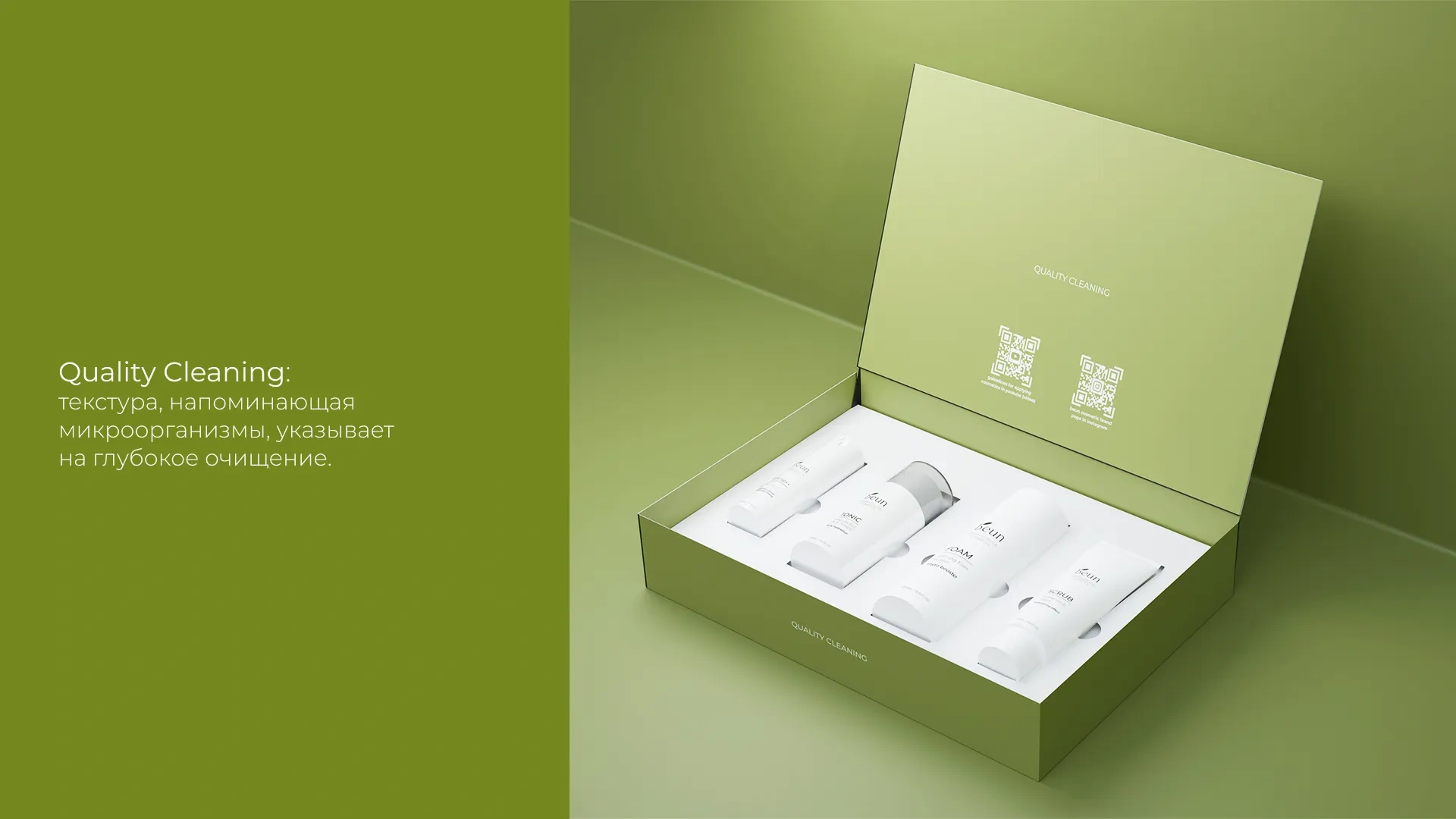
- Quality Cleaning: the texture reminiscent of microorganisms indicates deep cleansing.

Result
Where the beun name appears, the texture gradually disappears, as if it is being “cleaned” and “restored” – both metaphorically and visually. This symbolizes the brand’s concern for purity and naturalness, as well as for restoring the natural beauty of the skin.
The new Beun packaging design has become more attractive and recognizable to the target audience. The packaging is now clearly associated with cosmetics, which has contributed to sales growth and strengthening the brand’s position in the market.