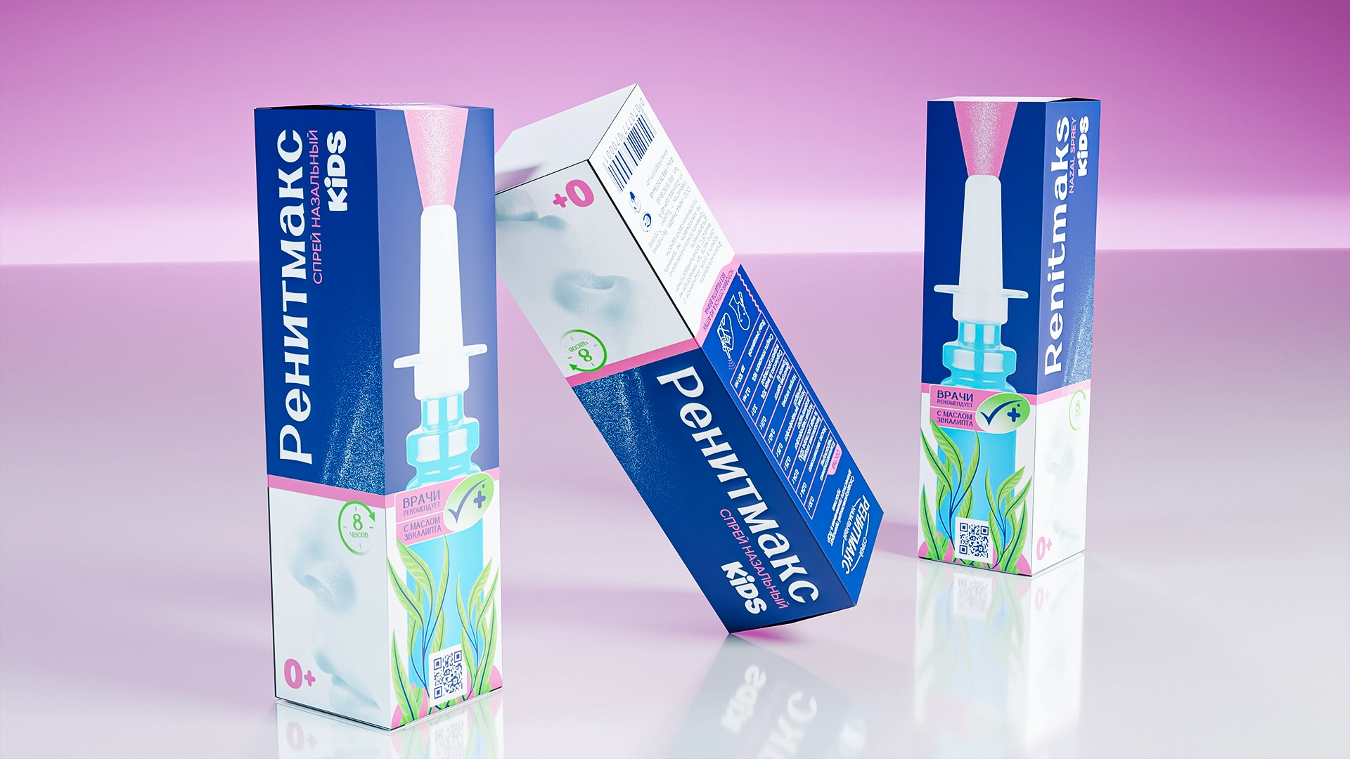
RenitMaks — Nasal Spray Packaging Design
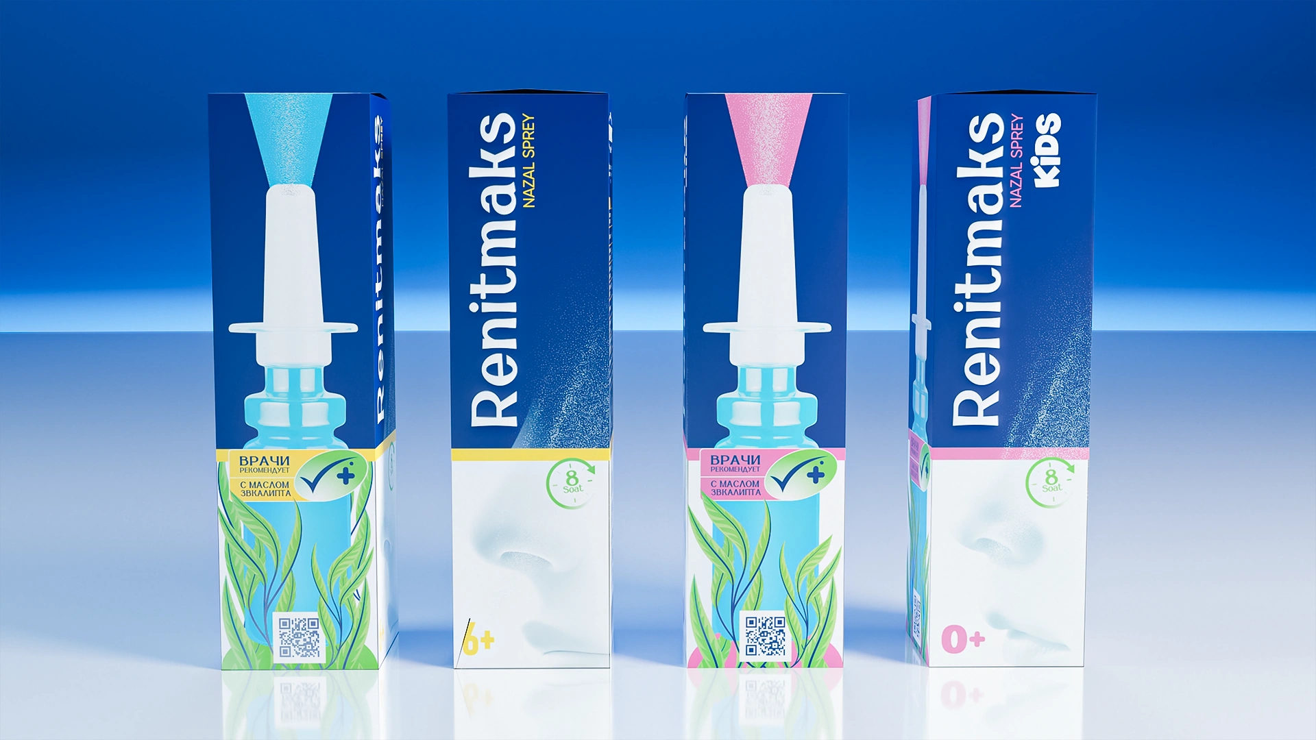
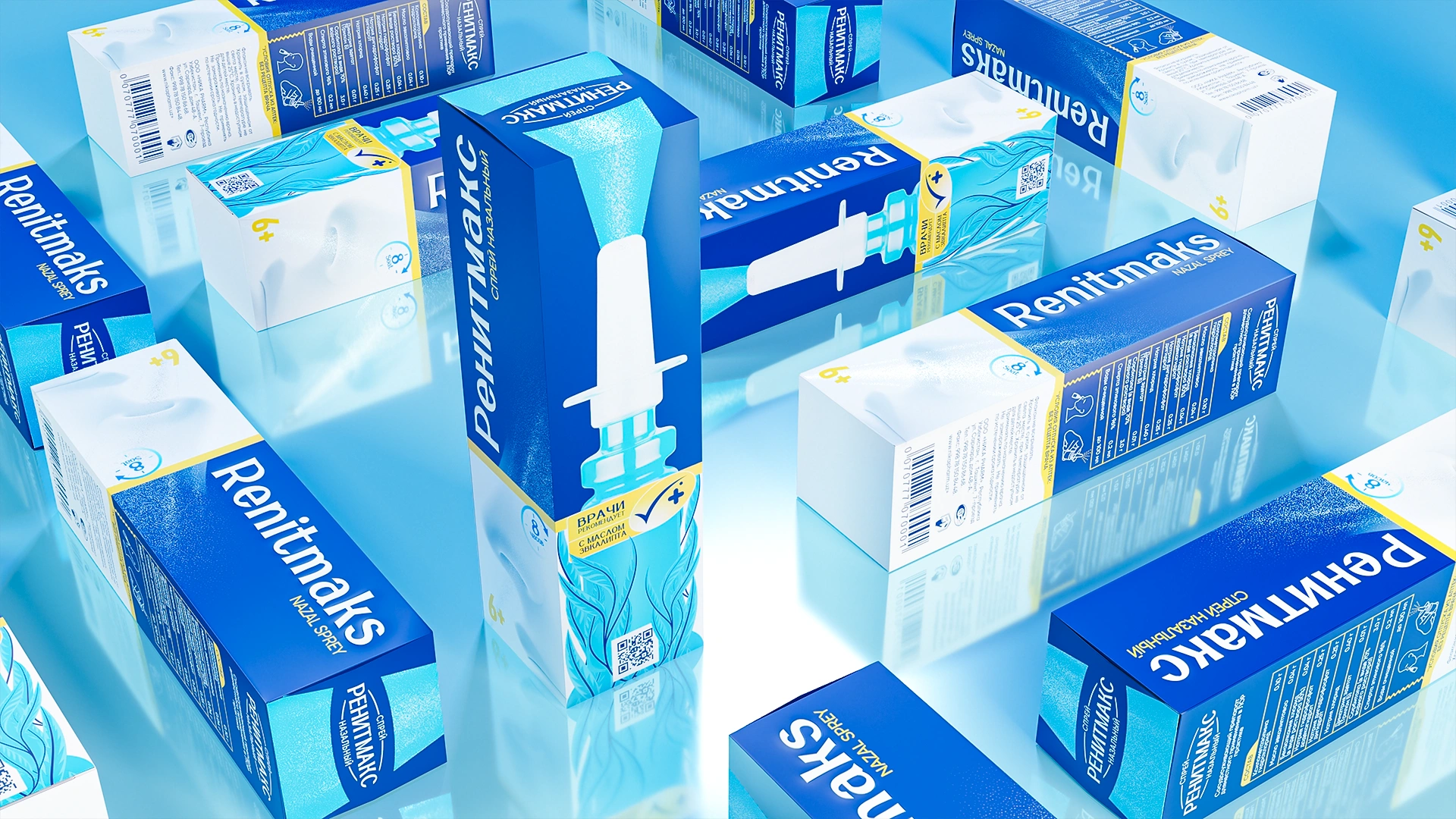
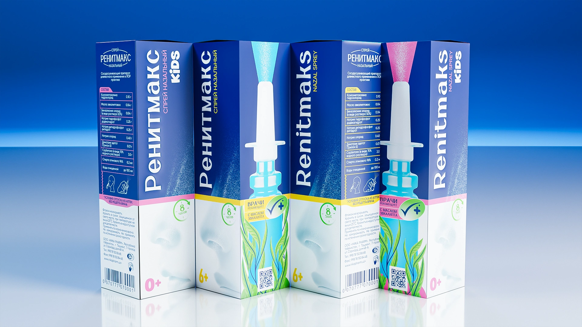
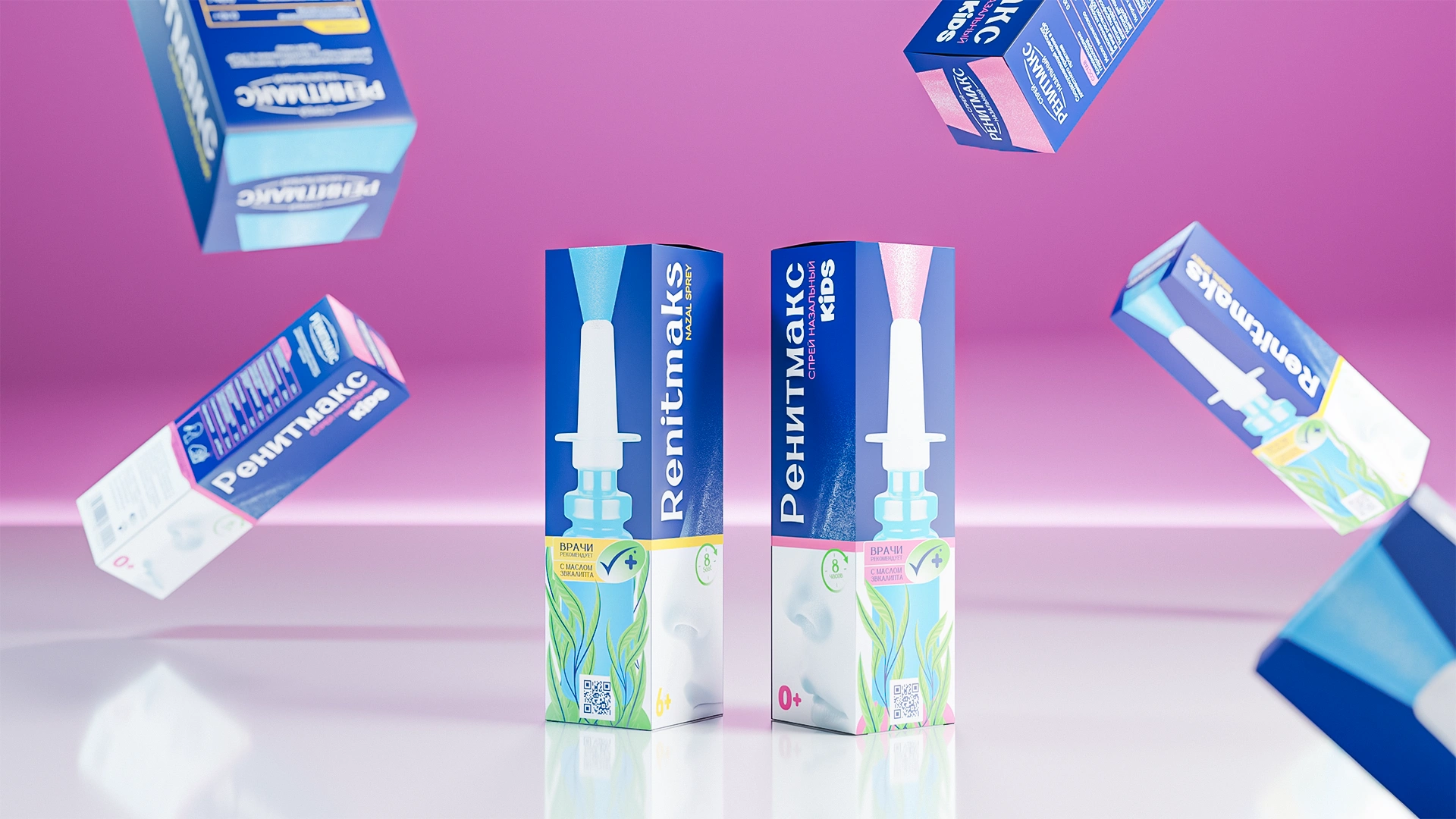
Packaging design was developed for the RenitMaks nasal spray. Saturated medical blue color, eucalyptus leaves (natural action), and vertical typography create a modern, professional style and a clear visual architecture for the pharmacy shelf.
1. Task
After several competitors exited the nasal spray market, a gap appeared in the pharmacy category. The client approached MINIM to develop a packaging design for the new brand RenitMaks, aimed at partially filling this vacant niche. The main goal was to create a product trusted by both doctors and consumers — one that looks modern, clear, and professional.

2. Research
The nasal spray market already had a well-defined visual language: clean, neat, and restrained — typical of medical design.
However, after several well-known brands disappeared, consumers began searching for alternatives that conveyed the same sense of trust and efficacy.
By analyzing pharmacy shelves, we noticed that while many packages looked similar, those that stood out relied not on bright colors or decoration but on system and structure — clear navigation, readability, and a logical hierarchy that helps people orient themselves quickly among the options.
Therefore, the challenge was not to create “just another attractive package”, but to build a coherent visual architecture for the entire line — one that would make the brand intuitive, consistent, and credible.
3. Solution
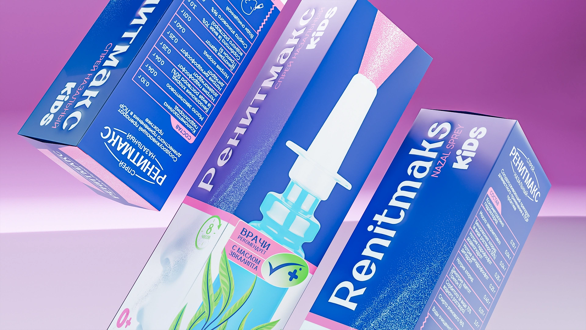
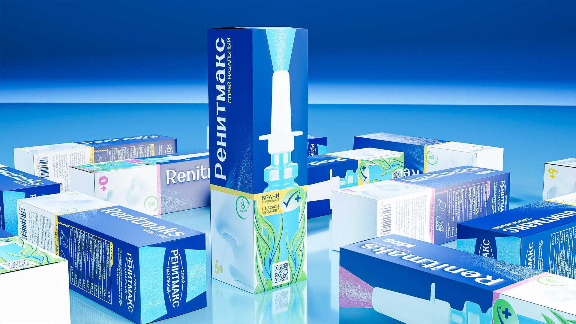
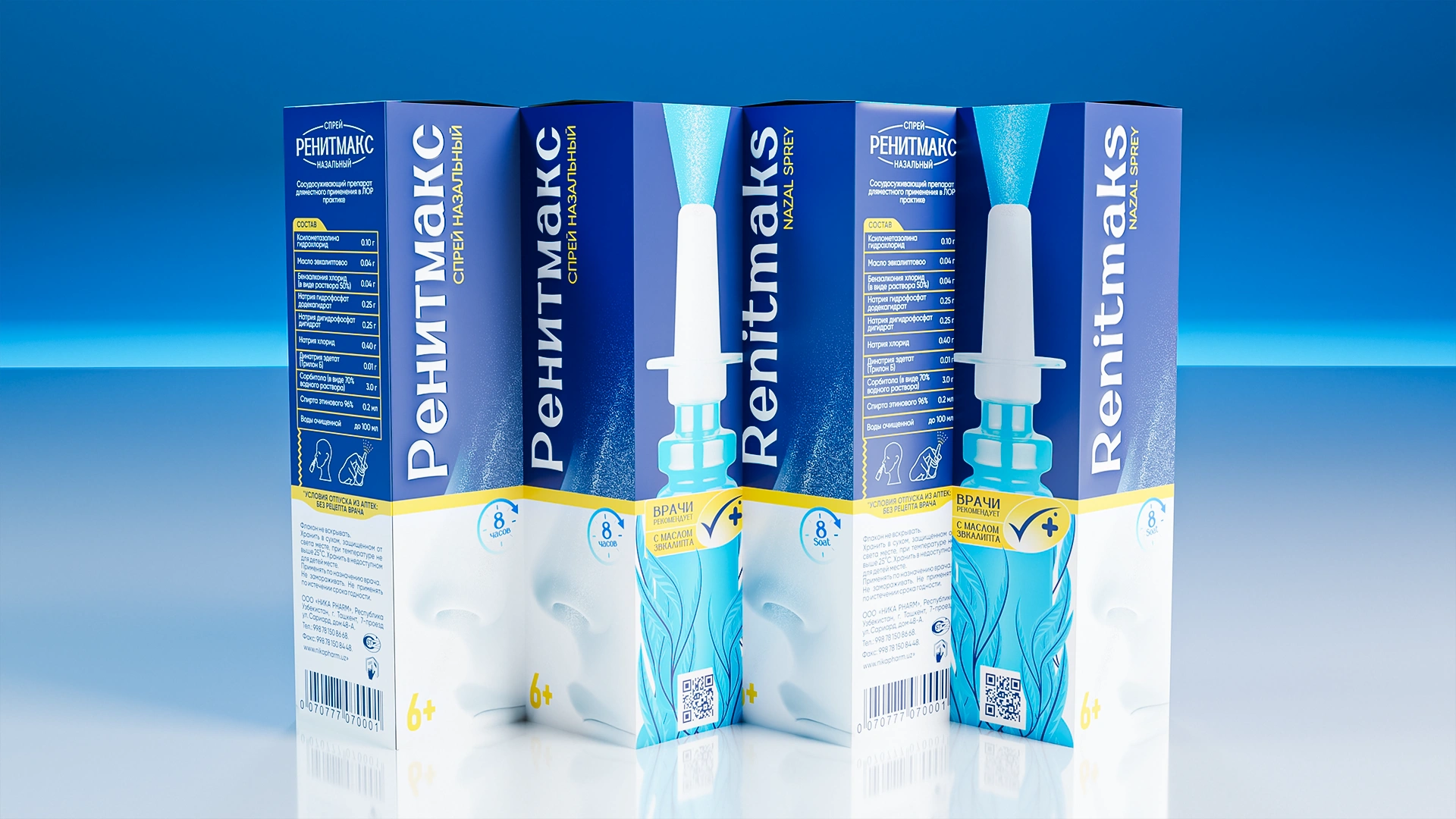
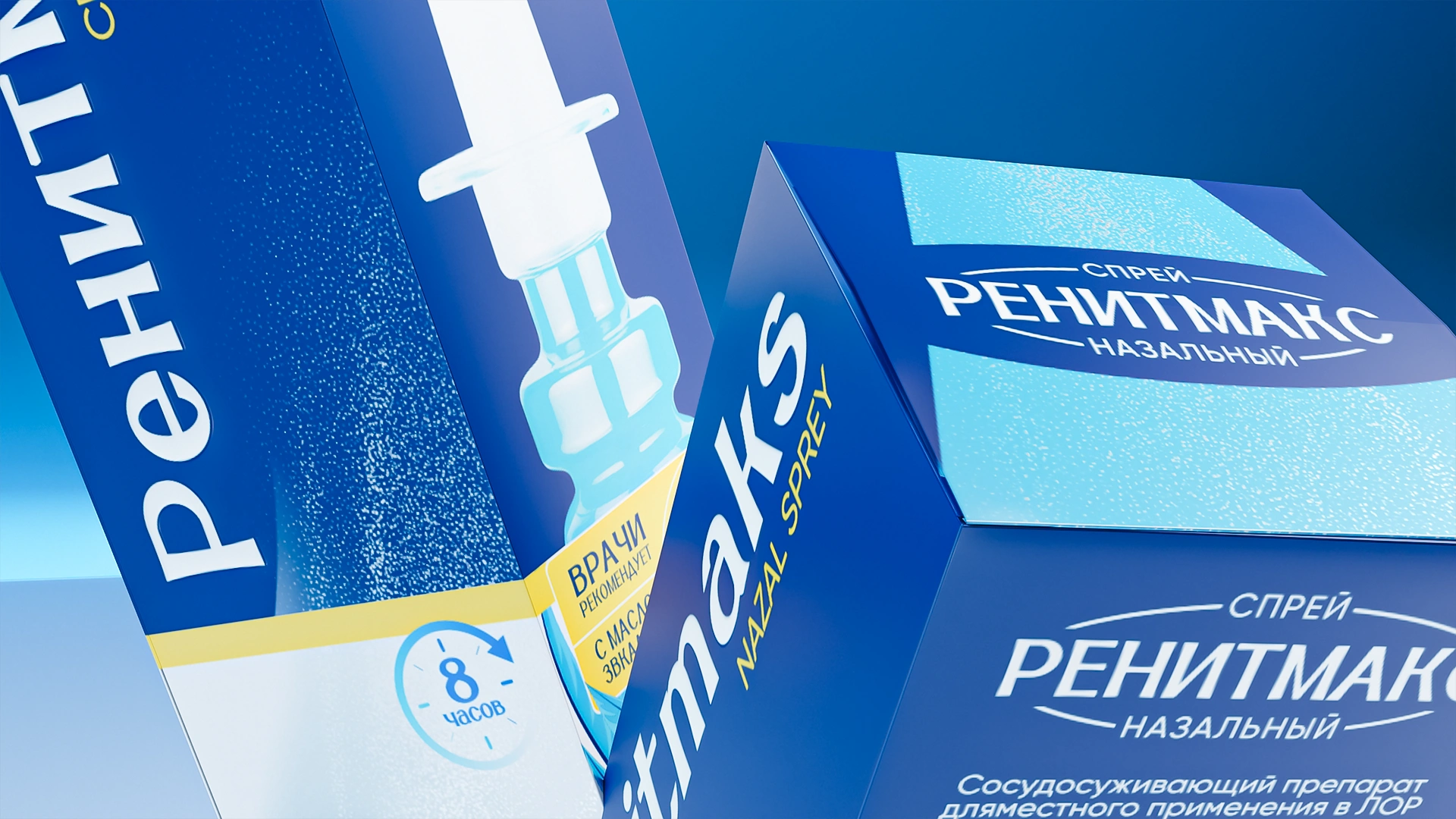
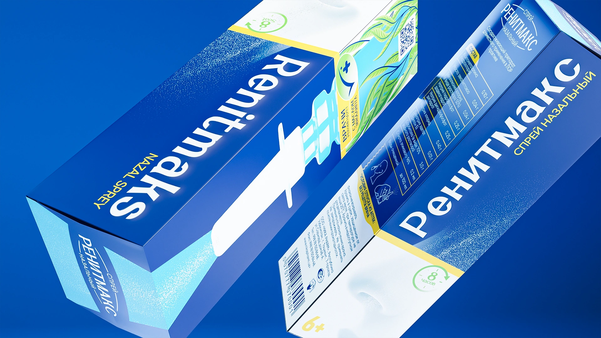
The new RenitMaks packaging became a benchmark of cleanliness, order, and contemporary medical aesthetics. It combines visual lightness, trust, and simplicity of choice.
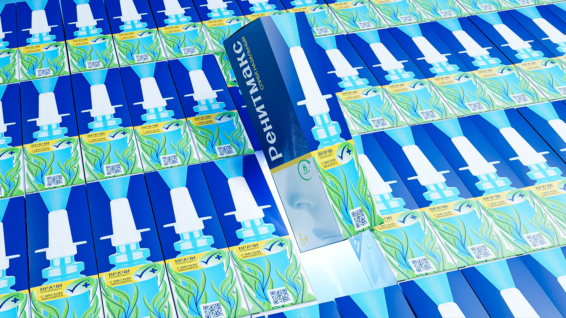
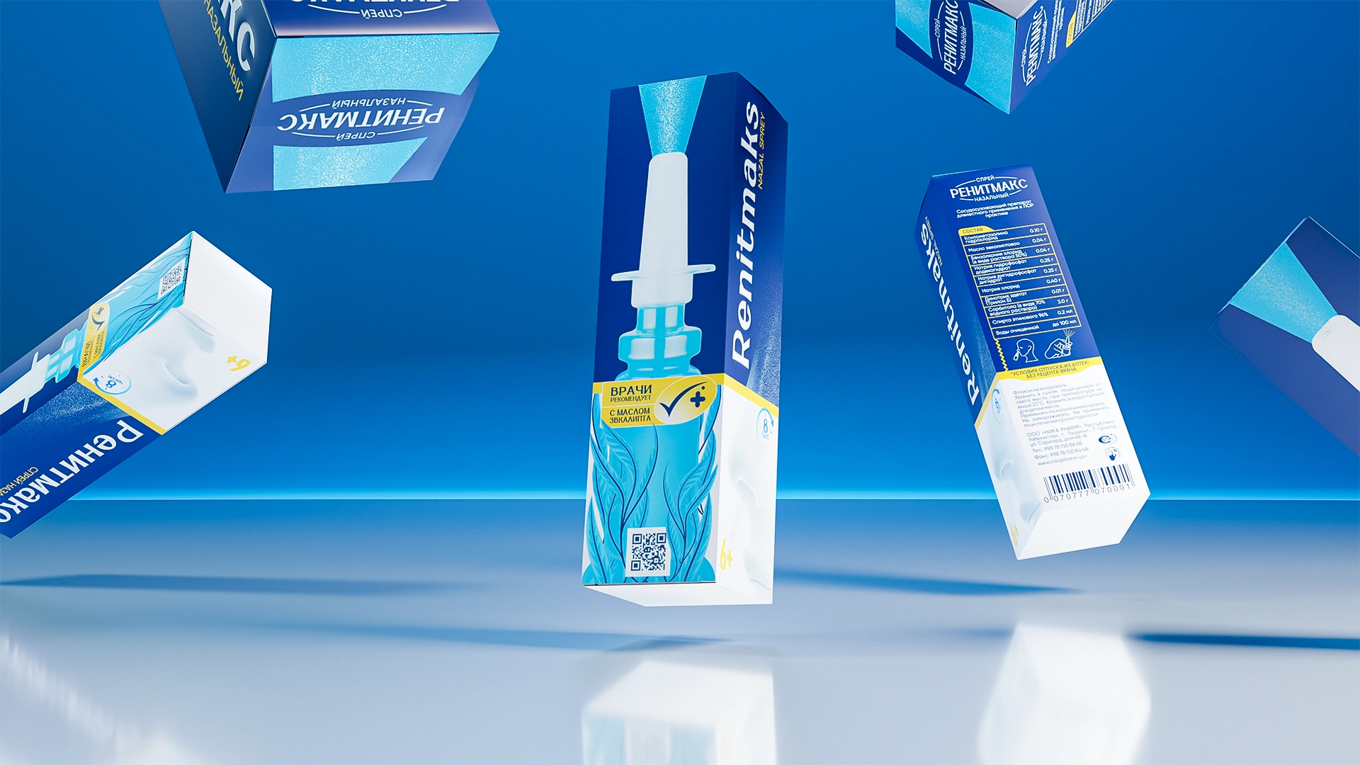
- The primary color — a deep medical blue — evokes air, breathing, and freshness.
- The RenitMaks Kids line introduces soft pink and blue accents to emphasize care, safety, and a friendly tone.
- At the center of the composition is a spray bottle surrounded by eucalyptus leaves, creating an image of gentle, natural action and a sense of ease in breathing.
- Vertical typography reinforces the professional character of the brand and ensures legibility on the pharmacy shelf.
- All design elements follow the principle of “Less, but clear” — minimal visual noise, maximum meaning and clarity.
Result
RenitMaks quickly occupied the open market niche and became an example of how pharmaceutical design can be both professional and human.
Its clear structure simplified the work of pharmacists and made the customer’s choice effortless.
The brand gained strong recognition and trust within pharmacy networks, establishing itself as a modern, reliable, and transparent product.