Onur — Naming and Packaging for Meat Semi-Finished Products
Onur – Naming and Packaging Design for Meat Semi-Finished Products
1. Task
The client approached us with the request to launch a competitive brand of meat semi-finished products (chicken and beef cutlets) on the Uzbek market — a brand that would immediately win consumer trust. In this segment, trust determines the choice, while price plays only a secondary role. The key requirement was to create a name and packaging that would reflect honesty, naturalness, and strict compliance with Islamic norms.
2. Research
We analyzed the category and identified three key insights:
- According to Euromonitor (2021), 72% of consumers in Central Asia are willing to pay more if they are confident in the halal quality of the product.
- The label “Based on Shariah norms” is not a decorative element but the main purchase trigger. Halal Market Report (2022) shows that products with clear value labeling demonstrate 35% higher repeat purchase rates.
- Visual noise among competitors: most players rely on bright, overloaded design solutions but rarely build a systematic brand.
These findings showed that the niche requires a brand that conveys honesty and modernity without overloading the packaging.
3. Solution
Naming
We proposed the name Onur. In Turkish, this word means “value, honor, dignity.” Harvard Business Review (2020) notes that brands whose names reflect cultural and value codes achieve 23% higher trust levels.
For the Uzbek market, this name became a perfect fit: it conveys associations with honesty, respect, and adherence to traditional principles.
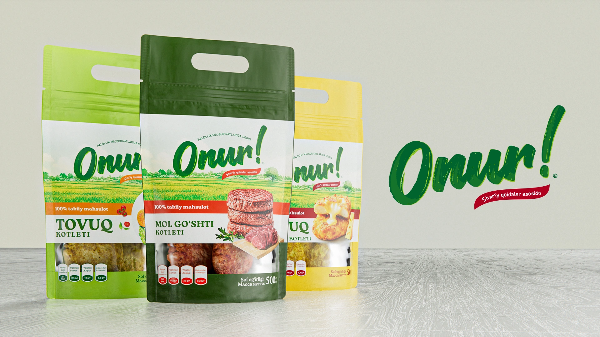
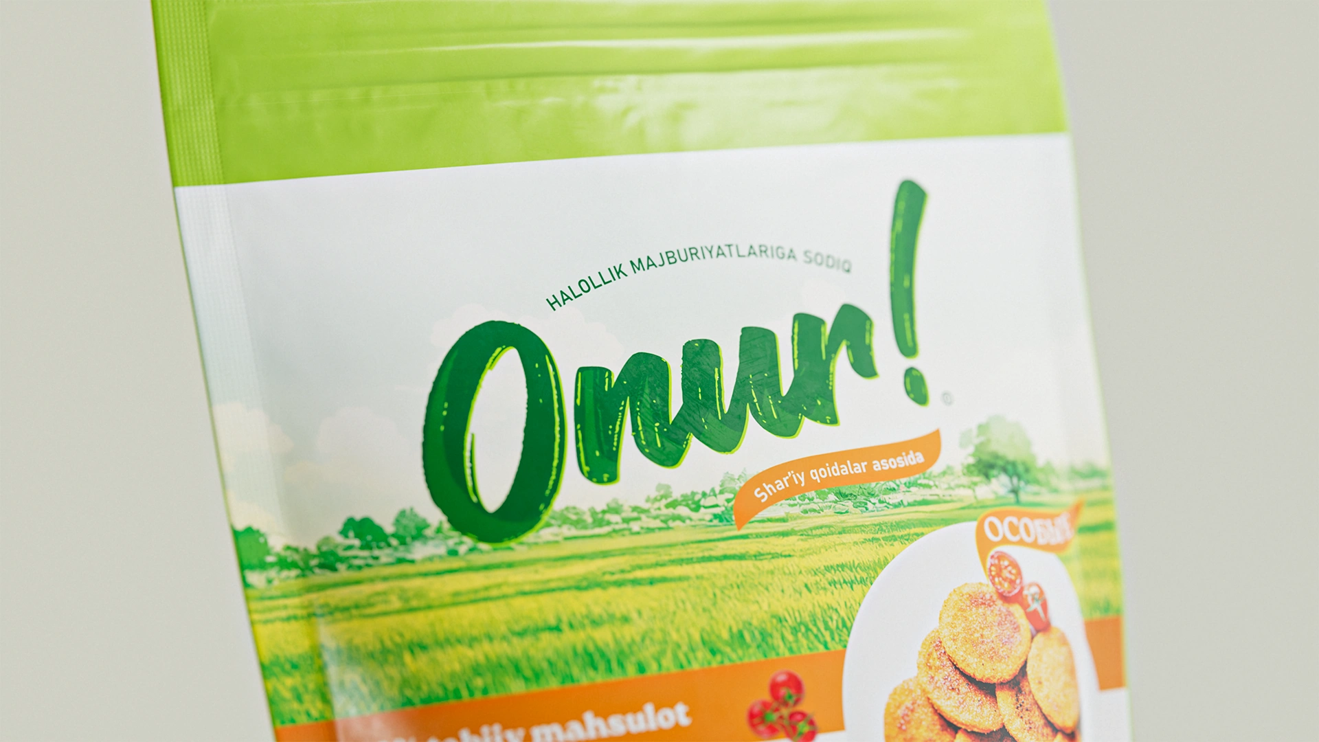
Logo
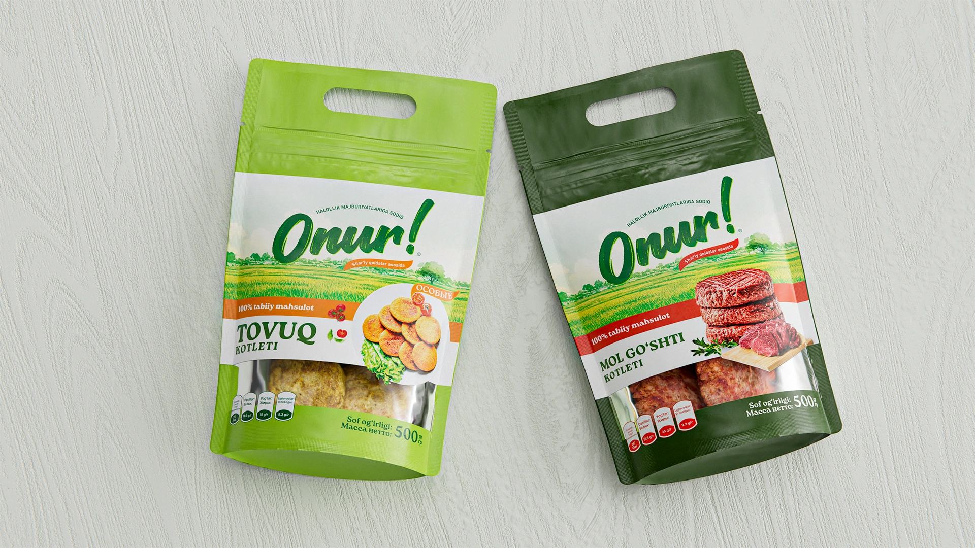
The logo was created in a handwritten style to emphasize naturalness and the brand’s authentic energy. The green color reinforces associations with freshness and natural origin. An additional ribbon with the inscription “Based on Shariah norms” enhances trust and makes the product stand out on the shelf.
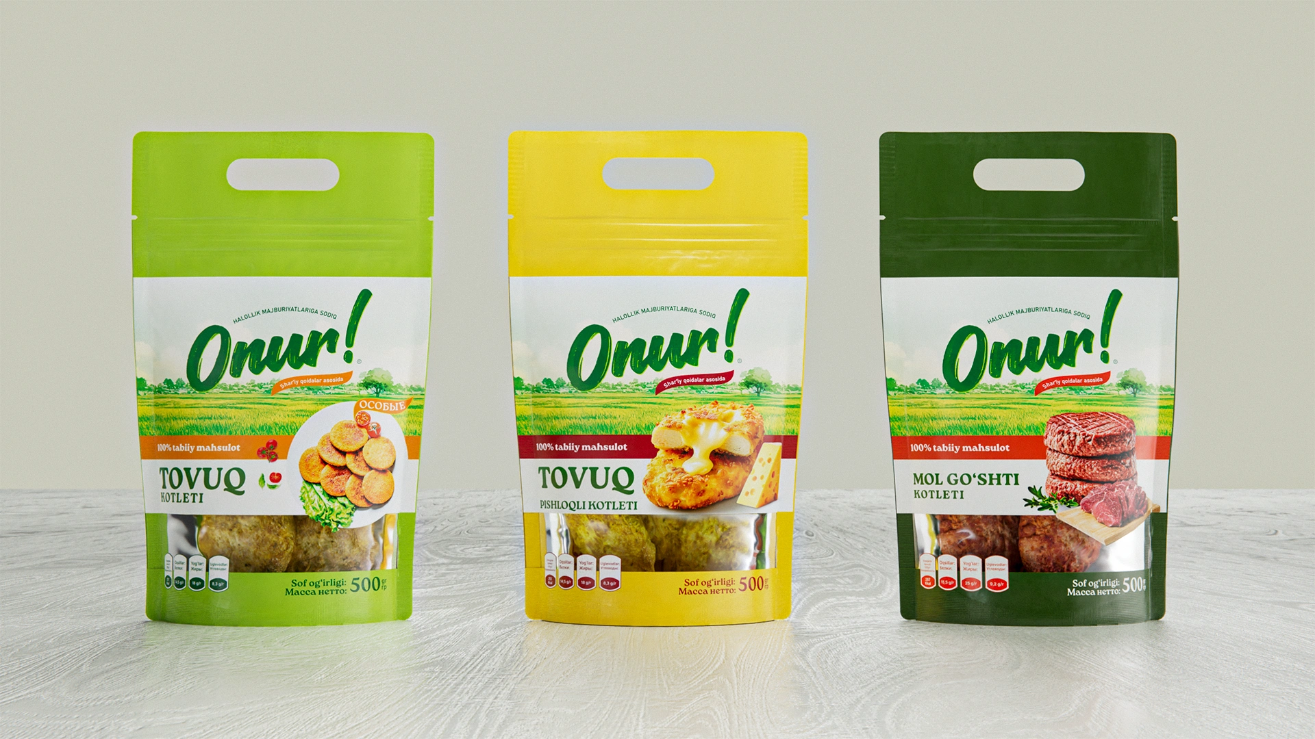
Packaging Design
We built a system that addresses three business objectives:
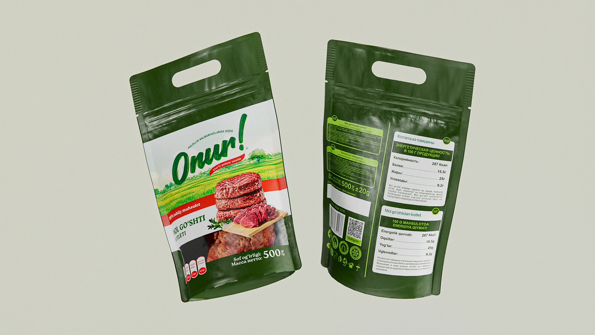
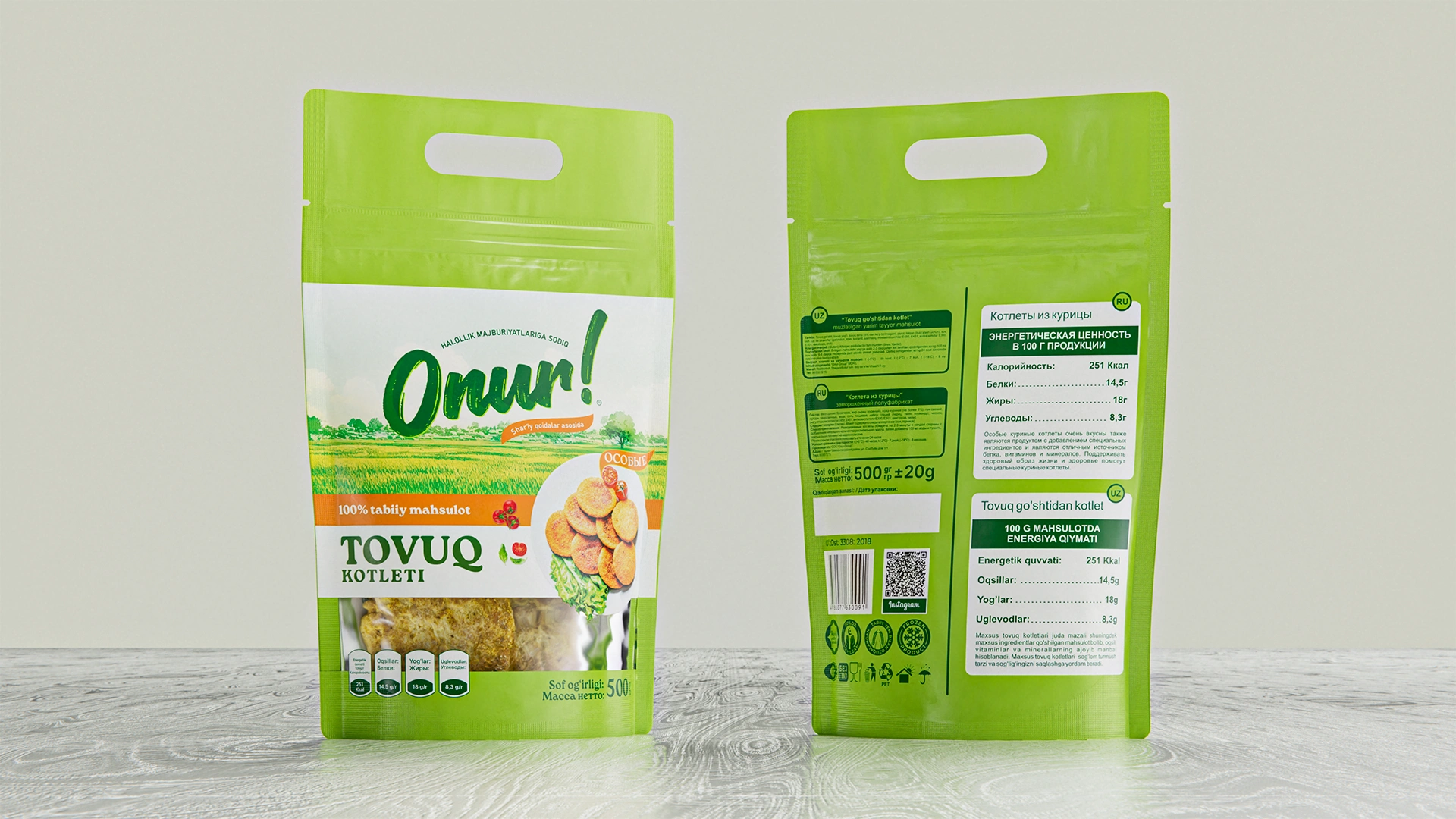
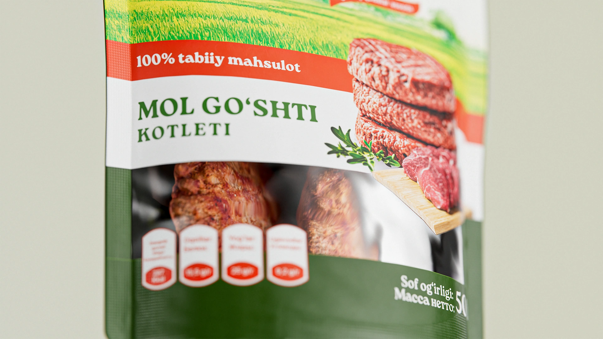
- Transparency. A clean composition and a real view of the product through the packaging further emphasize the brand’s honesty.
- Focus on halal. Icons and inscriptions strengthen the value perception of the brand.
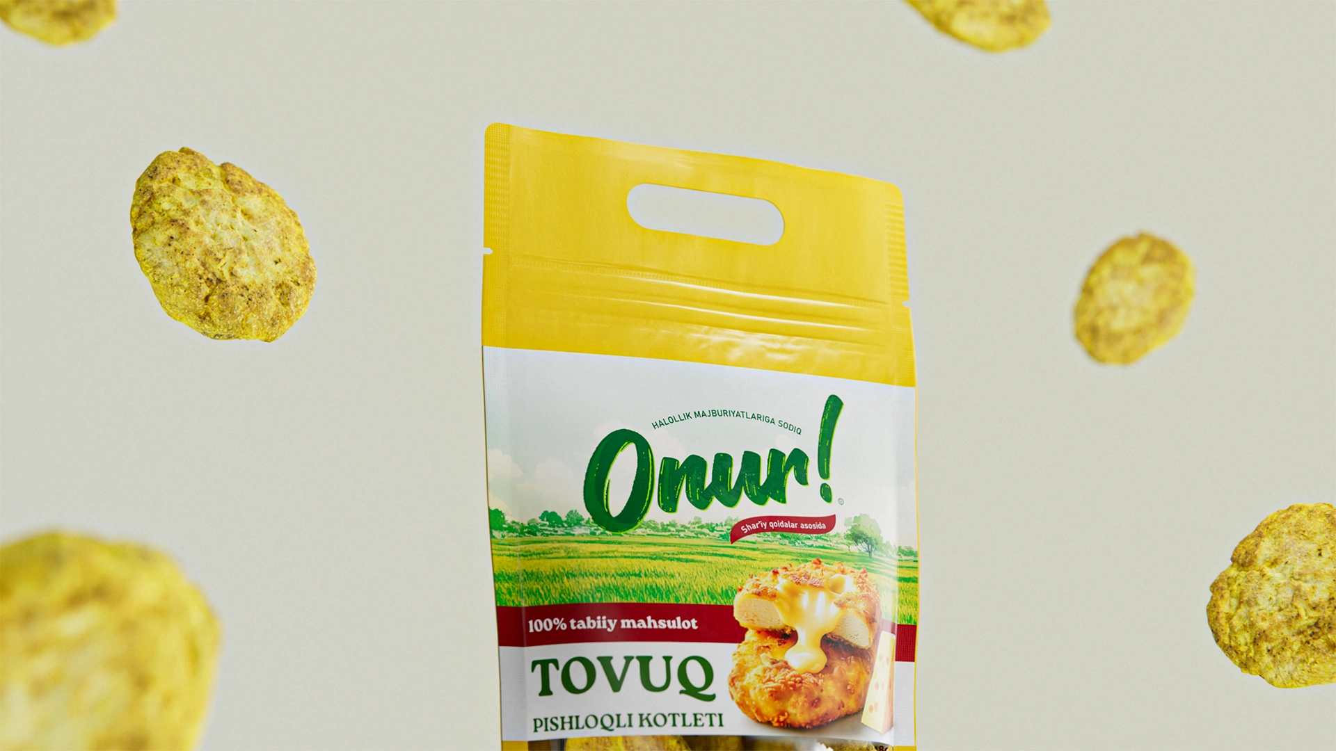
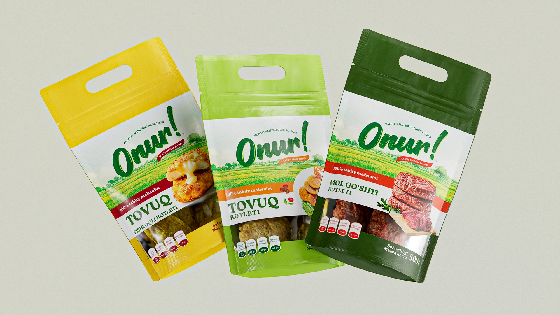
- Unified assortment. All products are combined into one system but are easily distinguished by colors: green (chicken), yellow (chicken with cheese), dark green (beef).
Result
The Onur brand received a strong name, logo, and packaging design that emphasize trust and compliance with traditional norms. With its new design, the brand confidently entered the market and has already won its first customers.
We are proud that the number of brands built on values and respect for the consumer is growing — and especially proud that we contributed to this process.