Aleey – Branding for Laundry Detergent
Turnkey branding for Aleey laundry detergent: naming, packaging, and mascots focused on the emotional power of scents.
1. Task
We were tasked with creating a new laundry detergent brand from scratch ("turnkey"): developing the name, logo, packaging, and website. The client's main requirement was for the product to immediately stand out on the shelf, form an emotional connection with the customer, and broadcast the brand's key values.
2. Research
We started by analyzing the product. It turned out that its advantage lies in its scents — rose and lavender. For the household chemicals category, this is a critically important factor.
Research showed:
- 72% of buyers consider the smell of the powder or conditioner decisive when choosing (Nielsen);
- lavender and rose scents are in the top 5 most demanded in the "home care" segment;
- more than half of buyers focus not only on efficiency but also on the "feeling after washing" — directly linked to the scent.
When studying competitors, we noticed that most brands focus on functionality — "removes stains", "preserves whiteness". But in doing so, they lose an important emotional aspect — the mood and sensations created by the scent.
Conclusion: the product has a solid position — to build the brand identity around fragrances.
3. Solution
Naming
The name Aleey traces back to the Uzbek word "Oliy", which means "high, sublime". It reflects the brand's striving for perfection and symbolizes the ideal quality of the product, emphasizing its noble and inspiring positioning.
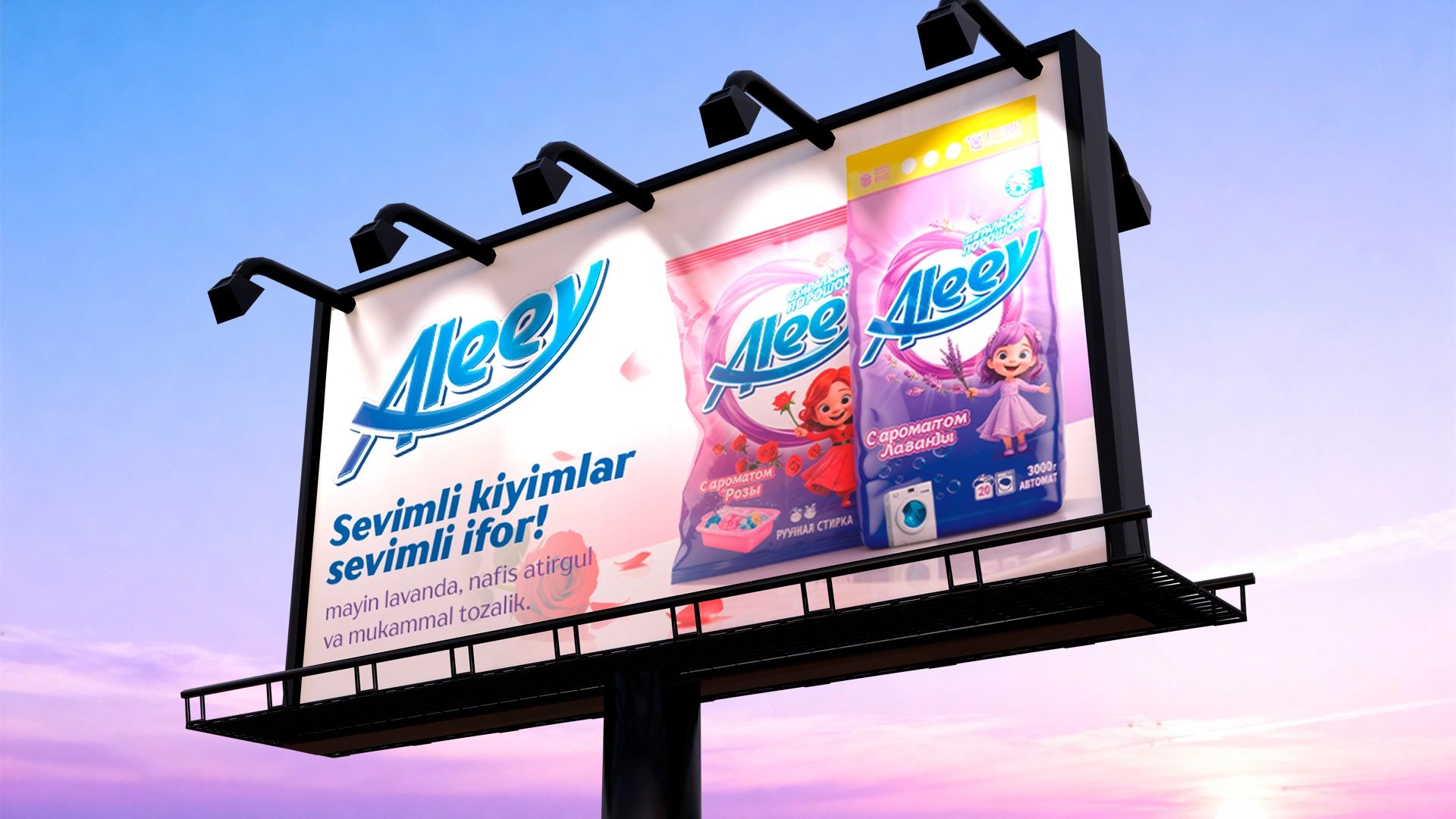
Logo
We developed a concise text logo with soft lines and light dynamics. It looks modern, easily adapts to different formats, and remains recognizable even from a distance.
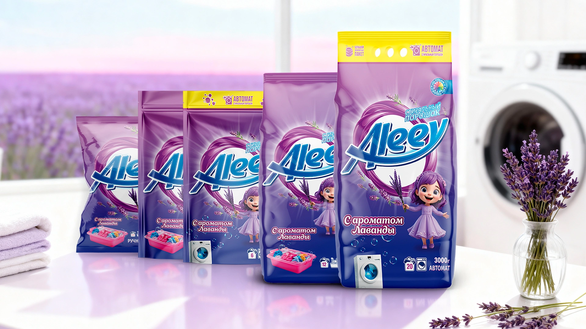
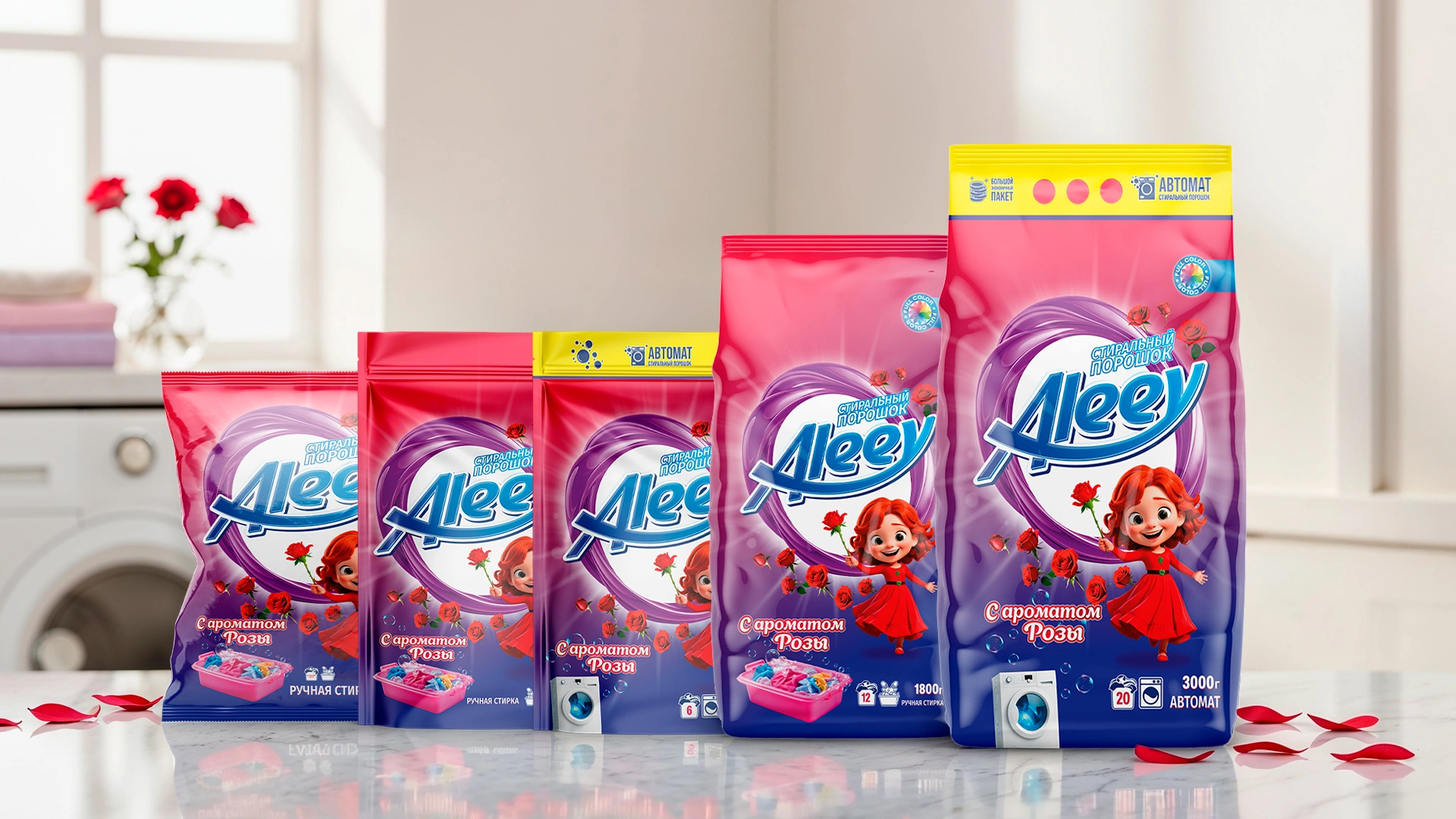
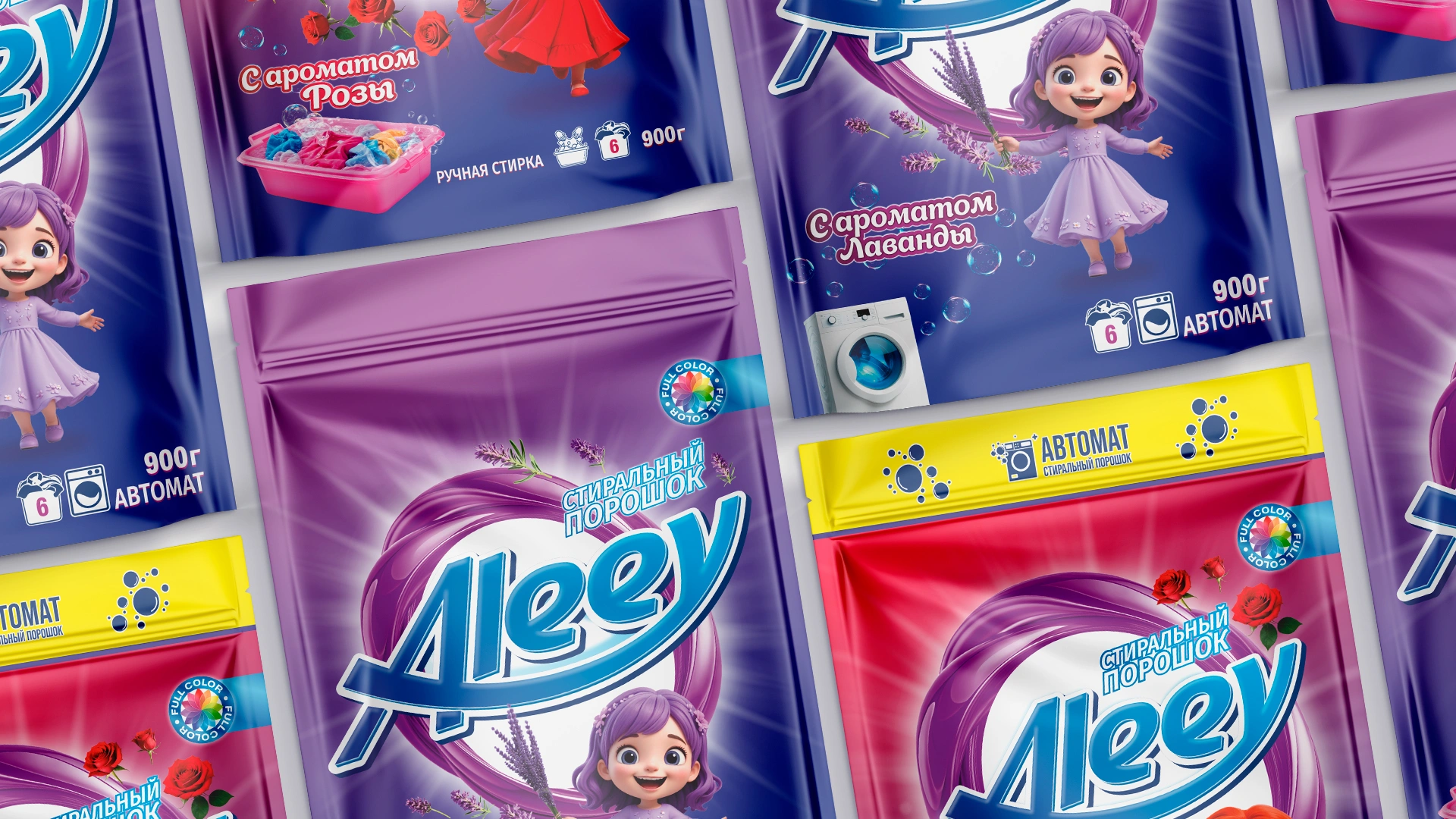
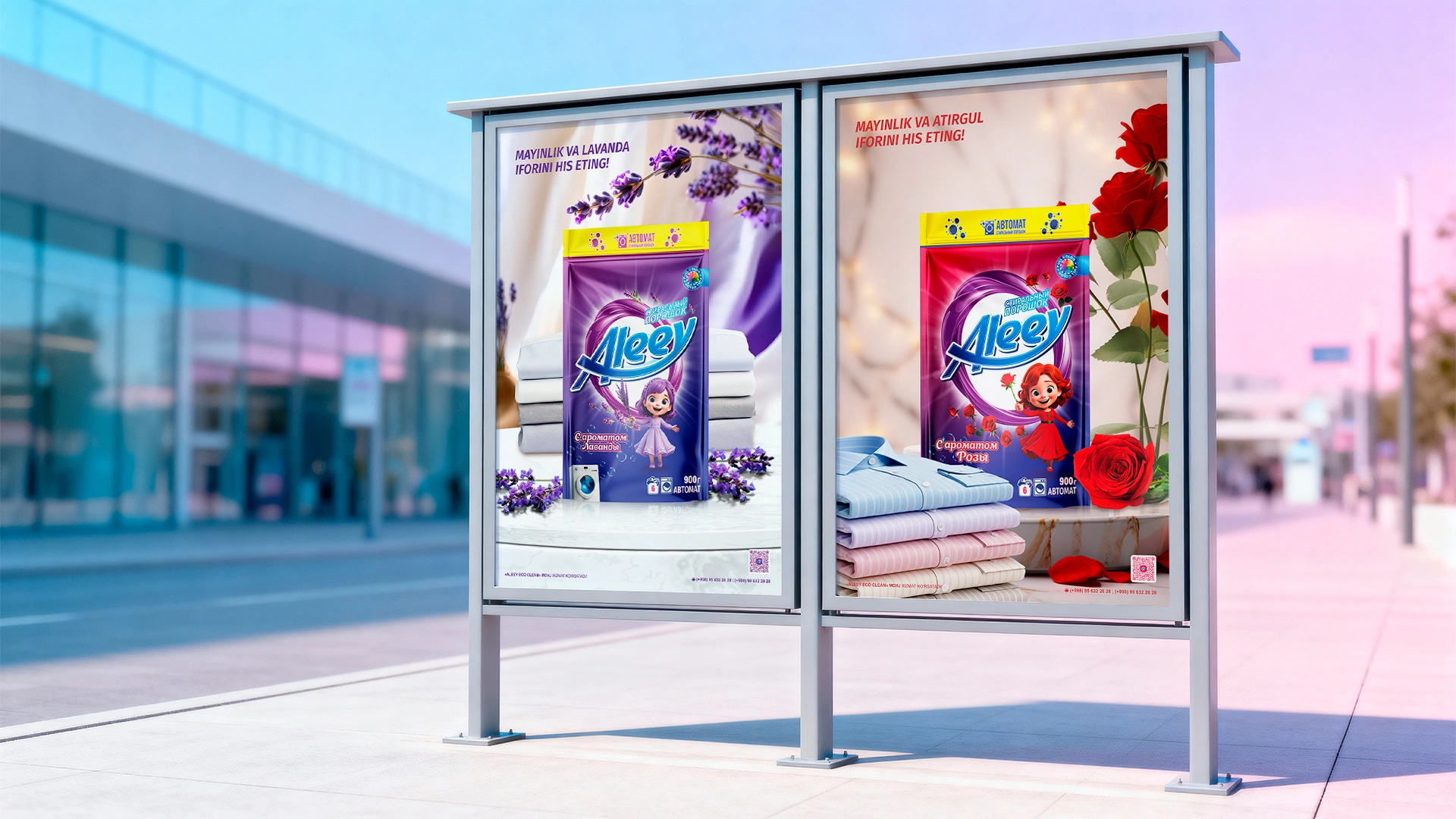
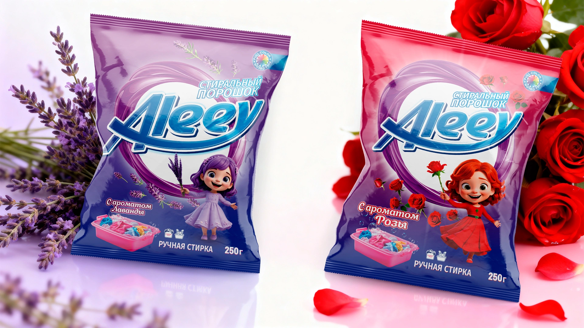
Packaging Design
The packaging line covered three formats — 250 g, 900 g, and 1800 g. The basis was the principle of color differentiation:
- the rose scent is designed in a red-blue palette,
- the lavender scent — in lilac-blue.
The visual solution turned out light and "breathing", which makes the packaging noticeable and attractive on the shelf.
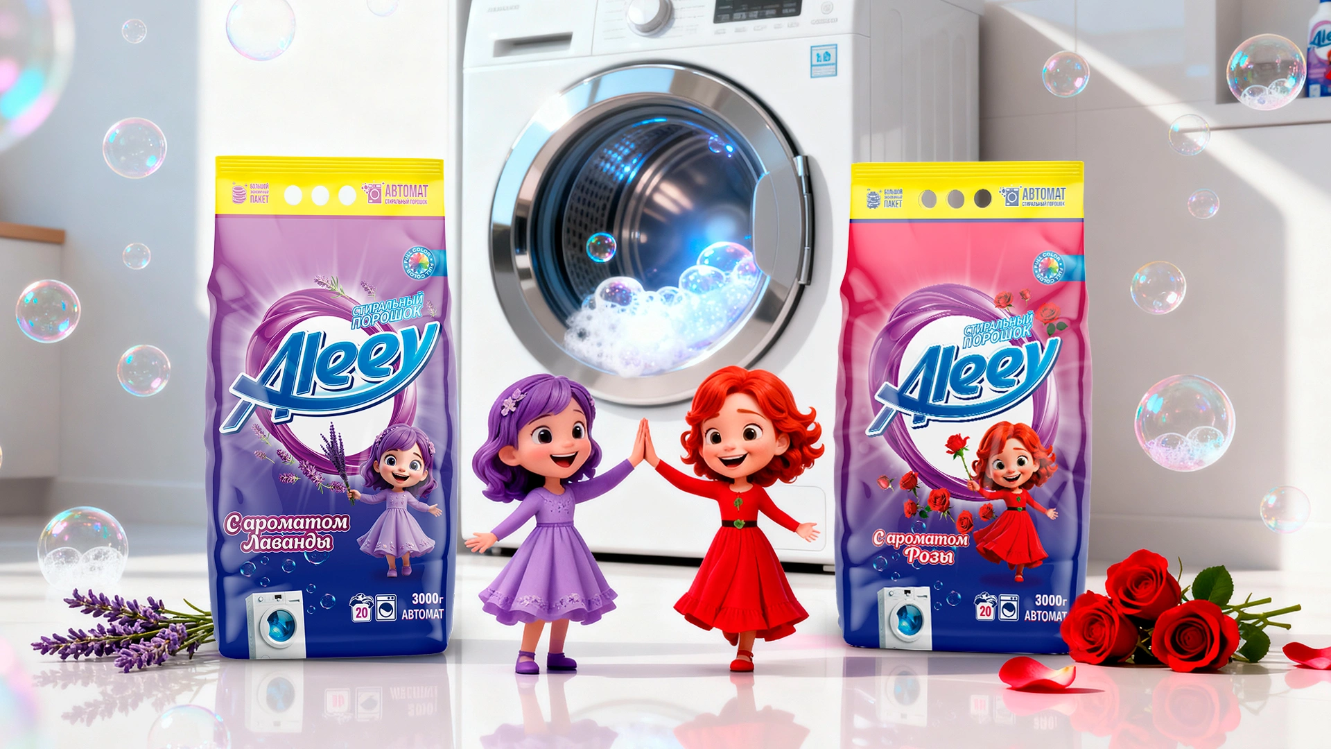
Mascots
To emphasize the value of the scents, we created characters personifying each smell:
- Rose — a red-haired girl in a red dress, a symbol of romance and tenderness;
- Lavender — a violet-haired girl in a lilac dress, a symbol of harmony and tranquility.
They added emotional depth to the brand and made it closer to the customers.

Result
- Aleey received a complete visual system: naming, logo, packaging, website, and mascots.
- The product stands out on the shelf due to thoughtful design and a strong emotional component.
- Mascots strengthened recognition and made the brand friendly and memorable.
- Aleey became an example of how even in FMCG one can build a brand not only on function but also on emotion.