Panda: Export-Class Packaging Design
Export-Class Laundry Detergent Packaging Design
1. The Challenge
Today, the business landscape in our country is shifting rapidly: new brands are springing up like mushrooms after rain. Production is booming, and competitors are breathing down our necks. In such an environment, entering the market with a "run-of-the-mill" product is a luxury no one can afford.
All the catchy, resonant names were long ago taken. However, our client managed to achieve the nearly impossible—trademarking the powerful name "Panda" for a laundry detergent. With this asset in hand, they approached the Minim agency.
But a loud name is only half the battle. Without the right "attire," it simply won't work. We faced an ambitious goal: to turn a simple word on a package into a reliable helper trusted by every homemaker.
There was a risk: if presented incorrectly, the name "Panda" could trigger associations with children's toys or the bargain bin. Our Goals:
- Reveal the product's value through visuals;
- Trigger "love at first sight" and evoke warm emotions;
- Cut through the competitor's "visual noise" on the shelf.

2. Research
We started with a deep shelf analysis. The picture was all too familiar: the shelves were teeming with every color of the rainbow, with every brand trying to "outshout" its neighbor with bright spots.
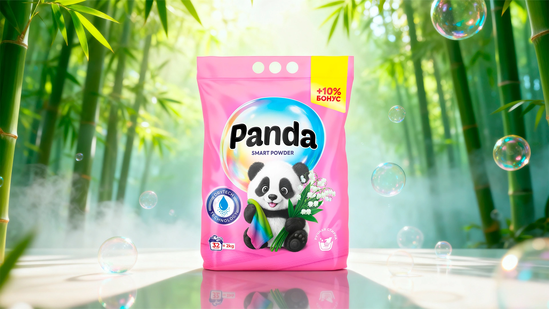
Amidst this visual chaos, we didn't just need another bright spot; we needed a color that speaks without words. We placed our bet on Turquoise—a color particularly revered in the East.
Why this color? While competitors create aggressive noise, the customer subconsciously seeks an island of calm. Turquoise doesn't attack; it broadcasts:
- Softness and delicate washing;
- Safety for fabrics;
- A fresh, unobtrusive scent.
However, color was not our main ace in the hole.

3. The Solution
To avoid dissolving into a sea of identical packages, we needed a "guide" to find a common language with the customer. We entrusted this role to a Mascot (brand character).
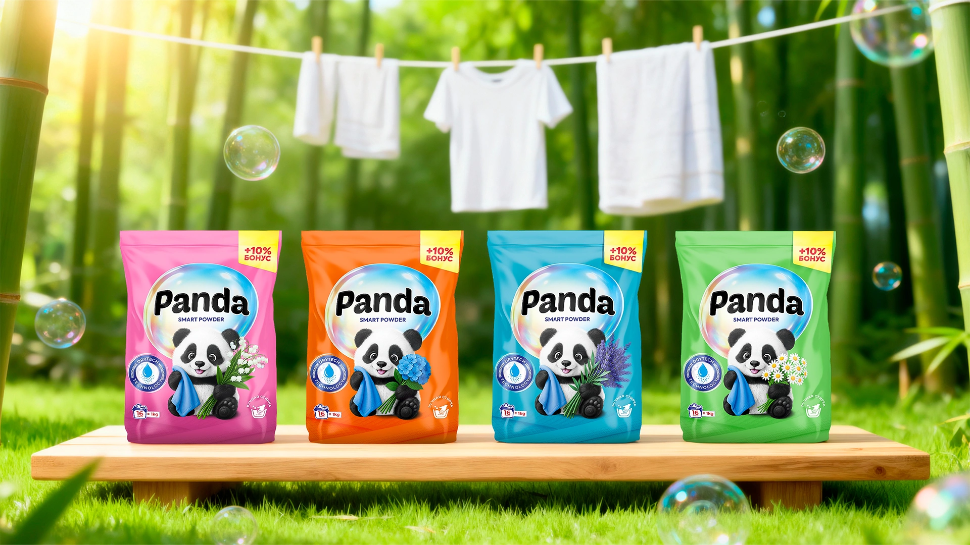
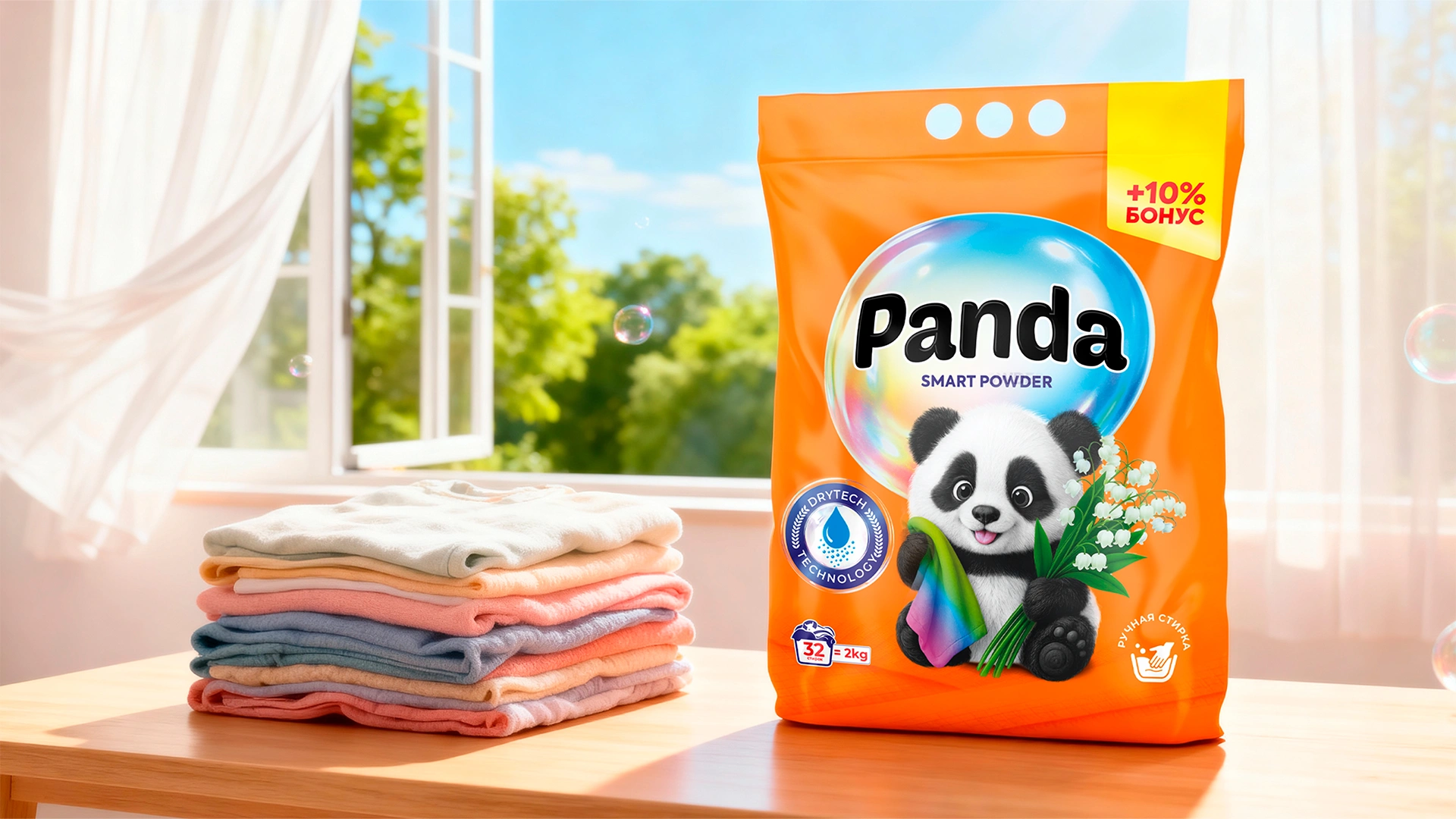
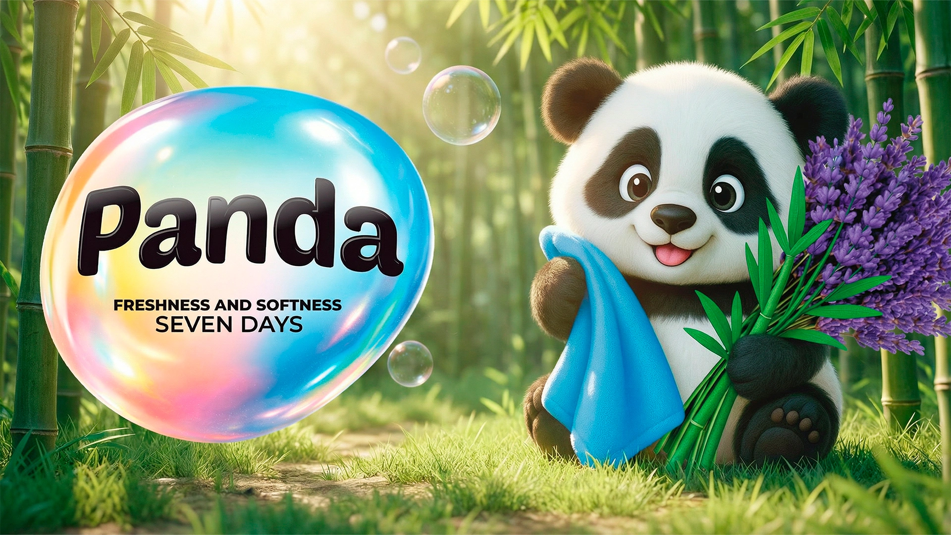
- The Mascot: The name dictated the solution—naturally, a panda. But not just a cute animal; a character with personality. Our Panda holds a soft towel and flowers in its paws. This is a non-verbal message: "I will care for your clothes just this gently." This removes the barrier of distrust. A customer might forget the name, but they will definitely remember "that detergent with the panda."
- Architecture: To confirm expertise, we used claim icons in the style of "DryTech Technology." This signals the rational part of the brain: there is modern technology inside.
- Navigation: We developed specific color coding for each scent (Lily, Iris, Lavender, Chamomile). This simplifies the choice and creates a beautiful, noticeable brand block on the shelf.

The Result
The synergy of smart design and a high-quality product produced an effect that exceeded expectations. We hit the bullseye:
- Instant Recognizability: Thanks to the turquoise color and the charming character, the product immediately found its audience.
- Trust Credit: The design categorically distanced itself from the "cheap" image, so consumers were not afraid to try the novelty.
- Export Expansion: The brand not only established itself in Uzbekistan but also successfully entered the markets of Kyrgyzstan and Tajikistan, where distributors have already set up sales channels.
Summary: They say, "First impressions are everything." In an overcrowded market, being "like everyone else" means losing. Only by having your own unique face and character can you force the customer to unerringly find you among hundreds of others. The Panda brand is vivid proof of this.