Basma – Boxed Ice Cream Packaging Design
In the world of design and branding, there is an unspoken golden rule: the more a client interferes with the process and micromanages like an “overseer,” the worse the final result turns out. At MINIM agency, we deeply respect all our clients and listen to their opinions, but there are some with whom working is an absolute pleasure. These are the leaders who completely hand over the “steering wheel” to the specialists, giving them total creative freedom. The owners of the Basma (Airport Icecream) brand are exactly this kind of rare and highly cherished client.
1. The Problem and Challenge
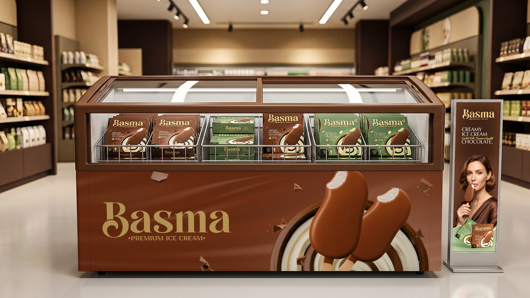
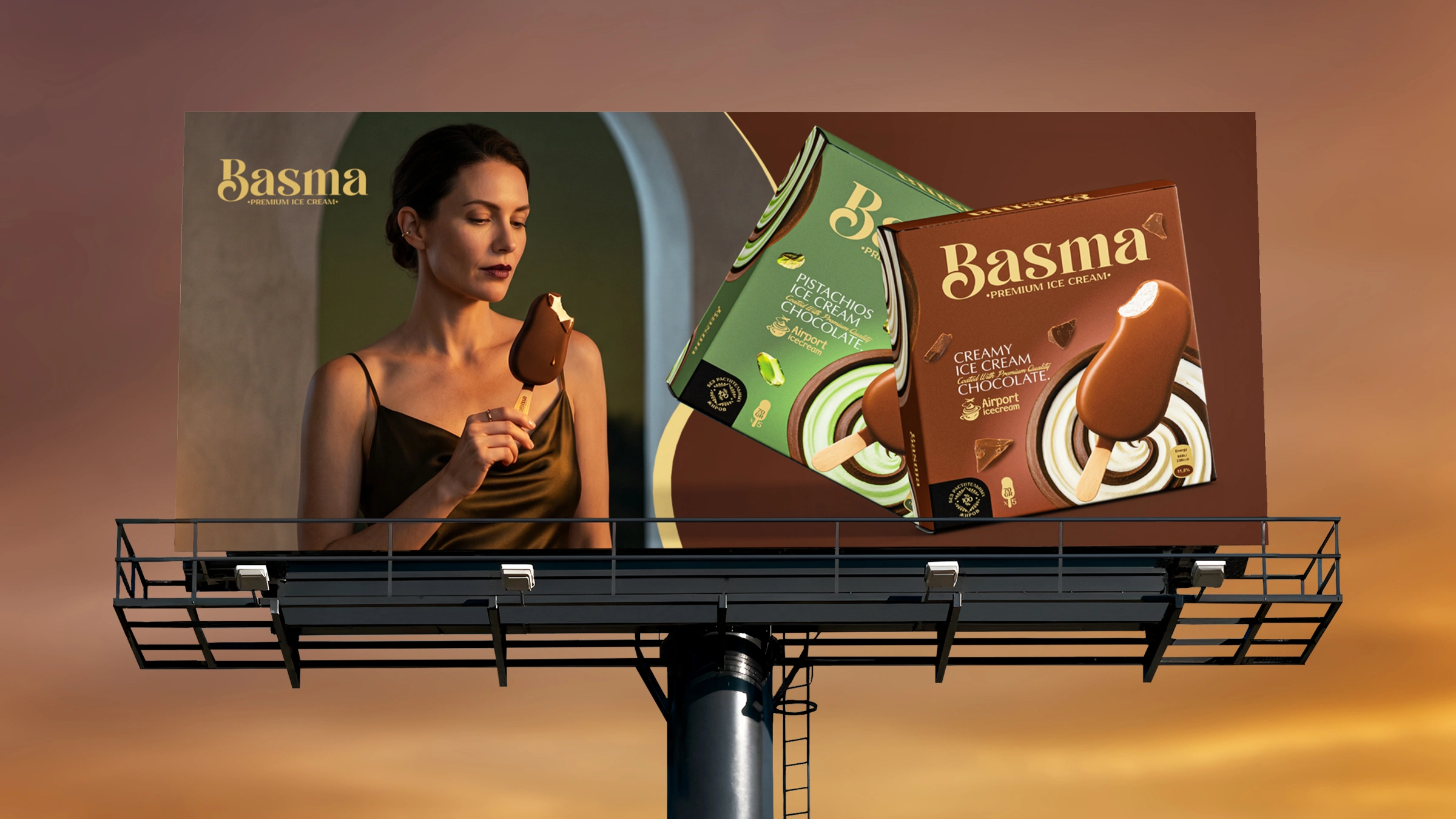
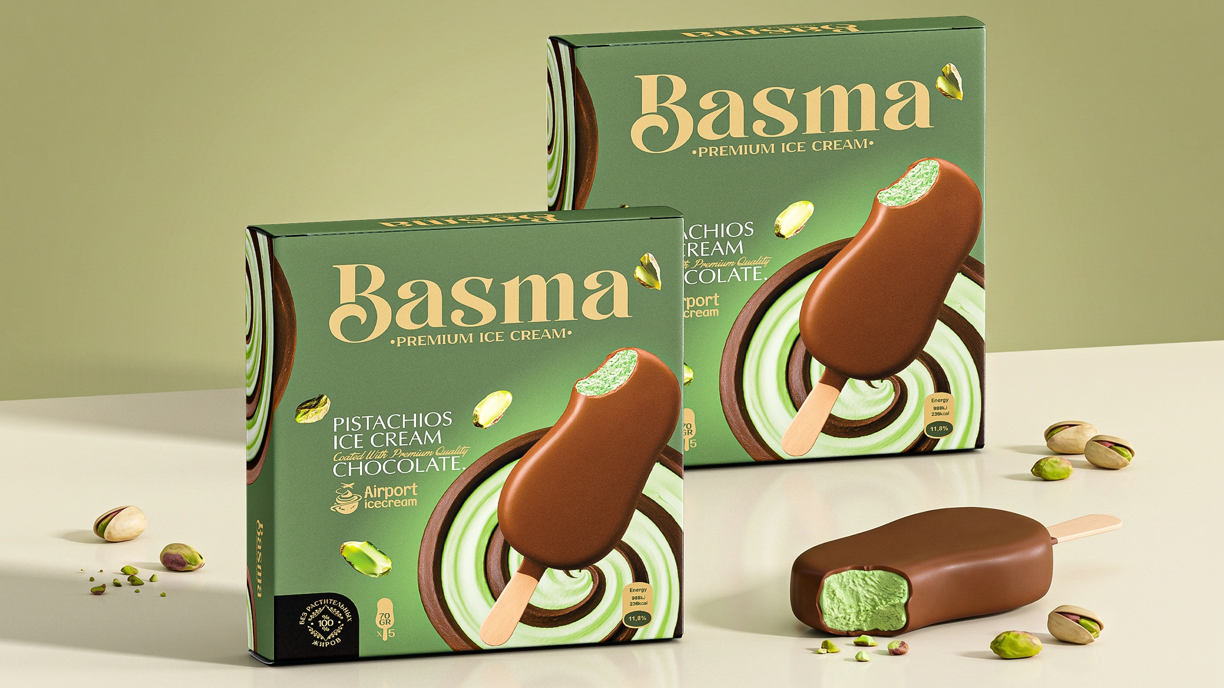
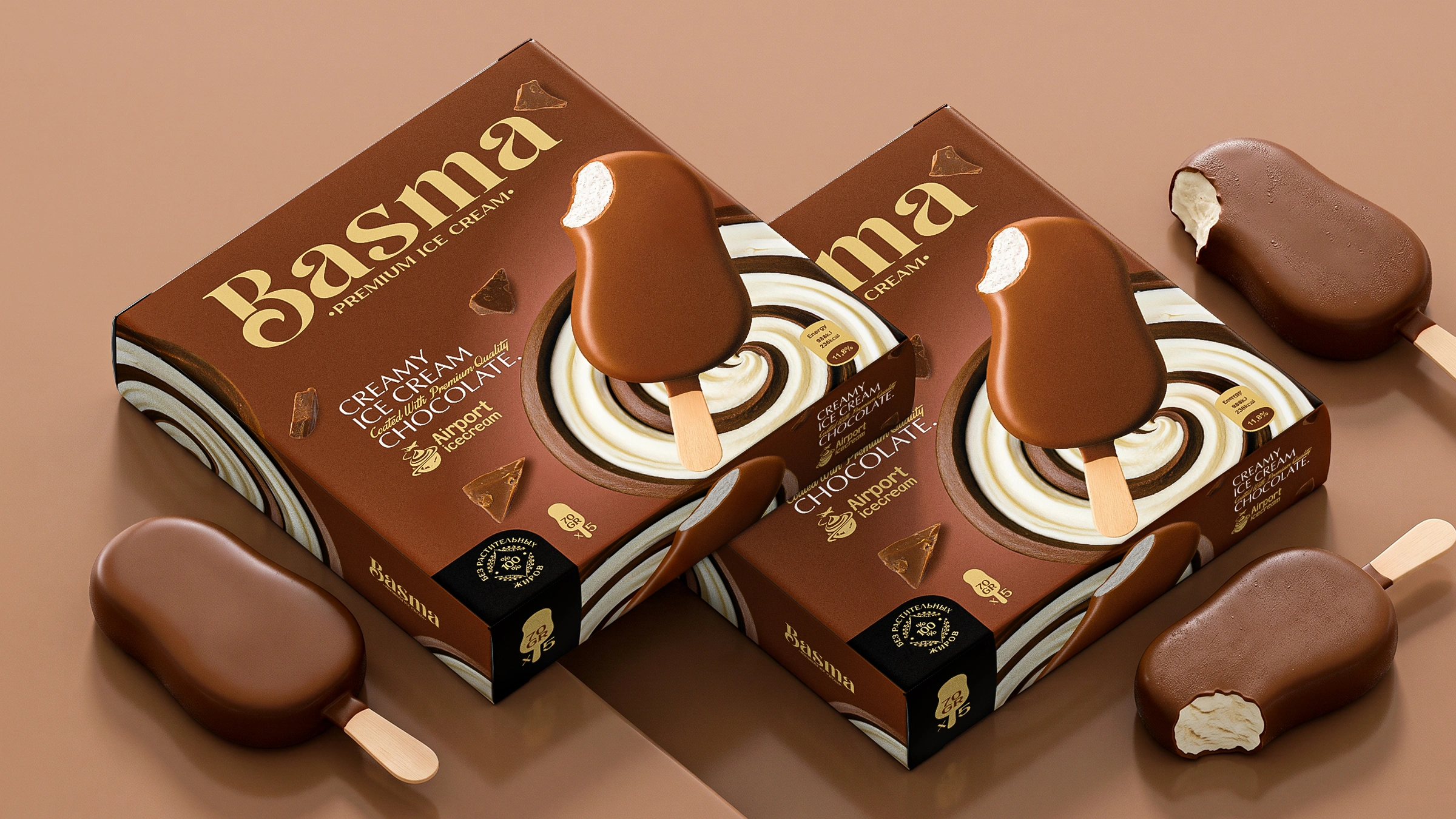
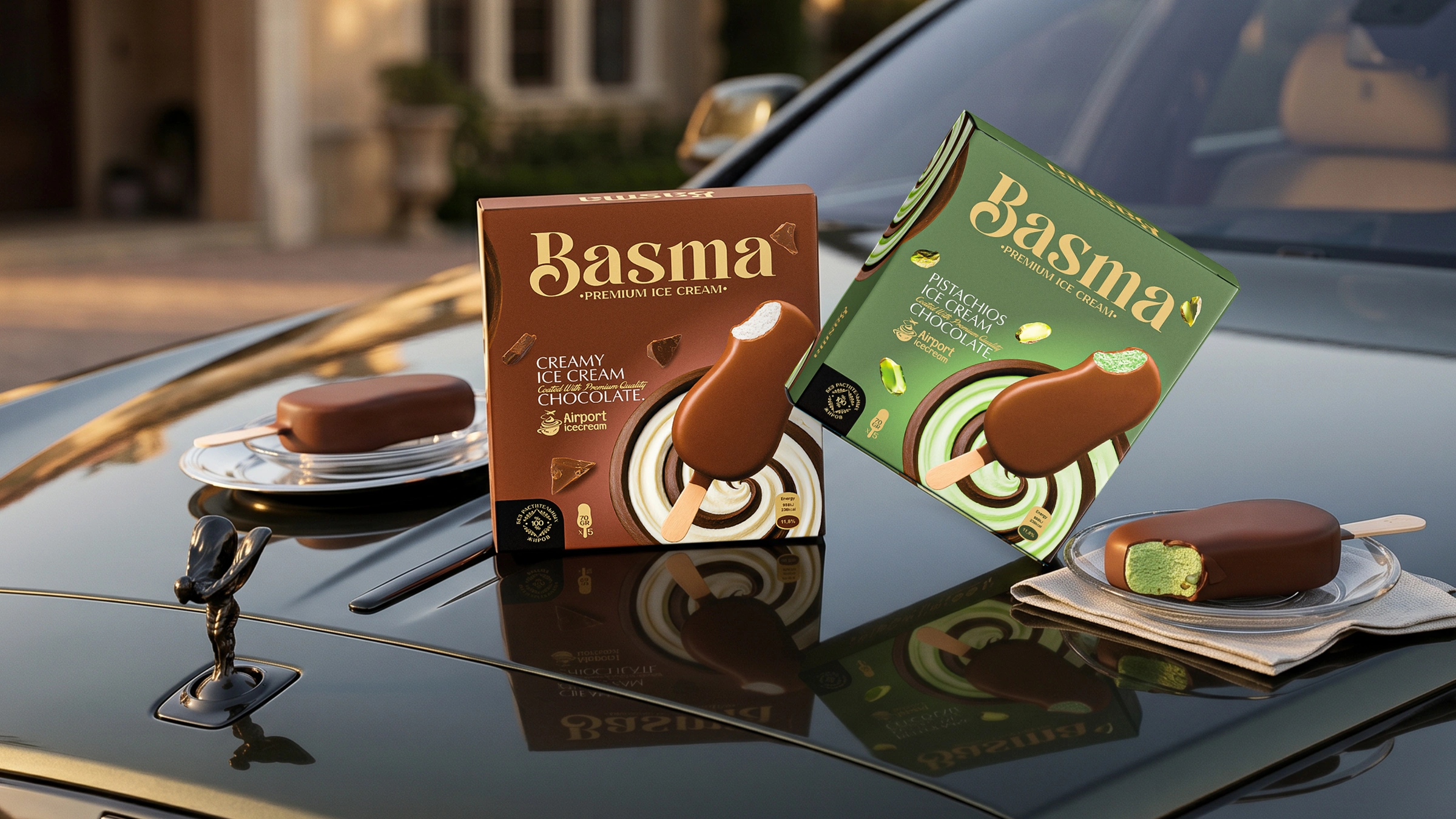
Following new market trends, the Basma brand decided to enter the boxed ice cream segment in a family-size format. Their main requirement was crystal clear: the product must unconditionally stand out amid the fierce competition inside supermarket freezers, capture the buyer’s attention and, of course, seamlessly adapt the visual DNA of the existing Basma brand to the new wide format.
2. Trust and Inspiration
The most inspiring moment in the entire workflow was the client’s approach. When assigning the task, they turned to our director with their usual trust: “Lazizkhoja, do everything at your own discretion, in the best possible way. You know how to create a great design much better than I do!”
What do you do when you are given such a high level of trust as an expert? You simply enjoy the process and pour all your creative energy into the project.
3. The Solution
We set a clear goal: when a buyer approaches the freezer, the competitors’ boxes should simply disappear from sight. To achieve this, we did not overload the design with visual clutter, but instead placed a strong emphasis on taste and premium status:
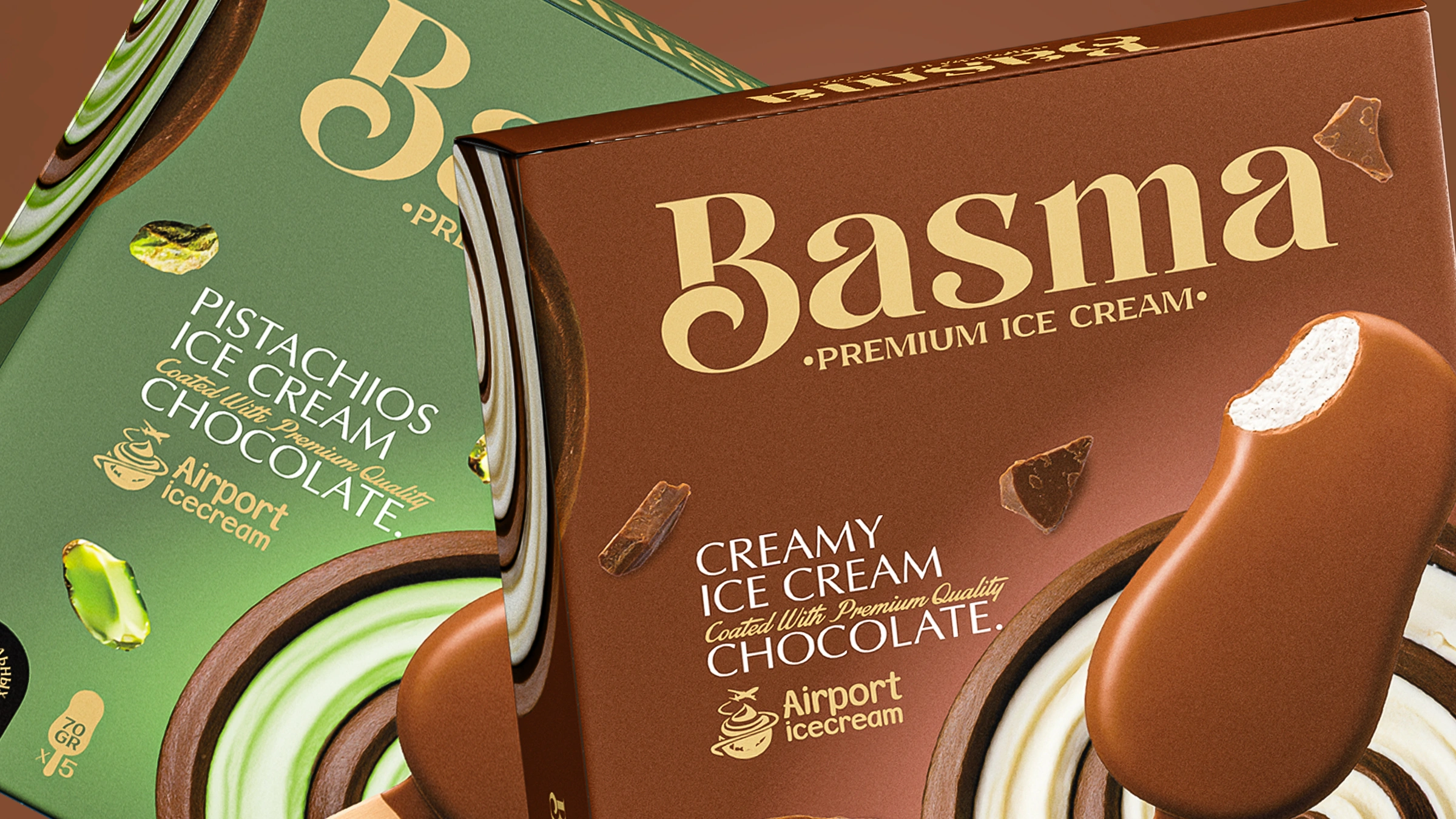
- “Expensive” colors: we categorically rejected cheap, eye-straining shades. To reveal the chocolate and pistachio flavors, deep brown and velvety green backgrounds were chosen. This is the first and most important condition for making the product look truly premium on the shelf.
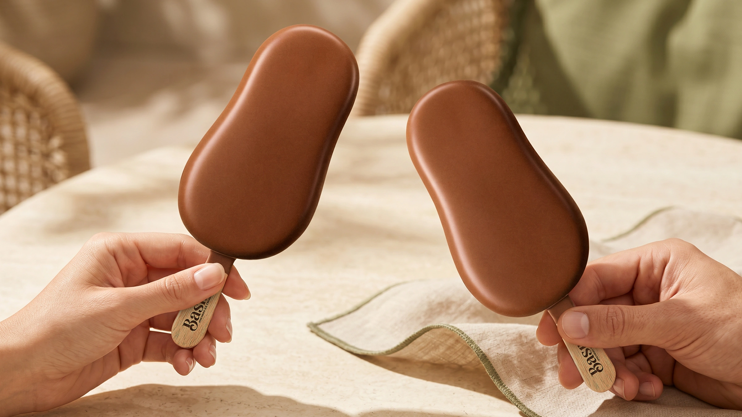
- Appetizing details: a bitten ice cream bar in the center and swirling creamy textures in the background were created to instantly awaken the buyer’s appetite.
- Organic adaptation: we did not simply “copy and paste” the existing Basma branding onto the new box. The brand’s visual DNA — fonts, logo positioning and golden elements — was adapted to the wide format naturally, elegantly and organically.
The Result
As the saying goes, “Work entrusted to a true master is destined for success.” The cohesive creative process and complete freedom of action bore fruit. Our visual solution was approved by the client in the very first round. The project was accepted without a single revision, and the fee was paid immediately.
Want a design that will take supermarket shelves by storm? Contact MINIM agency and entrust your project to professionals.