Zenit Duet – Dual-Flavor Ice Cream Packaging Design
The ice cream market is one of the most highly competitive and fast-changing segments. To surprise the modern consumer, simply introducing a new flavor is no longer enough. You need an unconventional format, an eye-catching visual identity, and a strong emotional hook. We have had a long and successful partnership with the Zenit brand. In our latest project, we developed the packaging design for exactly this kind of unique product — Duet ice cream.
1. The Problem and Task
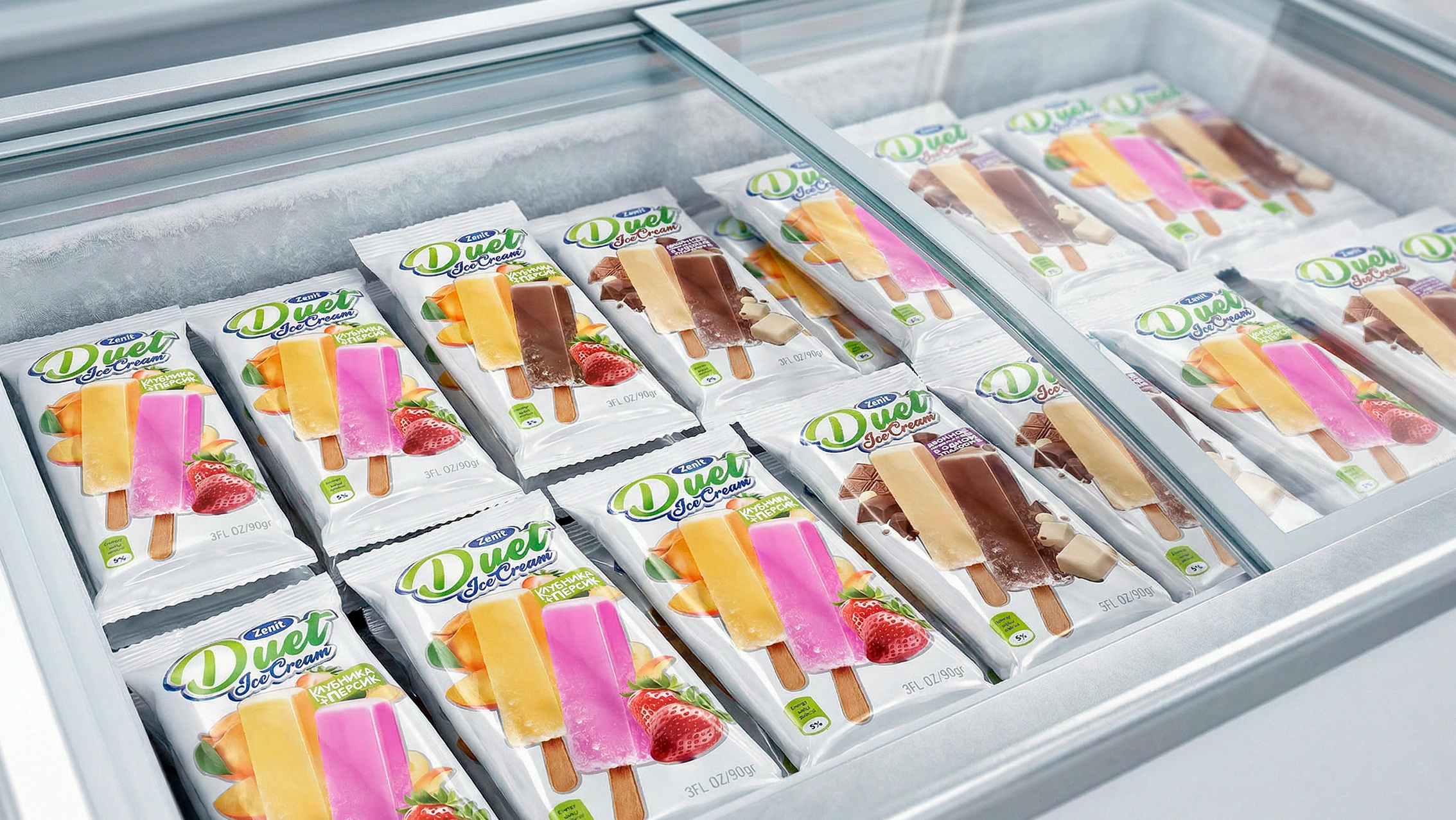
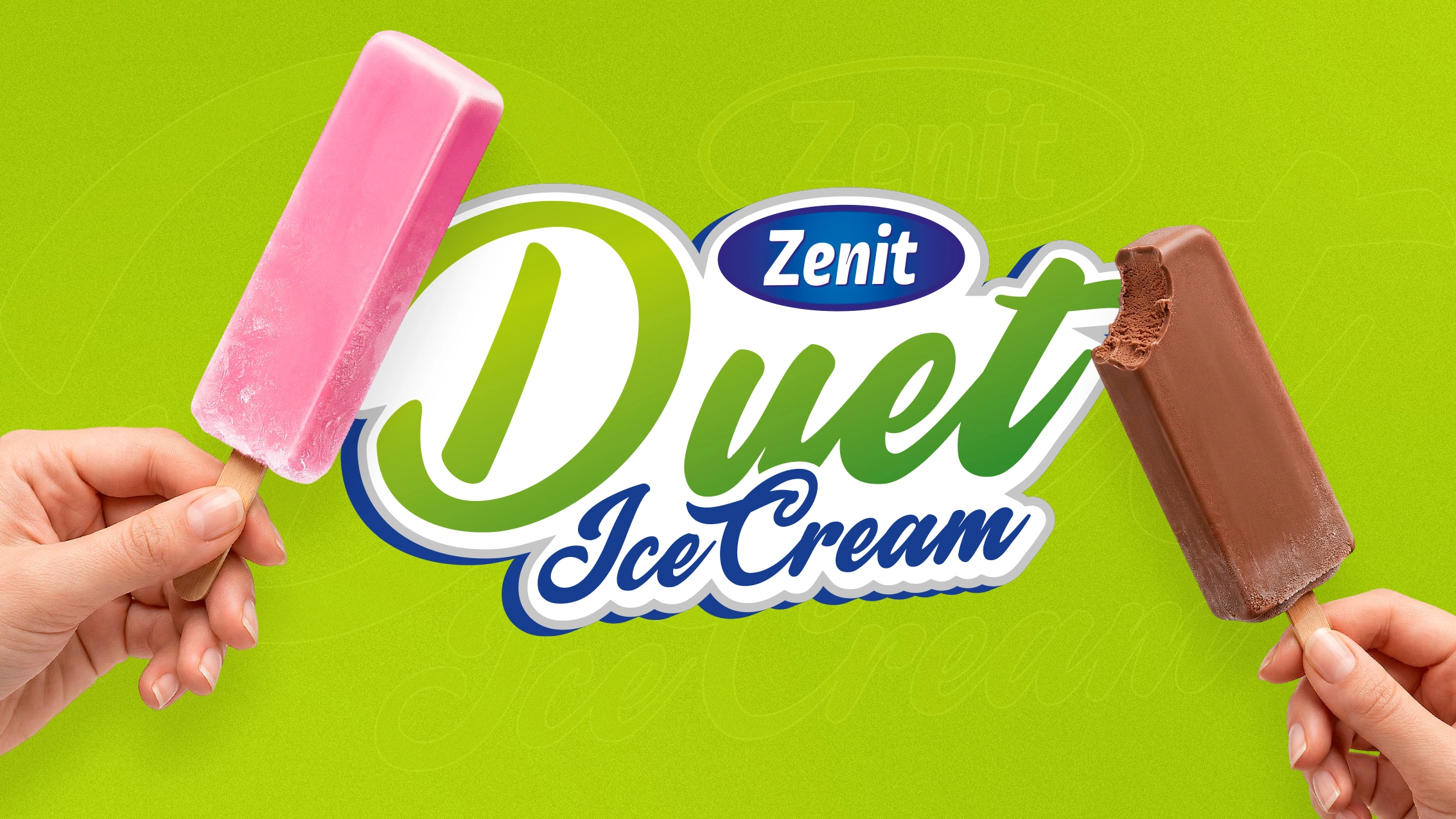
The Zenit brand introduced a completely new concept to the market: a single, whole ice cream, but with two sticks, which with a light snap breaks in half into two separate portions. Moreover, each half features its own distinct flavor. It is the very definition of "killing two birds with one stone."
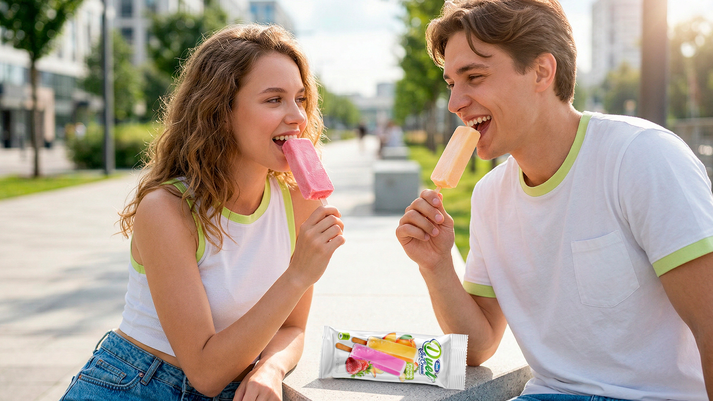
For the youth audience, this format evokes a special nostalgia and warm feelings. It brings to mind the iconic scene from the anime "Naruto," where the characters split a twin popsicle in half as a symbol of friendship and deep emotional bond.
This format gives the consumer ultimate freedom of choice: you can share the moment (and the ice cream itself) with a friend or loved one, or keep it all to yourself and enjoy two different flavors simultaneously.
Our task was to visually and clearly explain this unconventional and interesting format to the buyer. Looking at the packaging, they shouldn't mistake the product for a regular large popsicle — they needed to instantly recognize the "snap" feature and the presence of two flavors.
2. Research
While analyzing ice cream packaging in store freezers, we realized one thing: most brands use very busy, loud, and cluttered backgrounds. In such a noisy visual environment, the essence of a new and unfamiliar format would simply get lost.
If we had also used bright colors for the background, the buyer's attention would have been distracted from the most important feature — the two sticks and the combination of two flavors. It became obvious: the design had to be as clean as possible, shifting the entire focus solely to the shape and flavor of the product itself.
3. The Solution
To highlight the architecture and uniqueness of the ice cream, we utilized clean and appetizing visual solutions:
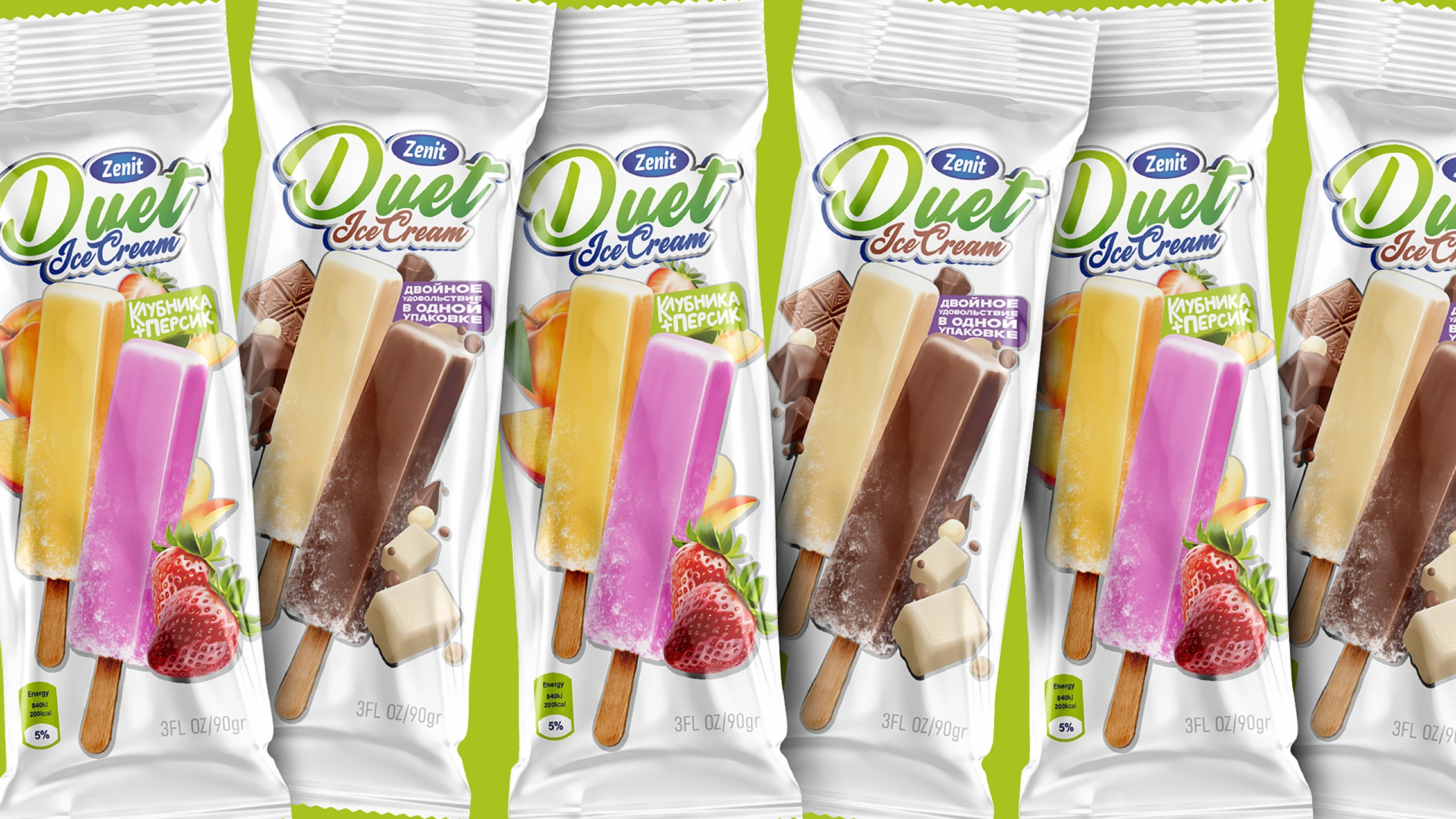
- White background: Stepping away from the visual clutter typical for this market, we chose pure white as our base. Not only does it convey the sensation of ice and pleasant coolness, but it also allows the two-tone ice cream in the center to pop and literally "glow" against the competition.
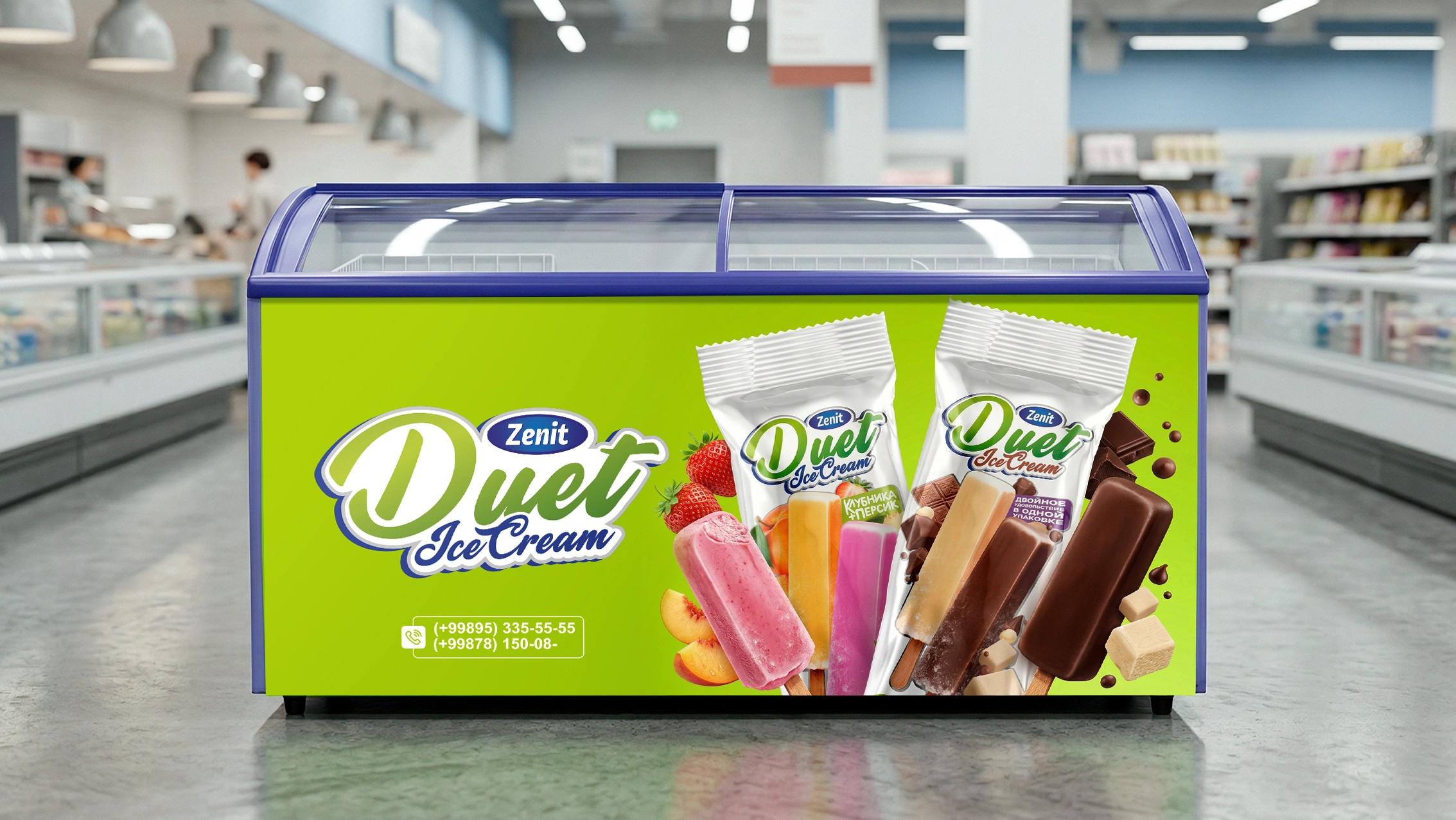
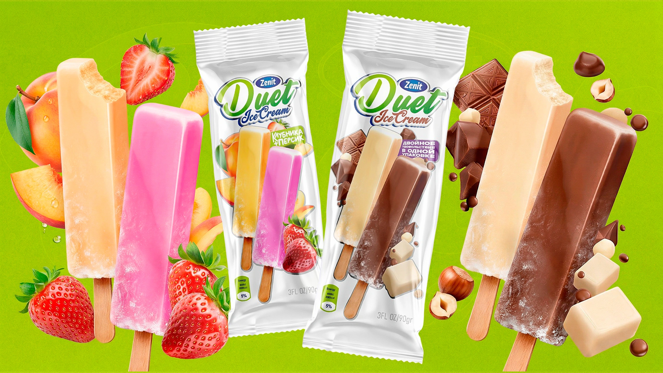
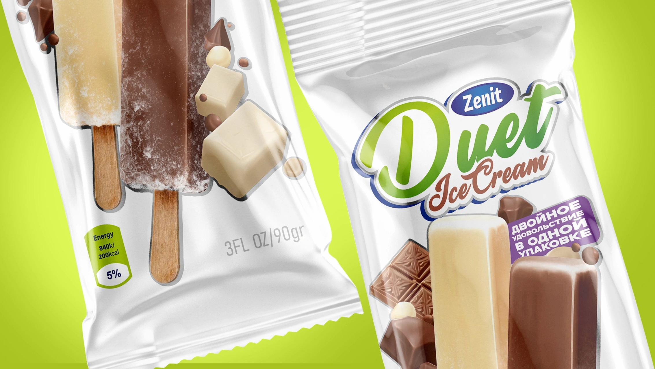
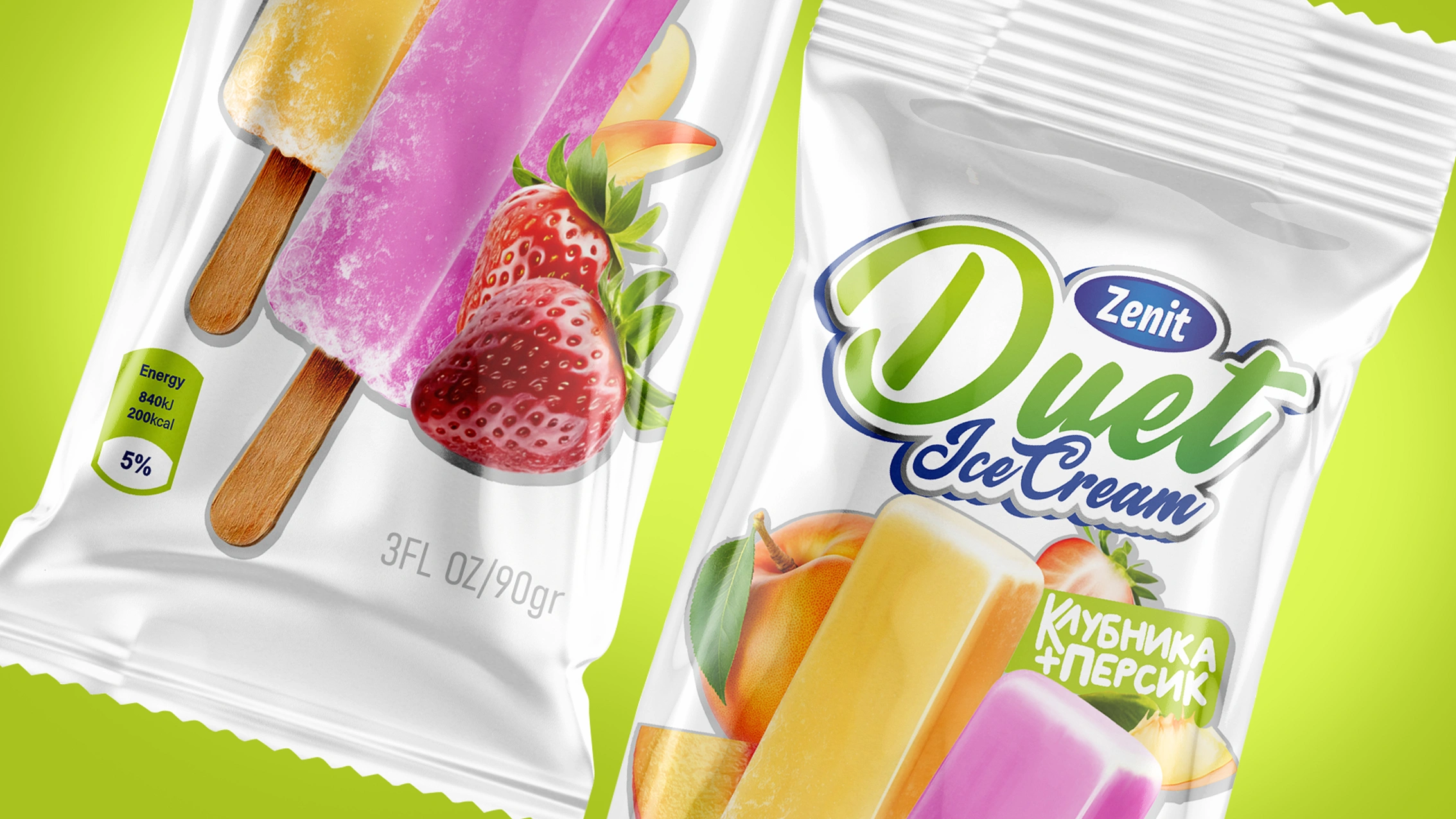
- Mouth-watering food zone: The main hero of the packaging is the snapping ice cream itself. We placed its realistic 3D model exactly with two sticks and in two colors. In the first variant (Strawberry + Peach flavor), the yellow-and-pink ice cream is surrounded by juicy fruits covered in fresh water droplets. The second variant (Dark Chocolate + Milk Chocolate) is complemented by appetizing chocolate cubes.
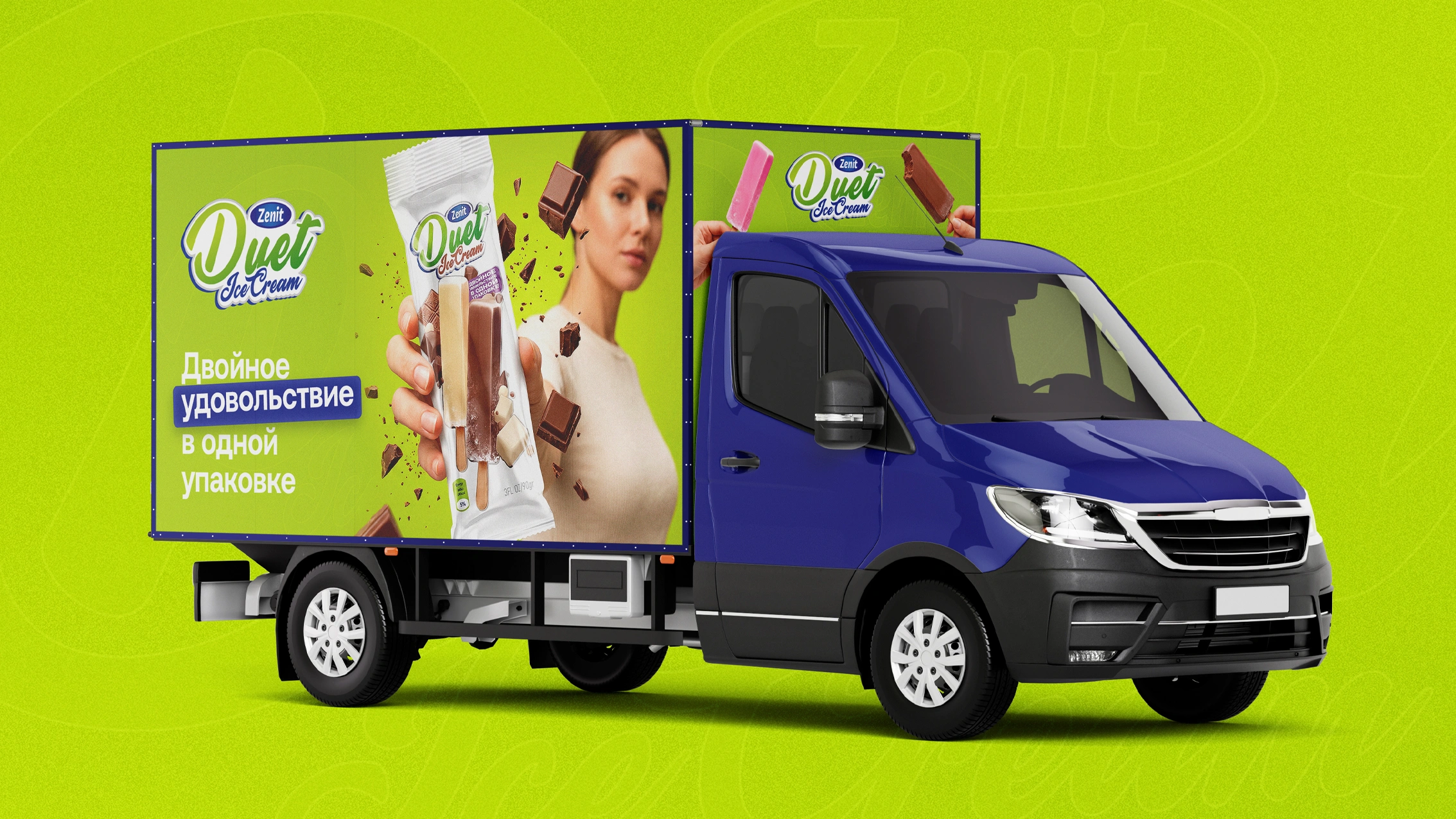
- Naming and navigation: The name "Duet" is written in a dynamic, free-flowing font, given a premium shine by a Metallic Stroke. To explain the product's concept without needing extra words, phrases like "Strawberry + Peach" and "Double pleasure in one package" were placed front and center.
The Result
Thanks to its clean, bright, and intuitively understandable design free of unnecessary details, Zenit Duet ice cream sharply stands out on the shelf.
The white background and highly detailed food zone instantly explain the unconventional shape to the buyer — two sticks and a snapping format. One look at the packaging immediately triggers an emotion: the desire to recreate that warm scene from "Naruto" by sharing it with someone close, or to treat yourself to a double flavor fest solo. This creative approach helped the Zenit brand successfully solidify its market position with a brand new product category.
If you also want to turn your product into a sales hit with a fresh and well-thought-out design, contact the MINIM agency.