Basma – Family-Size Ice Cream Packaging Design
1. The Challenge
As you might know, our expertise goes beyond design—we also do naming. Our client was planning to launch a new 1-kilogram ice cream line meant for families and big companies. Initially, we pitched the name "Davras" for this new direction. It’s a catchy word that perfectly captures the vibe of a lively feast and a full table. But as the project evolved, the strategy shifted.
2. The Research
We couldn't ignore one crucial fact: Basma’s single-serve ice cream had already won the market's heart and built strong brand loyalty. Spending huge budgets and resources to build a new name from scratch felt like an unnecessary risk. The most logical and profitable move was to stick with the trusted, good old "Basma" brand.
Ice cream isn't just a dessert; it's an emotion. Before a customer even picks it up from the freezer, they have to "eat it with their eyes." After diving deep into the market and consumer psychology, our conclusion was simple: the product must sell itself right off the shelf. The packaging couldn't just be a protective wrapper; it had to be a mouth-watering showcase that instantly triggers the taste buds.
3. The Solution
We made several bold design choices to reveal the true essence of the product:
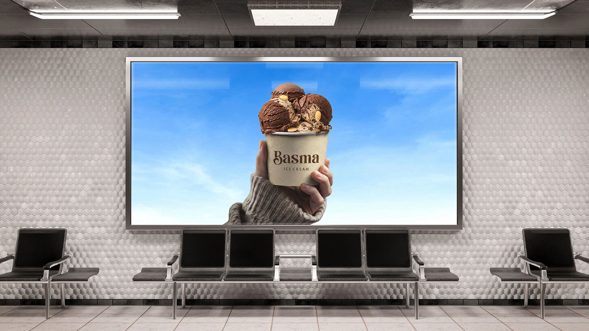
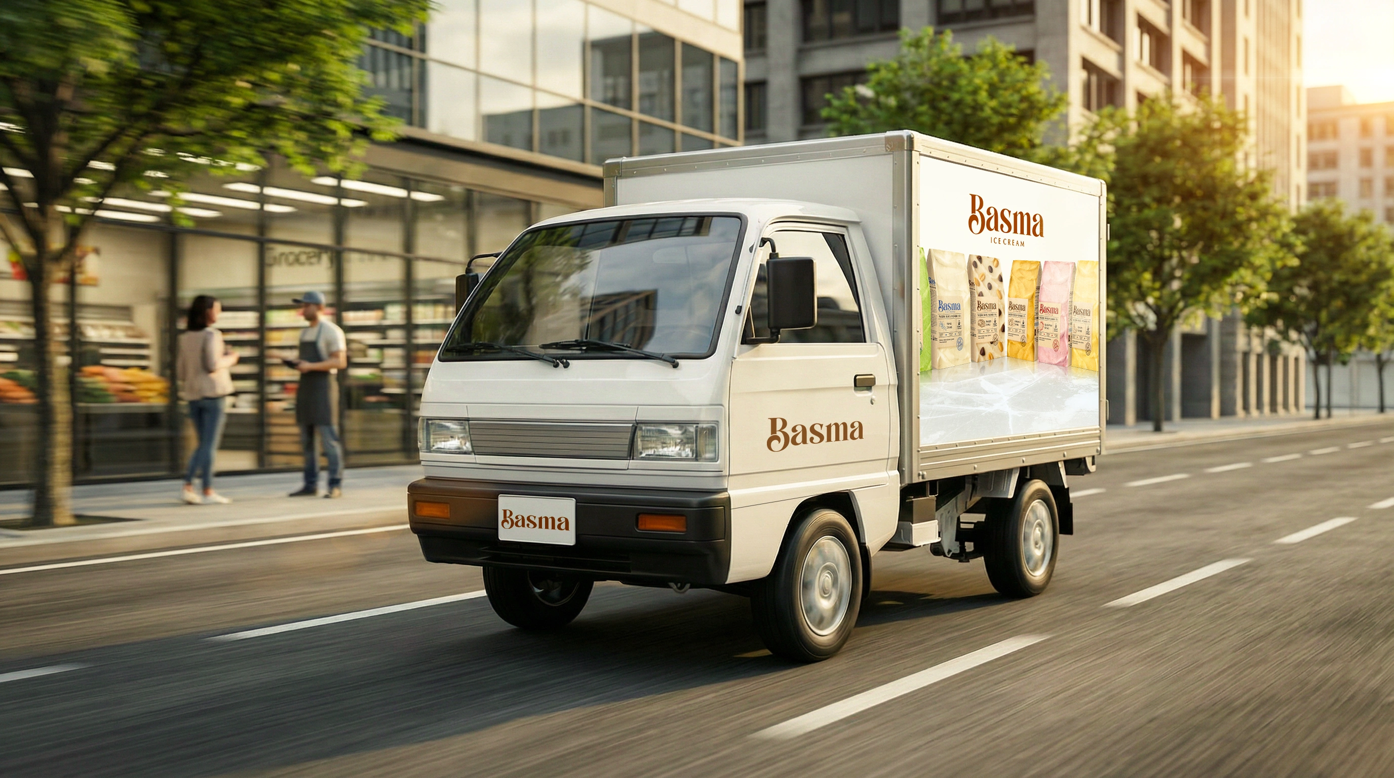
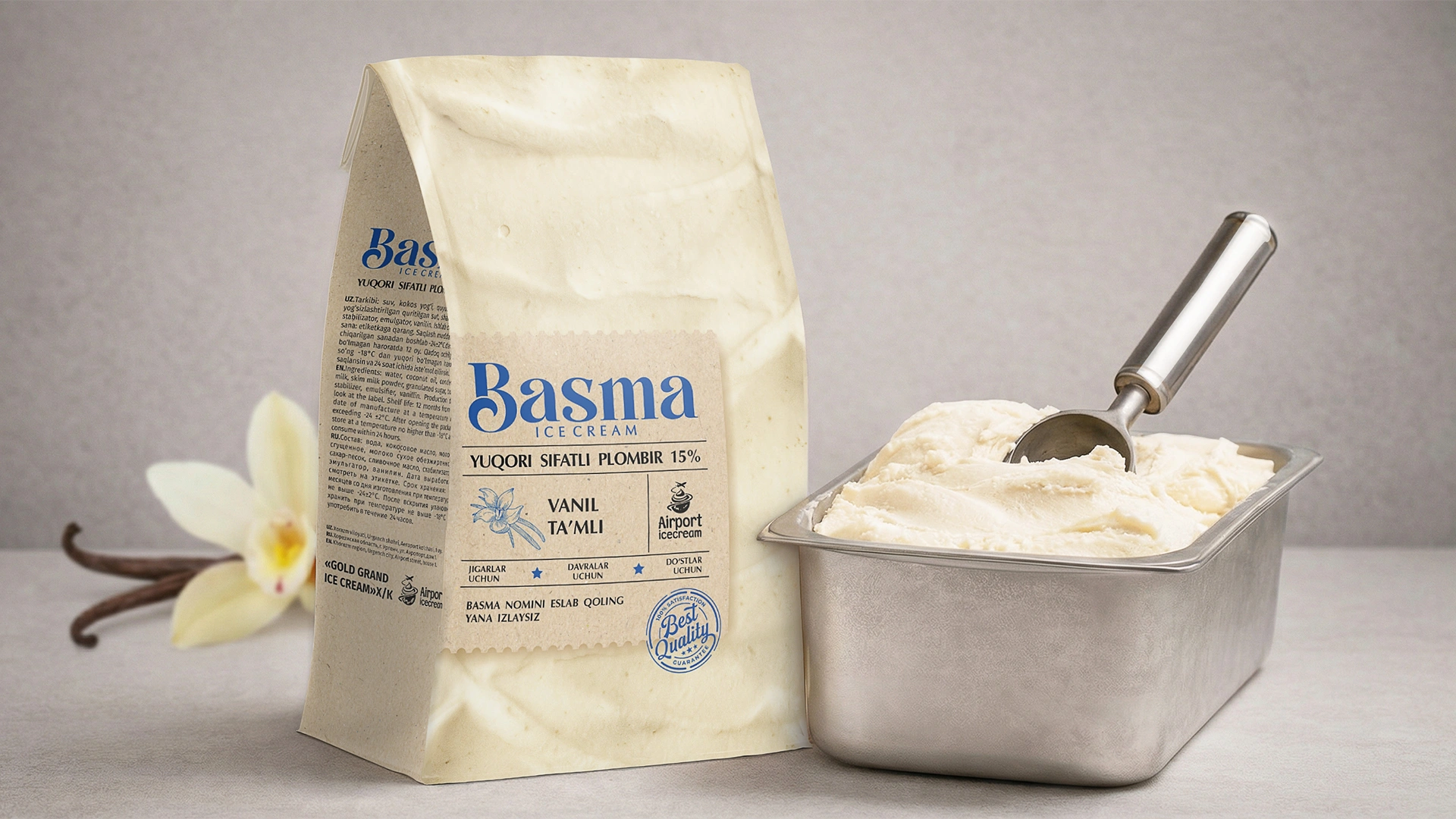
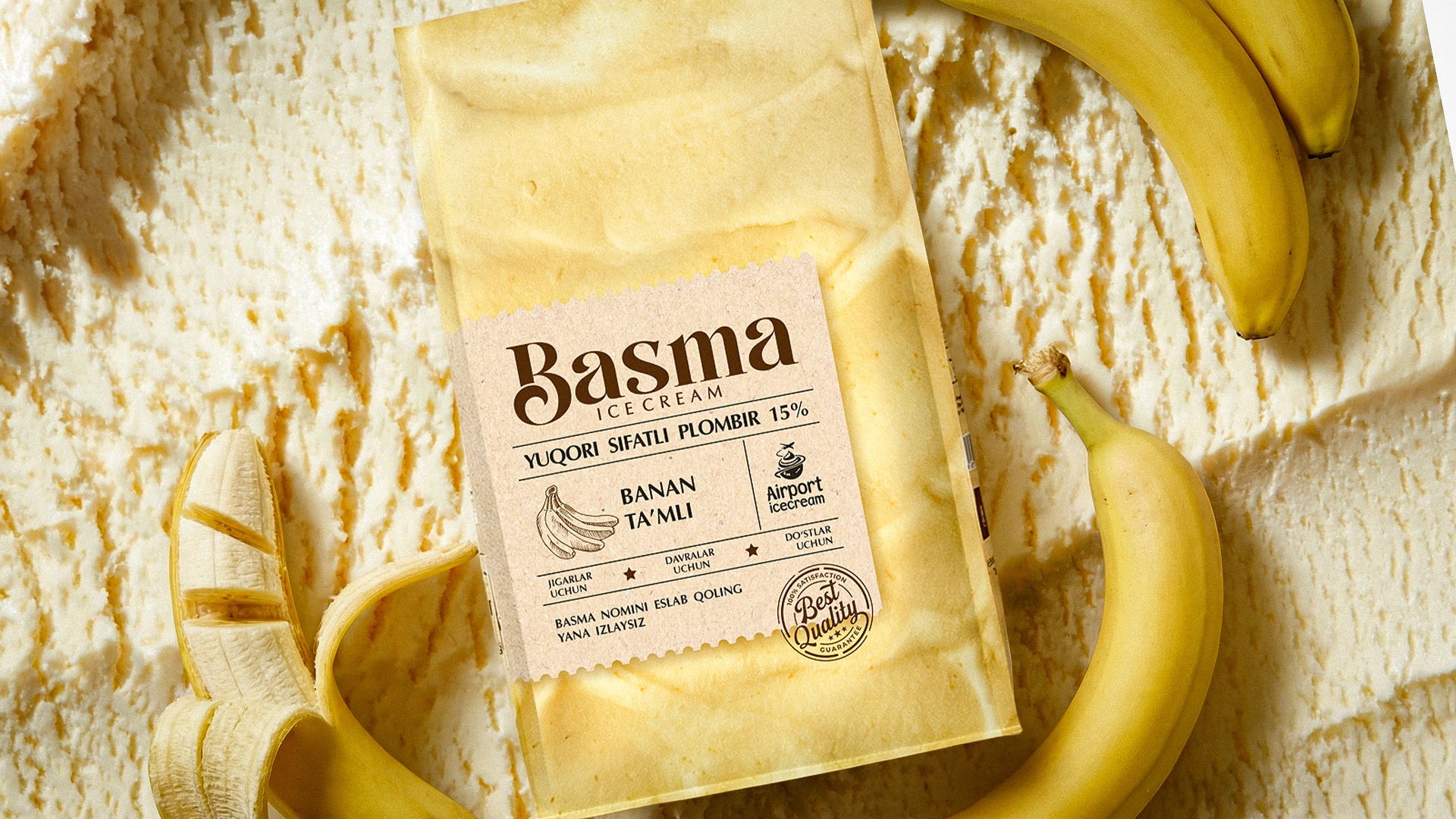
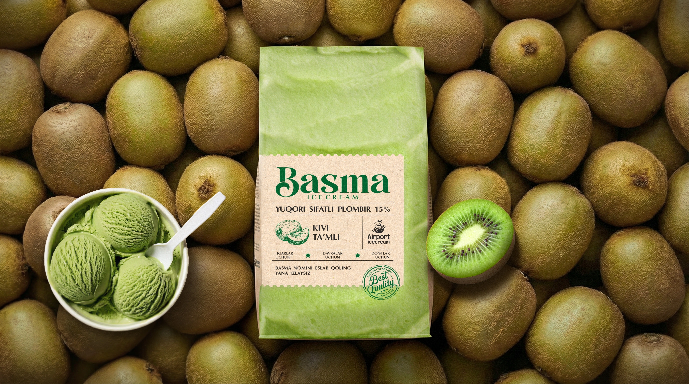
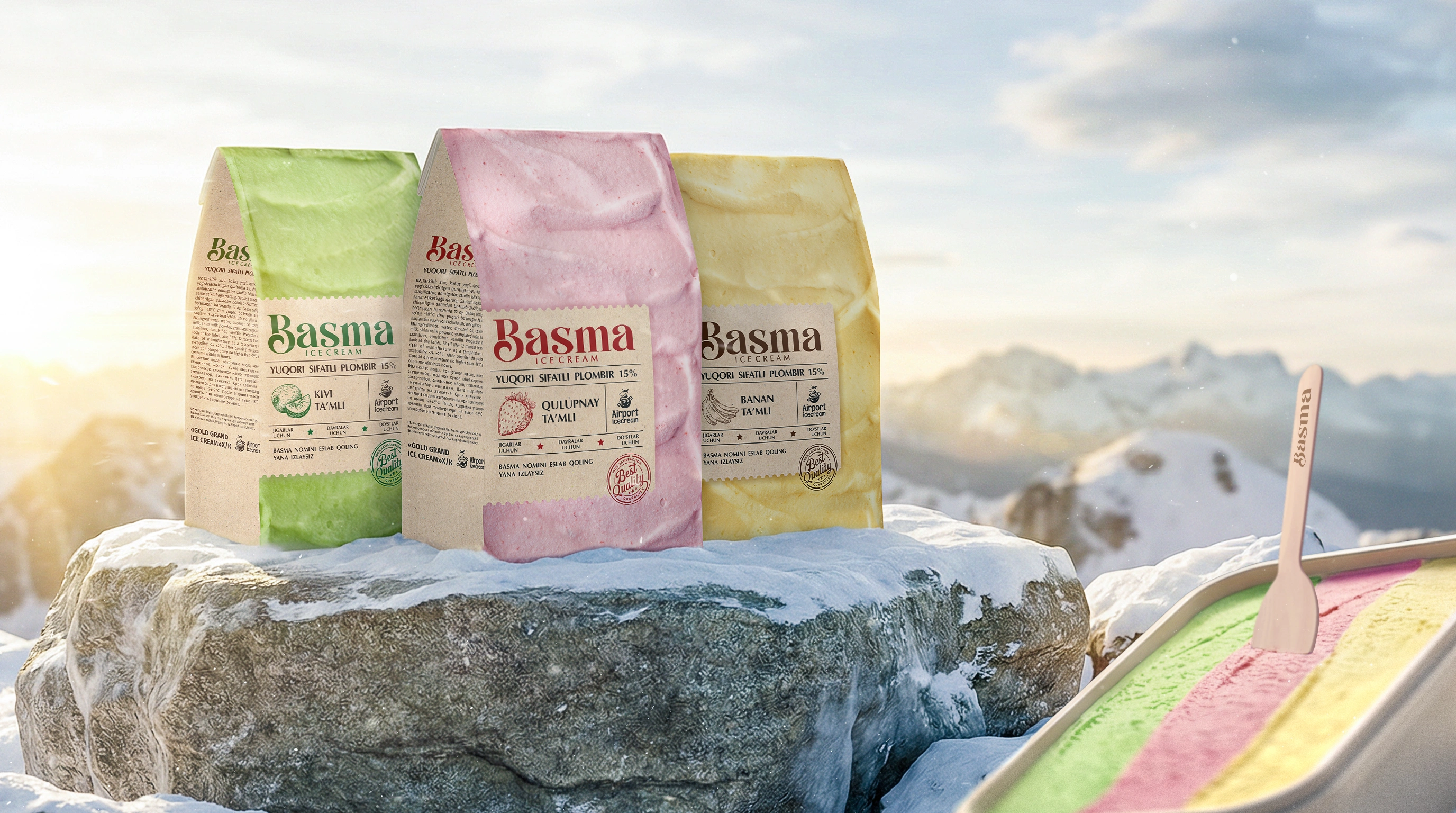
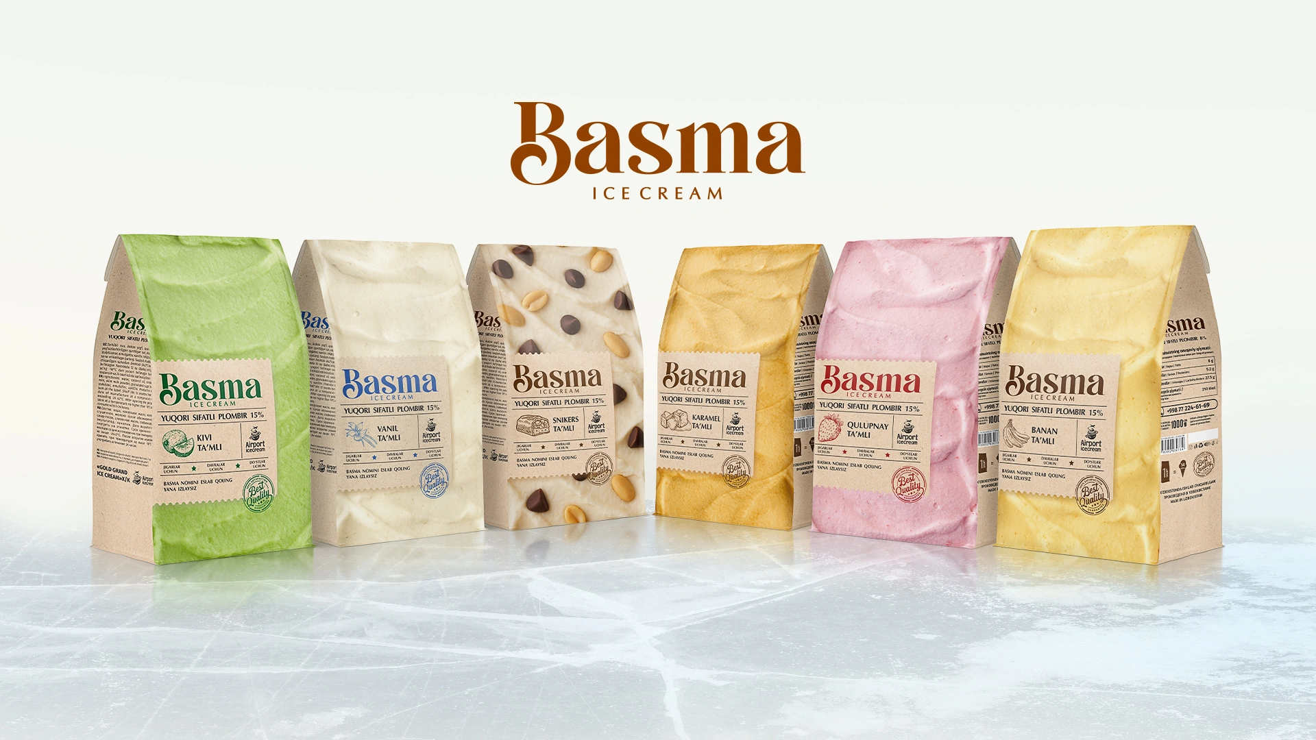
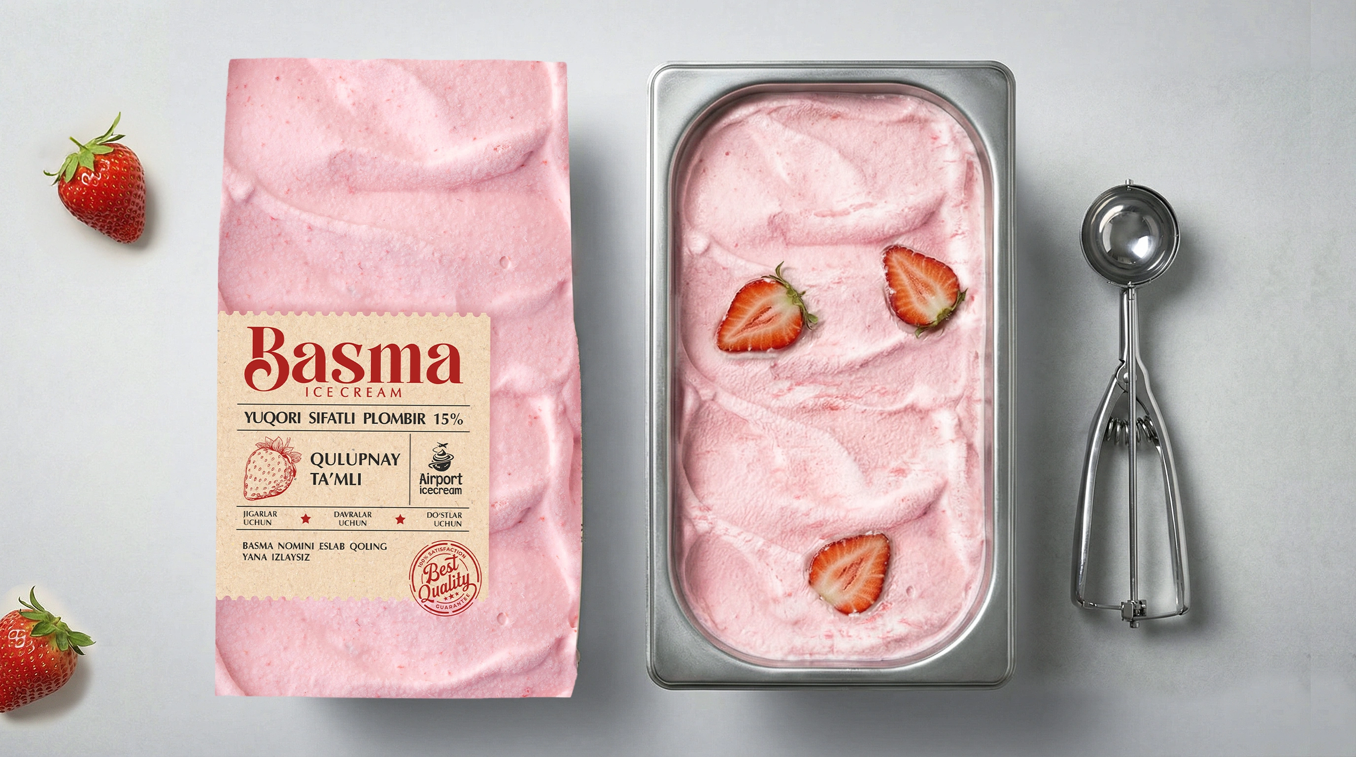
- Real texture as the hero: We completely ditched boring, solid-color backgrounds. Instead, we covered the entire packaging with a hyper-realistic, top-down texture of the ice cream itself (whether it's strawberry, vanilla, or kiwi). As a result, the packaging literally turns into a massive, appetizing scoop! The buyer doesn't just see a graphic; they see the treat itself.
- A focus on naturalness: In today's era of artificiality, people crave authenticity. That’s why we styled the main info label to look like craft paper. Subconsciously, this sends a warm signal of a handcrafted, clean, and natural product.
- The human touch: We custom-drew all the icons and infographics in a hand-written style, as if a calligrapher just sketched them. This stripped away that cold, corporate "stamped" look, bringing life and soul to the design.
The Result
The end result is a design that doesn’t just catch the eye, but makes the customer think: "Wow, they really nailed it!" The harmony between the realistic texture and the natural craft vibe significantly elevated the product's perceived value. Now, Basma isn't just a favorite solo treat—it’s the centerpiece of the table for big gatherings and family moments.
Did you enjoy this case study? If your product also needs a powerful design that practically sells itself, we’re right here. Reach out, and let’s discuss your next big project.