NINJA — Teen Ice Cream Branding and Packaging Design
A non-traditional visual solution for successful naming and showcasing the product’s inner layer.
1. Task
Trust is the greatest investment. After a successful partnership the previous year, Zenit approached us again with a new product.
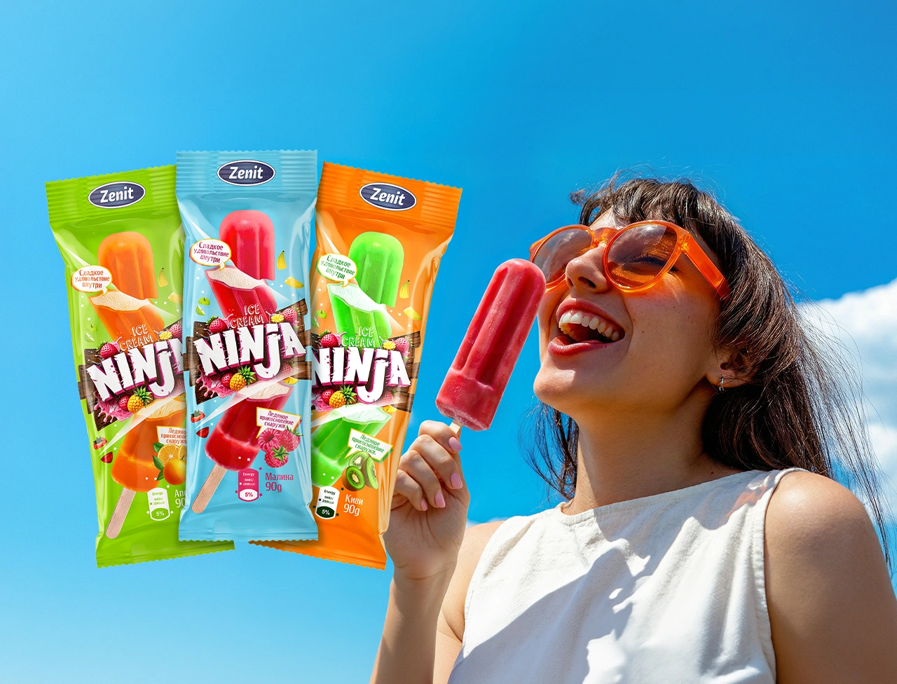
The product featured fruit ice on the outside and creamy plombir inside. The primary audience was teenagers aged 12–16. The objective was to develop a powerful name and cohesive packaging that would capture the attention of a trend-driven audience and communicate the product’s unique taste.
2. Research
Before starting the project, we conducted an in-depth analysis of audience psychology and product characteristics.
Audience insight. As the saying goes, “Every lock has its own key.” Modern teenagers are difficult to impress with generic and predictable design. To engage them effectively, it was essential to reference pop-culture trends and communicate in a visual language they naturally understand.
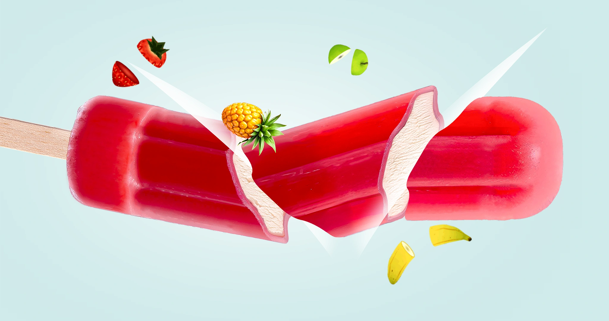
Product insight. Competitors typically reveal the creamy filling of double-layer ice cream by showing a “bitten” edge. We needed a completely fresh yet instantly recognizable approach that would feel original while remaining intuitive to the audience.
3. Solution
To define the visual concept correctly, we began with developing a strong brand name.
Naming. Initially, we presented eight naming options. Among them, “Ninjoy,” combining “Ninja” and “Enjoy,” became a frontrunner. However, during the final discussion, we chose simplicity and memorability, selecting the bold and universally recognizable name “NINJA.”
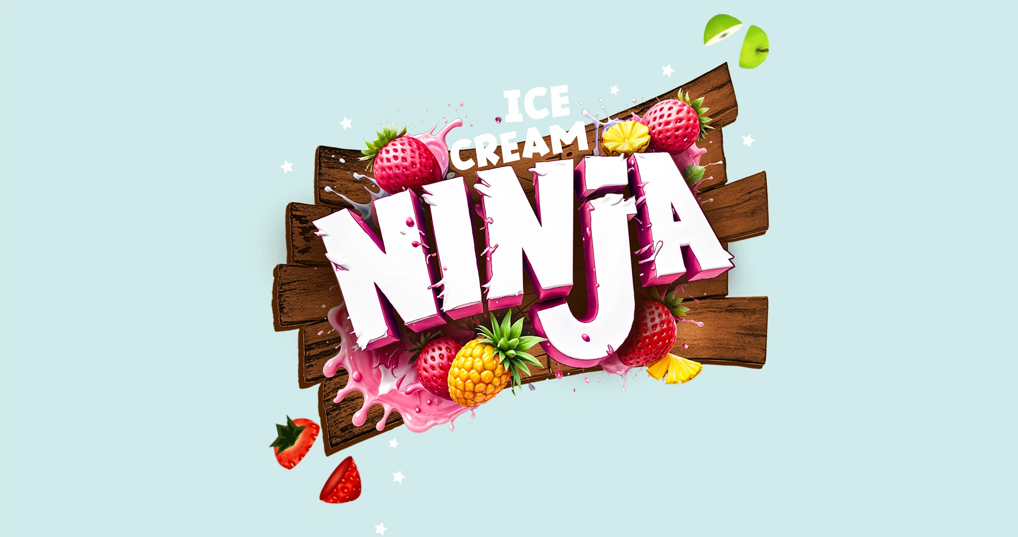
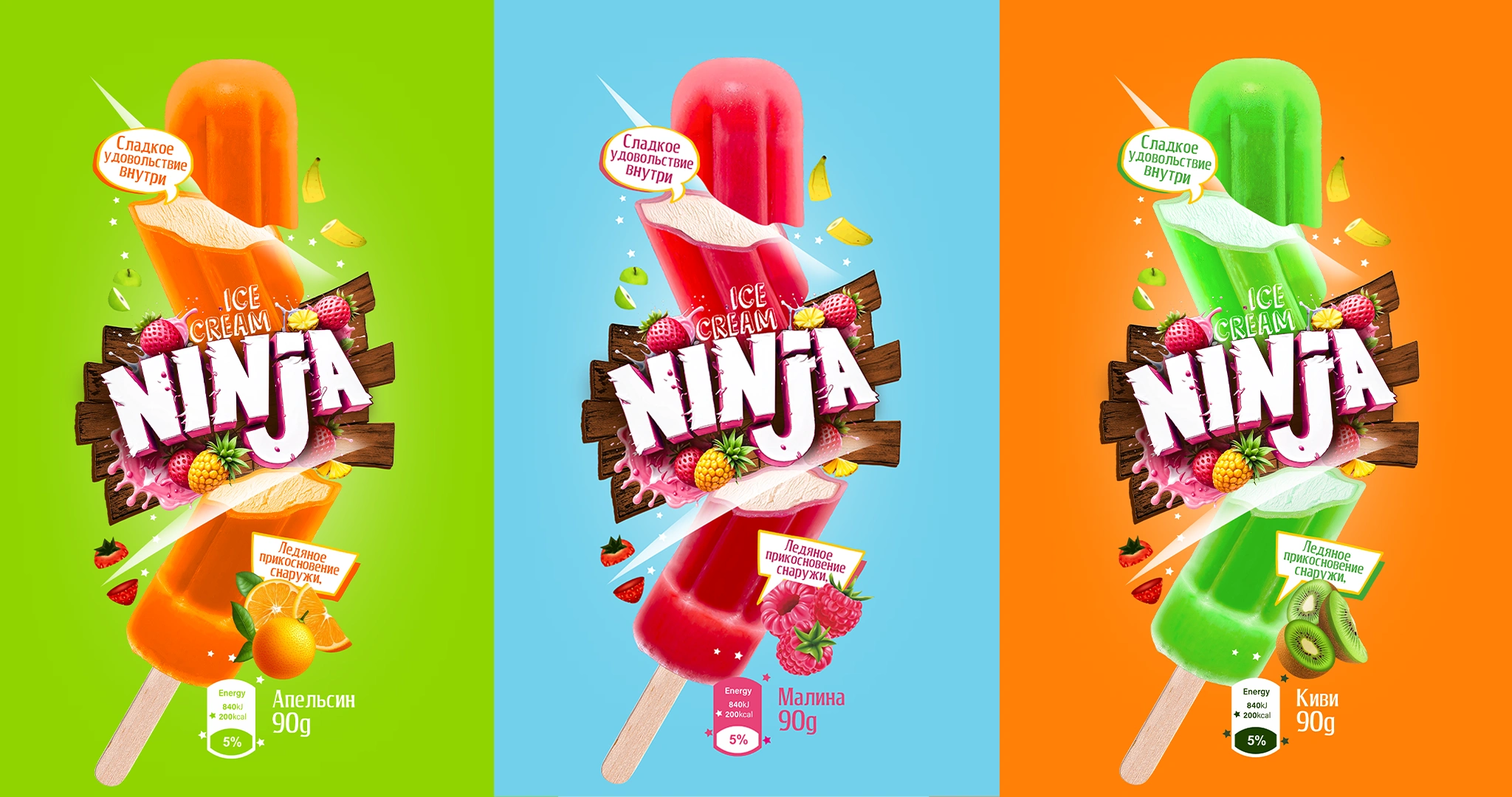
Visual identity. The power of the design lies in the harmony between the name and concept. Inspired by the globally popular mobile game “Fruit Ninja”:
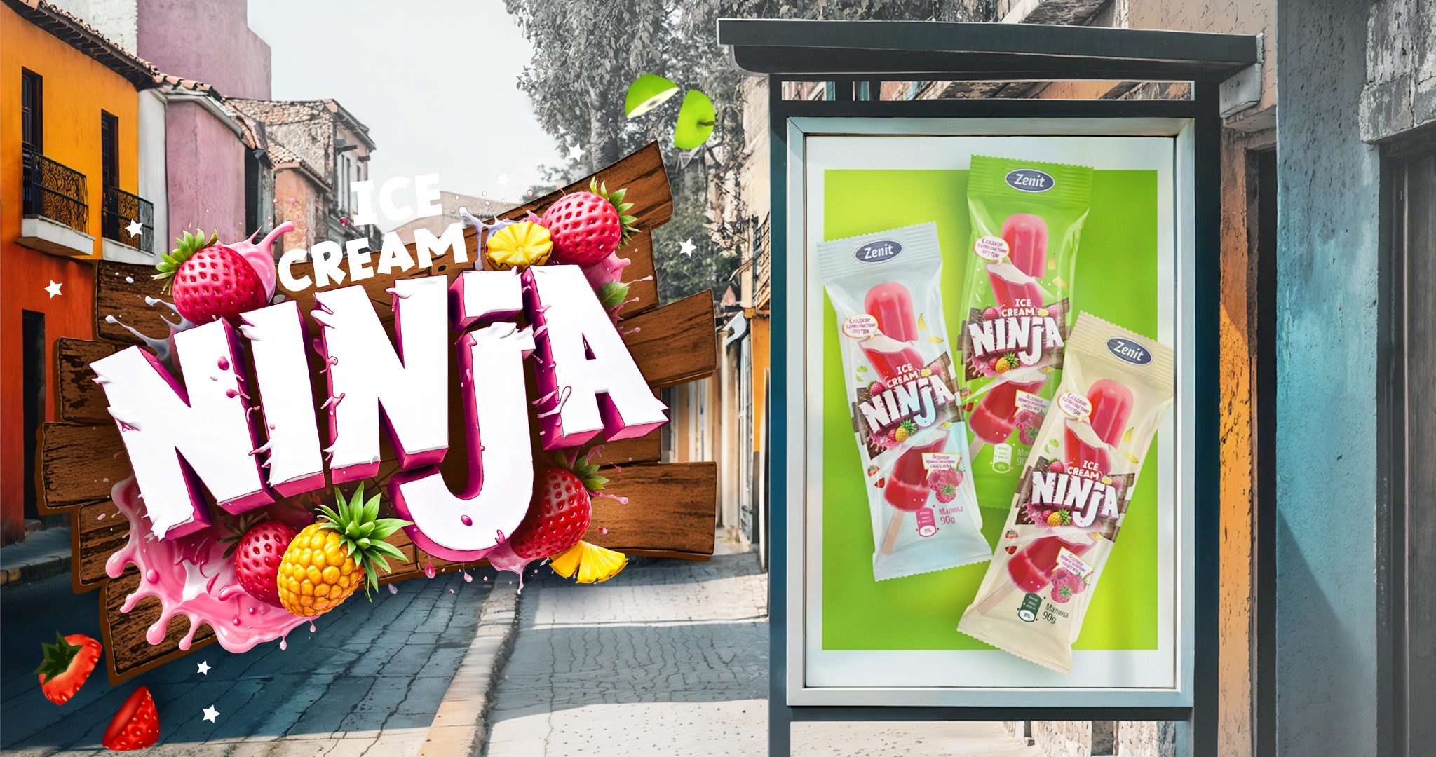
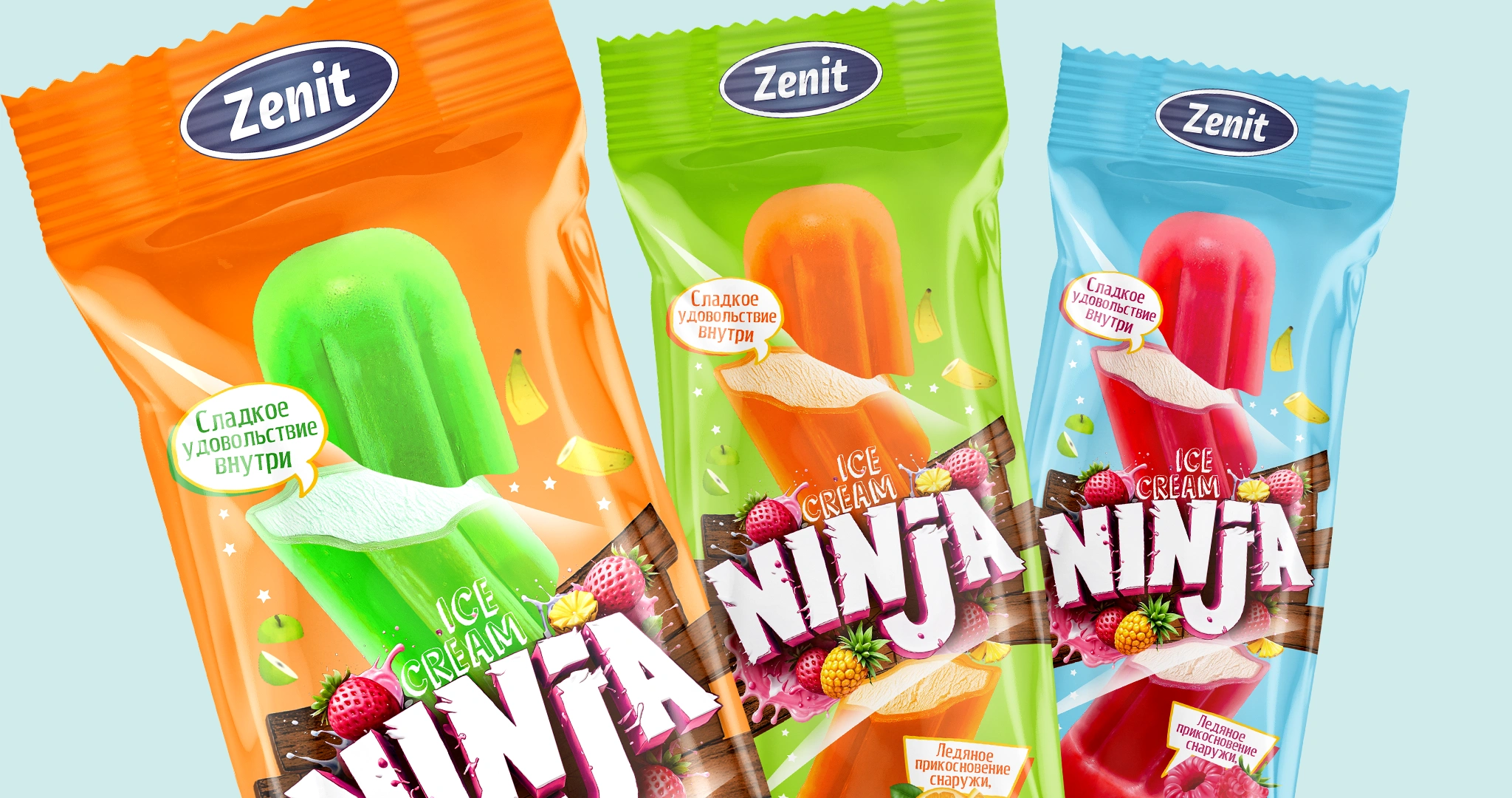
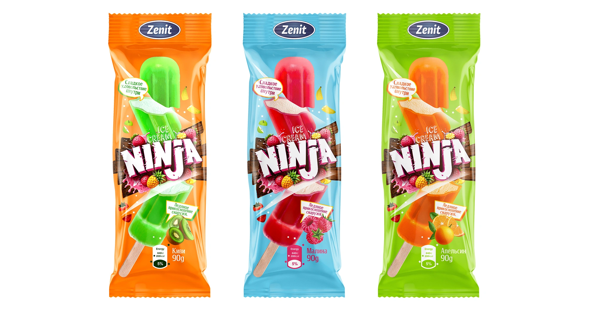
- Logo: Designed in a modern 3D style on a wooden board background with juice splashes and dynamically flying fruit pieces.
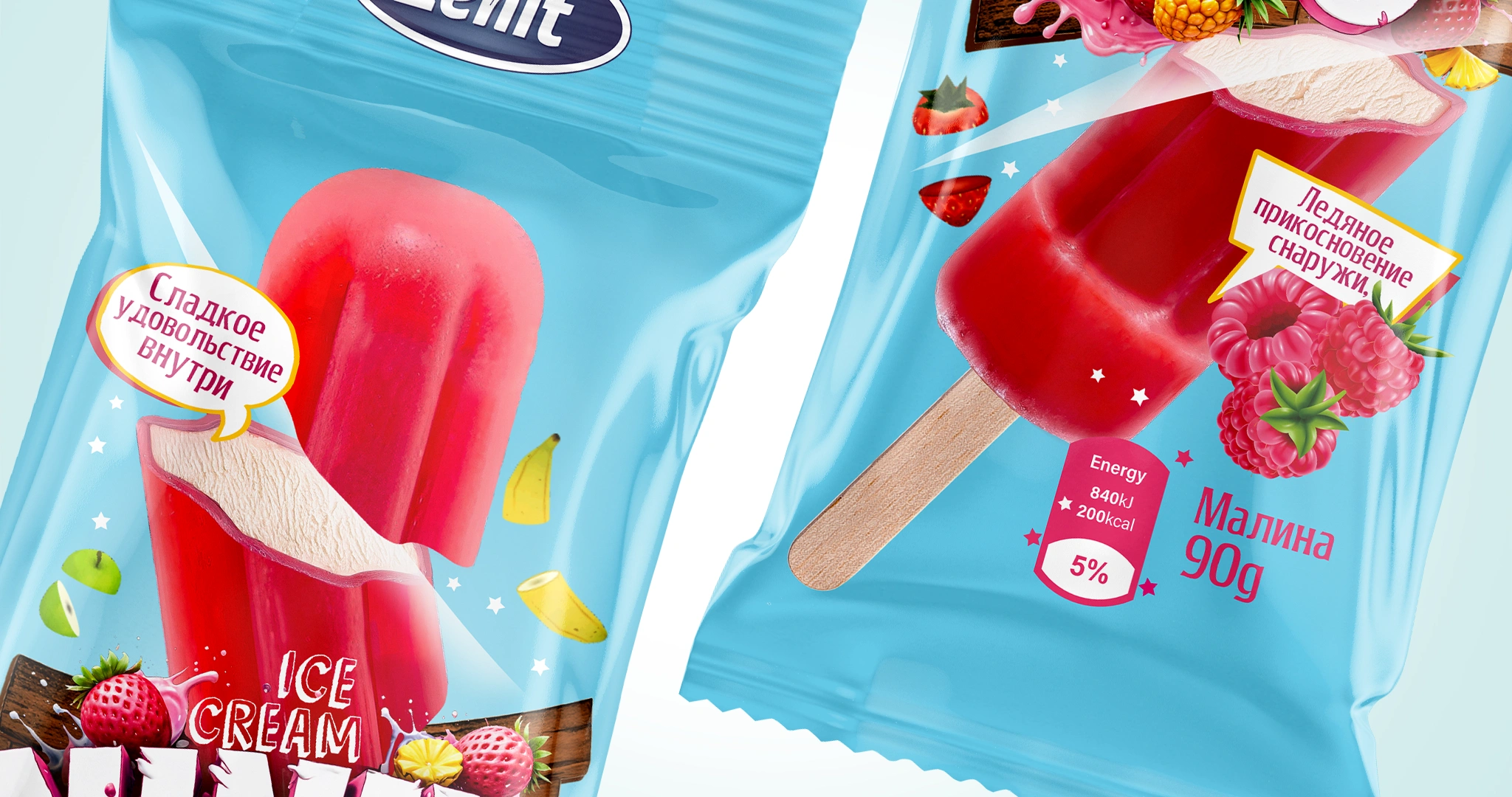
- Sliced ice cream: Instead of the predictable “bitten” shape, the ice cream was illustrated as if sliced in half by a ninja sword, creating strong motion and visual energy.
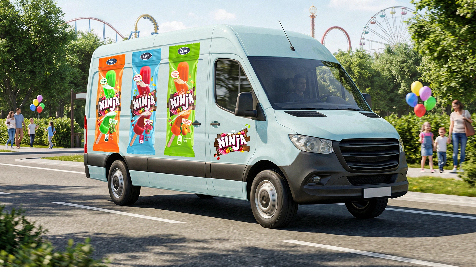
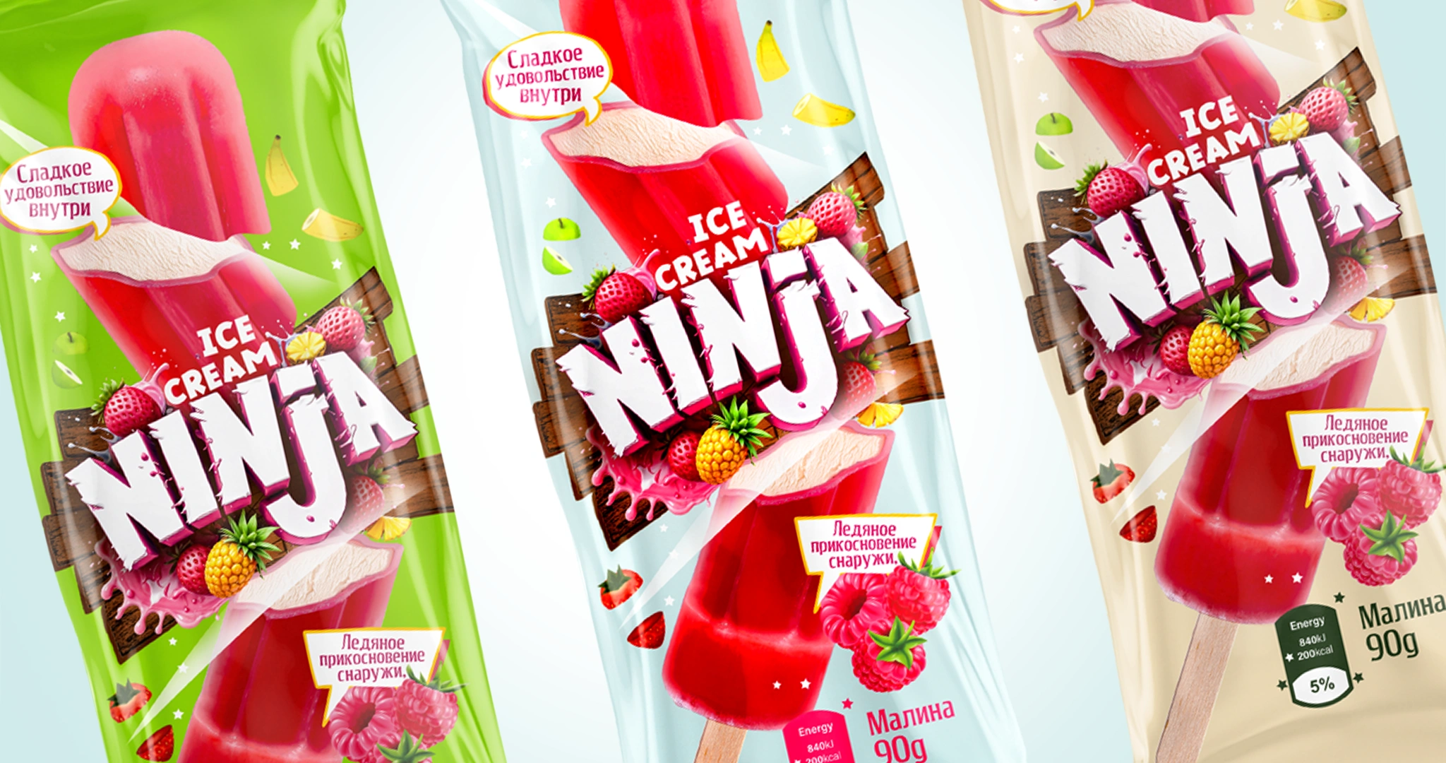
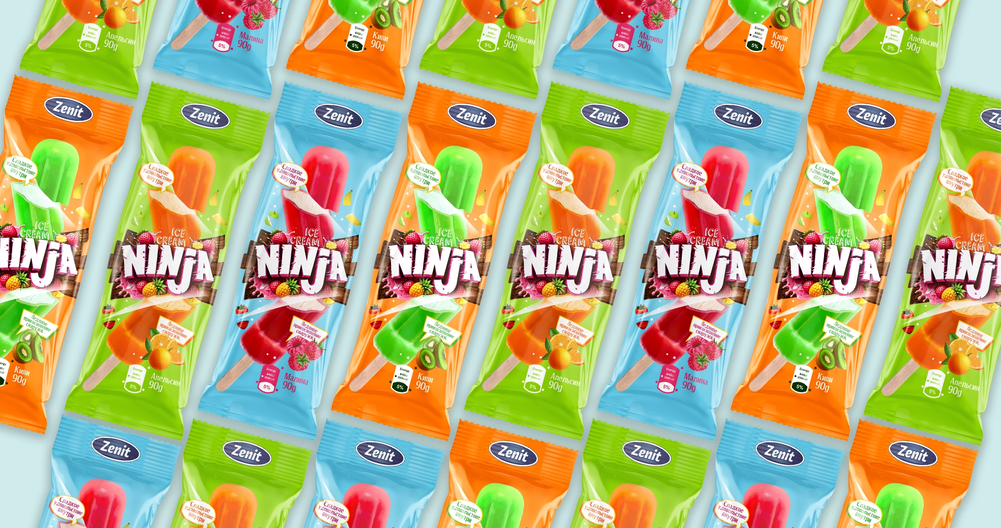
- Colors: Bright palettes were developed for three flavors (Kiwi, Raspberry, Orange), emphasizing the refreshing nature of the product and enhancing appetite appeal.
Result
The outcome was more than packaging — it became a cohesive visual story built around a powerful name and infused with a playful gaming spirit. The “NINJA” brand instantly captured attention in freezer displays thanks to its brightness and dynamic presentation.
As legendary designer Milton Glaser once said, “There are three responses to design: No, Yes, and Wow.” Achieving that “Wow” was our goal. Through the strong naming and the sliced-ice-cream concept, we successfully triggered this reaction among teenagers. Today, “NINJA” has become one of the top-performing products in Zenit’s portfolio and a strong contender for Category A status.