


MONDAY – Express Branding for an Ice Cream Brand in Uzbekistan
Name, logo, and competitive packaging design developed within 2 weeks for an MVP product launch.
1. Task
Sometimes a business does not need hundreds of pages of marketing analysis or a long-term strategy. It simply needs a fast and precise solution to enter the market and compete effectively.
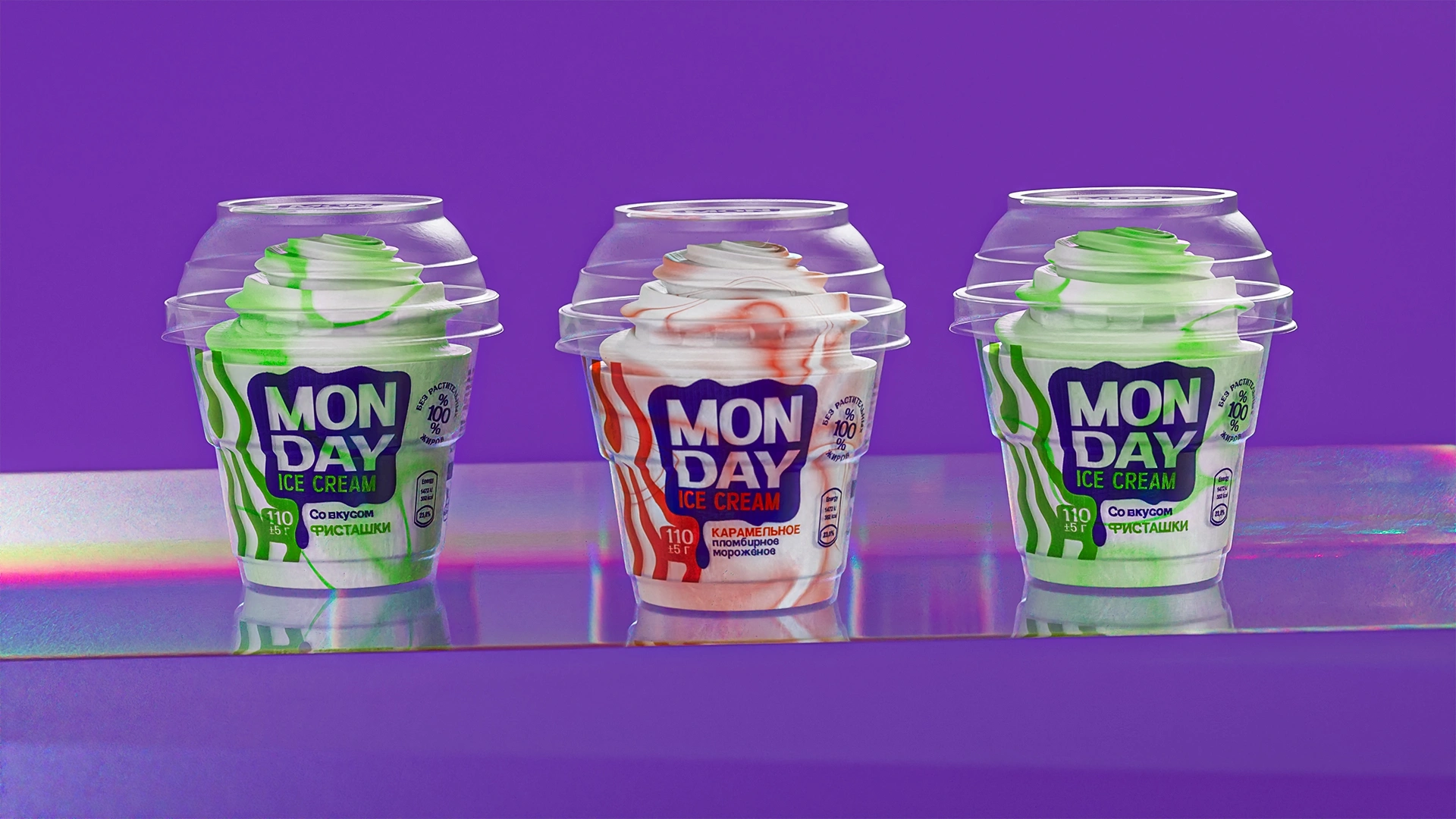
Our client was preparing to launch a new ice cream line as an MVP product. We had an empty container sourced from China and a strict two-week deadline. The objective was to create a brand name, develop a logo, and design packaging that would clearly differentiate the product from the market leader Shin-Line and other competitors.
2. Research
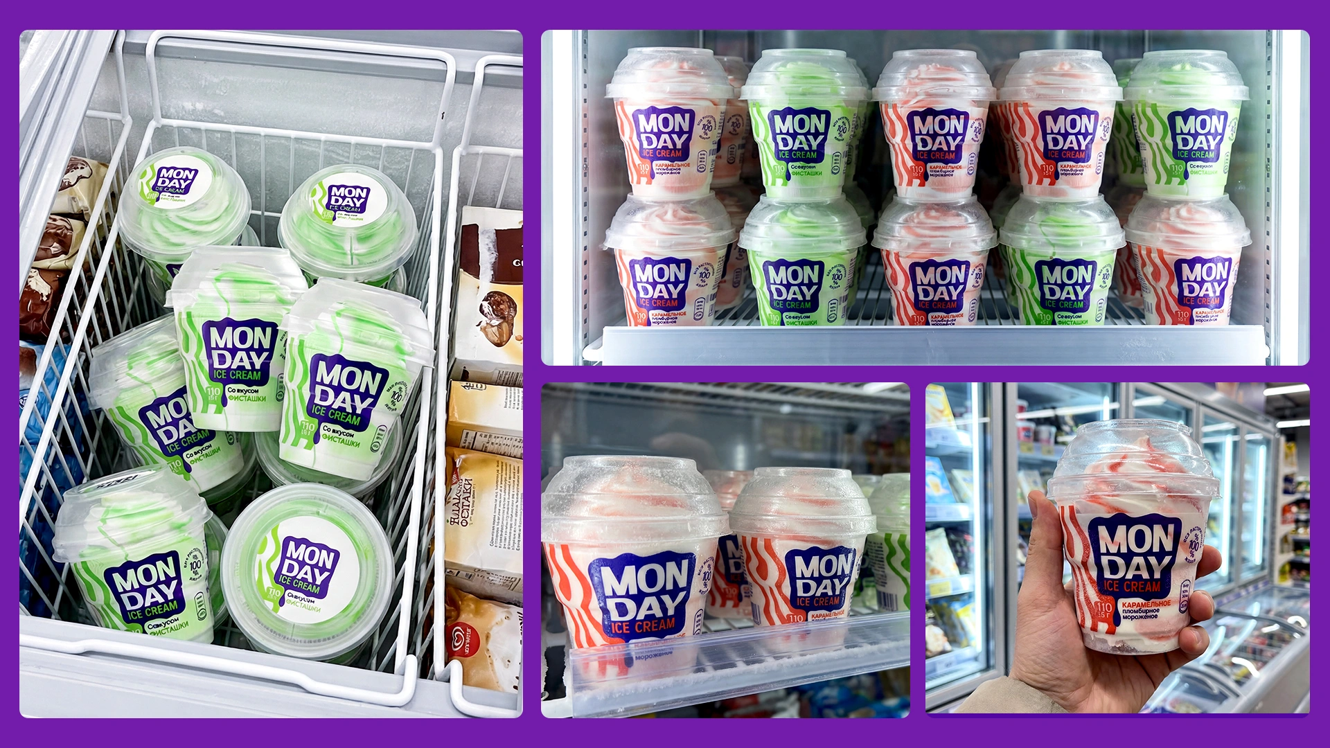
Due to the limited timeframe, we focused on practical shelf research rather than theoretical analysis. The most valuable insights were found directly in retail freezer displays.
Shelf analysis
During our research, we discovered that most competitors were using visually similar and outdated design approaches.
Even established brands lacked freshness, innovation, and strong visual contrast. As a result, the entire category appeared visually uniform and offered no clear focal point inside the freezer.
Differentiation strategy
Our goal was to ensure that the customer’s attention would immediately shift toward MONDAY as soon as the freezer door was opened.
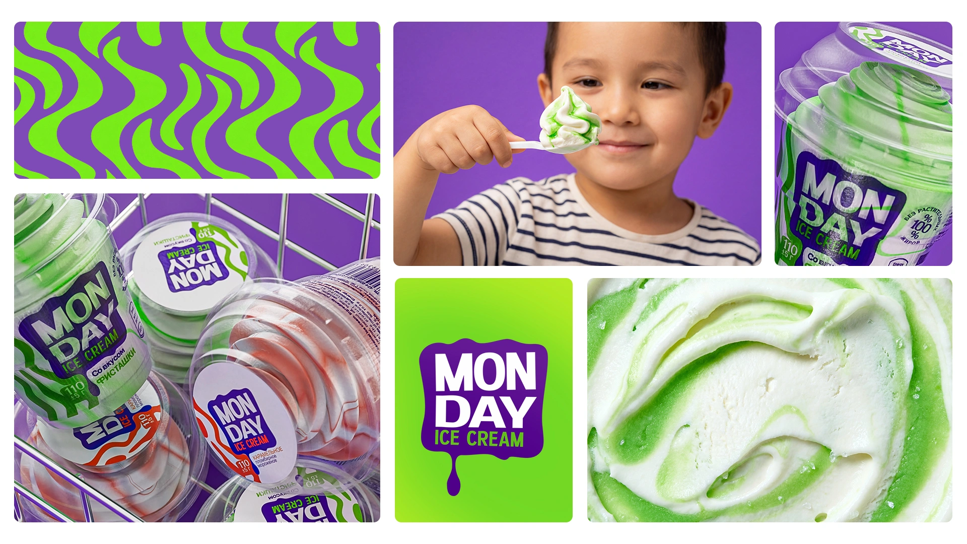
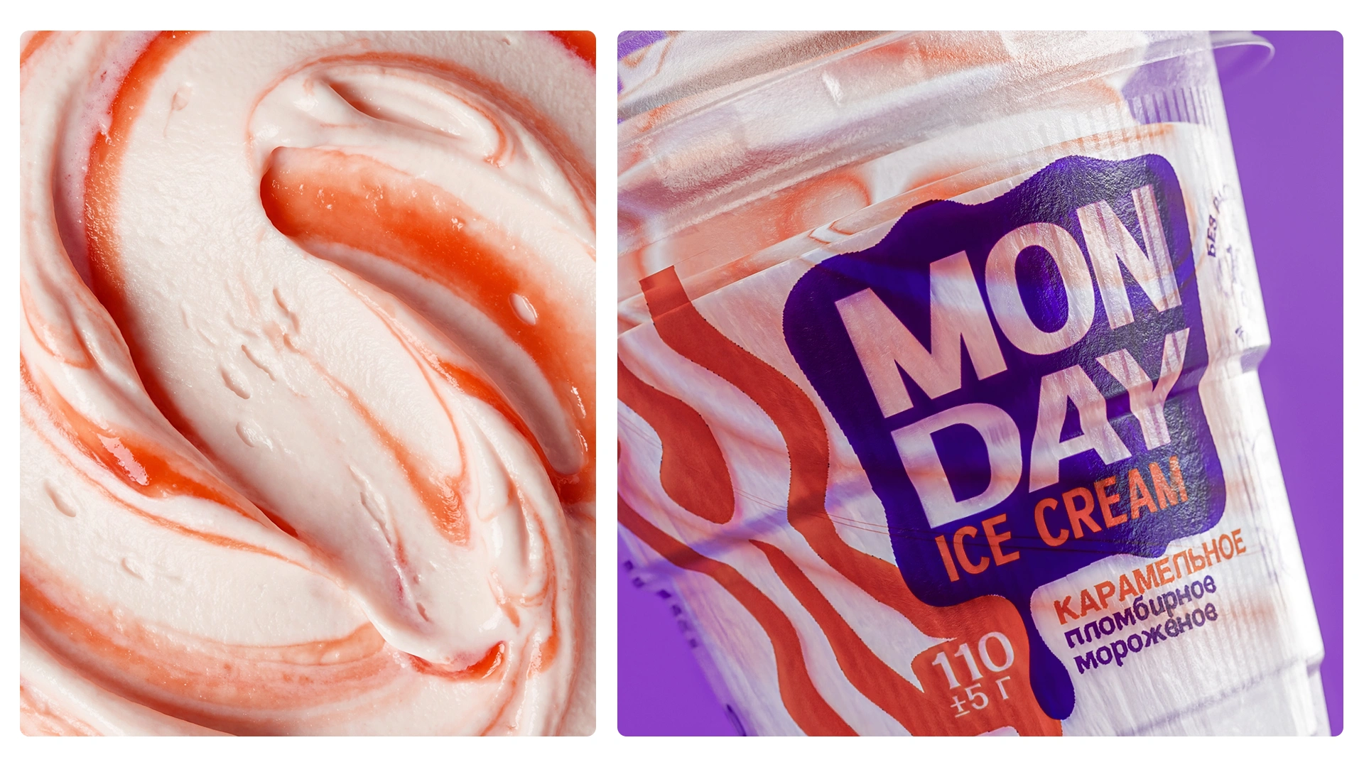
Instead of developing an overly complex brand philosophy, we focused on bold visual clarity. Bright colors and dynamic patterns became the main tools for creating instant shelf impact.
3. Solution
We applied an “Express Design” method: no unnecessary elements, maximum visual impact, and fully professional execution.
- Naming — a strategy born from constraints: the original idea was Sunday, a name associated with relaxation, sunshine, and positive emotions. However, the name was unavailable, so we shifted to Monday. Since Monday is often perceived as the most difficult day of the week, it gave us the foundation for a strong emotional concept: “Start your heavy Monday with light and delicious ice cream.” As a result, the brand received a short, memorable name with a distinctive personality and positive emotional character.
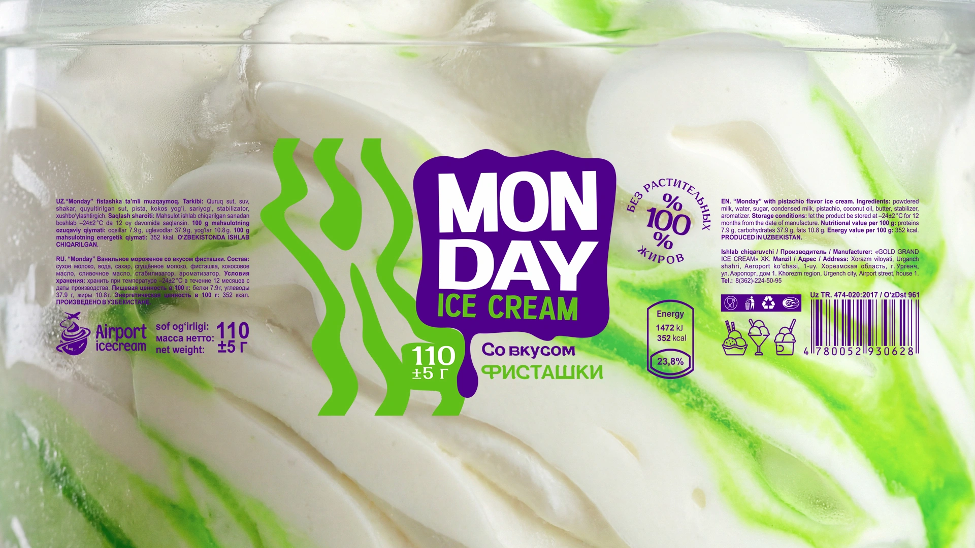
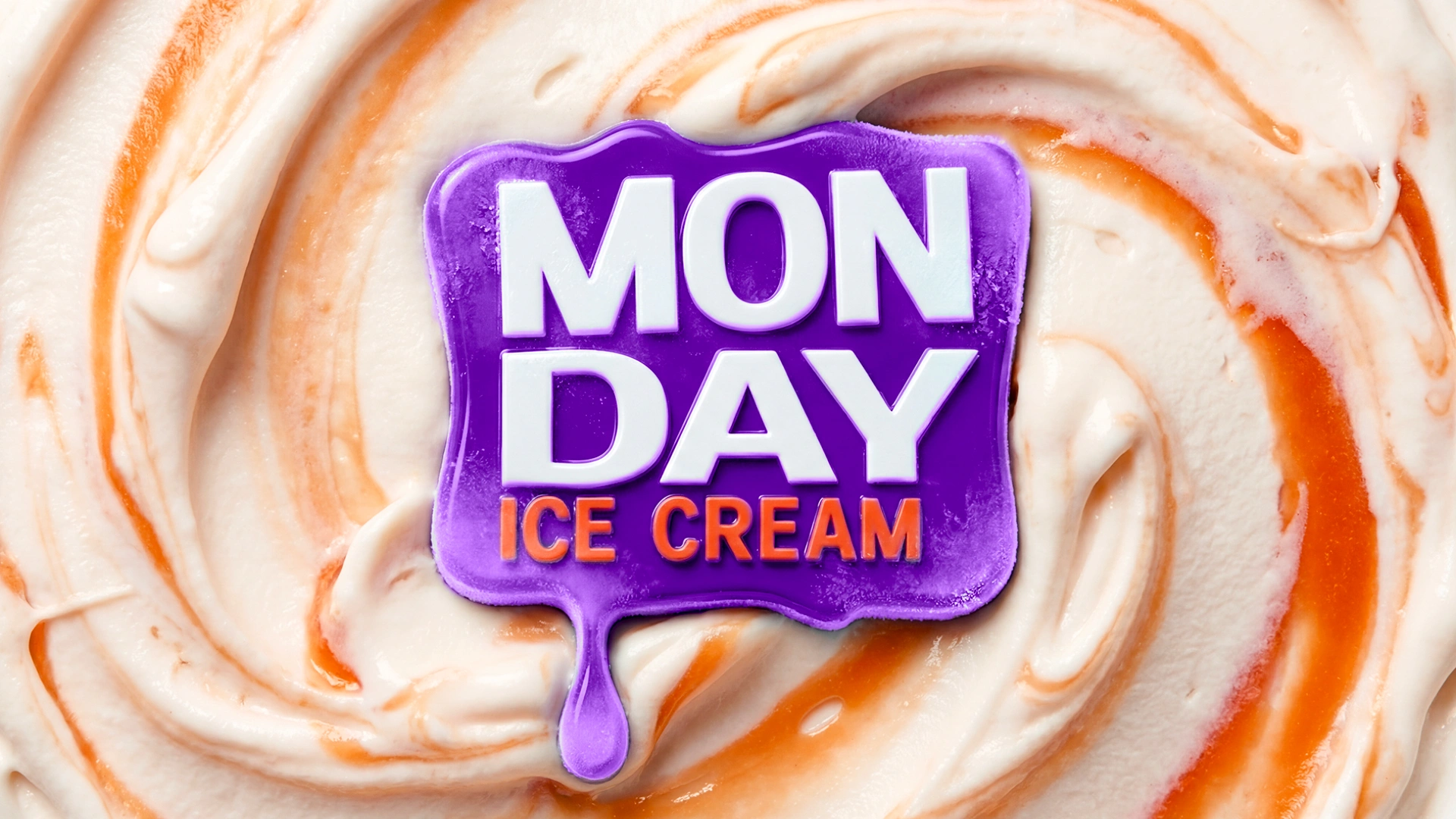
- Logo: a modern, clean, and highly readable logo was developed for the brand. The graphic elements were inspired by the flowing texture of ice cream topping, creating a direct connection with the product category and reinforcing its appetizing character.
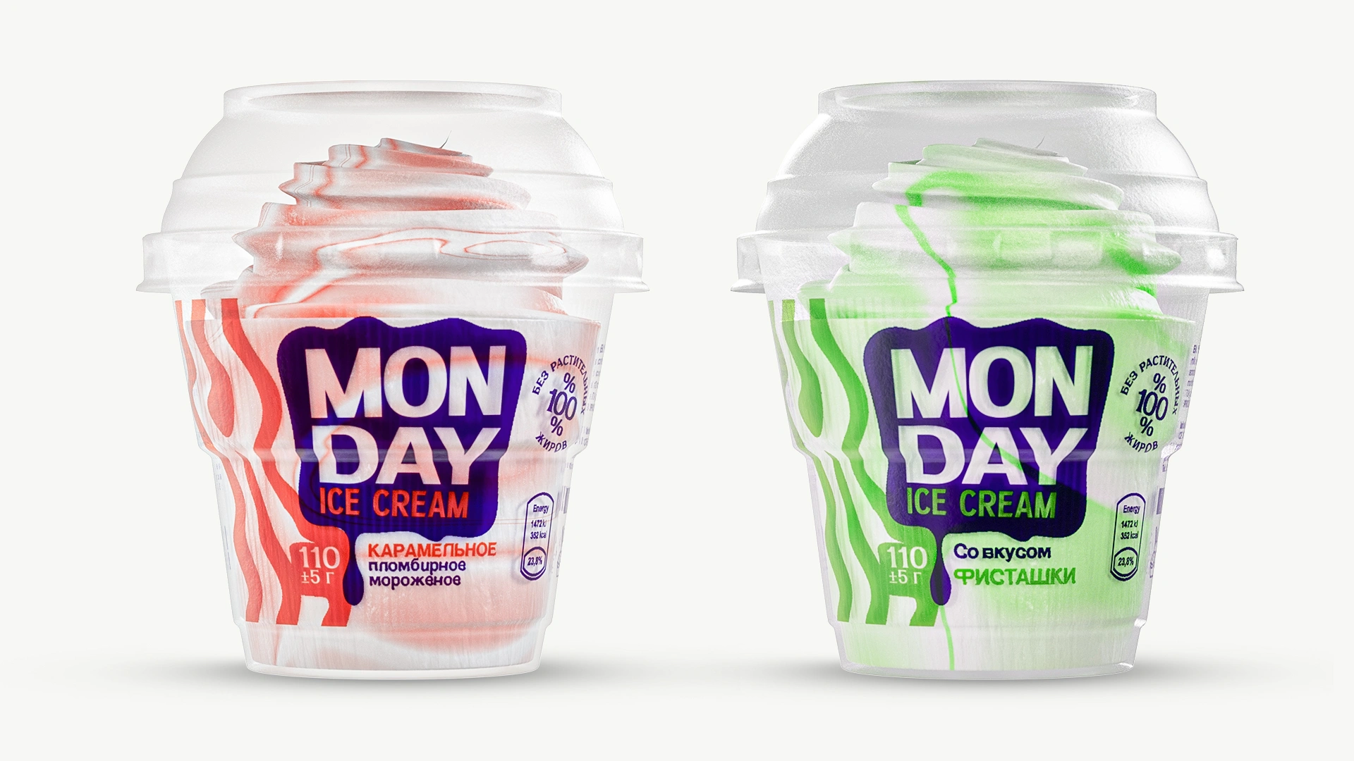
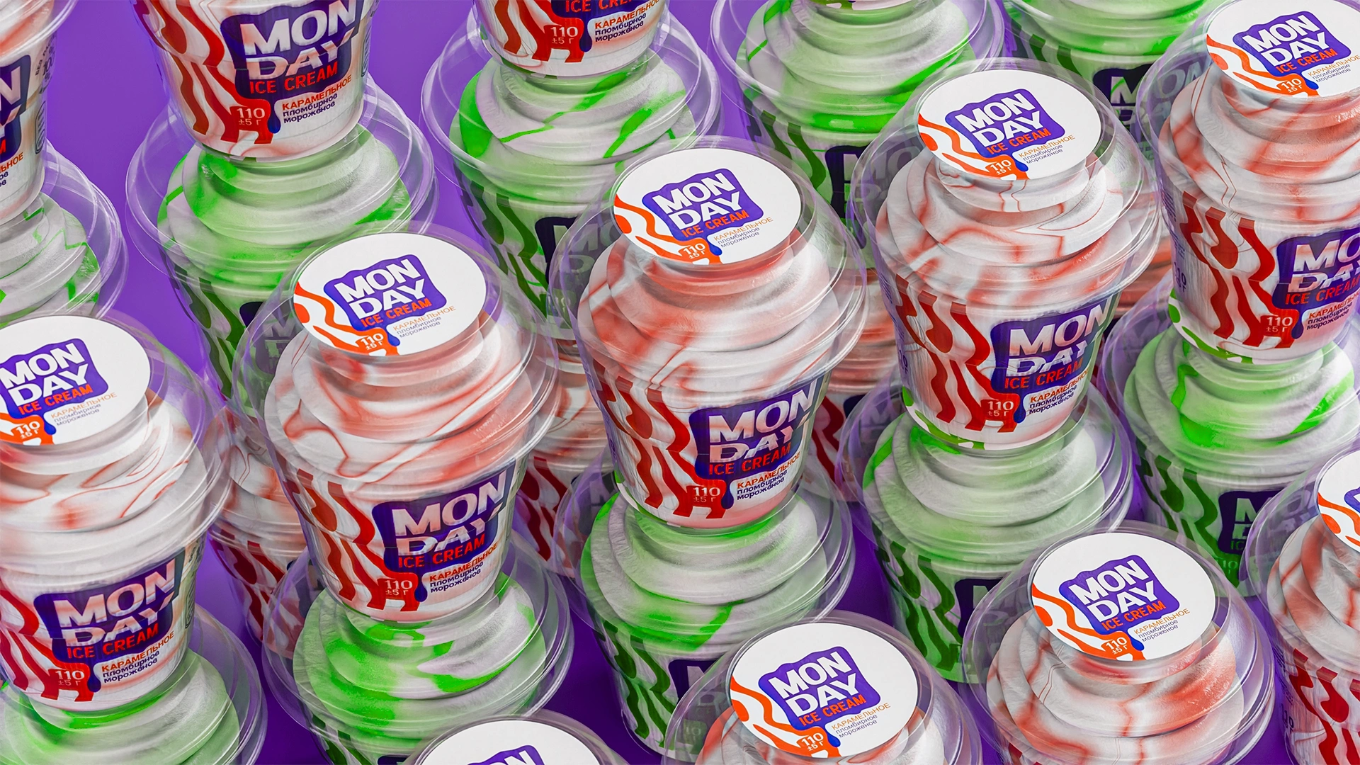
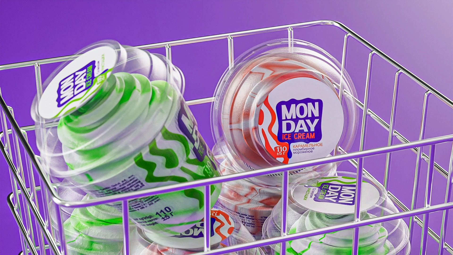
- Color system: high-contrast and appetizing color combinations were selected for the Pistachio and Vanilla variants. The color system creates clear SKU differentiation and ensures strong visibility in freezer displays, helping the packaging stand out from Shin-Line and other competitors.
Result
Within 14 days, an unnamed product was transformed into a complete and market-ready brand.
The product gained a distinctive personality and a strong visual identity. Its packaging cuts through the visual noise of retail freezer displays and attracts customer attention among competing products.
The client received a confident platform for launching the MVP product, testing market demand, and evaluating its potential for future growth.
MONDAY proves that even with limited time and resources, it is possible to create a professional, memorable, and competitive brand.
Now Monday can finally be sweet.
If you also want to develop a strong brand name, logo, and competitive packaging design within a short timeframe, contact MINIM Agency.