Basma: Packaging Design and Naming for Natural Ice Cream
Complete branding for Basma ice cream: culturally inspired naming, elegant serif typography, and appetizing 3D visuals. Packaging merges Eastern traditions with modern FMCG aesthetics to stand out on the market.
1. Problem
By the client’s request, the packaging had to take into account Eastern traditions and distinguish the product among similar offers.


2. Research
We conducted a thorough market analysis and competitor research. Research into the target audience’s preferences confirmed that consumers are not only looking for visual appeal, but also cultural value.


Solution
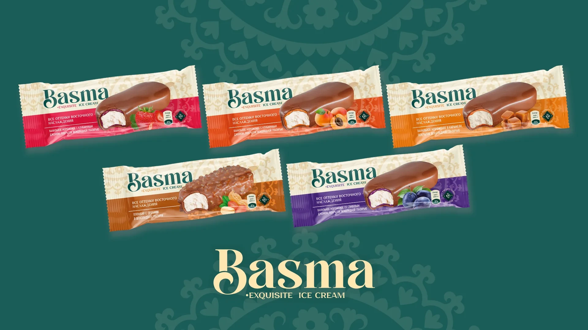
- Naming: we chose the name “Basma” for the new ice cream line in the brand. This word means “signature”, “seal” or “edition” in Turkish, which symbolizes the uniqueness and indelible mark that our product leaves in the hearts of consumers.
- Logo: to make the name of the new product quickly memorable, we designed the logo in aesthetic typography, namely a serif font.
- Packaging design: we created appetizing 3D models of the ice cream, emphasizing bright fruits and chocolate coating. The visualization was done in such a way as to emphasize not only the attractiveness of the product, but also to integrate Eastern traditions, adding cultural value to the packaging.