Taamin — Packaging Design for an Ice Cream Line
Modern entrepreneurs are, in the truest sense, universal soldiers. They are not only executives; when needed, they act as marketers and creative directors. Before launching a project—long before reaching an agency—they conduct extensive research, brainstorm with ChatGPT, generate countless ideas, and shape their own visual concepts.
The Urgench-based company Khorezm Holod (our long-term client) approached us with this exact modern mindset to develop the packaging design for their new Taamin ice cream line.
1. Problem and Task
The client's brief was both intriguing and creative. Using artificial intelligence, they had already formulated the technical requirements (TOR) and coined the brand name Taamin. However, they entrusted the visual execution entirely to us—tasking us with making the product truly eye-catching and commercially successful.
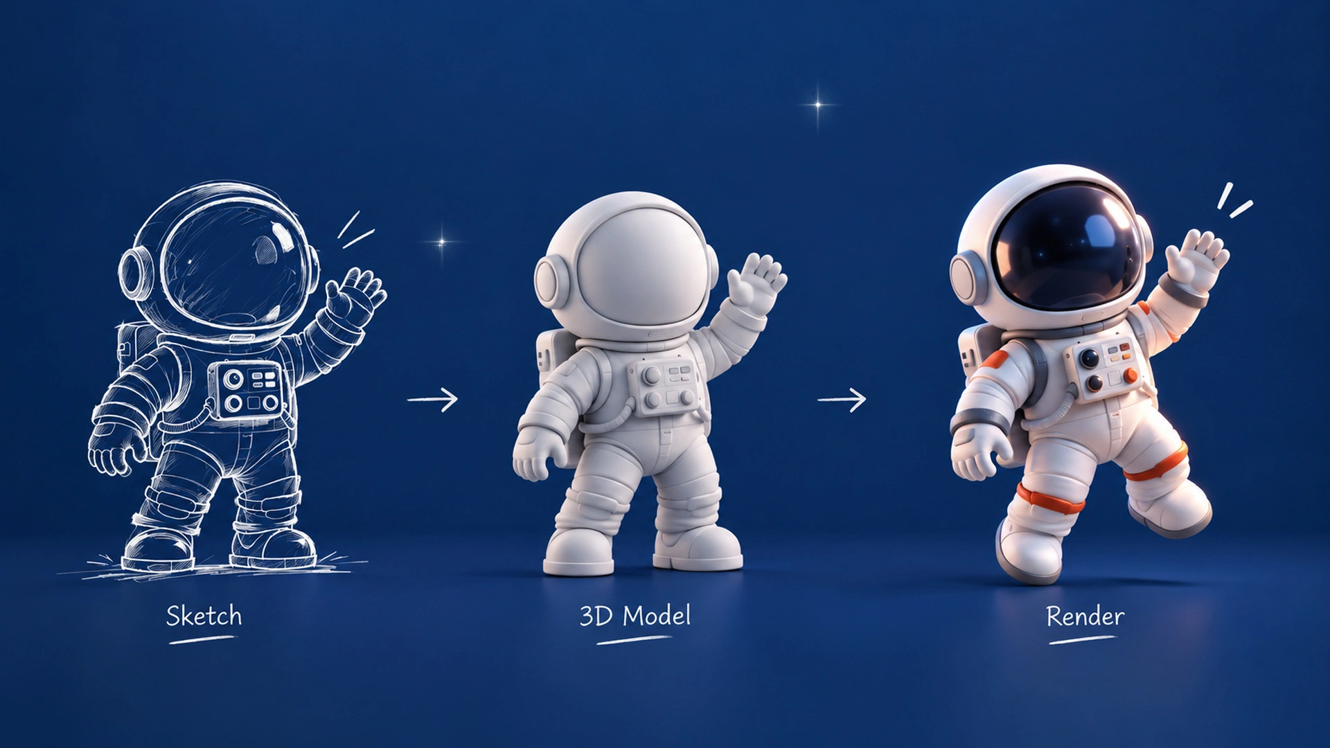
Thus, our primary task was to transform the concepts from the client's imagination into real, appetizing, and modern packaging.

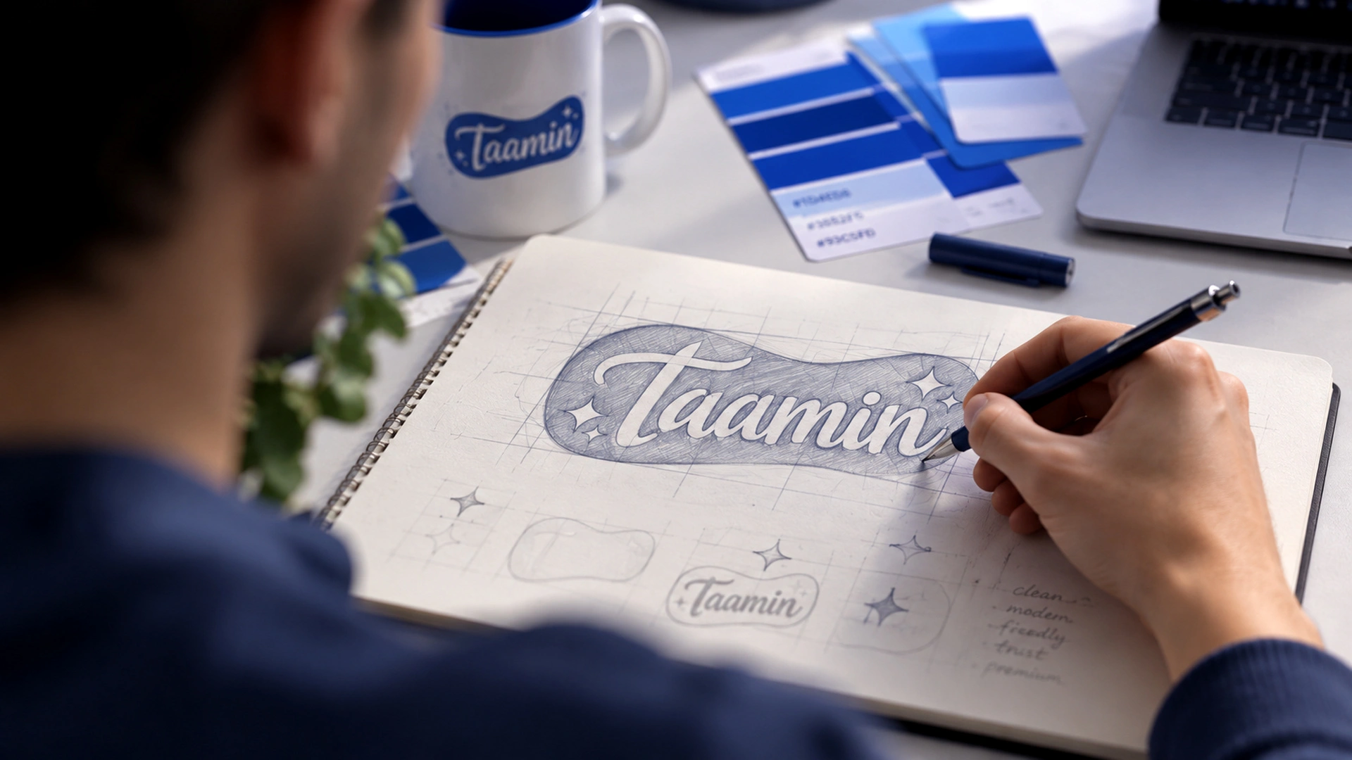
2. Research
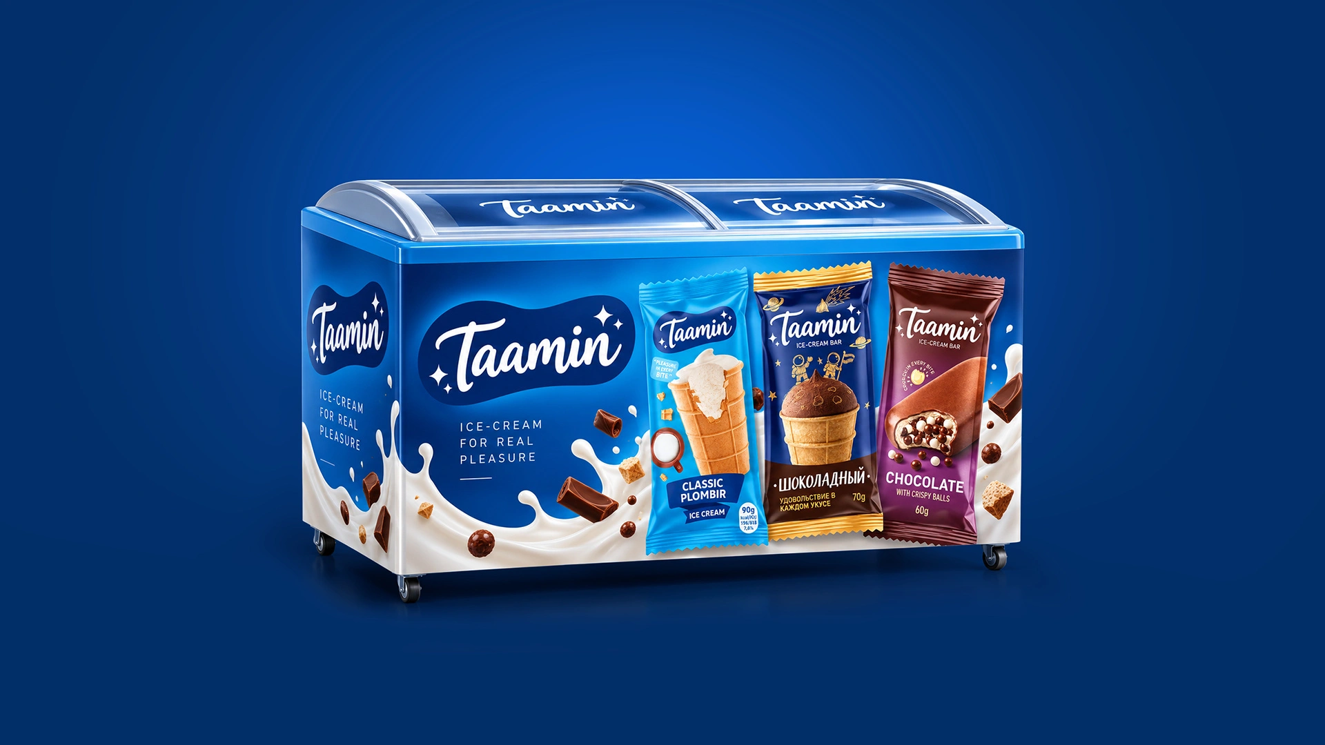
We were presented with two distinct ice cream lines: ice cream bars with crispy balls inside and classic plombir in waffle cups.
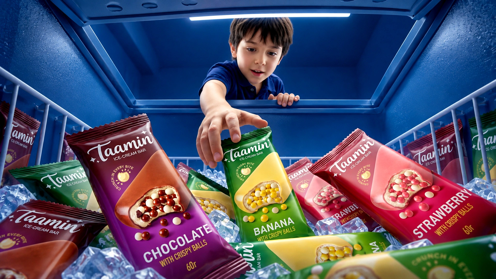
As the saying goes, "People eat with their eyes first." To make shoppers' mouths water the moment they look into the freezer, we needed to highlight the product's strongest selling point. Simply holding the pack had to make the customer anticipate the crunch of the crispy balls or the taste of soft, velvety ice cream.
3. Solution
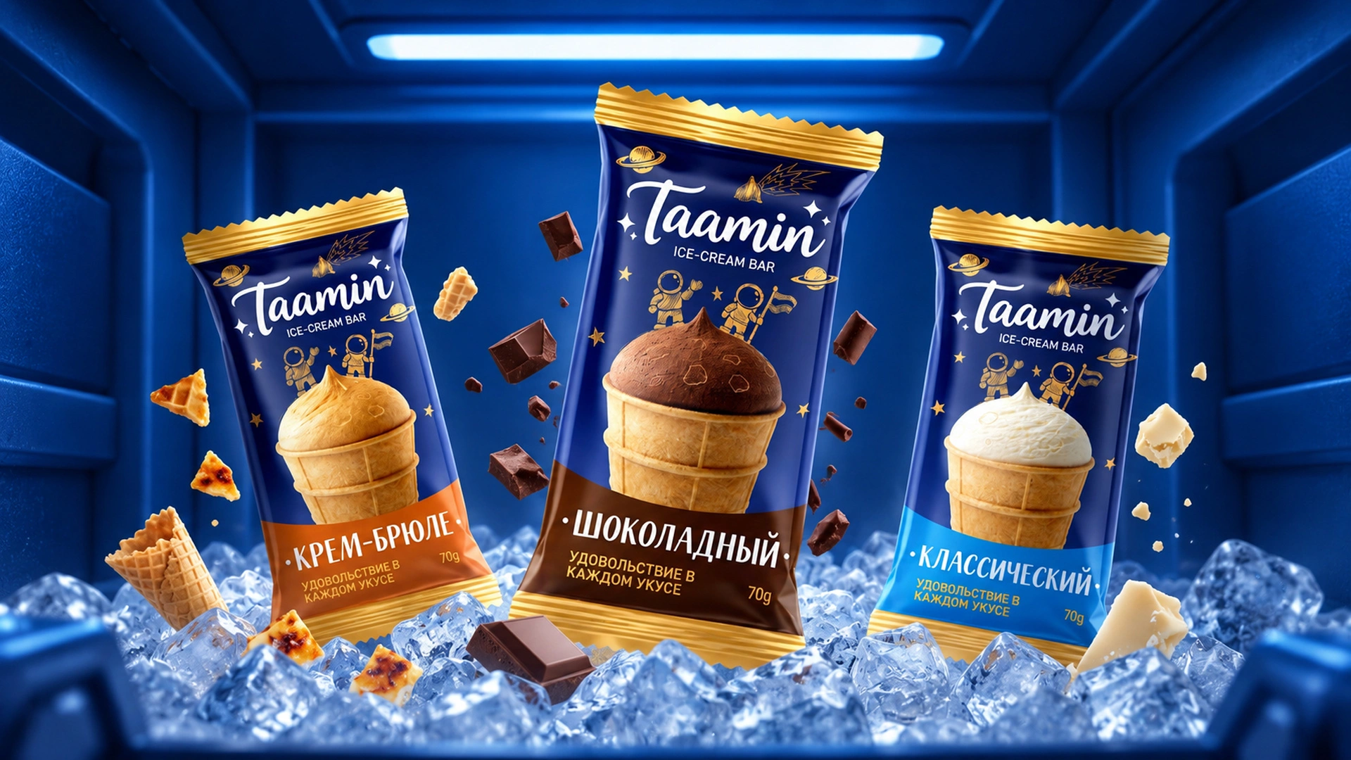
Without overcomplicating things, we brought all the products together under a unified, memorable design system while highlighting the distinct character of each variety:
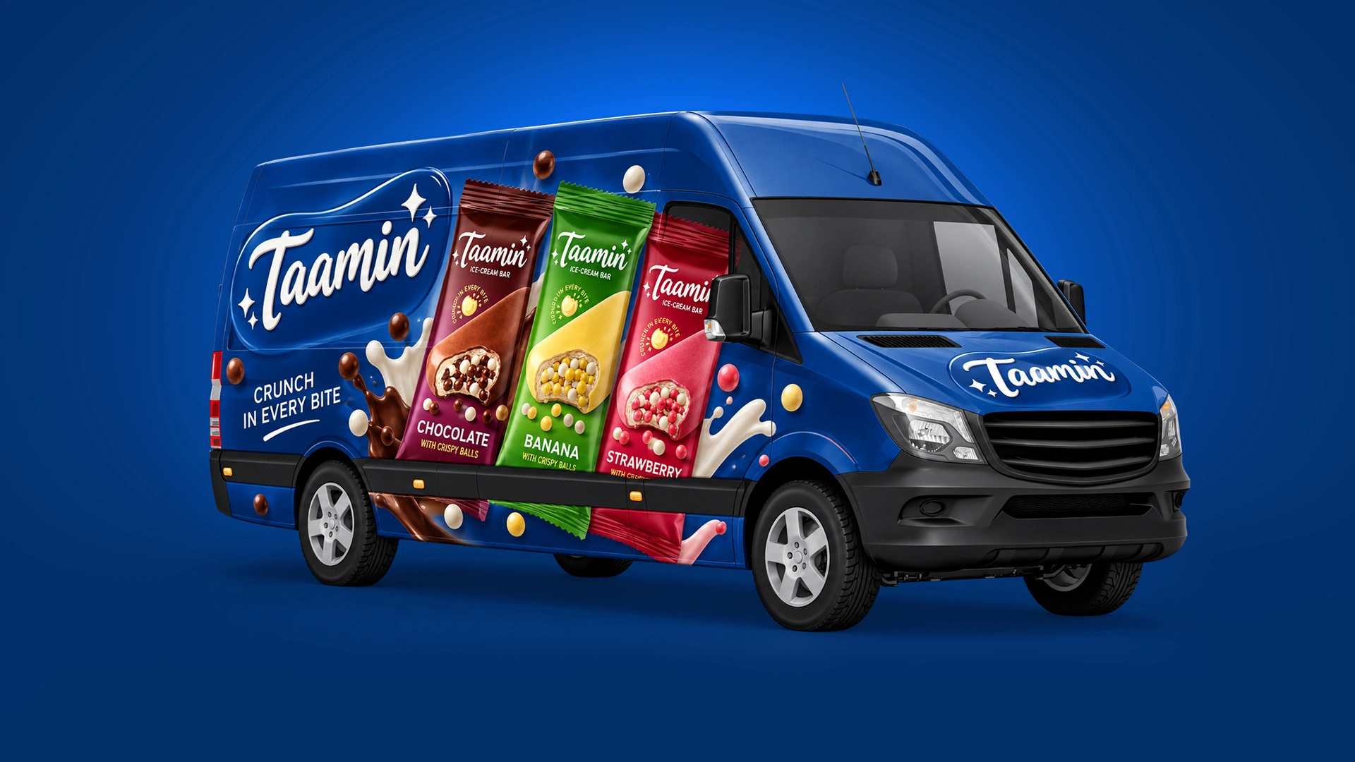
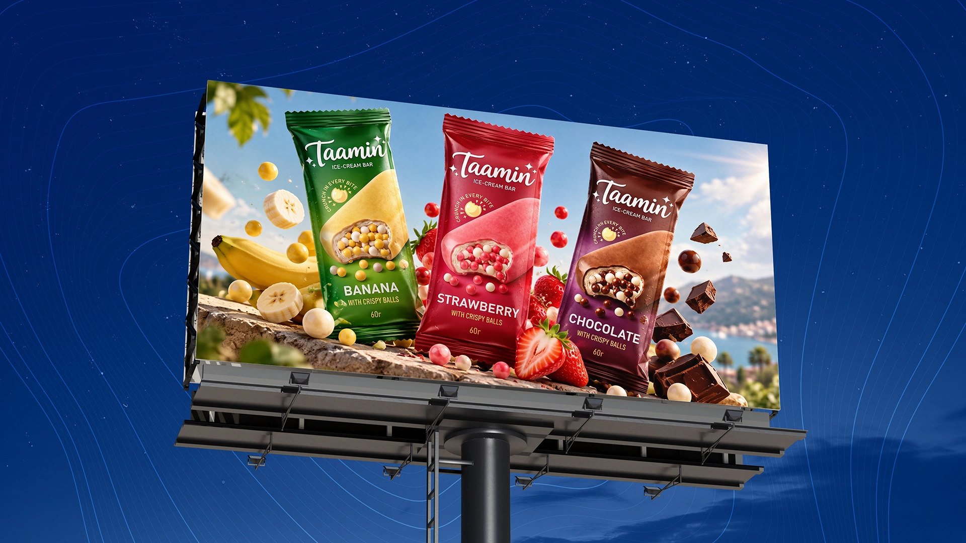
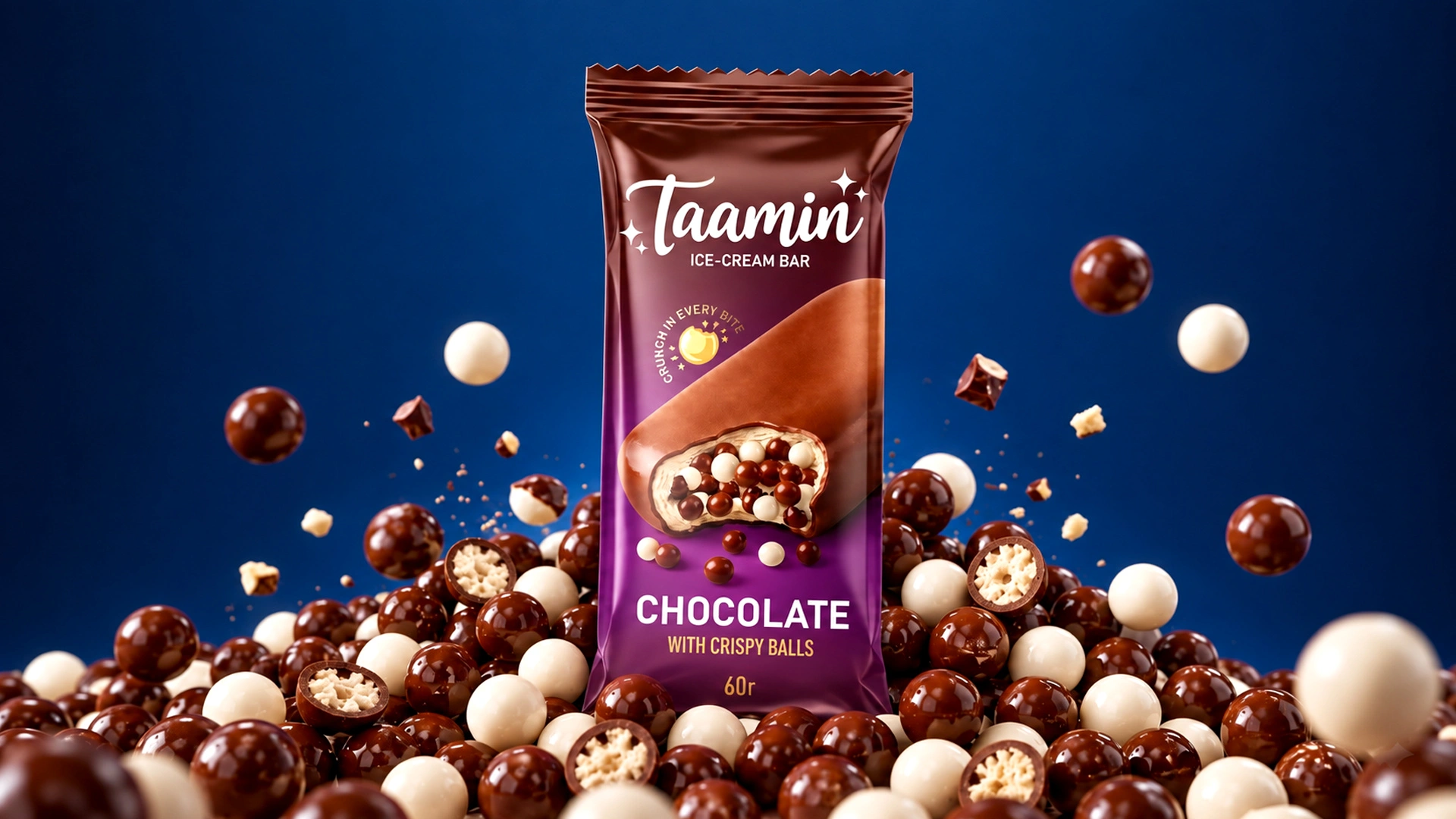
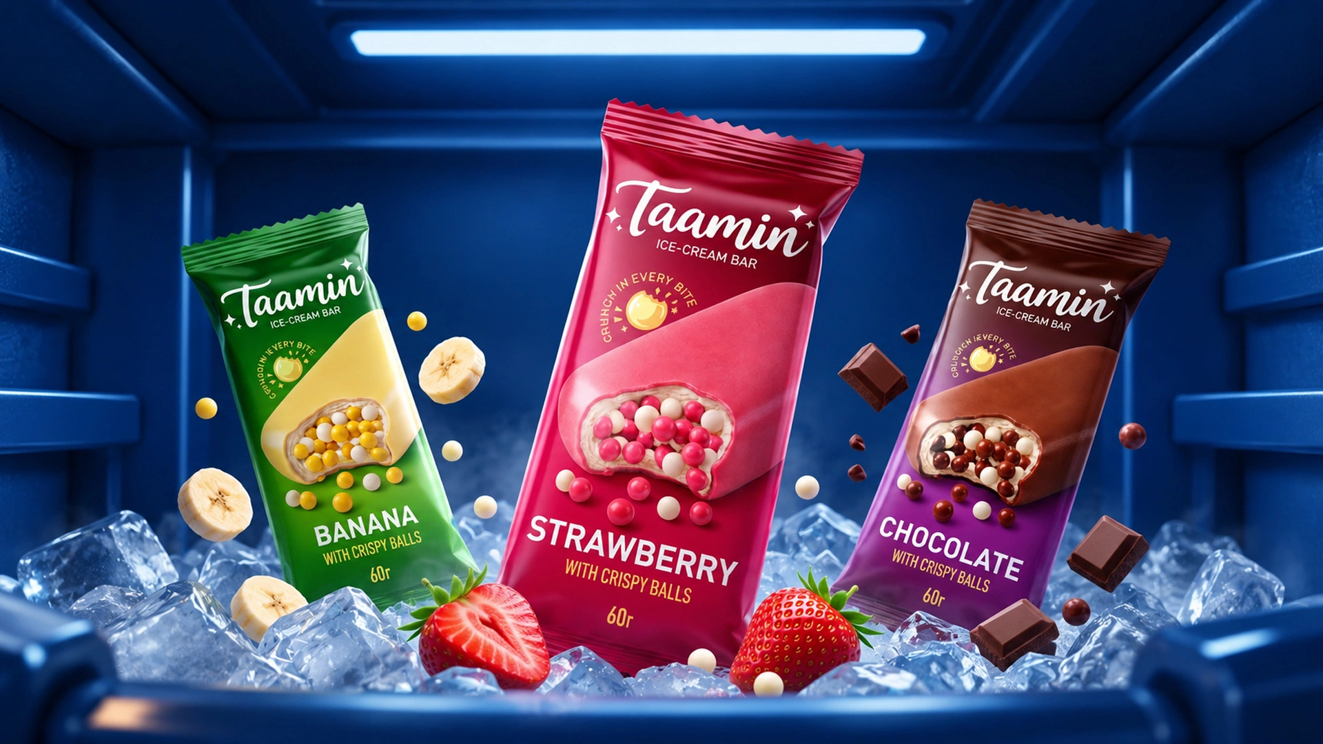
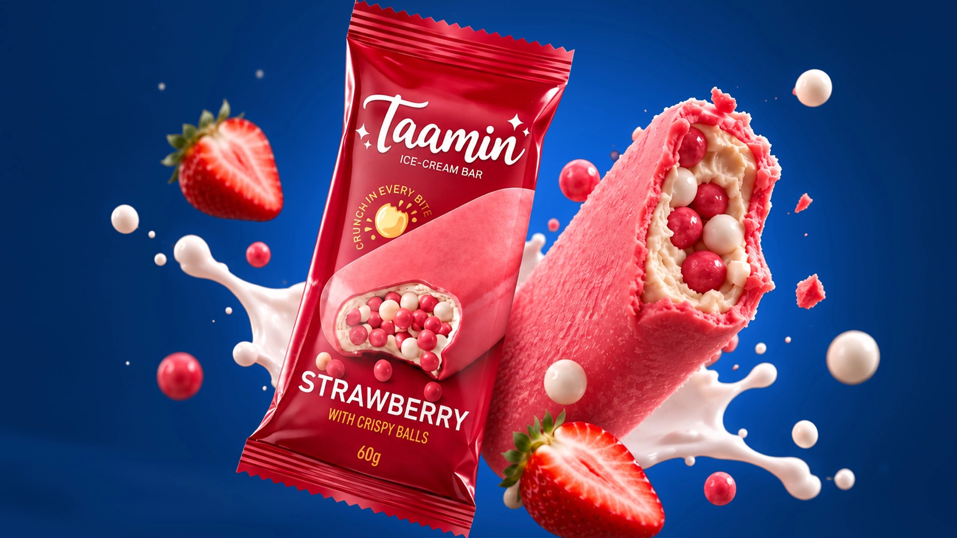
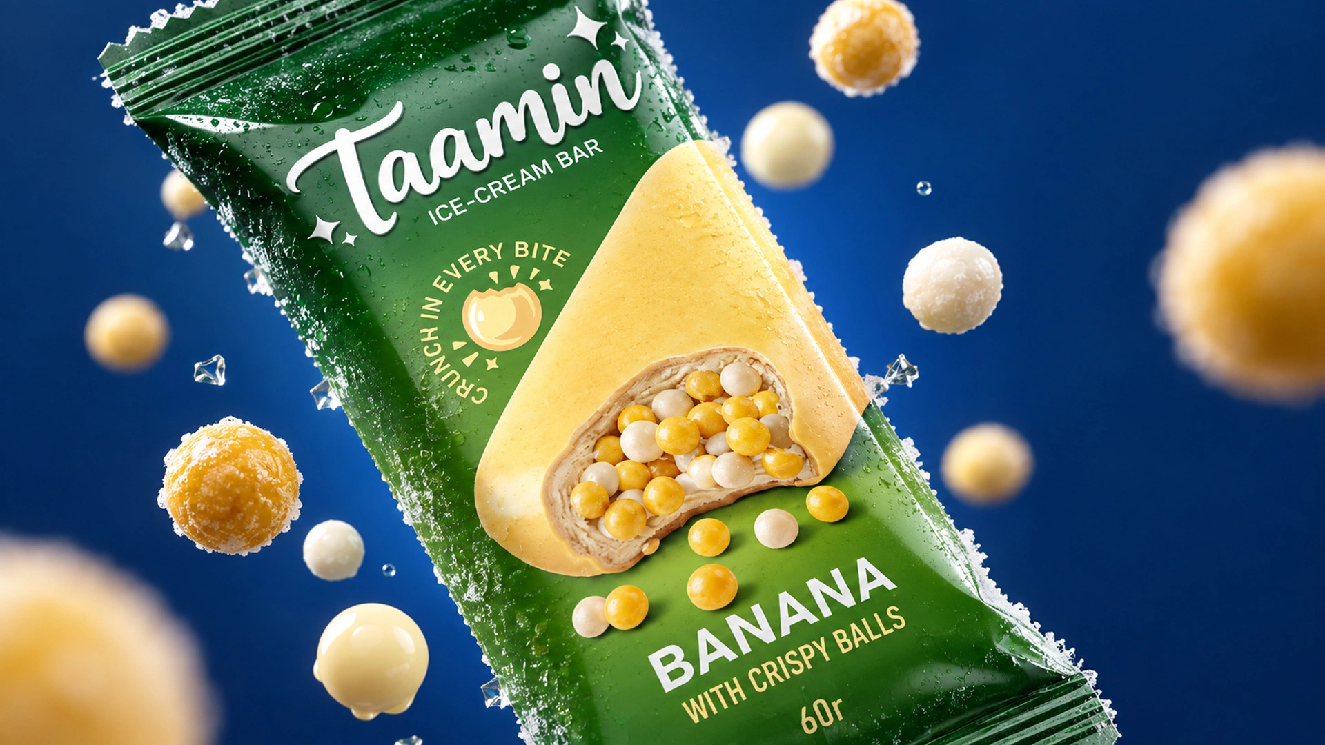
- Crispy Bars: For the chocolate, banana, and strawberry flavors, we selected deep, premium colors. A bitten bar is illustrated right in the center of the packaging, putting the crispy balls on full display to practically say "eat me." To reinforce this, we added the slogan "Crunch in every bite."
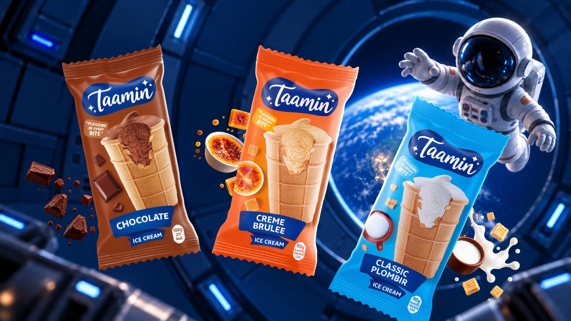
- Waffle Cup Ice Cream: Here, we focused on color interplay and rich details. We created a light blue package for classic plombir, brown for chocolate, and orange for crème brûlée. Each design skillfully showcases the bitten ice cream alongside appetite-inducing elements (a jug of fresh milk, chocolate pieces, crème brûlée dessert).
- Label Layout: All technical and nutritional information was formatted using typography and modular grid standards, ensuring it remains clean, structured, and easy for consumers to read.

Result
The initial concepts we presented were an instant hit with the client. However, as the saying goes, true success comes from collaboration. The design process is rarely seamless on the very first try; throughout the project, the client provided valuable adjustments and feedback.
We truly appreciate and welcome such feedback. Why? Because as designers sitting in a comfortable office, we mostly see the world through a screen. Our clients, on the other hand, interact with consumers face-to-face every day and know the real pulse of the market inside and out.
By incorporating their practical market insights, we made the necessary refinements and polished the design to perfection. The result is a standout packaging line that will turn heads on retail shelves and pull customers in.
Take a look and judge for yourself! Don't forget to like our work, subscribe to our page, and share this sweet project with your friends. Which flavor are you most tempted to try?