Gelion Ice Cream — Packaging Design and a Unified Design System
What could be better than eating ice cream in the summer heat? But the competition in this sweet business is so "hot" that if you lose focus for even a second, your business can melt away like ice cream left in the sun.
A manufacturer from Samarkand—the Gelion Ice Cream company—came to the MINIM agency with these exact problems and big ambitions.
1. Problem and Task
It is no exaggeration to say that today's ice cream market is heavily oversaturated. If you look into the store freezers, your head will spin from the choices: packaging from Russia, Belarus, Kazakhstan, and even Korea and China is lined up in dense rows. Under such intense pressure, older local brands have to sweat to keep their positions—fighting for space on shelves and in freezers is getting harder every day.
But that's not even the worst part. Let's say a manufacturer has their own branded freezer. But inside, there are 20 products in 20 completely different designs. The buyer simply doesn't know they all belong to the same brand. As a result, one hit ice cream sells well, while the other 19 just sit at the bottom of the freezer, racking up dead stock in the warehouse.
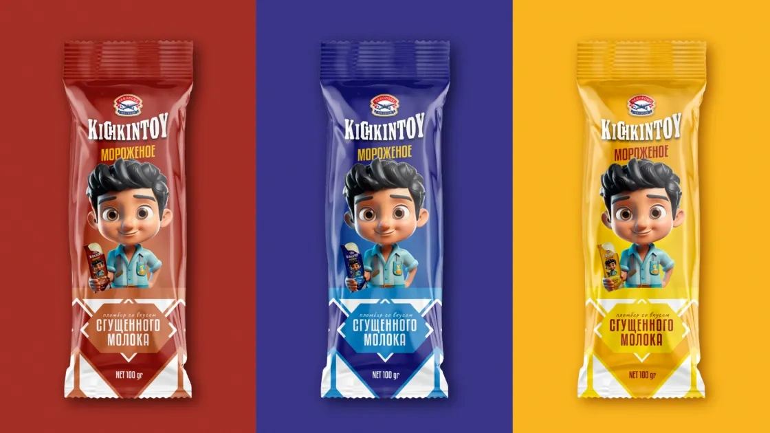
Gelion Ice Cream was facing this exact issue. They had an assortment of over 50 items and more than 50 disconnected, completely different designs.
Our task was to create a single, flexible, and perfect design system for this entire army of products, whether it was bulk ice cream, cones, popsicles, or cups.
2. Research
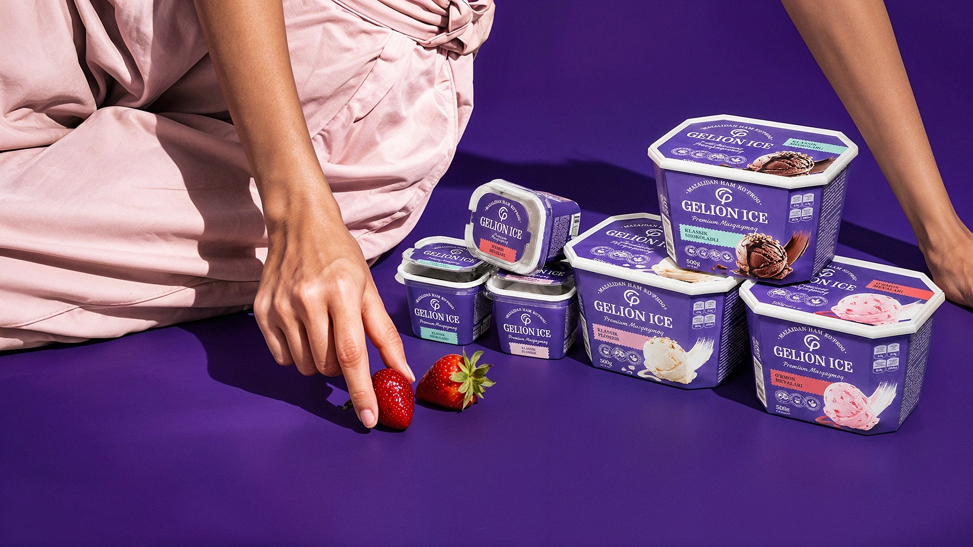
Studying the ice cream market revealed that most competitors use white, light blue, red, or brown (chocolate) packaging. The visual noise on the market is overwhelmingly loud.
We needed a core brand color that would instantly grab the buyer's attention, was rarely used in the market, but still looked premium and appetizing.
3. Solution
After much brainstorming and research, we found the perfect solution.
Primary Brand Color — Purple
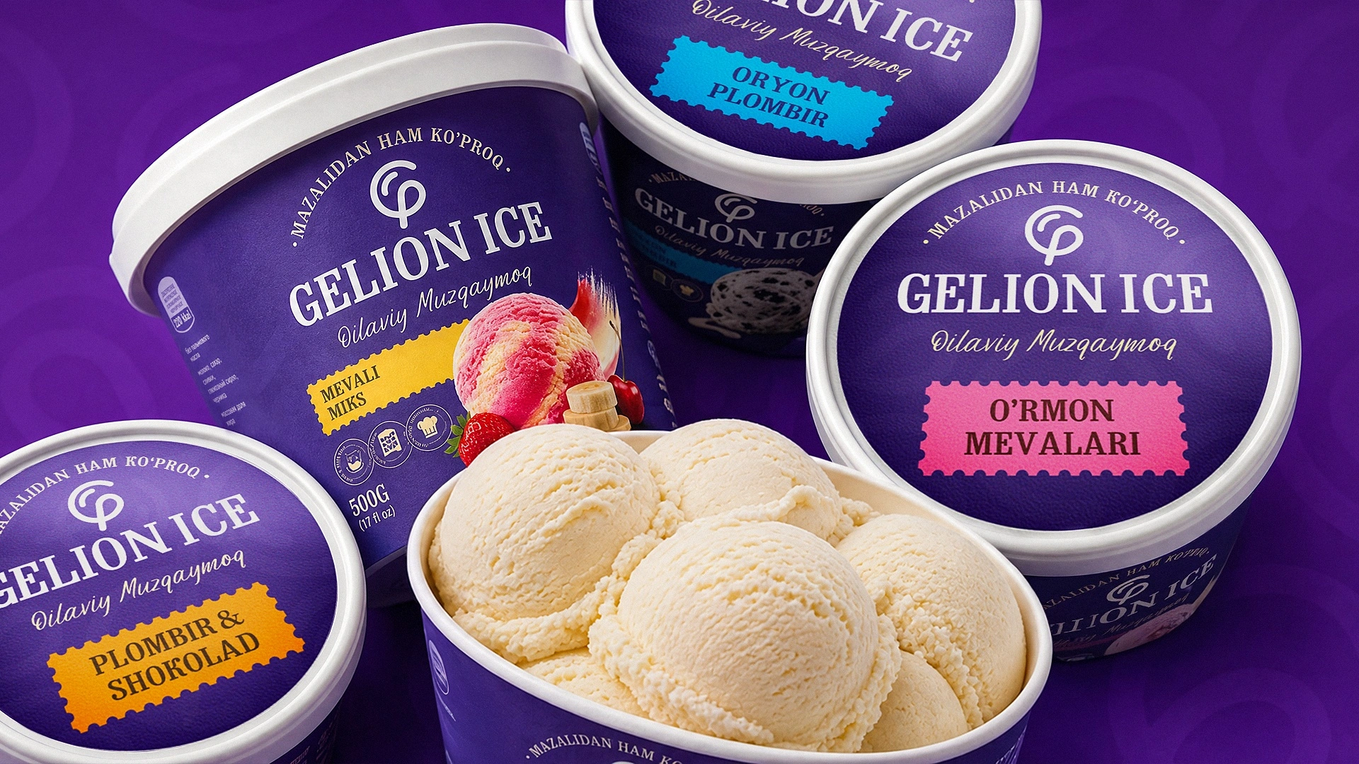
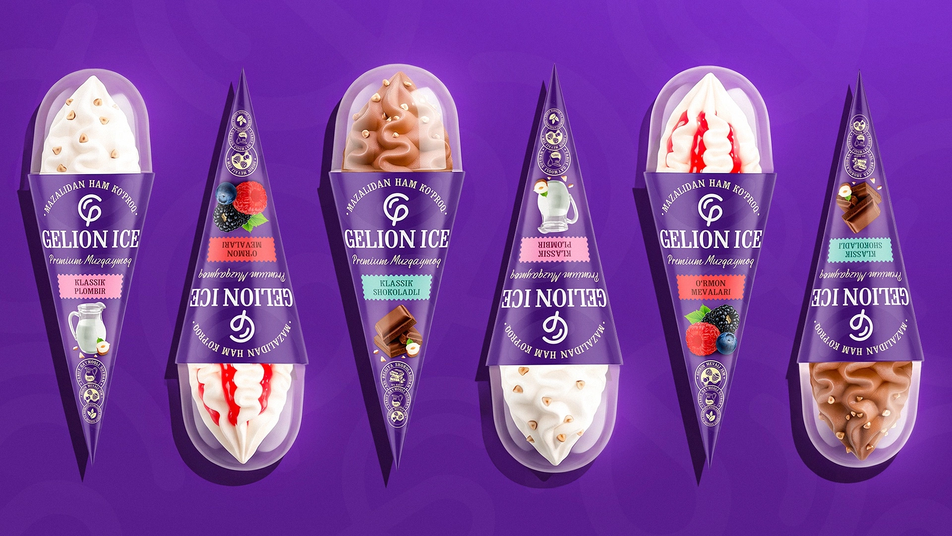
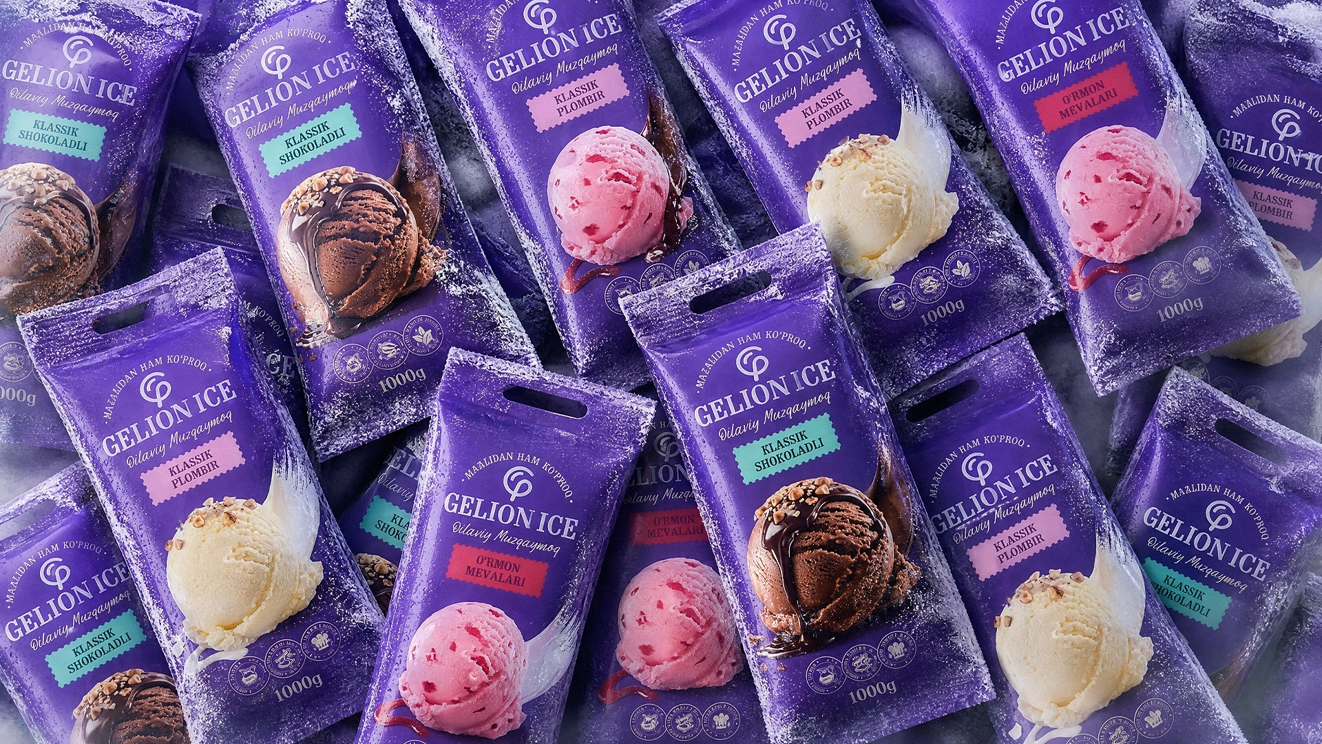
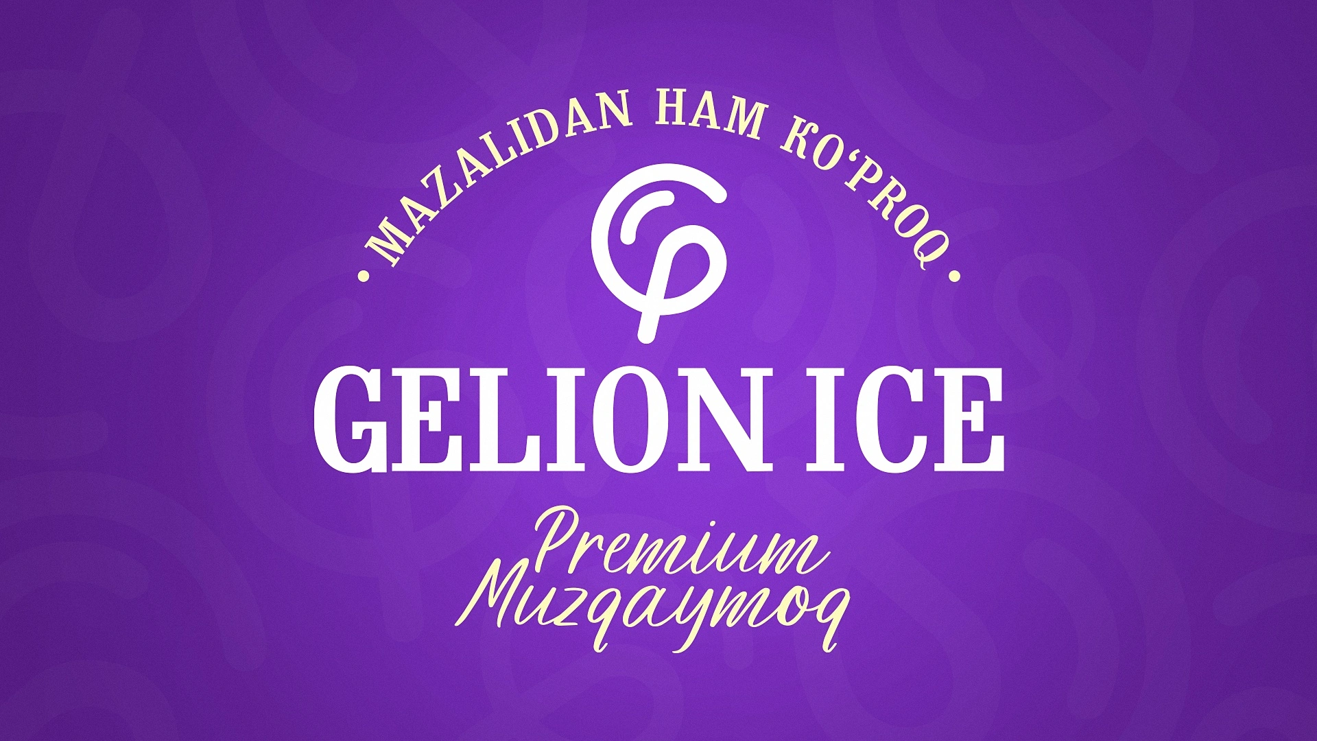
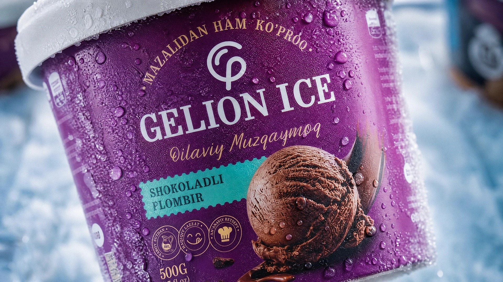
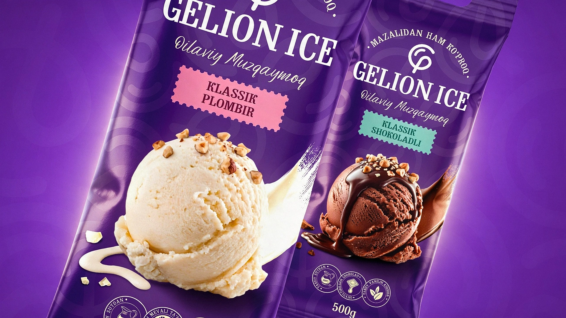
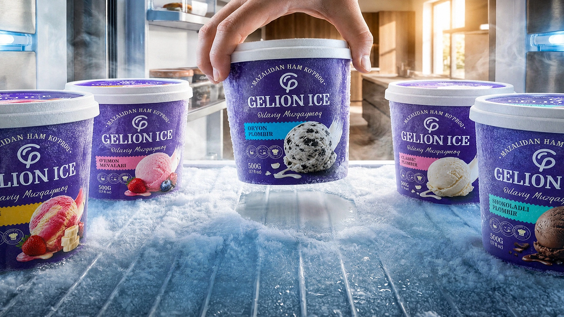
To build the entire design system, we chose a deep purple. This color is rare in the market, highly eye-catching, and most importantly, visually pairs perfectly with any fruit or chocolate flavors. In the foreground, the Gelion Ice name was rendered in large letters, and beneath it, the flavor or product type was indicated on a special label.
Mouth-Watering Renders
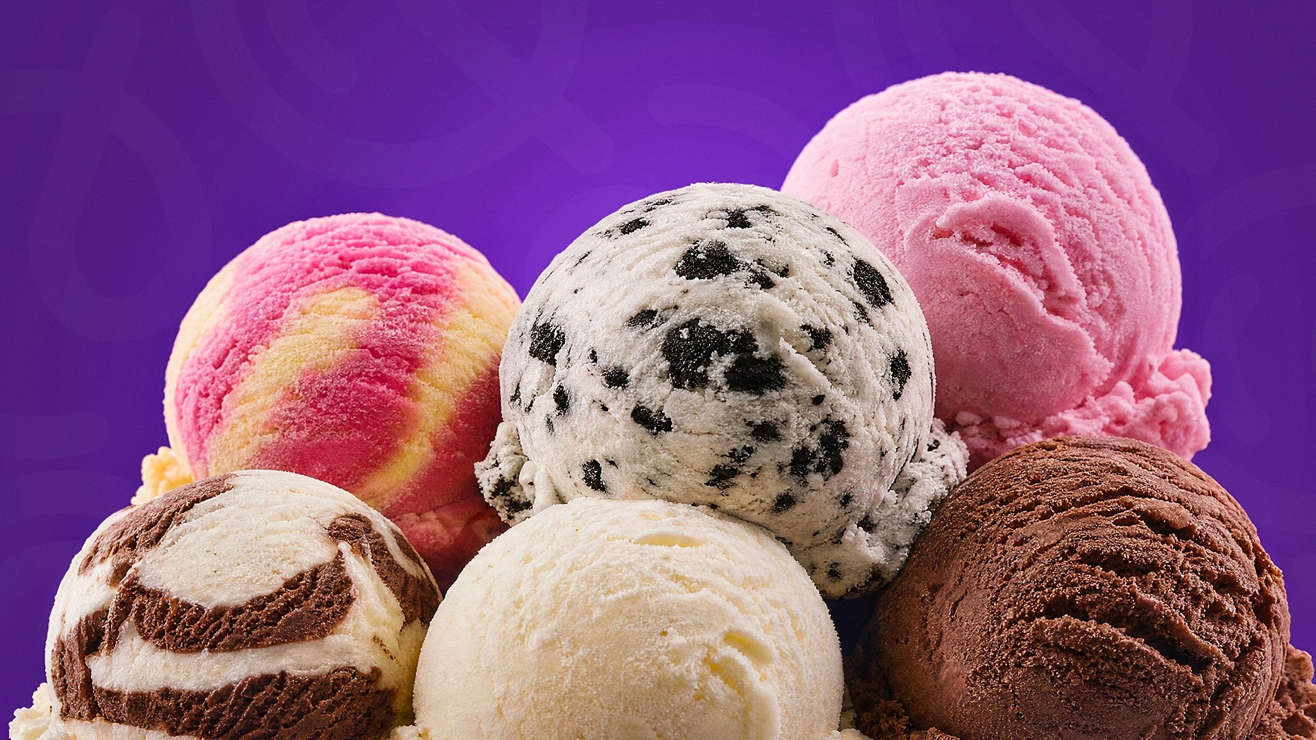
The most important thing in ice cream design is the product itself! We developed each ice cream model to be so realistic and appetizing that just looking at the packaging makes your mouth water. Soft dripping chocolate, nuts, and the texture of the ice cream itself were brought to the forefront.
Innovation: The Taco Format
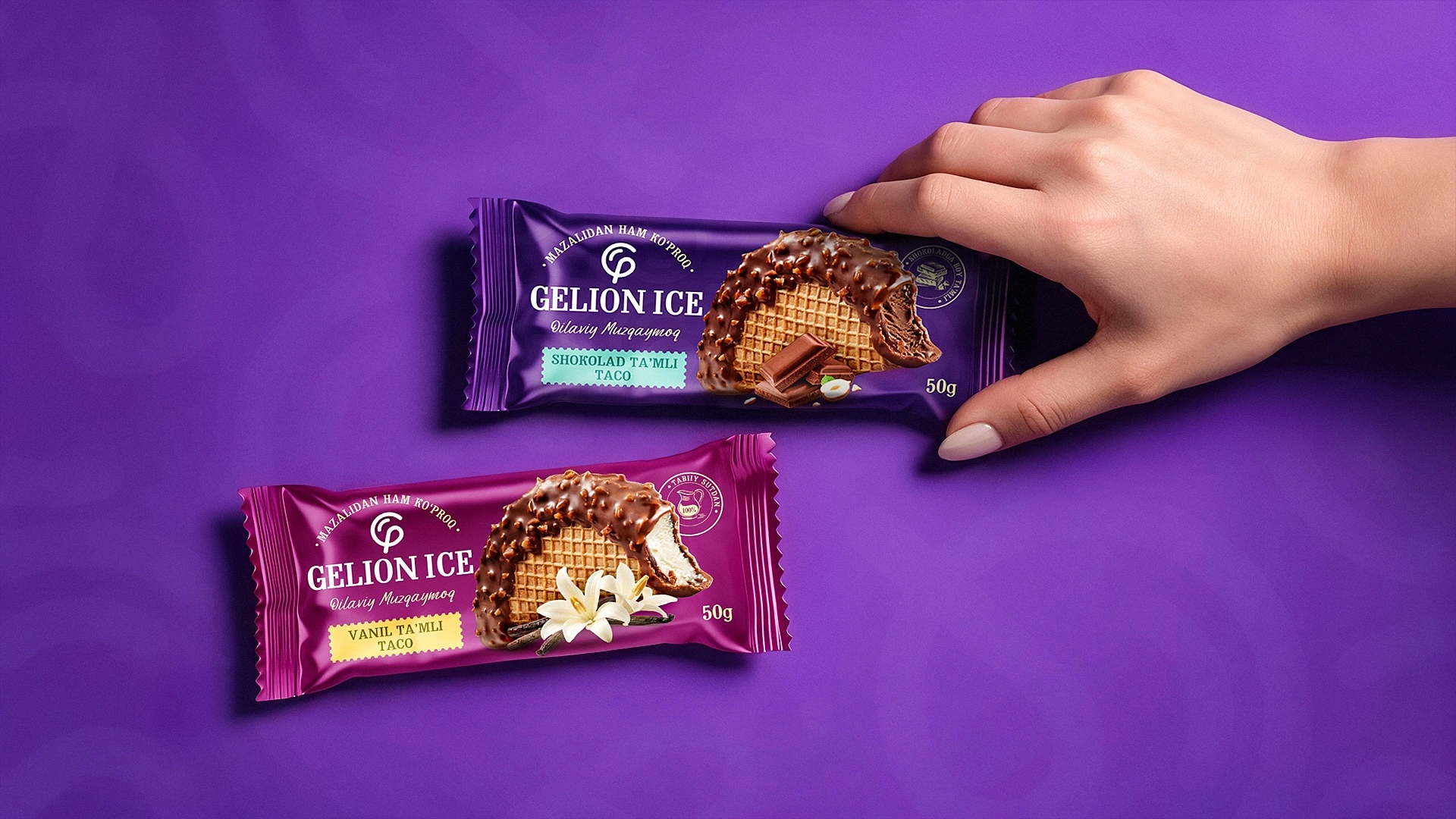
We didn't shy away from innovation. As a novelty, we introduced a market concept of ice cream styled like a famous Mexican "Taco." Folded on two sides like flatbread, filled with ice cream and covered in chocolate, this unconventional format is sure to be a real surprise for buyers.
Beyond the Packaging
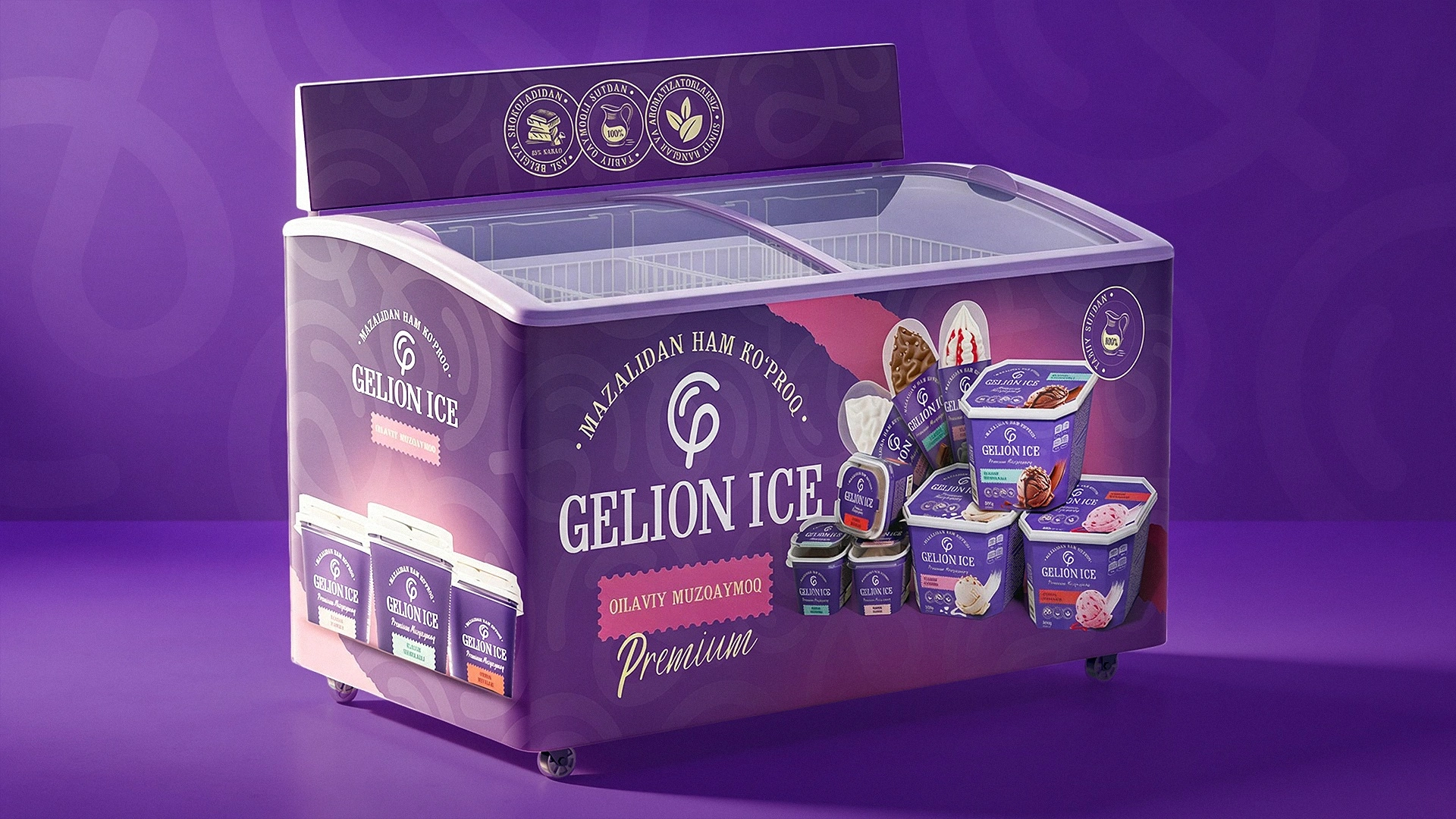
Our design system turned out so universal that we adapted it not only for the packaging but also fully branded the company's freezers, delivery vehicles, and outdoor advertising (banners).
Result
As the saying goes, "A good intention is half the success." In this project, both our intentions and our work won the client over in the very first round, without any pushback. The most interesting part is that initially, the client only wanted designs for 4 types of ice cream. But after seeing how flexible and powerful our design system was, they ordered a redesign for a total of more than 25 SKUs!
Marketing and Financial Impact
Now, let's explain the business benefits of this unified design system in the language of mathematics. Previously, the client had 50 scattered, different designs. Imagine: if they spent $500 to advertise each product, $25,000 would just vanish into thin air for 50 items.
Now, the situation has radically changed. Because all designs share the same style and purple background, advertising a single product automatically promotes the entire Gelion Ice brand. Meaning, the entrepreneur no longer needs to scatter $25,000. They only need to invest $1,000 or $2,000 into one killer video or banner—the buyer will see a purple ice cream, walk into a store, and confidently buy any other product from the brand in that same style.
As a result, marketing costs dropped dozens of times, brand awareness skyrocketed, and the memorable design served as a driver for a sharp increase in sales volume. And the MINIM agency successfully wrapped up another project, breathing truly "hot" life into Samarkand ice cream.