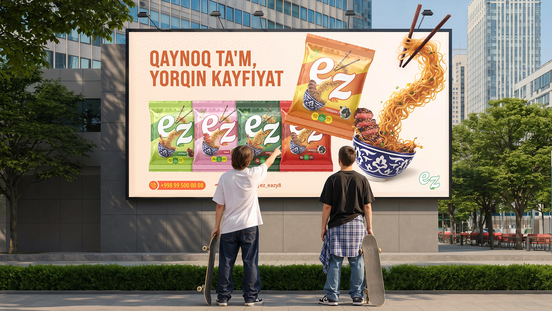



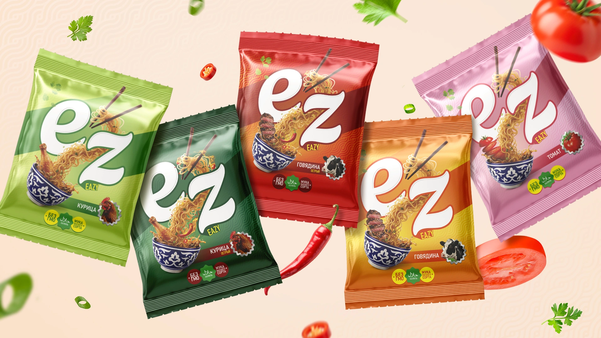
Ez (Easy) — Naming and Packaging Design for Instant Noodles
People's lifestyles are changing: everyone is in a hurry, and saving money and, most importantly, time has become today's biggest trend. This is clearly visible right on supermarket shelves. Have you noticed? Previously, instant noodles occupied only 2-3 rows in a store. Now, they take up entire massive shelving units.
This market is highly saturated with competitors, but at the same time, it is expanding rapidly. Understanding this trend perfectly, our Chinese clients, who decided to invest in a new project, knocked on the door of the MINIM agency.
1. Problem and Challenge
Our clients (a modern-thinking family of entrepreneurs in their early 30s) came to the agency with their own ready-made ideas. They wanted to launch the product under the name "Chop-chop".
Actually, the history of this word is quite fascinating. In the 19th century, workers in Chinese ports frequently used the Cantonese word 急急 (gap-gap or kap-kap), meaning speed (in Chinese, repeating words intensifies the meaning). To the British ear, this sounded like "chop", and they turned it into the command "chop-chop", urging immediate action.
Even the famous English word chopsticks comes from this exact root—the British called them "fast sticks".
But there was one important catch: the phrase "chop-chop" simply doesn't exist in modern Chinese! It's just a historical slang used by foreigners that became popular among sailors and later assimilated into English as a full-fledged idiom. Since the product was intended to be exported to the entire CIS market, we didn't need historical slang; we needed a modern name that was equally understandable to everyone.
The most interesting part happened with the visuals. The client brought a ready-made logo, generated by AI in an "Uzbek style", featuring a smiling elderly man wearing a traditional Kyrgyz kalpak (hat). Seeing this, we couldn't help but smile: “Guys, we won't get far with a Kyrgyz grandpa! We are targeting not only Uzbekistan but the entire CIS. Therefore, we need a completely new, universal name that everyone understands, highlighting that the product is 'quick and easy to prepare'.”
2. Research
The biggest value the product provides is its quick and easy preparation. One day, while we were searching for a bold and modern name, the guys on our team were holding an internal CS:GO tournament in the office. Gamers have a favorite term they boastfully use when winning: "Easy". This word wouldn't leave our team's vocabulary. Suddenly, a great idea struck us: the noodles are easy to prepare, the name is youth-oriented, and it's incredibly catchy. Why shouldn't it be "Easy"?!
3. Solution
-
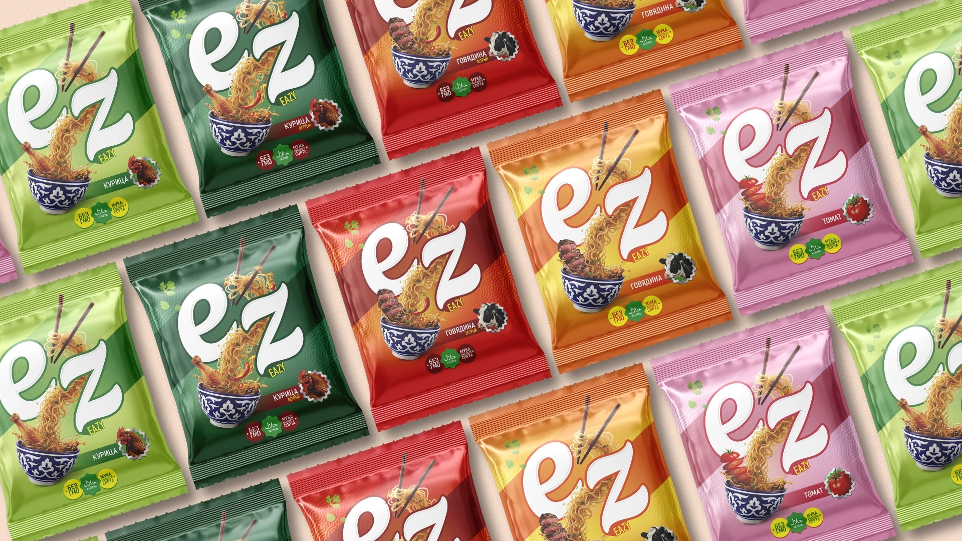
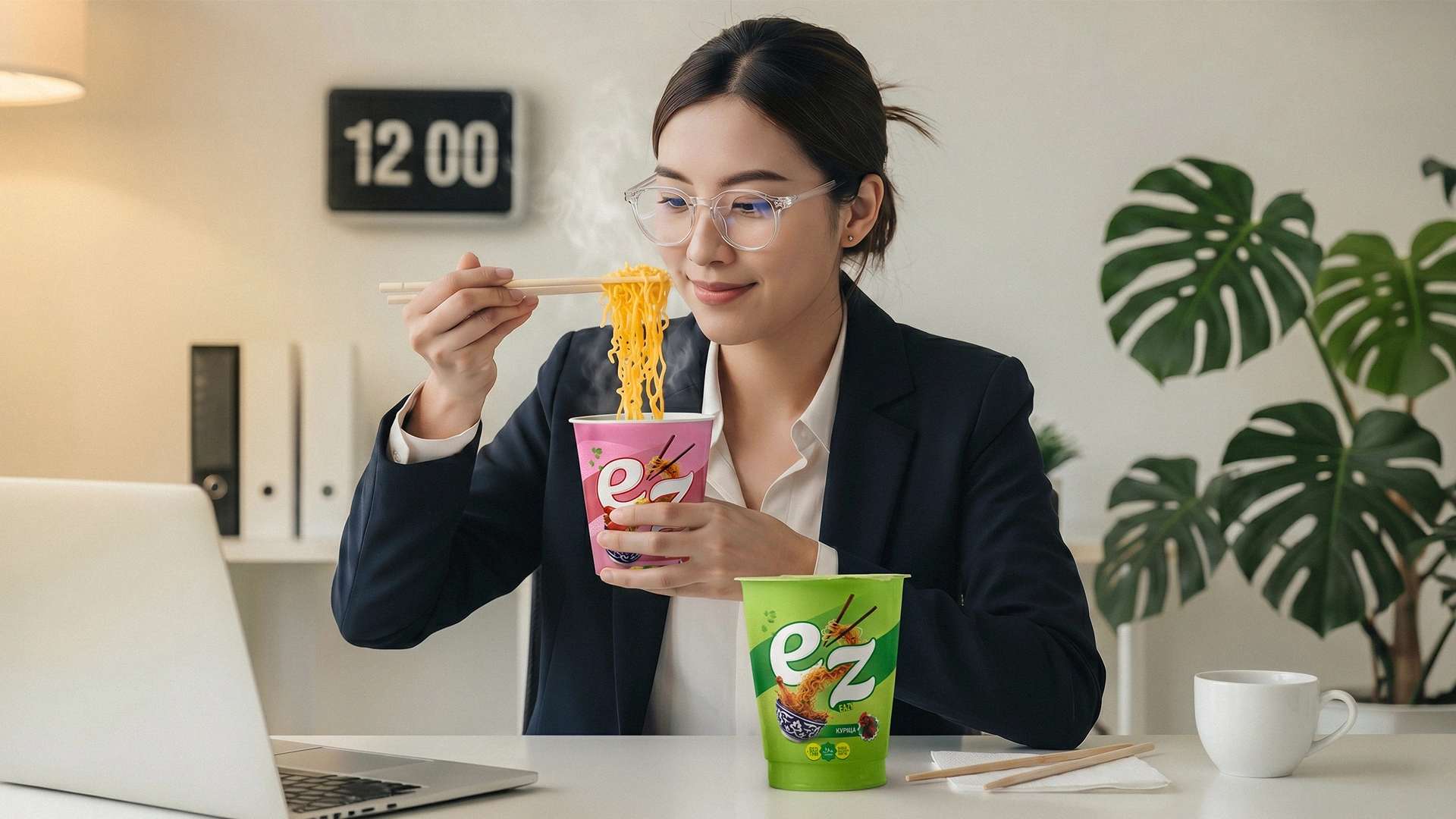
Naming: When choosing the name, we simplified the word even further and proposed its written form "EZ". The client's wife turned out to be a big fan of video games and perfectly understood the spirit of this term! Upon hearing this name, she was thrilled and became the true "advocate" of the project. She personally defended and convinced both her husband and the Chinese investors leading the project to approve this name.
Currently, the situation in the patenting field is very complicated, with up to 20,000 applications pending in a single class. Patenting a great, memorable name is becoming increasingly difficult. But to protect our name, we successfully patented it with the addition "Ez — Easy to cook".
-
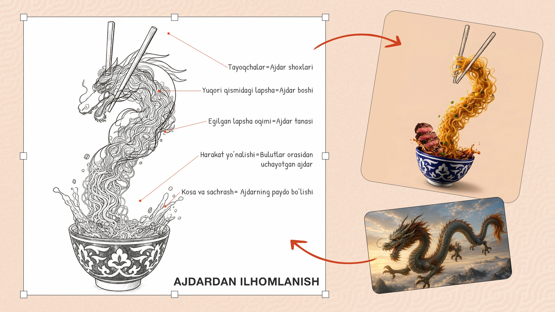
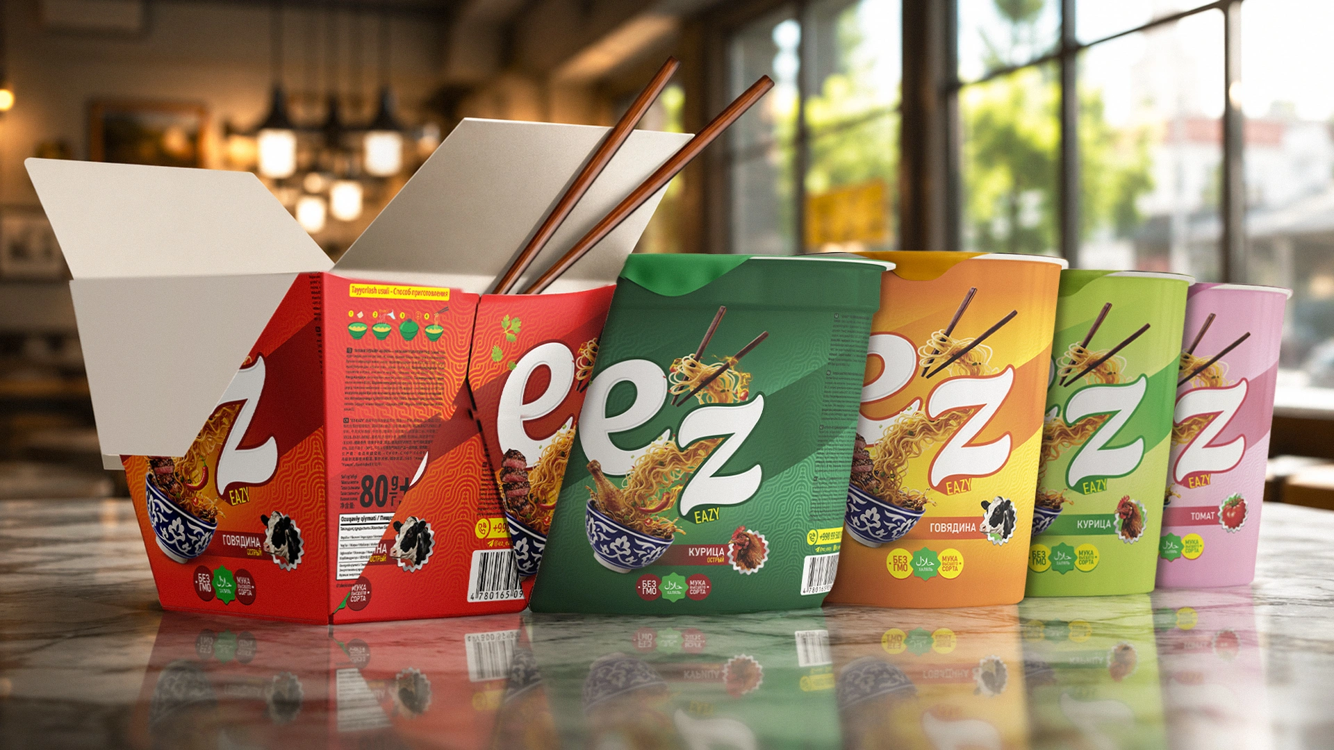
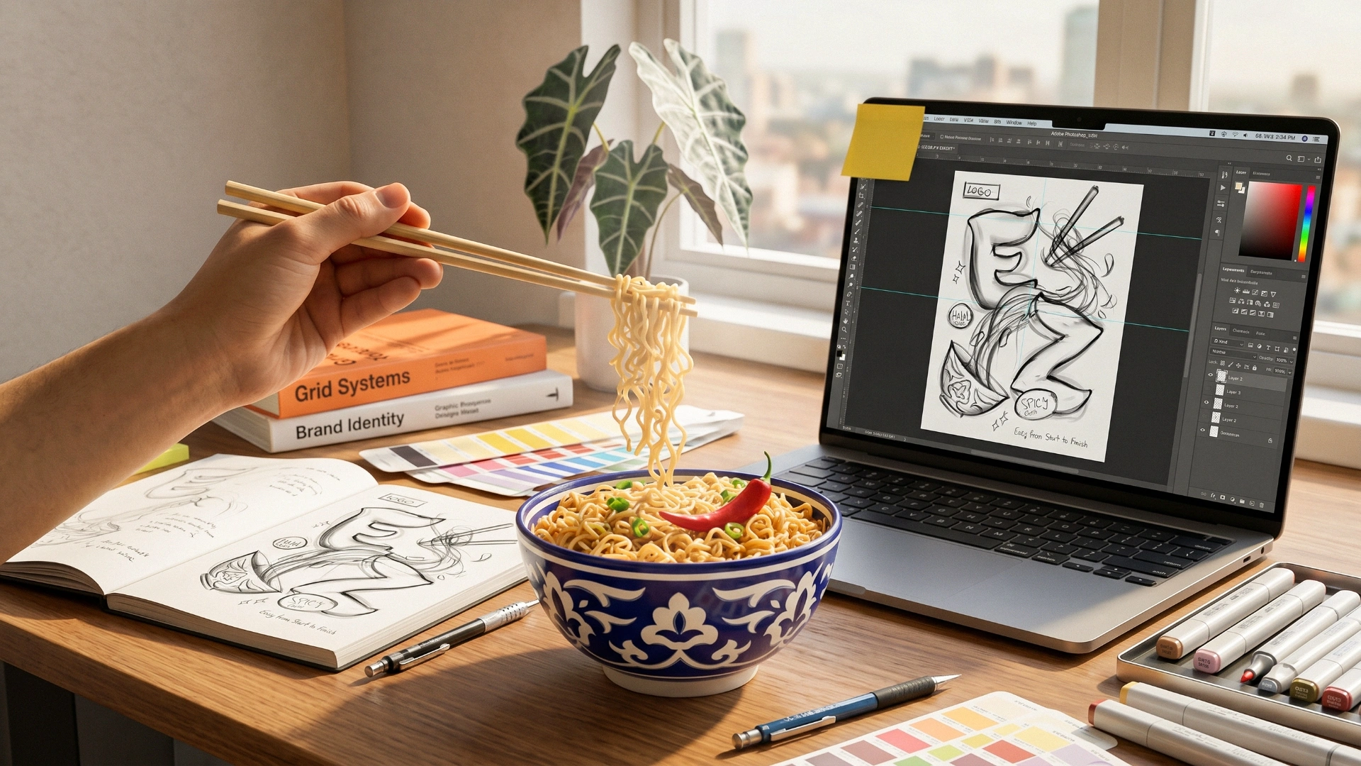
Illustration: We needed a visual solution for the packaging that would bridge two cultures. We were inspired by the famous dragons from Chinese carnivals. A dynamic silhouette of a soaring dragon was shaped out of boiling noodle strands.
-
Local Color: To show that the product is made in Uzbekistan, we added the most subtle and important detail—this dragon is depicted soaring not from the sky, but from our national, beloved paxta gul (cotton flower) bowl.
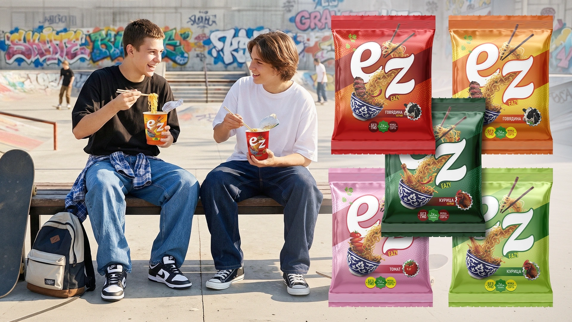
After the vibrant packaging was adapted for each flavor, the leading investors flew in from China. We held a presentation for them based on this design and concept. They thought about it for a day or two and firmly decided to stick with this exact name and design.

4. The Process
This project started at the end of December and was fully completed before the Chinese New Year—in early February (within just 1 month).
During this process, we were amazed by the Chinese investors' attitude towards work. If a Zoom meeting was scheduled for 14:00, they would log in at exactly 13:55 and wait for us. For offline meetings, Tashkent traffic jams or arriving from another country were never used as excuses. They changed 3 translators in between. Such flexibility (adaptability) in business, discipline, and unstoppable drive towards the goal became a great lesson for the MINIM team, and we became close friends.
Result
Today, "Ez" noodles are being produced in the free economic zone in Syrdarya. The product recently entered the market, took its place on the shelves, and began its active life on social media. The brand is confidently promoting itself and has started working with new partners.
Our client was so happy with the project's outcome that they sent a special video thank-you (feedback), expressing how much they enjoyed working with us and that they got exactly the result they wanted. They even wanted to hand over the brand's SMM services to us. However, since we focus solely on packaging design and branding, we believe everyone should be a master of their own craft, so we confidently recommended 2-3 strong SMM agencies we trust.
Want to turn your product into a market leader and take over shelves crowded with competitors? Contact the MINIM agency.