Rozi Candy — Candy naming and Packaging Design
Rozi Candy is a confectionery manufacturer with a strong production legacy. However, in the FMCG sector, product quality alone cannot guarantee sales. Even a superior product can suffer from “shelf invisibility” due to weak packaging. We executed a comprehensive brand overhaul for Rozi Candy to solve this critical bottleneck.
1. The Problem and The Task
Despite the high quality of the product, Rozi Candy’s visual identity was obsolete. The packaging failed to meet modern category codes and lacked “stopping power” on the shelf.
Retailers were hesitant to stock the SKU, fearing low turnover and dead stock. Sales were on a steady decline.
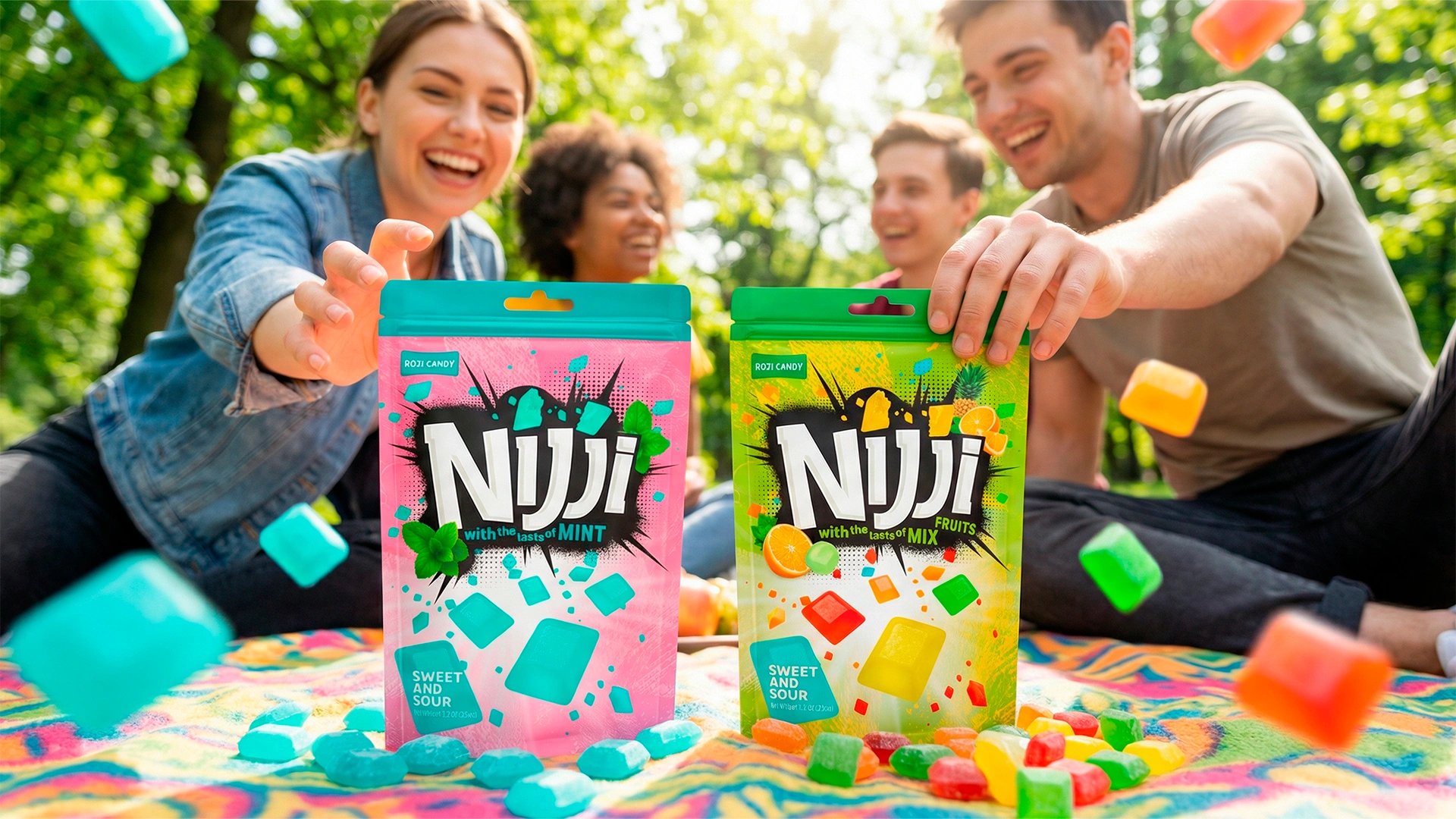
We identified an opportunity to expand the Total Addressable Market (TAM). Instead of targeting only children, we aimed to capture the adult demographic by positioning the candy as a functional breath freshener (ideal for meetings or after smoking). The goal was to maximize market penetration with a single, versatile product line.

2. Research & Insights
Before design execution, we conducted a market audit:
- POS Analysis: The legacy packaging was effectively invisible in the high-traffic “impulse zone” (checkout counters).
- Benchmarking: We analyzed successful international brands to decode their visual success factors.
- Key Insight — Perceived Value: Mass-market consumers still demand a premium, modern aesthetic. If the packaging triggers a dopamine hit (“eye candy”), price sensitivity decreases and conversion rates increase.
This insight was the cornerstone of our strategy.
3. The Solution
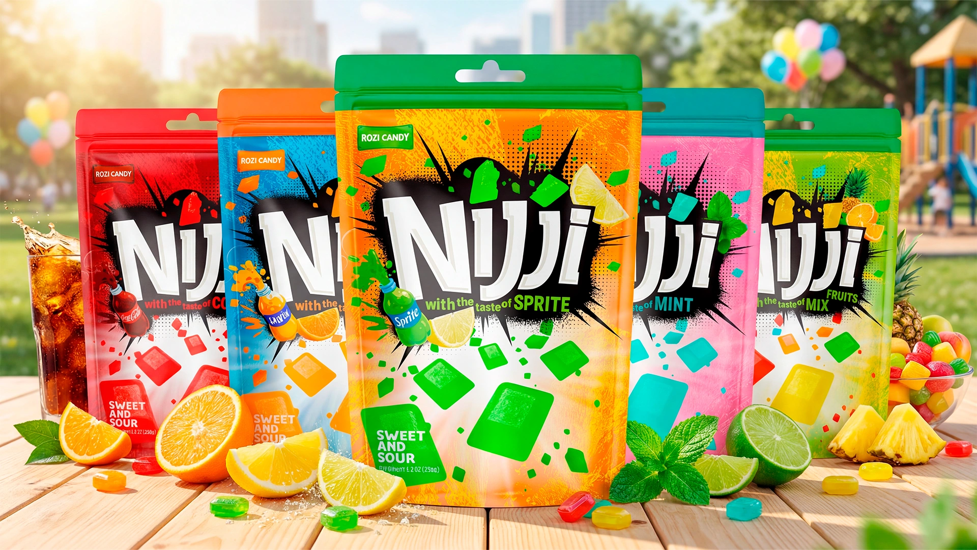
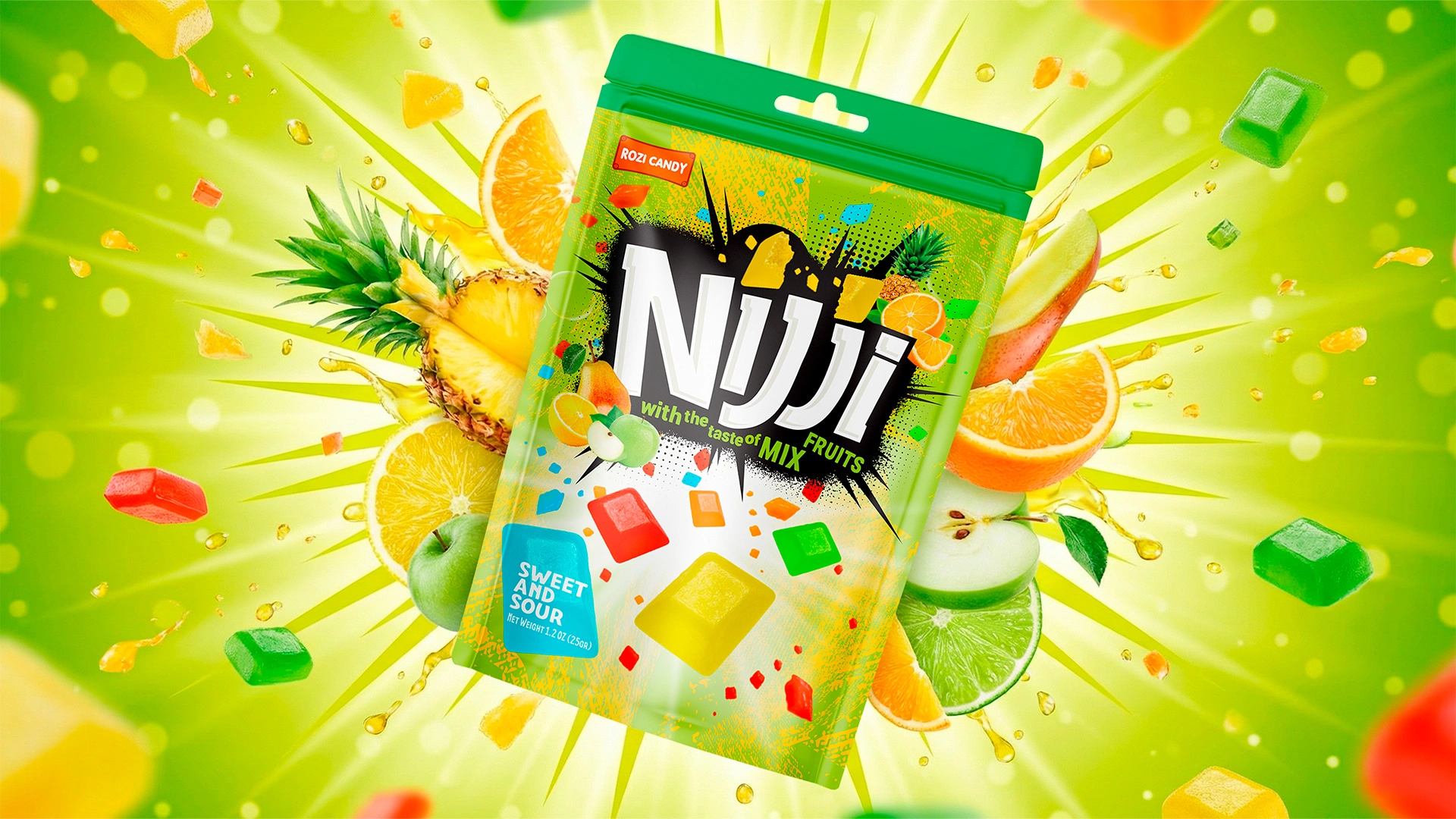
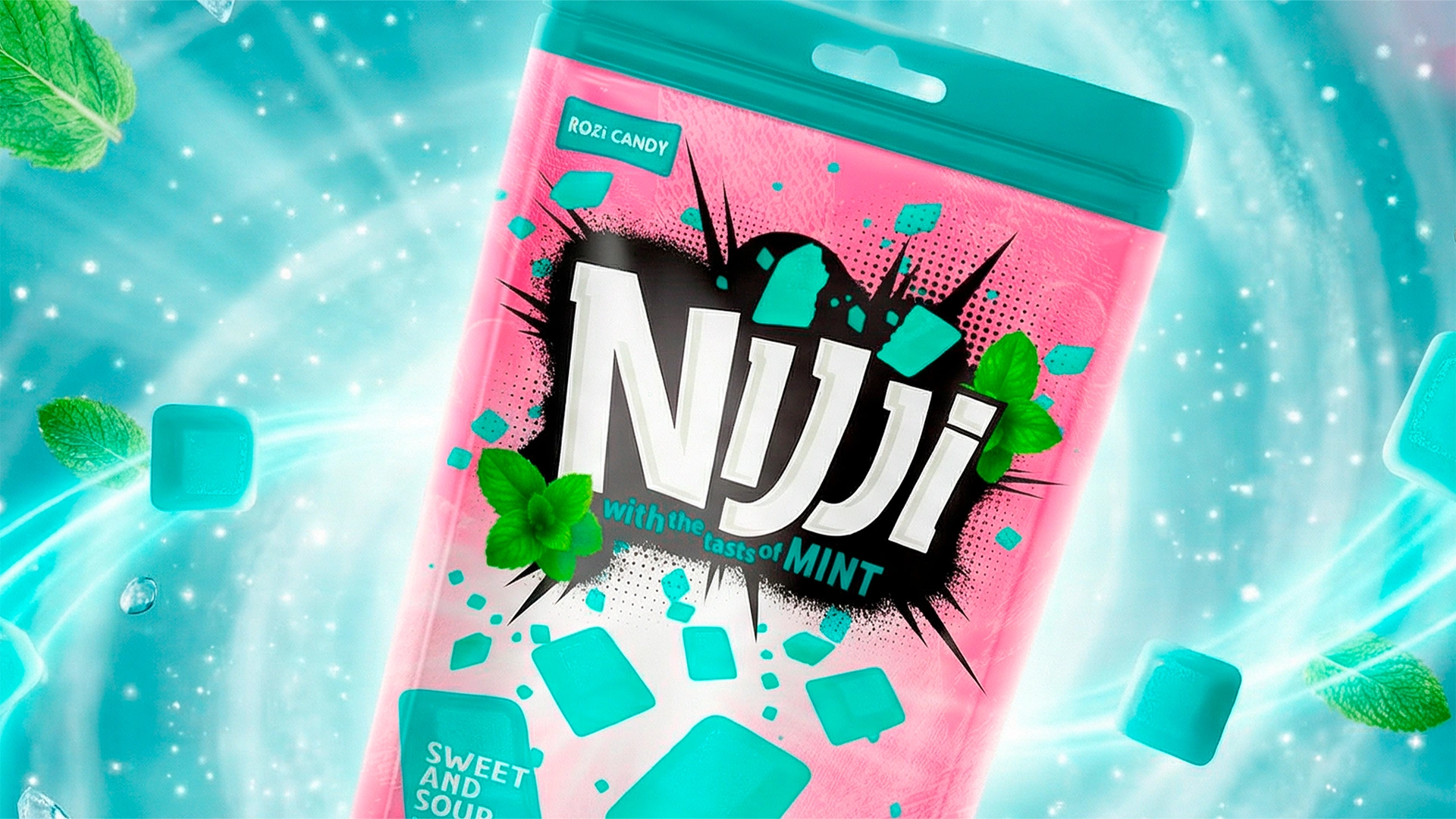
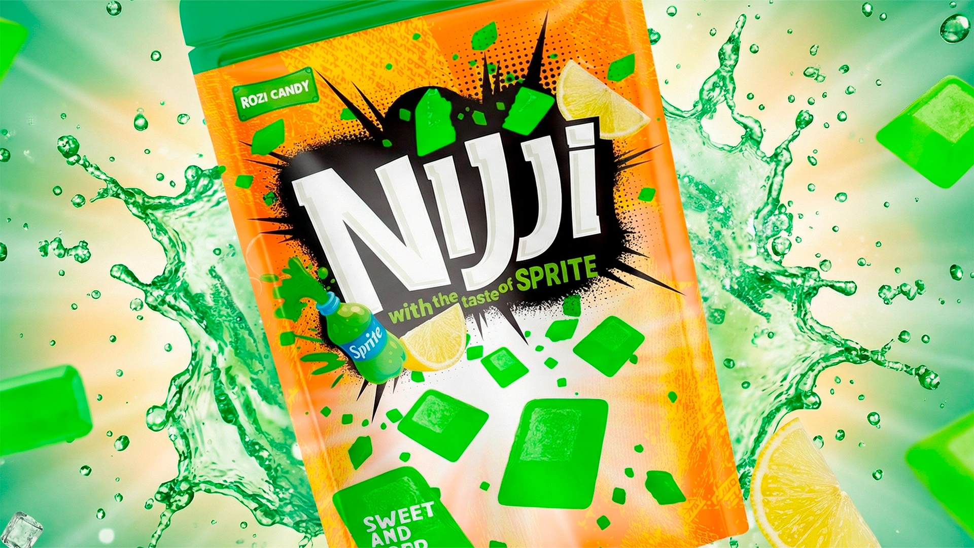
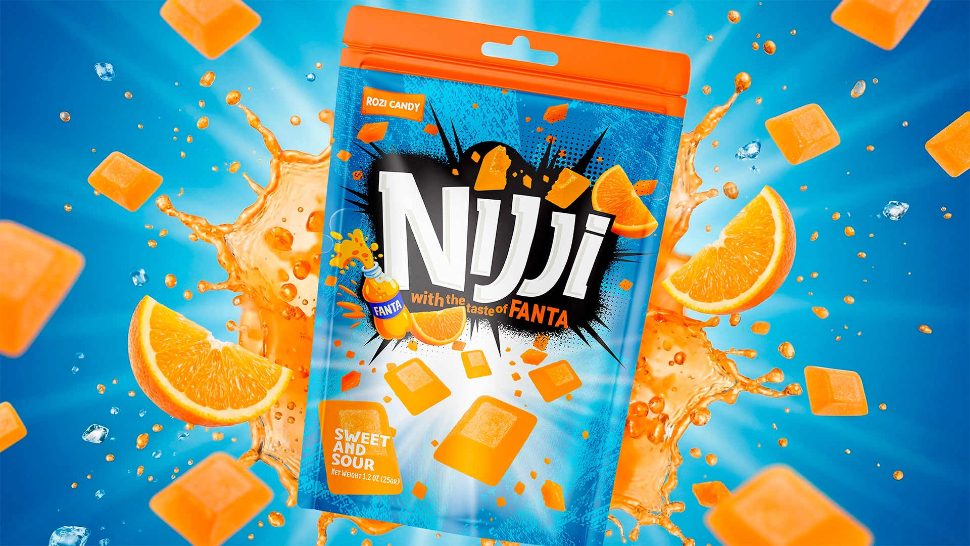
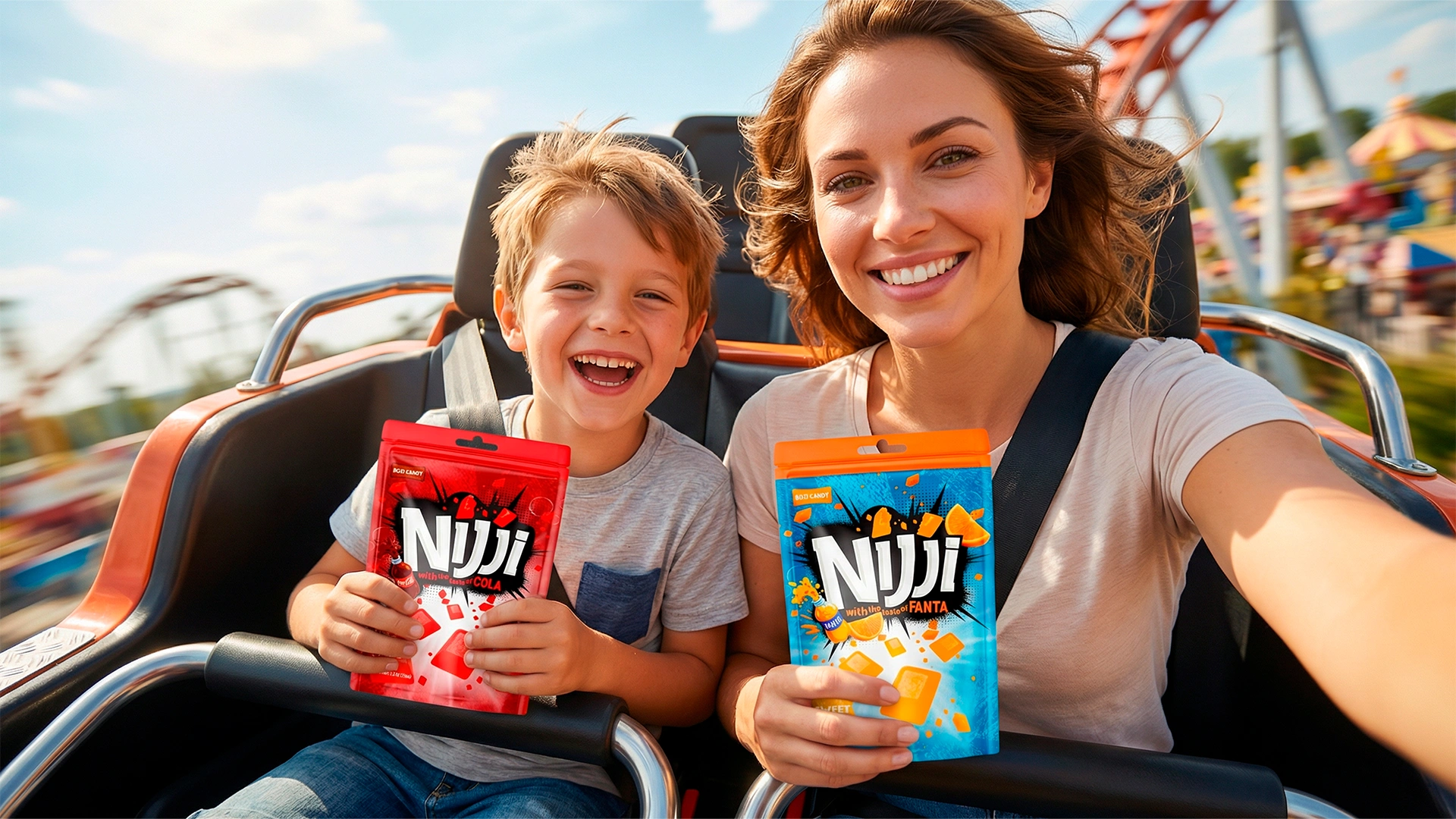
Naming
Data-driven creative exploration led us to the name “Nijji” (Japanese for “Rainbow”). This moniker succinctly communicates the product’s core value proposition: a vibrant variety of flavors and a joyful experience.
Design
- We engineered the design specifically for maximum impact within the visual clutter of the checkout zone.
- Premiumization: The result is a bold, approachable, yet premium look. We applied “imported goods” design codes to elevate the brand’s perceived value, making it appear more expensive than its actual price point.

The Result
The launch of the Nijji rebrand delivered immediate ROI:
- High Velocity: The product became a magnet at the Point of Sale (POS), transforming into a high-rotation SKU.
- Distribution Expansion: The design successfully bridged the gap between child and adult demographics. This universal appeal drove significant revenue growth and enabled listings in new retail chains.
Nijji continues to capture market share. If you need high-performance design solutions that drive real business metrics, Minim Agency is your partner for growth.