Crispy — naming, logo and packaging design for soft croutons for the Kazakhstan market
Baraka N1 from Shymkent started out in 2014 making kurt, a traditional Kazakh snack. Today its range includes sunflower seeds, popcorn, sweet corn, candy and croutons, all sold under one name: Baraka. Then the company was about to launch a new product, soft croutons, and a question came up: keep putting everything in one basket, or give the newcomer a name of its own?
1. Problem and Task
We proposed a house-of-brands logic: Baraka N1 becomes the parent company, like PepsiCo, and each product gets its own trademark. Hard bread croutons stay under Baraka, while the soft ones, made from a blend of wheat and corn flour, needed a new name. In parallel, we worked on the WooW brand for popcorn and corn.
The client's requirements:
- the brand comes first, the product name second;
- no characters or mascots;
- one style across the line, with each flavour set apart by colour;
- Russian as the main language, with Kazakh, Uzbek, Kyrgyz, English and Arabic on the back.
2. Research
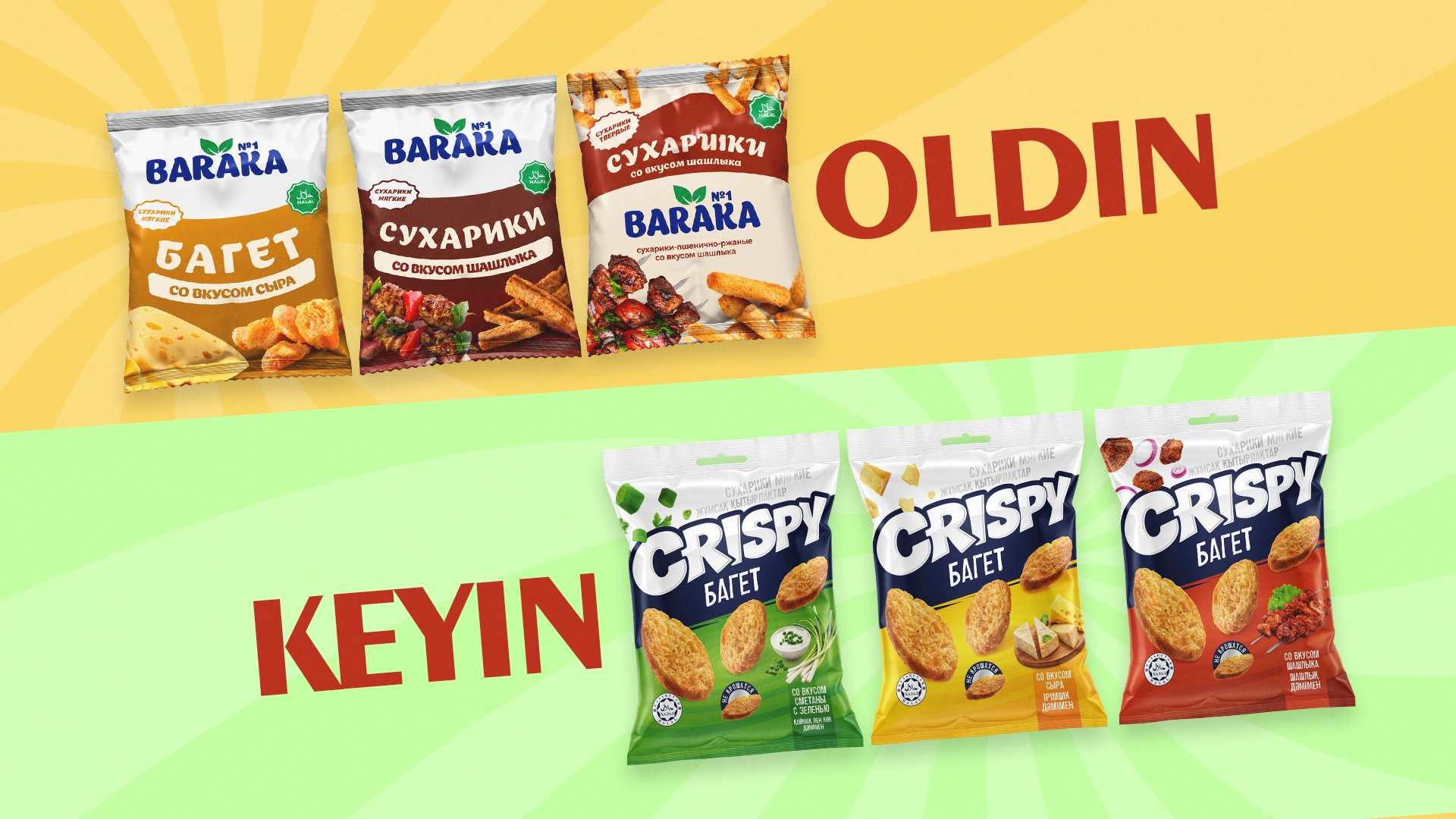
Kazakhstan's crouton shelf has strong players such as Flint and Khrustim. Their strength is a recognisable name that shoppers use instead of the word “croutons”. The old Baraka pack lacked that: it looked like one more item in a broad range rather than a product with its own character.
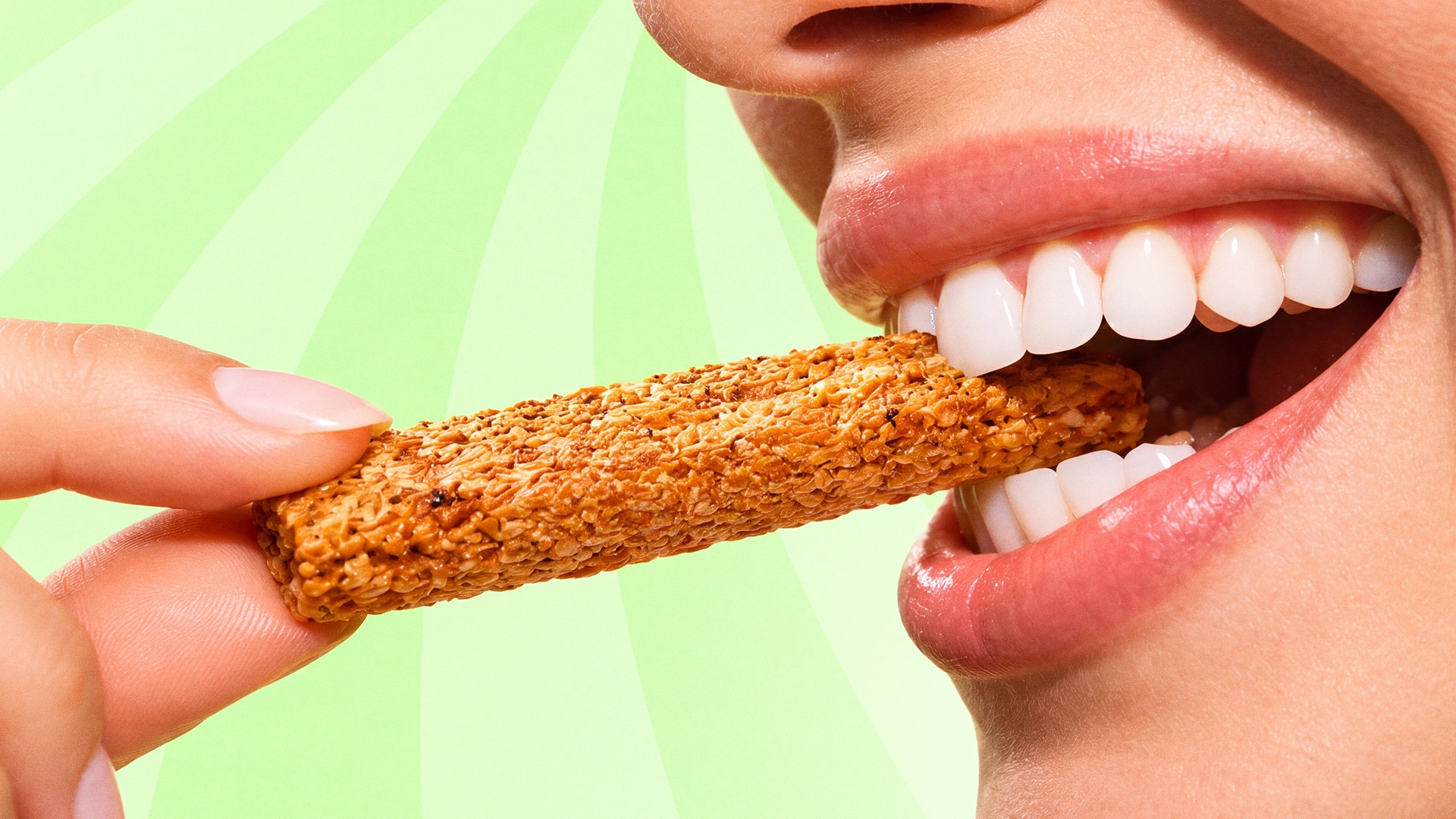
Our key insight: soft croutons have an everyday benefit that competitors don't talk about. Of the USP options we discussed with the client (“golden roast”, “no artificial additives”, “doesn't crumble”), we put the last one on the pack. A crouton that leaves no crumbs on your hands or at the bottom of the bag makes sense to everyone.
3. Solution
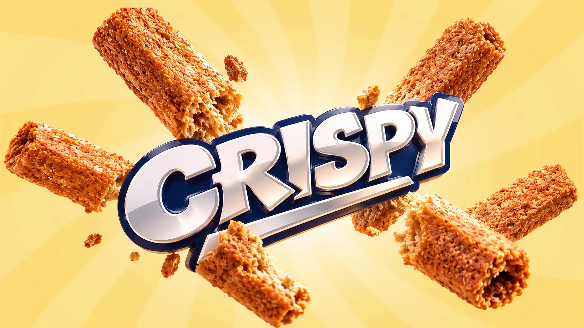
Naming. Crispy speaks for itself. It's equally clear in Russian, Kazakh and English, reads in a split second and instantly names the product's main sensation. The client chose it in January 2026.
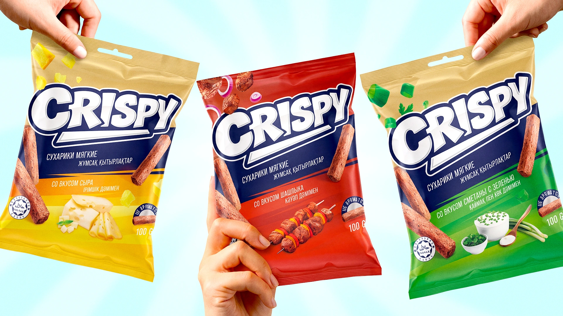
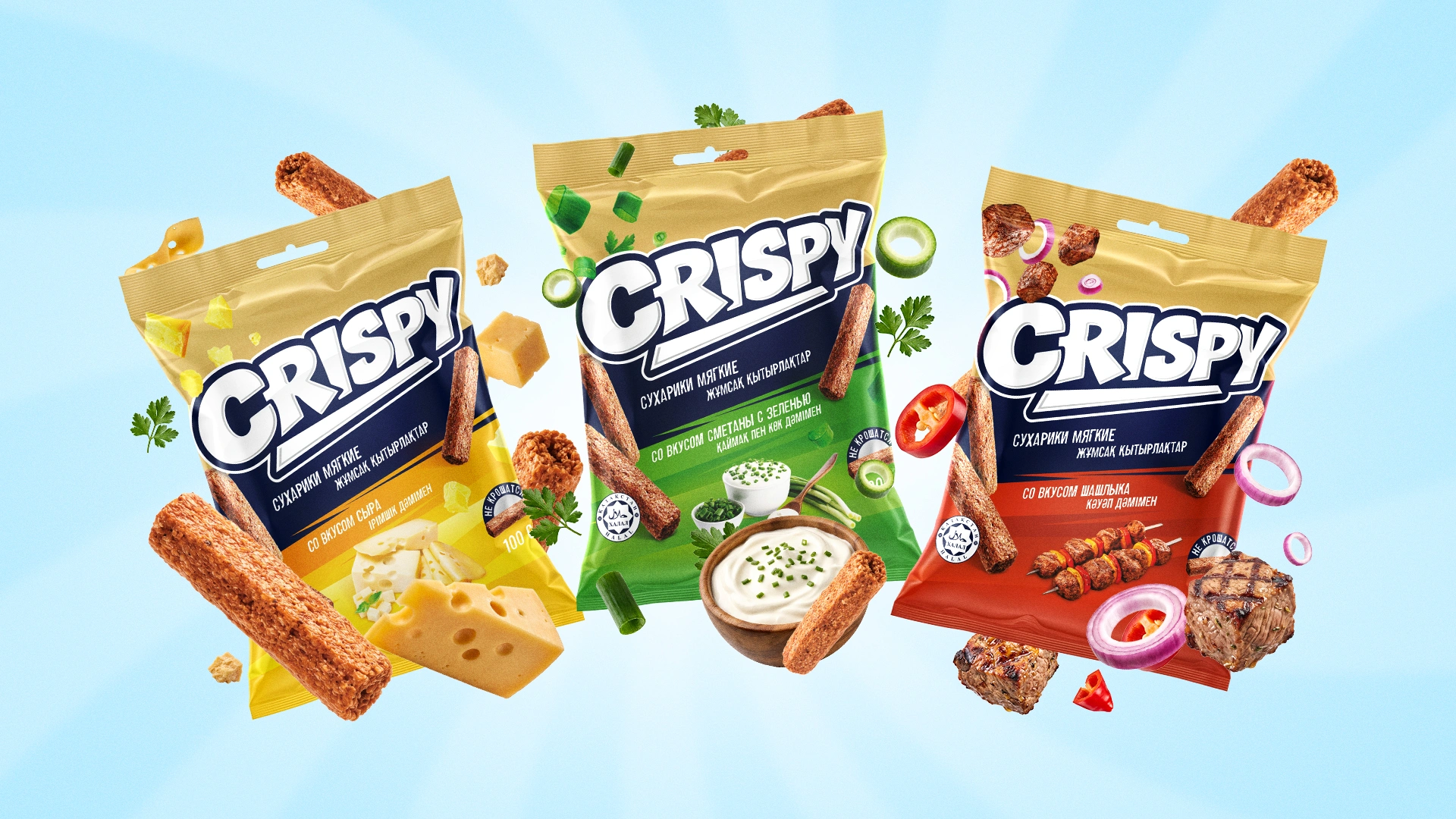
Logo. Bold white letters with a navy outline and a slight slant, as if the crouton had just cracked. A short dictionary word is hard to register as a trademark on its own, so we added graphic elements that make the logo distinctive and fit for registration.
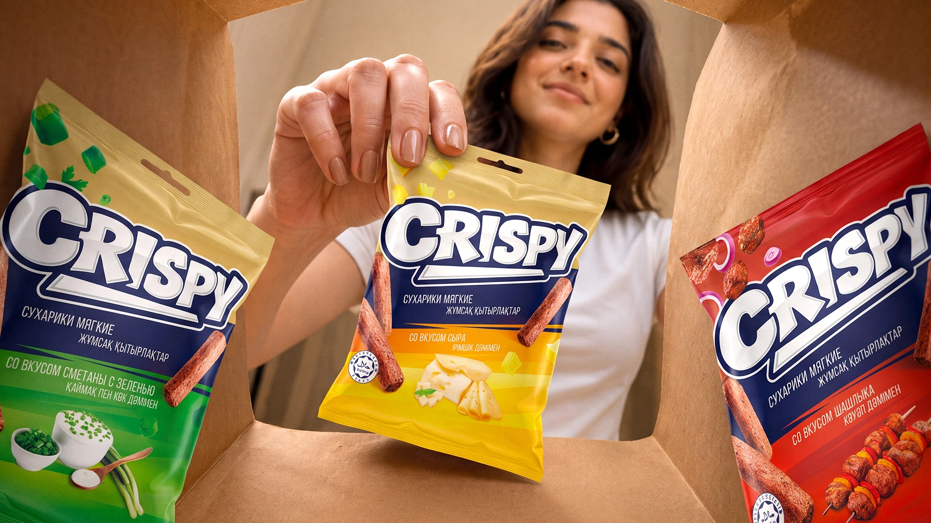
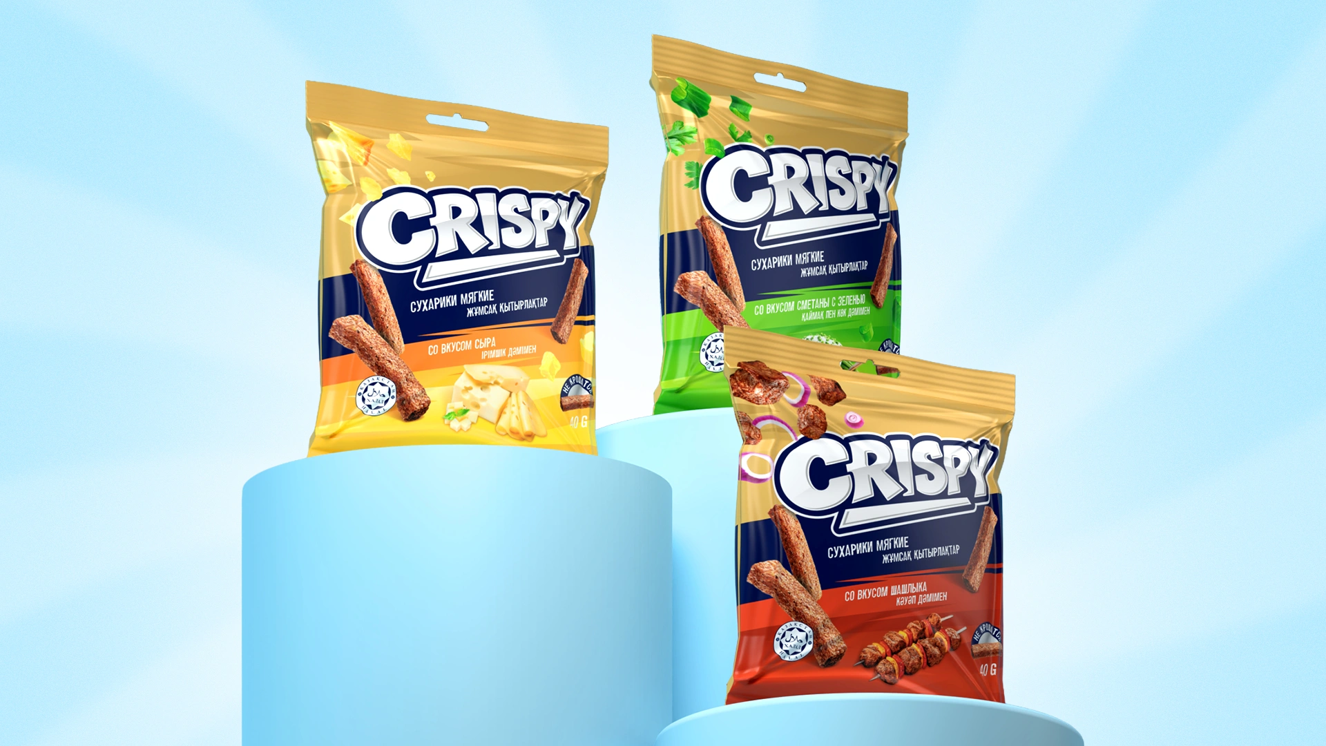
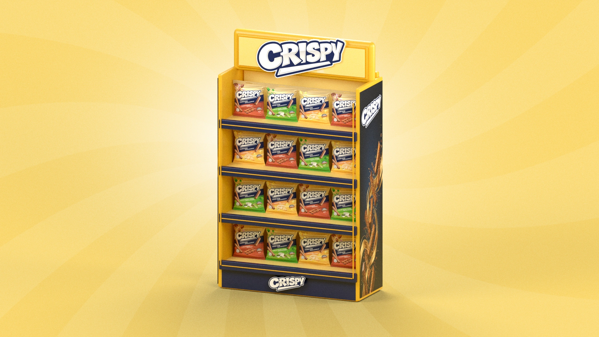
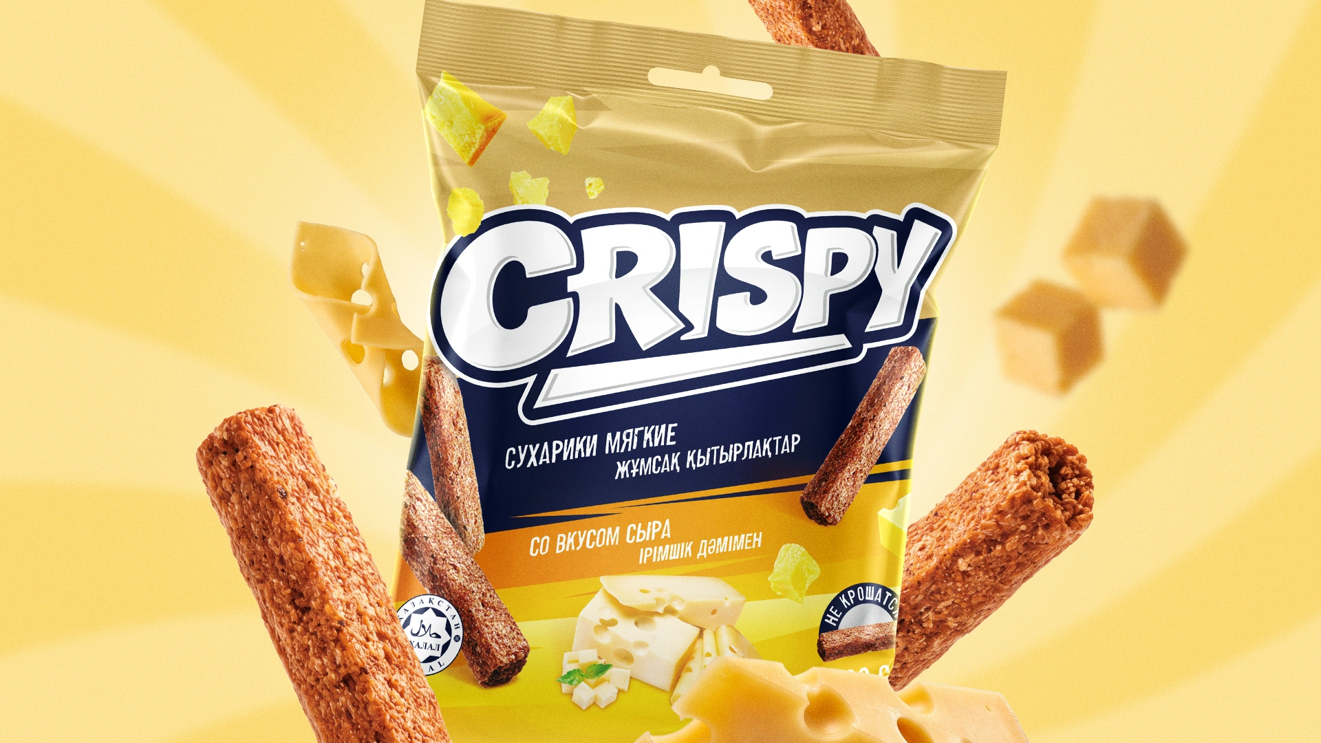
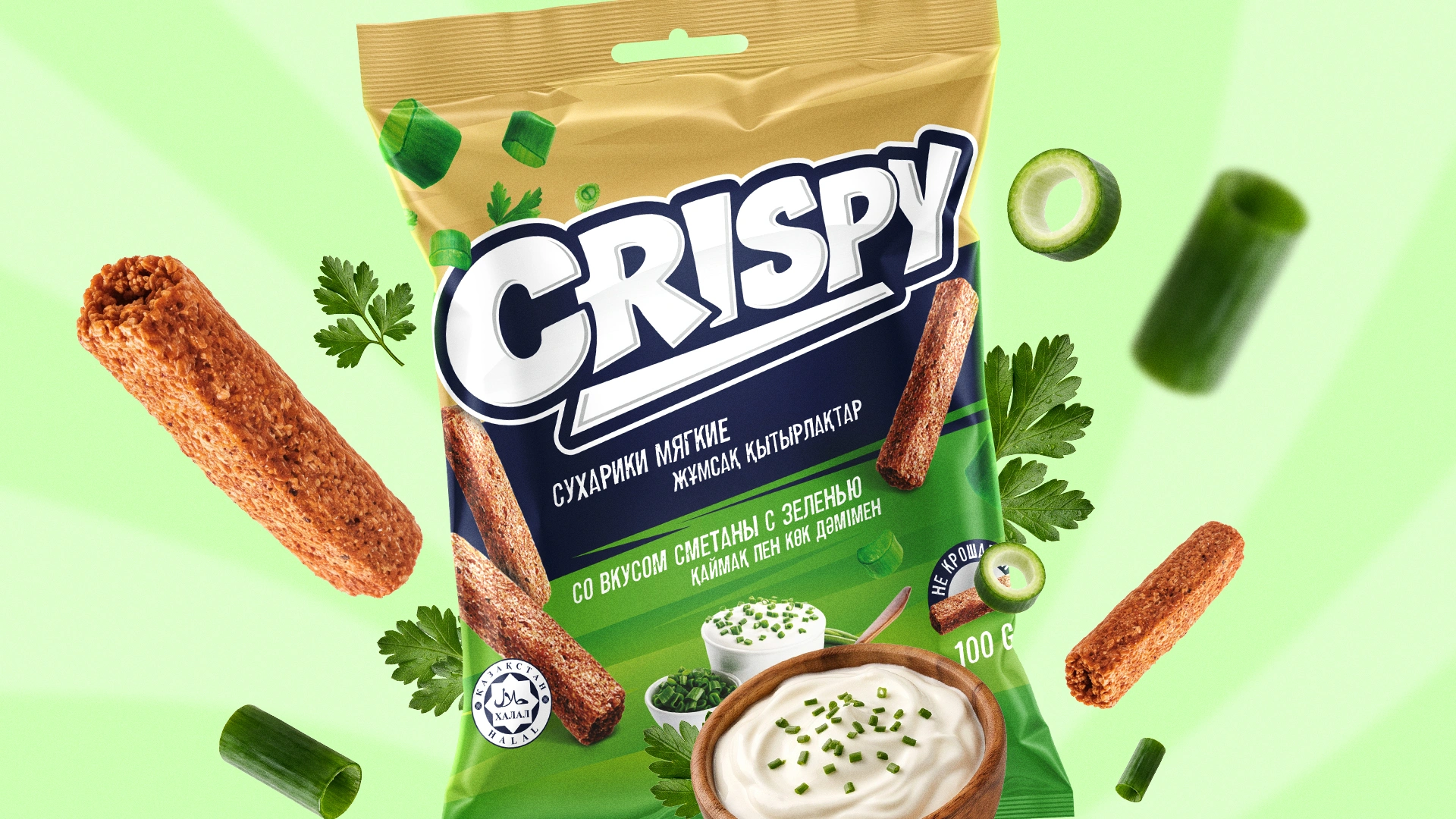
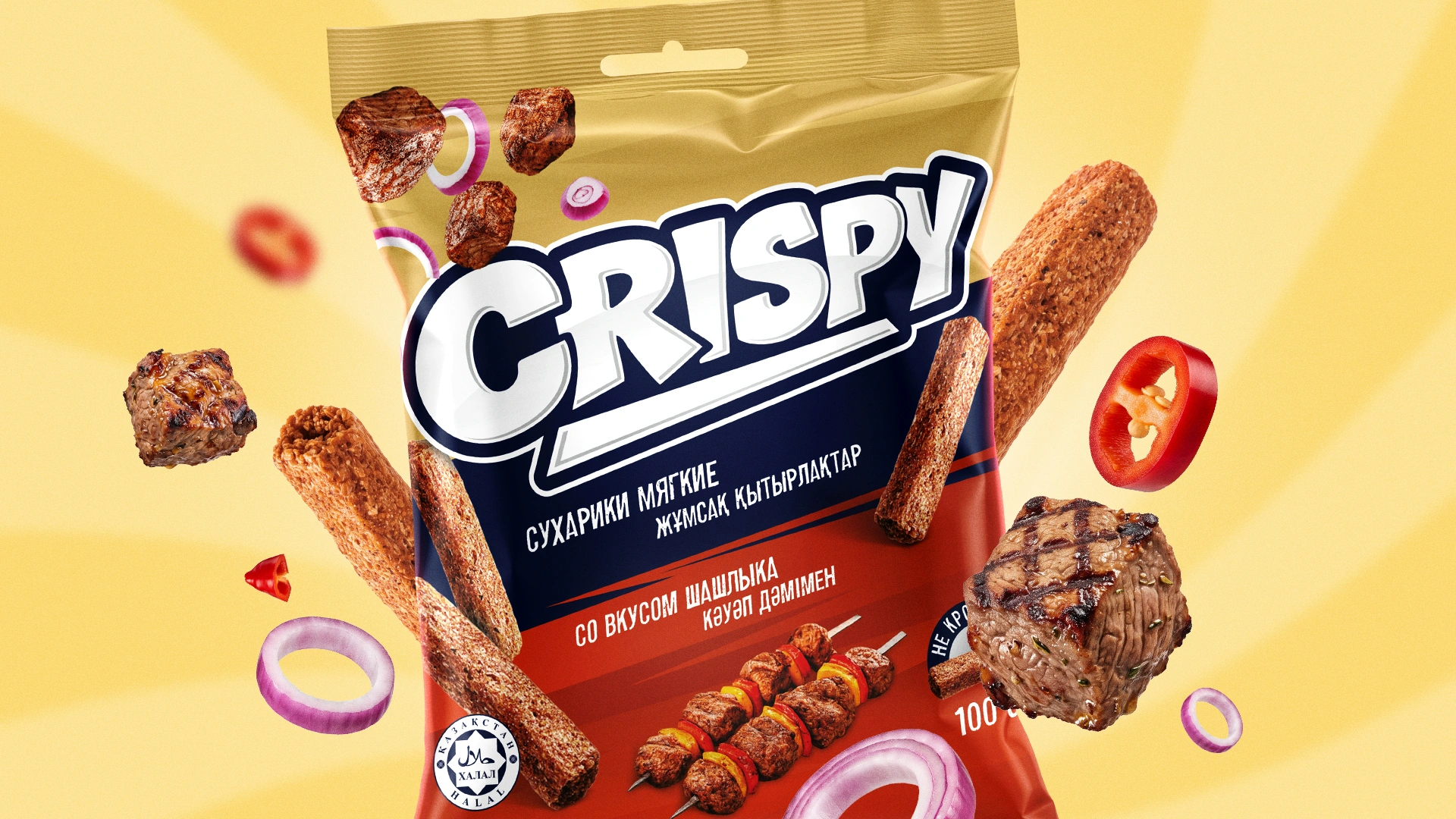
Packaging. We built one system for two product shapes (sticks and baguette) and two weights (40 g and 100 g):
- A golden metallic top band instead of a blue one: it echoes the colour of a toasted crouton and adds a premium touch.
- Colour codes the flavour: green for sour cream and herbs, yellow for cheese, red for shashlik.
- Flying ingredients: spring onion, parsley, and pieces of meat and cheese swirl around the logo. The client put it simply: “The shashlik has to fly!” So instead of a whole skewer, its pieces float across the pack.
- Realistic crouton photography and an appetising food zone: a bowl of sour cream with herbs, cheese, meat.
- A “Doesn't crumble” badge and a Halal mark, two things shoppers scan for.
- The product and flavour names in Russian and Kazakh.
The first wave totals 12 SKUs: three flavours in two shapes and two weights. We took every detail to print, from the 155 mm height of the 40 g bag to a nutrition table in five languages.
4. A New Order
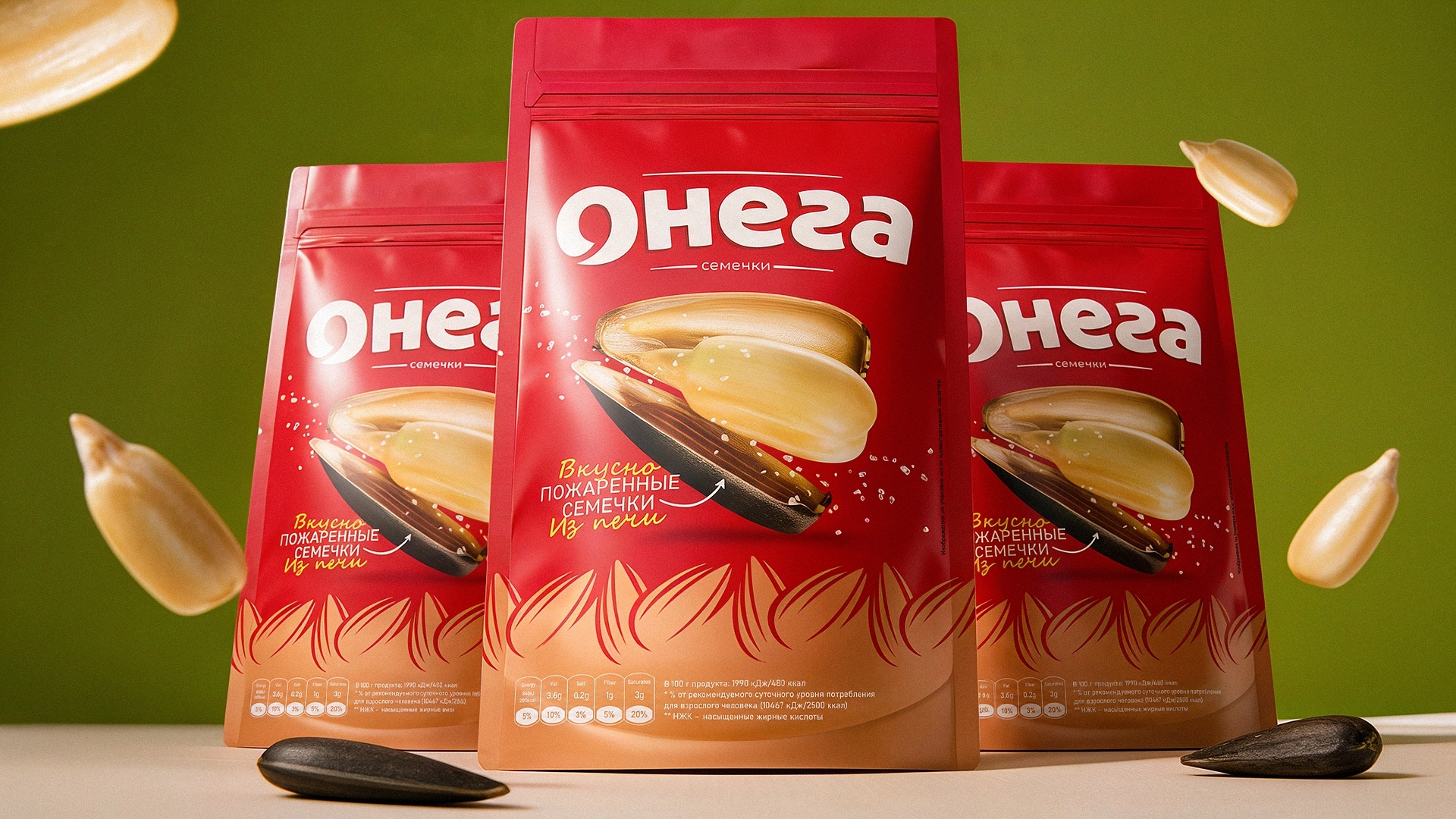
In summer 2026, the client came back with new flavours: steak, sweet chilli, crab, charcoal-grilled meat, chicken and red caviar. The system held up: the new flavours slotted into the line without redoing the concept. In autumn, we adapted the design for 100 g Crispy crackers in aluminium packaging. Meanwhile, Baraka N1 also trusted us with its sunflower seeds and kurt.
Result
About four months passed from the first brief to print-ready files, covering naming, logo and a full packaging line. Croutons that used to get lost in the Baraka range now have their own name, personality and a pack you can spot from across the aisle. The first Crispy products are already on sale, and the client keeps growing the line with us.
Crispy: a crunch you can hear from the shelf.
If your new product deserves a name of its own, get in touch with Minim.