


Onega — Packaging Design Adaptation for a Belarusian Sunflower Seed Brand
Many people know the Belarusian brand "Onega" well from their chips on store shelves. They entrusted us with the packaging design for their new product — sunflower seeds. But with one condition: we had to strictly adhere to the corporate style of their chips.
1. Problem and Task
Usually, it is easier to create a new and free concept for a new product. But here the task was different: when a buyer sees the sunflower seeds on the shelf, they should immediately think of the familiar "Onega" chips. That is, it should be glaringly obvious that the seeds and chips belong to the same brand.
2. Research
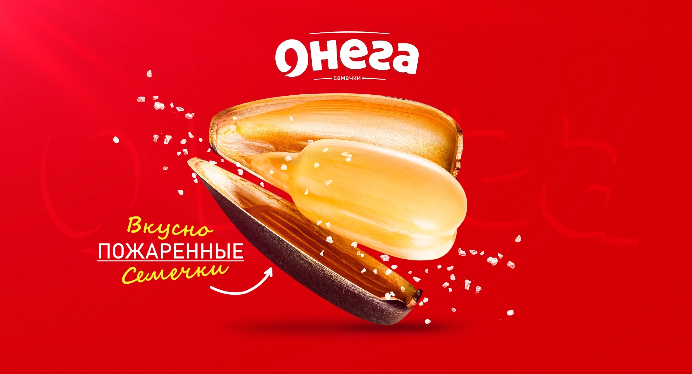
Most sunflower seed packaging on the market follows the same template: either black (gray) packaging or a giant, boring picture of a sunflower. The main visual weapon of "Onega," however, is a bright red color and an easily recognizable logo. We decided to move away from those field landscapes and black colors, focusing all attention on the product itself — the shelled, golden kernel of the sunflower seed.
3. Solution
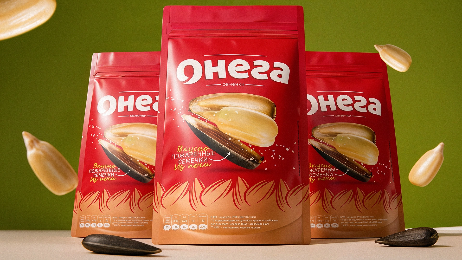
We directly applied the "Golden Seed" concept in the design.
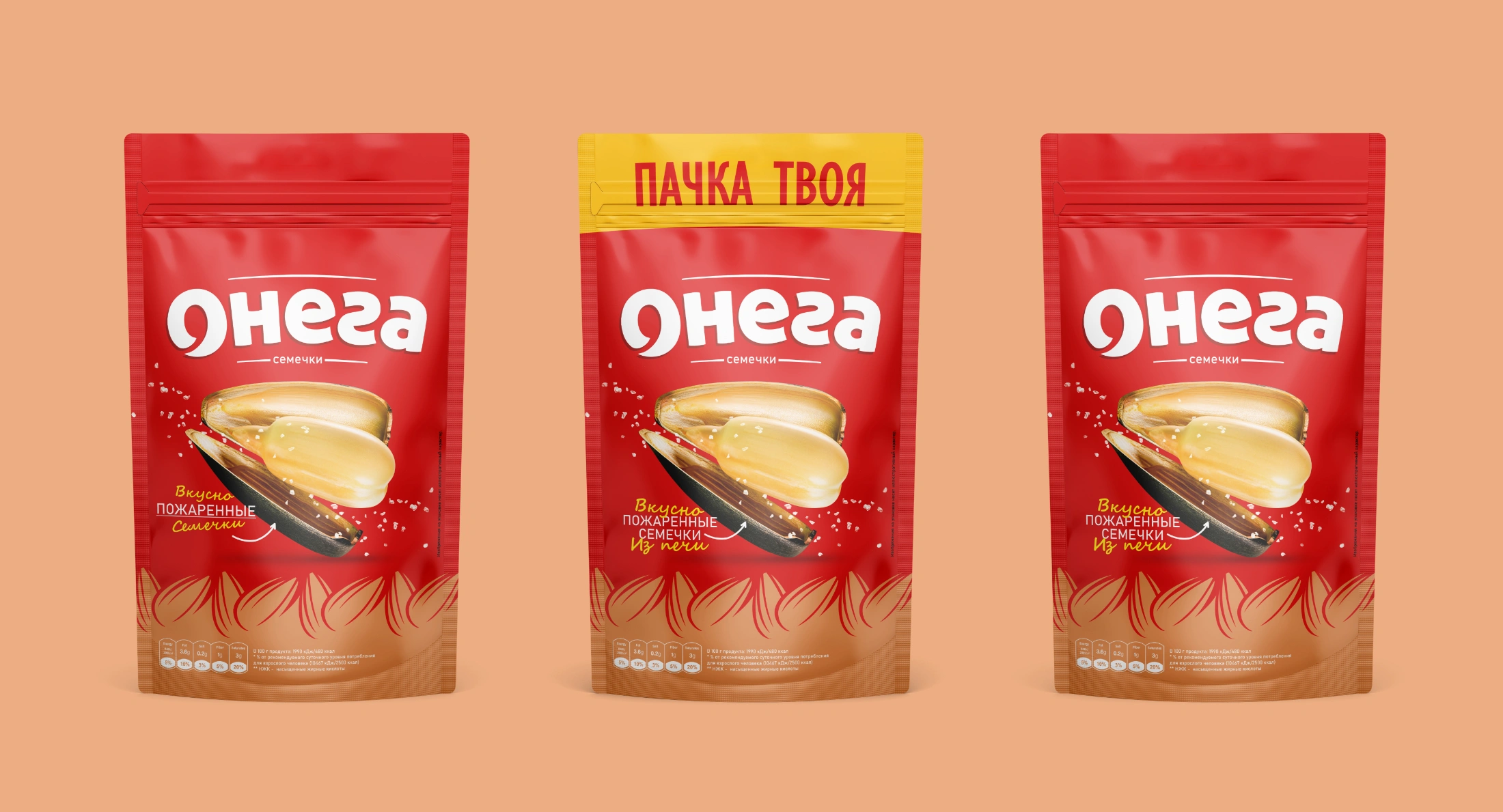
- For the main background, we used the brand's famous, eye-catching, and appetizing red color. We placed a large white "Onega" logo.
- Right in the center of the packaging, we placed a hyper-realistic 3D cracked sunflower seed. Notice that a large kernel, shining like gold, is emerging from the cracked shell, and the small salt crystals around it serve to whet the appetite.
- At the very bottom of the packaging, you will see a golden-brown sunflower seed pattern. This seemingly simple detail gave a premium feel to the overall design.
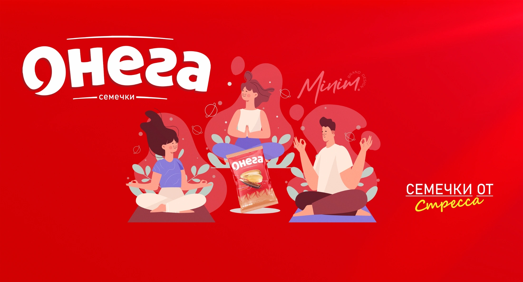
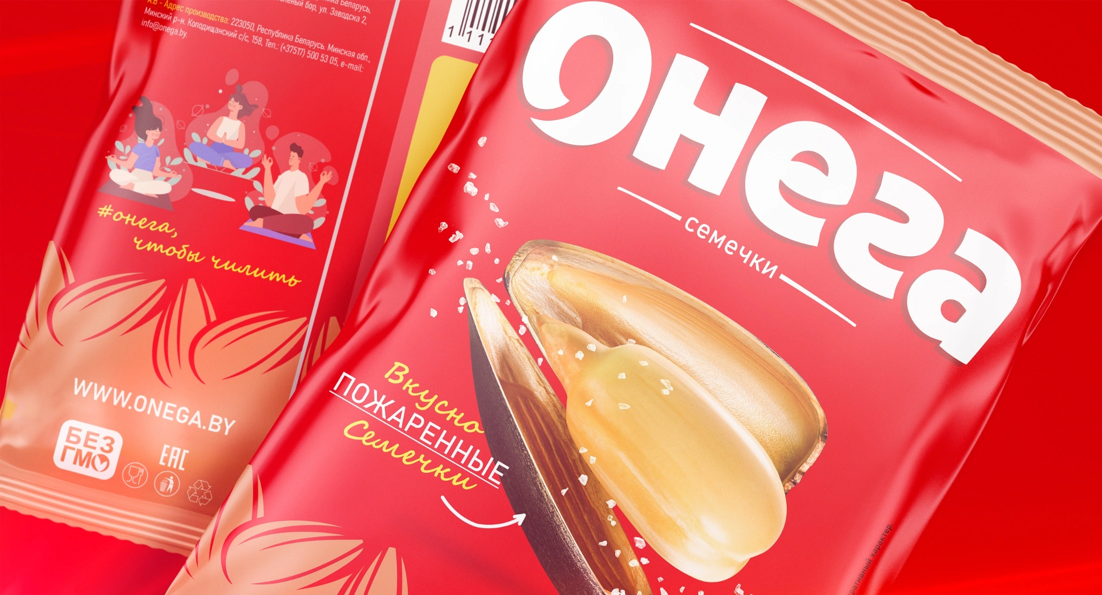
- On the back of the packaging, we added an illustration of young people enjoying themselves while cracking seeds. After all, cracking seeds is not just a process; it's a unique form of relaxation!
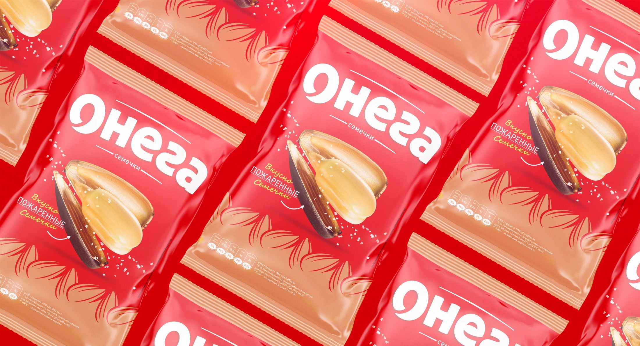
Result
The client's main requirement — to stay true to the corporate style of the chips — was fully met. Now, the sunflower seeds sit on supermarket shelves next to the famous Belarusian chips. The design retained the beloved look of the brand and, most importantly, turned out so attractive that a buyer's hand instinctively reaches for it when seeing it on the shelf.