Janob Semechka – Sunflower Seeds Packaging Design & Mascot
Selling sunflower seeds in Uzbekistan is like selling sand in a desert. The market is saturated. Every corner store offers dozens of options. Mass imports of high-quality raw materials from China have completely filled the market. Surprising a sophisticated buyer with "just seeds" is virtually impossible today.
How do you launch a new product in such a crowded territory, especially for the demanding customers of the Valley?
1. The Challenge
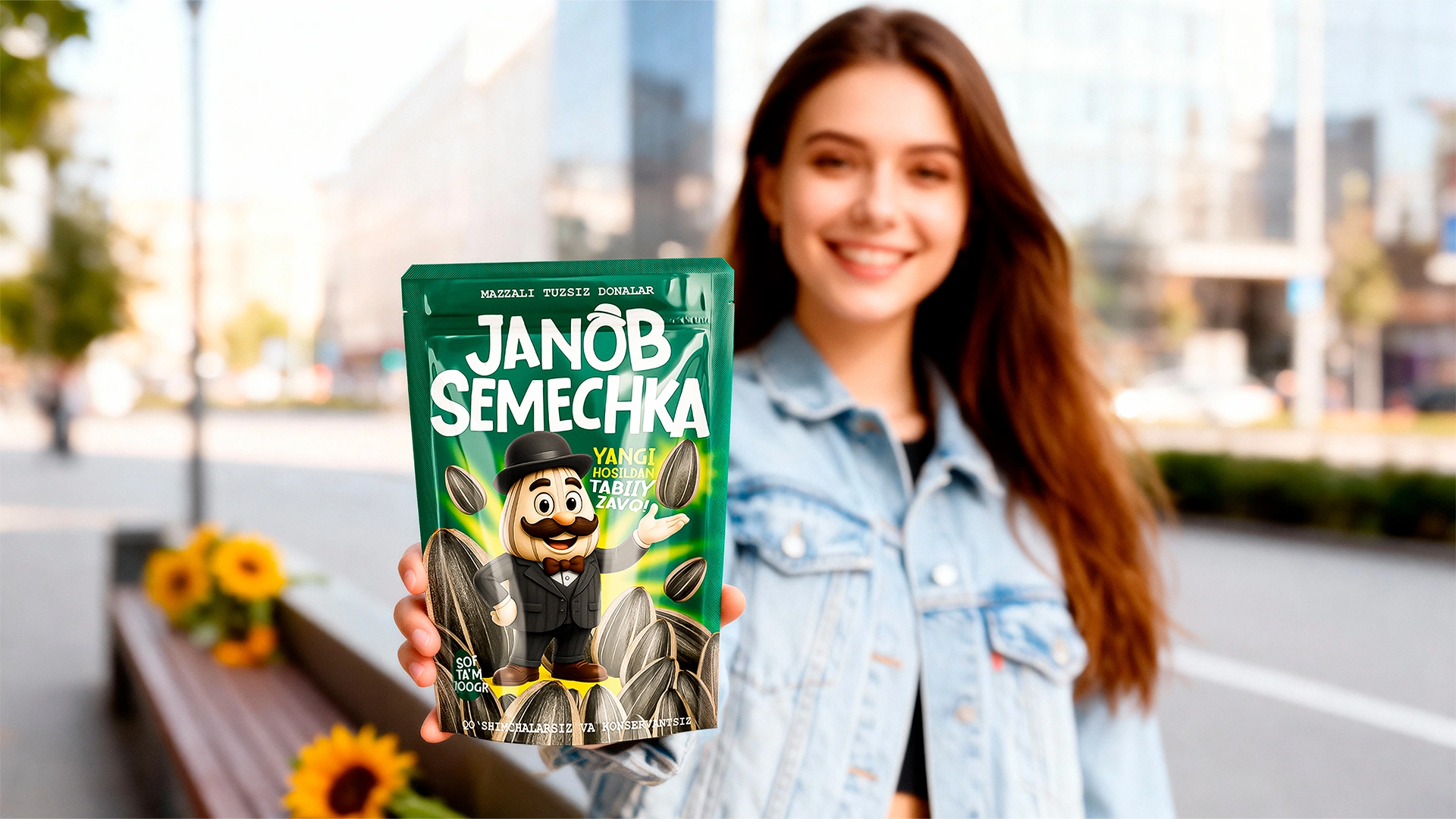
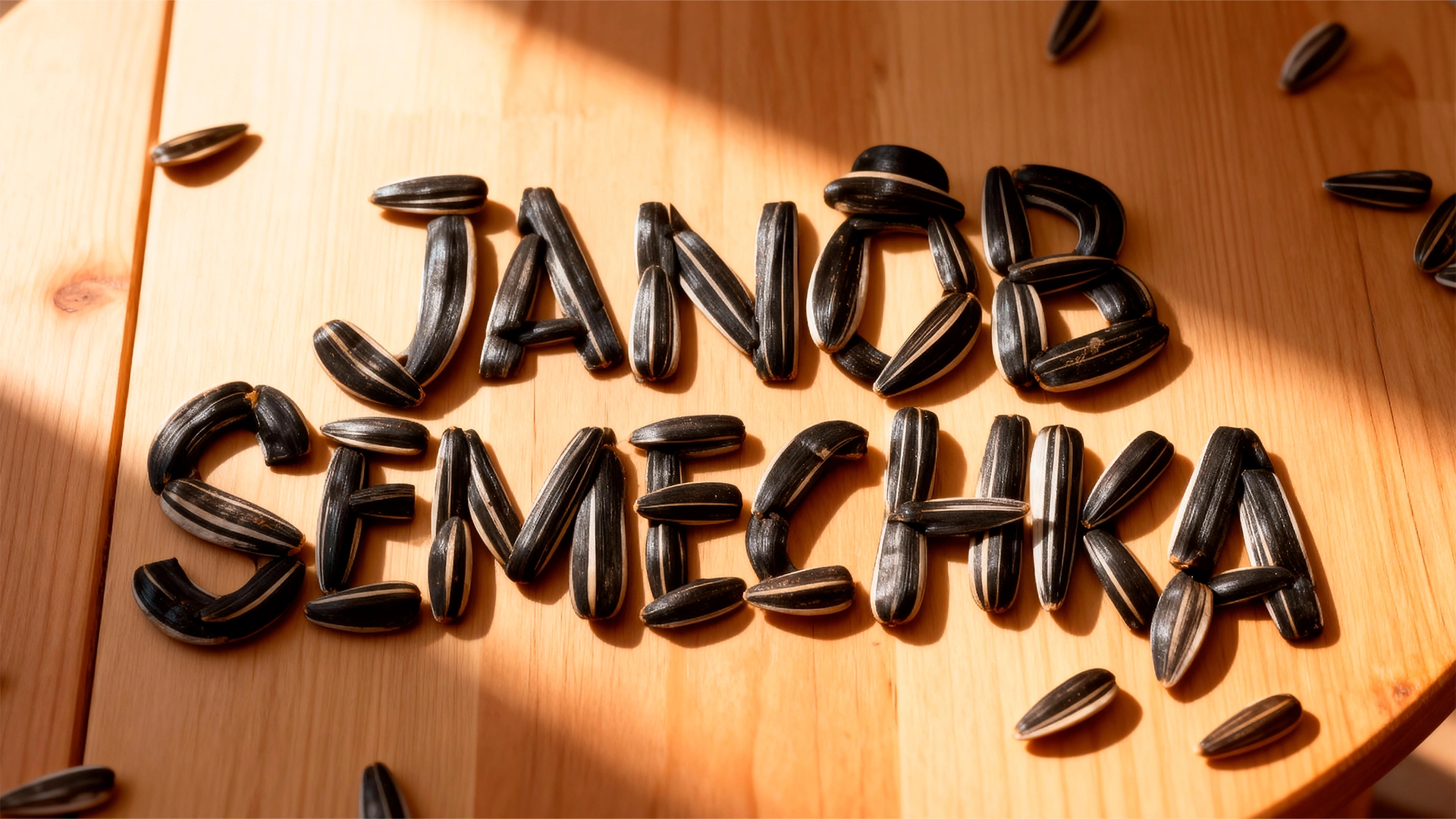
The client arrived with a ready-made name—"Janob Semechka" (Mr. Sunflower Seed). Our task was not just to draw a pretty package, but to "animate" the name and find a way to the consumer's heart.
The main battleground was the Fergana Valley. If we had followed the beaten path with a generic sunflower image, the brand would have instantly vanished in the visual noise. We needed character.
2. Research
We started with a deep shelf analysis. First, competition is intense—the category is packed tight.
Second, we saw depressing uniformity: mostly black bags or photos of seeds. To the consumer, Brand A looks just like Brand B. In this scenario, choice is dictated by the lowest price or pure chance.
People are tired of faceless products but value sincerity and respect. The name "Janob" (Mister/Sir) offered a great clue. It implies culture, stature, and quality. We realized: if we breathe soul into the brand, standing out from competitors will be a matter of technique.
3. The Solution
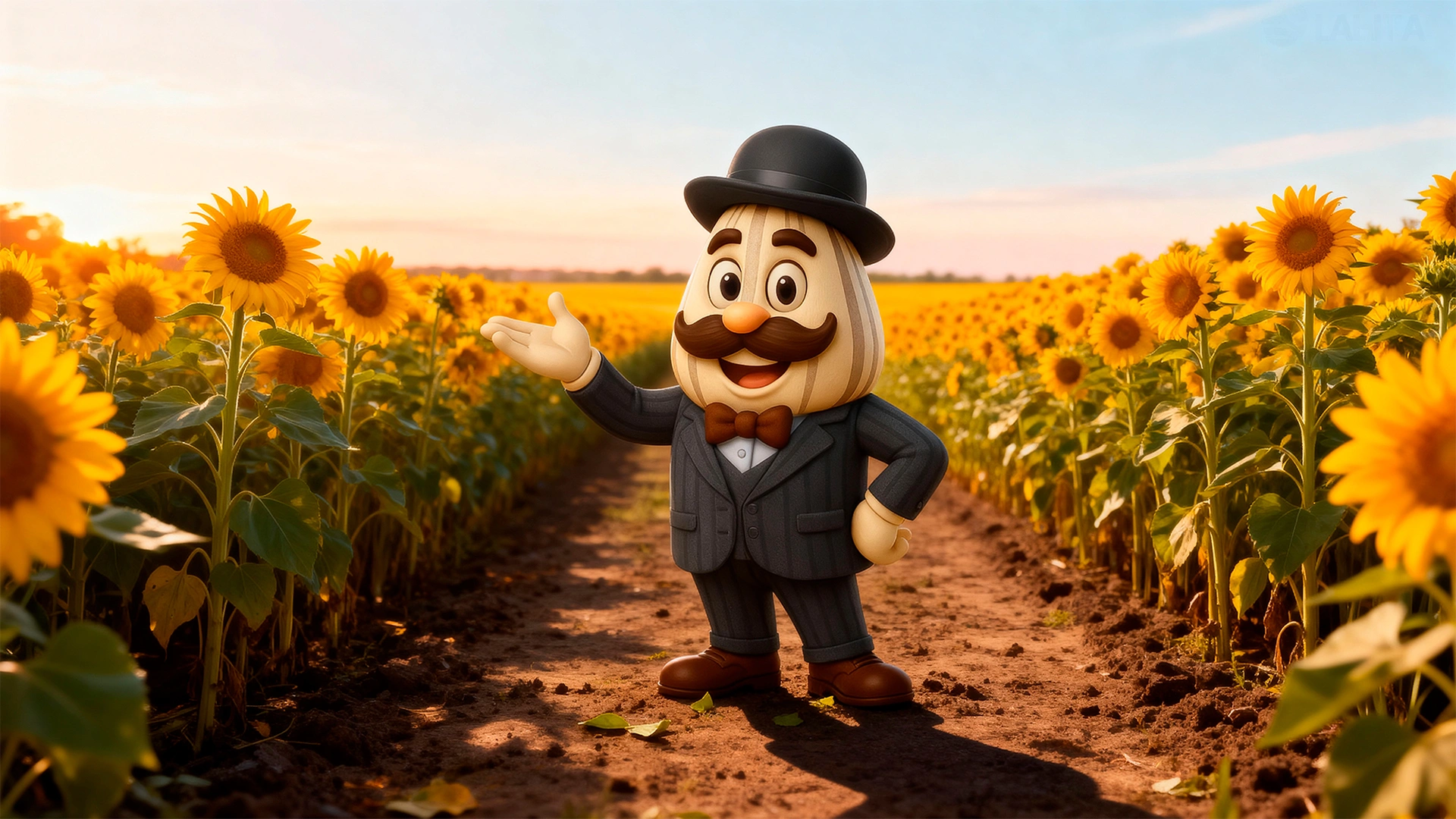
We turned the product from "just food" into a personality. Instead of a boring sunflower, we created a unique mascot (brand character).
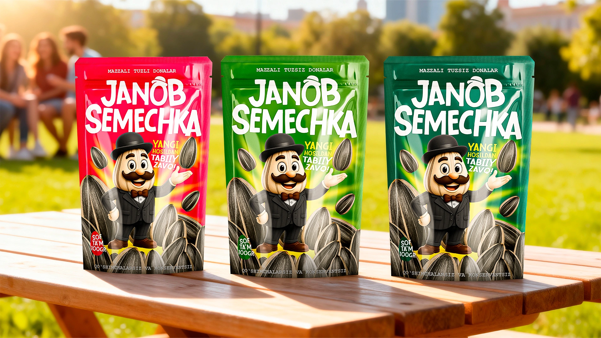
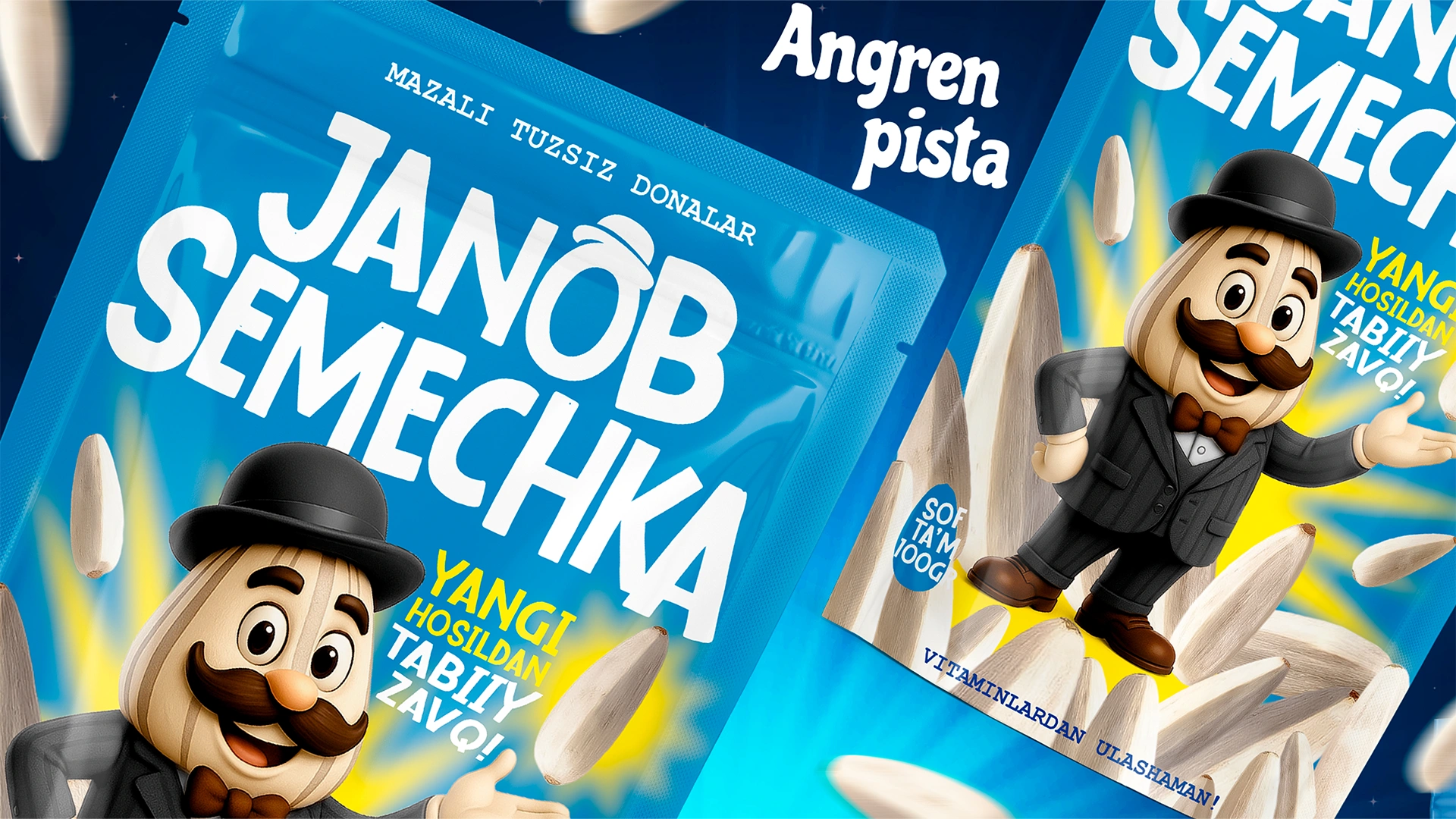
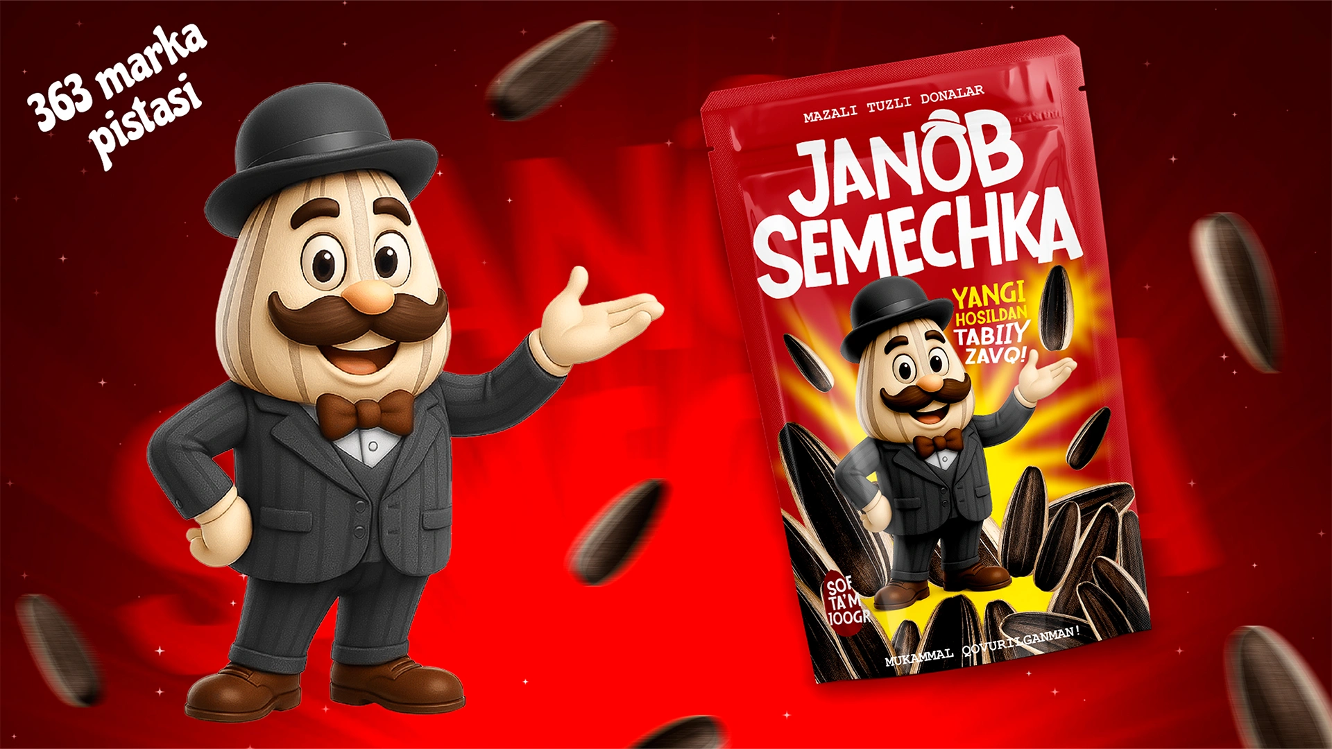
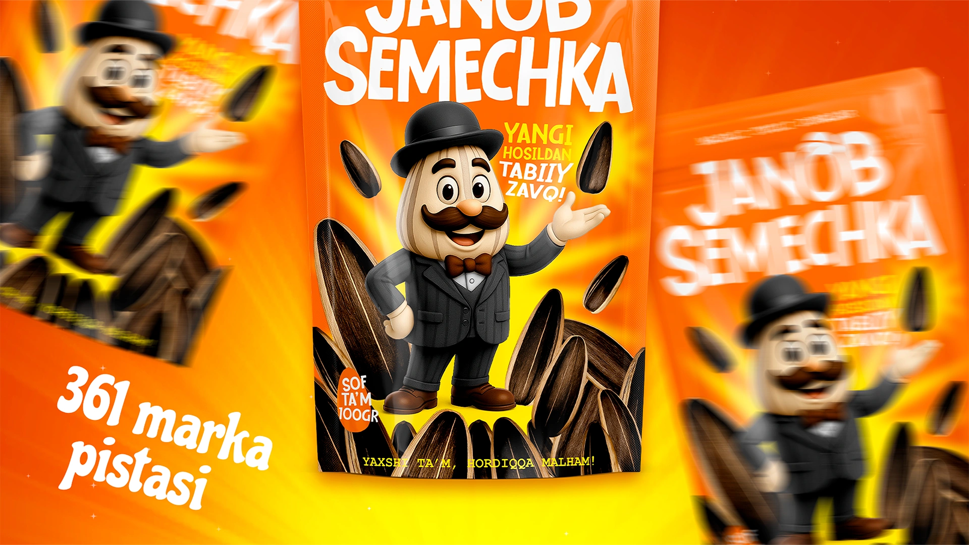
- Image and Character: Look at the hero on the pack. It is not just a drawing. A bowler hat, a bowtie, and a solid mustache.
- Meanings: The hat and bowtie are markers of premium quality. These aren't homemade seeds sold in paper cones on the street. This is a factory product—clean, calibrated, and made with respect for the buyer.
- Color Navigation: We selected distinct color codes (green, red, dark orange) for each type (salted, unsalted, large). This helps the rushing customer find their flavor instantly without reading the text.
The Result
The synergy of smart design and client effort yielded excellent results:
- "Janob Semechka" entered the Valley's retail outlets in record time.
- People remembered the product by its image, not just the name. A clear anchor formed: "The one with the mustache and hat." The mascot worked perfectly, highlighting the brand against dozens of faceless black bags.
- The design helped lift the product from the economy segment to a higher level.
Summary: There may be many competitors, but brands with a face are rare. If your product looks "like everyone else's," you are doomed to price wars. But if you have a face, like "Janob Semechka," the customer perceives you as an old friend and becomes loyal.
Want your product to "speak" from the shelf? Minim Design — we breathe life into brands.