Wateron
With environmental pollution, the need for the most basic things - air and water filters - is growing. But to take a place in a highly competitive market, it is important that your product name is clear and the design is attractive.
1. Solution
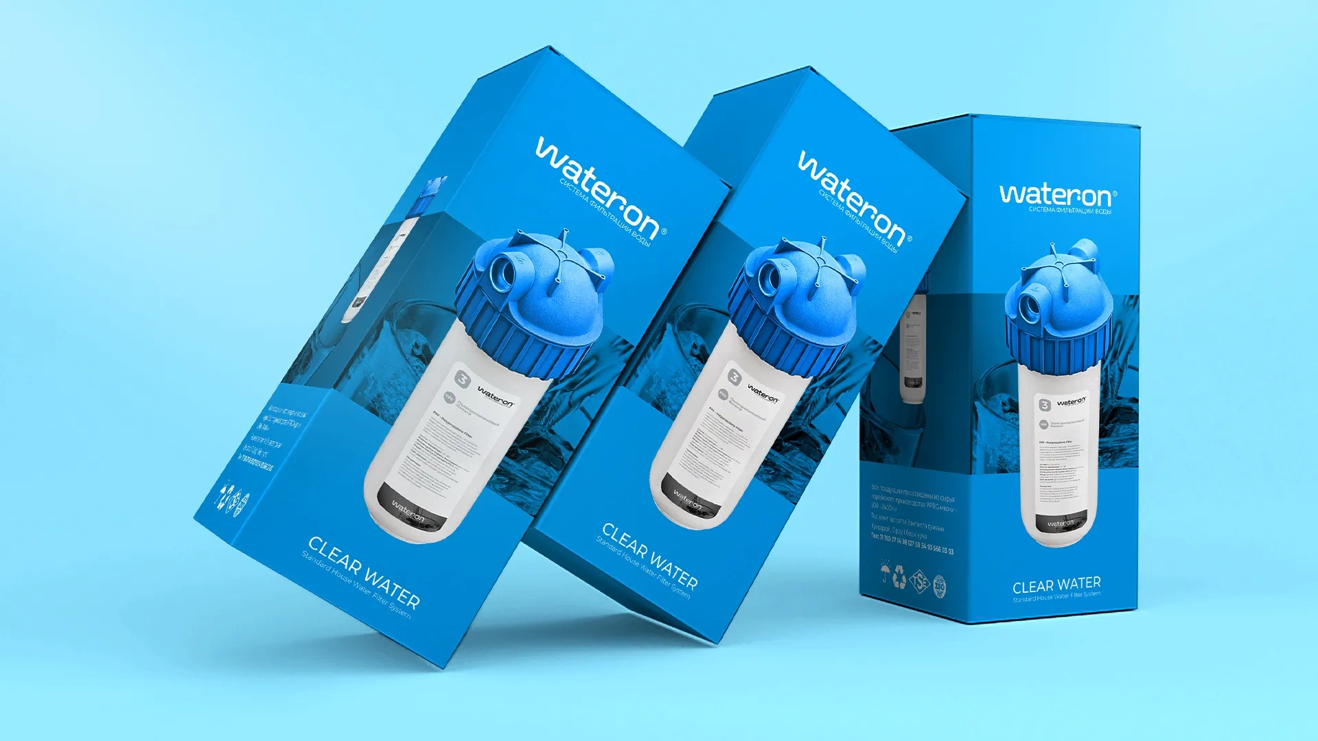
This time we provided services for the development of naming, logo and packaging design for a water filter based on granular activated carbon.
When choosing a name for the brand, given that the product is intended for the middle segment, we suggested a simple and understandable option - Wateron, which means "turn on water". With this name, we put forward the position of "use water, being confident in its purity."
Result
In the logo design, we used a typographic style that helps a new brand gain recognition faster and be remembered well. To avoid the logo being too minimalistic, we chose a font without sharp angles, reminiscent of plumbing pipes. In addition, we skillfully compared the letter r to a tap and depicted water dripping from it.
Finally, we designed the product packaging in the corresponding colors and enriched it with a thematic background.
If you also want to launch a new product on the market, you should definitely use the full branding service. And the Minim team will help you with this.


