Green Way – Packaging Design for an International Canned Fruit Brand
Some projects speak for themselves through their scale and well-executed strategy. The Green Way line of canned fruits is an exemplary case in our portfolio.
This isn't just about design; it's about our client's business mindset. They are a true “global player.” The project’s concept and management were developed in Uzbekistan, production was established in Indonesia, and the finished products are exported to markets across Central Asia. The ability to find optimal resources worldwide and transform them into a large-scale, functioning business is true mastery.
1. The Challenge
In the canned goods market, especially in Central Asia, products often look like cheap imports or ordinary everyday items lost in visual noise.
Our primary task was to position Green Way as a strong international FMCG brand. For distributors to easily enter retail chains and dominate shelf space, the packaging itself had to become a powerful sales tool.
2. Research
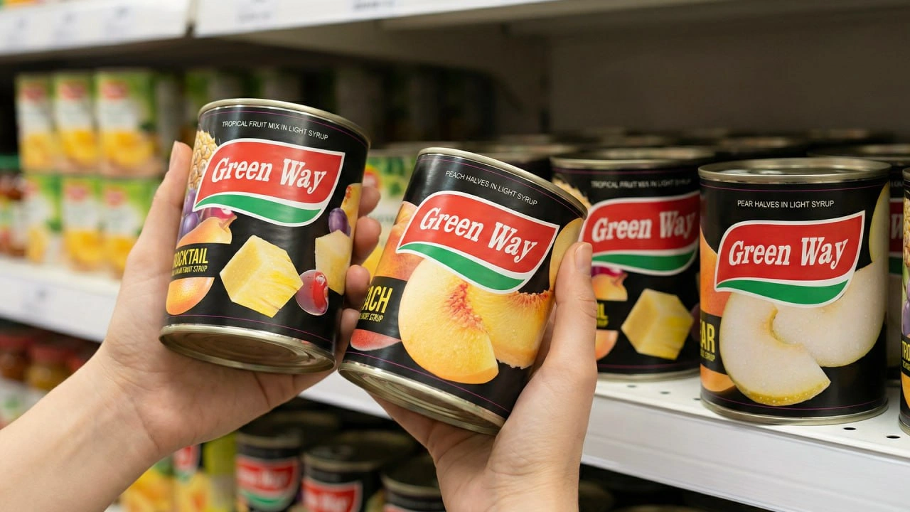
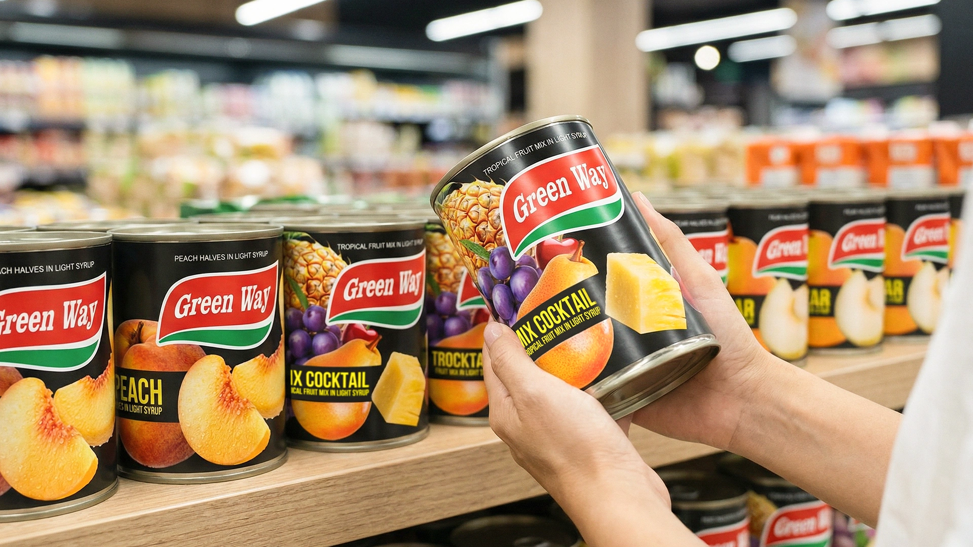
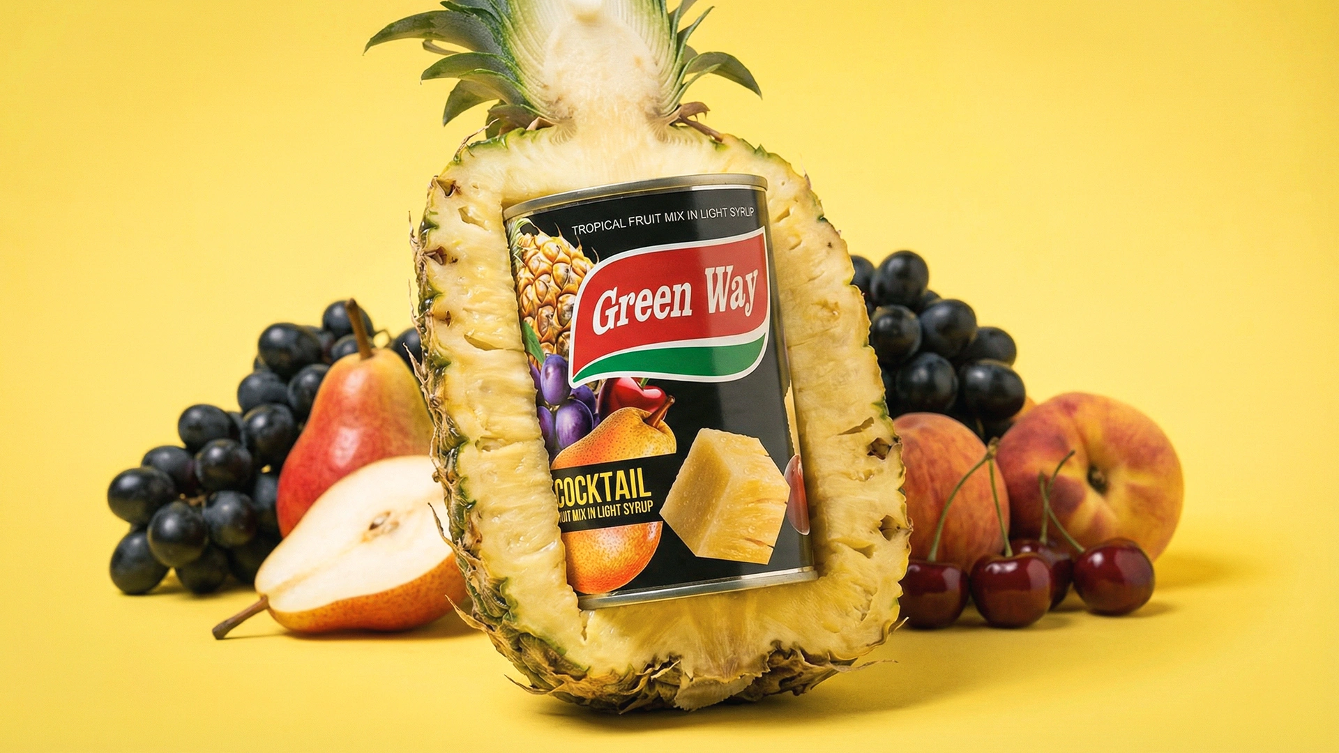
Shelf analysis revealed an interesting trend: most premium canned pineapples use a black background — this has become a category standard. However, for peaches, pears, and fruit cocktails, many brands switch to light, cluttered, and low-value-looking backgrounds, causing the product line to lose visual consistency.
Additionally, modern consumers are often skeptical about the freshness of canned fruits. Therefore, the design needed not only to ensure visual unity but also to eliminate these doubts.
3. The Solution
We leveraged existing market standards and turned them into a competitive advantage:
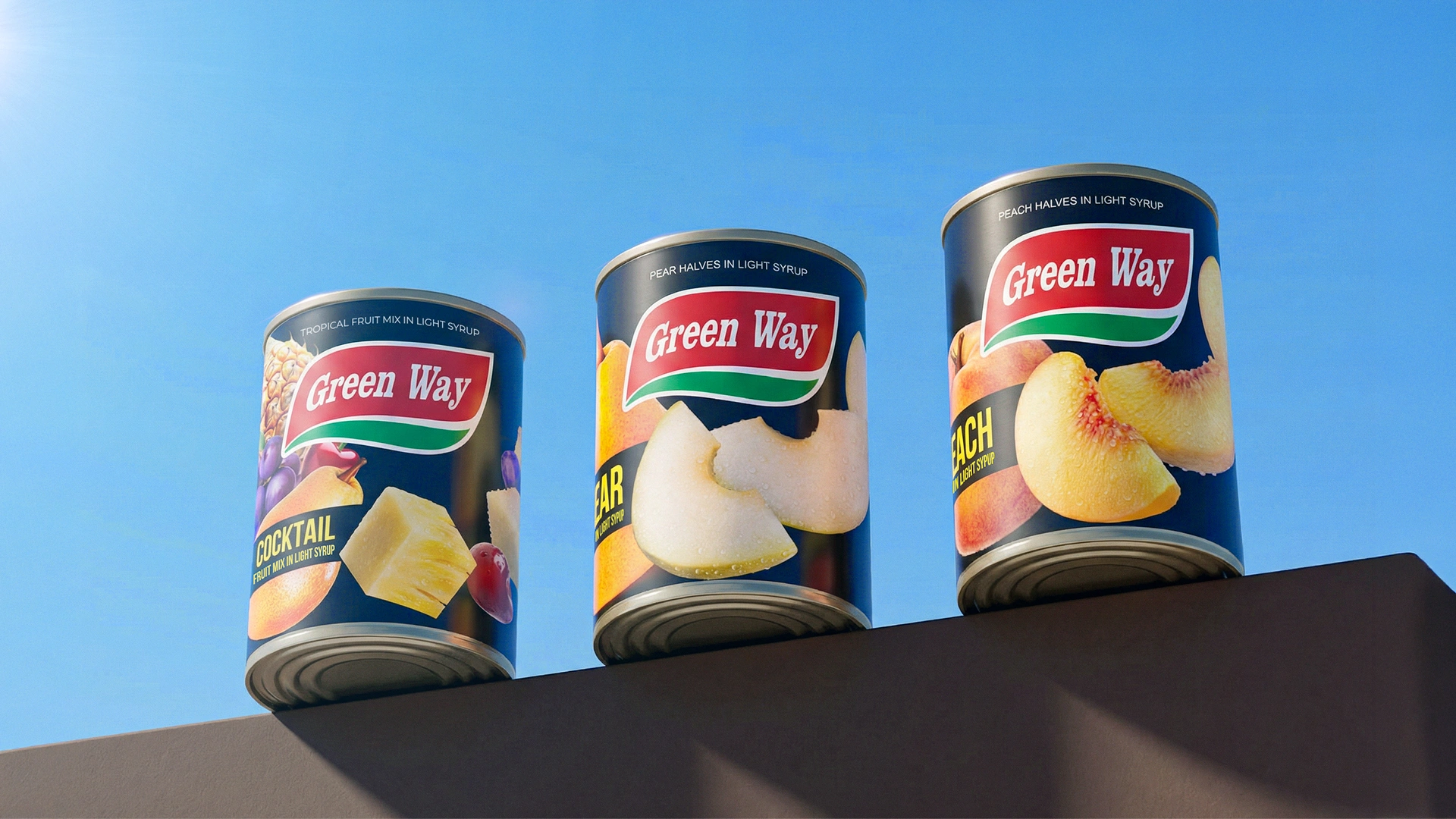
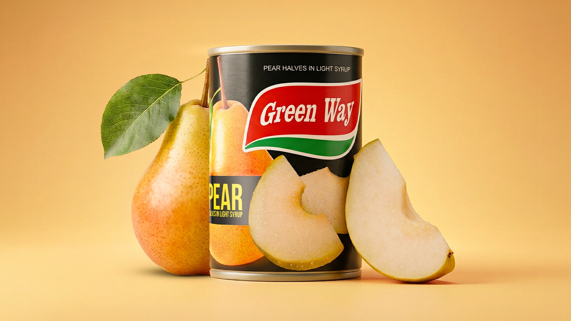
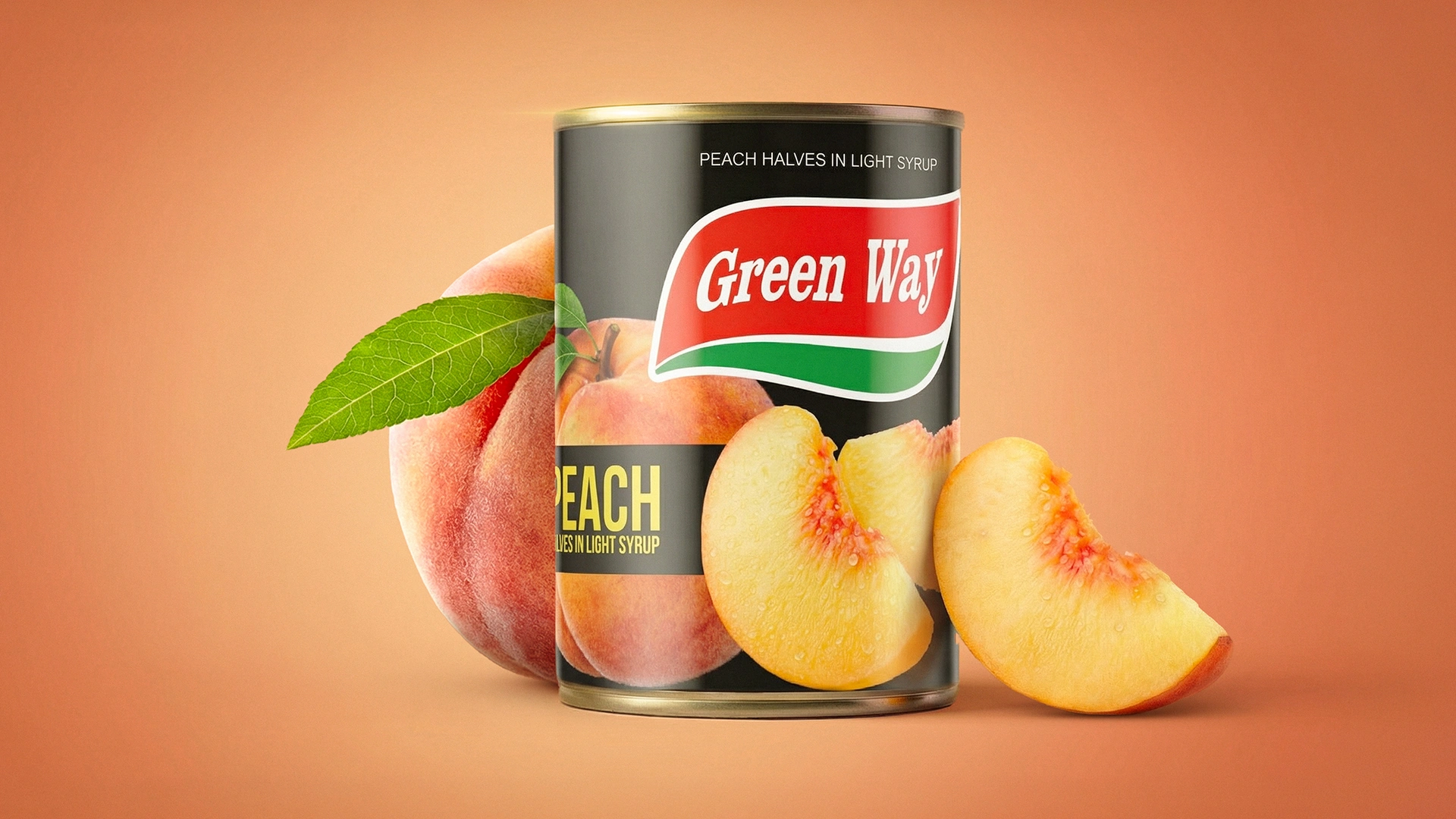
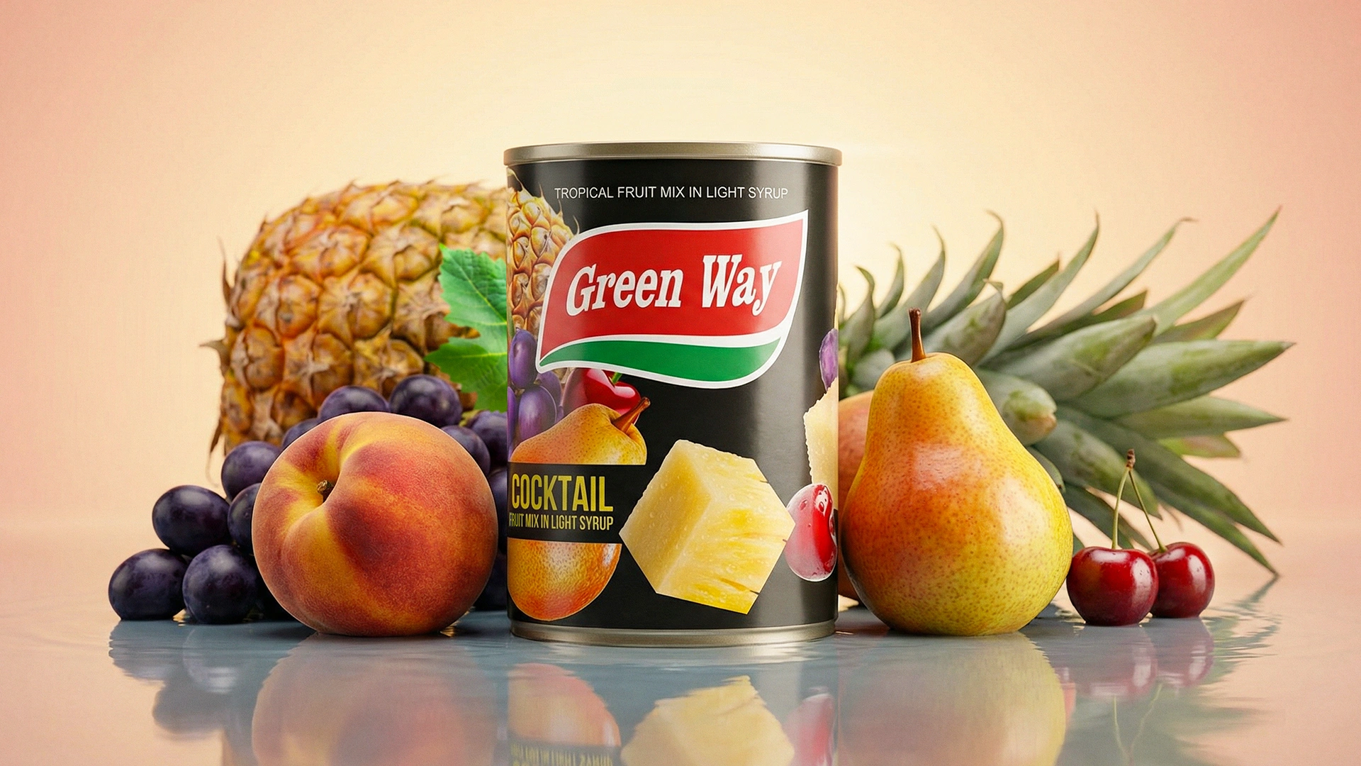
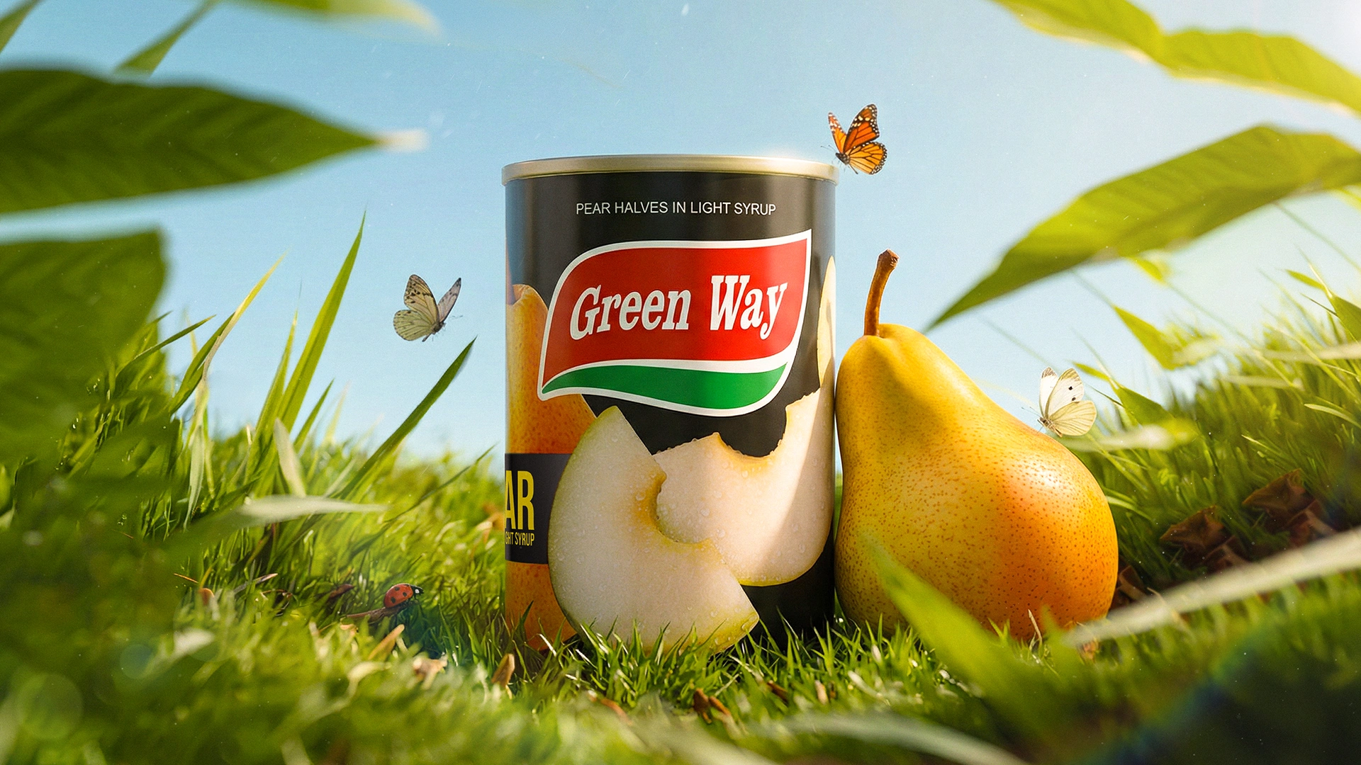
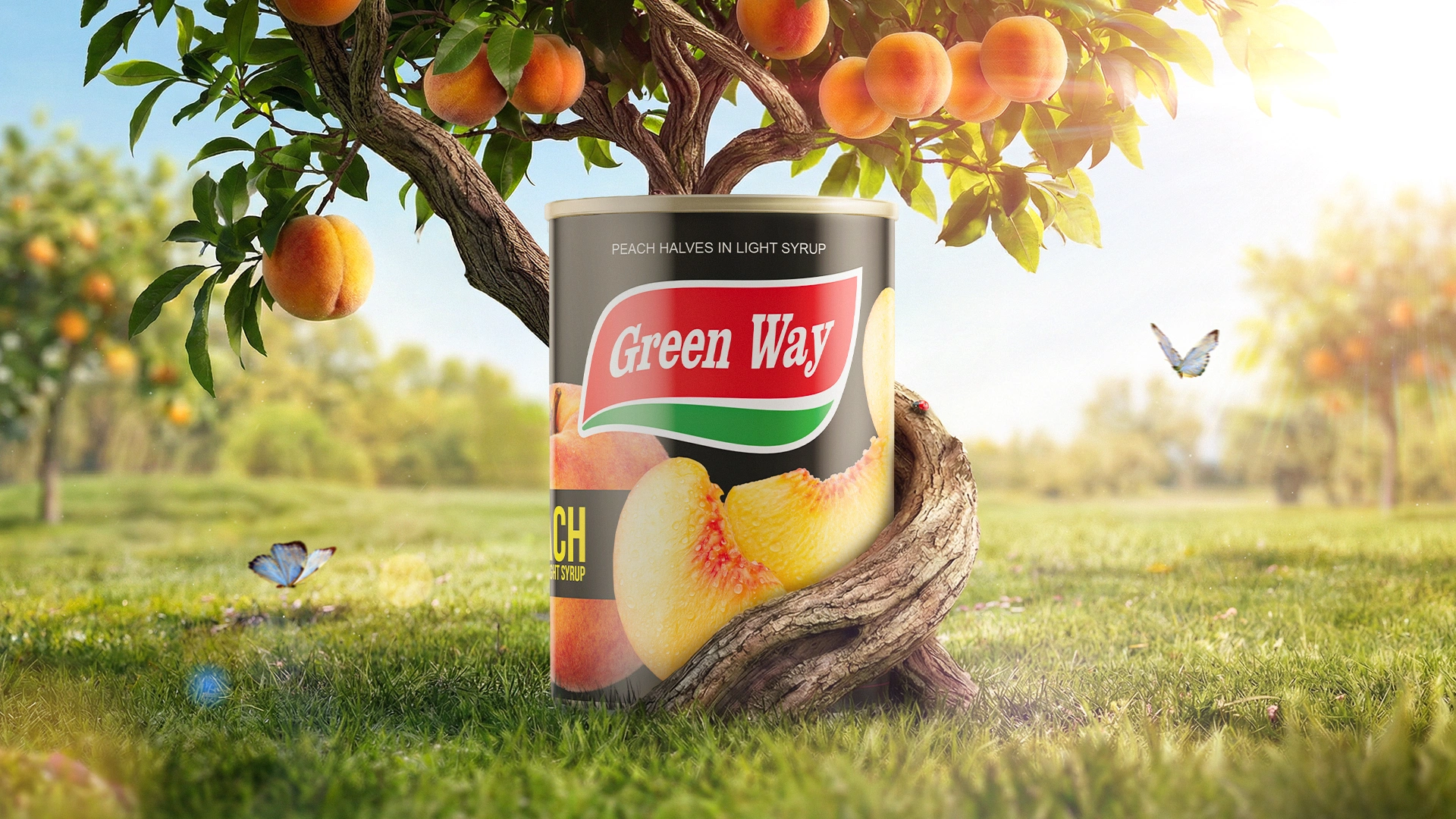
- Unified visual block: the black background was applied across the entire product line (peach, pear, cocktail). On the shelf, products form a strong “color block,” instantly elevating the brand to a premium level.
- Typography (navigation): unnecessary elements were removed. Bold, high-contrast typography (“PEACH”, “PEAR”, “MIX COCKTAIL”) ensures readability and attracts attention from a distance.
- Hyper-realism: fruits were rendered in highly detailed 3D with water droplets. Against the dark background, their brightness and freshness are maximized, breaking the stereotype of canned products.
The Result
Thanks to its cohesive visual system, Green Way packaging achieved the look of a global-level product. For distributors, this design became a strong argument for entering retail chains and positioning in the premium segment.
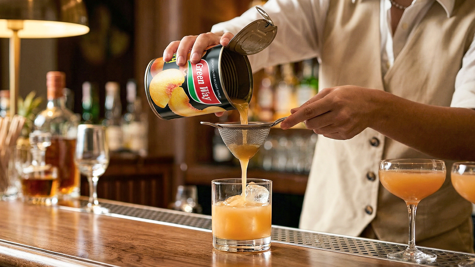
For consumers, the packaging triggers impulse purchases by presenting a clean and clear product image. Multilingual labeling further ensures seamless sales across Central Asia.