IMPERIA – Pasta Packaging Design and Brand Rebranding
Translating the brand's 23-year history into modern visual language and an open communication strategy with the customer.
1. Objective
Trust passes the test of time. The Imperia brand, which has been present in the market since 2003, possesses exactly such a historical asset. However, over time, the product's appearance began to lag behind modern market requirements and the competitive environment.
Our main task was to adapt the brand's well-known name to the times and create a premium packaging system that would once again capture the customer's attention on the shelves.
2. Logic and approach
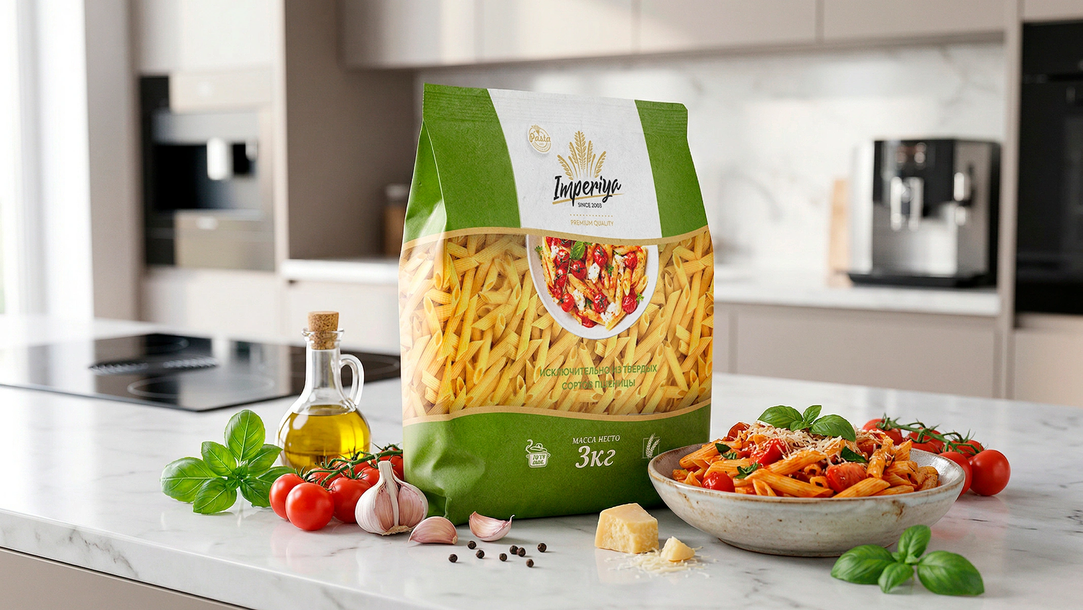
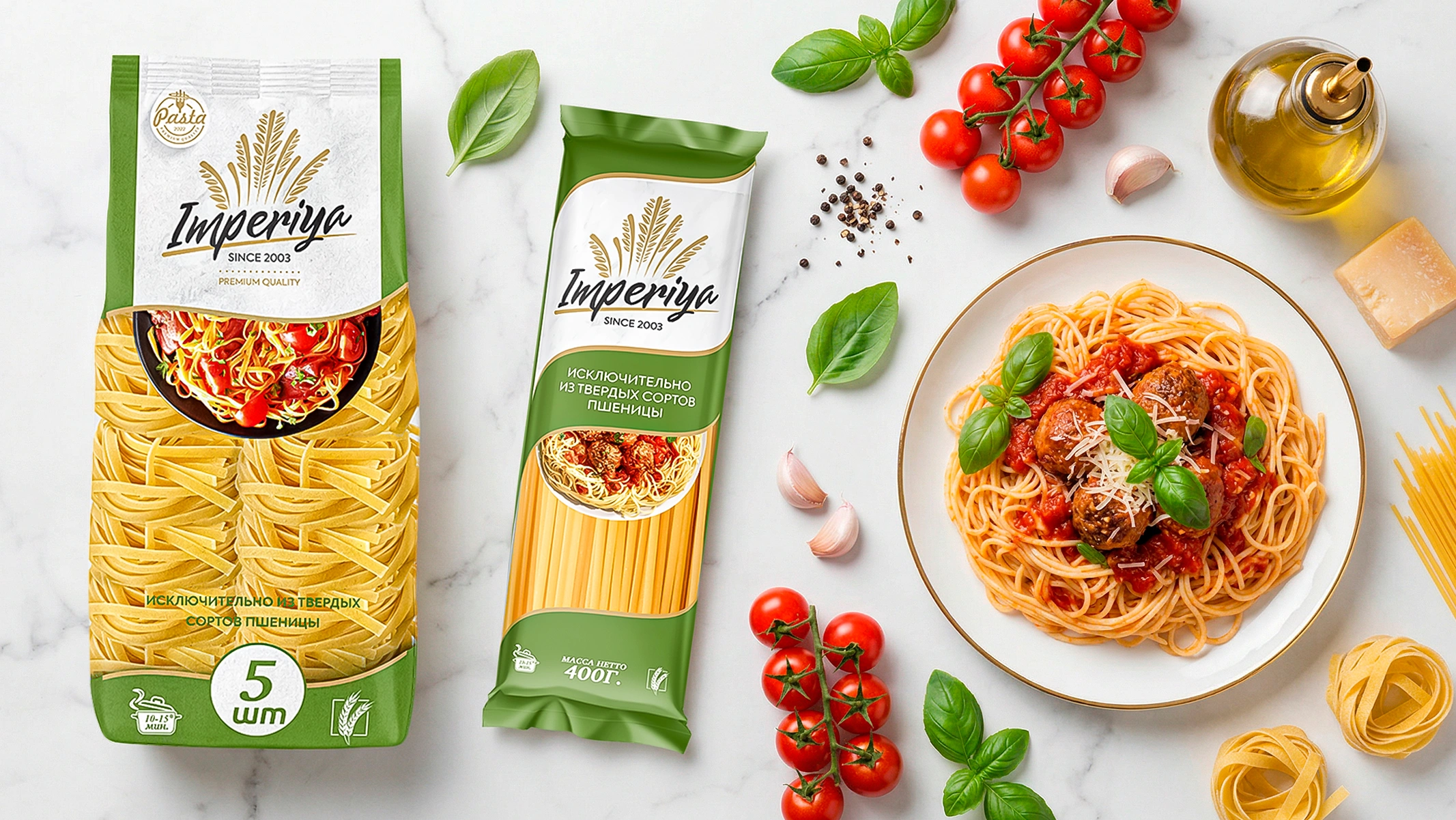
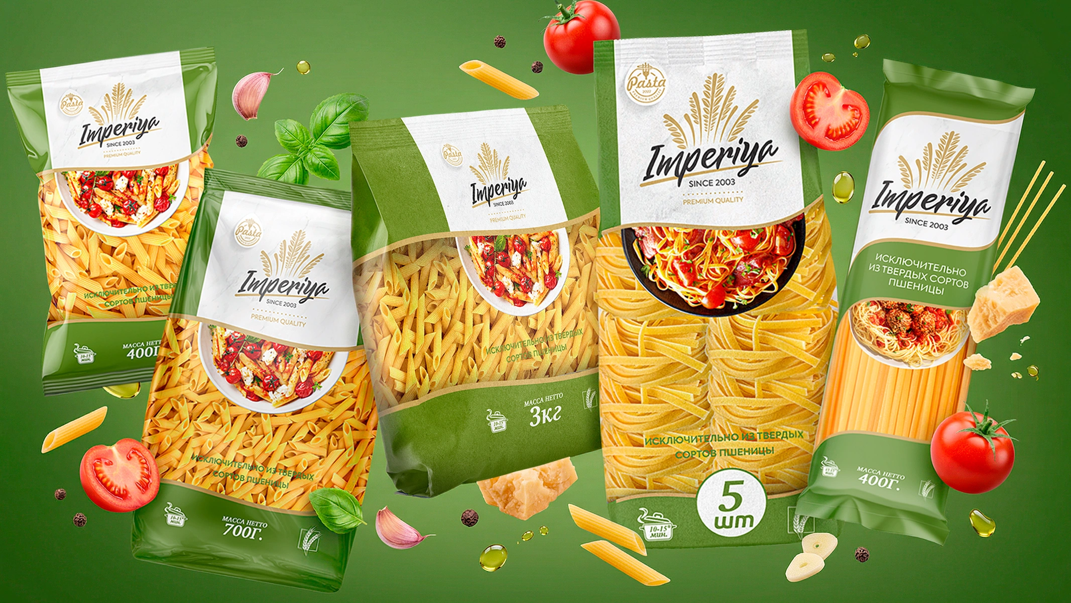
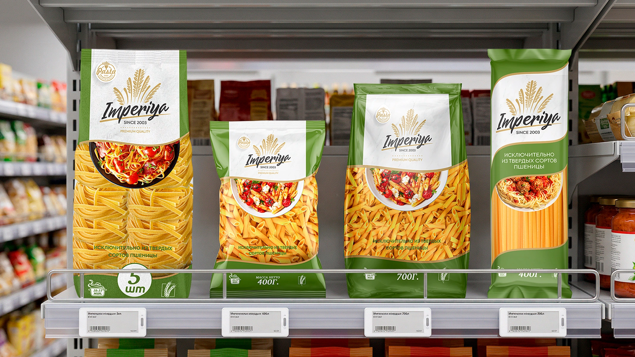
In the pasta segment, the buyer's decision-making process takes only a few seconds. In this process, the consumer first visually evaluates the color, shape, and integrity of the product, and then makes a choice. Therefore, in the new design, we abandoned "hidden" zones and made transparency the main criterion.
The fact that a large portion of the packaging remained transparent allowed the buyer to directly see the quality of the product.
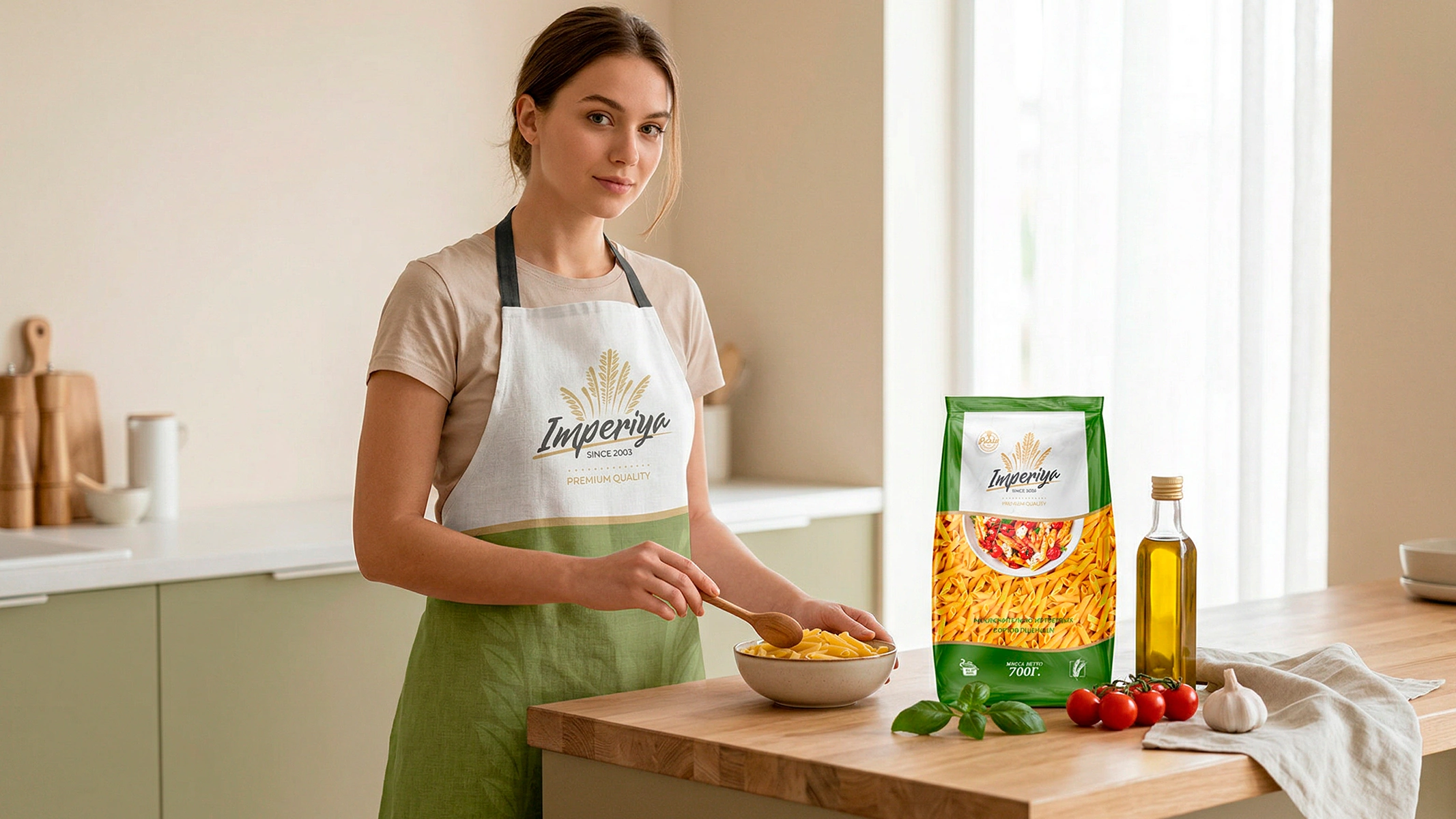
We also placed an image of an appetizing dish made from the product in the center of the design. This serves to evoke in the buyer a desire not just to buy the product, but to try it out as soon as possible.
3. Solution
We have combined both pragmatic and aesthetic solutions in packaging design.
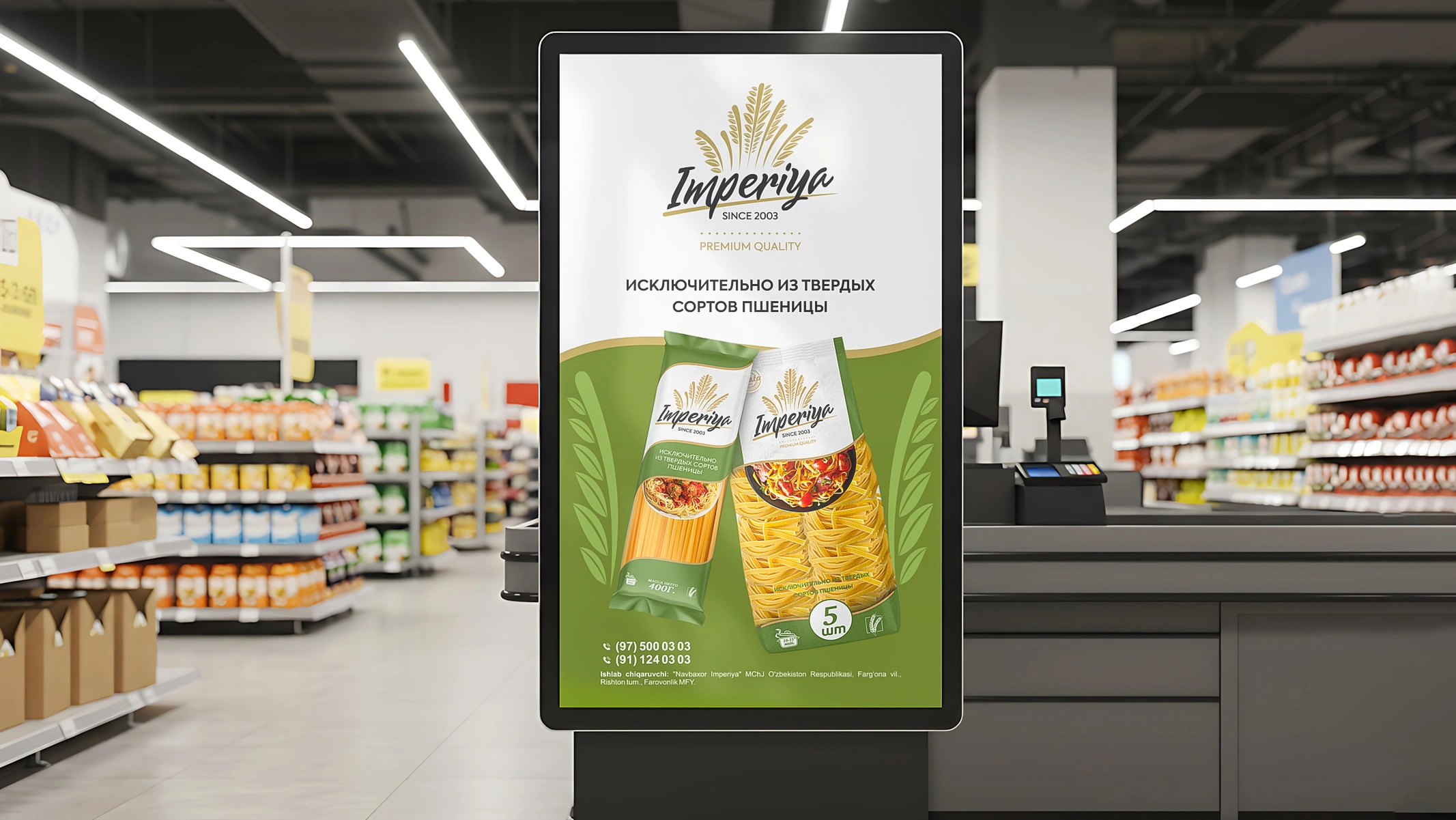
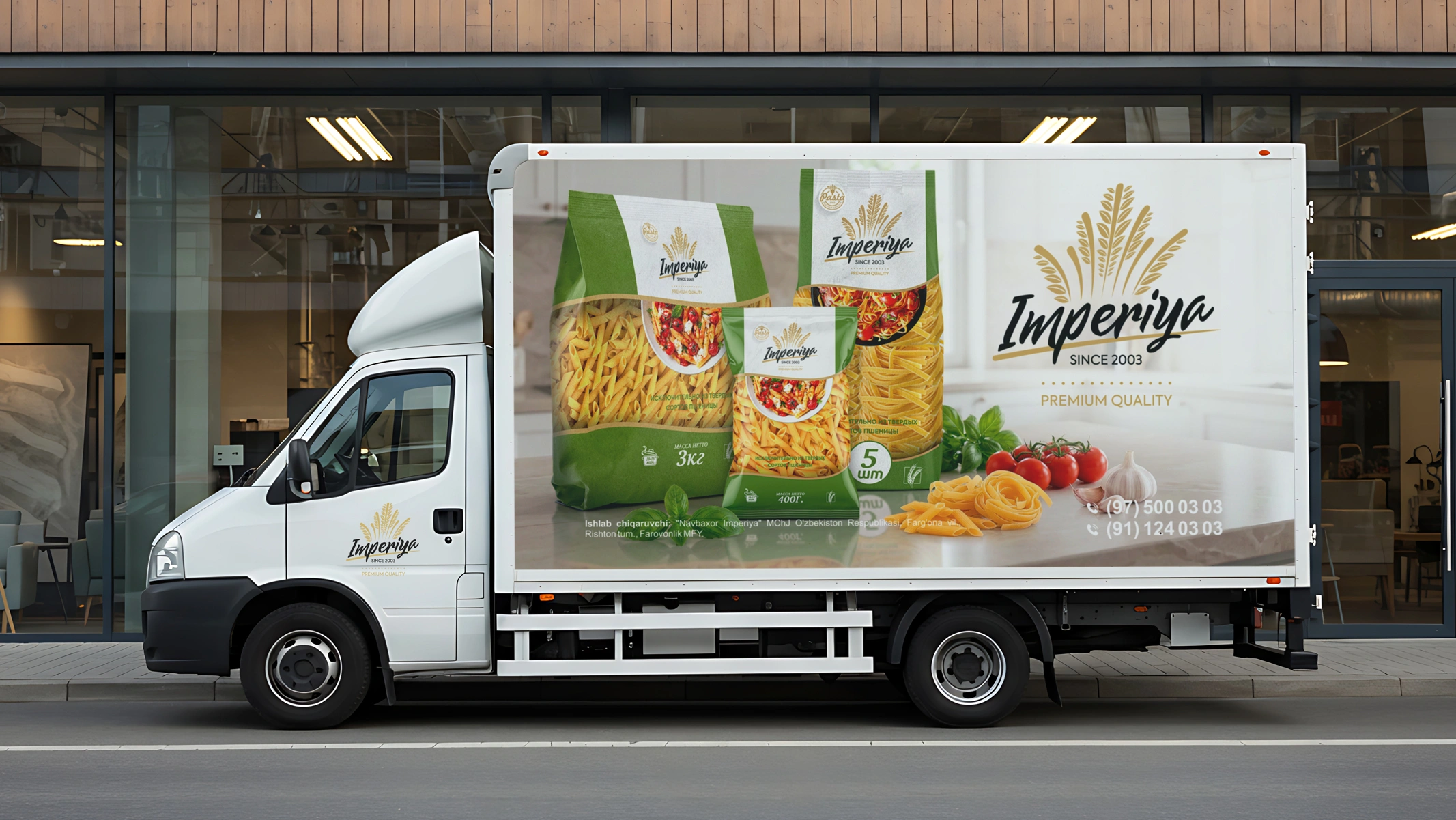
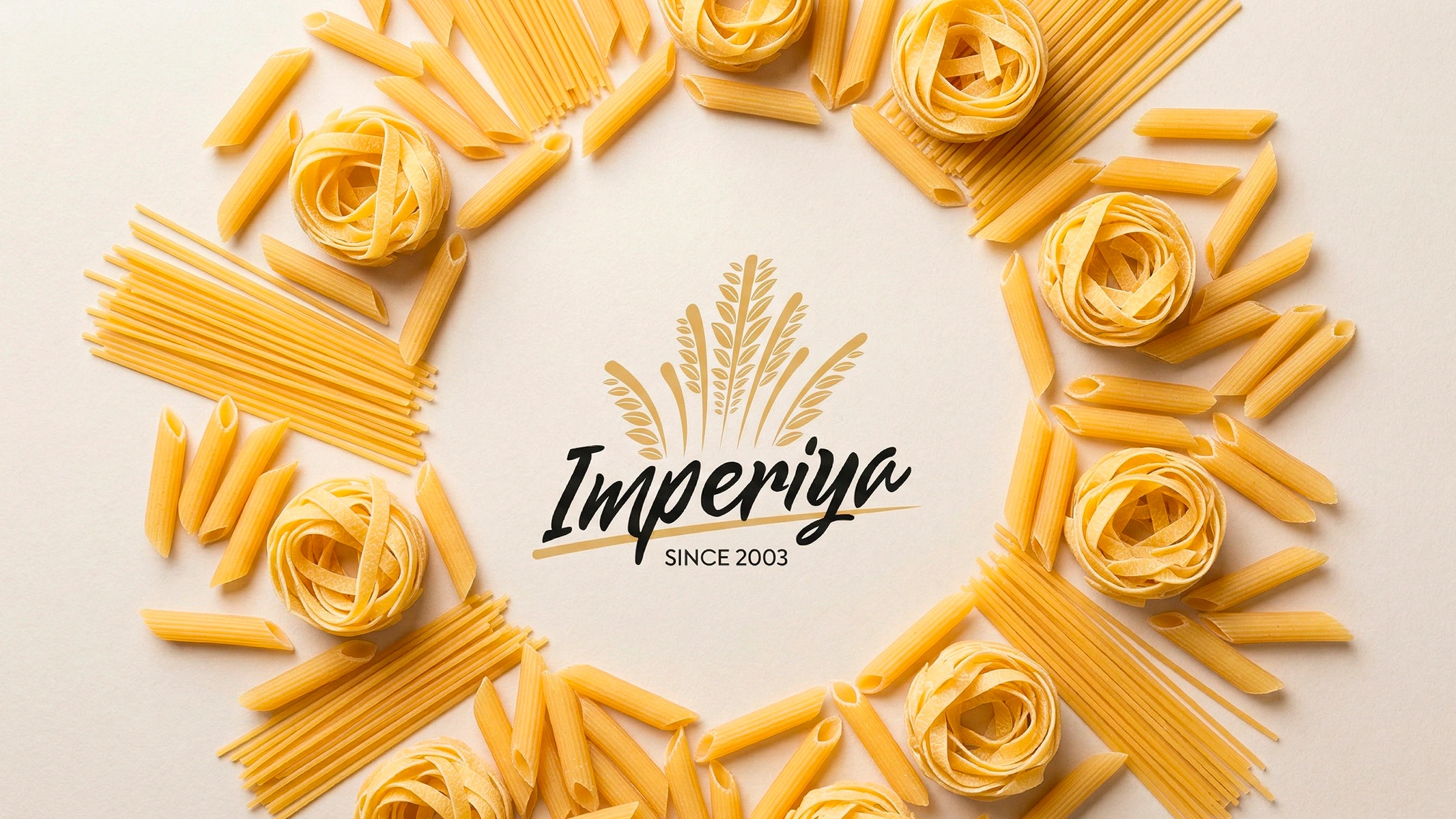
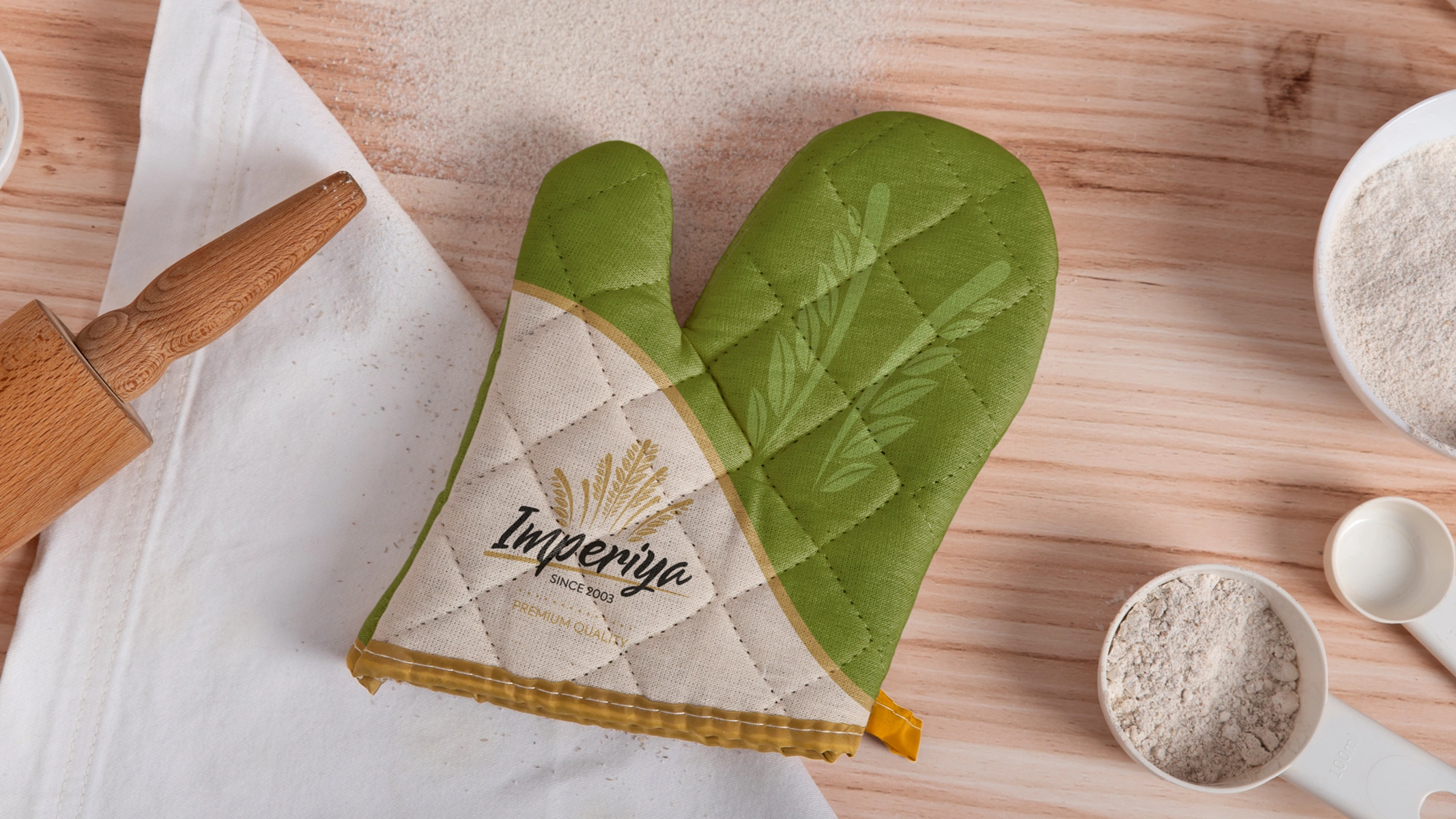
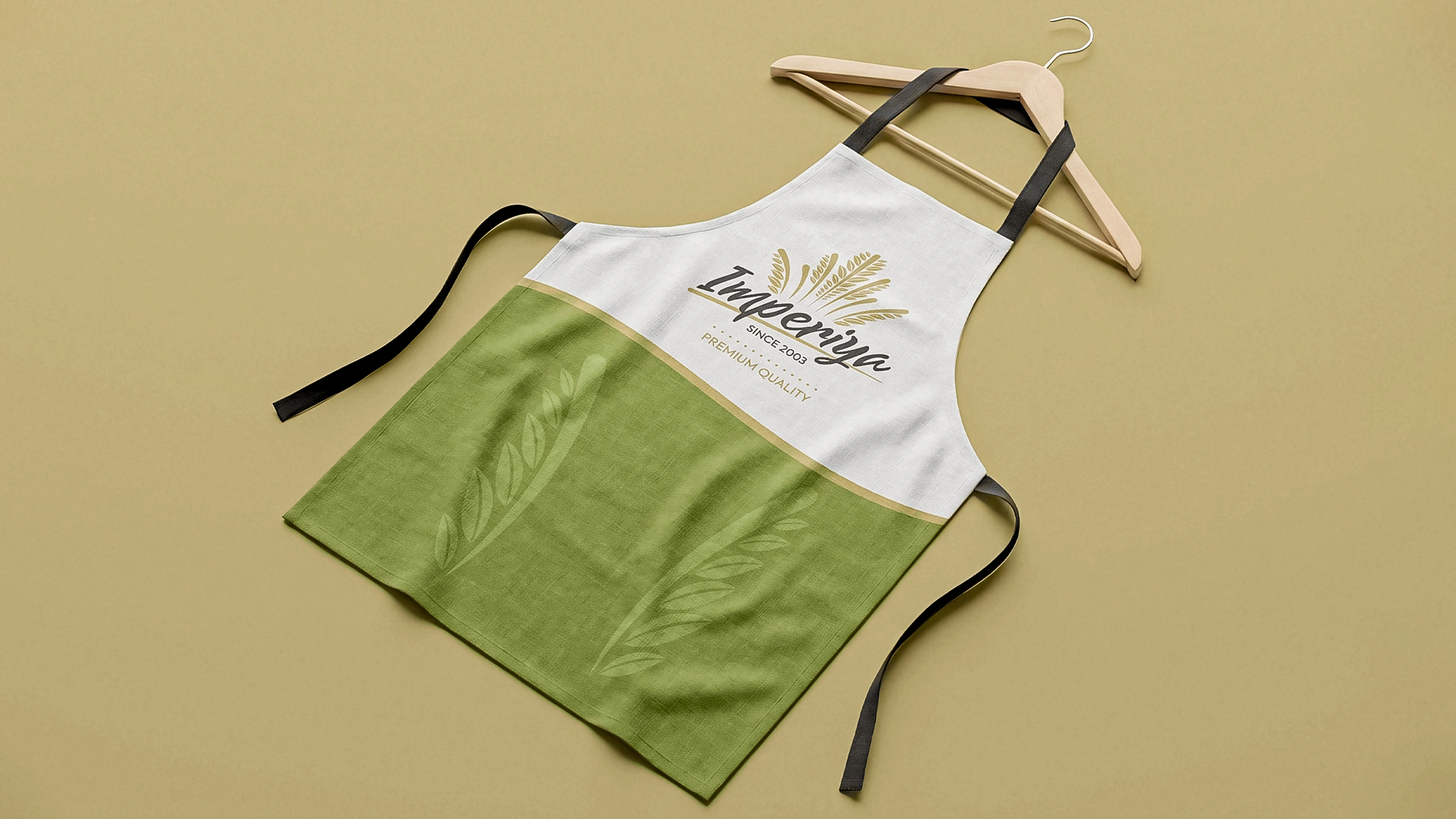
- Logo and Identity. The brand name is "Imperia." To express this grandeur in a visual language, a logo in the form of a "crown" consisting of wheat ears was created. This element clearly indicates both that the product is made from natural wheat and its premium level.
- Transparency and "Food zone". The bottom of the packaging was left completely transparent. This allowed the buyer to clearly see the product and evaluate it. An image of an appetizing pasta dish was placed in the center of the packaging.
- Unified stylistics. For the entire line, a combination of dark green and white colors symbolizing naturalness and quality was chosen, forming a unified visual system.
Result
As a result, a reliable and attractive brand has appeared on the shelf that lives up to its proud name, yet hides nothing from the consumer. Open transparency and correct visual hierarchy had a positive impact on the product's demand.
As Wally Olins noted: "The foundation of a brand is truth and trust."
Through the transparency of the packaging, we conveyed this idea and built strong trust in the brand.