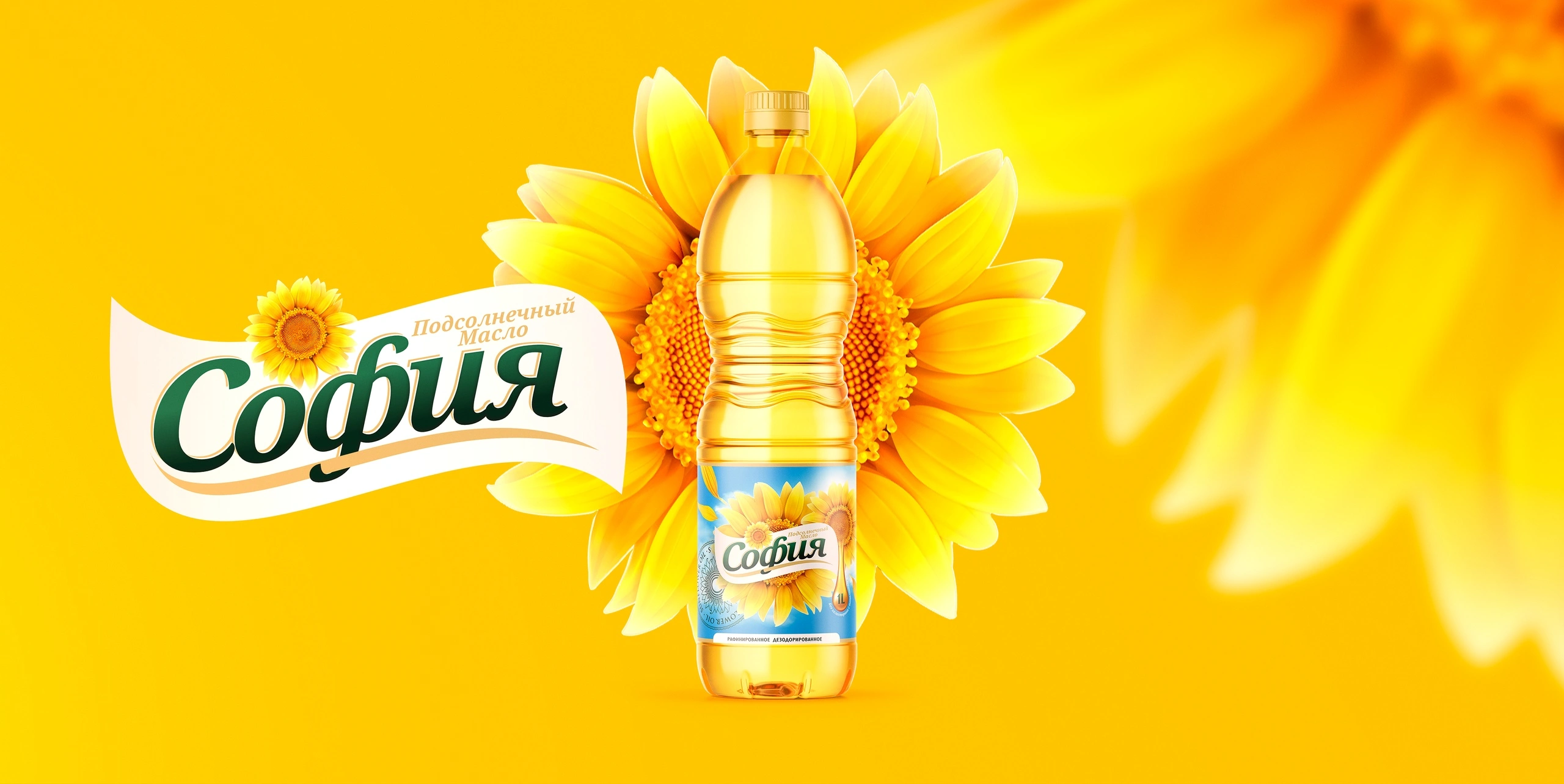
Sofia — logo, label and promotional materials for sunflower oil
Sunflower oil is one of the most competitive products on the shelf. People buy it every week and decide in a second: their hand reaches for the bottle that looks familiar and feels trustworthy. Sofia needed to become that bottle.
1. The task
Design a logo, a label for a PET bottle and promotional materials that work together on the shelf, in advertising and at tastings.
2. The solution
Our key insight: sunflower oil already has the perfect symbol, the sunflower itself. There was no need to invent a new image; the job was to make this one Sofia's own.
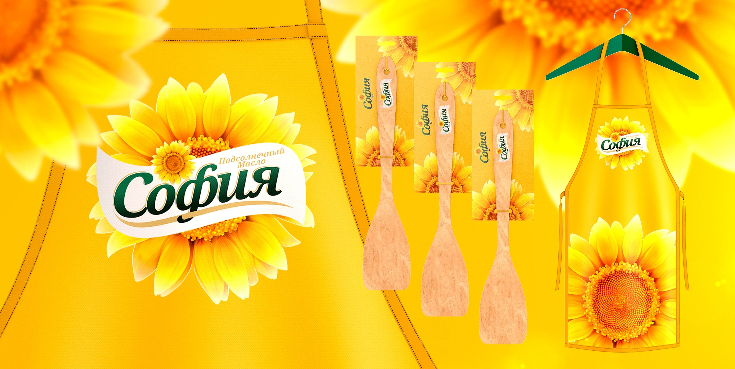
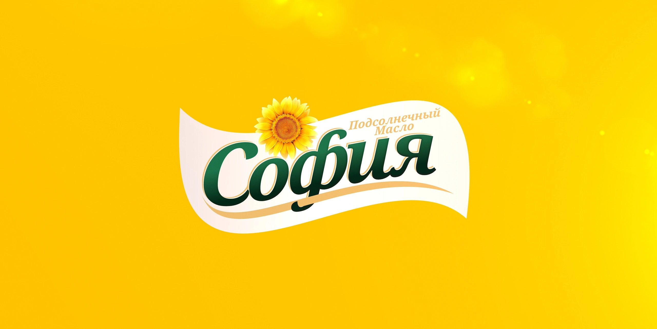
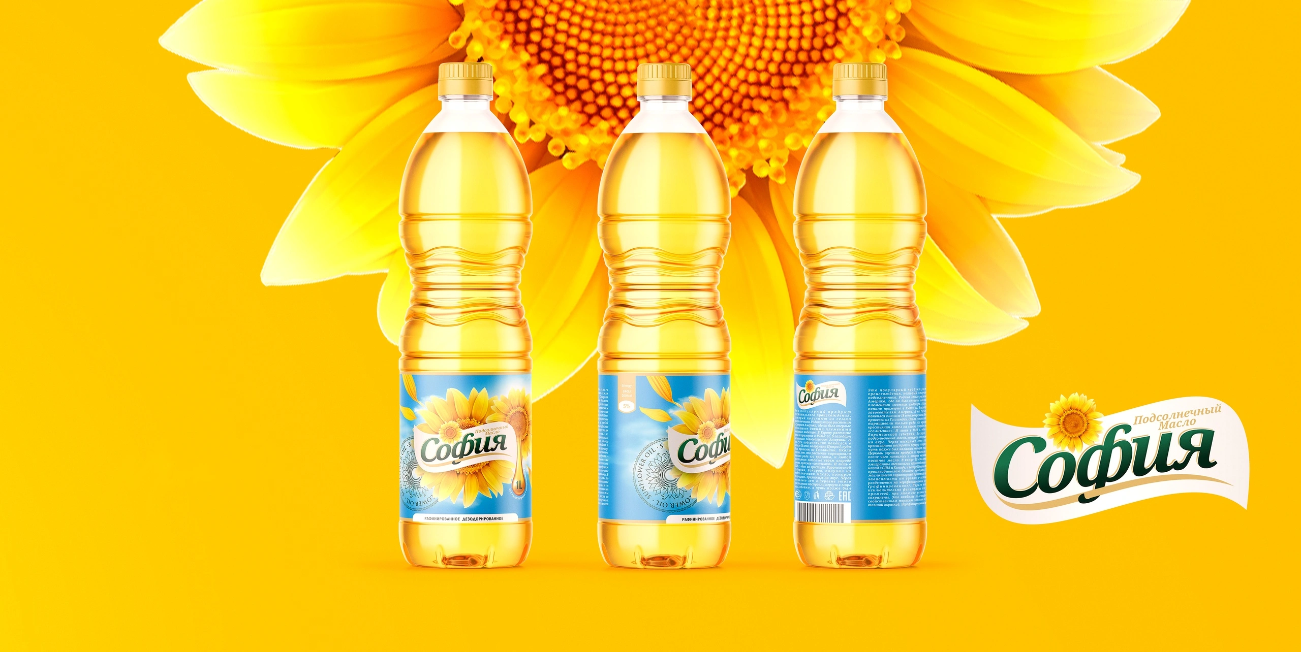
- The logo is a green hand-lettered “София” on a white wavy ribbon with a living sunflower above it. The name sounds warm and homely, and the lettering supports that feeling.
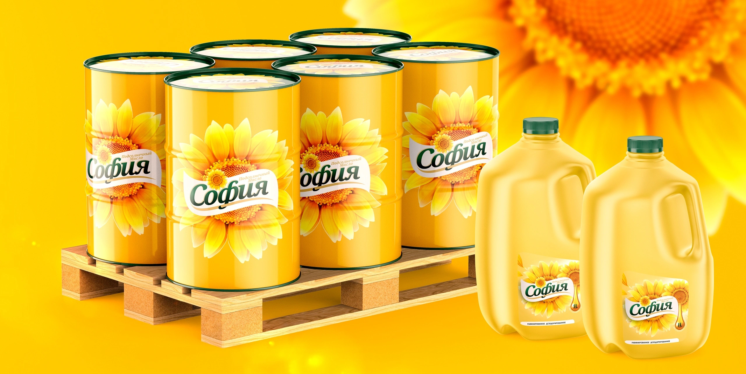
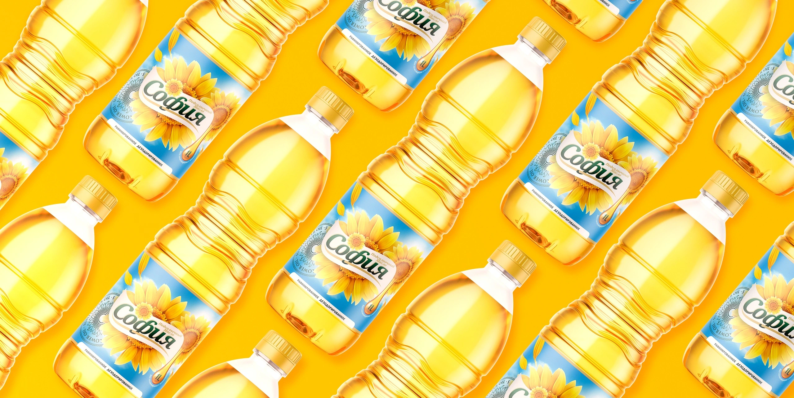
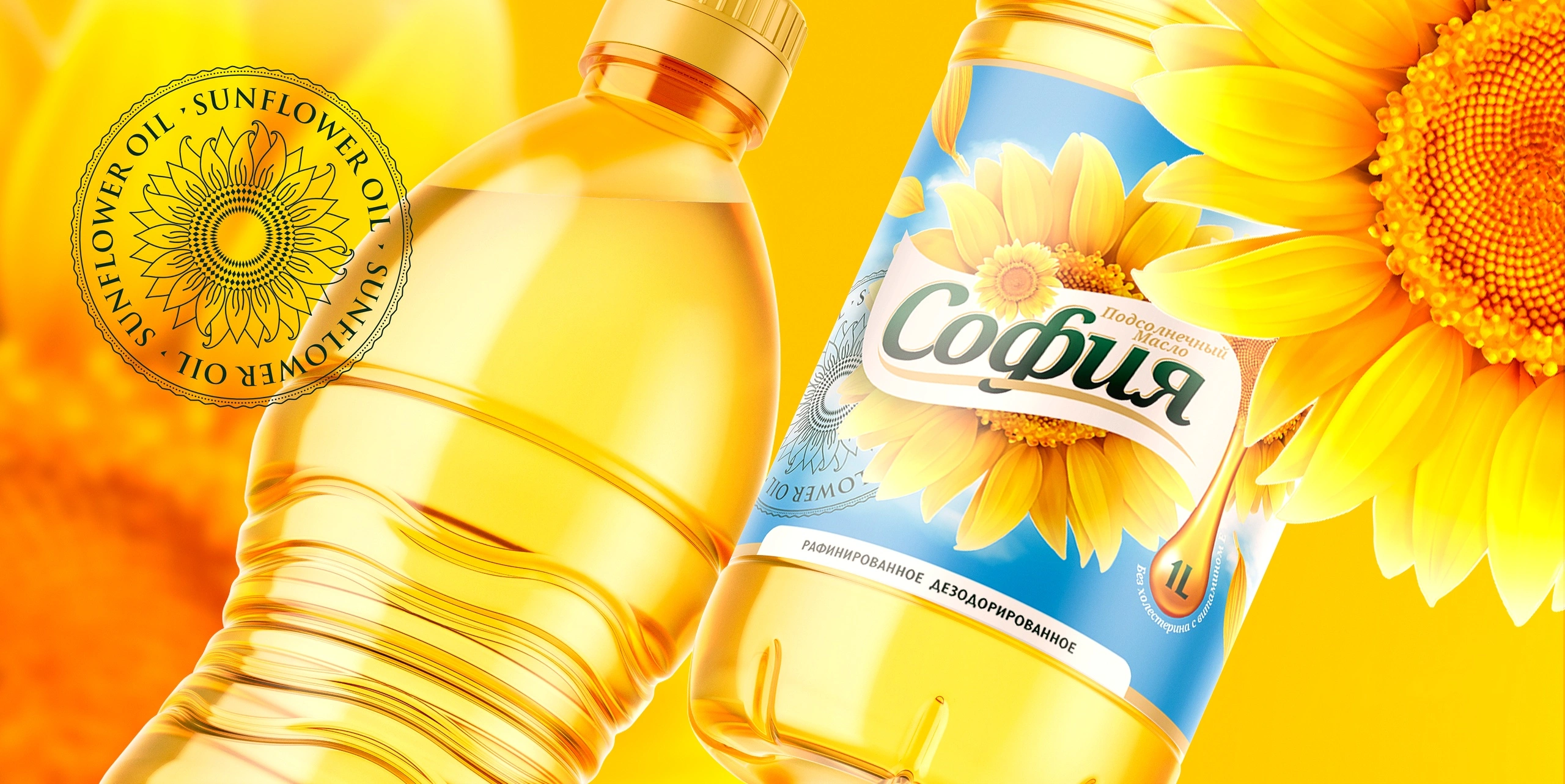
- A sky-blue label with a sunflower contrasts with the golden oil in the bottle. The colour of the oil remains the main proof of quality.
- Sunny yellow backgrounds and large sunflowers carry the advertising visuals.
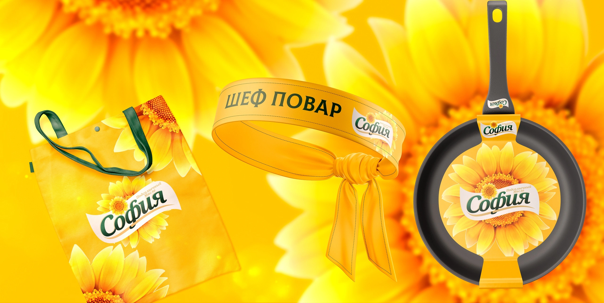
- Promotional items, aprons and wooden spatulas with the logo, make the brand part of the shopper's kitchen.
The result
Sofia got a recognisable system: a logo, label and promotional materials that all speak the same sunny language.
Sofia: a little sunshine in your kitchen.
If your product needs to feel like a household name, get in touch with Minim.