Natte — naming, logo and label design for natural juices
A good name sets the course. And this juice has a long way to go: from Uzbekistan to Kazakhstan and on to export markets. Euro Food Trade, together with its partner Modesto, a juice concentrate supplier, was preparing to launch a line of natural juices in 8 flavours. They came to us with one request: “We need a name people will repeat.”
1. Problem and Task
The client's brief was clear. The name had to be:
- short, 4–5 letters, “like Tesla or Apple”;
- equally easy to understand in Uzbekistan, Kazakhstan and abroad;
- a signal of natural origin and high quality;
- nothing like the main competitors, Iran's Ararat and Turkey's Vostochniy Sok.
The logo had to be typographic, and the cap had to be black. Once the name was approved, we would design labels for the whole line.
2. Research
At the kick-off meeting, the client told a story that unlocked the whole project. A mother asks her child to pick up a small juice at the shop, and the child asks back: “Rich?” Our key insight: in this category, the winner isn't the juice but the name that replaces the word “juice”. So the name had to be resonant, memorable at first hearing, and sound premium.
We analysed more than 30 juice packs from Uzbekistan, Europe and the US: Rich, Zuegg, Biotta, Bolthouse Farms, Naked, Ararat and others. Premium brands shared four codes:
- a typographic logo with no extra graphics;
- a black cap as a marker of value;
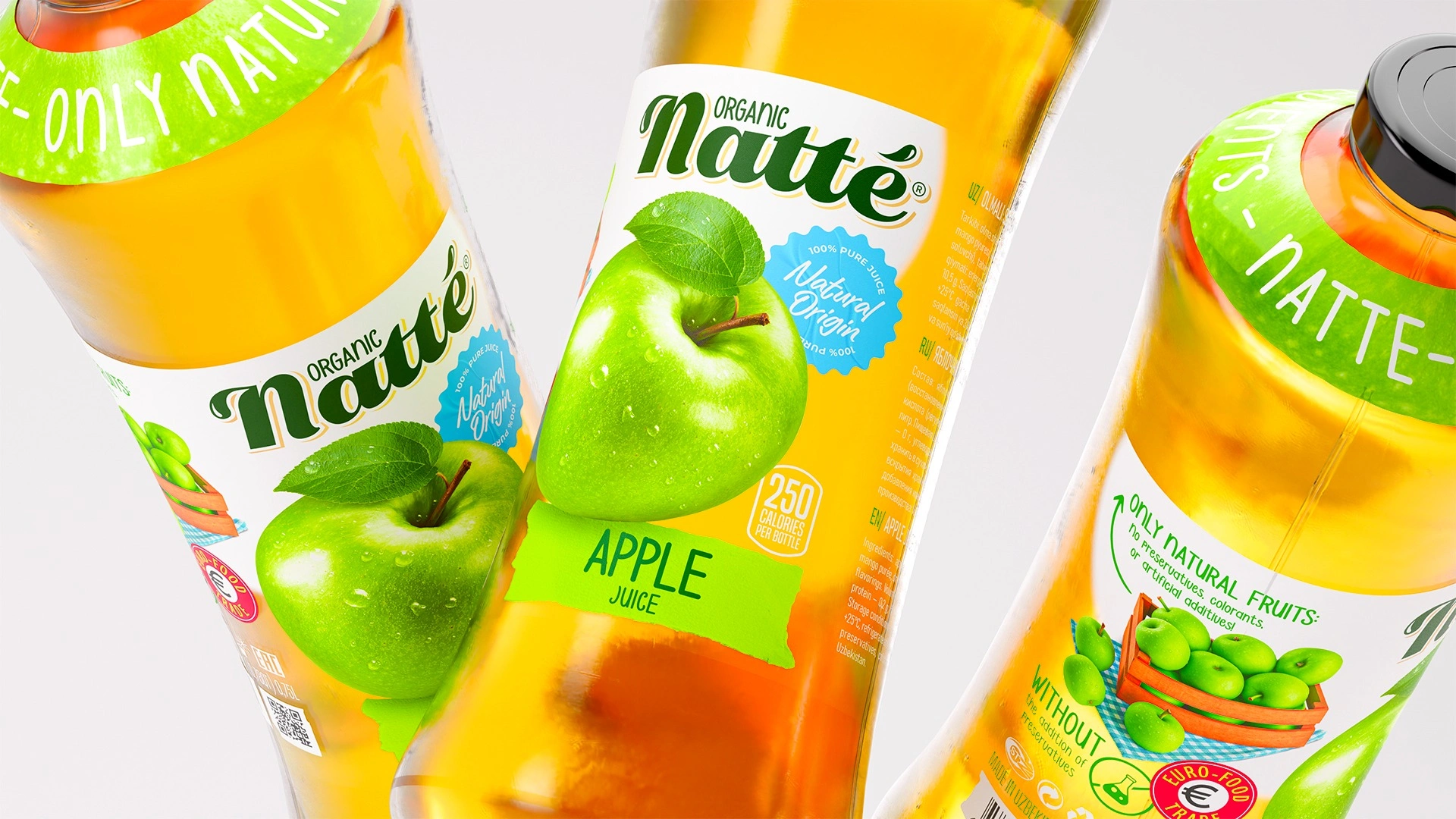
- a clear bottle, so the colour of the juice proves it is natural;
- minimal copy: just the flavour and “100% natural”.
3. Solution
Naming. We tested every name option against six criteria: originality, simplicity, no negative meaning in other languages, fit with the brand's values, registrability, and room for future products. The winner was Natte, a phonetic twist on the English word “natural”. Five letters, easy to say in any language, and the natte.uz domain was available. Before final approval, the name went through a trademark check.
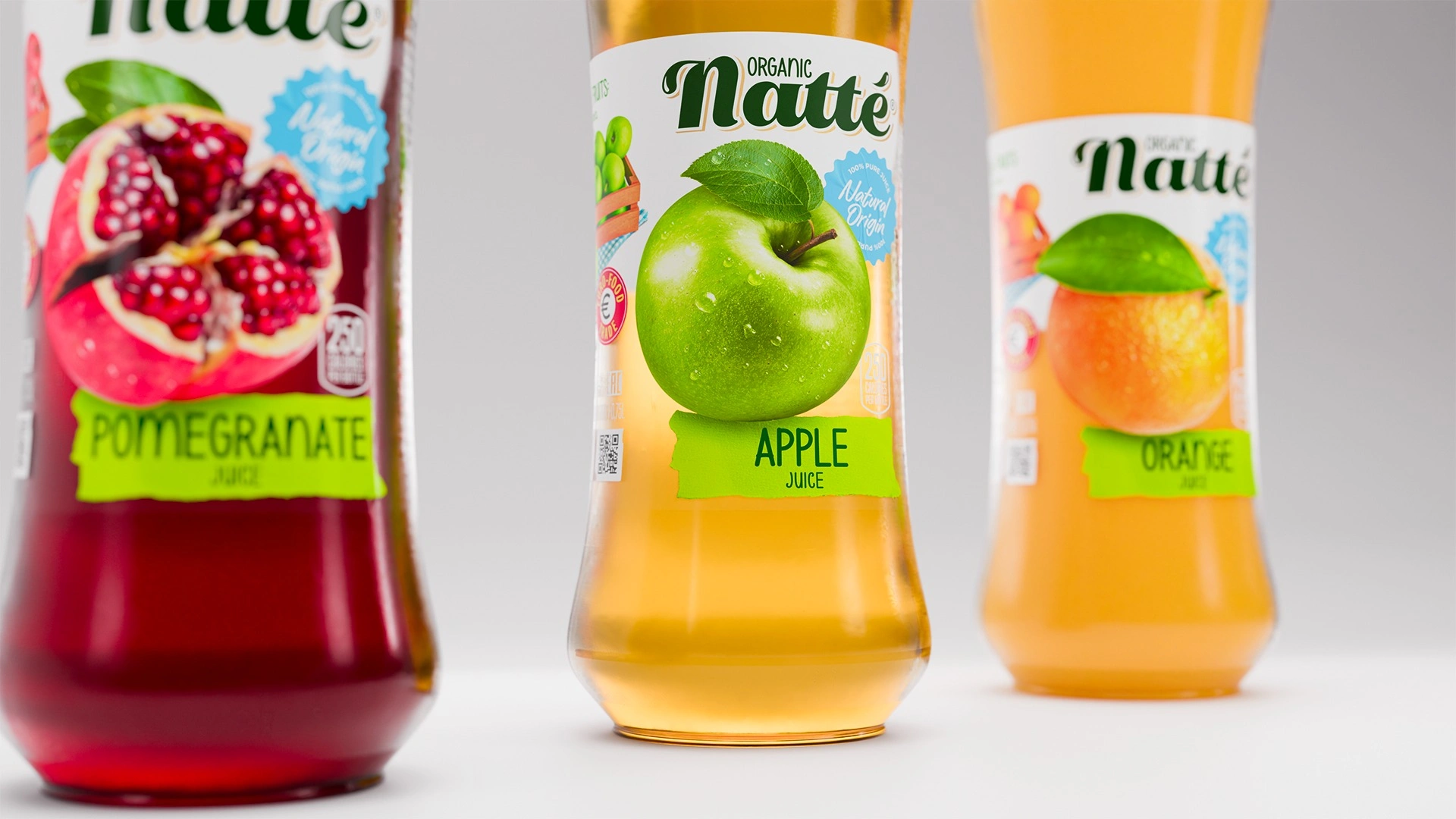
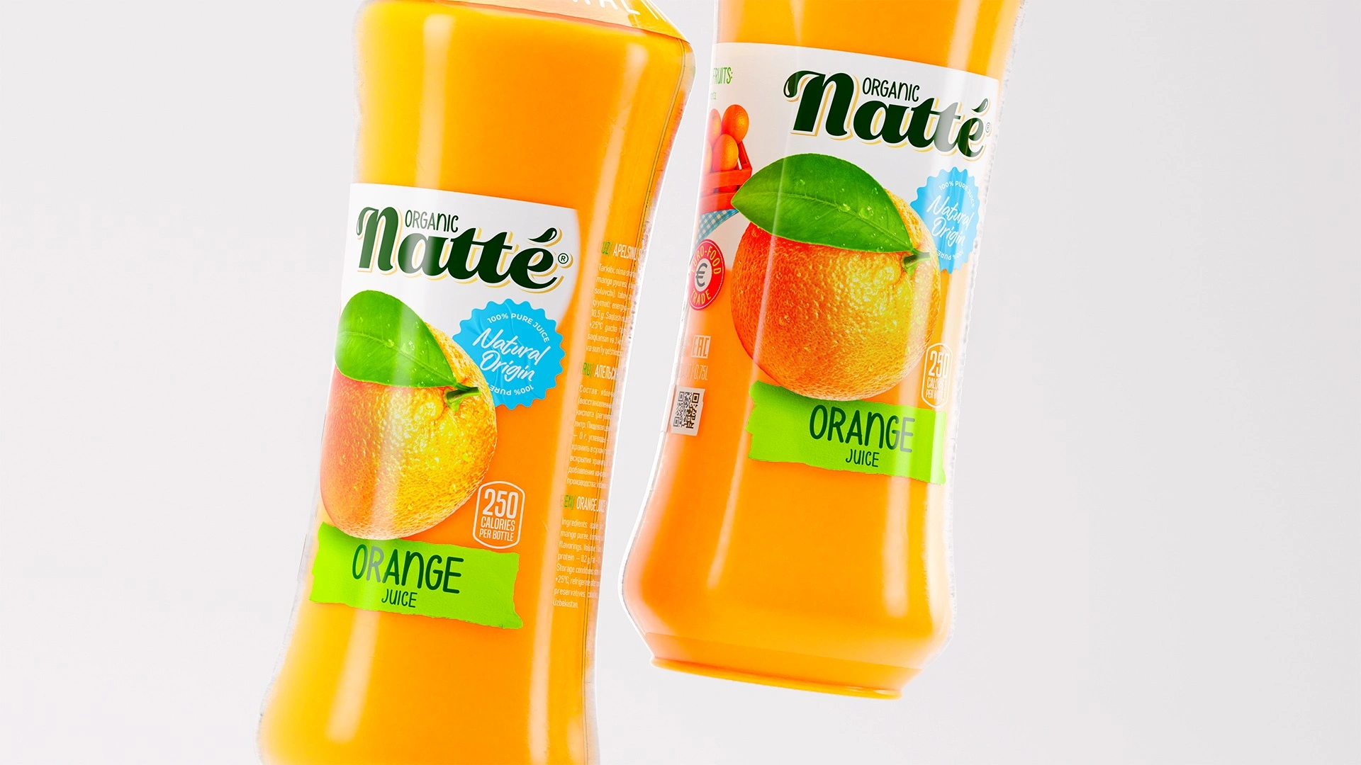
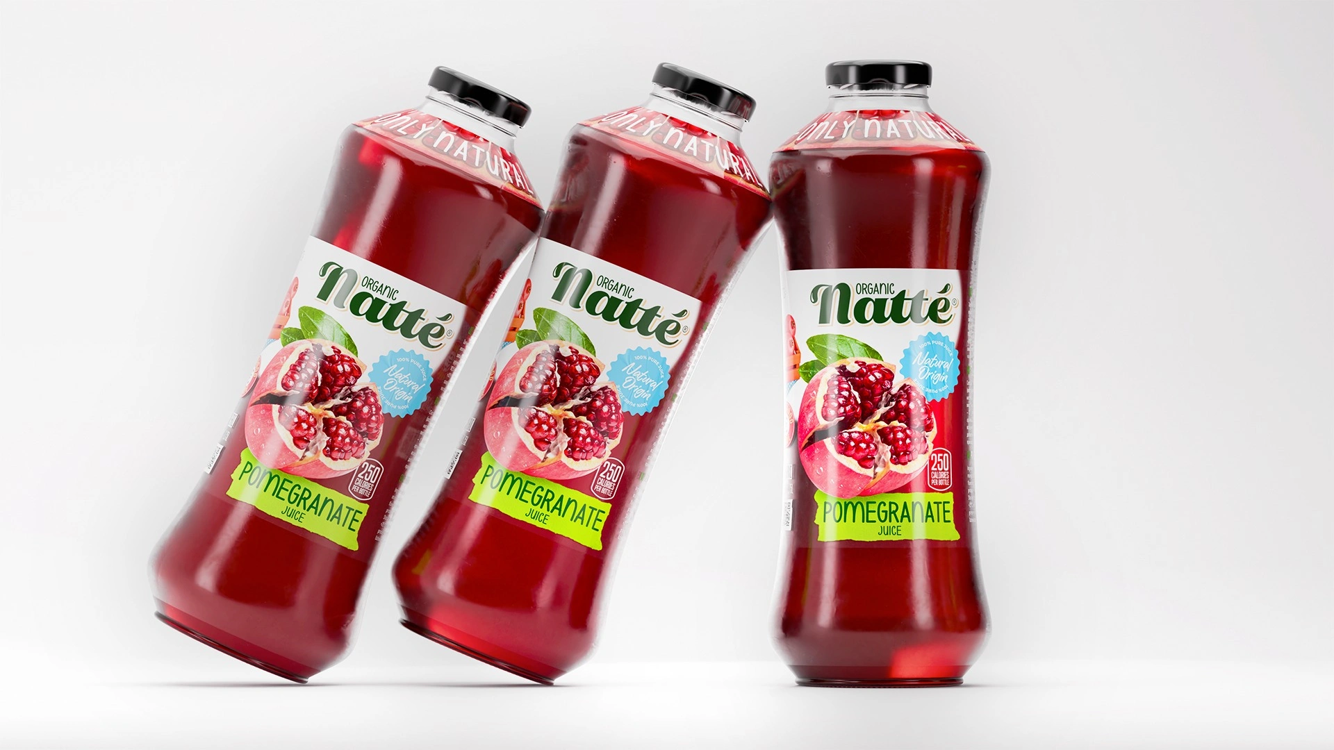
Logo. Typographic, in deep green, with an accent over the “é”. This light European touch sets Natté apart from its “eastern” competitors.
Label. We deliberately kept the category code of a clear bottle and a black cap, like premium brands do. We stood out through flavour instead:
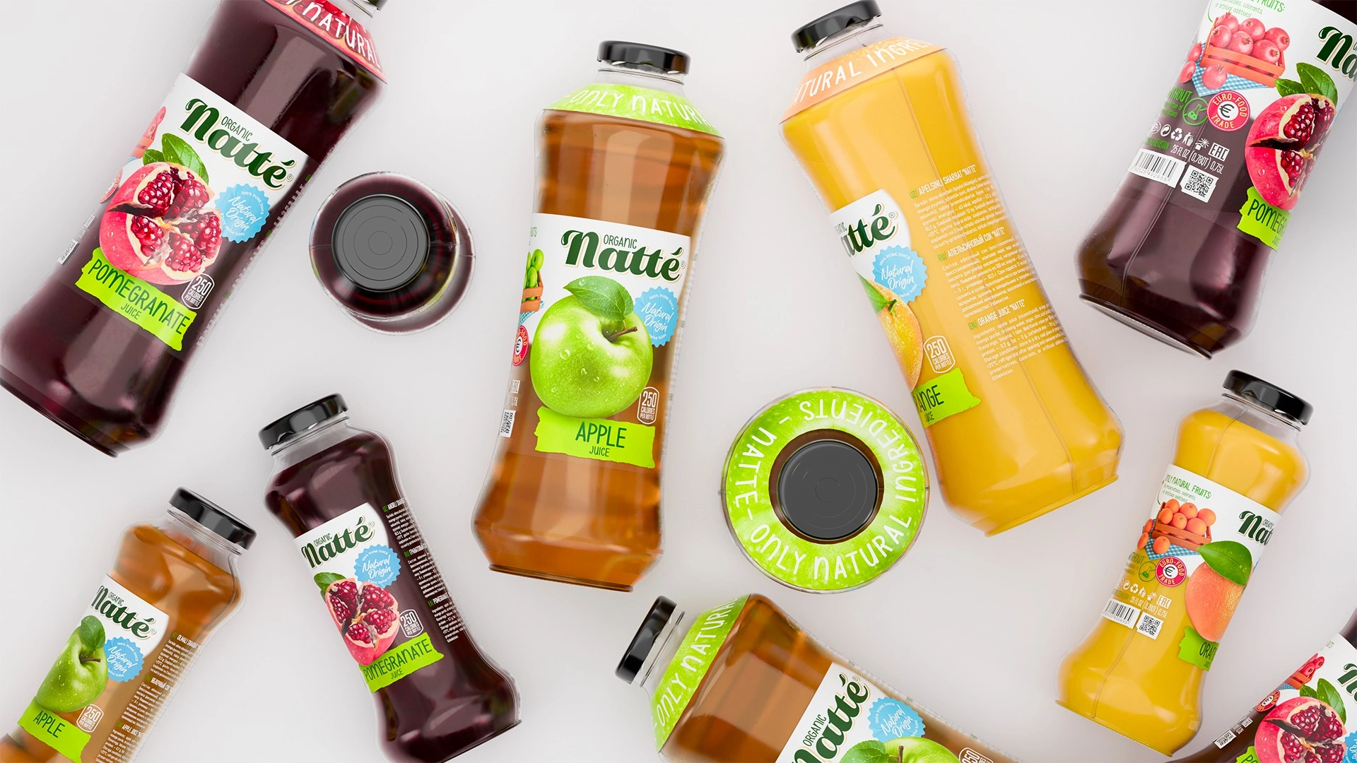
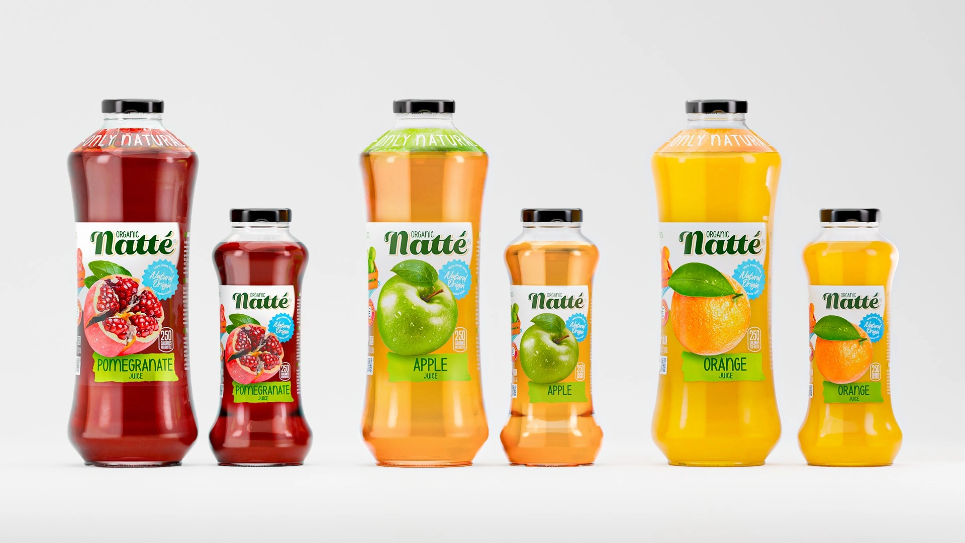
- An appetising food zone: hyper-real fruit on a white field (pomegranate, apple, orange). Shoppers recognise the flavour in a second, before they even read the name.
- A “hand-drawn” lime-green ribbon carries the flavour name. It ties the line together and brings life to the clean logo.
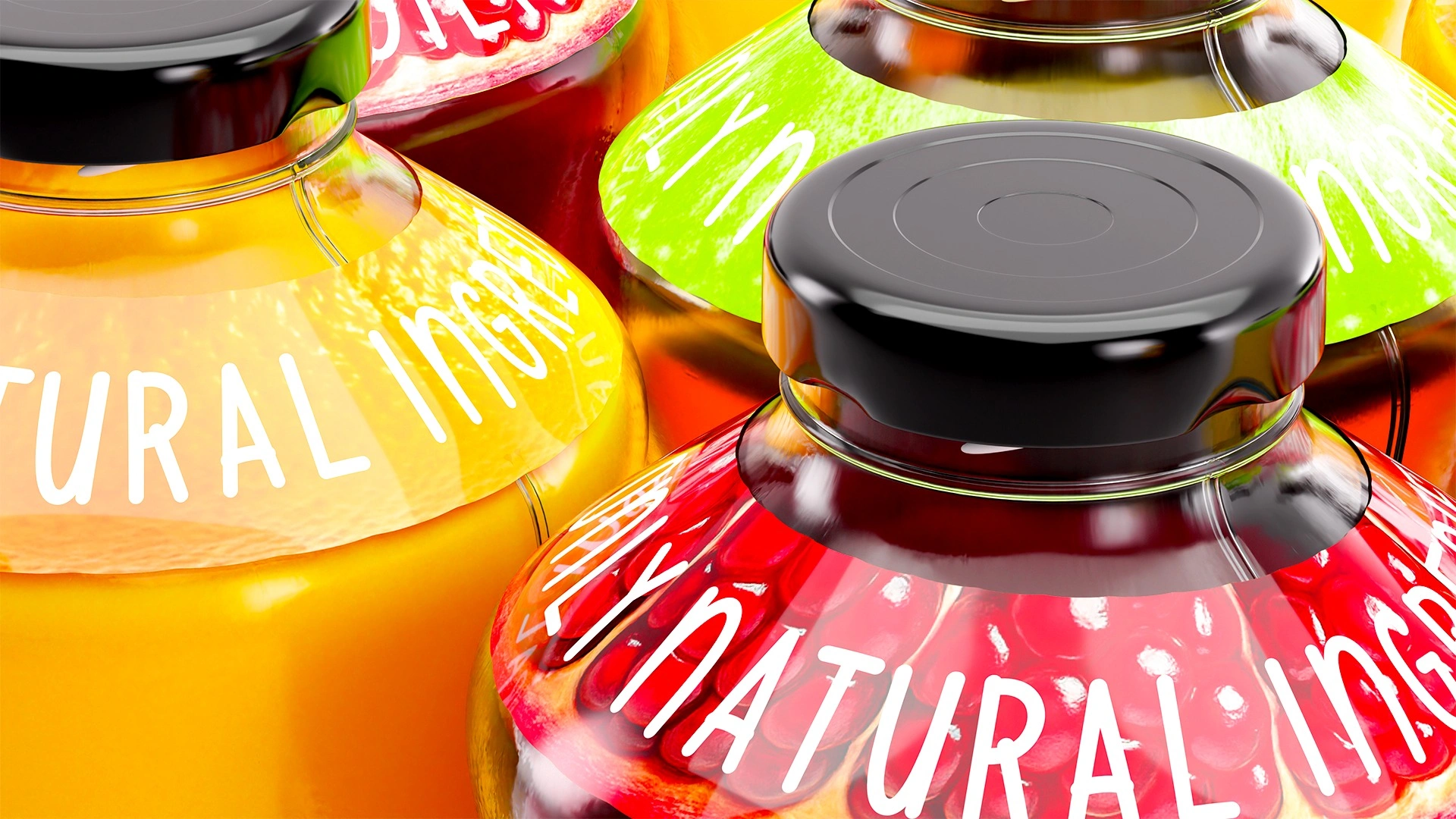
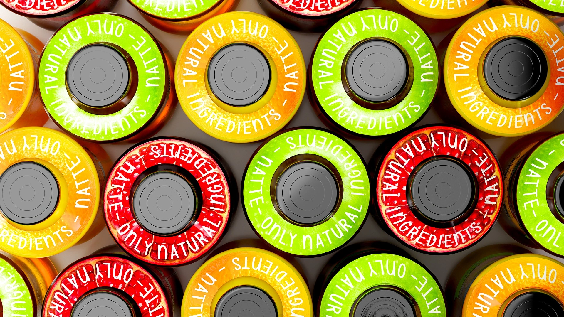
- A shoulder ring reads “Only natural ingredients — Natte”. It is visible even from above, when the bottles stand in rows in a fridge.
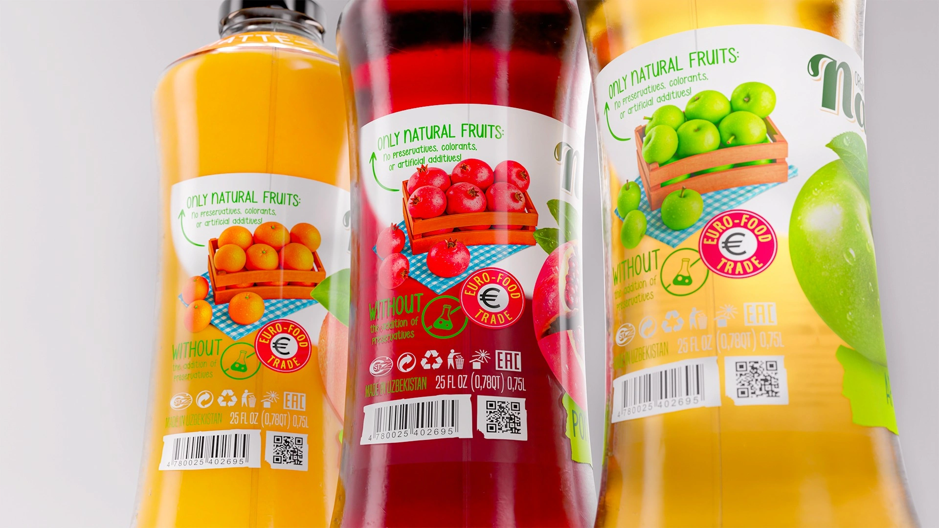
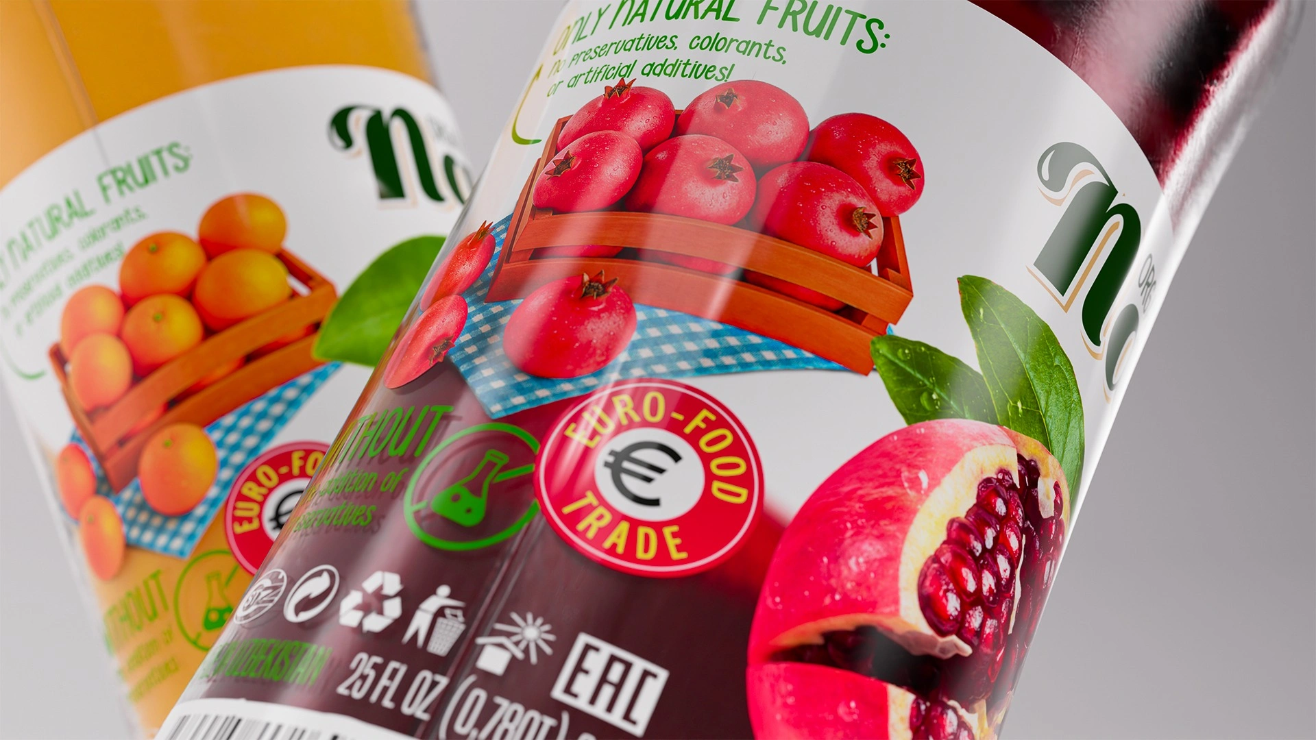
- An honest back label shows a wooden crate of fruit on a blue gingham tablecloth, with the promise “no preservatives, colourants or artificial additives”. Next to it sit the Euro-Food Trade seal and “Made in Uzbekistan”.
The system works across two formats: a large 0.75 L bottle and a small single-serve bottle.
Result
About 7 weeks passed from the first brief to the label presentation. Around three of them went into naming, and the name was approved at the first presentation. Euro Food Trade got more than a beautiful label: a ready-made brand with an export-ready name that can grow across all 8 flavours and the concentrates. The production process is now being fine-tuned and the equipment commissioned. As soon as Natte reaches the shelves, we'll share the news.
Natte: nature you can see through the glass.
If you need a name people remember the first time they hear it, get in touch with Minim.