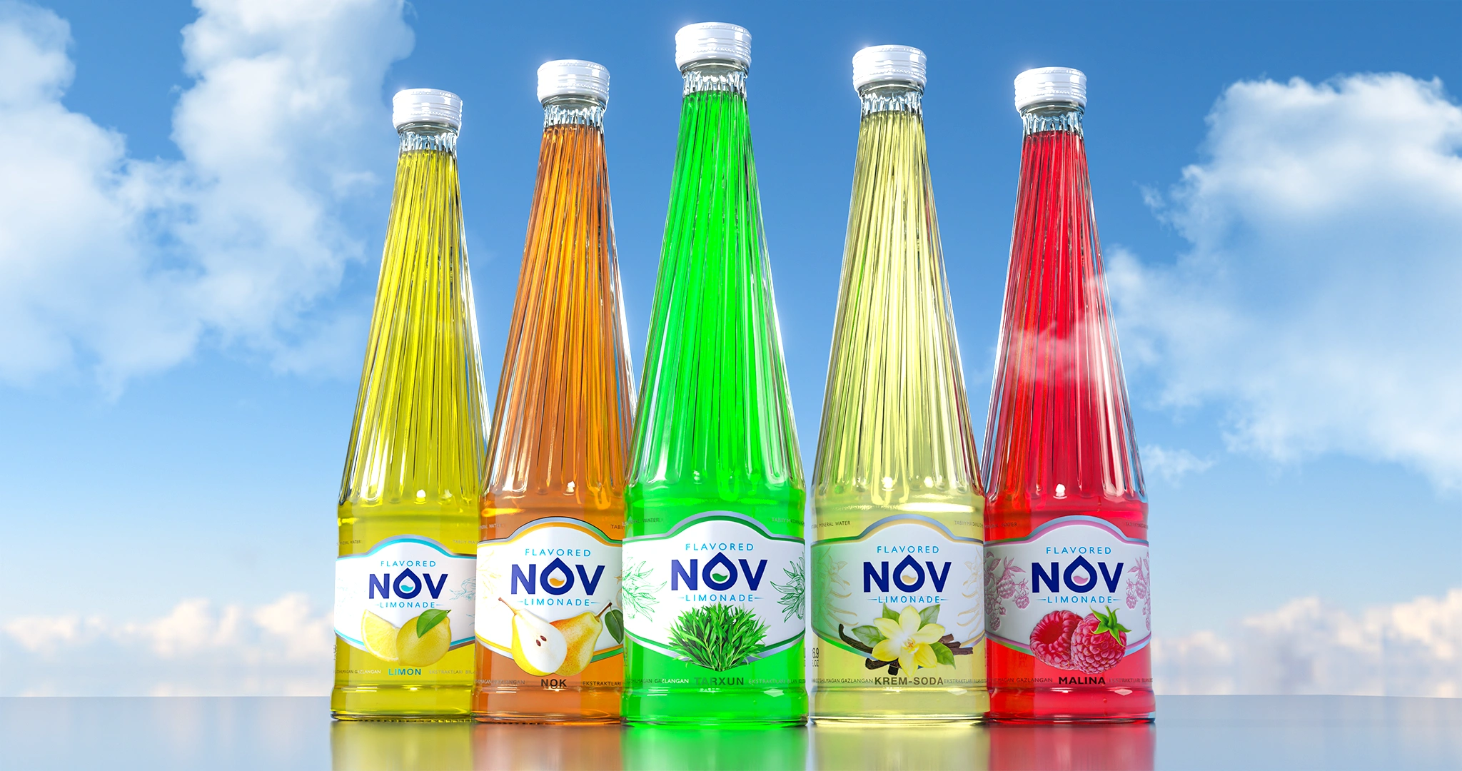
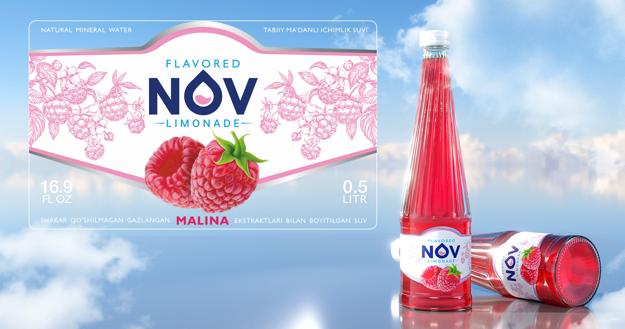
NOV — Label Design for Lemonades
The label design for the NOV lemonade line has been developed. A transparent "window" integrates the beverage's color into the design, a photorealistic fruit ensures instant taste recognition, and botanical graphics impart a premium and juicy appearance.
1. Task
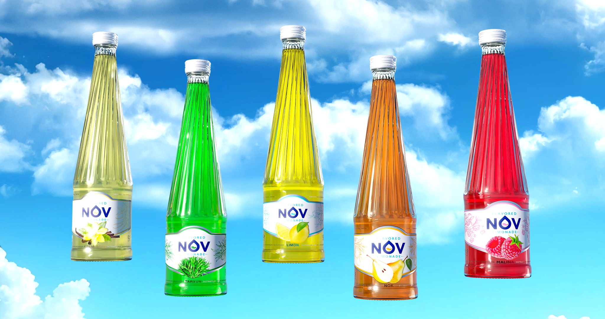
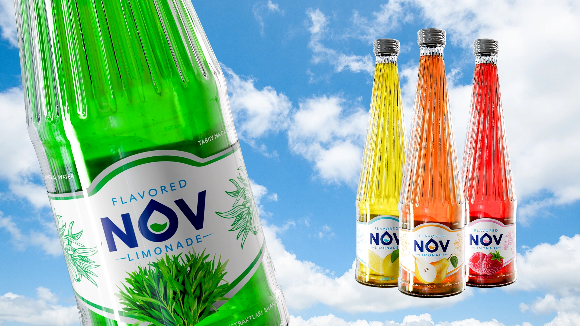
After the successful launch of NOV mineral water, the client approached us with a new challenge: to create a design for a range of fruit carbonated lemonades — lemon, pear, tarragon, cream soda, and raspberry. The key goal was to preserve the brand’s architecture while adding brightness, emotion, and the juiciness consumers expect from the lemonade category.
2. Research
We analyzed the market and identified three key insights:
- Instant decision-making. According to Nielsen, up to 70% of consumers choose lemonade directly at the shelf, relying primarily on visual cues.
- The product as part of the design. The vibrant colors of the beverage and the faceted glass bottle needed to be integrated into the visual concept.
- Transparency as a trend. In the premium segment, it is increasingly common to use transparent “windows” in packaging design to showcase the product and emphasize its quality. In Uzbekistan’s lemonade category, this practice is still rare.
3. Solution
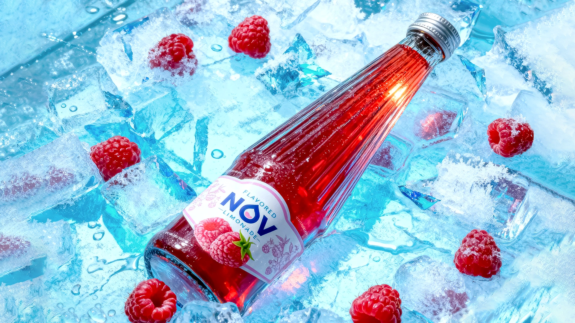
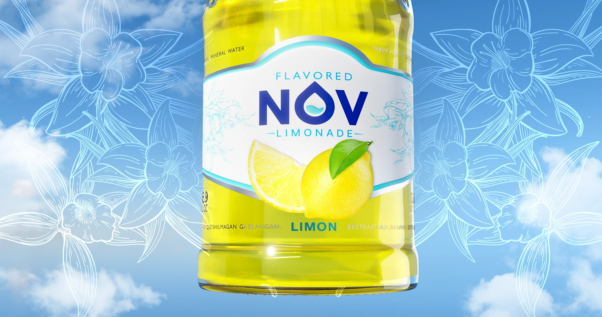
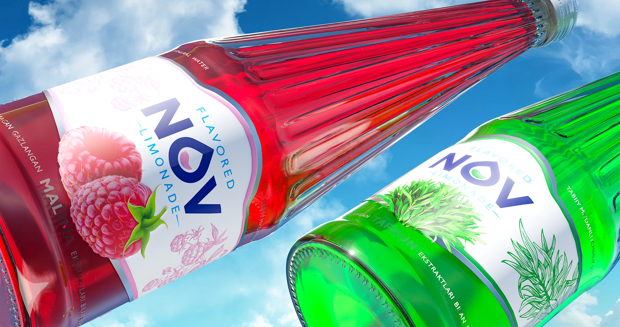
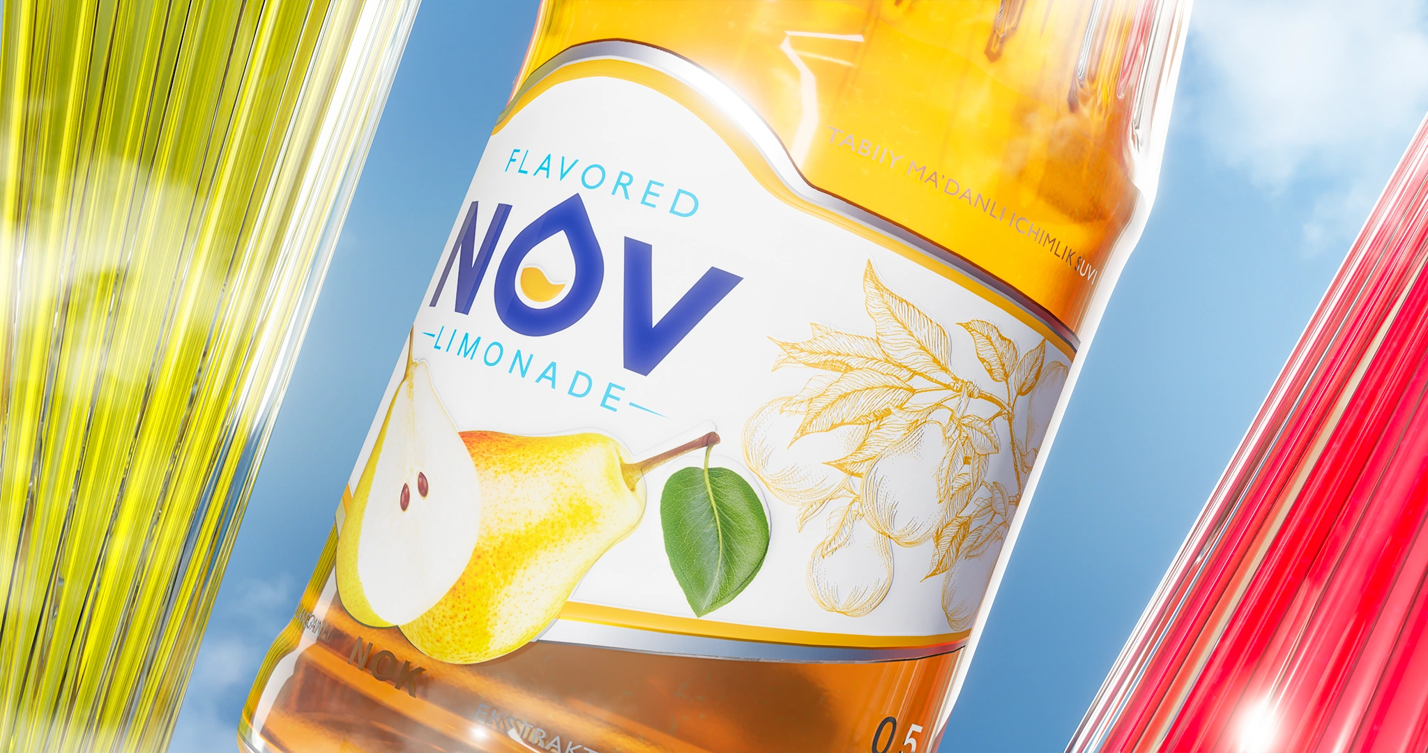
Central fruit
At the heart of each label, we placed a photorealistic fruit (lemon, pear, raspberry, etc.) that clearly communicates the flavor and is instantly recognizable from any angle.
Background illustrations
On the sides, we added delicate botanical graphics in the corresponding flavor palette. This creates a premium feel and adds character without overloading the design.
Transparent window
Part of the label is printed on transparent film, with text and graphic elements applied directly onto the “window,” making the beverage itself part of the design. This solution enhances the premium perception.
Result
The new NOV lemonade line received a fresh and modern design that maintains brand recognition while making the product stand out on the shelf.
The bottle and label now work together as a single system: the drink itself becomes the hero, while the design highlights its flavor and quality.
The concept is easily scalable to new flavors and strengthens the brand’s recognition and consumer trust.