Luna – Chocolate Bar Packaging Design
We developed a bright and dynamic packaging design for Luna (chocolate with peanuts). The concept is inspired by comics: aggressive typography, black background, 3D visualization of the bar, and two contrasting packages for visual dominance on the shelf.
1. Task
The Luna brand approached us with an already chosen name but no visual identity. Our task was to develop packaging for a peanut chocolate bar. The target audience — schoolchildren, teenagers, and young adults. The product needed to grab attention instantly, stimulate appetite, and stand out on crowded shelves among other snacks.
2. Research
The challenge wasn’t simple. First, the name itself didn’t suggest a clear visual direction. Second, teenagers are a tricky audience: they choose with their eyes, love bright visuals, and have little time for close inspection. And of course, competition is fierce — retail shelves are packed with well-designed packaging.
We conducted research to observe how teenagers behave at the shelf — what catches their attention and what they scroll past. We found that emotions and visual drive were decisive. They respond to bright colors, dynamic compositions, and convincing, appetizing product imagery.
3. Solution
We drew inspiration from visual languages familiar to young audiences: gaming, superheroes, comics, YouTube graphics, and action styles. This defined the character of the packaging.
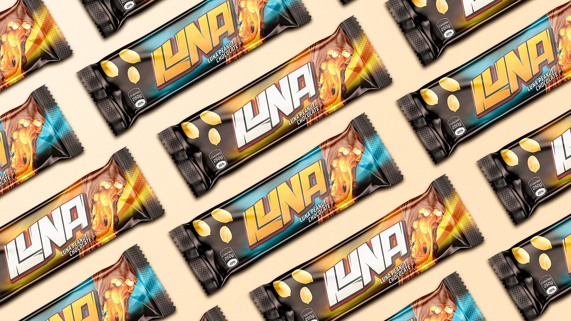
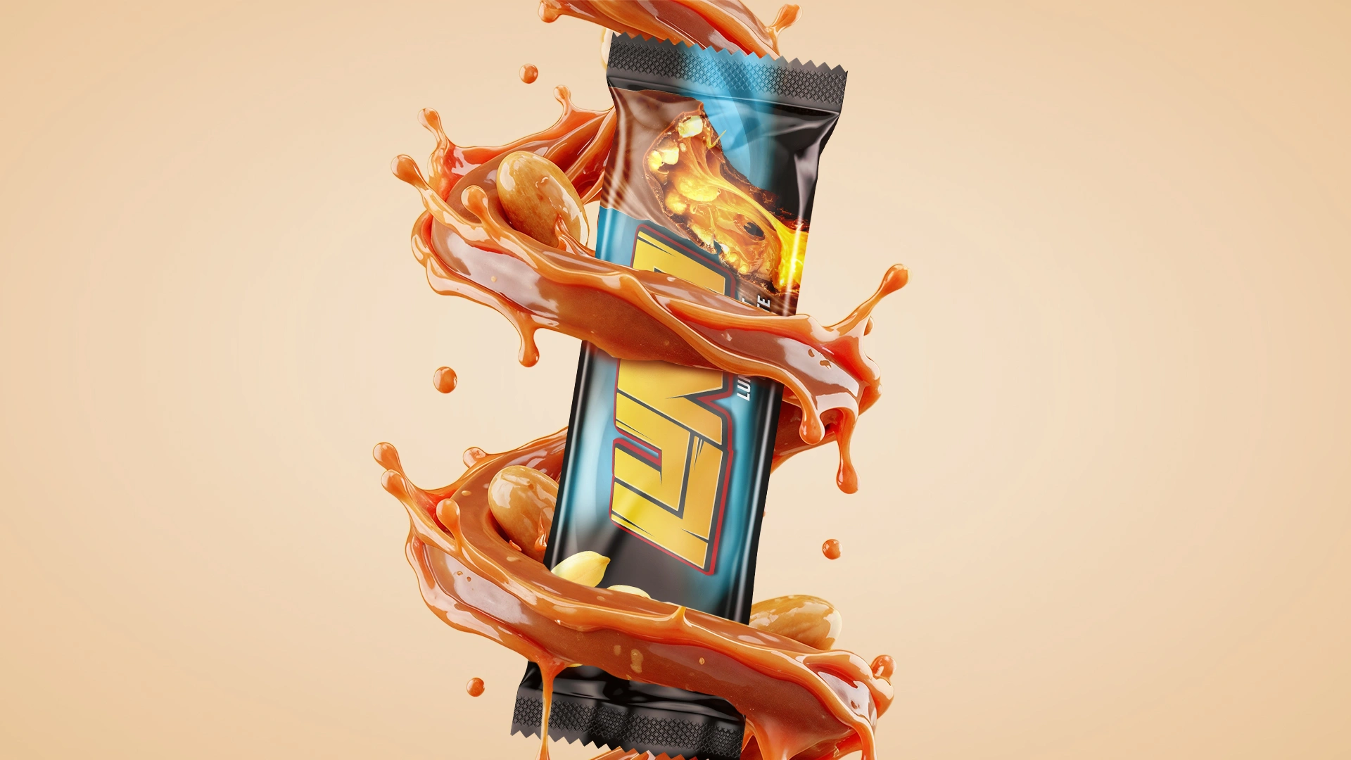
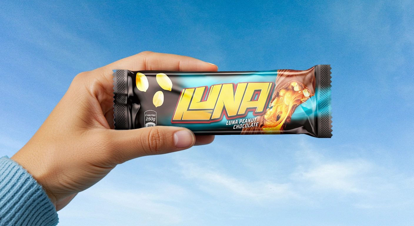
We created a logo with aggressive typography, a slant, and a sense of motion. The letters seem to scratch the background or resemble cracks in wood. The letters L and U are combined into a unique graphic symbol.
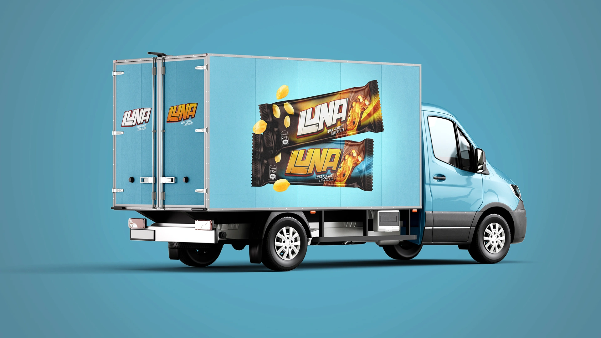
We also designed two contrasting packaging variants that work as a duo:
First — warm, sunny tones.
Second — blue and yellow, cooler and more energetic.
This approach allows the product to take up more visual space on the shelf — a visual domination strategy that is especially relevant in an oversaturated market.
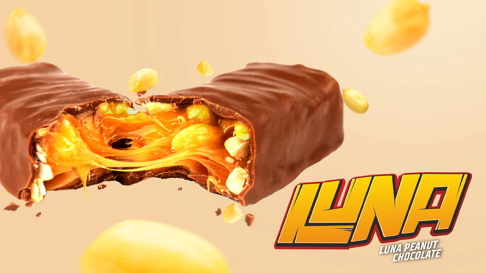
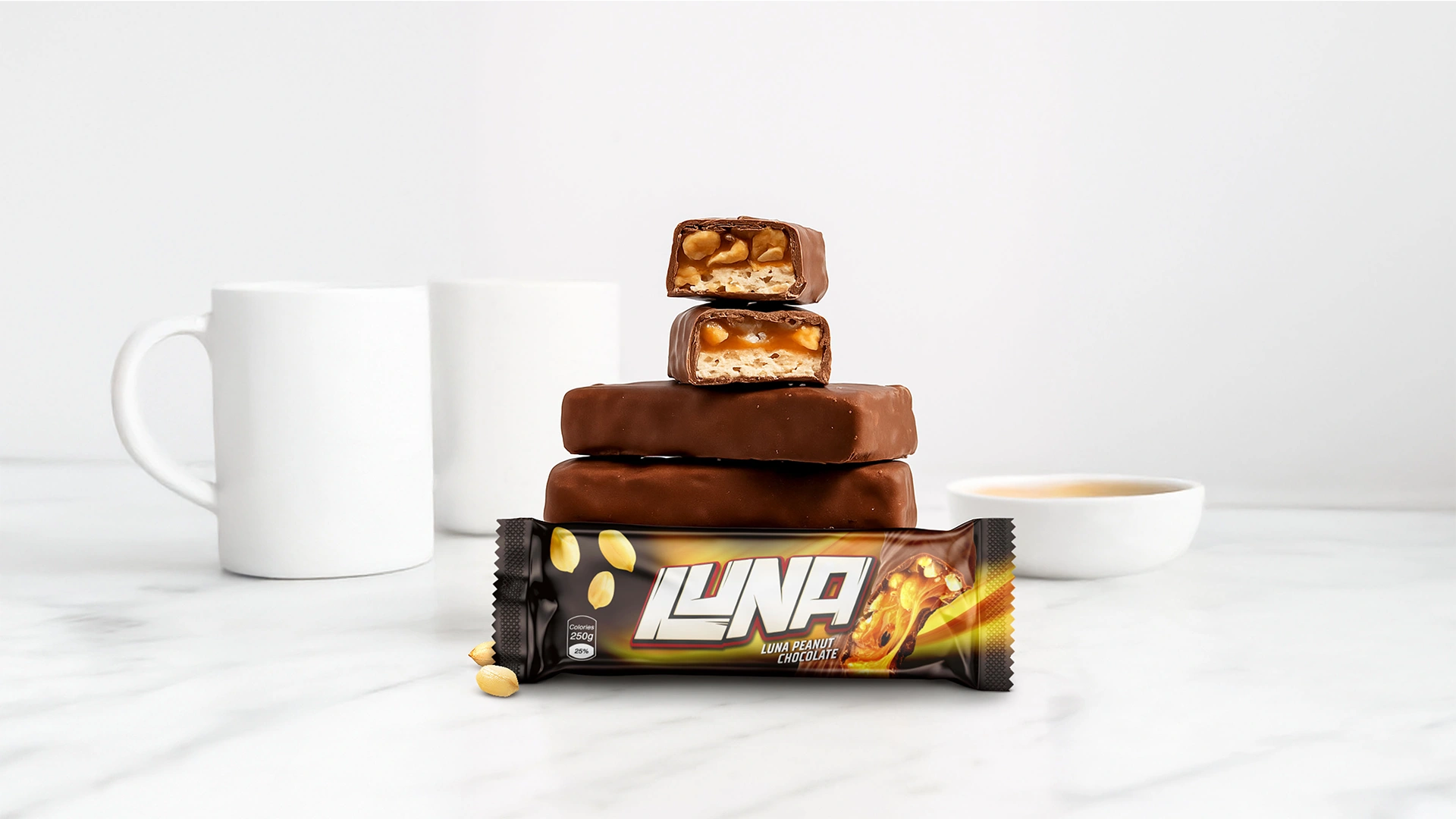
A key element is the 3D visualization of the bar in cross-section — luscious chocolate, gooey caramel, whole peanuts — all rendered to look as realistic and delicious as possible. This is one of the main attention hooks.
The background is black to amplify contrast and push the packaging forward visually.

Result
The result is packaging that instantly grabs attention, speaks to teenagers in their visual language, conveys the product’s taste even before purchase, and positions the brand for easy scaling.
If you also want effective and appealing packaging design for your product, contact Minim.