Rash Milk: Ayran Packaging Design
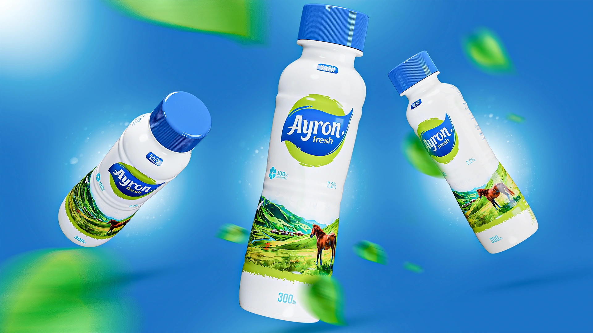
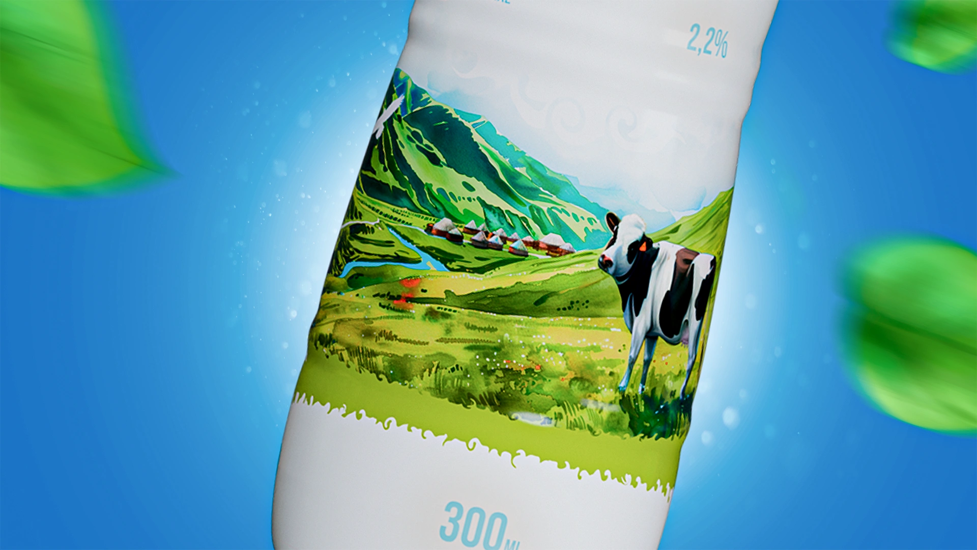
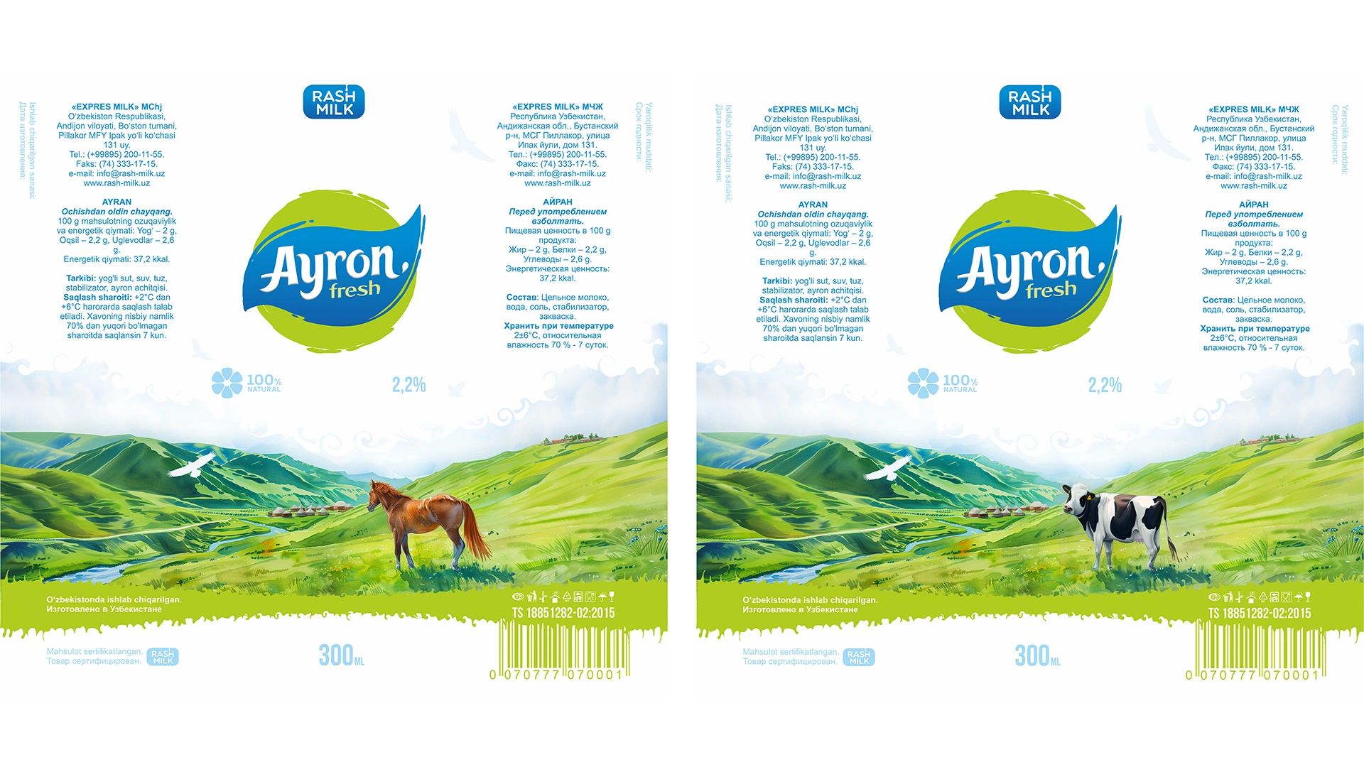
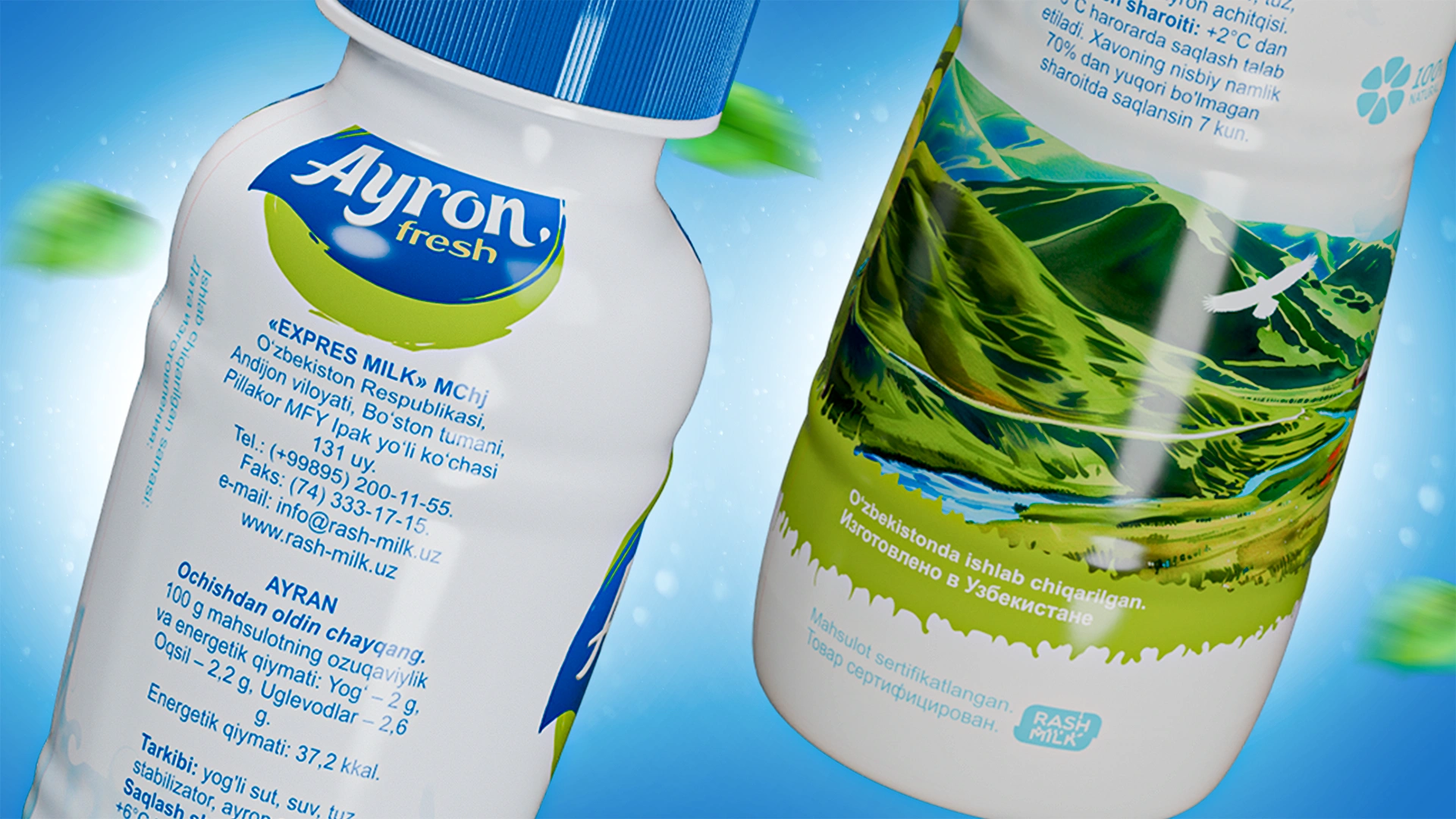
We developed the packaging design for Rash Milk Ayran: a clean, light image with a visual metaphor of a pastoral landscape (hills, yurts). The design stands out on the shelf, conveying freshness, natural purity, and association with summer relaxation.
1. Task
The Rash Milk company approached us with a request to develop packaging for their new product—ayran. The objective was not merely to create an appealing design but to build an image conveying freshness, purity, and natural coolness. Ayran should evoke associations with lightness, summer, and active leisure, both in nature and in the city.
2. Research
We analyzed the market and discovered that most dairy beverage packaging appeared monotonous: cold colors, standard shapes, and visually sterile designs. Given this competitive environment, it was essential to create a vibrant, emotional image that would stand out and immediately evoke a desire to taste the product.
3. Solution
- We emphasized the visual metaphor of a summer pastoral landscape.
- The packaging features green hills, clear skies, yurts, and grazing animals. This imagery creates a sense of freedom, open space, and fresh air.
- The color palette combines white, natural green, and blue shades to emphasize the product's naturalness.
- The logo is a textual element executed in a thematic typeface that draws attention to the product's name.
- The entire composition reinforces the core idea—a natural product ideally suited for hot summer days.
Result
The resulting packaging is clean, fresh, and expressive. It distinctly stands out from competitors, quickly catches attention on shelves, and evokes associations with nature, summer leisure, and freshness.
The design effectively drives sales, as its primary task is to capture consumer attention and clearly communicate the product's value.


