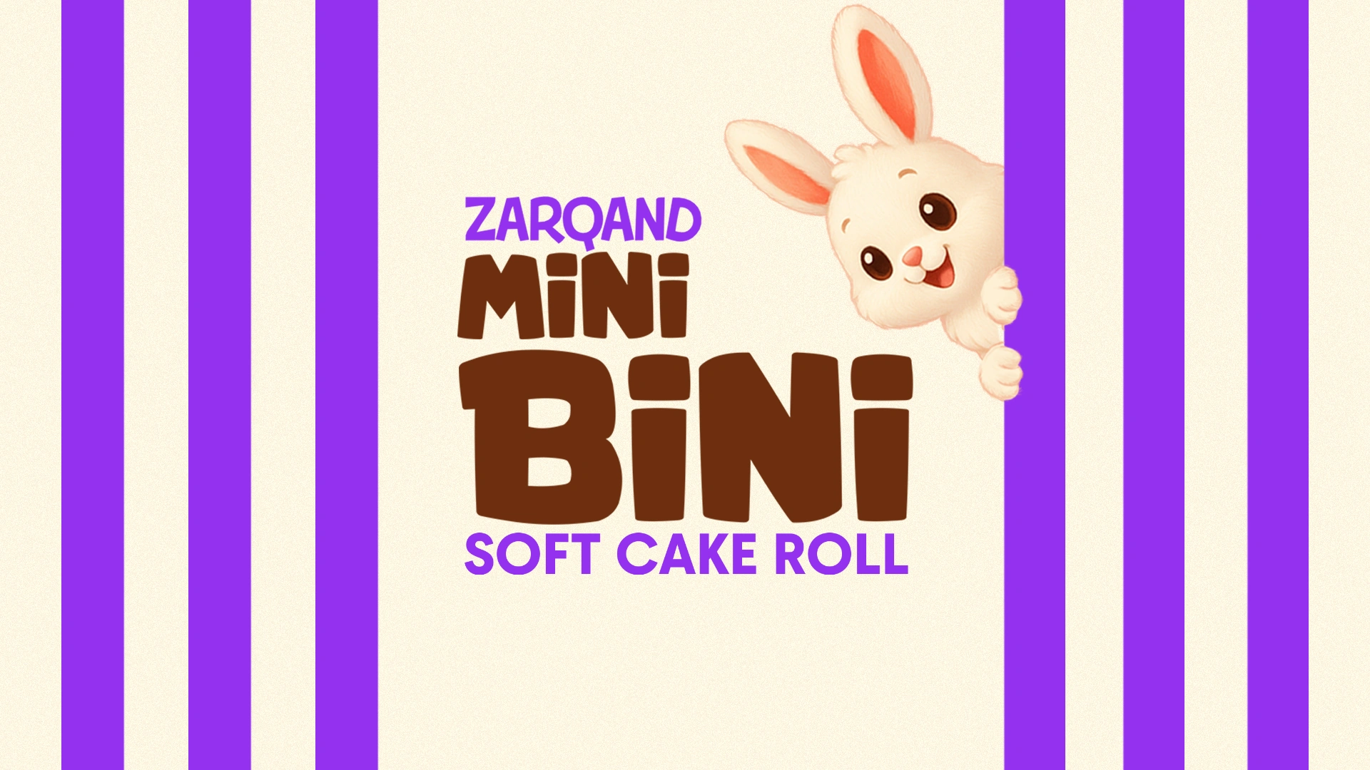
Mini Bini — packaging design for a mini roll
Mini Bini: the mini roll that says “take me with you”
1. Task
This time our client — the Zarqand brand — came to us with the product Mini Bini. The product is neither a classic snack nor just a sweet — it is a light bite that fits perfectly in those moments when your heart craves something sweet, and your stomach hints that it’s time to eat something.
The task was simple yet ambitious: to create packaging that could make friends with children, inspire parents’ trust, and stand out among dozens of competitors on the shelf.
2. Research
We dived deep into the confectionery market. The numbers showed the following:
- According to FMCG studies, more than 60% of snacks are purchased “on the go” when people don’t have time for a full meal.
- In the mini-snack category, the most in-demand format is “sweet & fill” — a product must both delight with taste and slightly satisfy hunger.
- More than half of parents choose the product that their child “asks for themselves” — packaging becomes the main argument here.
Competitor analysis confirmed our assumptions: some brands overload the design and scream from the shelf, while others are too rational and look “boringly adult.” As often happens, the truth lies somewhere in between.
In our case, it was necessary to “hit two birds with one stone” — the packaging had to bring joy to children and confidence to adults.
3. Solution
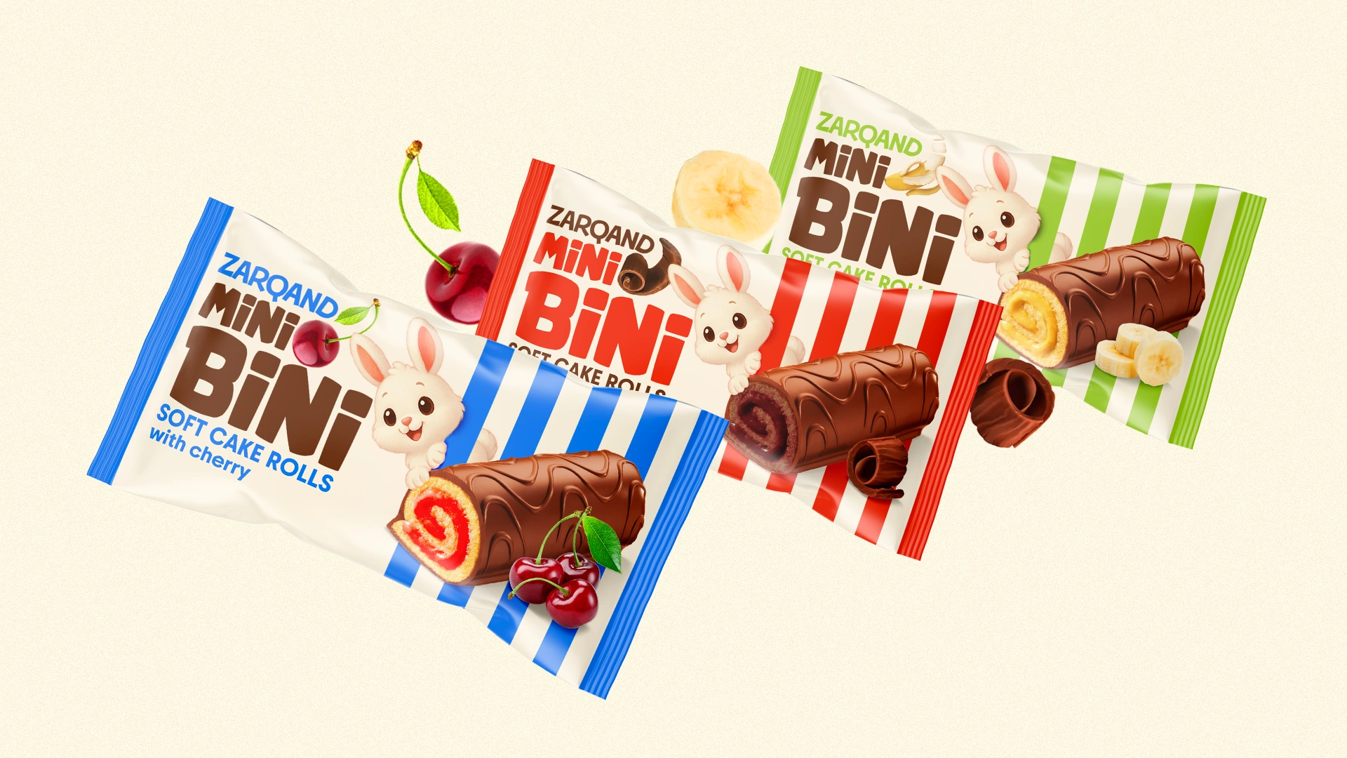
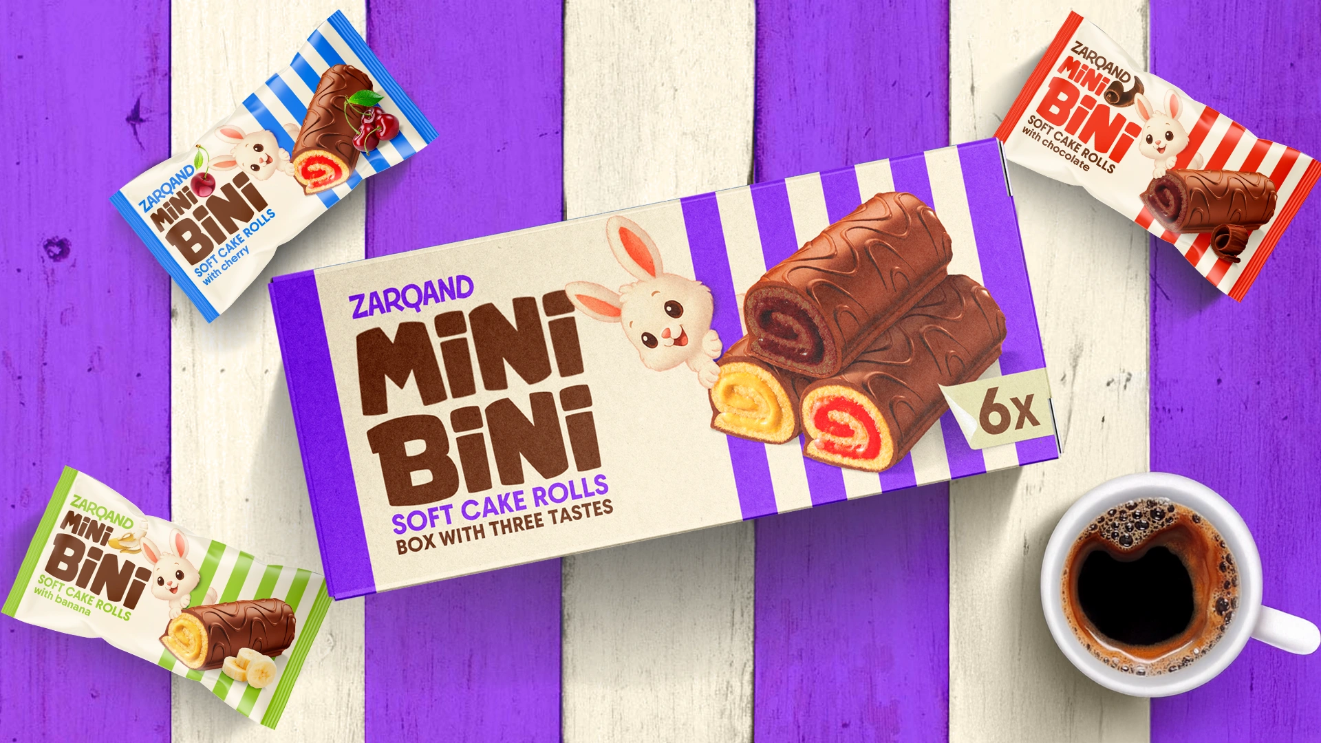
Logo
We developed a simple, easy-to-read, and memorable logo: bold, rounded, with soft lines. The word “MiNi” was styled in a smaller size accordingly.
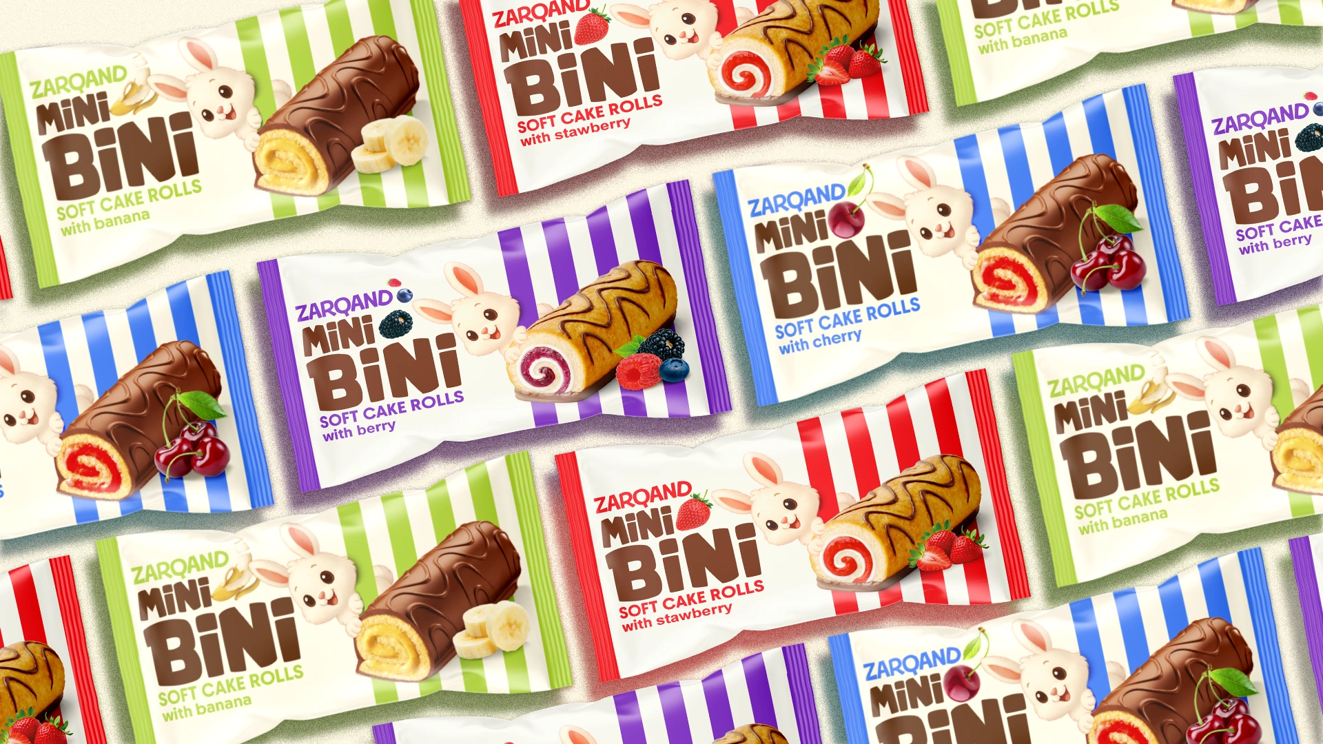
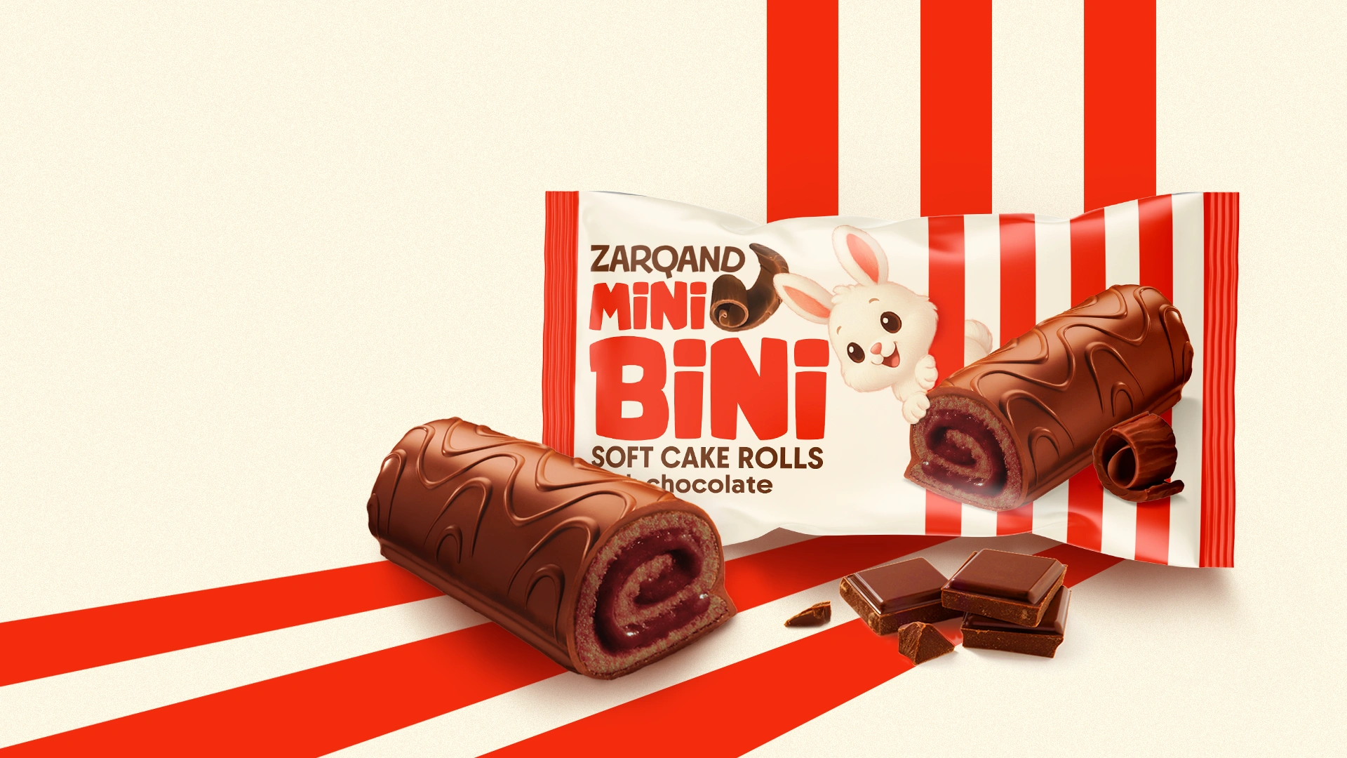
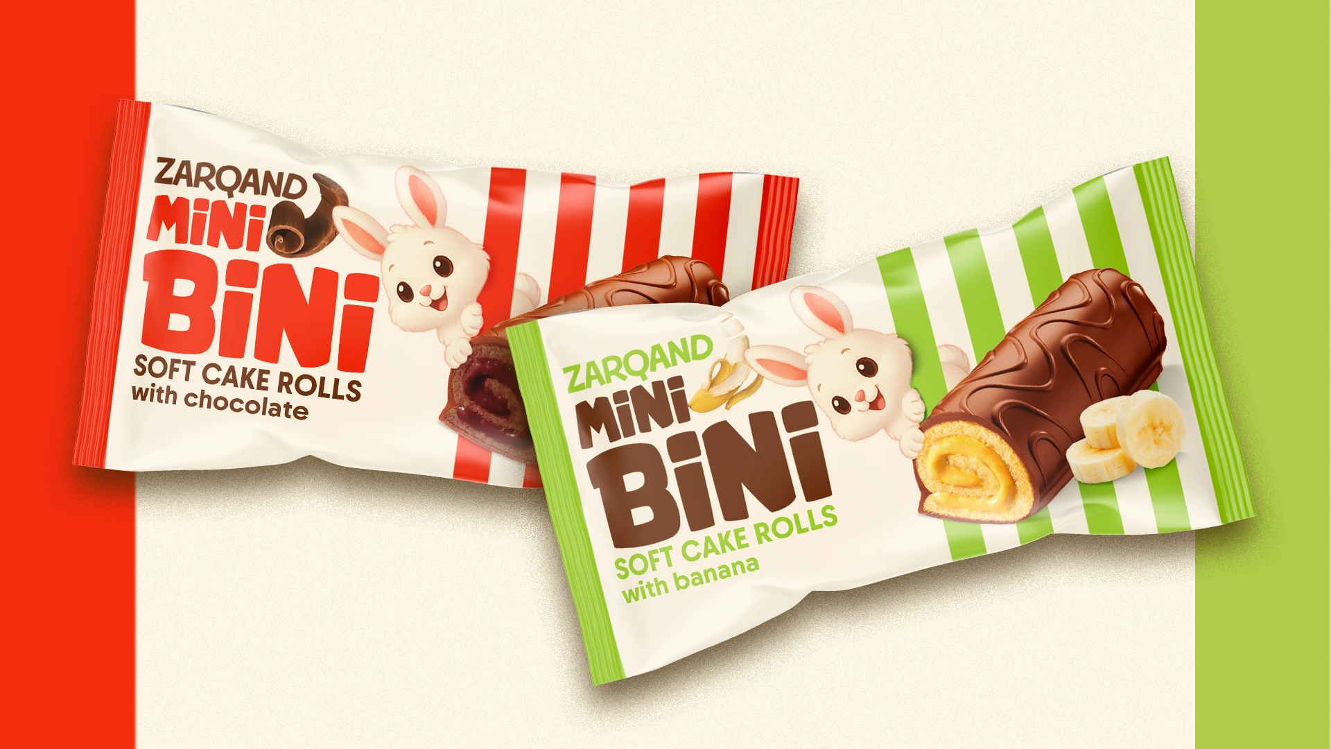
Packaging design
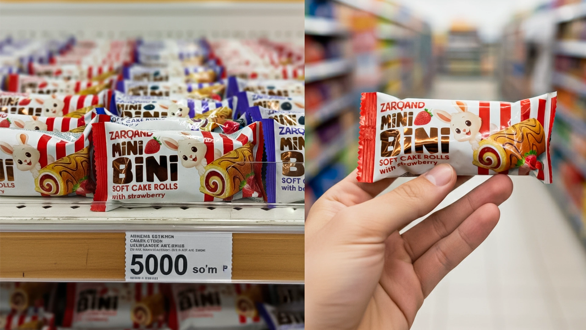
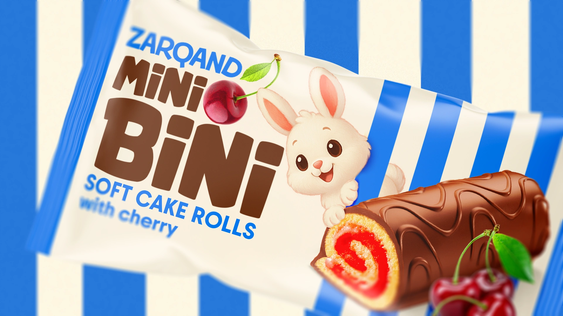
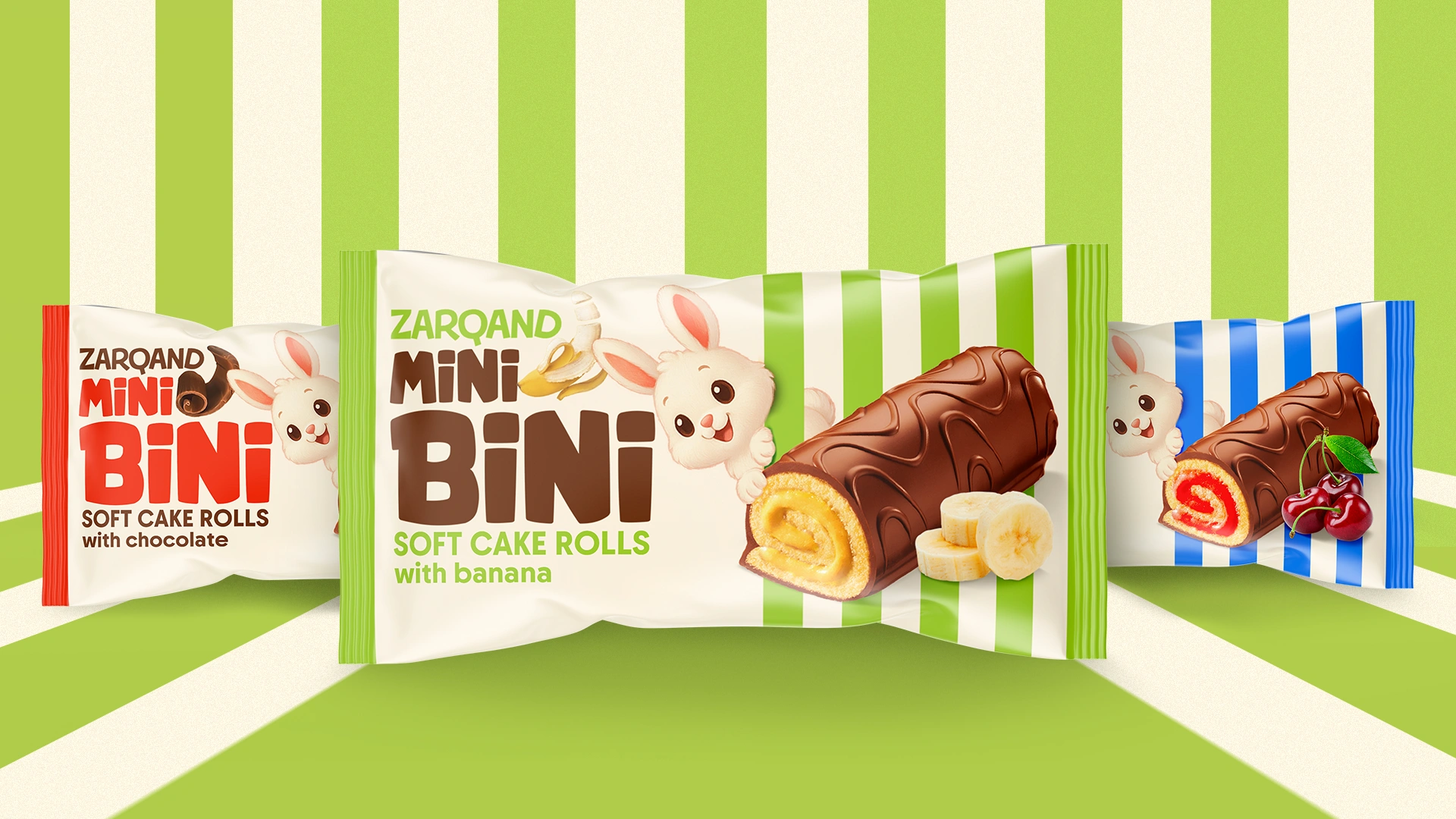
- Colors. Bright enough but not overwhelming — red stripes for strawberry flavor, purple ones for berry mix.
- Appetizing product. The roll is shown so deliciously that you immediately want to try it.
- Character (mascot). A white bunny — the brand’s hero. A symbol of kindness, trust, and lightness. It appeals to children and brings a sense of comfort to adults.
Brand atmosphere
Mini Bini seems to say: “Take me with you — I’m small, sweet, and will help satisfy your hunger.” This is light but honest communication that works on both emotional and rational levels.
Result
- The product stood out on the shelf — not by noise, but thanks to its clear, friendly image.
- Parents note that children “want to choose exactly this packaging” — which means the design works.
- The color system can easily adapt to new flavors, turning the line into a bright constructor.
- The brand gained an additional communication resource: the bunny mascot can live not only on the pack but also in promos, advertising, and digital campaigns.