Demax — a unified concept for a toothbrush line
A unified visual concept was developed for the Demax toothbrush line. Graphic rays became the signature accent, symbolizing cleanliness and freshness, uniting different series into a single recognizable family.
1. Task
When we started working on the packaging for the Demax toothbrush line, the challenge was more than just “making it look good.” We needed to design a system that would unify different series into a single story and allow the brand to communicate with customers in one recognizable, consistent language.


2. Research
We analyzed the market and noticed that most brands use fragmented designs — each toothbrush looks like a standalone product with no connection to the rest. This weakens perception and makes it harder to build trust. Our insight: Demax needed a unified visual language that would not only deliver information but also strengthen brand recognition.
3. Solution
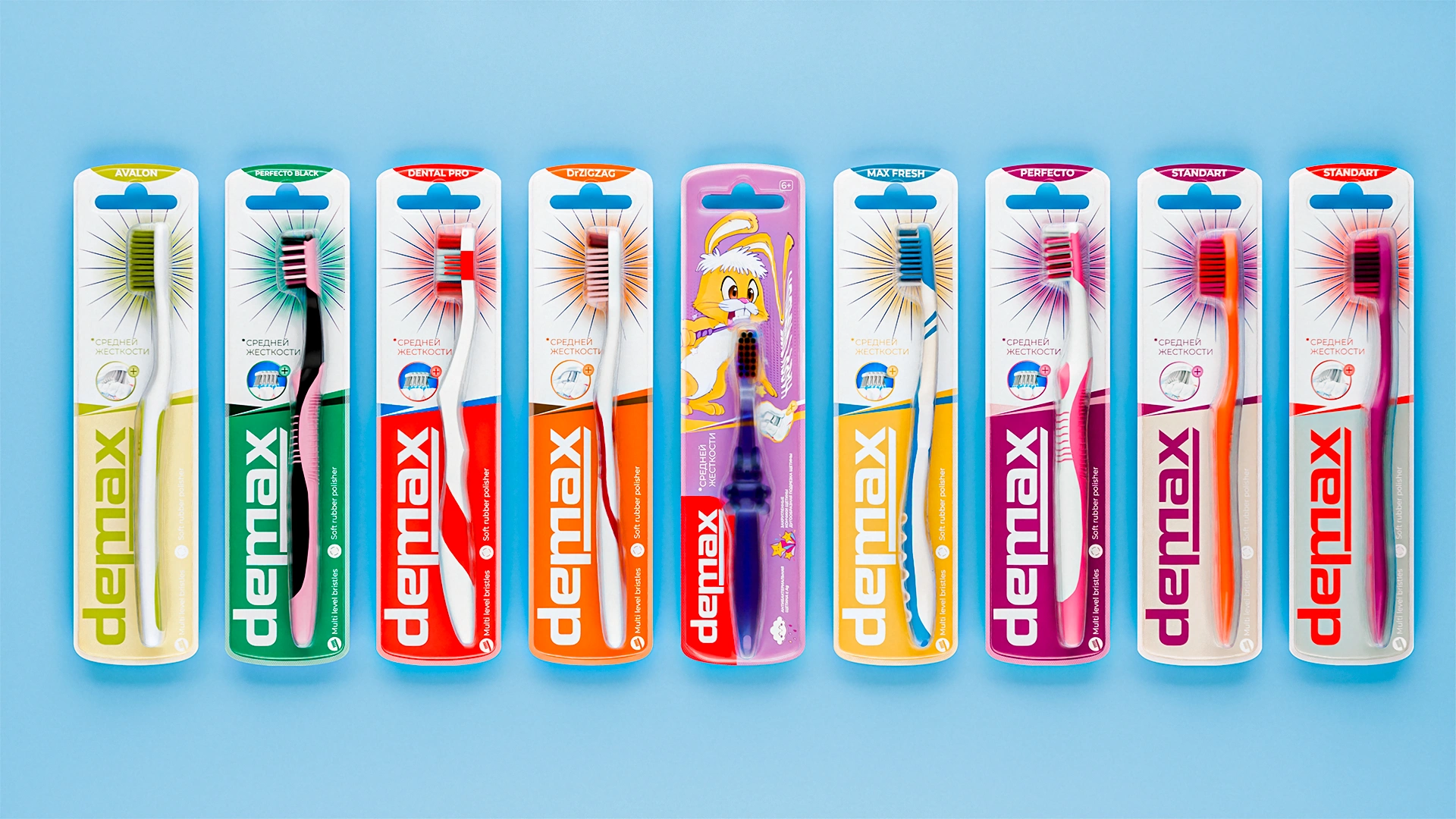
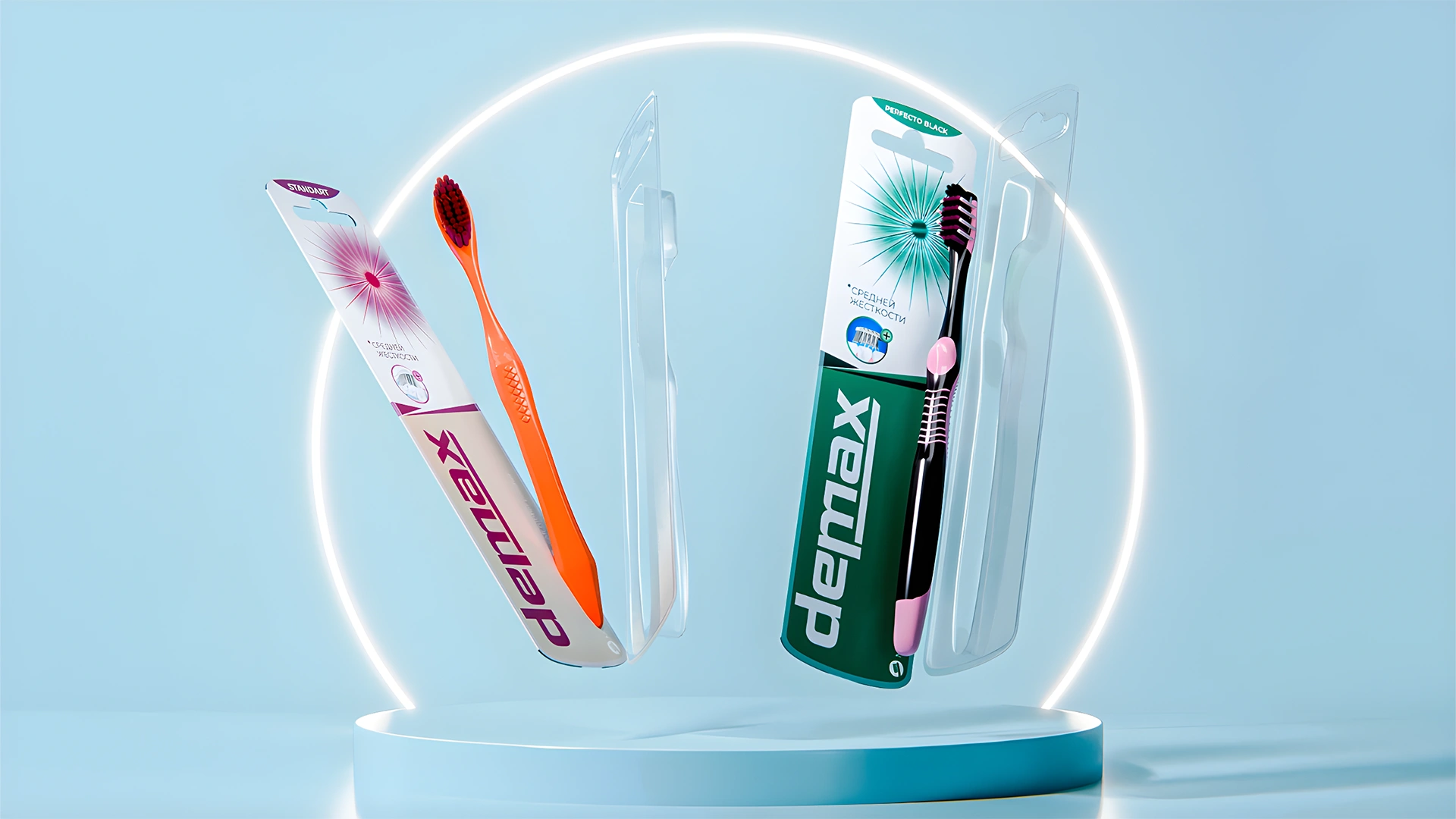
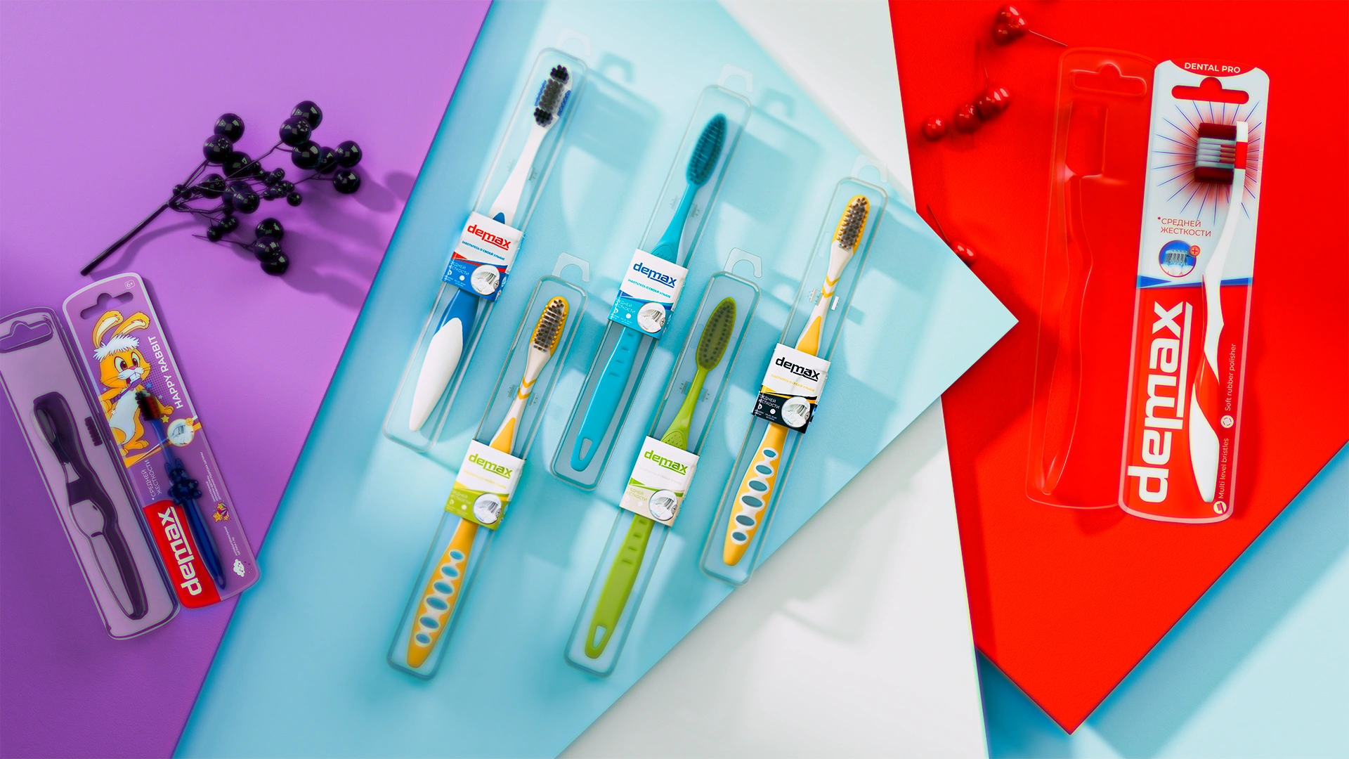
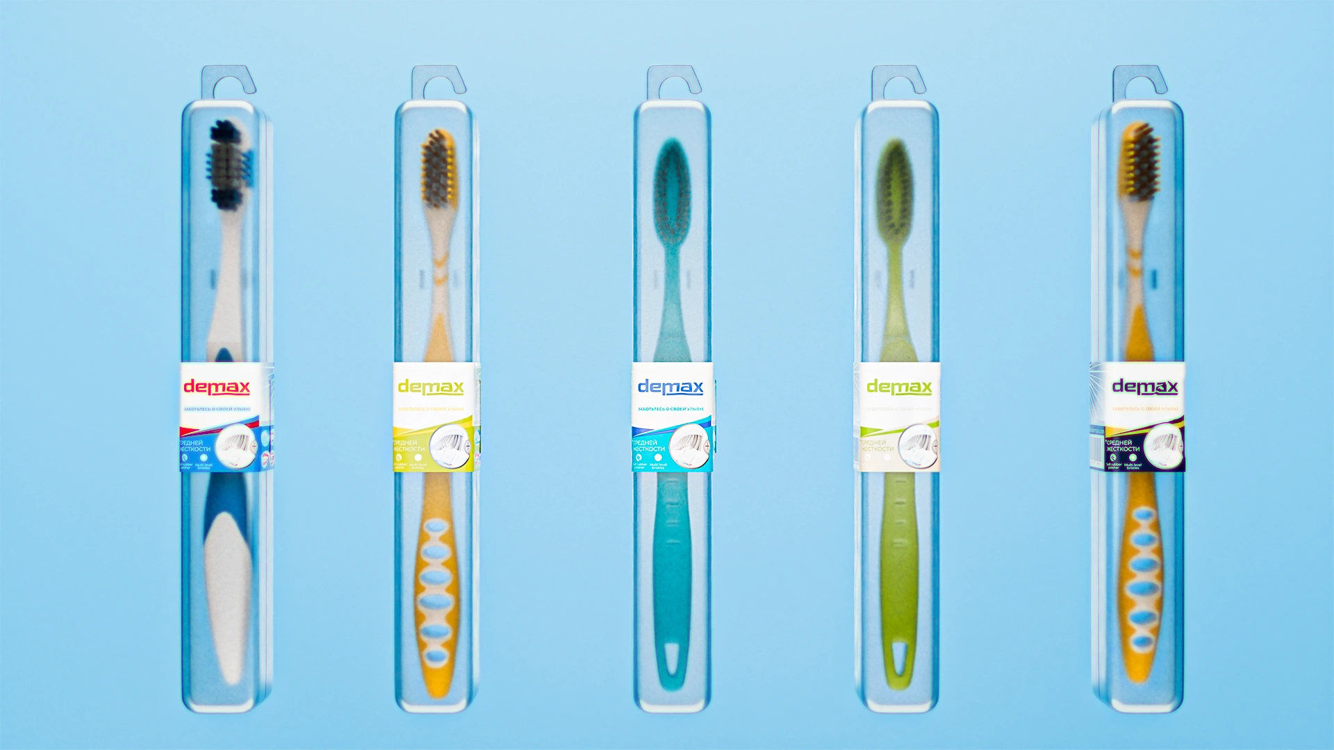
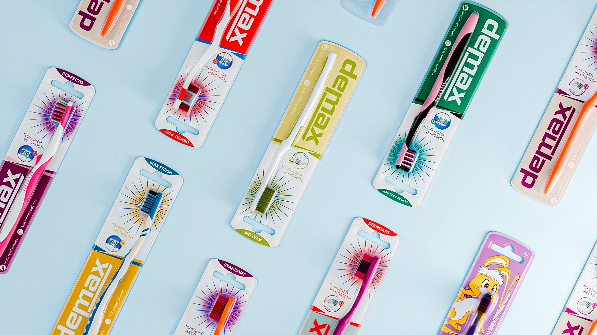
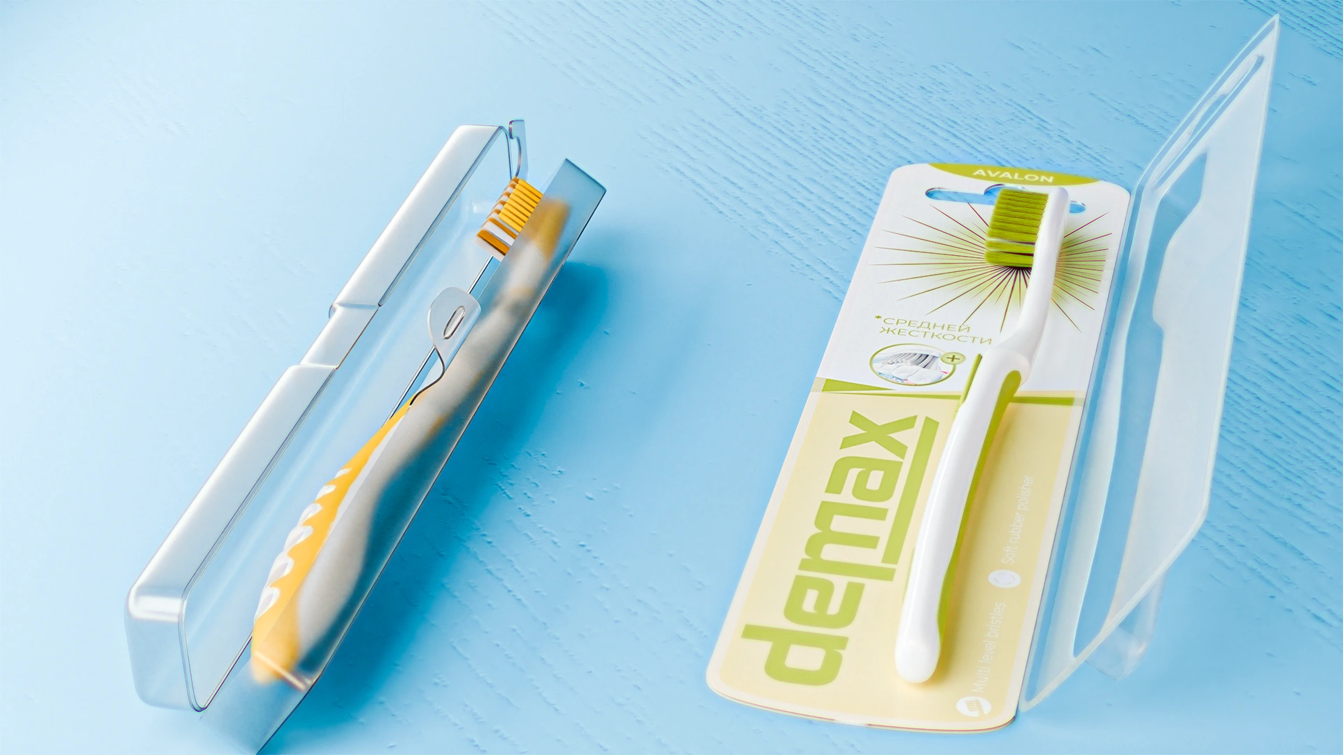
We developed a unified design concept that brought multiple toothbrush series into one visual family.
- Each series received its own background color, reflecting the product’s unique features, while all shades work together as part of a single system.
- As a key visual device, we used graphic rays radiating from the center of the brush. This became a metaphor for energy, freshness, and action — a glow of cleanliness.
- The Demax logo is large and legible, reinforcing brand presence and recognition.
Result
Demax now has a unified visual code — the brand is easy to notice and instantly recognizable. The line is perceived as a system rather than a set of separate items. The rays became a signature accent that can be scaled across new products. The client received packaging that both strengthens the brand and simplifies customer choice.