Oreon — Packaging Design for Fruit Candies
Oreon – Fruit Candy Packaging Design in Chocolate Glaze
1. Task
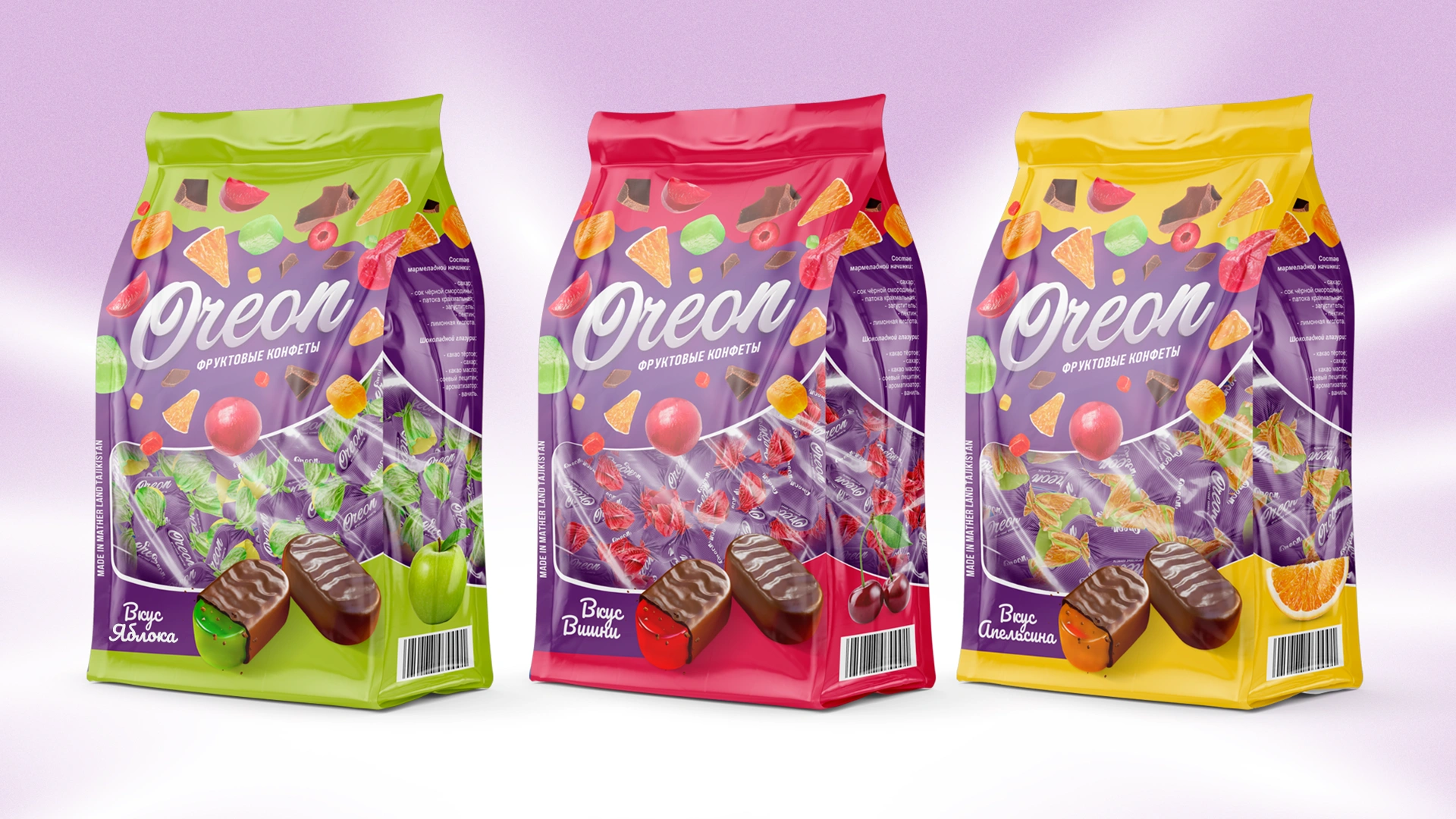
A client from Tajikistan came to us with a new product — fruit candies in chocolate glaze called Oreon. This is a mass-market FMCG item, produced and sold locally in supermarkets, neighborhood shops, and bazaars.
The goal was to create packaging that could compete with established brands and attract attention at first glance. In a market where decisions are made impulsively and within seconds, the packaging had to:
- clearly convey flavor and category;
- differentiate Oreon from competitors;
- build a trustworthy brand image that encourages repeat purchases.
2. Research
We went beyond typical “references” and examined how the category really behaves — both on the shelf and in consumers’ hands.
1. Category codes stuck in “tradition.”
Most chocolate candies use the “burgundy-and-gold classic”: ornate patterns with little uniqueness. As a result, flavors are hard to recognize quickly, and the sense of joy is lost. Our takeaway: put fruit in the spotlight and add a contrasting background so flavor is registered instantly.
2. Purple as a “flavor booster.”
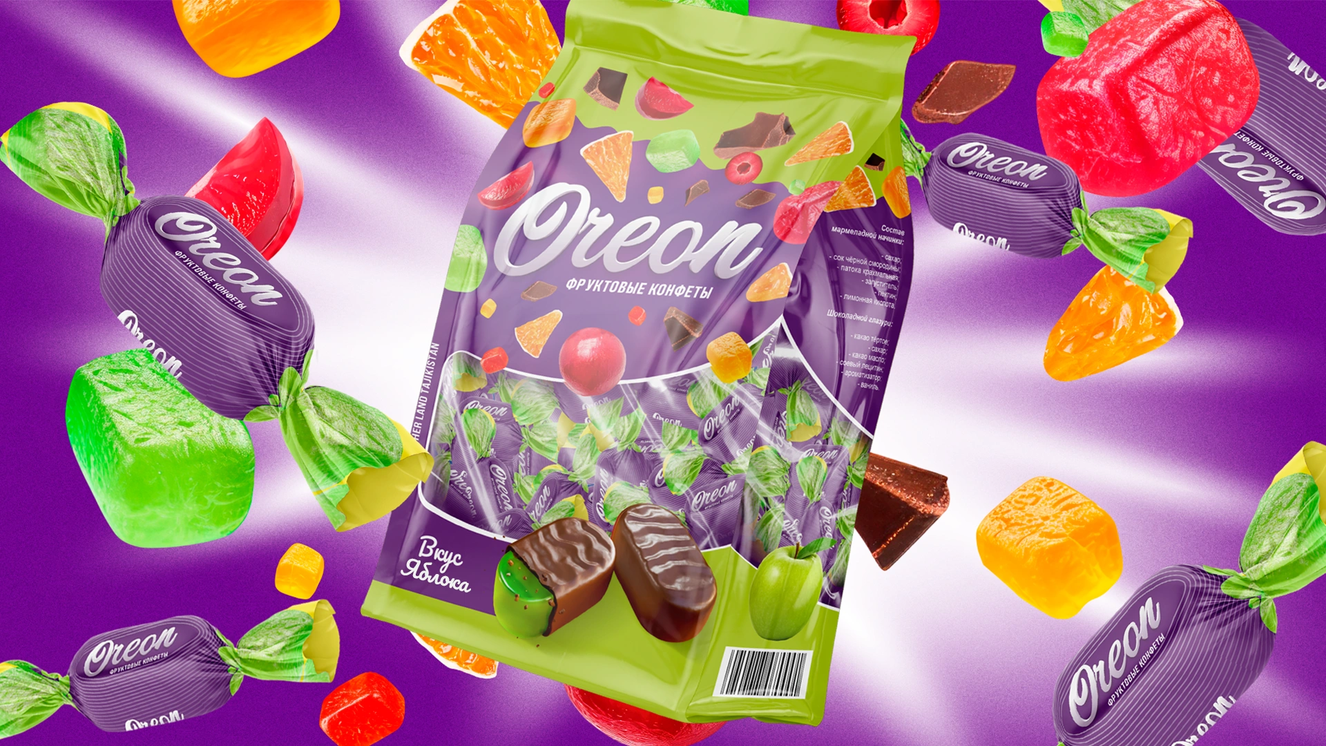
Purple is rarely used in confectionery packaging in Tajikistan. It doesn’t clash with green, yellow, or red fruits — instead, it enhances their juiciness. On the shelf, it works like a spotlight: fruits appear to glow and stand out without looking overly acidic.
3. The “faceless cube” problem.
Competitors often depict generic jelly cubes with no clear flavor. The buyer sees “red” or “green,” but not a specific taste. The fix: make the ingredient more tangible — show slice texture, skin, fibers, and always include a “bite” of the candy so the brain imagines juiciness.
4. Assortment lost inside the bag.
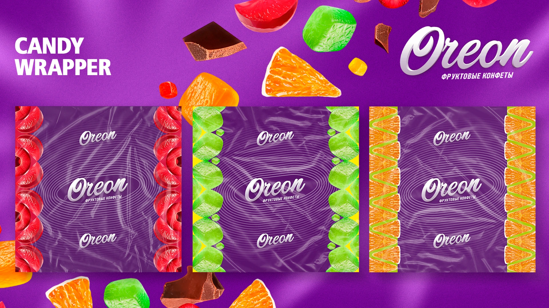
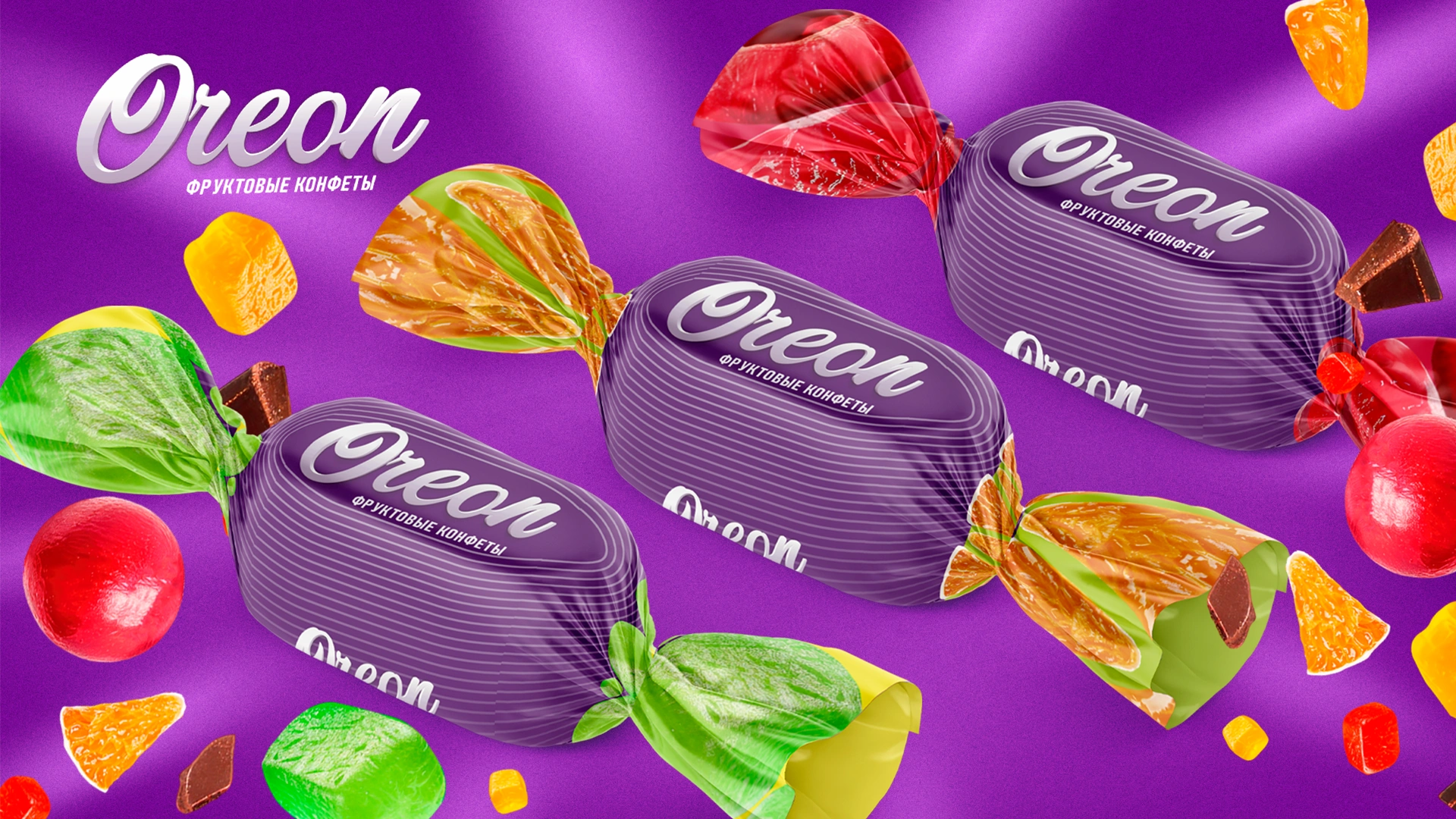
A common issue: the outer pack is bright, but the individual wrappers look inconsistent and disconnected. Our insight: the external design language must carry through to every wrapper to preserve quality and brand unity.
5. Dynamics vs. chaos.
Many brands “shout” to drive impulse buys but end up discouraging repeat ones. The reason: visual noise and eye fatigue. Our rule: keep the energy, avoid the chaos. Motion comes from flying fruits, not from overload.
3. Solution
We created a unified visual concept:
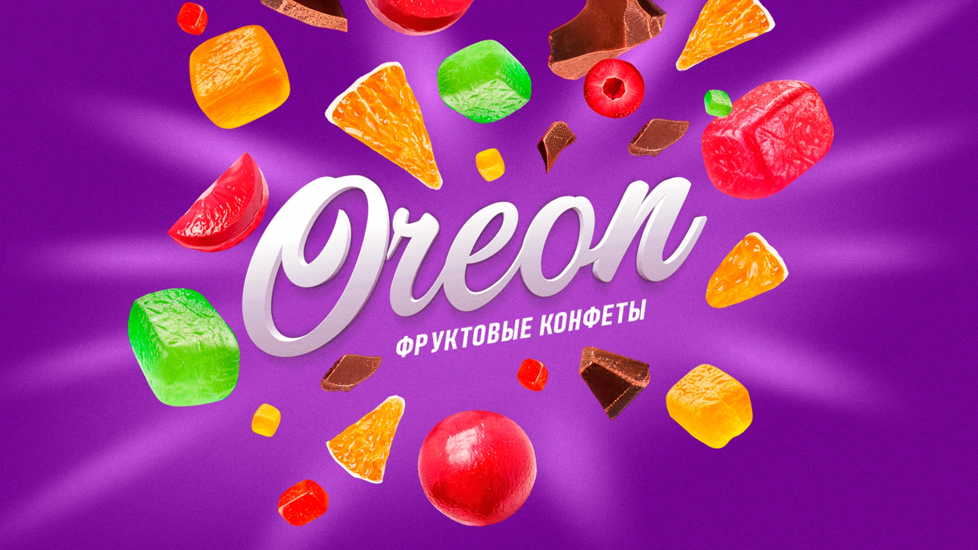
- Background: deep purple to highlight fruit brightness and act as a strong shelf differentiator.
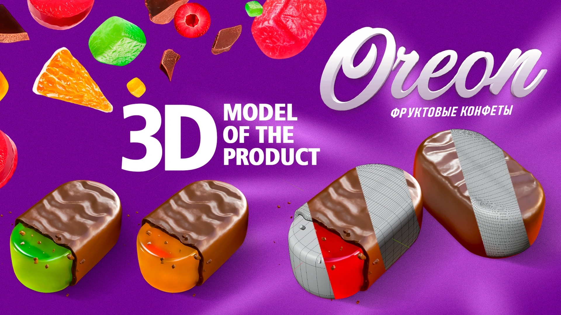
- Graphics: realistic 3D fruits and candies with detailed textures, glossy chocolate glaze, and a “bite” effect.
- Dynamics: fruits shown as if bursting around the logo, scattering outward.
- Logo: bold, soft script with volume — large, legible, and memorable.
- Flavor range: one system for the whole assortment to show family belonging, while each flavor stands out with its own accents and colors.
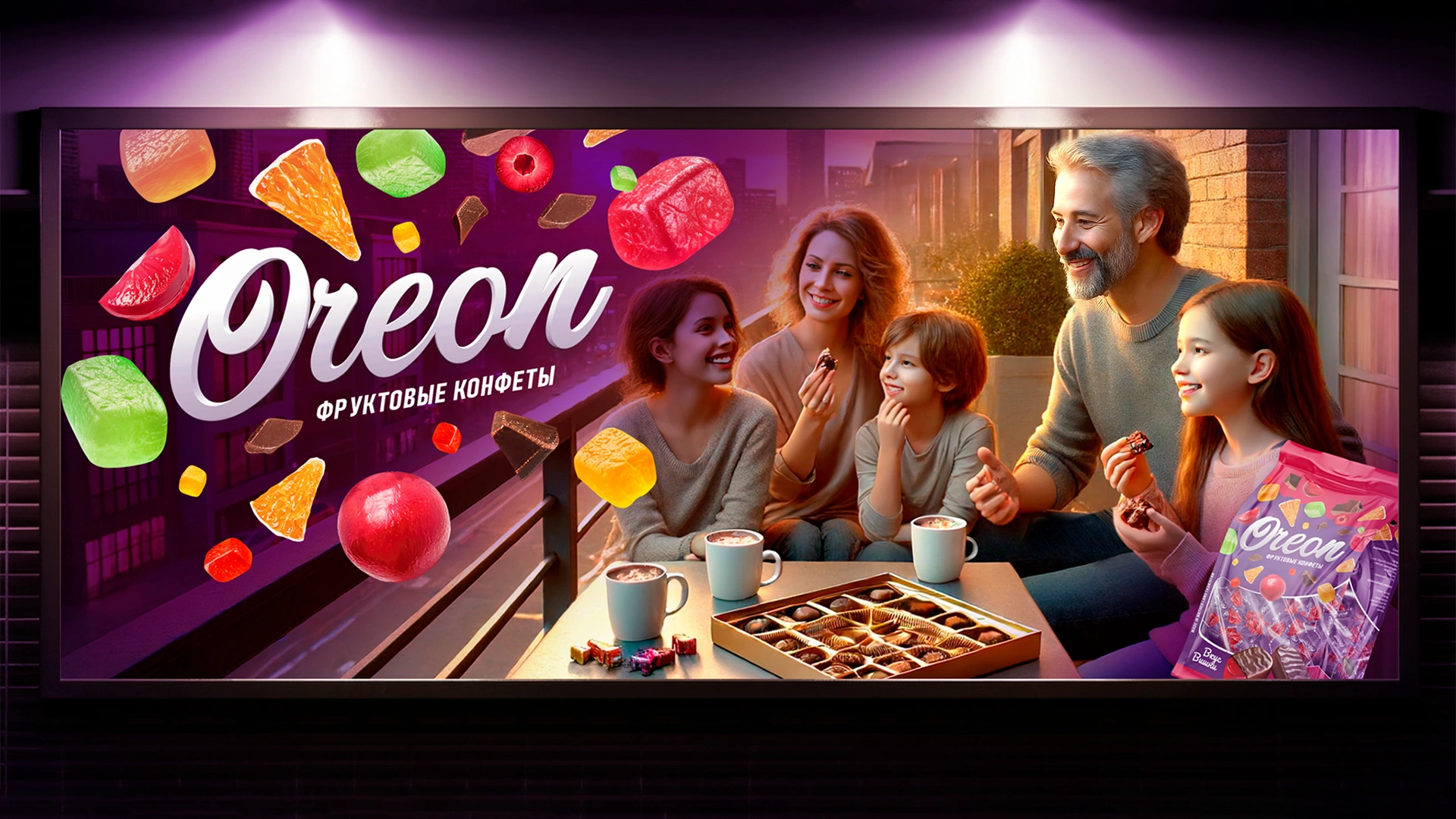
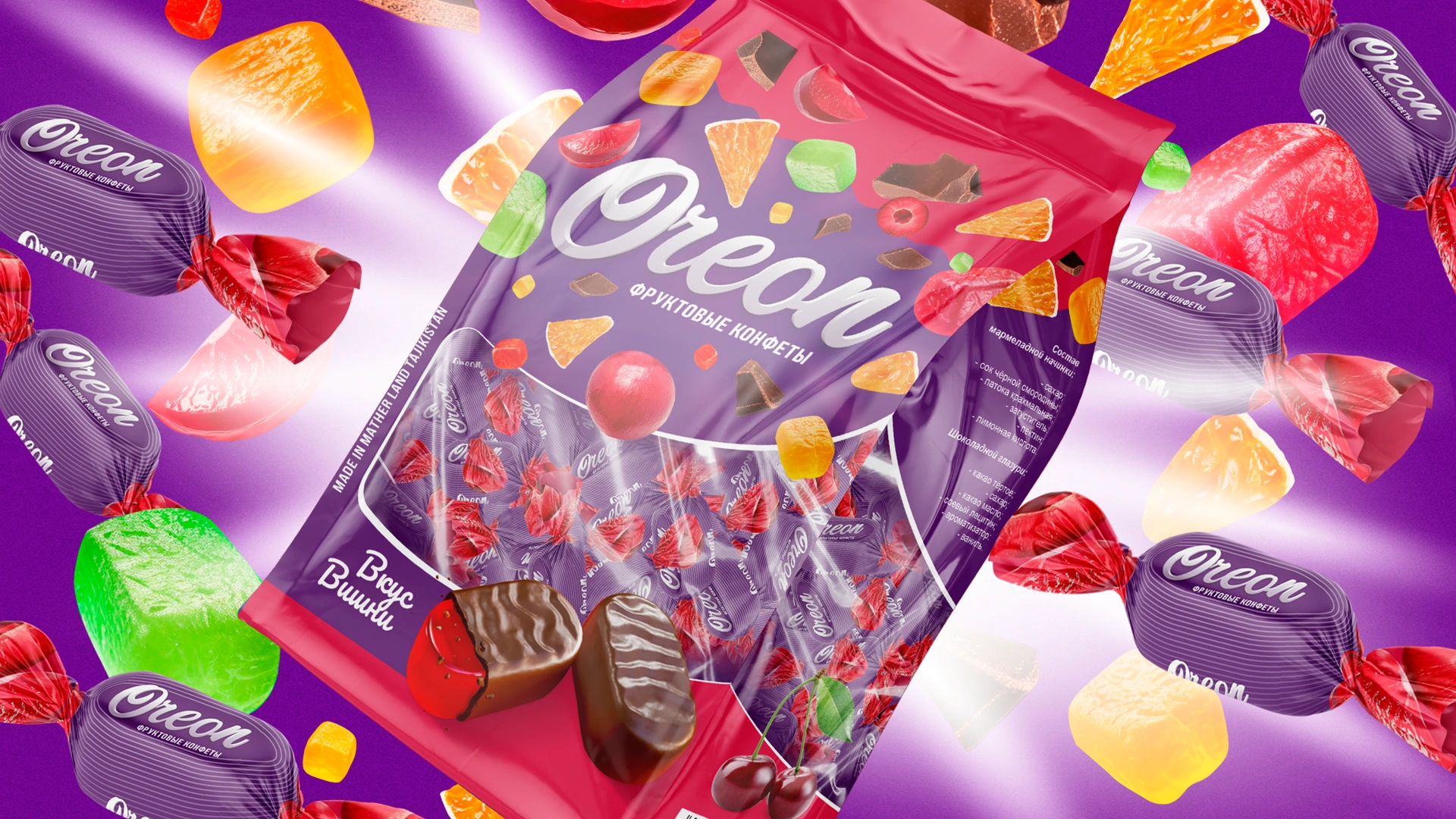
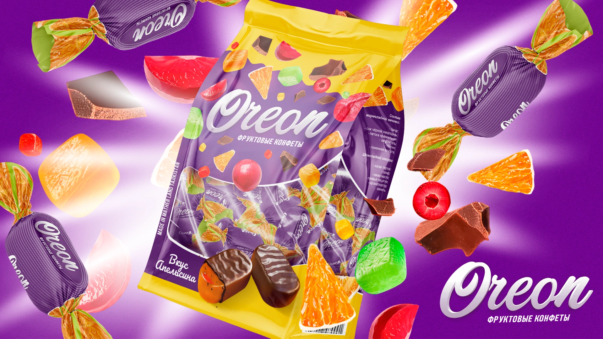
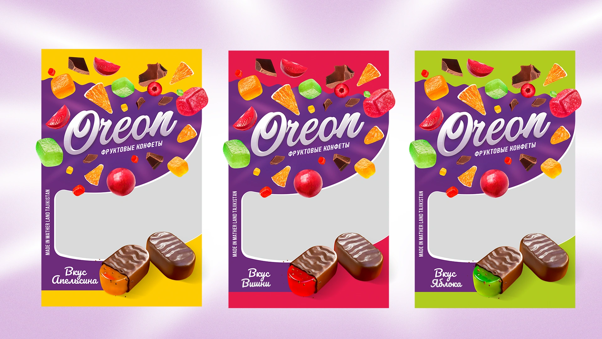
Result
Oreon gained a strong visual identity that instantly sets it apart on Tajik shelves and communicates flavor at a glance — orange, cherry, or apple are recognizable even before reading the label. The “pack + wrapper” system delivers a cohesive impression of European quality and brand consistency. The concept scales easily to new flavors and formats while maintaining recognition.