Black Cap – Sunflower Seeds Packaging Redesign
Black Cap is a sunflower seed brand redesigned with inspiration from everyday life and traditions in Karakalpakstan. It features a bold new name, local characters, and a visual identity that resonates with the people.
1. Task
The client approached us with the task of redesigning the packaging for sunflower seeds. The brand’s previous name—“Xit”—did not reflect the region's cultural uniqueness or the product’s character. The client aimed to create a local brand specifically targeting the Karakalpak audience. It was essential to establish a clear visual identity and distinctive style so the brand could genuinely become beloved in the local market.
2. Research
We also identified other key insights:
- the market is saturated with monotonous, unappealing packaging designs featuring sunflower seeds as background imagery.
- practically no brand emphasized regional cultural elements.
- many brands missed opportunities to emotionally engage consumers through visual storytelling, limiting their brand recognition.
3. Solution
This name simultaneously:
• is easy to remember.
• sounds modern and impactful phonetically.
• most importantly, expresses local identity, as black headwear is integral to the traditional culture of Karakalpakstan.
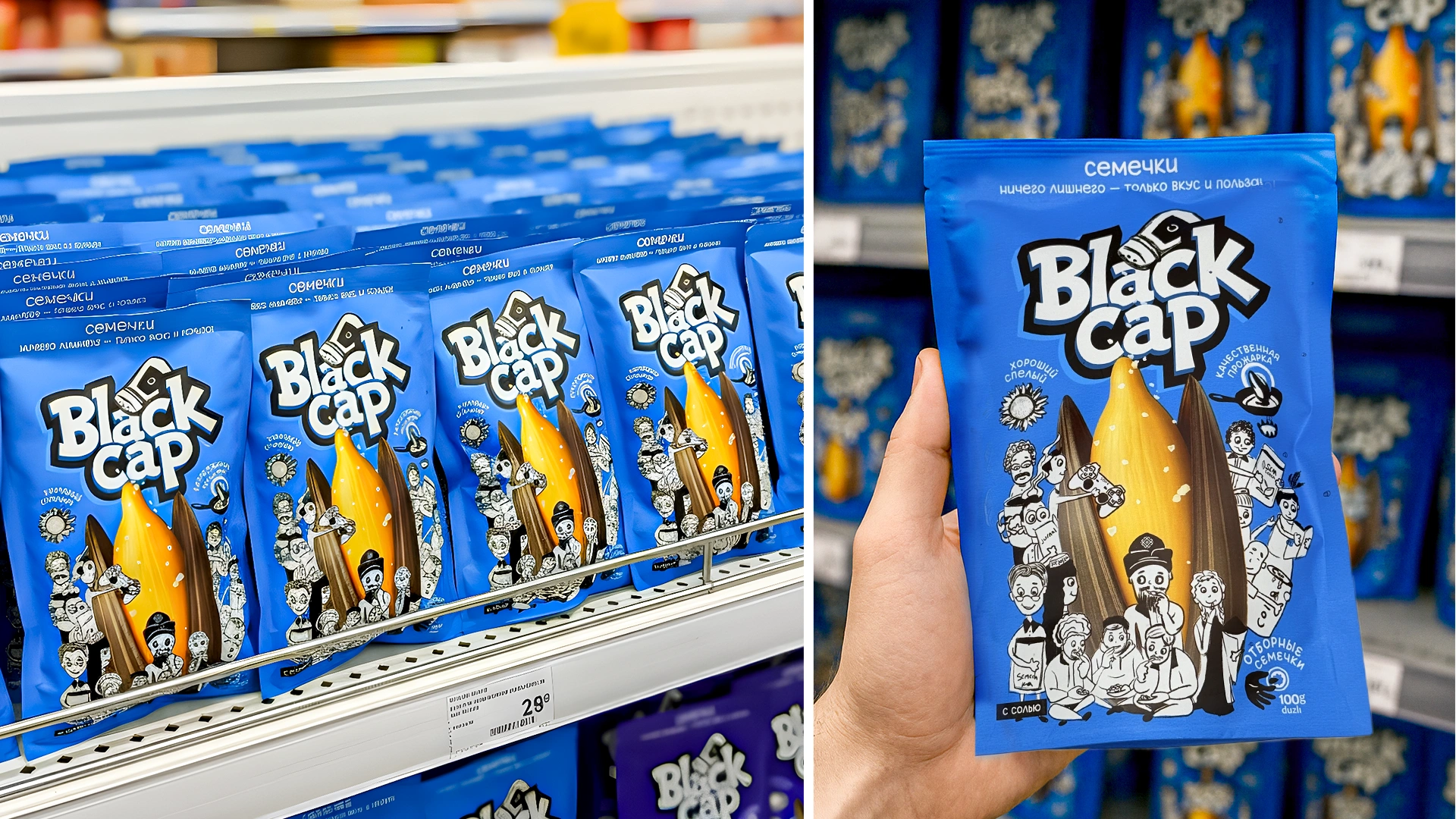
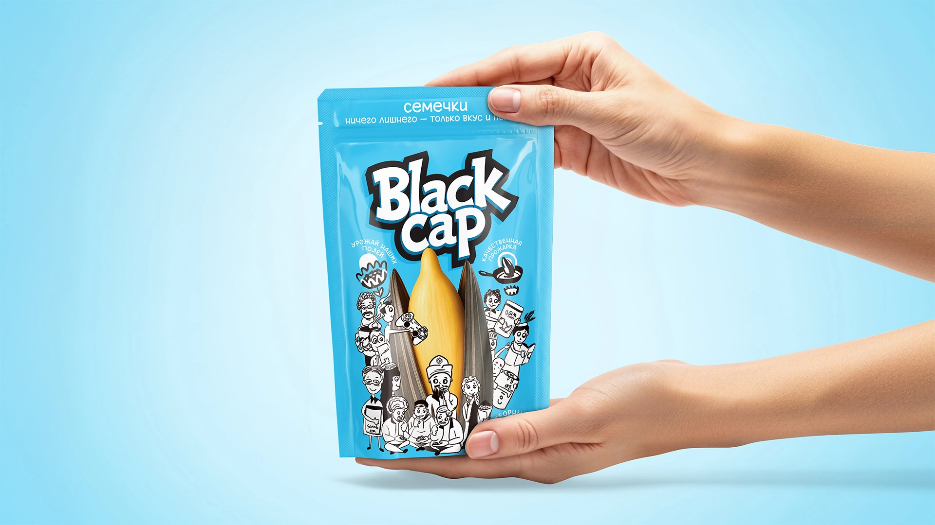
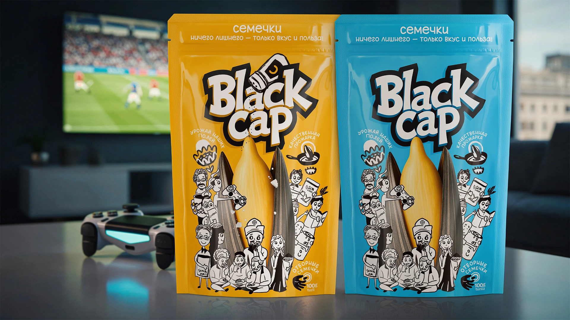
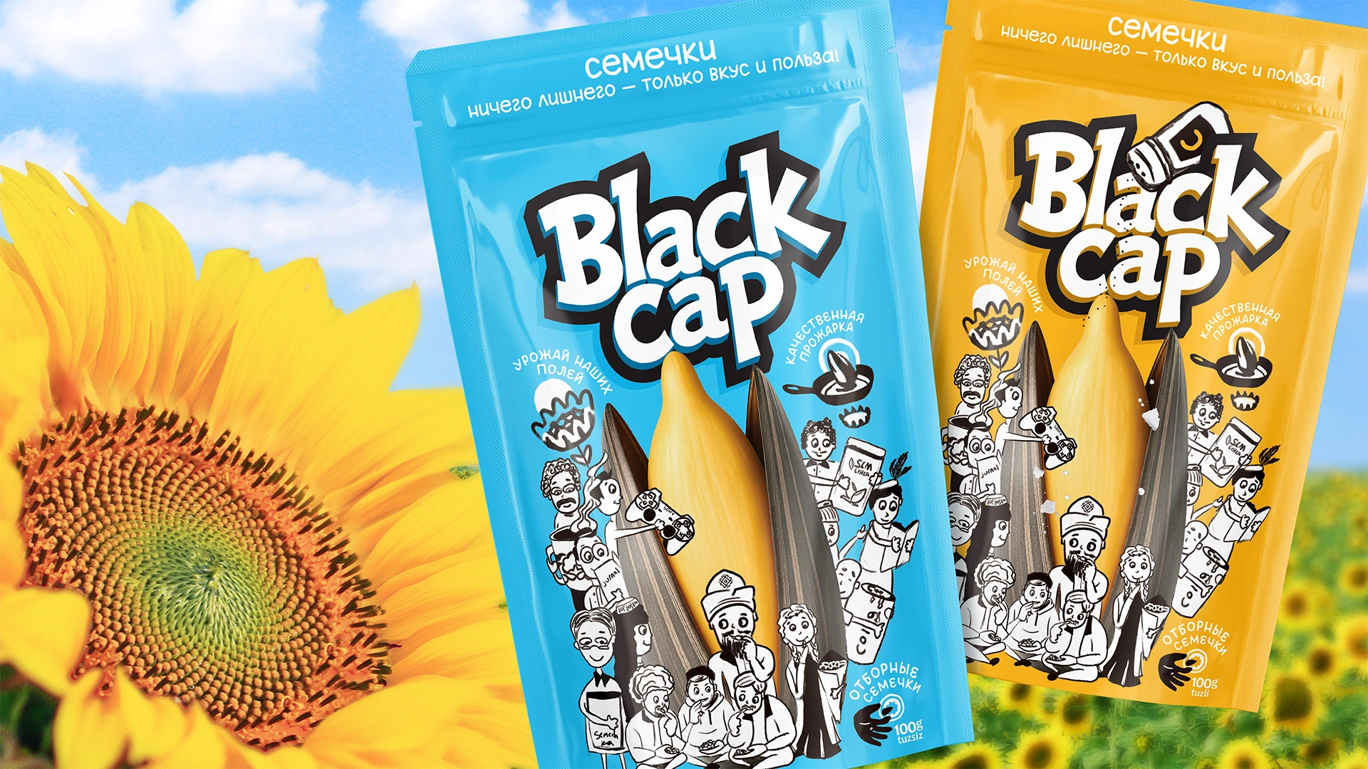
Illustrations and Characters
We developed several illustrations featuring characters in everyday scenarios involving sunflower seeds, including:
- a young man holding a cup decorated with a national cotton pattern.
- a man wearing traditional Karakalpak headwear.
- • a gamer, a girl holding a paper cone of seeds, young people gathered in a teahouse, family gatherings, and even a student—all emphasizing the local specificity of the brand.
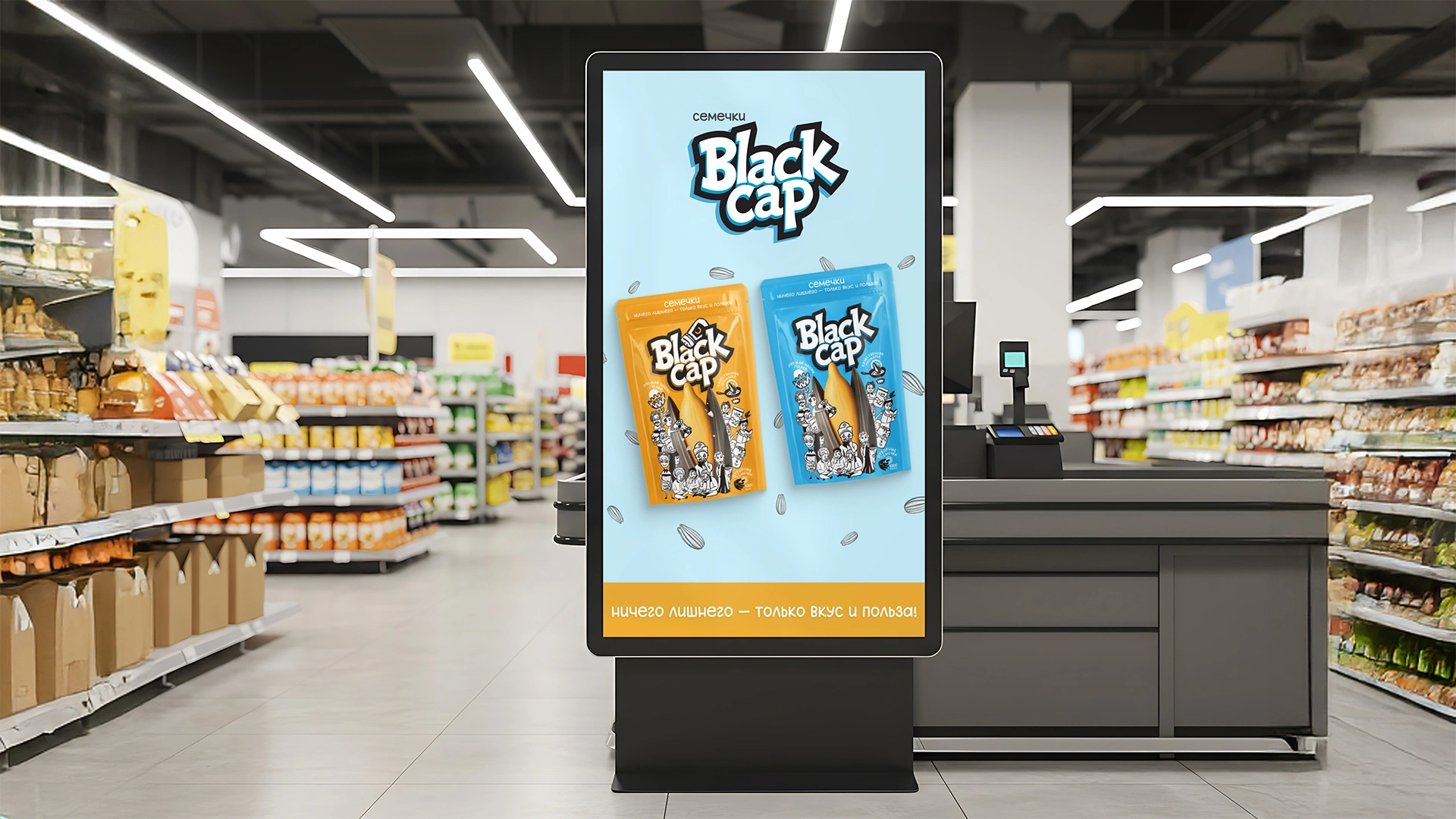
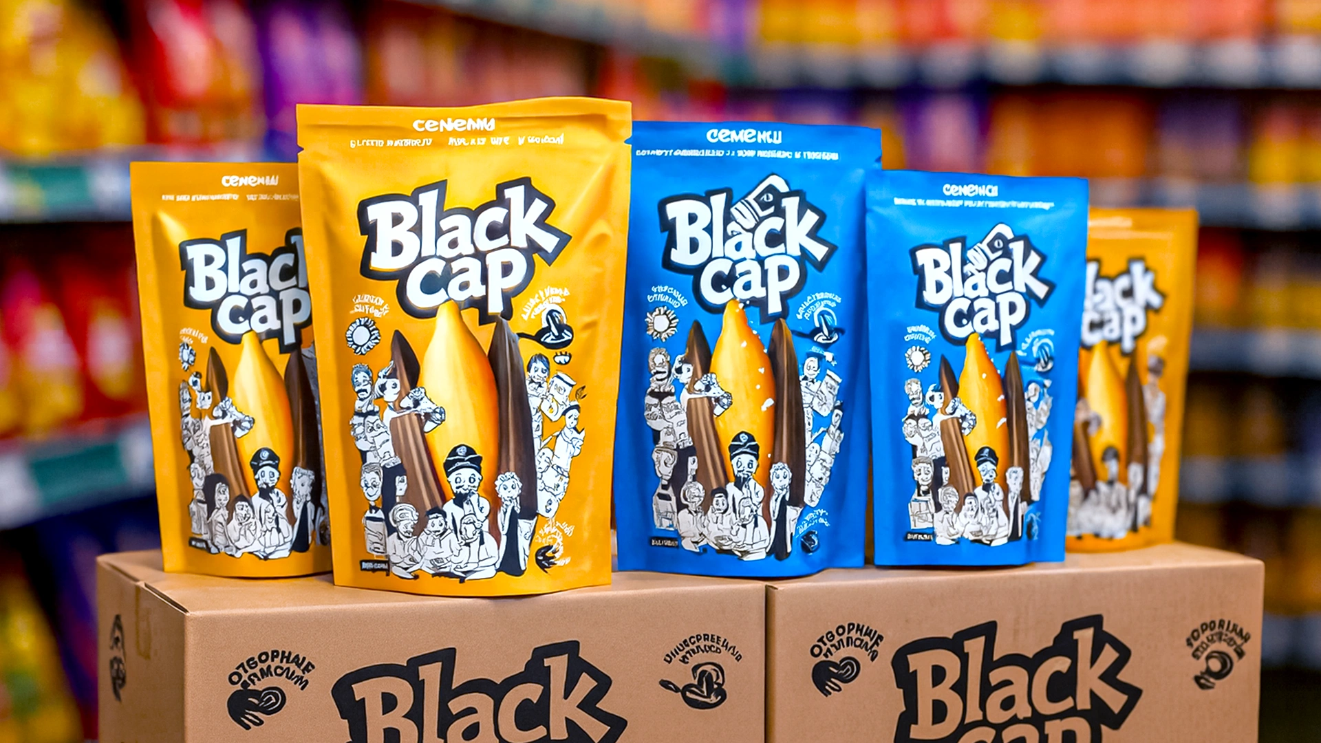
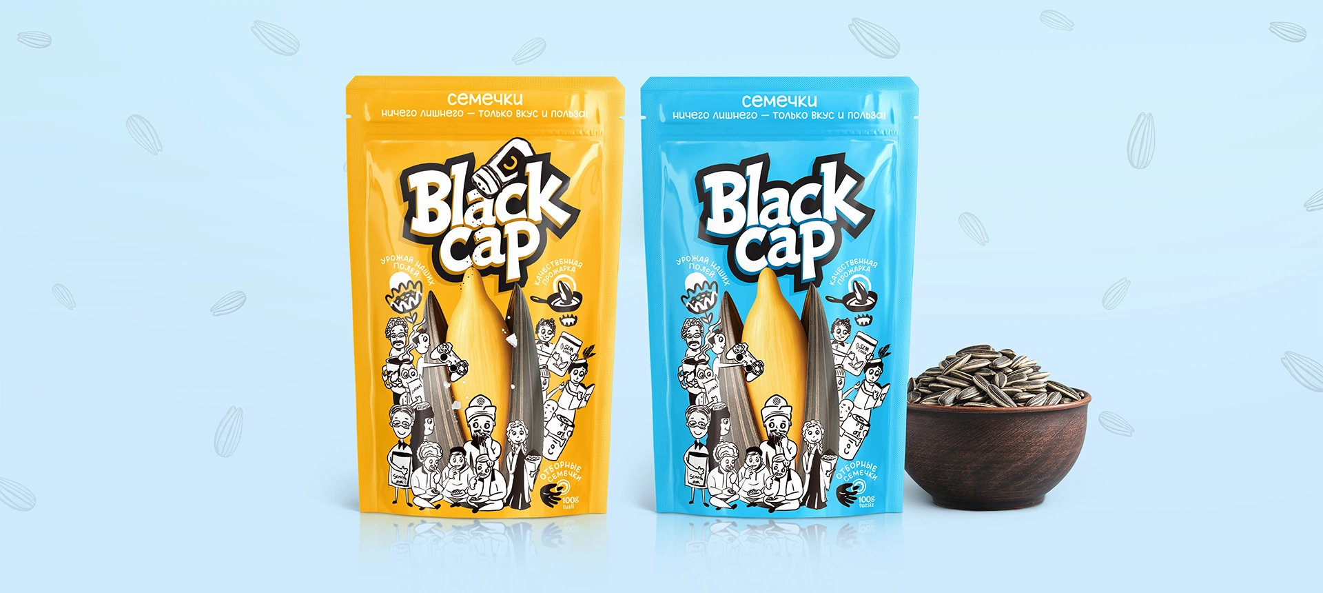
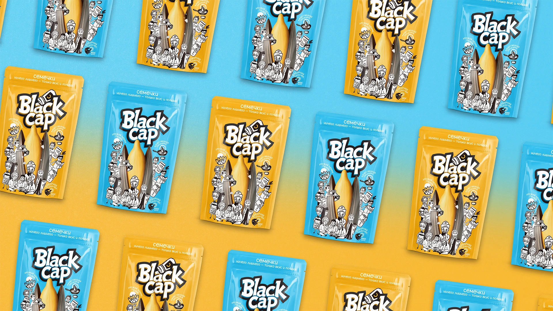
Colors and Differentiation
- Blue packaging—salted sunflower seeds.
- Yellow packaging—unsalted sunflower seeds.
Icons and Semantics
To make the packaging easily understandable, we created three icons with clear descriptions:
- Ripe and Selected—indicating the quality of raw materials.
- Quality Roasting—highlighting production standards.
- Premium Seeds—demonstrating special attention toward consumers.
These elements build trust, transforming the packaging from a simple container into an effective communicator of the brand’s unique voice.

Result
The redesign received enthusiastic feedback from both the client and focus groups:
— “Nothing like this exists on the market yet!”
— “Looking at the characters is pure joy!”
— “Finally, the brand has its own personality.”
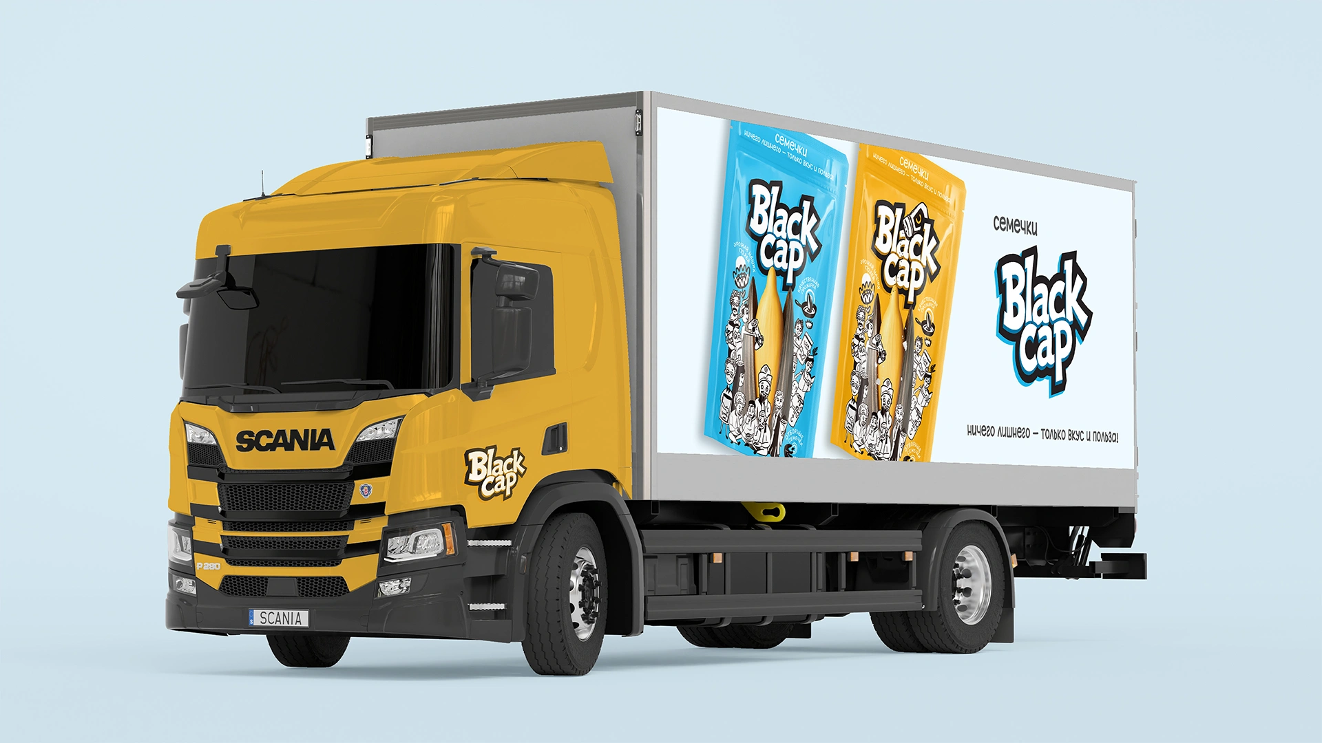
The new packaging will soon be available, with the first batch ready to enter the Karakalpakstan market.
We wish the Black Cap brand success—not only in Nukus but across other cities as well!