"YUMA GREEN" — Branding and Packaging Design for Natural Medicinal Products
A design solution that breaks the "cold" standards in pharmaceuticals and visually explains the product's function.
1. Problem and Task
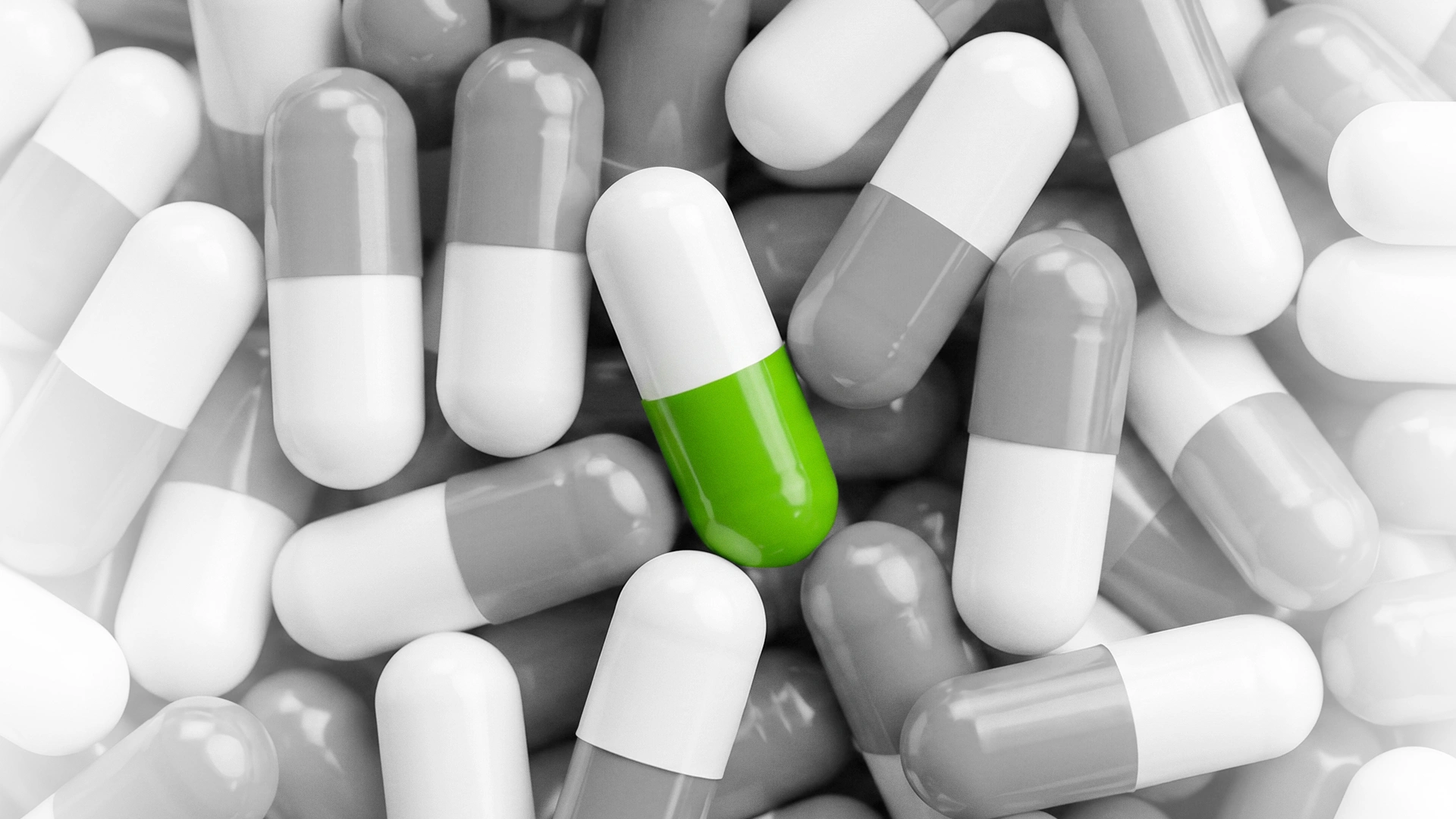
Pharmacy shelves are typically filled with packaging that looks almost identical. Our client wanted to introduce a new line of completely natural, herbal-based medicinal products and dietary supplements (biologically active additives) called "Yuma Green" to the market.
Our task was to create a logo and a unified packaging system that would not get lost among the boring packages on the shelf, and that could convey both the naturalness and the specific function of the product to the consumer at a single glance.
2. Research
Before starting the project, we analyzed the market for medicinal products and natural supplements.
- Audience insights. As the saying goes, "it is better to see once than to hear a thousand times," and consumers dislike reading complex medical terms. When a customer is looking for a cure, they need to see from a distance exactly which organ the product will work on and trust it.
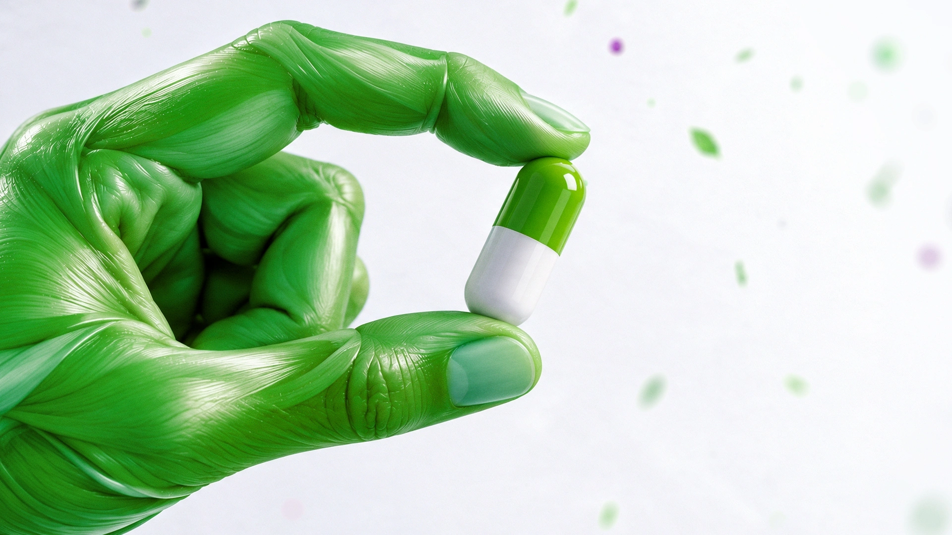
- Product insights. Natural supplements on the market are usually limited to simply putting a picture of a green leaf or plant on the packaging. And chemicals look "cold." We needed a creative approach that combined both healing and 100% naturalness.
3. Solution
Not just the composition of the product, but its specific function was brought to the center of design.
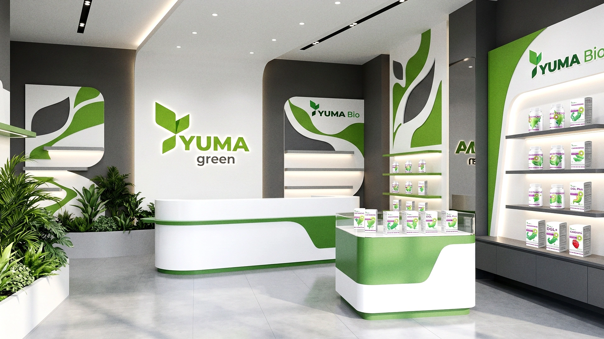
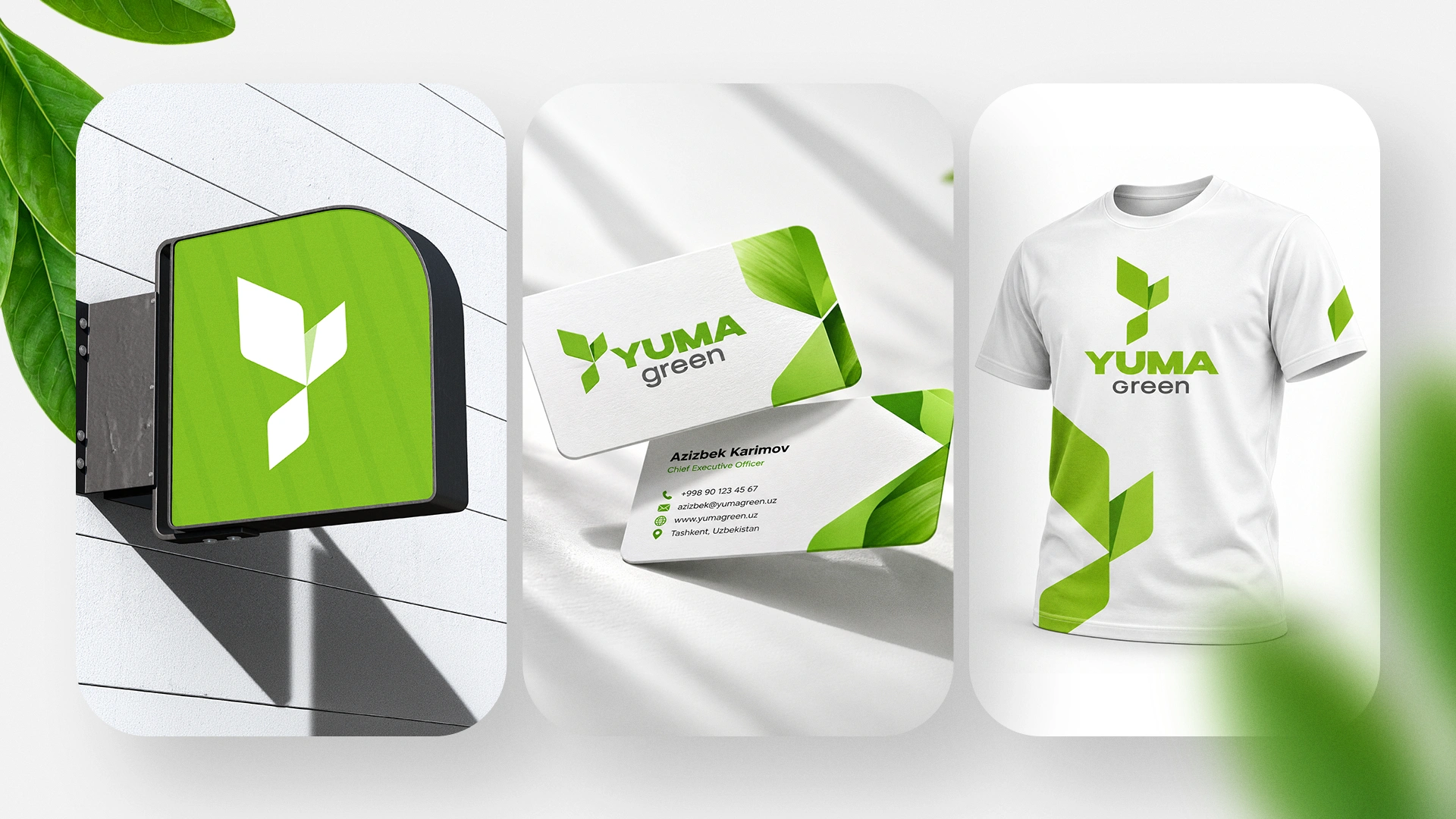
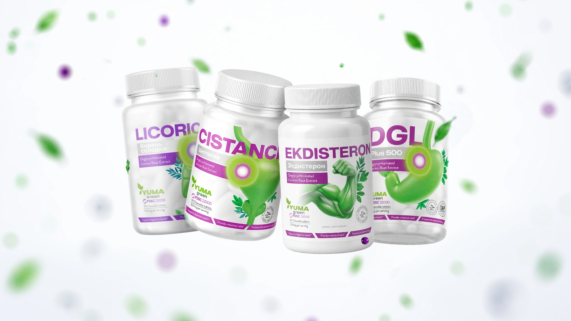
- Logo and Identity. A minimalist and modern "YUMA green" logo was developed for the brand, enriched with a green leaf element that symbolizes environmental friendliness.
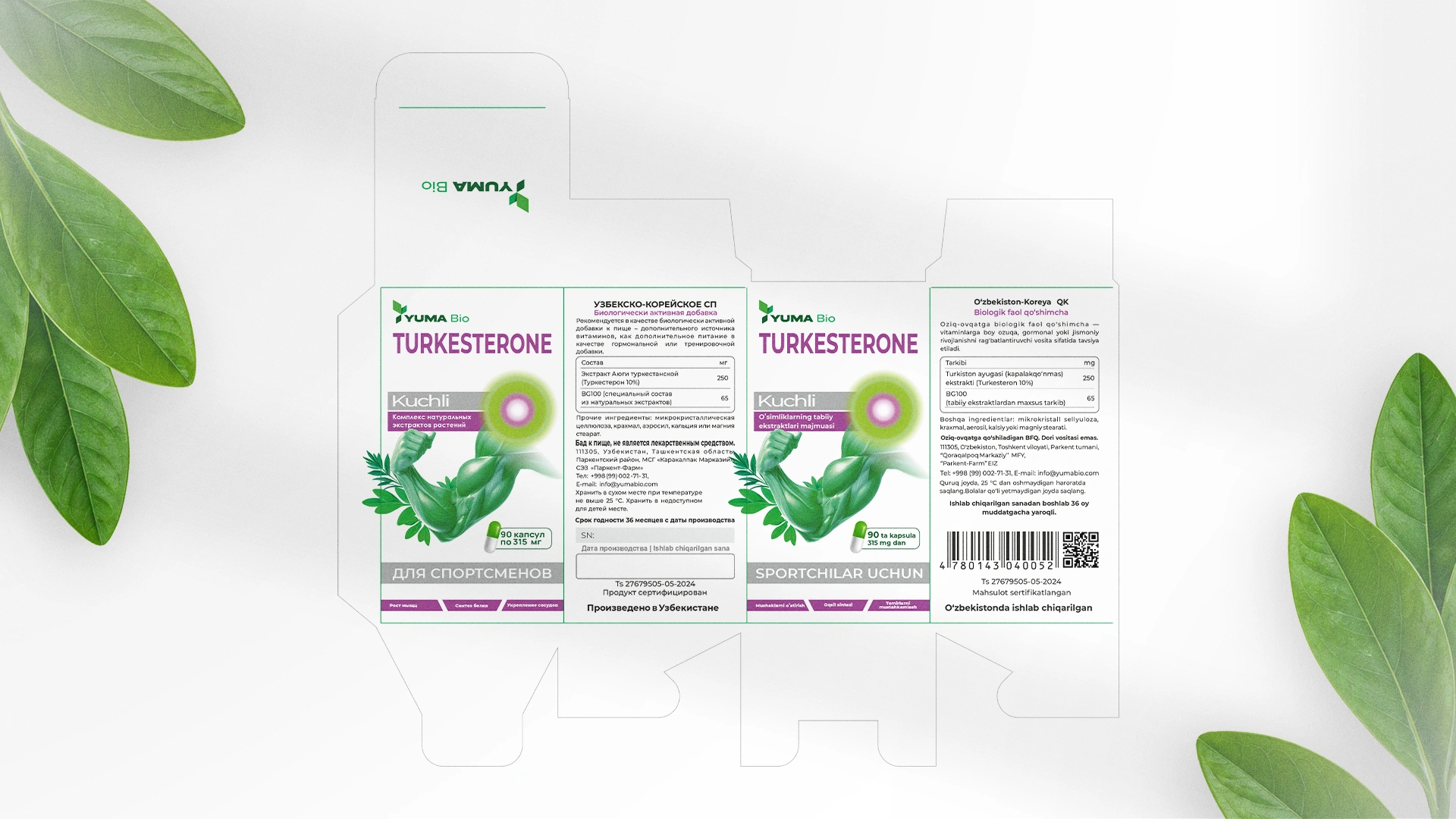
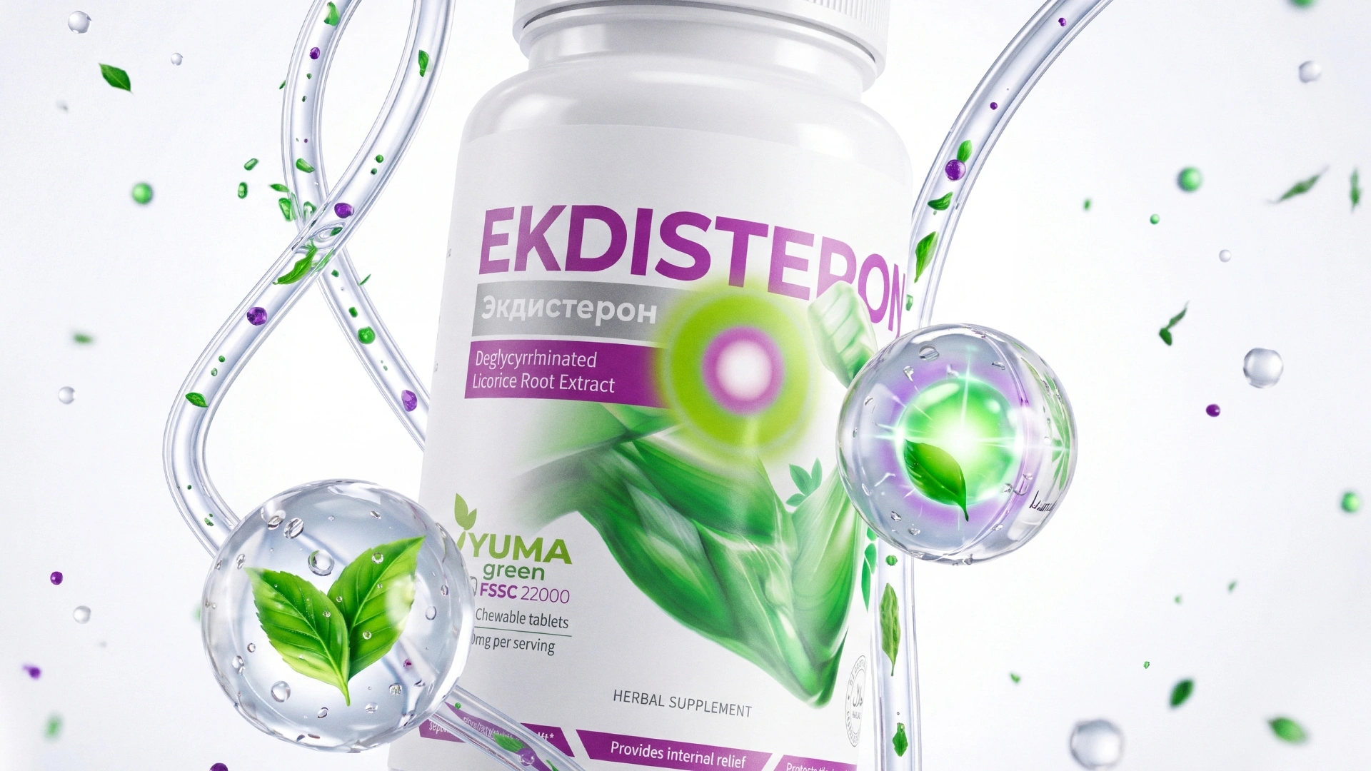
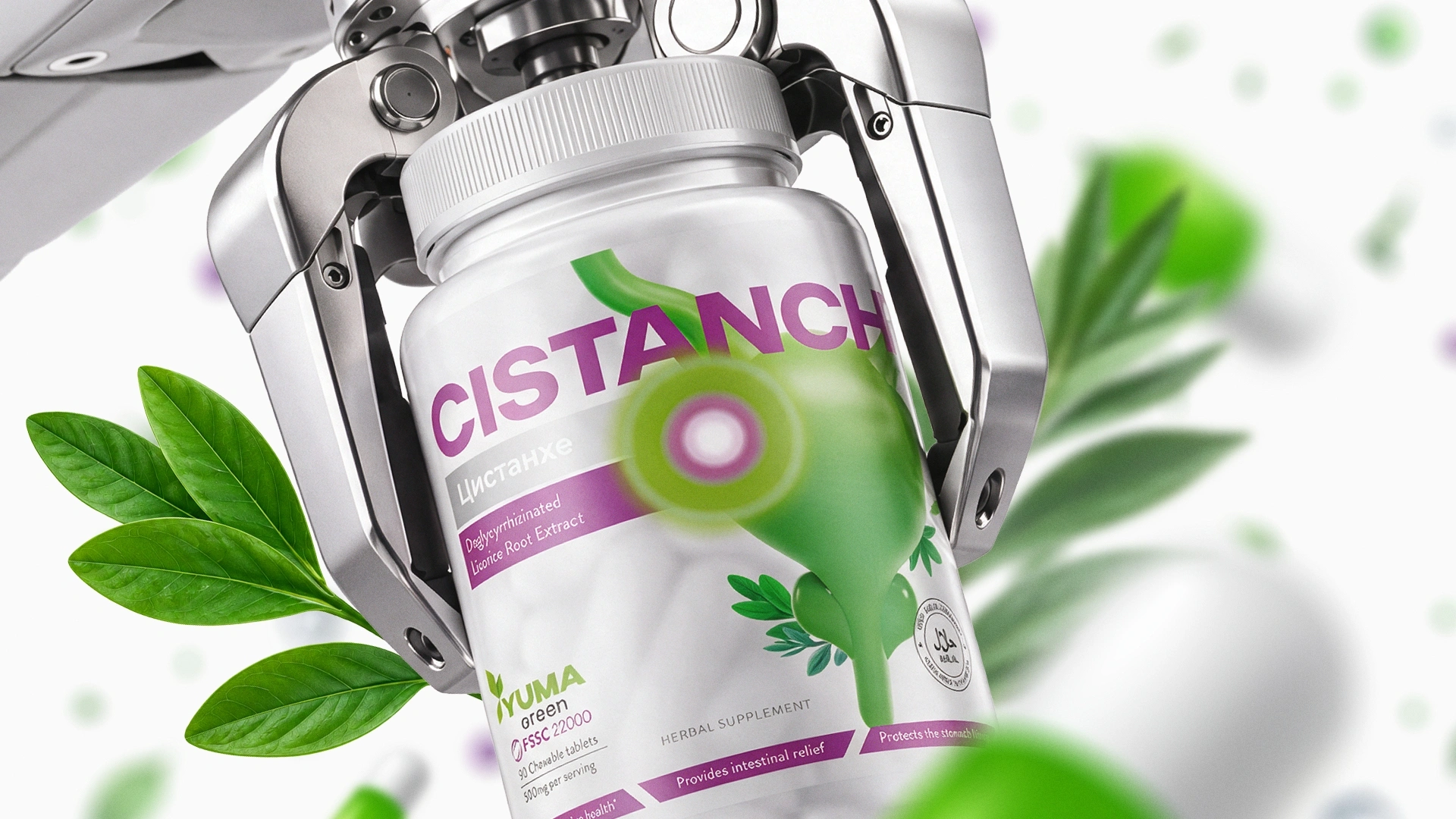
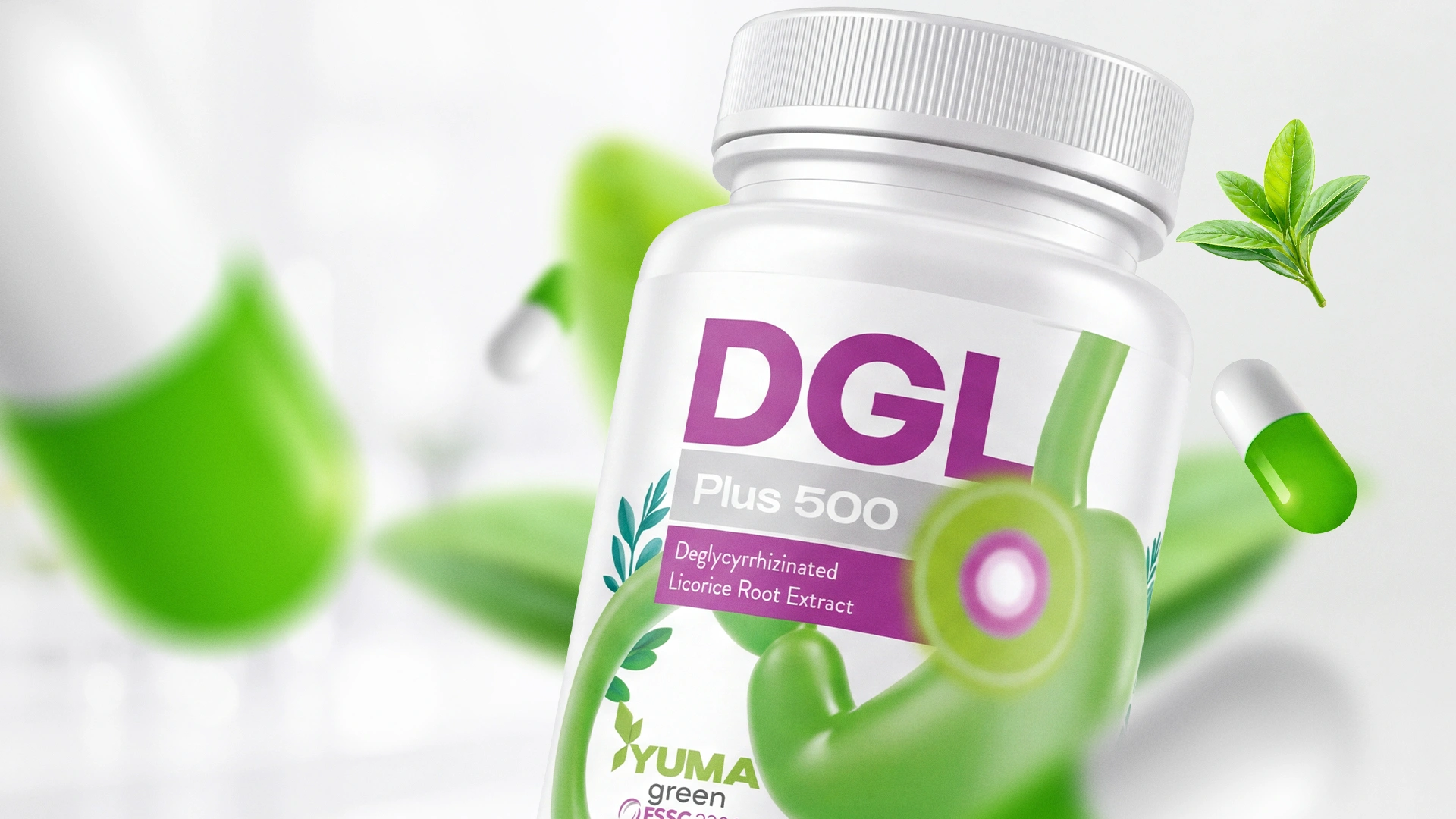
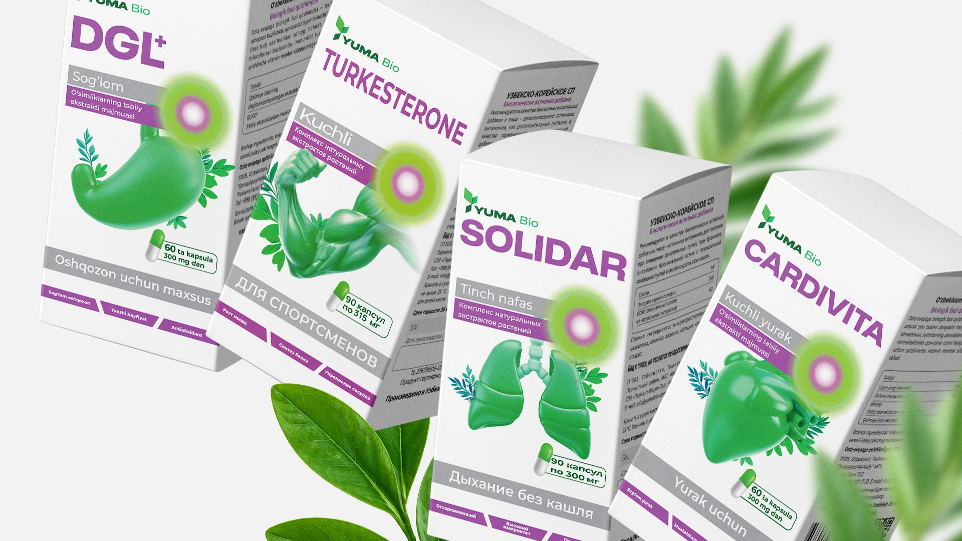
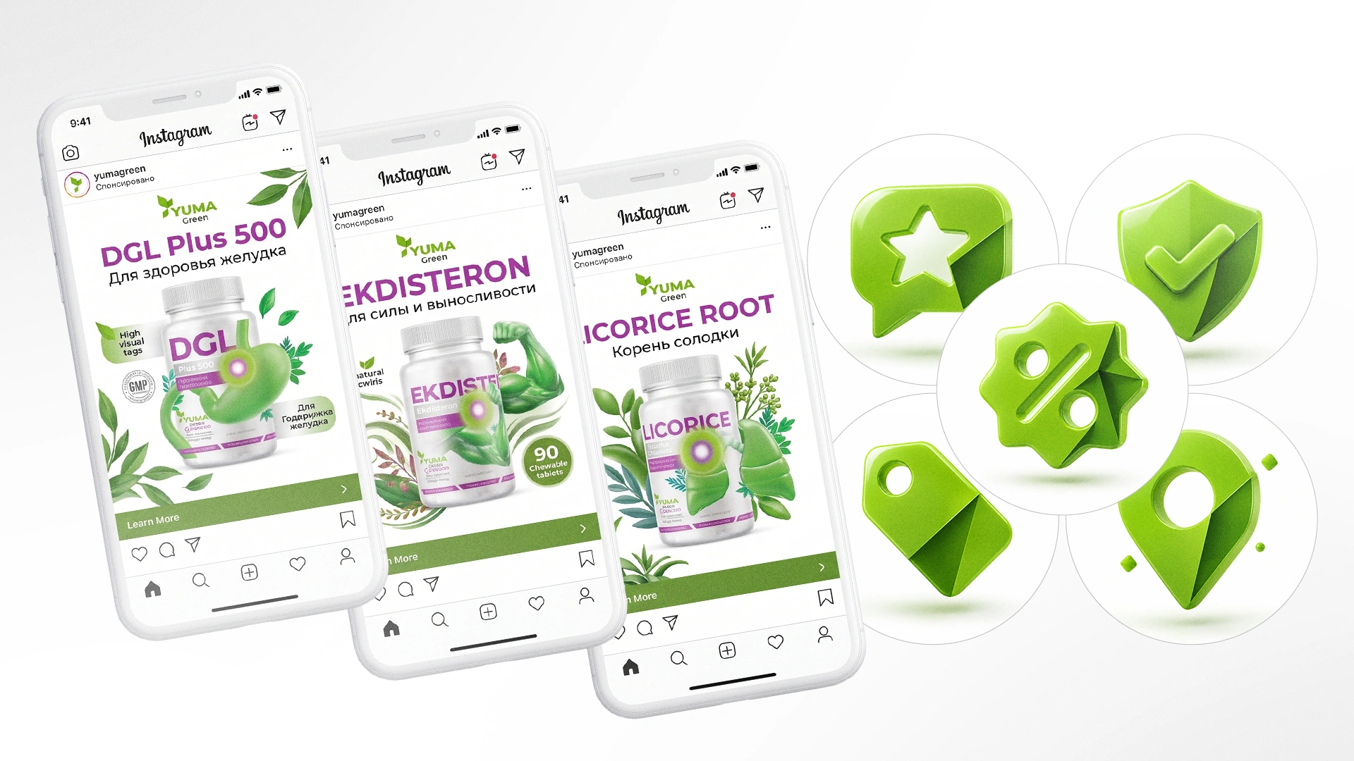
- Visual Solution. The main "feature" of the packaging design is its 3D illustrations of human organs. For example, for the DGL (licorice root extract) product, the packaging doesn't just show a picture of the herb, but a direct image of the stomach with a bright light highlighting the healing point.
- The specific use of green for the stomach visually reinforces that the product is natural (herbal) rather than chemical-based.
- The contrast between the dark purple and green in the typography gives the packaging a premium and trustworthy appearance.
Result
We created a design that speaks directly to the consumer without unnecessary complexity. The moment a customer looks at the packaging, they understand in seconds which part of the body the medicine treats and that it is natural.
As the legendary corporate designer Paul Rand said, "Design is the silent ambassador of your brand." The 3D illustrations we created became a true "ambassador," capable of conveying the product's healing power to the customer without any extra words.