Aklis: Packaging Design for Laundry Detergent
Before creating a brand of washing powder, we studied the market. We studied the strengths and weaknesses of the main players in the market, and also examined the shortcomings that allowed other players to enter the market. We shared our experience with sellers and received their advice. We conducted interviews to identify consumer needs and problems.
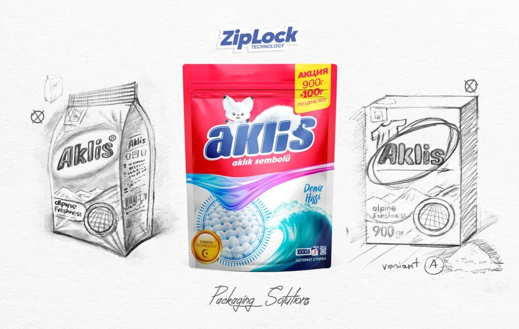
1. Solution
After collecting the analysis results and ideas, we focused on improving the composition, size and packaging of the product. We organized a focus group and collected their opinions on the design and fragrances.
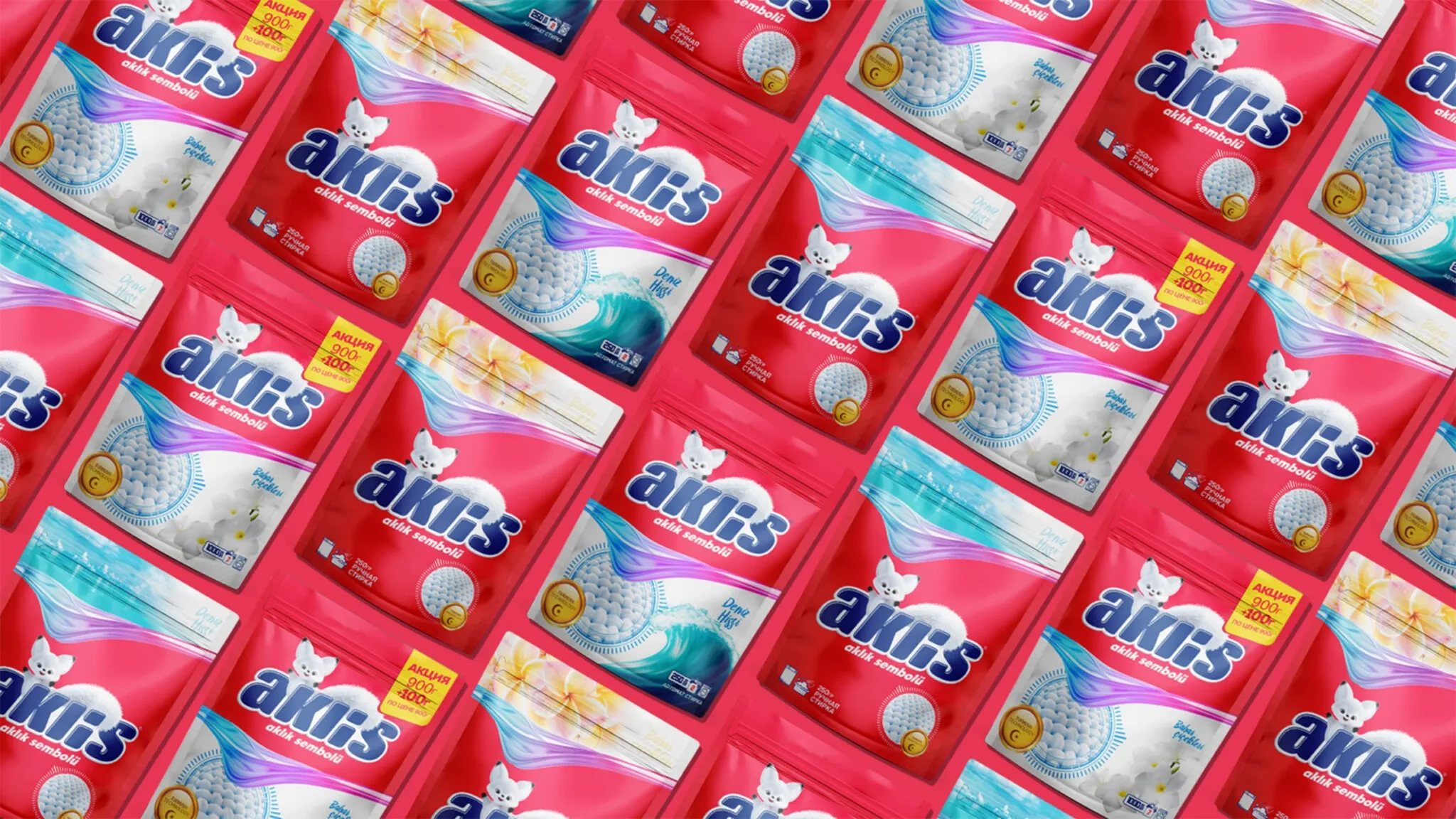
The name Aklis was chosen for the new brand. Aklis is an original name derived from the combination of the words Arctic fox. The main emphasis is on cleanliness, neatness and whiteness, and the fox is one of the neatest creatures.
The name Aklis is written legibly, easy to pronounce and easy to remember. At the same time, it fully meets the naming requirements. In accordance with this name, we chose the slogan "Aklik sеmbolu" - "Symbol of whiteness". It corresponds to the name of the product and the value it gives.


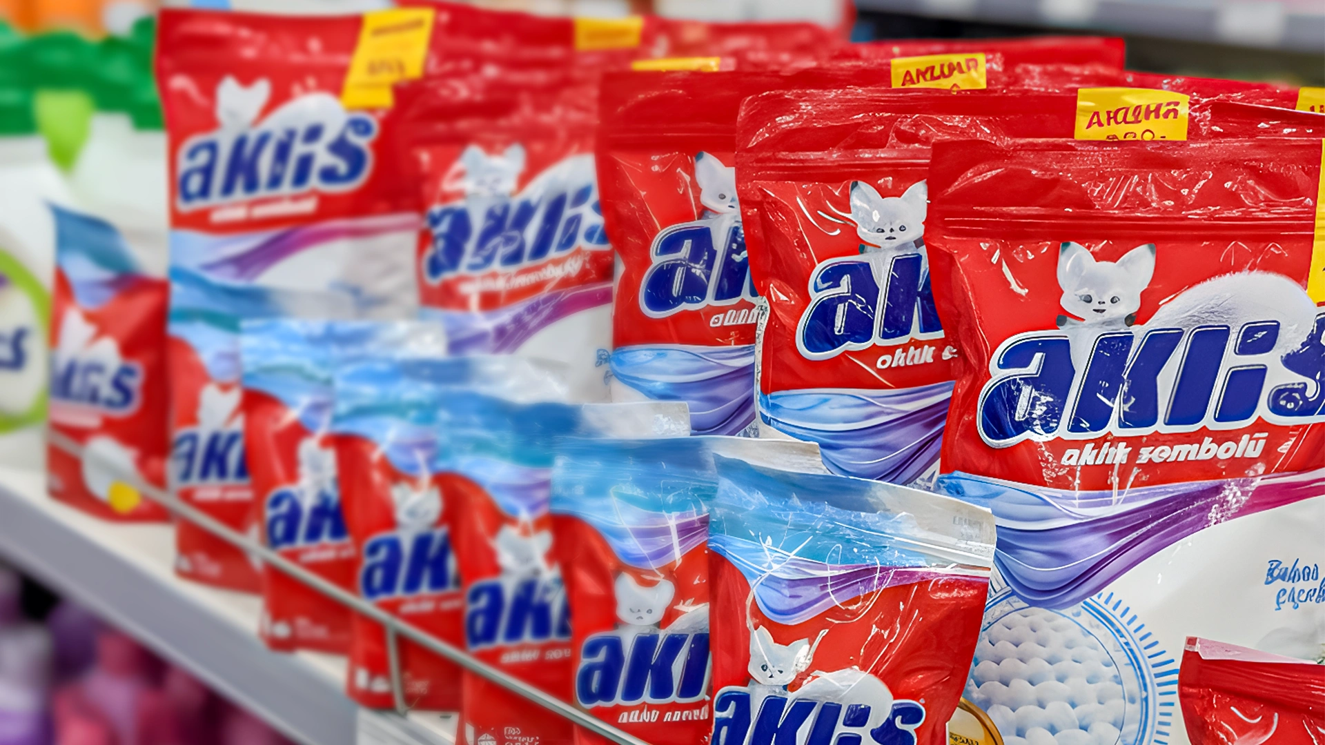
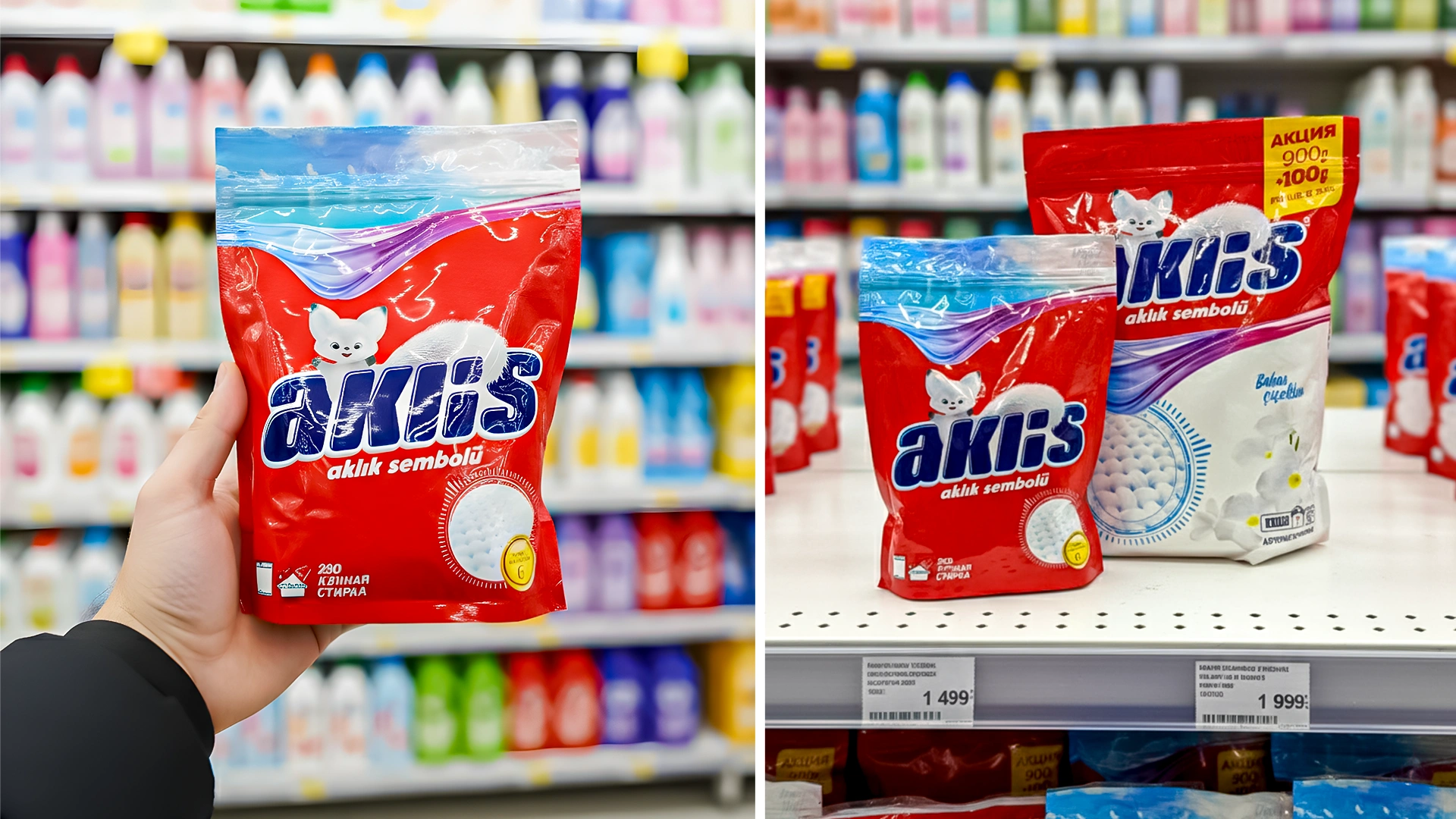
Result
We also used the Arctic fox as a character in the packaging design.
To stand out from the competition on store shelves, we chose crimson red as the main design color.
By switching the packaging to a Zip-lock bag, we found a solution to a number of problems:
No leaks during storage
Maximum aroma retention
Children cannot open it easily
This design in World Brand Design UK (https://worldbranddesign.com/bright-packaging-for-aklis-washing-powder/) and Packaging of the World (https://packagingoftheworld.com/2022/04/bright-packaging-for-aklis-washing-powder.html) was included by the community among the best designs.