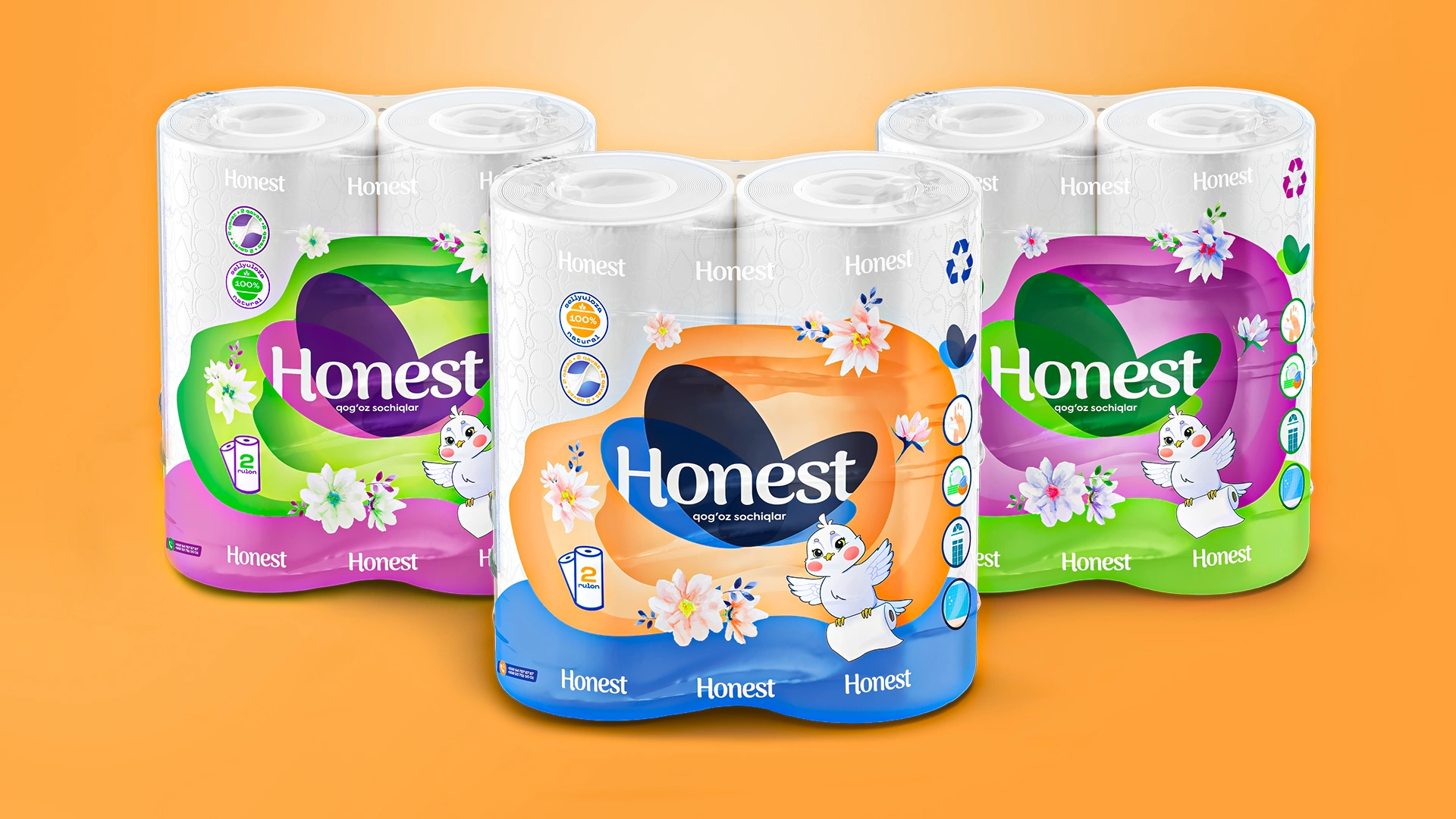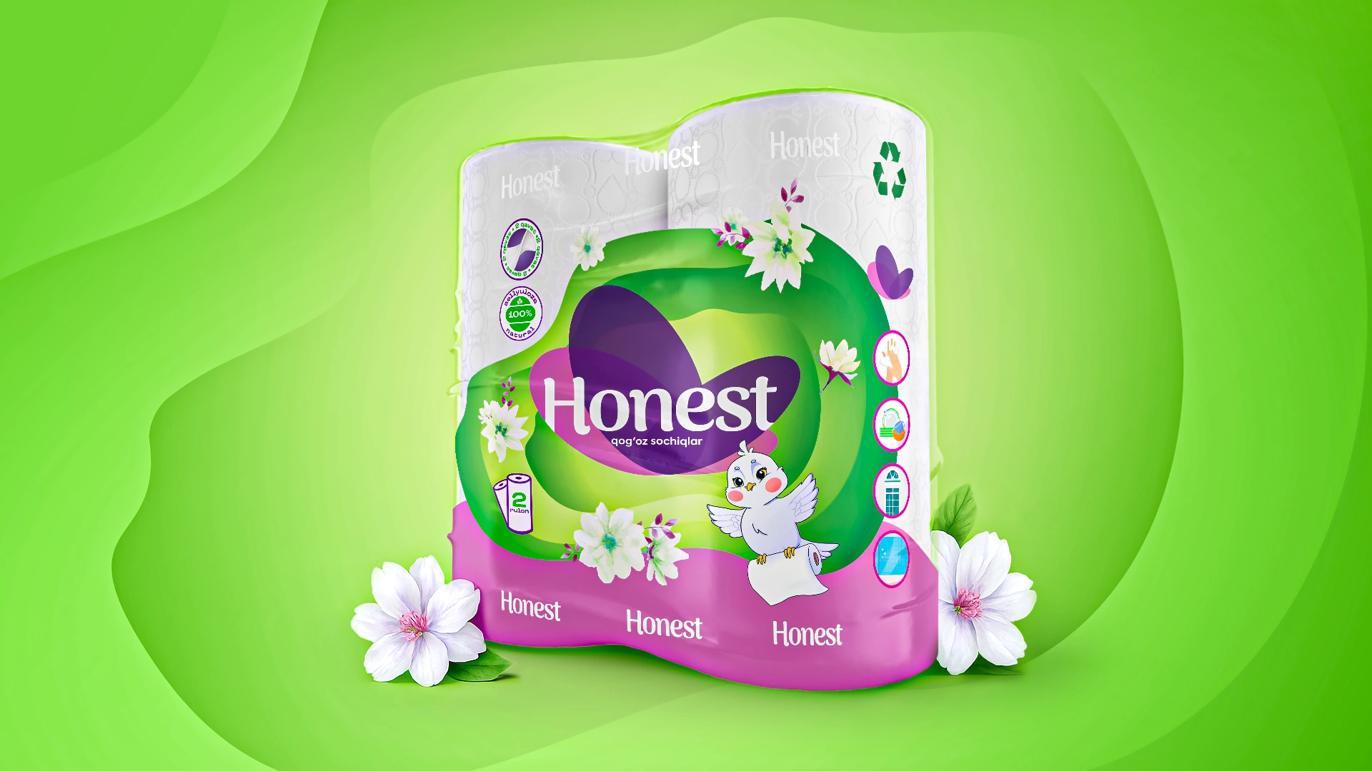
Honest — Paper Towel Packaging Design
Honest – Paper Towel Packaging Redesign Focused on Clean Aesthetics and Trust
1. Task
The Honest brand approached us to redesign the packaging for their paper towel rolls. The primary goal was a complete refresh of the visual identity, aiming to enhance shelf appeal and competitiveness. The client wanted to move away from the perception of "cheap" packaging towards a modern, emotional, and memorable design solution. Additionally, the logo required adaptation to align with the new visual system.

2. Research
We analyzed the paper goods market in Uzbekistan and neighboring countries. Our findings indicated that most existing packaging relied on standard color schemes, cluttered with small elements, typography, and outdated colors. Such packaging did not evoke emotion, blended with competitors on shelves, and failed to convey quality or inspire consumer trust.
Simultaneously, we conducted an audit of the target audience—primarily women aged 25–45, who make purchasing decisions in supermarkets. Beyond price and product features (softness, number of layers), aesthetics played a significant role in their choices: they preferred neat, visually clean, and appealing products.
3. Solution
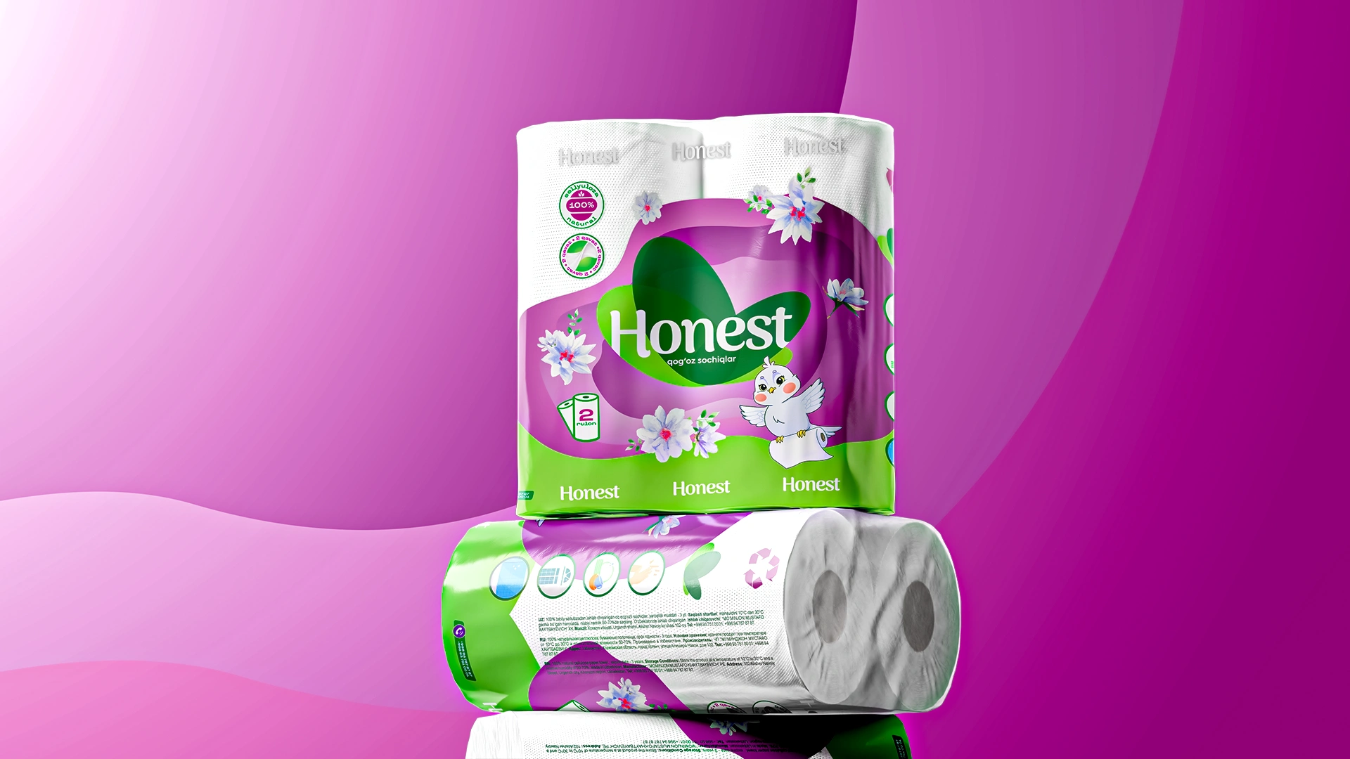
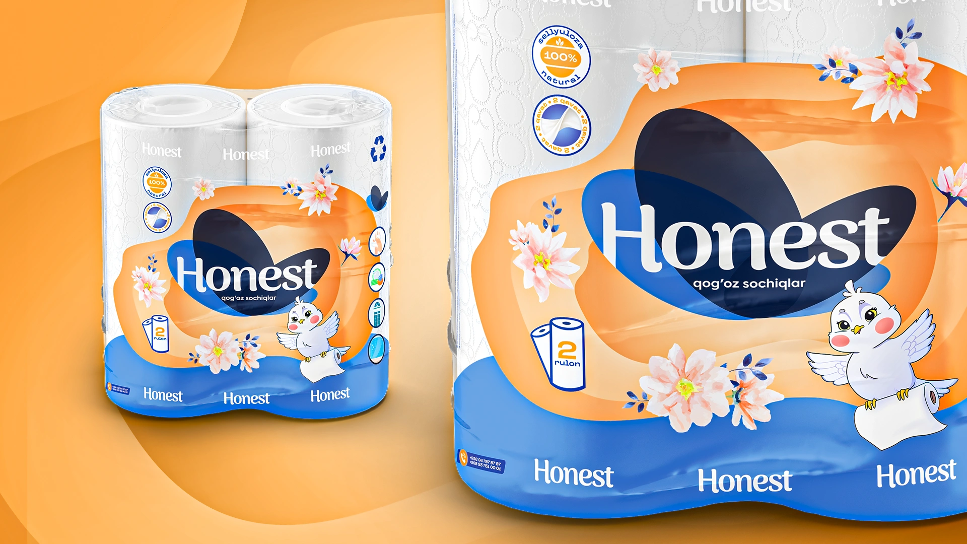
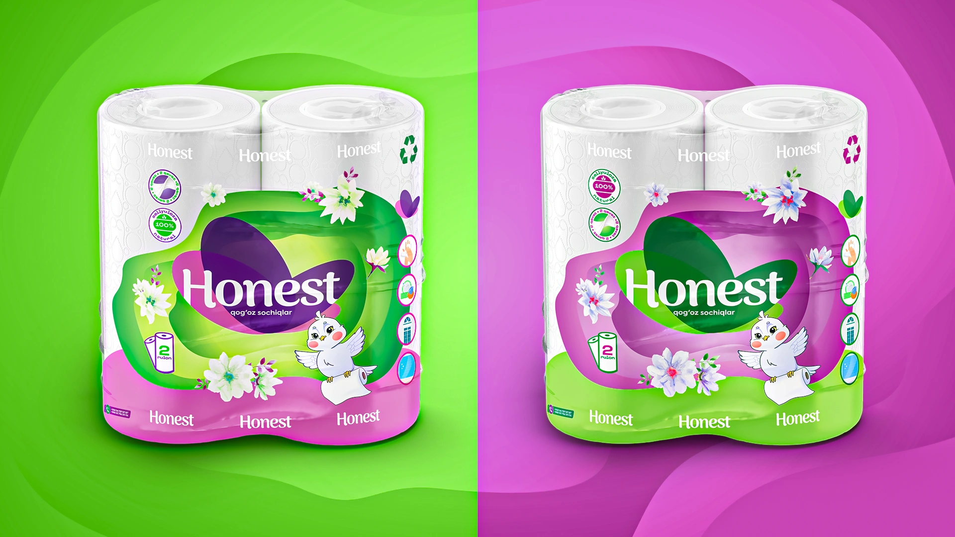
- Logo Refresh: We updated the logo while retaining its recognizability, making it smoother and more friendly.
- Light and Fresh Color System: Developed a visually appealing palette associated with freshness and naturalness.
- Soft Gradients and Watercolor Floral Elements: Employed these design touches to create a sense of gentleness and trust.
- Each package featured a distinct decorative color scheme: orange, green, and purple, offering variety.
- Clear and prominent icons were added: 2 rolls, 100% cellulose, softness, and density.
- The resulting packaging was modern and airy. We intentionally avoided excessive visual noise, emphasizing a clean background for easier perception.

Result
Following the redesign, Honest's packaging became instantly recognizable and more prominent on store shelves. The variety of color choices increased product attractiveness and allowed consumers to select their preferred shade. The overall visual impression now communicates cleanliness, quality, and care for the customer.
The redesign revitalized the brand: it updated its image, retained existing loyal customers, and attracted new ones. Honest is now perceived as a mid-to-premium segment product, clearly distinguished from its previous "economy" positioning and trusted by consumers.