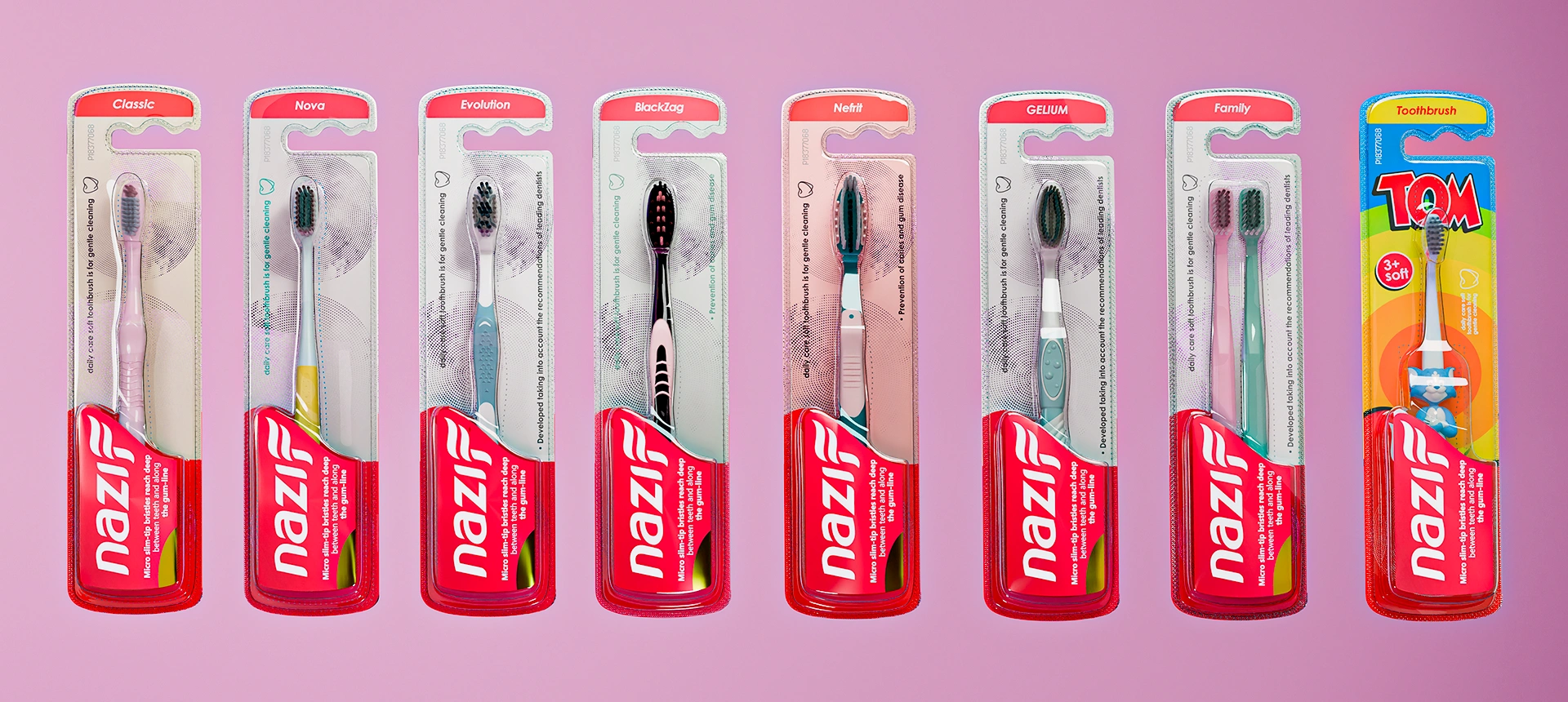
Nazif — Toothbrush Packaging Design
A unified and recognizable visual system was developed for Nazif ("clean") toothbrushes. Saturated red color, a toothpaste stream logo, and a clear blister structure ensured immediate standout on the shelf and communication of brand values.
1. Task
When Nazif approached us at Minim, our goal was clear: to create a unified and memorable visual system.
The Uzbek word "Nazif" translates as "clean, tidy," perfectly capturing the essence of the product. However, despite its precise naming, the brand lacked visual consistency. Like many emerging companies, Nazif initially experimented with various styles, colors, and formats. But as the brand grew, there was a clear need for a structured approach—a cohesive style, recognizable packaging, and distinct market positioning.
2. Research
- We studied the oral care market in Uzbekistan and neighboring countries, uncovering several critical insights:
- Over 80% of consumers select a toothbrush within just 3 seconds, relying heavily on color, shape, and packaging.
- Most packaging designs blend together, especially on crowded supermarket shelves.
- There were few brands in the category with enough personality to instantly capture attention.

3. Solution
Logo
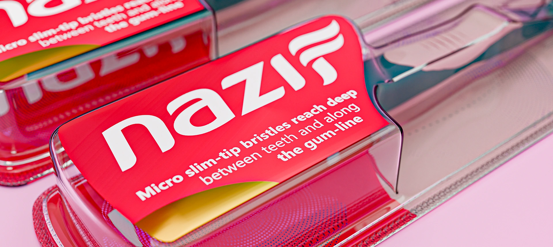
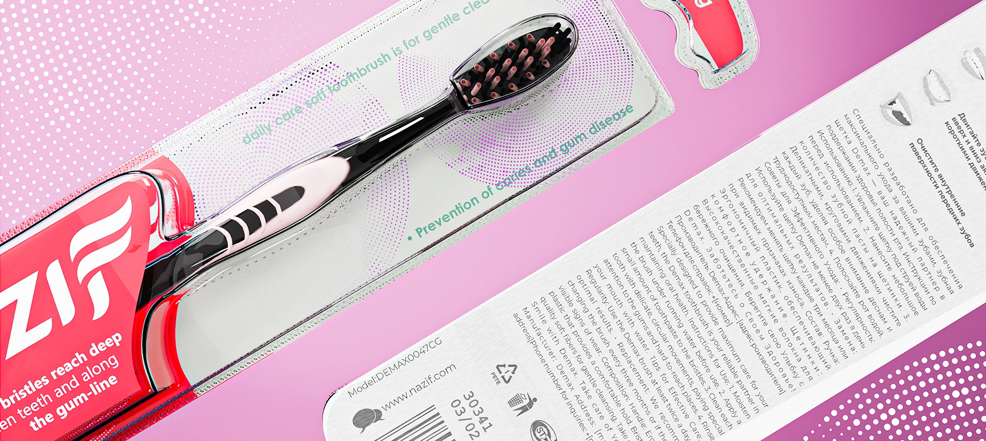
We developed a logo featuring a stylized letter "F," designed to resemble a stream of toothpaste. This design evokes movement, care, softness, and purity.
Smooth, balanced, and visually fresh—exactly how a self-care brand should feel.
Color
The visual identity centers around a bold, vivid red color, symbolizing health, energy, and confidence—the exact feelings consumers want after personal care.
Red is a bold choice in a category traditionally dominated by sterile, cool tones. This deliberate choice ensures Nazif packaging stands out immediately, engaging consumers directly and emotionally.
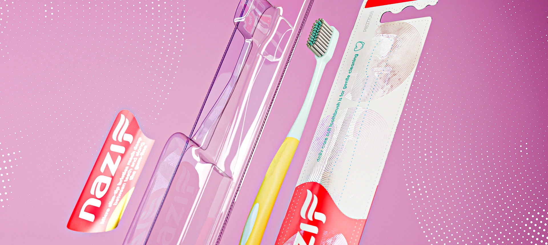
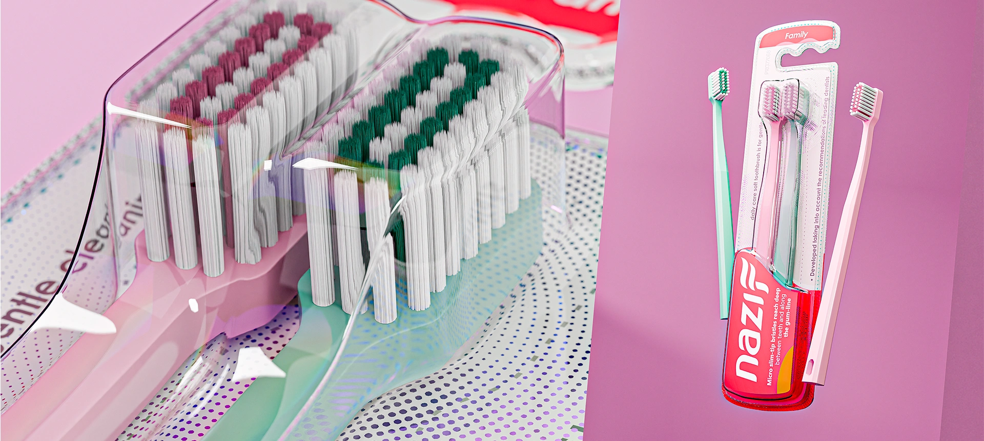
The contrast between the bright red lower half and transparent upper half of the blister pack creates a balance between dynamic energy and cleanliness, making it easy to recognize and remember.
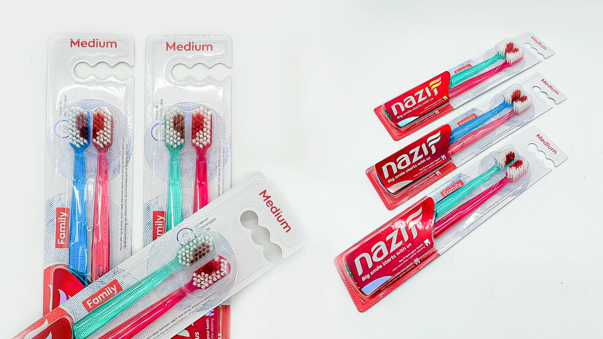
4. Packaging
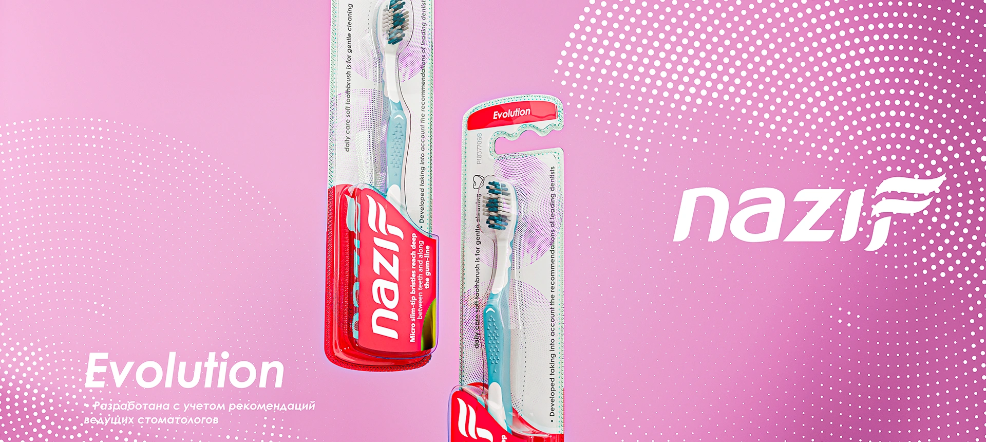
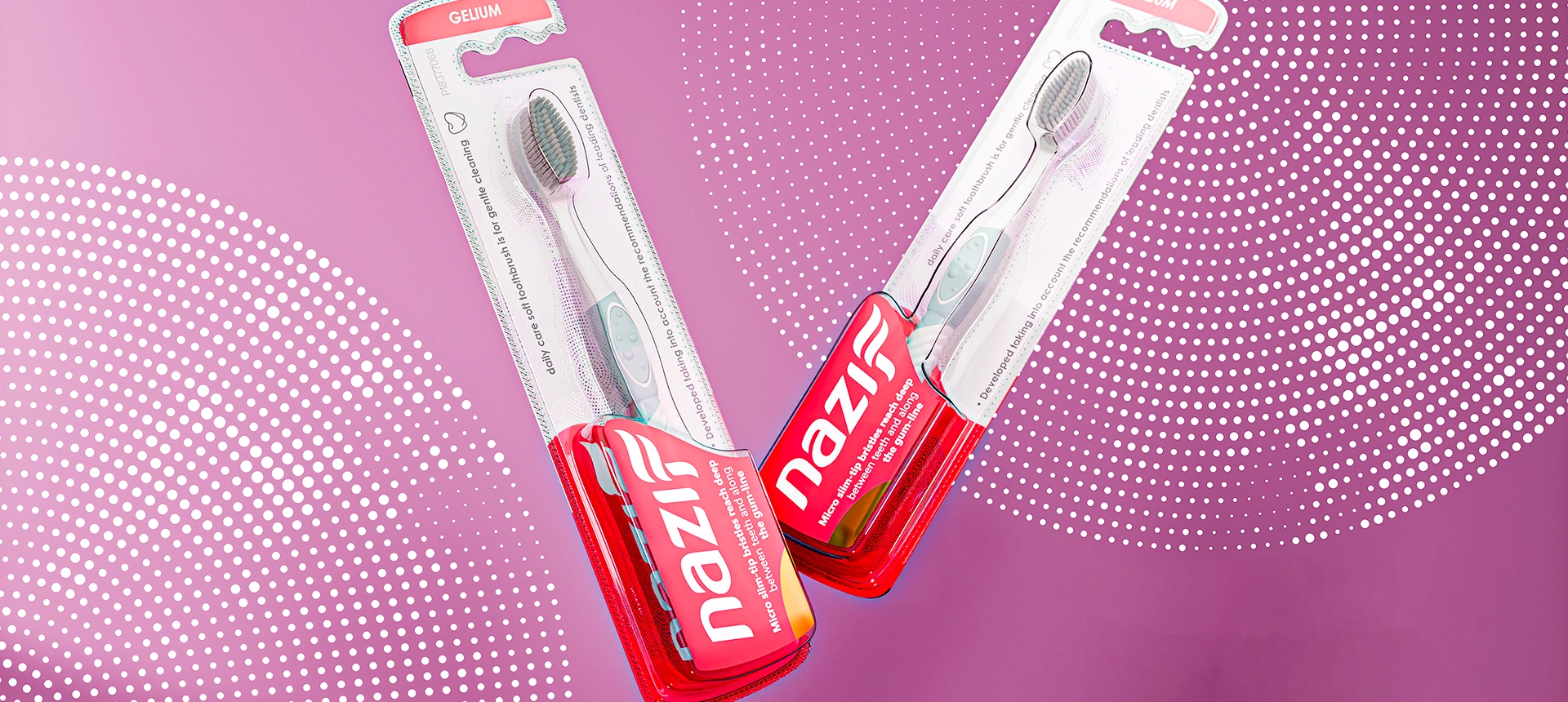
The lower portion of the blister pack features the brand’s signature red with the logo and product description clearly displayed.
An angled logo block adds motion and a contemporary feel.
Product types (SKUs) are prominently placed at the top for quick and easy identification.
Essential product details are strategically positioned for maximum visual impact.
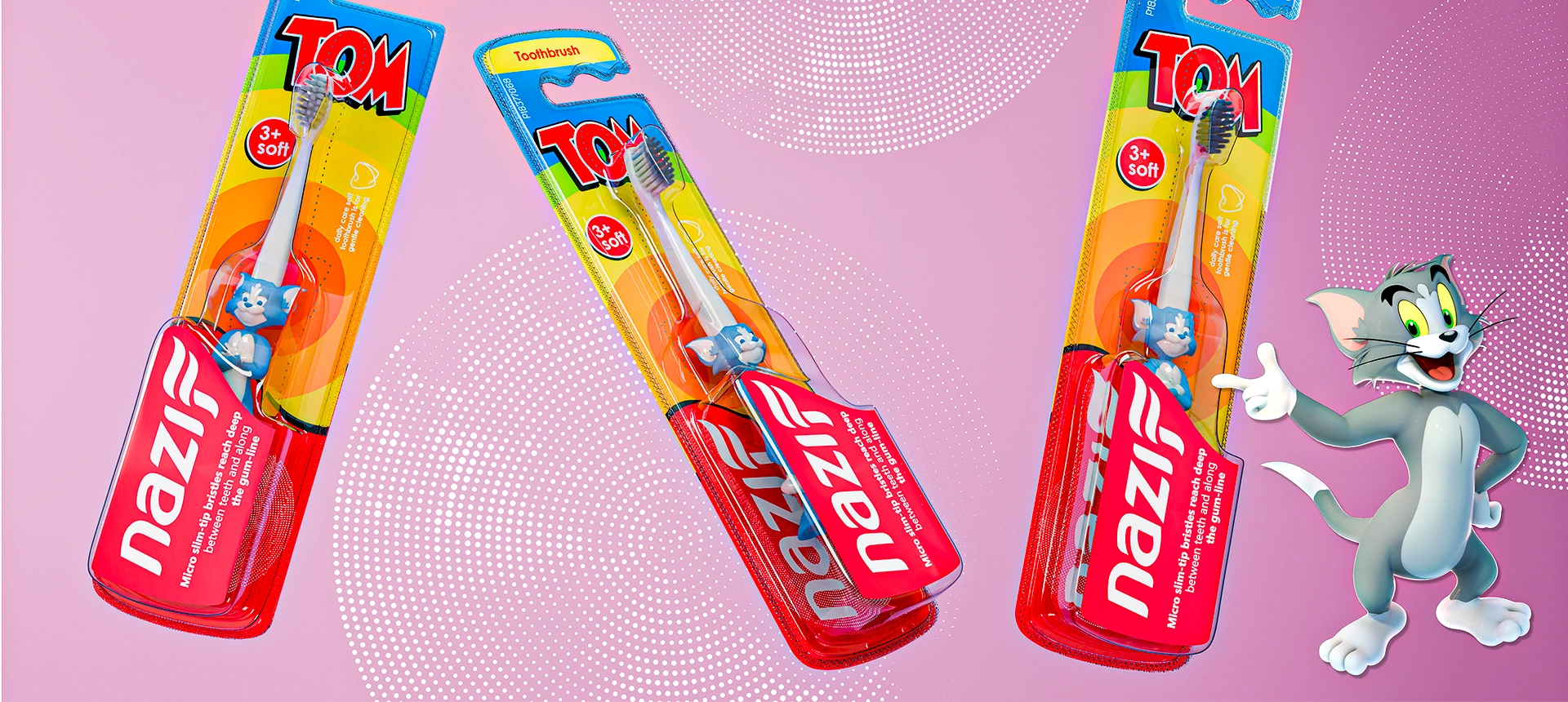
Children's toothbrushes have distinctively bright colors and playful characters, yet consistently retain the lower red block and logo to maintain visual unity.
Texture
The packaging background features a subtle dotted gradient pattern. It adds depth while remaining visually neutral, enhancing not only the aesthetics but also providing a pleasing tactile experience.

Result
The new visual system enabled Nazif to
Unify over 8 SKUs under a consistent style;
Achieve immediate shelf recognition;
Simplify consumer navigation by clearly indicating softness level and product purpose;
Clearly communicate brand values: cleanliness, neatness, and reliability.
The client approved the concept immediately after presentation. The products are already on shelves, garnering excellent consumer feedback and strong market performance—proving that the new packaging truly delivers.