Dadasini Qizi: Family Ice Cream Branding
Complete branding for Dadasini Qizi ("Daddy's Daughter") ice cream was developed. The design with mascots (father bear and daughter) and a unique palette (blue/yellow) reflects family values, joy, and care, creating a strong emotional connection.
1. Task
At Minim, we were approached by manufacturers on the brink of a significant launch: a factory expansion, new production lines, and a whole new range of ice cream. But most importantly, they came with a vision—to create a brand that isn't just delicious, but genuinely family-oriented, warm, and memorable. One that instantly stays in the heart and mind.
2. Research
During the research phase, we discovered simple yet powerful insights:
— Ice cream is most often bought by dads—purchasing for their family, especially their children, and notably more often for their daughters.
It’s that warm moment when Dad can't resist the request: "Can you buy me an ice cream?"
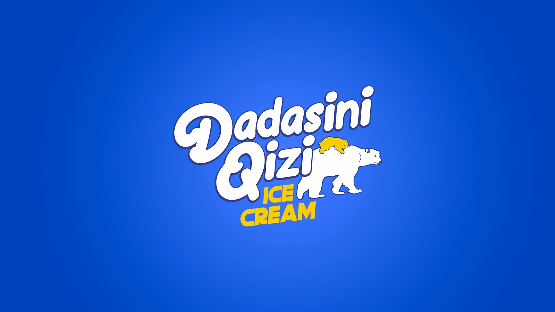
That’s how the brand’s idea and name were born—Dadasini Qizi ("Daddy's Daughter"). Touching. Authentic. Uniquely Uzbek.
We also explored local and international FMCG best practices, highlighting key principles:
— Packaging should evoke emotions—joy, playfulness, and care.
— Be distinctive on the shelf (the segment is crowded with similar offerings).
— Feature characters who build stories and brand recognition.
— Have flexibility to adapt across different SKUs and sales channels.
— Portray positive moments from family life.
One insight particularly inspired us: consumers often remember feelings rather than flavors.
The special feeling of, "My dad bought this ice cream for me."
3. Solution
We created a visual system entirely focused on a single powerful emotion—family love.
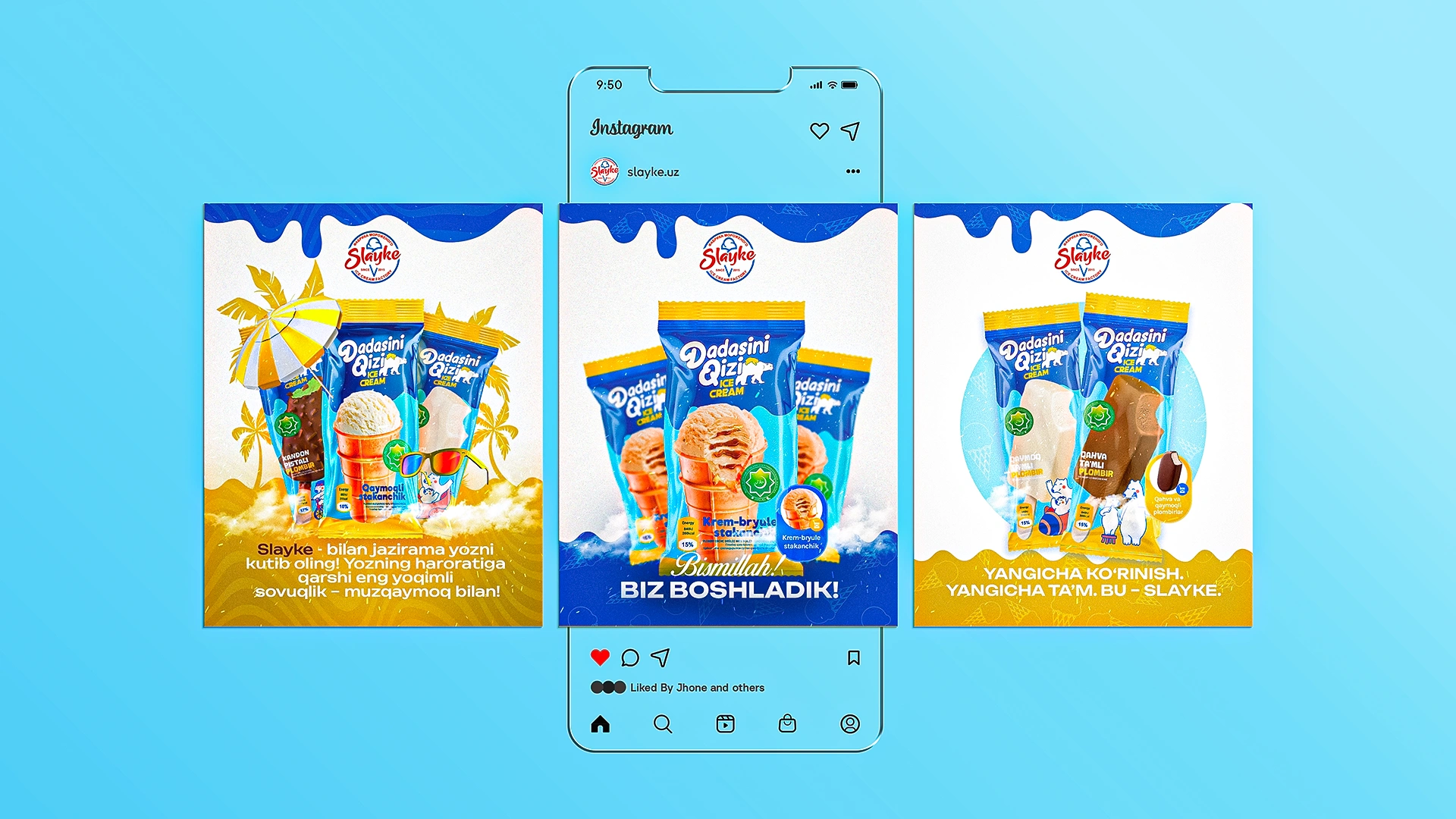
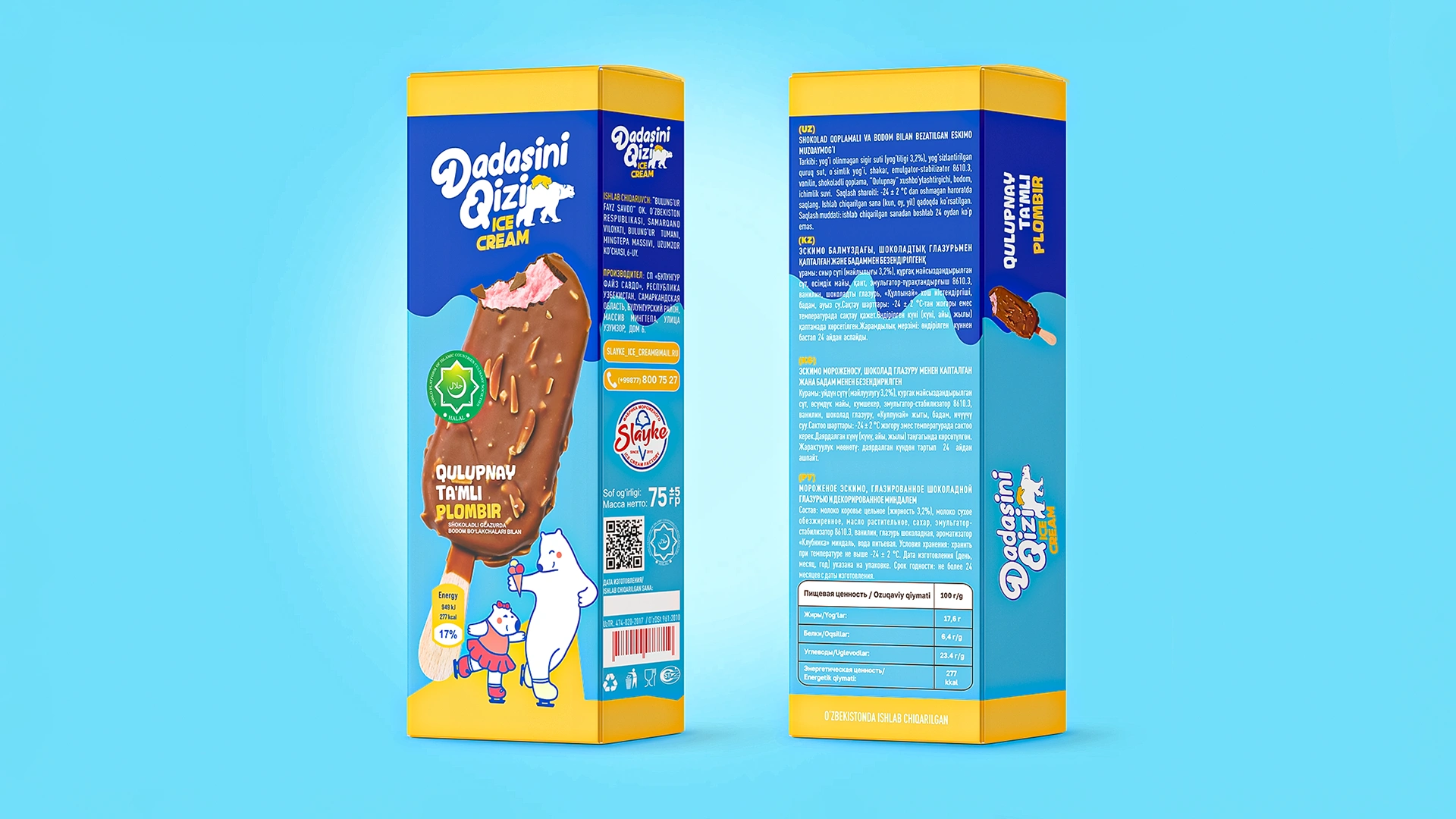
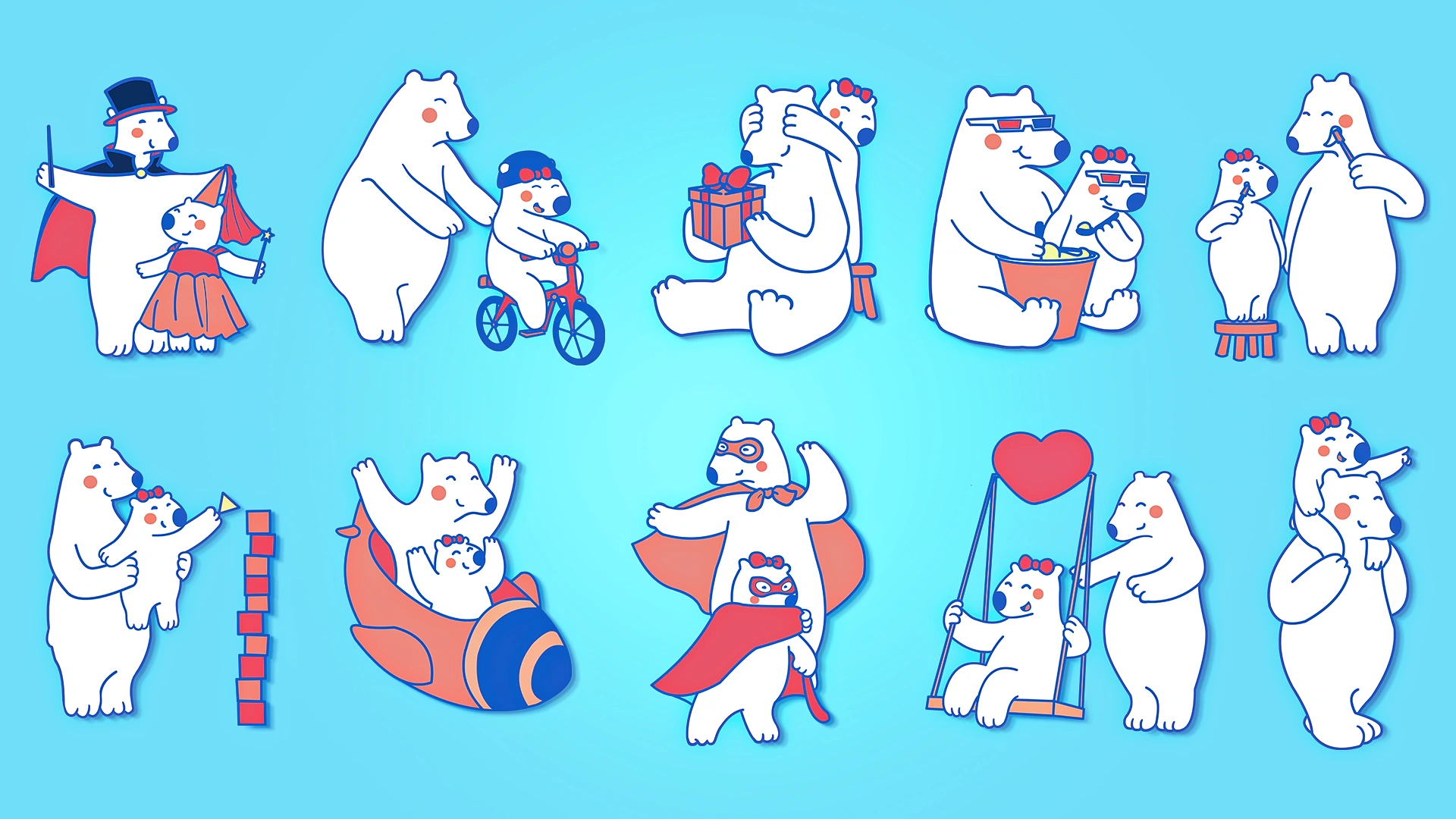
At the heart of the brand are a dad bear and his daughter. They're not mere mascots; they're protagonists of mini-stories. Together they ride bikes, exchange gifts, transform into superheroes, hug, make ice cream, and simply cherish each other's company.
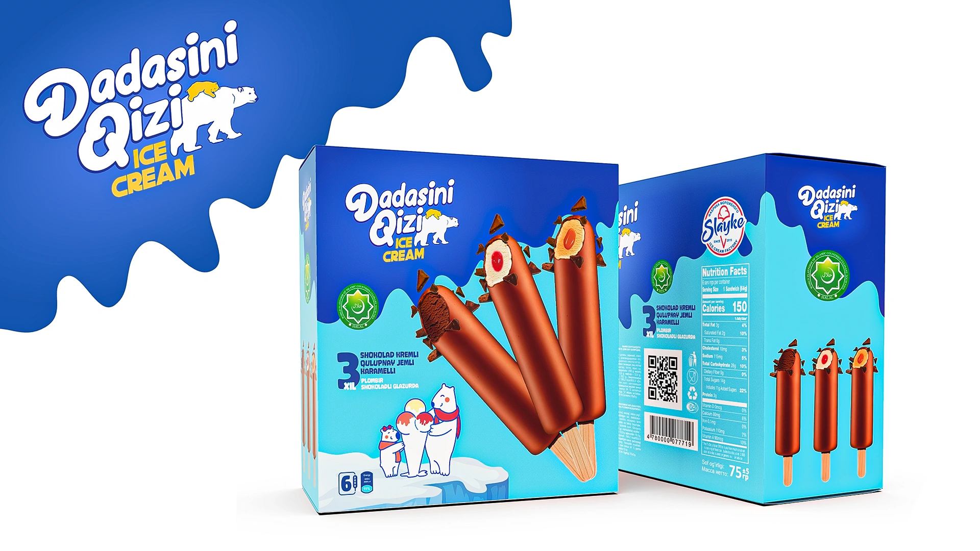
Each packaging design is like a frame from a comic, capturing a moment and mood.
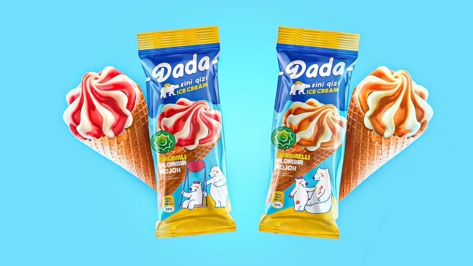

4. How it works in design:
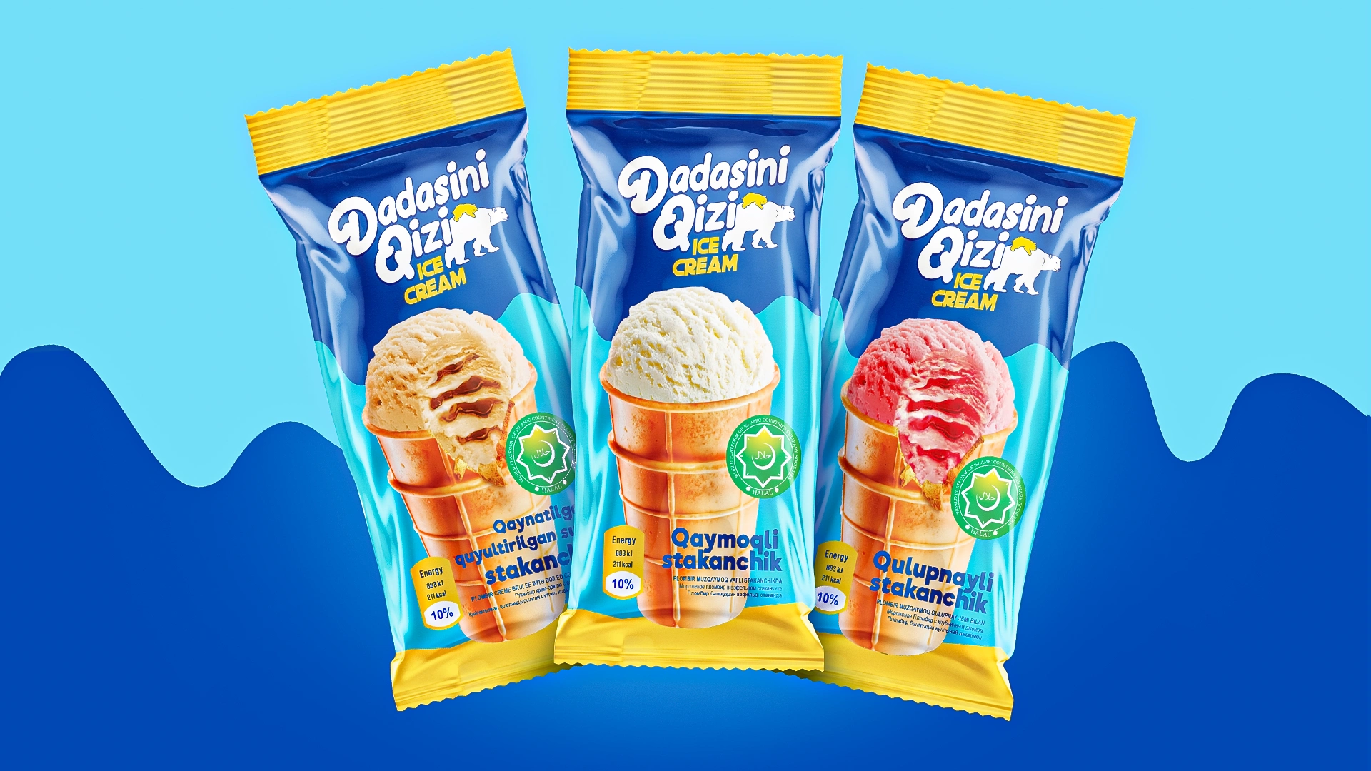
• Universal format: Easily adaptable across sticks, bars, boxes, freezers, and POS materials.
• Color palette: Blue, light blue, and yellow—fresh, unconventional colors in the ice cream category that immediately stand out, evoking coolness and happiness.
• Logo: Rounded, friendly, designed with a warm, handwritten font.
• Illustrations: Minimalistic and clean, scalable, and easy to read even from a distance.

Result
Dadasini Qizi is now ready to meet customers. The launch is in its final stages, and we eagerly anticipate seeing our brand heroes take their rightful place in freezers, on shelves, and in the hands of those who choose with love.
Dadasini Qizi—a brand reminding us that sometimes, love is simply buying ice cream for your daughter.