TADA! — Rice & Corn Chips Packaging Design
We developed a minimalist yet expressive packaging design for TADA! healthy chips (unfried). The pastel palette and clean chip visual convey health benefits. The contrasting logo ensures attention on the shelf.
1. Task
When the Prima Foods team approached us at Minim agency, they already had a name and a product — but no image.
TADA! — these are rice and corn chips made from whole grains, without frying and excess fat. The product is light, healthy, and suitable for everyone: from children to office workers, from healthy lifestyle enthusiasts to those who just want a crunchy snack with benefits.
The client came with a ready-made name: TADA — in Japanese means “just,” “only,” or “usually.”
And in this word lies the philosophy of the product itself: nothing extra, only the essential.
Our task was to develop a logo and packaging design concept that conveys the essence of the brand.

2. Research
The demand for “smart snacks” is growing globally. According to Nielsen, more than 65% of consumers aged 18 to 45 are looking for snacks labeled low fat, natural, or whole grain. At the same time, it is important that the packaging doesn’t look “nutritionally dull.”
In Uzbekistan, this trend is just gaining momentum: young parents, office workers, healthy lifestyle followers — all are looking for “tasty but not harmful.”
Another important figure: up to 80% of purchasing decisions are made right at the shelf. It is at this moment that the packaging must not just “look nice,” but convince and evoke the desire to try. We knew the design had to work quickly, simply, and emotionally.

3. Solution
We started with the logo — it is built on contrast: bold typography, dynamic shape, strong accent. It’s as if it says: pay attention to me. Because in FMCG, as in marketing in general, the rule applies:
“If you haven’t sold attention, you haven’t sold anything.”
The logo is built on contrast:
• bold typography with expressive form,
• a graphic “splash,” but without visual shouting,
• a sense of motion and lightness, but with clear geometry.
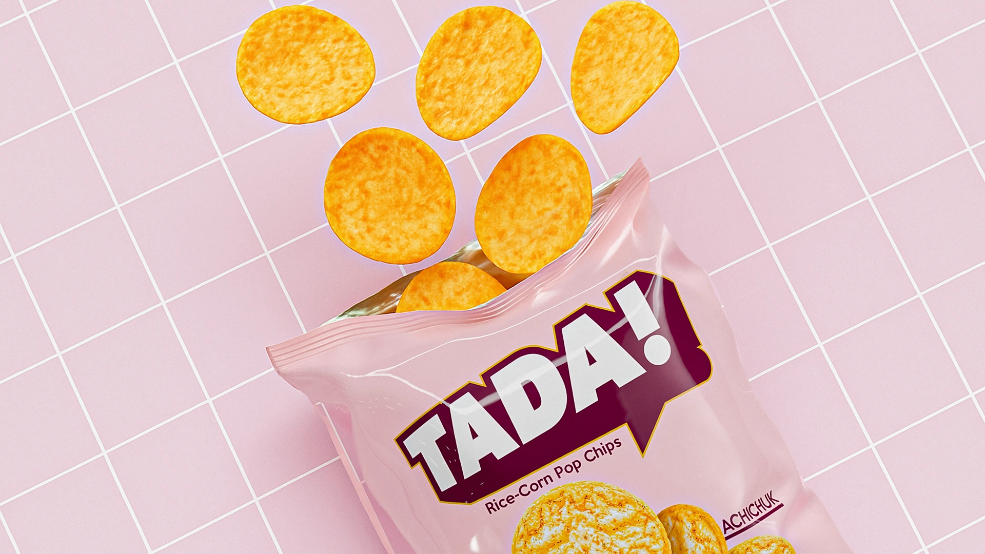
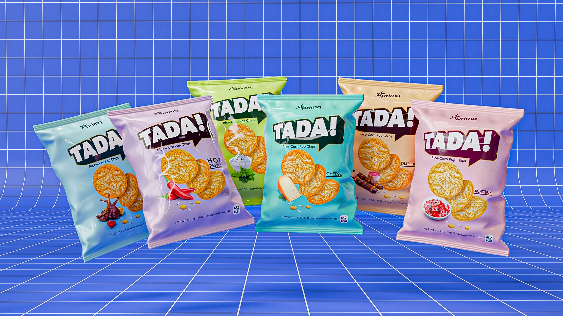
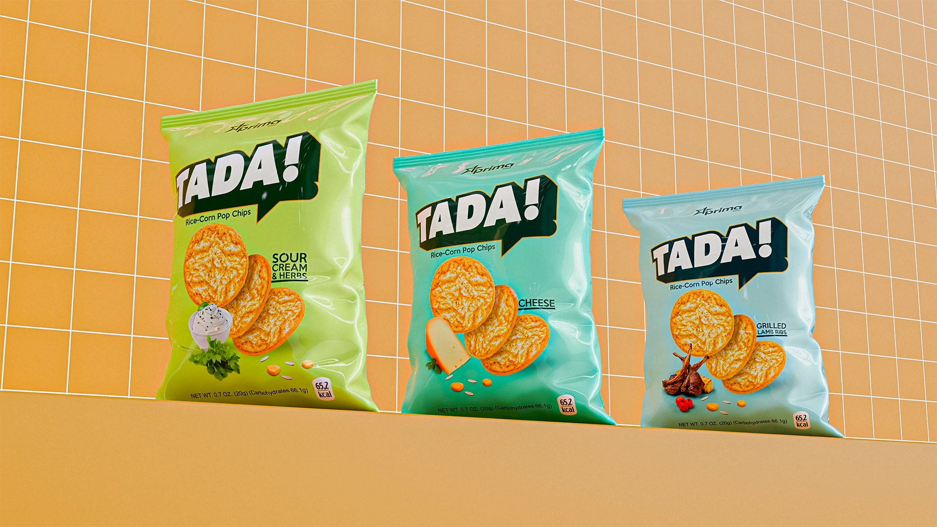
4. Packaging
Then — packaging. Key design principles:
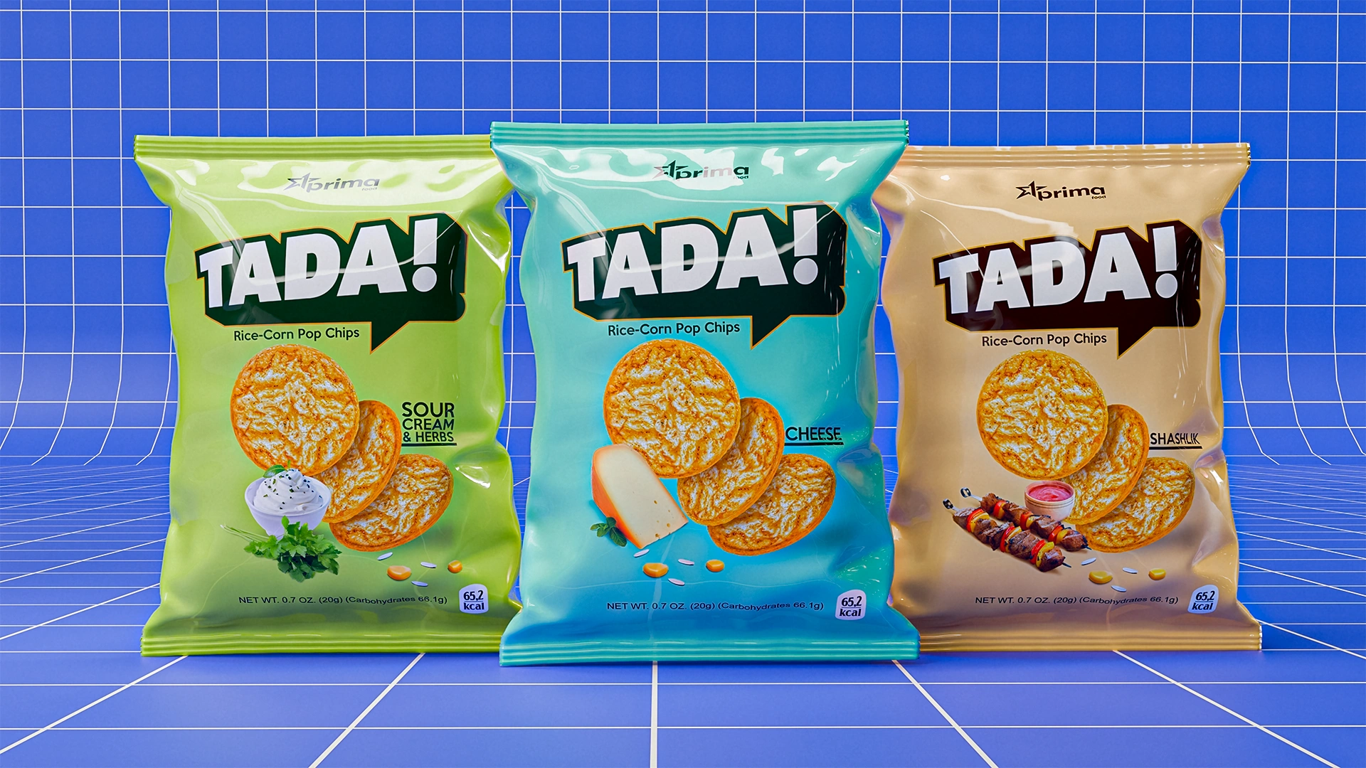
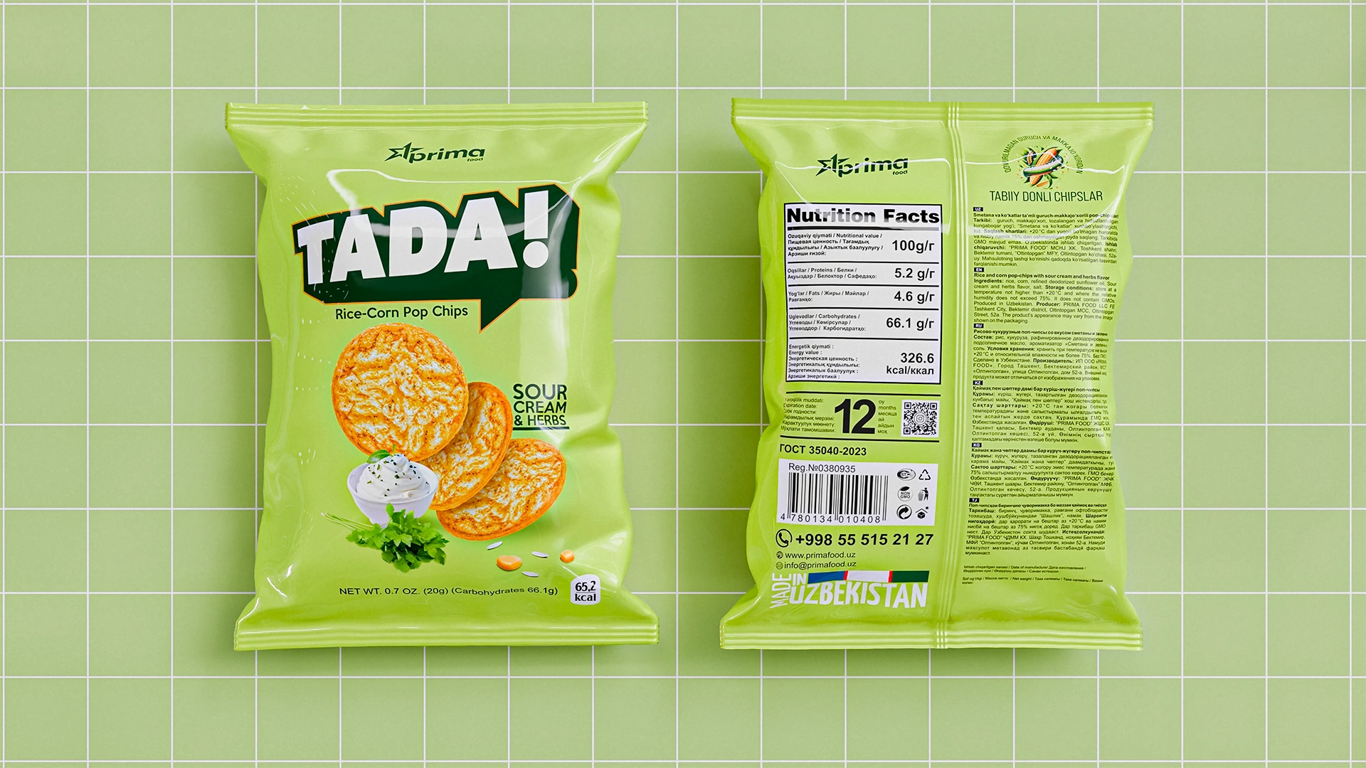
• Pastel palette — soft, “edible” tones creating a light and clean perception.
• Flavor icon — a simple yet recognizable image of the ingredient (cheese, herbs, kebab, etc.).
• Main character — the chip itself. Not a stylization, not a background — but the real product, beautifully placed in the center.
• Readability — all key text can be read from a distance of up to 2 meters.
• Backside modules — information structured according to FMCG logic, from nutritional value to contact details.
Result
We created packaging that looks simple — but works deeply.
It builds trust, speaks of benefits, and remains bright and modern.
The product line merged into a unified system, where each flavor is recognizable yet part of the overall brand.
The brand entered the market with six flavors — and each was visually adapted within the unified concept.
As Paul Rand said,
“Design is not just what it looks like, but how it works.”
In this project, the packaging works: it helps to sell.